
Simple design choices that make a big visual difference.
Do you ever wonder why some handmade cards just grab your attention as you scroll?
I do. And when a card really catches my eye, I often stop and try to figure out why the design works so well. Is it the color? The layout? The way the focal point jumps off the card?

Over time, I’ve noticed that some of my favorite handmade card designs have a few simple things in common. They usually have a strong focal point, intentional framing, a limited color palette, plenty of contrast and a little dimension.
Those are the five handmade card design tips we’re going to look at today.
I recently made three fall cards with the October My Monthly Super Hero Kit from Hero Arts, and they turned out to be perfect examples. I used the same basic color palette and many of the same die-cut elements on all three cards, but made slightly different design decisions on each one.
And I think that’s what makes this so interesting: you don’t necessarily need more supplies or more embellishments to make a card pop. Sometimes a few thoughtful design choices make all the difference.

What You’ll Learn
In this post, we’ll look at how to:
- Create a strong focal point
- Use framing to direct the eye
- Choose a limited, cohesive color palette
- Add contrast for more visual impact
- Use dimension to bring your design to life
And along the way, I’ll show you how I used these ideas on three different fall cards.
1. Create a Strong Focal Point
A strong focal point tells your eye exactly where to look first.
That’s especially important in cardmaking because we have such limited real estate. There simply isn’t room for everything to compete for attention. I find that when I decide what the star of the card is going to be—and let everything else support it—the entire design becomes easier.
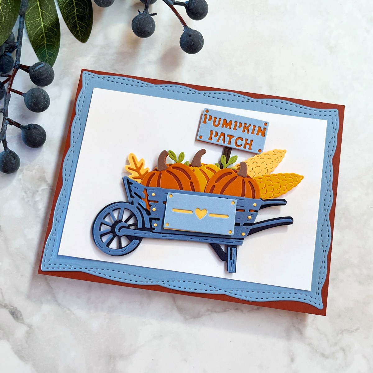
My pumpkin wheelbarrow is probably the strongest example of this in today’s cards.
I filled the slate-blue wheelbarrow with pumpkins, corn, leaves and flowers. Then I added the little Pumpkin Patch sign behind it.
That sign was a small addition, but it made a surprisingly big difference. It gave the focal point more height and turned the arrangement into a loose triangular shape. Suddenly, instead of having a collection of cute die cuts, I had one strong focal point that told a little story.

And notice what I didn’t do: I didn’t fill every empty spot on the card.
White space—or simply giving your focal point some breathing room—can be incredibly useful. I kept the surrounding areas relatively clean and uncluttered so all those wonderful little details in the wheelbarrow could shine.
Design Tip: Once you’ve created your focal point, stop for a moment before adding anything else. Ask yourself whether another element improves the design—or simply fills an empty space.
2. Use Framing to Direct the Eye
Framing is more powerful than we sometimes realize.
A frame gives your card structure and helps lock your attention onto the focal point. It can also anchor your elements so they don’t feel as though they’re floating around the card front.
And framing doesn’t have to mean adding an actual decorative frame.
For these cards, I created frames by layering my backgrounds and repeating colors from the focal elements. I used Postage Stamp Infinity Dies and Playful Stitched Panel Dies to add another subtle layer of interest.

I especially love the framing on my bucket of sunflowers card.
The white postage-stamp panel gives the simple blue bucket and three sunflowers a clean backdrop. Behind that is a Celestial Blue mat, followed by the warm Cinnamon card base.
Those layers do several things at once. They frame the flowers, repeat colors from the focal point, add contrast and draw your eye toward the center of the card.
Infinity dies are wonderful for this. A simple rectangle, postage-stamp edge or stitched panel can add structure without distracting from the main event.
If you enjoy die-cutting as much as I do, I’ve collected more of my favorite techniques in 13 Die-Cutting Tips I’ve Learned After Making Thousands of Cards.
Design Tip: If a focal point feels as though it’s floating on your card, try adding one or two simple layered panels behind it before adding more embellishments.
3. Keep Your Color Palette Limited
One of the easiest ways to make a handmade card feel cohesive is to limit the color palette.
There are lots of ways to choose colors, but for these three cards I pulled out an old favorite—my Color Cubes.
I searched for “Autumn” and chose Inspiration Card #135 from Volume 1. It gave me a beautiful fall palette of slate blues, buttery yellows, rusty oranges, cinnamon and a little brown.
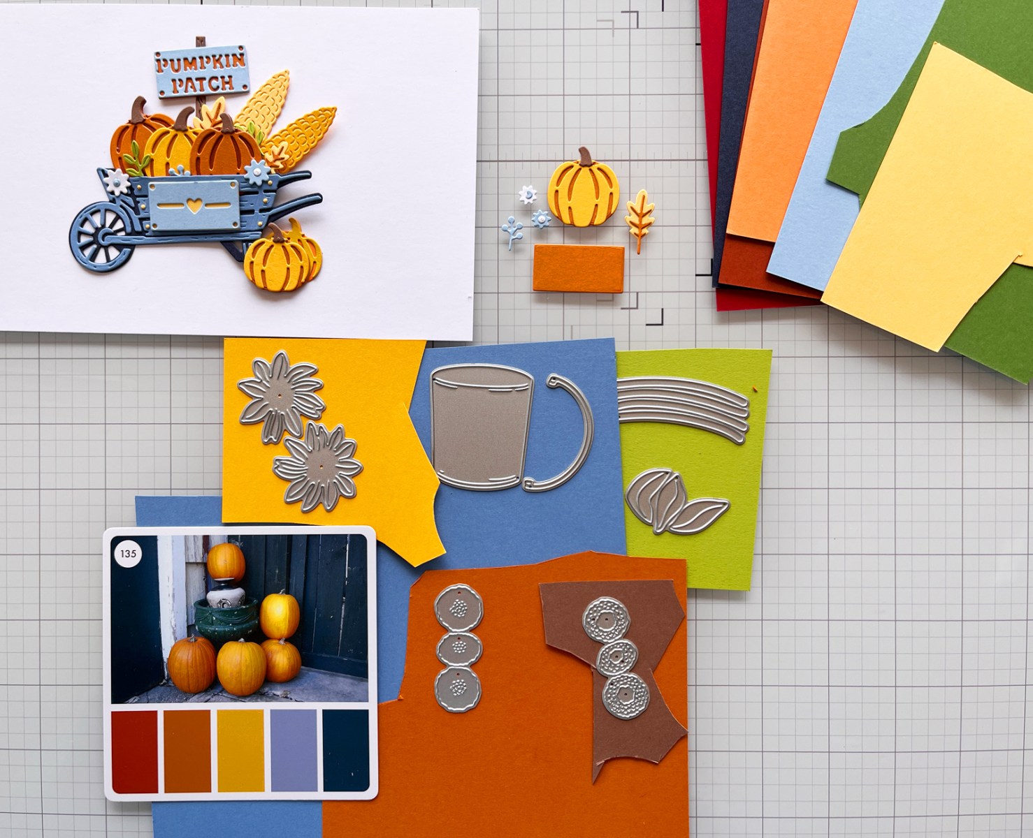
I loved the combination so much that I used it for all three cards.
The slate blues are cool and calming, while the rusty oranges add warmth. The buttery yellows bring in a soft bit of brightness. Together, the colors feel earthy and natural rather than as intense as a traditional primary-color palette.
And because I stayed within the same limited palette, I could die-cut a number of pieces at once and then mix and match them while designing my cards.
I partially assembled the individual elements first—pumpkins, flowers, wheelbarrow, bucket, leaves—and then played with different combinations and layouts. It was such an easy and enjoyable way to work.
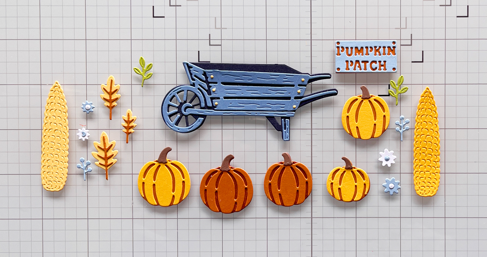
Limited palettes also reduce visual clutter. When fewer colors are competing for attention, your focal point has a better chance to shine.
Design Tip: If your card feels busy, don’t automatically remove an element. First look at the colors. Simplifying the palette may be all you need.
4. Add Contrast for More Visual Impact
Contrast creates energy.
It can come from light against dark, bright against neutral, large against small or even smooth against textured. Color contrast is one of my favorite ways to add that extra bit of drama.
For these cards, the slate blues and rusty oranges do much of the work.
Blue and orange sit opposite one another on the color wheel, so they naturally create contrast. But there’s also a temperature difference: the blues feel cool while the cinnamon, rust and yellow feel warm.
You can really see this on my little pumpkin-and-sunflower scene.
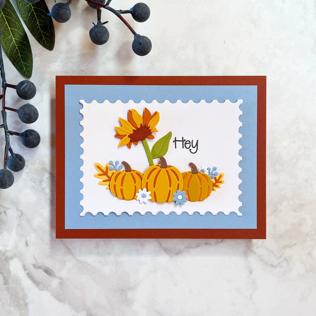
I started with a Cinnamon card base, added a wider slate-blue mat and then placed the scene on a crisp white postage-stamp panel. The rust-colored pumpkins and golden sunflower stand out beautifully against the blue and white.
That contrast helps a fairly simple little scene feel much more dramatic.
You don’t need a rainbow of colors to create visual impact. Sometimes two colors that play beautifully against one another can be much more effective.
Design Tip: If your finished card feels a little flat or lacks energy, look for an opportunity to increase the contrast before adding more embellishments.
5. Add Dimension to Bring Your Card to Life
This may be the easiest tip of all.
Add a little foam.
Craft foam and foam squares physically lift elements away from the background. That creates depth and natural shadows, which can transform a flat arrangement of paper into something that feels much more dimensional.
I used foam squares behind the more prominent die cuts on all three cards.
On the bucket of sunflowers, I went one step further and put two foam squares behind the middle sunflower. That tiny difference pushed it forward just a little more than the other flowers and made the arrangement look much more natural.
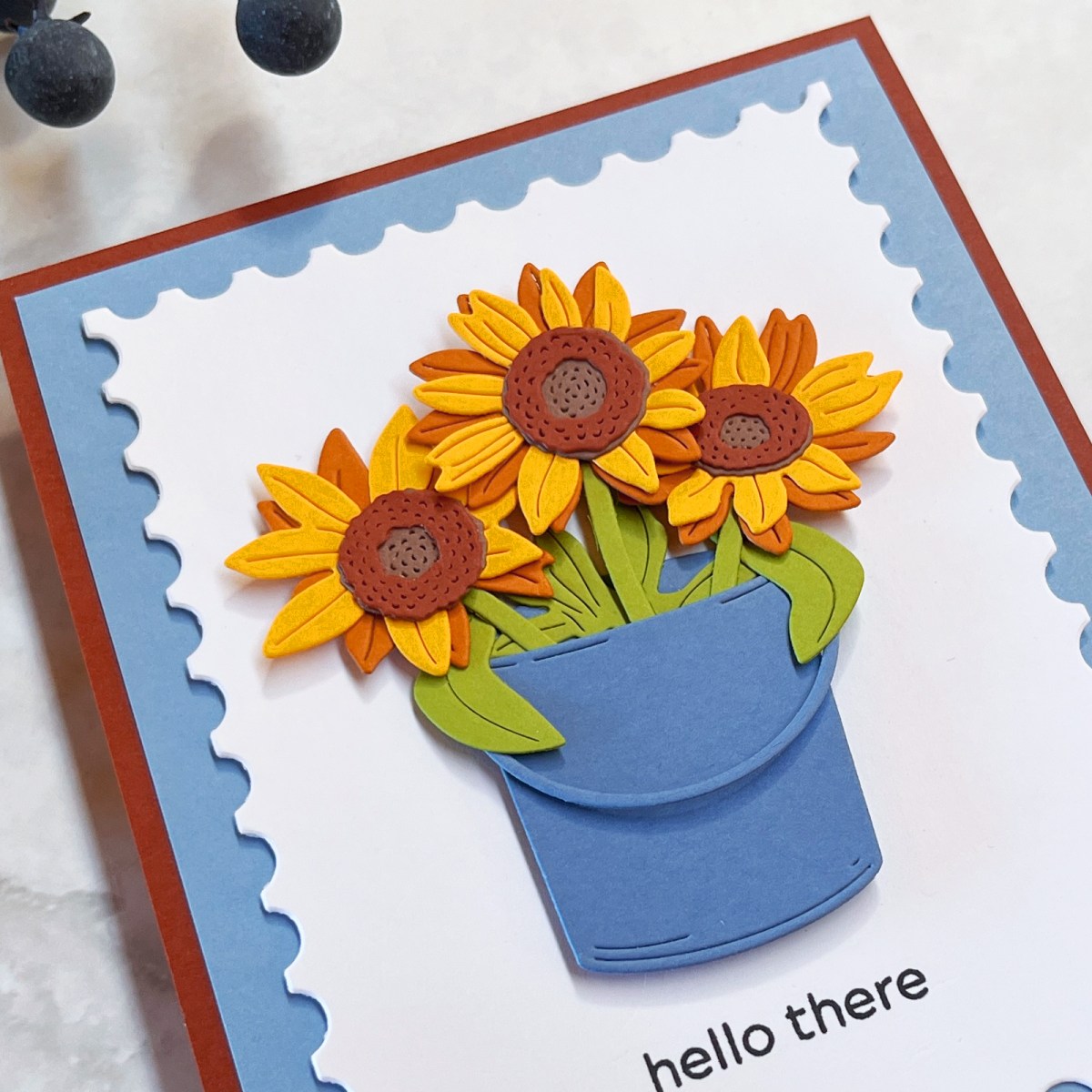
Dimension is particularly effective with die-cutting because we’re already building our images from layers. Raising one flower, leaf, pumpkin or sentiment slightly above the others reinforces that illusion of depth.
You don’t have to pop up everything. In fact, I think dimension is often more effective when you’re selective.
Design Tip: Decide which element you want closest to the viewer and raise that piece slightly higher than the elements around it.
How I Designed Three Cards at Once
I usually make one card at a time, but I tried something different with these cards.
The October My Monthly Super Hero Kit worked so beautifully together that I did much of my die-cutting first. I glued the small pieces together to create individual elements but stopped before assembling the complete focal points.
Then I started playing.
I moved the wheelbarrow, pumpkins, flowers, bucket, corn and leaves around until combinations began to emerge. I added corn to the Rustic Wheelbarrow. I tried the Pumpkin Patch sign behind it. I experimented with the sunflower arrangement.
Having all those finished little elements sitting on my craft mat made it surprisingly easy to experiment with layouts.
And because I had already chosen one color palette, everything coordinated.
That may be my bonus tip from this project: sometimes it’s easier to design when you give yourself a limited collection of coordinating pieces and simply play.
If you enjoy creating with coordinated monthly kits, you might also enjoy my Best Cardmaking Kit Subscriptions (2026 Guide), where I compare some of my favorite craft kits and what makes each one different.
Products & Supplies I Used
The Rustic Wheelbarrow, pumpkins, sunflowers and other focal elements on these cards are all from the October My Monthly Super Hero Kit from Hero Arts.
I also used:
- October My Monthly Super Hero Kit — Hero Arts
- October My Monthly Hero Kit – Hero Arts
- Postage Stamp Infinity Dies — Hero Arts
- Playful Stitched Panel Dies — Spellbinders
- ColorWheel Cardstock Sampler Pack — Spellbinders
- Color Cubes, Volume 1 — Inspiration Card #135
- Platinum 6 Die-Cutting Machine
- Scout Die-Cutting Machine
- Crystal Katana Pick Up Tool
- Tweezers
- Craft Stax Tray Organizers
- Craft foam, foam squares and glue
Many of these are the tools I reach for over and over again. You can find more of my longtime favorites in My Go-To Cardmaking Supplies.
Three Cards, Five Design Decisions

The three finished cards are quite different.
The Rustic Pumpkin Wheelbarrow has the most elaborate focal point, filled with pumpkins, corn, leaves and flowers and topped with that fun Pumpkin Patch sign.
The Bucket of Sunflowers is much simpler—a blue bucket, three cheerful sunflowers and a little “hey there” sentiment. I think it would make such a sweet friendship or get-well card.
And the mini pumpkin patch is somewhere in between: three pumpkins with one regal sunflower swaying above them, a simple “hey” sentiment and a few scattered leaves and flowers for just a hint of complexity.
But all three rely on the same basic design ideas.
A clear focal point.
Framing.
A limited palette.
Contrast.
Dimension.
None of these ideas is complicated, and you certainly don’t have to use all five on every card. But they’re wonderful things to think about when a design isn’t quite coming together—or when you want to give a pretty card that extra little bit of “wow.”
The next time you’re looking at your card and thinking, Something is missing, take a look at these five things before reaching for another embellishment.
Sometimes the best way to make your card pop is not to add more.
It’s to make the elements you already have work a little harder.

Beautiful cards as always! Love how you brought the blue in. Those color cubes must be really helpful. Haven’t bought those yet but man what an impressive color palette. Keep up the good work!
Thank you so much for your kind comments. I loved reading them.
Hi, Karen! It’s Mari 🙋🏻♀️ I’m not on Instagram anymore. They accused me of being a 13 year old girl. 🤦🏻♀️ I hope you are well. I miss you. 💜 Mari mariandmonsterd@yahoo.com
I don’t know why I stopped receiving your blog posts, but I subscribed again. I hope you are well. I miss you and your pretty cards. Email me if you can. Much love to you 💜🐻 Mari