
Simple ways to personalize die-cut characters with outfits, color, framing and interactive movement.
Who doesn’t love an adorable animal card? I certainly do—and so does my family.
Dogs, cats, frogs, skunks (yes, even skunks!)…animal cards have a way of making people smile. And when I showed my husband this little die-cut rancher, he grinned for what seemed like a full minute.
That’s when you know you have a winner.
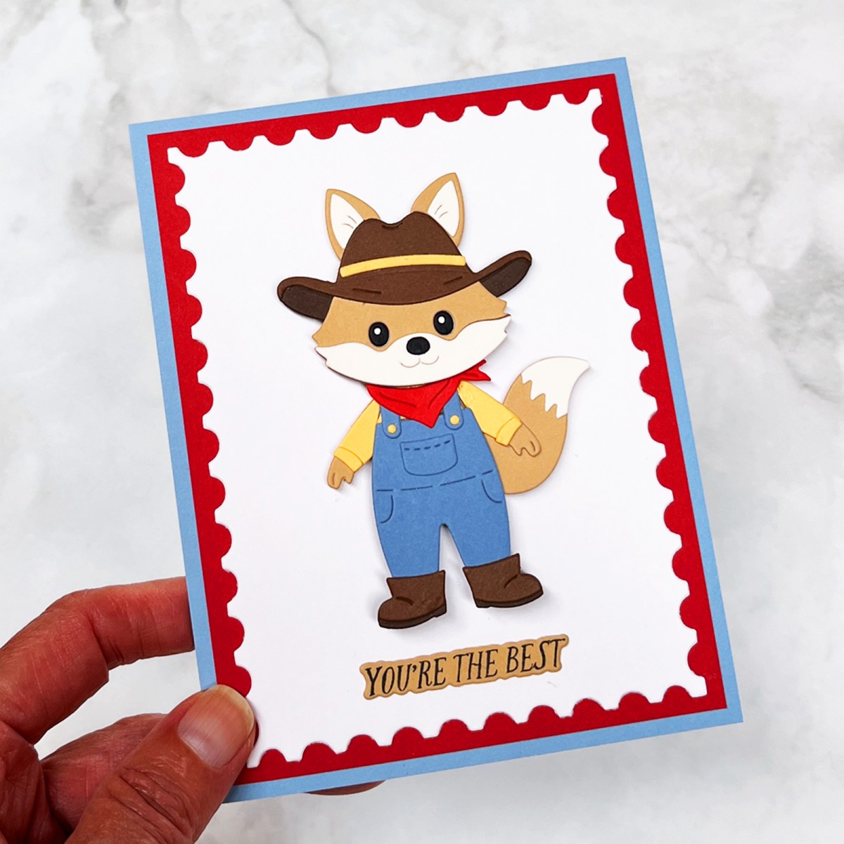
One of my favorite things about making cute animal cards is finding little ways to give those die-cut critters their own personalities. Change an outfit, choose colors with the recipient in mind, add a few special details—or even give your character a little movement—and suddenly you’ve created something that feels completely different.
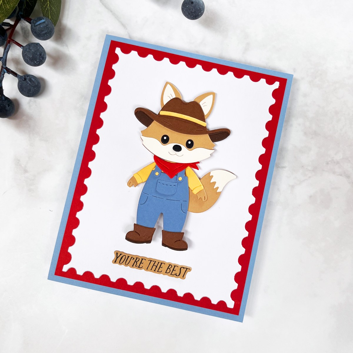
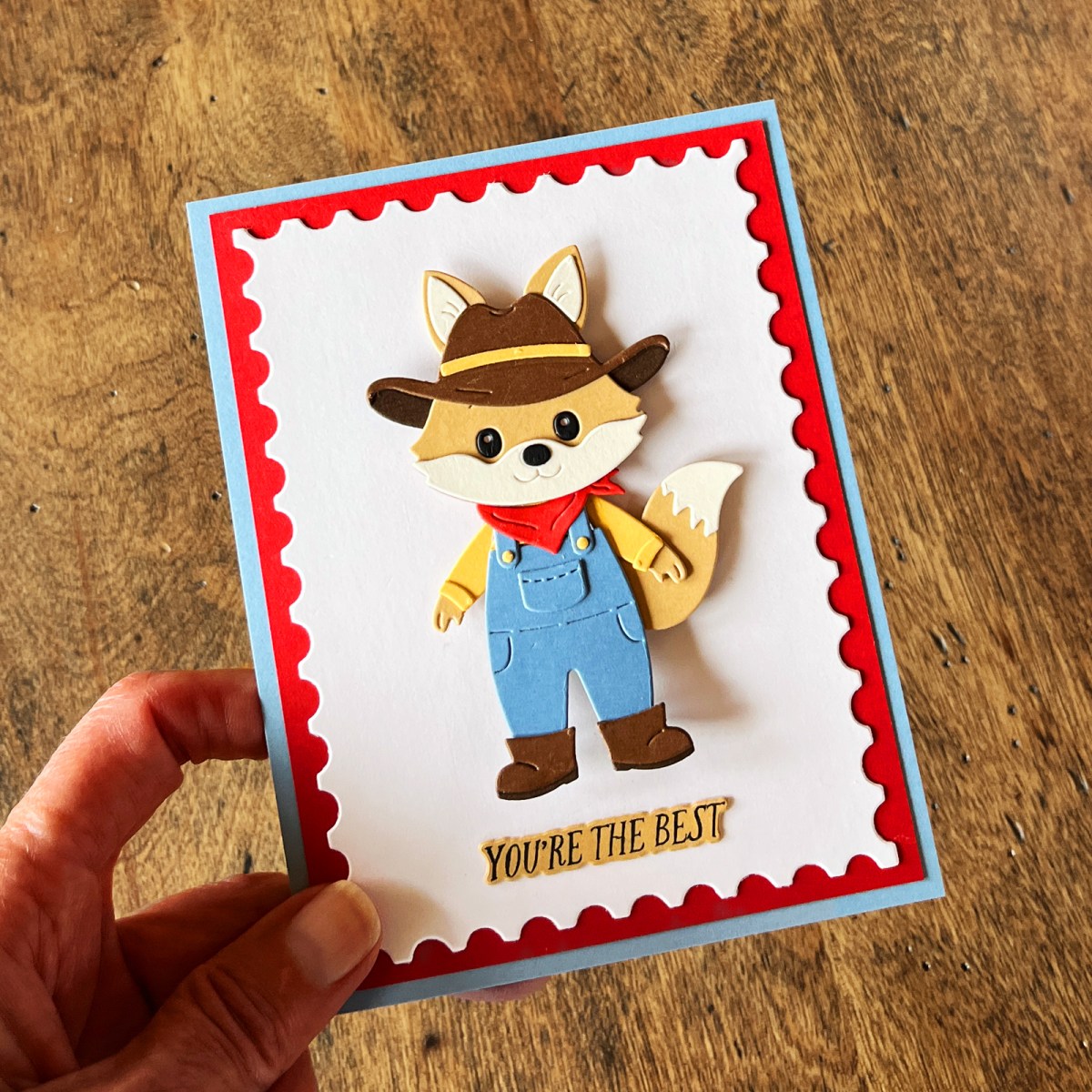
For this card, I started with a tan fox from Allison Frazier’s collection for Spellbinders and transformed him into a Texas rancher with denim overalls, a kerchief and cowboy hat.
He may be one of the cutest die-cut focal points I’ve ever made.
And because he already has so much personality, I kept the rest of the card relatively simple. Sometimes clean and simple really is the right recipe.

What You’ll Learn in This Post
- How to give animal and character dies more personality
- Easy ways to personalize a character for the recipient
- Why a simple background can make a strong focal point even better
- How a small pop of saturated color can change an entire card design
- How interactive movement can bring a die-cut character to life
Start With a Character You Can Personalize
One reason I find animal dies so versatile is that they work for almost anyone.
Kids. Adults. Men. Women. Teens. Birthdays. Holidays. Thinking-of-you cards. Just-because cards.
And if you’ve followed me for long, you know how much I enjoy personalizing cards for the person who will receive them.
Alli Frazier, in conjunction with Spellbinders, designed an entire collection of adorable die-cut critters, along with scene-building and dress-up add-on sets. I started with the original Trailside Trio die set and used the Harvest Style set to transform my tan fox into a little rancher.
I’m from Texas and have a small ranch, so those overalls and that cowboy hat immediately spoke to me. And I knew this character would make a fun card for my nephew.
That’s what I especially like about character dies. You aren’t limited to making the character shown on the package.
Change the clothes. Change the colors. Create a scene. Choose an outdoor activity. Dress your character for a holiday. Add details that remind you of the recipient.
The possibilities start multiplying pretty quickly.
Design Tip: Before assembling a character die, think about the person who will receive the card. One or two personalized choices can turn a cute die cut into a character that feels made especially for them.
Give Your Animal a Personality
There’s a difference between assembling a die cut and creating a character.
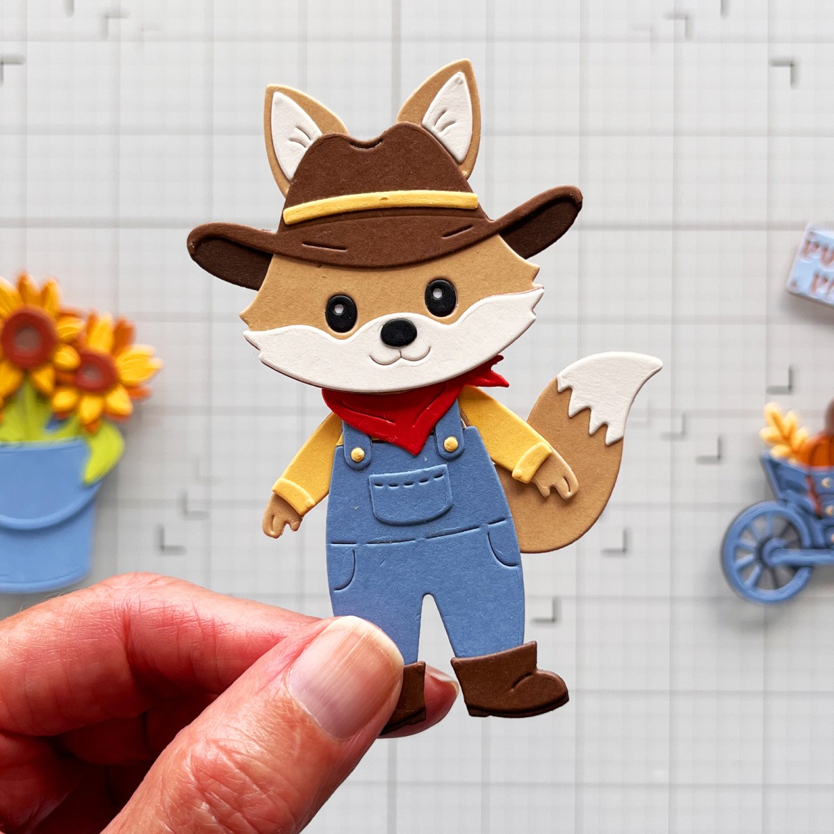
For my fox, the personality really came together when I added the clothes. His blue-gray overalls, buttery yellow shirt, red kerchief and cowboy hat turned a cute little animal into a rancher.
And this is where the creative process gets especially fun. Before anything is glued together, I can move pieces around, change colors and experiment until the character starts to feel right.
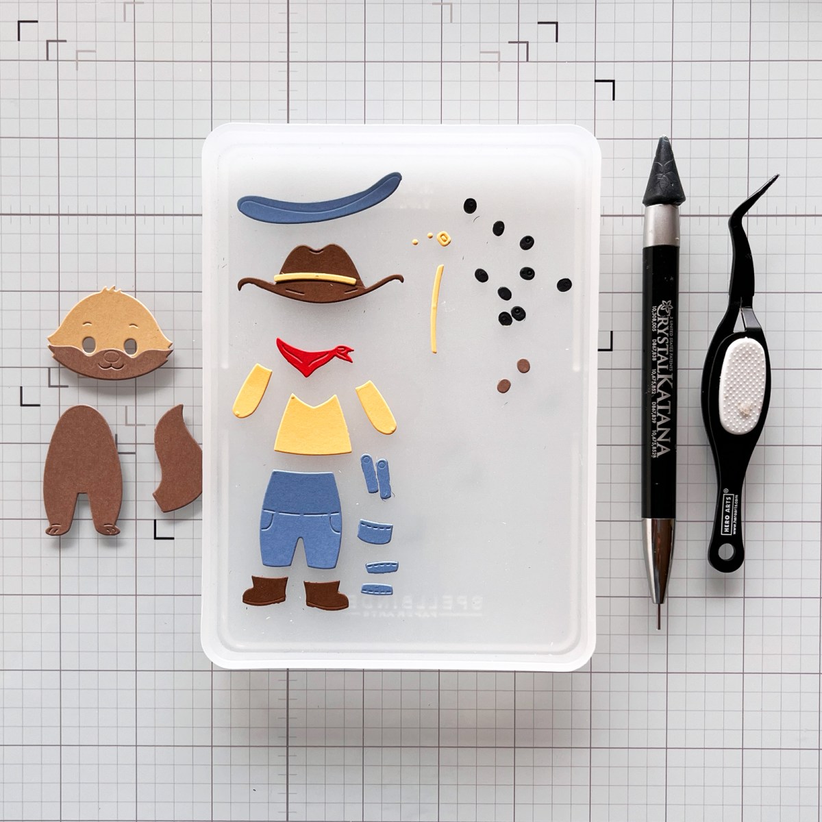
CraftStax helps keep the tiny die cuts corralled while I work, and my reverse tweezers and Crystal Katana pickup tool are especially useful when I’m assembling small character details.
Once I had assembled him, I realized I didn’t need much more.
That’s an important design lesson for me because I usually love layers, details and scene building. But when your focal point is this strong—and this cute—adding more can actually make the design less effective.
I wanted your eye to go straight to that fox.
Design Tip: When your focal point already tells the story, try removing something before adding something. A little breathing room may be exactly what the design needs.
Let a Strong Focal Point Be the Star
Once my rancher was assembled, the next design decision was really about restraint.
I could have created an entire ranch scene around him—and I was tempted. But every additional element would have competed for some of the attention I wanted the fox to receive.
So I let him be the story.
This is one reason strong focal points are so helpful in card design. They tell your eye where to look first. When that focal point is already detailed, colorful and full of character, the rest of the design can work quietly in support.
That doesn’t mean the background has to be boring. It simply has a different job.
Don’t Be Afraid to Make the Background Simple
The background for this card is intentionally clean and crisp.
I die-cut white cardstock with my Postage Stamp Infinity Dies. The perforated edge adds just enough texture and gives the card a slightly nostalgic feel without competing with the character.
Behind the white panel is a red mat, followed by a Cascade blue card base.
That’s it.
Those simple layers give the design structure and frame the fox without making the card feel busy.
This is also a good example of why I love versatile dies. A simple stitched or postage-stamp panel can completely finish a card without requiring another focal element.
And layers don’t always have to mean more stuff. Here, the layers are doing a specific job: creating structure, contrast and a visual frame around the character.
If you enjoy die-cutting as much as I do, I’ve collected more of the techniques I rely on in 13 Die-Cutting Tips I’ve Learned After Creating Thousands of Cards.
Design Tip: Ask what your background needs to do. If the focal point already tells the story, the background may only need to frame it.
Use a Small Pop of Color for Big Impact
The colors on this card started fairly quietly.
The fox and cowboy hat give me warm neutrals. His clothes introduce muted blue-gray and soft buttery yellow. Those colors feel natural and almost act like additional neutrals.
Then I added red.
And that tiny bit of red changed the card.
Blue, yellow and red are the three primary colors, so there’s an inherent relationship among them. But I didn’t use them equally. The blue and yellow are softer and more muted, while the red is much more saturated.
That means even a very narrow red mat catches your eye.
I actually took two quick photos while I was designing—one version with the red mat and one without it—because I wanted to see which layout I preferred.
The red won.

That small strip of color gave the card just enough energy without taking attention away from the fox.
Design Tip: If a card feels a little too quiet, don’t automatically add another embellishment. Try introducing a very small amount of a stronger color. A narrow mat, tiny accessory or sentiment can sometimes provide all the contrast you need.
Add Movement to Bring Your Character to Life
There was one more thing I wanted to try with my little rancher: giving him some movement.
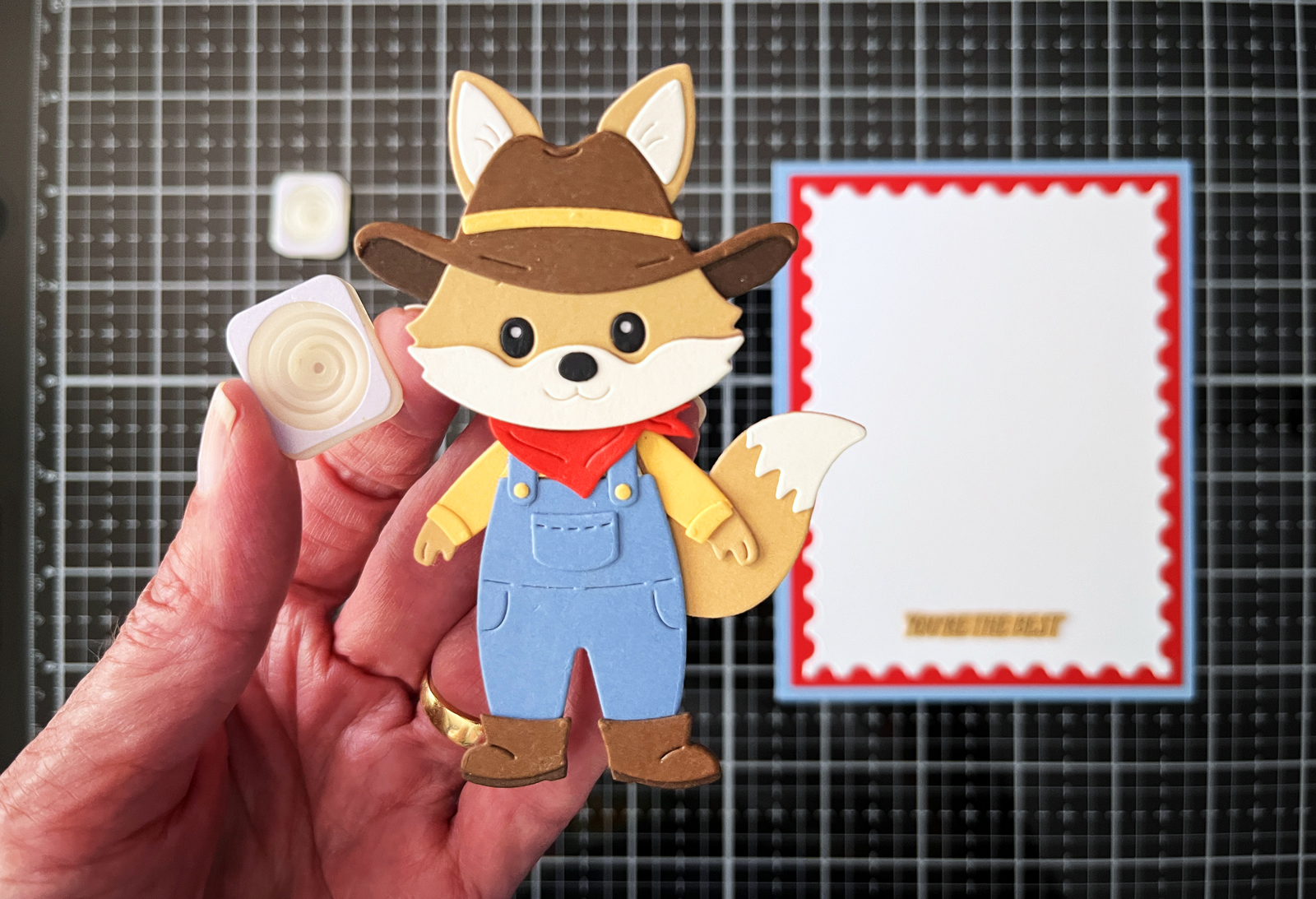
I added a Giggle Spring behind the fox, and this may be one of the easiest ways I’ve found to make a card interactive. It took only a minute or two to install, but that little bouncing motion makes the finished card so much more memorable.
In fact, I like the action so much that I’m already planning another Giggle Spring card for November—this time with a snowboarding animal for winter!
How I Added the Giggle Spring
Giggle Springs have adhesive tape on both sides, so there really isn’t much to the installation.
The spring has a thicker base on one side and a thinner attachment point on the other. You can use the spring in either direction. For my card, I adhered the thicker base to the card and the thinner side to the back of my fox.
Before removing the adhesive backing, I tested the placement to make sure my fox would balance properly.
Because this character isn’t symmetrical—his tail adds more weight to one side—I positioned the spring slightly off center, toward the tail. The spring ended up behind his neck and kerchief and slightly toward that heavier side.
Once I was happy with the balance, I made two tiny pencil marks above and below the spring so I would know exactly where to place it when I was ready to adhere it.
Design Tip: If your focal point isn’t symmetrical—perhaps it has a large tail, hat or another element extending to one side—try positioning the wobble spring slightly toward the heavier side rather than automatically centering it. Test the balance before you glue.
Installation was quick and easy. With a little tap from my finger, my fox moves approximately 20–30 degrees in either direction.
And he is ridiculously cute in motion.
The spring also compresses, so even though it adds dimension and movement, the card still fits easily into an envelope
I initially thought of interactive cards as especially fun for children, but I don’t think we need to limit them to kids at all. This rancher is headed to my college-age nephew, and I think he’ll get a kick out of it. I certainly do—and I know my husband would too.
Sometimes one unexpected detail is all it takes to turn a handmade card into something the recipient will remember.
If you enjoy adding movement to your handmade cards, you might also like Interactive Cards Made Simple, where I share how I created a spinner card.
A Peek at My Die-Cutting Process
My cards usually begin looking considerably messier than the finished project.
I often die-cut several colors at once, using partial sheets of cardstock rather than cutting everything down to tiny pieces first. I tape my dies in place before running them through my Platinum 6 so they stay exactly where I want them.
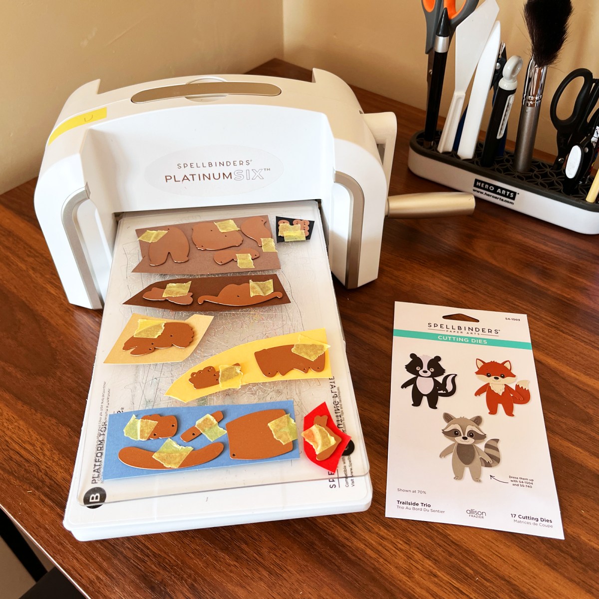
Then comes one of my favorite parts: sorting through all those little pieces and deciding what goes where.
If you make a lot of die-cut cards, keeping those little pieces organized makes the process considerably more enjoyable.
You can find more of the tools I reach for regularly in 11 Best Die-Cutting Staples Everyone Needs.
Why I Keep Coming Back to Animal Cards
I think one reason I love making cute animal cards is that they can be almost anything you want them to be.
A fox can become a Texas rancher.
A dog can be dressed for a birthday.
A little critter can become part of an outdoor scene, celebrate a holiday or simply pop up on a card to make someone smile.
And because the characters themselves are playful, they work for so many different people and occasions.
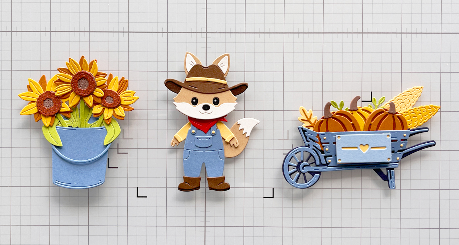
If you’re looking for more animal-card inspiration, you might also enjoy my Cute Dog Theme Birthday Card Ideas.
Products Used
- Spellbinders Trailside Trio
- Spellbinders Harvest Style
- Allison Frazier Collection
- Hero Arts Postage Stamp Infinity Dies
- Spellbinders ColorWheel Cardstock
- Platinum 6 Die-Cutting Machine
- Crystal Katana Pickup Tool
- Reverse Tweezers
- CraftStax
- Giggle Springs 12 pack, or 50 Pack

Final Thoughts
Maybe that’s why I love animal cards so much.
Start with an adorable little fox, dog, frog—or even a skunk—and with a few thoughtful choices, it becomes a character that feels as though it was made for one particular person.
You don’t necessarily need an elaborate scene or lots of embellishments. Sometimes an outfit, a carefully chosen color palette, simple framing and one unexpected detail are enough to give a character all the personality it needs.
And in this case, I’m hoping one little wobble will make my Texas rancher even harder to resist.

Hi, Karen 🙋🏻♀️ It’s Mari! From San Antonio! From Instagram. I’ve missed you. My Instagram was deleted. Meta accused me of being a 13 year old girl. 🤦🏻♀️ I hope you are well. I hope you get this message. Sending you much love 💜