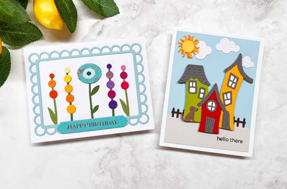
Learn the 5 practical steps I use on almost every handmade birthday card. This colorful floral birthday card features Spellbinders Whimsical Blooms dies, rainbow colors, die-cutting tips, and simple design principles that help create memorable handmade cards.
Tag: Die Cut Card
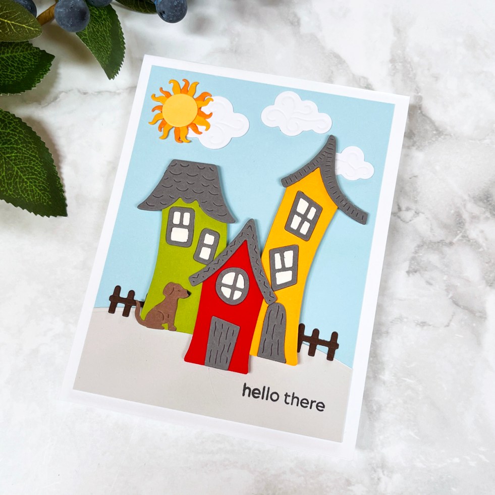
How To Create an Easy Whimsical Village Scene Card
Learn how to create a charming whimsical die cut village scene card using playful storytelling elements, bold color combinations, and dimensional layering techniques. This easy handmade card tutorial includes assembly tips, color inspiration, and creative ways to customize your village scene.
How to Create a Cozy Die Cut Scene Card (Beautiful House Card Ideas & Tips)
Learn how to create a cozy die cut scene card using the Spellbinders City Holiday Collection. Includes design tips, color inspiration, and creative ways to customize a charming house card for any occasion.
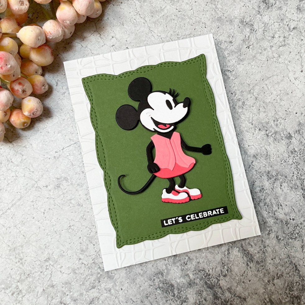
How to Make an Easy Minnie Mouse Birthday Card (One of the Best Die Sets for Beginners)
Create an easy Minnie-inspired birthday card using one of the best beginner-friendly die sets. Learn how to simplify colors, adapt die sets, and design a bold, graphic card with minimal supplies
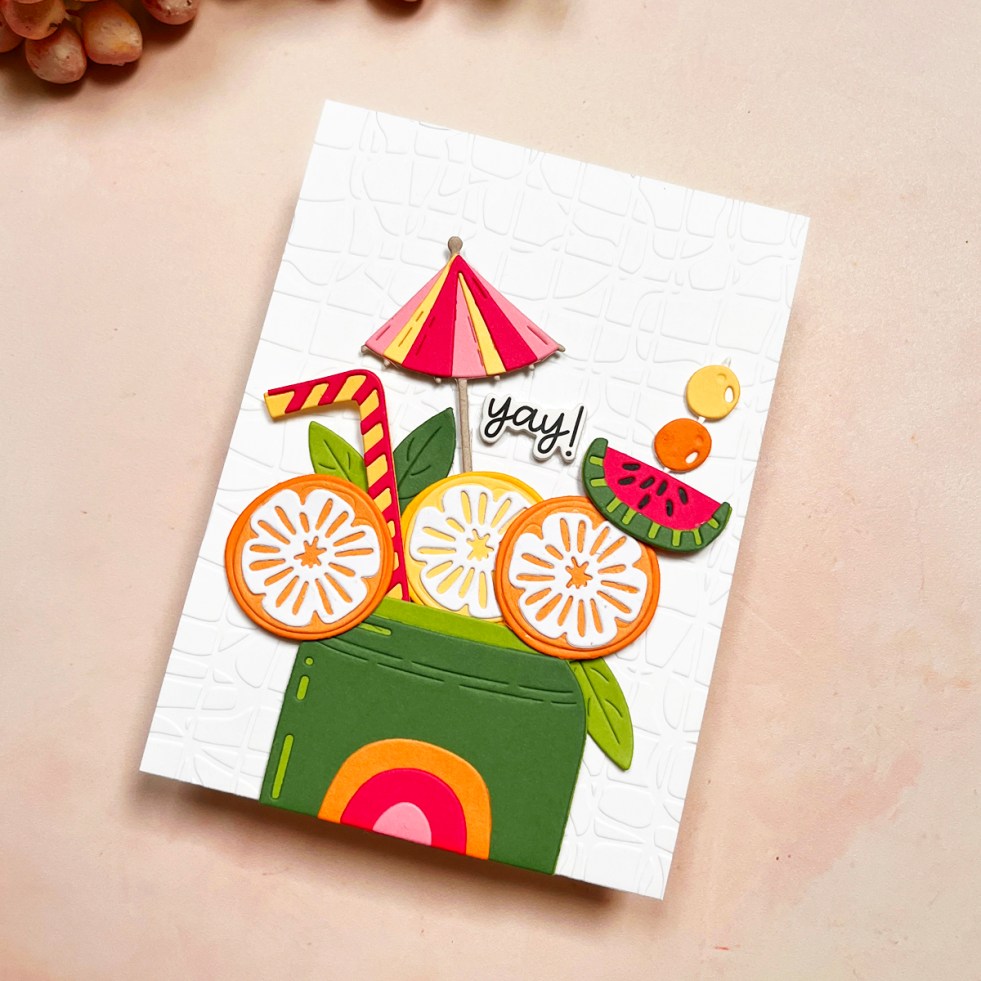
Best Card Making Kit? Easy Summer Die Cut Card Tutorial + Review
Create a bright, summery die cut card using the Spellbinders Large Die of the Month “Pop of Summer” kit. Learn simple design tips, color strategies, and creative ways to use this versatile subscription kit.
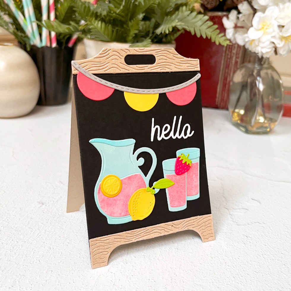
1 Die Set, 2 Moods: Coffee Shop Chalkboards & a Lemonade Easel Card
Looking for a die set you’ll use again and again? Today I’m sharing two very different looks using the Spellbinders Lemonade Stand Collection—a trio of dramatic black chalkboard thank-you cards with heat embossing, plus a bright, cheerful lemonade easel card that’s made to be displayed. Along the way, I’m sharing a reliable heat embossing tutorial, easel card tips, and ideas to help you get the most from this versatile die set.
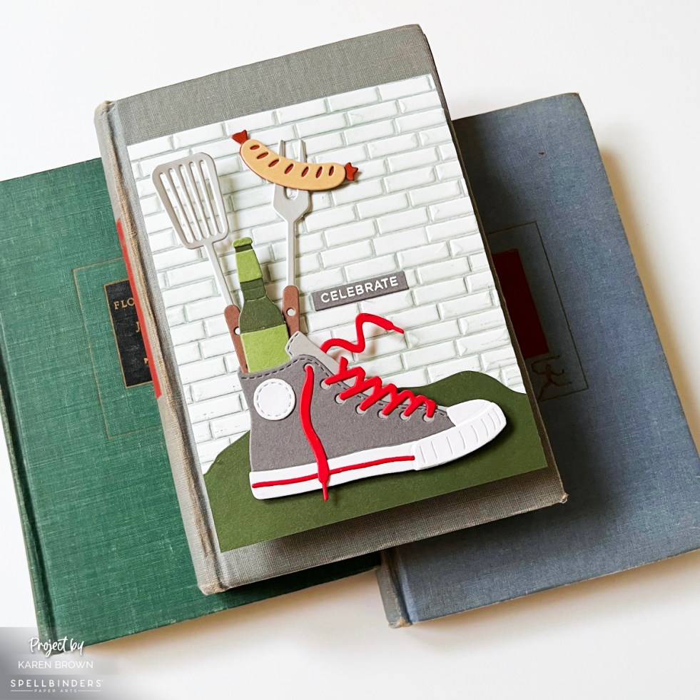
How to Create Die Cut Scene Cards: Easy Design Tips That Work Every Time
Learn how to create die cut scene cards using simple design principles that work every time. This masculine Spellbinders card features layered backgrounds, grounding foregrounds, and a playful focal point inspired by backyard cookouts. I used the Spellbinders March 2026 Large Die of the Month Club Kit called Classic Kicks.
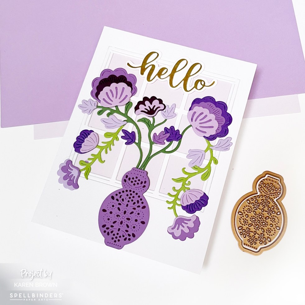
How to Design a Stunning Handmade Card | Process and Inspiration
I created a handmade die cut floral card using the Spellbinders Regal Blooms die set (S4-1465), featuring elegant purple flowers in a vase set against a sunlit window backdrop. This classic, feminine design is perfect for Mother’s Day, birthdays, or get-well cards.
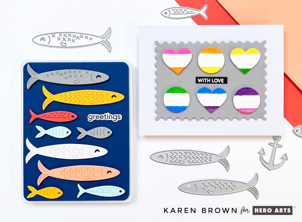
Tips and Tricks for Making Two Playful Die Cut Card Designs | Packed with Love
Create 2 cheerful, modern carda using Hero Arts Big Mouth Sardine Tin Dies and the Wide Stripe background stamp from the Packed with Love Collection. The playful school-of-fish design features colorful die cutting, simple layout tips, and easy dimension—perfect for quick cardmaking with big visual impact. The bright modern watercolor geometric valentine is an artistic beauty for anyone you love.

Top 5 Hero Arts Cards of 2025 (Fan Favorites & Personal Picks)
A roundup of the best and most popular Hero Arts cards of 2025, including fan favorites, personal picks, and standout techniques. Featuring Valentine cards, clever themed designs, coffee-inspired projects, letterpress and foil cards, and bold floral die cutting—with links to each original tutorial.
