
Learn how to design eye-catching scene cards with simple layout tips, beginner-friendly techniques, and creative die cut ideas.
Everyone loves a good story—and in cardmaking, scene cards are one of the most beautiful ways to tell one.
From cozy homes to whimsical outdoor settings, scene cards create a sense of warmth and connection that recipients truly love. They feel personal, thoughtful, and often become keepsake cards that are displayed long after they’re received.
You may also want to explore how die cutting fits into these designs in my Die Cutting Guide.
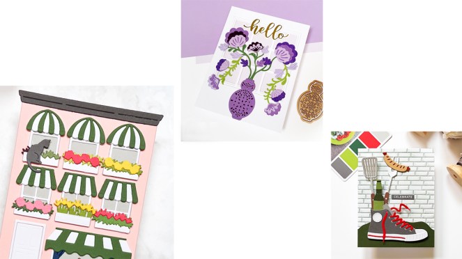
The best part?
While scene cards may look complicated, they don’t have to be.
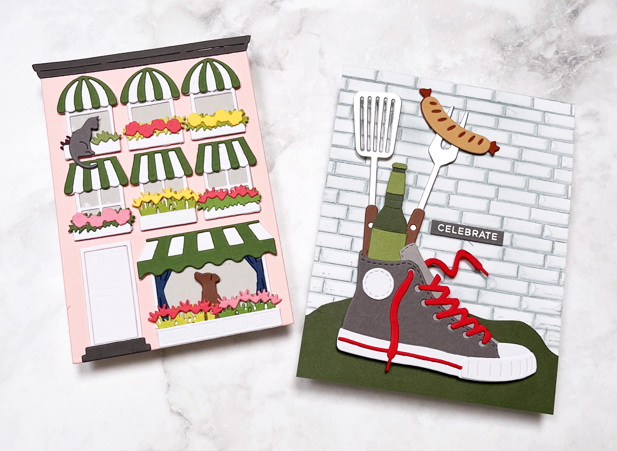
These examples show how versatile scene cards can be…from charming houses to masculine sneaker bouquets.
In today’s post, I’m breaking down simple, beginner-friendly ways to create scene cards that feel polished, balanced, and full of charm.

This post is part of my Scene Card Series where I share layout ideas, design tips, and inspiration for creating beautiful, story-driven card scenes.
📌 In This Post
- What makes a great scene card
- Easy layout tips
- Scene card ideas and inspiration
- Beginner-friendly techniques
📌 Save this post for later—perfect to reference when you’re ready to create your own scene card!
🧠 What Makes a Great Scene Card?
At their core, all great scene cards share a few key elements:
- A strong, clear focal point
- Grounding elements (to anchor the design)
- Layered details for depth
- A sense of dimension
- Balanced composition
- Harmonious color palette
When these elements come together, the result is a card that feels intentional, engaging, and visually complete.
✂️ Easy Scene Card Layout Tips, Ideas & Inspiration
If you’re new to scene cards—or want fresh inspiration—these are a few of my favorite approaches.
👟 Fun Sneaker Bouquet Scene Card
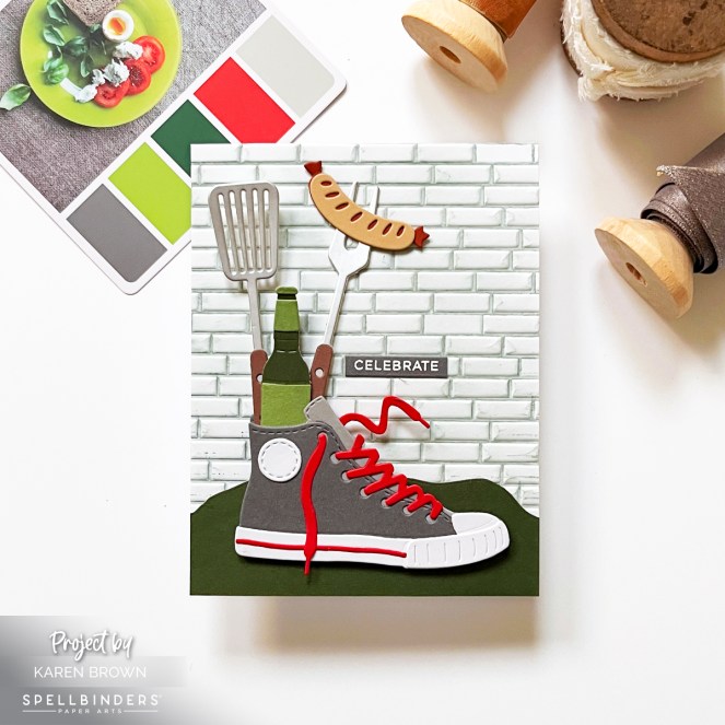
One of my most popular scene cards features a sneaker bouquet design—a playful and creative take on scene building.
👉 In this post, I dive deeper into layout and composition, including:
- using a limited color palette
- creating background and foreground layers
- emphasizing the focal point
I also share tips for masculine cards, which can sometimes be tricky.
🪟 Sunny Floral Window Scene Card
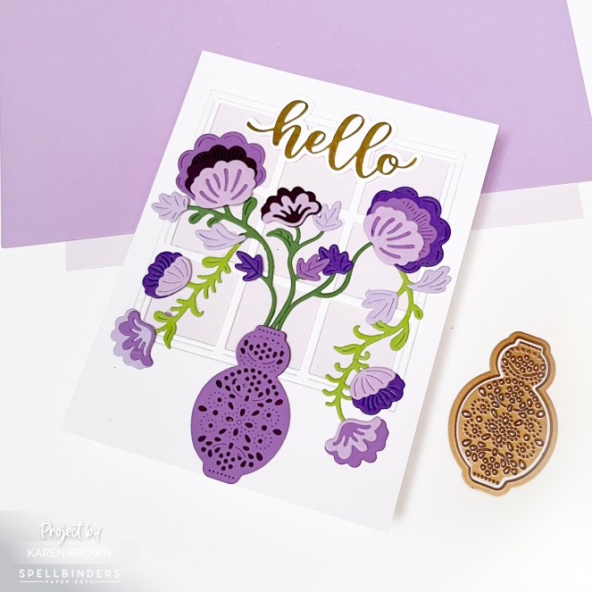
Not all scene cards need to be bold or busy—sometimes a softer approach creates a beautifully timeless result.
In this design, I used a gentle purple palette paired with a window backdrop to create a calm, classic scene. The window adds structure and architectural interest without competing with the focal point—a vase of flowers.
This is a lovely example of how a simple “frame within a frame” can guide the eye and keep your design cohesive.
👉 This style is perfect for occasions like birthdays, get well, Mother’s Day, or sympathy cards.
Windows are a great way to anchor your scene without adding visual clutter.
You can see the full window scene tutorial.
🏡 Cozy House Scene Card
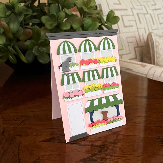
House scenes are always a favorite—they feel inviting, nostalgic, and full of personality.
In this design, I created a pink three-story home with green and white striped awnings for a cheerful, welcoming look. I also turned the design into a stand-up shaped card, which adds even more visual interest.
👉 You can read the full tutorial here:
How to Create a Cozy Die Cut Scene Card
❄️ Heartwarming Outdoor Scene Card
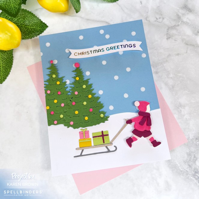
Building “little worlds” with die cuts is one of my favorite techniques.
In my Tips for Arranging Scene Cards post, I share:
- how to build outdoor scenes
- creating custom backgrounds
- choosing playful sentiments
These types of cards are perfect for seasonal designs or storytelling scenes.
👉 If you enjoy scene cards, you might also like:
- Best Cardmaking Subscription Kits (kits are a great source for scene dies)
- My Lemonade Stand Easel Card post
- My Dimensional Die-Cut Tote Bag Gift Card Holder
- Tropical Hula and Penguin Cards
🎨 Color & Design Tips for Scene Cards
Color and composition make all the difference when building a successful scene.
Here are a few of my go-to strategies:
- Limit your palette
Stick to 2–5 colors for a cohesive look. I often prefer 2–3 colors for a clean, unified design. - Use contrast intentionally
High-contrast areas naturally draw the eye to your focal point. - Guide the viewer’s eye
Start with your main focal point, then add supporting elements to build the scene without overwhelming it. - Add charming details
Small touches—flowers, accessories, textures—bring personality and make the card feel special. - Use odd numbers
Groupings of 3 or 5 elements tend to look more natural and balanced. - Leave breathing room
White space (or intentional “empty space”) keeps your design from feeling cluttered. - Add dimension
Using foam squares or craft foam helps highlight key elements and adds depth.
One of my favorite “secret ingredients” is ColorWheel cardstock—48 beautifully coordinated colors that make designing so much easier.
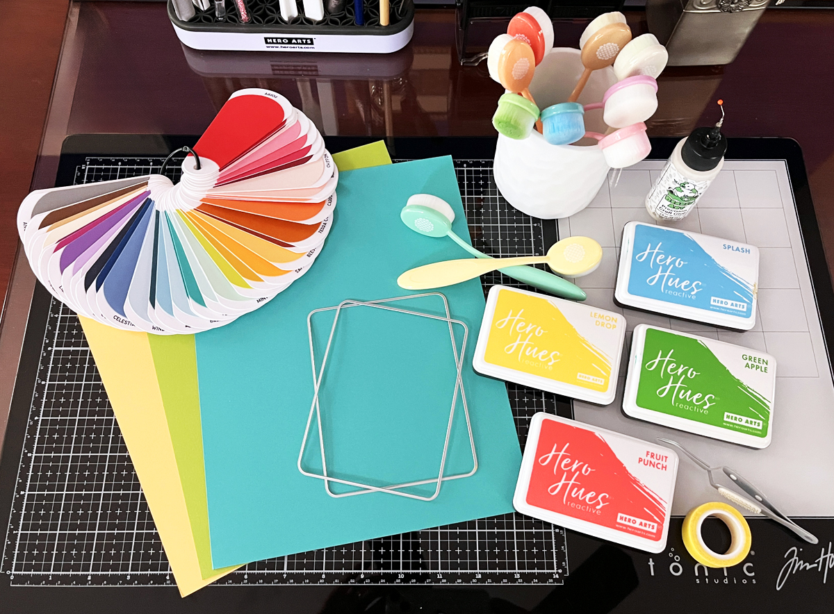
🧰 Supplies for Scene Cards
I like to keep this simple and approachable.
⭐ Essentials
- A high-quality die cutting machine (I use my Platinum 6 daily)
- Solid-core cardstock (ColorWheel is my go-to)
✂️ Favorite Die Sets
- Large Die of the Month (great for building your collection)
- City Holiday Collection (perfect for cozy house scenes)
👉 If you’d like to explore more of my favorite tools:
📌 Save this post for later so you can come back when you’re ready to create YOUR scene card.
🏆 Proud to be ranked among the Top 75 Cardmaking Blogs by Feedspot
Thanks so much for stopping by!
Which scene style is your favorite—cozy homes, outdoor scenes, or something playful like the sneaker bouquet?


11 thoughts on “Best Scene Card Ideas: Easy Layout Tips & Die Cut Designs That Work Every Time”