This die/folder combo made it incredibly easy to create an adorable bunny card that feels fresh, modern, and perfect for springtime sending. And, cards for kids are such fun to create!
👉 I’ll link all the helpful supplies below so you can easily recreate this project—or put your own spin on it.
👉 I created this card for a little girl, but you could easily customize the card for a boy as well by changing the color palette.
Although this is a large die (perfect for oversized cards), I chose to use it on an A2 card base and let the tops of the bunny’s ears peek above the card front. It’s such a simple design choice, but it adds instant charm and visual interest—plus, who doesn’t love a bunny that refuses to stay inside the lines?
For the background, I used a buttery yellow cardstock and embossed it with the Spring Stripes Embossing Folder of the Month. The subtle striped texture adds just the right amount of detail without competing with the bunny focal point. It’s one of those embossing folders you’ll reach for again and again.
To finish the card, I added an easy sentiment using a Bayfair Puffy Sticker that reads “it’s a wonderful day.” Quick, cute, and perfectly on theme.
This card came together fast, looks polished, and would be easy to mass-produce—always a win in my craft room.
Creating stunning, multi-layered mixed media tags is easier than you think—here is an easy to follow 9-step tutorial.
The techniques I’m sharing today can be used with almost any stamp set or focal elements you already have.
If mixed media feels a little intimidating—don’t worry. This project is about building layers slowly, having fun with color, and letting the process guide you. Let’s walk through it step by step!
👉 I’ll link to the exact supplies at the bottom of this post.
Step 1: Create a Watercolor Gradient Background
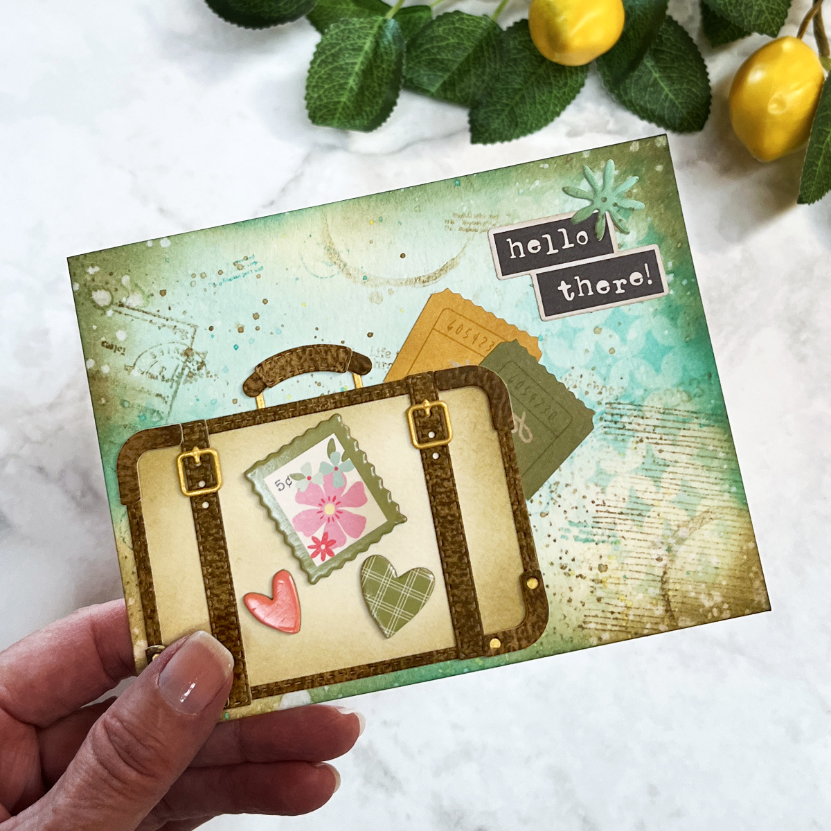
When I saw the Hero Arts Partners in Brine Stamp Set, I immediately pictured a colorful, summery mixed media background filled with texture, stamping, and playful details.
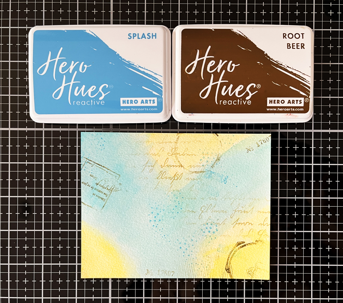
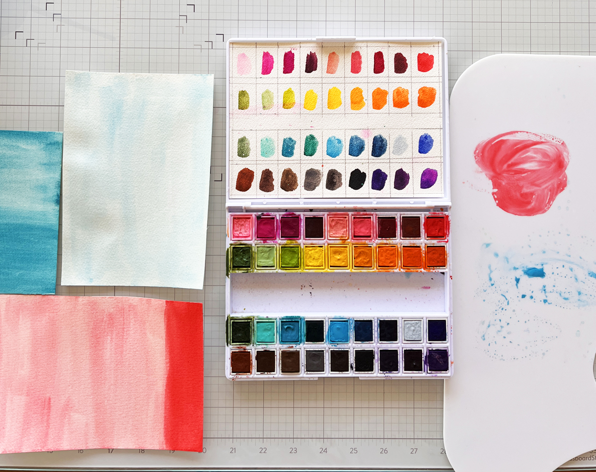
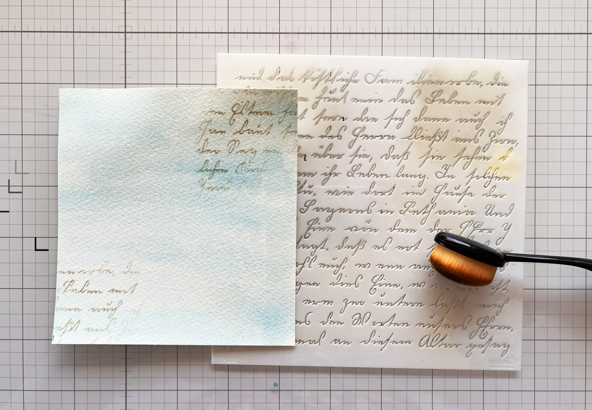
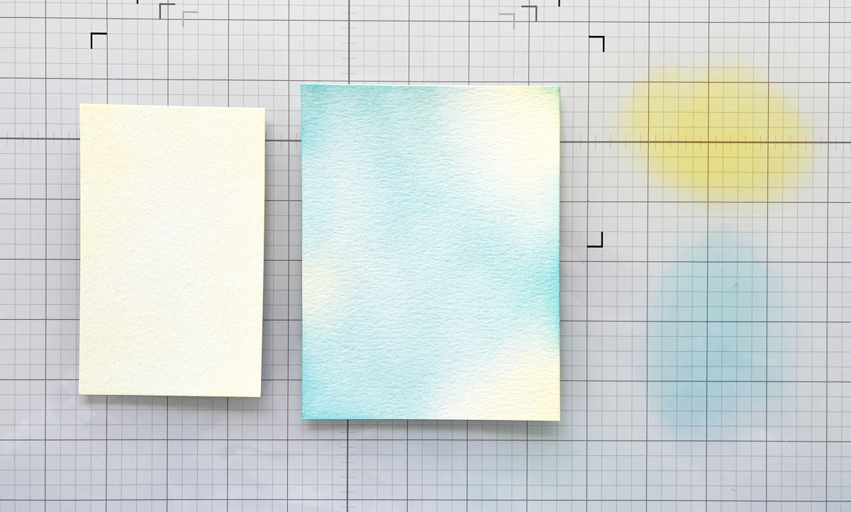
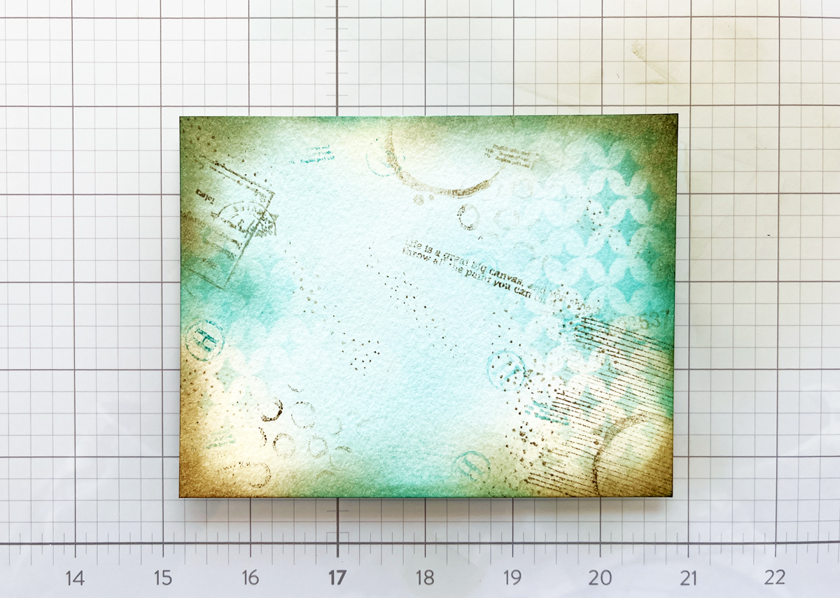
I began by taping a 6″ x 6″ panel of watercolor paper to a hardboard using washi tape. On my craft mat, I dabbed Hero Arts Reactive Ink, spritzed it with water, and used a brush to watercolor a smooth gradient.
I blended the colors so they flowed fromblue into green, yellow, orange, and finally pink. Since this stamp set has an aquatic theme (which always feels like summer to me), I wanted bright, happy, sun-washed color.
Dry your panel naturally or speed things up with a heat gun. If your paper warps, simply flatten it later with a book.
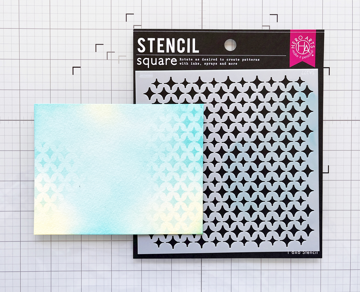
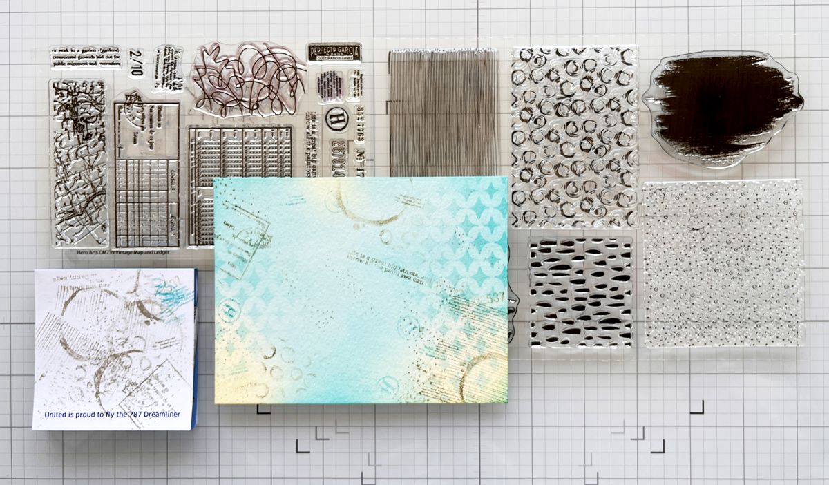
I especially loved the Packed with Love, waves, anchor, fish, and “packed in brine” images. Stamping in matching colors keeps the look layered but cohesive.
Step 3: Add Second-Generation Stamping
To deepen the texture, I used Black and Root Beer Reactive Ink and stamped a few images using second-generation stamping (inking the stamp, stamping once on scrap paper, then stamping again on the background).
Second Generation Stamping adds subtle depth without overpowering the colors.
Step 4: Add Ink Splatters
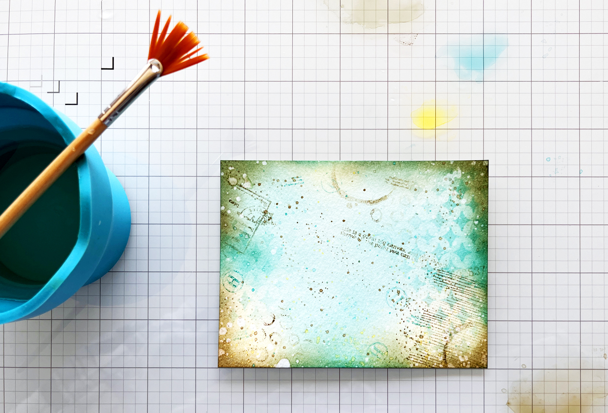
Next came one of my favorite steps—ink splatters! Using a fan brush, I flicked Splash, Lemon Drop, and Taffy onto the panel.
Ink Splatters add movement, texture, and that perfectly imperfect mixed media charm.
Step 5: Die Cut the Tags
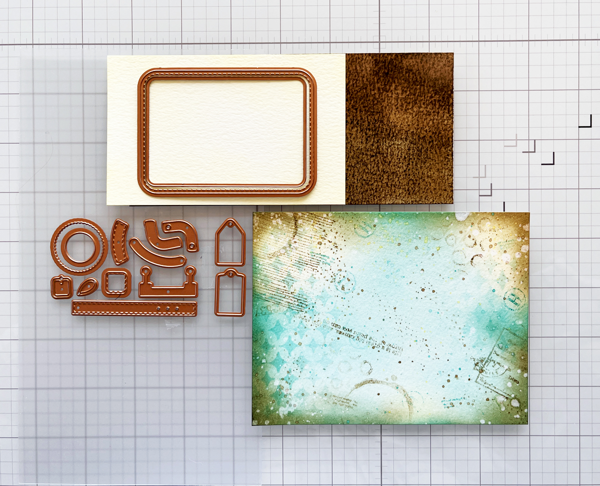
Before cutting, I used my Hero Arts Tag Infinity Die as a viewfinder to decide which parts of the background I wanted to showcase. Once I had the section I wanted to use, I taped my tag die to the watercolor panel and ran it through my Platinum 6 die cutting matchine.
I die cut two tags (4½” x 2⅜”), making sure one included the “Packed with Love” area as a focal point.
Step 6: Ink the Edges
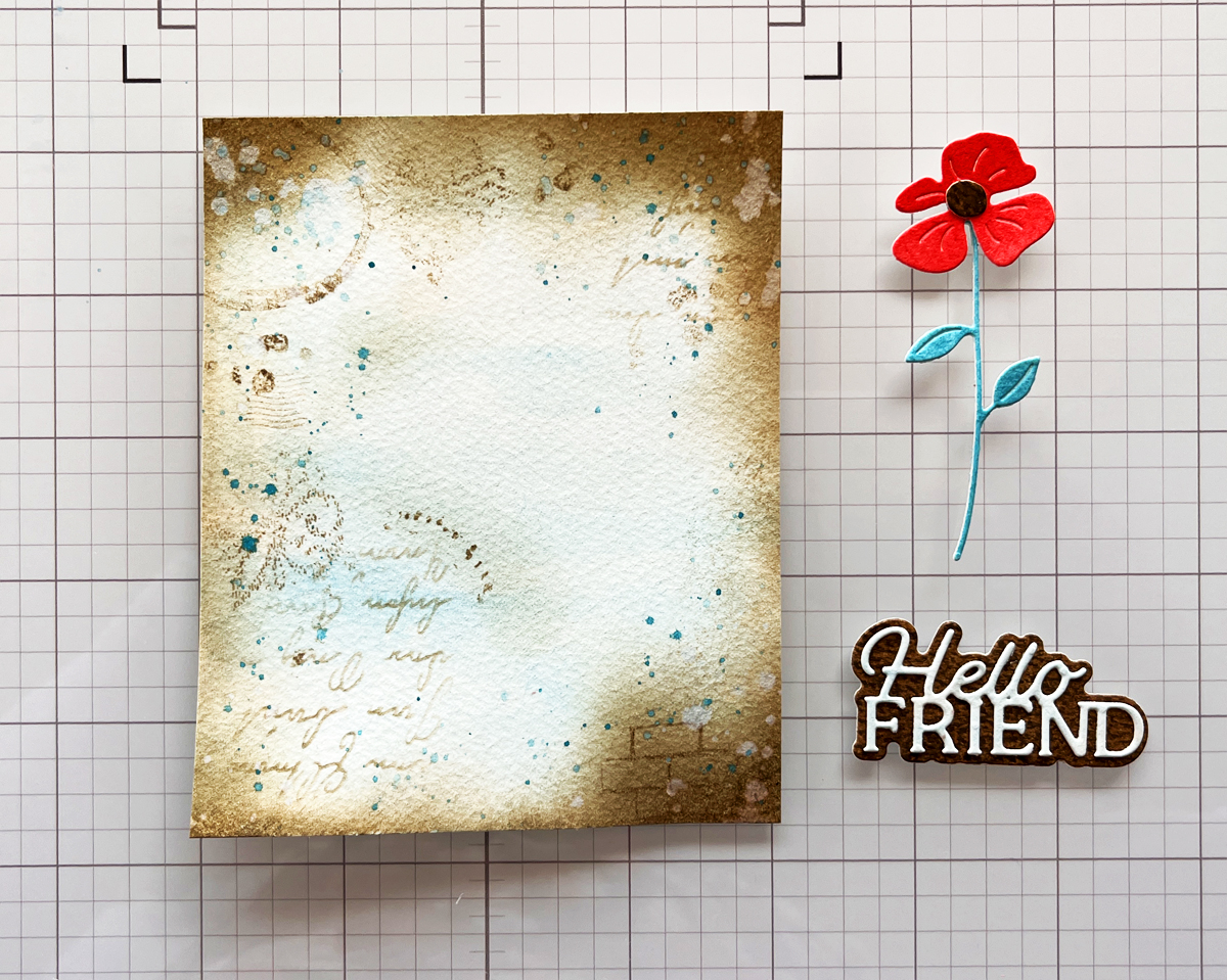
To give the tags a vintage, worn look, I ink blended Root Beer Reactive Ink around all the edges. This step instantly adds depth and contrast,
The mix of soft watercolor, stamping, and shiny foil adds beautiful contrast.
Step 9: Finish with Twine or Ribbon
To complete the tags, I simply added twine through the top. This final touch makes them perfect for gift wrapping, journaling, mini albums—or even framing as tiny art pieces.
Mixed media doesn’t have to be complicated. By working in layers, repeating colors, and letting each step build naturally, you can create beautiful, dimensional projects that feel artistic without being overwhelming.
If you enjoyed this tutorial, I’ll link a couple of my other mixed media posts below for more inspiration. And remember—these techniques work with any stamps, any colors, and any theme. The process is what makes it magic.
Creating a beautiful handmade card doesn’t require a studio full of supplies, but rather a simple, creative process that turns paper into a work of art.
👉 I wanted to walk you through my inspiration and thought process.
This card features (Spellbinders Regal Blooms die set (S4-1465) and a vase of elegant purple blooms basking in sunlight in front of a nine-pane window, that feels equally perfect for Mother’s Day, birthdays, or a thoughtful get-well card.
For this card, I wanted to create a moment—almost like looking through a window on a quiet afternoon and catching sight of a bouquet glowing in the light. The Regal Blooms dies make that easy. The flowers are graceful, detailed, and feminine, with just the right amount of structure to feel refined without being fussy.
👉 I chose a purple color palette for a soft, girly, and classic look. Using Spellbinders ColorWheel cardstock in Lavender, Lilac, and Fairy Tale, along with a few coordinating purple scraps, allowed me to build beautiful tonal variation throughout the card. Here is how I swatched my cardstock, which is a real time saver when I am planning my color palette.
👉 Mixing multiple shades of the same color family adds richness and depth while keeping the overall design calm and cohesive.
👉 To finish the card, I added a glimmer hot foil sentiment—a scripty “hello”—for a touch of elegance and shine. If you’ve been considering learning to foil, my video is a great introduction.
Thoughts onCreating the Window Backdrop
As I mentioned above, I wanted my flower vase to be sitting in front of a sunny window.
👉 I love that a windowinstantly adds structure, light, and architectural interest to a card. I had two window dies in mind, but couldn’t decide which one to use:
👉 Behind the window panes, I layered a soft panel of Fairy Tale ColorWheel cardstock. This pale lavender shade helps the purple flowers stand out while reinforcing the gentle, airy mood of the scene. The window gives the card the feeling of an interior moment—flowers sitting quietly in the sunlight.
Adding Dimension: Two-Tone Vase Technique
One of my favorite details on this card is the vase. I wanted it to have subtle dimension without overwhelming the florals.
👉 To achieve this:
I pierced the vase die cut using a pokey tool.
Then I placed a darker purple shadow layer behind the pierced openings.
This simple technique creates a two-tone effect that adds depth and interest while keeping the design clean and elegant. I’ve included a process photo above so you can see exactly how this detail comes together.
to gentle and comforting (ideal for a get-well card).
This card may be purple and feminine, but the structure of the design makes it easy to adapt for many styles and recipients.
Final Thoughts
This floral window card feels cheerful, classic, and heartfelt—the kind of design that never goes out of style. Between the layered purples, the glowing window backdrop, and the elegant foiled sentiment, it’s a project that looks intricate while still being approachable.
Whether you’re creating for a sister, a friend, or someone who simply loves flowers, the Regal Blooms die set is one you’ll reach for again and again.
Hello friends! Karen Brown here today sharing two cheerful cards created with products from the Hero Arts Packed with Love Collection. I love when a release offers versatility, and this collection made it easy to explore different looks while keeping the designs clean, playful, and approachable.
Both cards highlight simple layouts, bold color choices, and easy-to-repeat techniques—perfect whether you’re making one special card or crafting a small batch. One card leans bright and aquatic with colorful die cut fish, while the other explores a graphic, modern style with bold shapes and happy color transitions. Together, they show just how flexible this collection can be.
Let’s take a closer look at each card!
🐟 Card Details: A Happy School of Fish
For my card, I used DF274: Big Mouth Sardine Tin Dies, but instead of building the tin, I focused solely on the fish dies. I die cut nine fish in assorted sizes and colors, then arranged them swimming horizontally across the card for a playful, modern look.
The background is Cosmic Sky ColorWheel Cardstock, trimmed with my favorite Rounded Rectangle Infinity Dies and mounted onto a crisp white A2 card base. A small, simple sentiment that reads “greetings” keeps the design clean and versatile—perfect for hello cards, encouragement, or just-because mail.
This card feels colorful, cheerful, and a little bit whimsical…like a happy school of fish swimming together. 🐠🐠🐠
To give each fish more presence and durability, I die cut every fish twice and glued the layers together. This subtle dimension makes a big difference, especially on clean and graphic designs.
I used my Spellbinders Scout desktop cutter to cut all of the fish. When I’m working with lots of small or medium-sized dies, the Scout is my go-to—it’s fast, efficient, and perfect for batch die cutting. You might also be interested in the 14 tools that I use most often in my craftroom.
🧠 Layout Tip: Arranging Die Cuts with Ease
If you’ve ever struggled with spacing repeated die cuts, here’s the method I used—and it works every time:
Start at the top of the panel (I placed the gray fish first).
Move to the bottom with the smallest fish (aqua and saffron).
Fill in the middle next.
Work up and down from the center, adjusting spacing as you go.
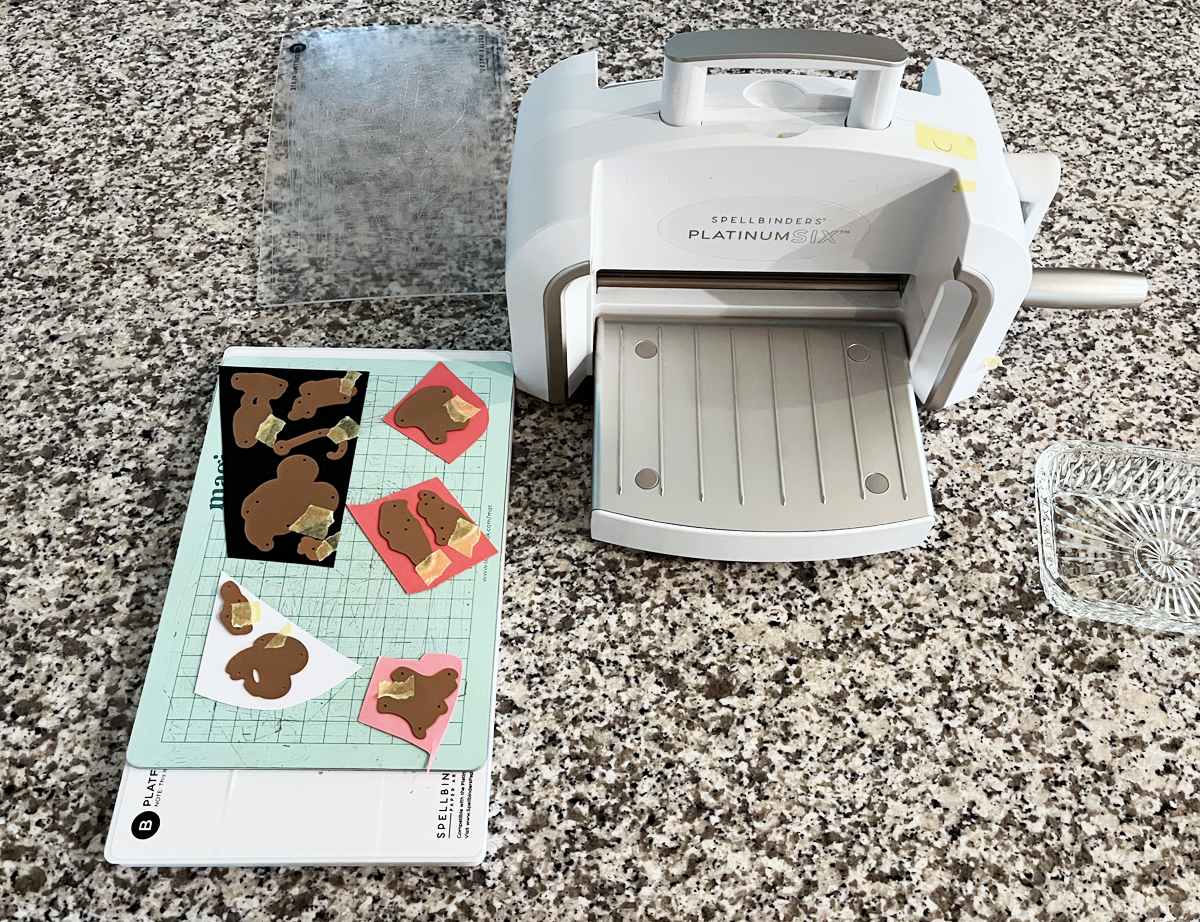
This approach helps keep everything visually balanced and evenly spaced without overthinking it. I’ve included a process photo (above) of the die-cut fish and dies on my craft mat.
🧷 Assembly
I used a combination of craft foam and foam squares to attach the fish and background, adding just enough dimension to create interest while keeping the card mail-friendly.
Rainbow Watercolor Wide Stripes
I stamped the Wide Stripe Background Stamp onto watercolor paper using Unicorn White Pigment Ink, then heat embossed it with white embossing powder. I knew I wanted to watercolor in between the embossed stripes, so I taped my panel to a hardboard to help minimize warping—always a helpful step when working with lots of water.
Working in rainbow order, I watercolored each stripe band by band. The raised white heat embossing created beautiful texture and helped keep each color neatly contained. I have a process photo showing this panel alongside my watercolor palette, and at this point… that was as far as the original plan went!
Sometimes the best ideas happen mid-project. I started thinking about repeating geometric shapes and how fun it would be to combine that idea with the striped watercolor background I had already created.
Using my Nesting Hearts Infinity Dies and Nesting Circle Infinity Dies, I die cut three 1-inch hearts and three 1-inch circles—perfect timing since we’re getting close to Valentine’s Day. Each die cut features the white heat embossed stripe running through the center, with one rainbow color above and the next color below.
I worked across the panel so that the bottom color of one shape becomes the top color of the next:
Pink over orange
Orange over yellow
Yellow over green …and so on.
I alternated the shapes—heart, circle, heart—creating a playful rhythm across the design.
To ground all that color, I mounted the six die cuts (two rows of three) onto a 4″ x 3″ gray mat die cut with the Nesting Postage Stamp Infinity Dies. Yes—this card uses three different Infinity Die sets, and they all worked together beautifully. The card base is a crisp white A2, keeping the focus on the cheerful pops of color.
My sentiment is small and simple: “With Love”, white heat embossed on black cardstock. This card could easily work as a Valentine, a friendship card, or a just-because note.
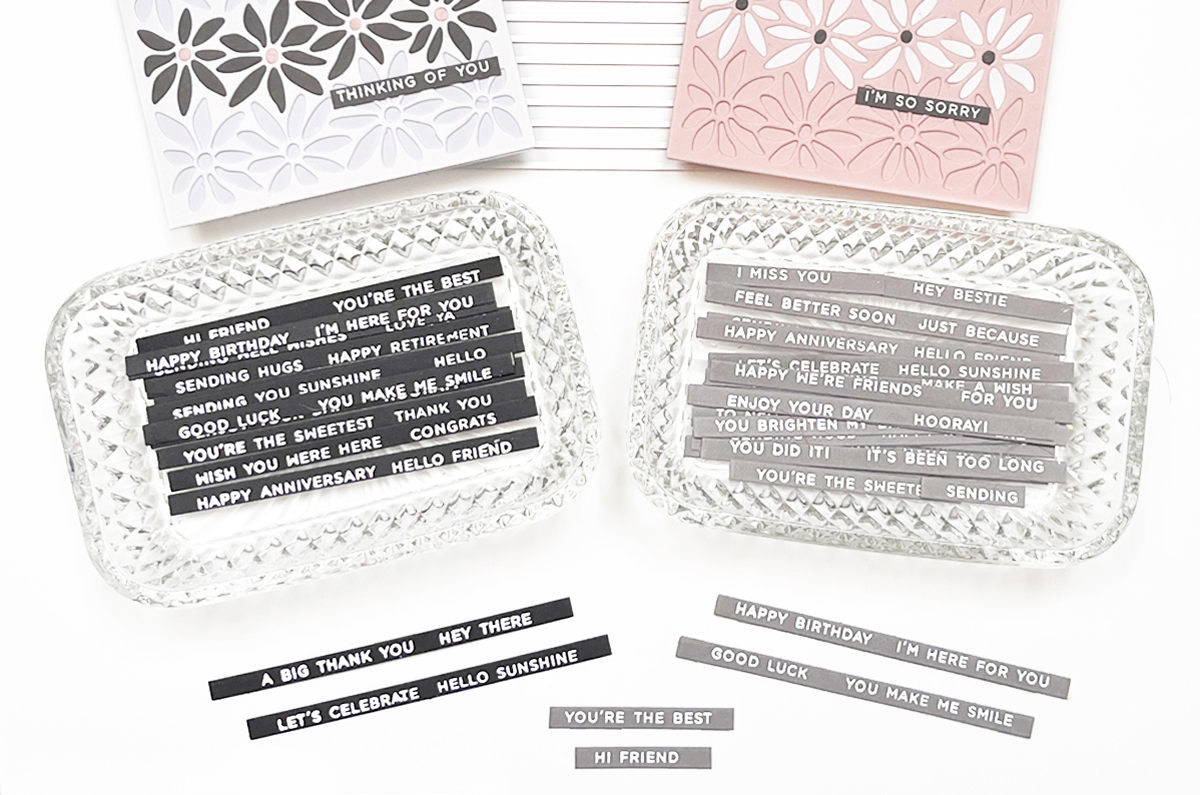
TIP: I love keeping pre-made heat embossed sentiment strips on hand. Using large sentiment strip stamps that coordinate with the matching Sentiment Strip die makes it easy to stamp and die cut everything at once.
For this card, I used a leftover Christmas Sentiment Strip, but I also reach for Everyday Sentiment Strips constantly—definitely worth checking out if you haven’t already. The photo above shows how many sentiments you can make at one time.
Why I Love This Collection
These two cards show how products from one collection can go in completely different directions:
One soft, artistic, watercolor-focused design
One clean, graphic, and modern card with bold shapes
This is a great reminder to let yourself play and see where your ideas lead.
There’s just something timeless about Winnie the Pooh. The gentle illustrations, the sweet stories, and the nostalgia make Pooh-themed projects extra special—and the newly released Spellbinders Classic Pooh Baby Collection captures that magic beautifully.
For today’s post, I created three handmade cards using this collection. Two are perfect for spring baby girl showers, and the third is a rustic birthday card with a mixed media twist. Even though the themes are different—Baby, Maps, and Pooh—they all celebrate the charm of the Hundred Acre Wood.
Card One: A Sweet Baby Shower Card from the Hundred Acre Wood
I pressed the plate using my BetterPress LetterPress System and black ink onto a Bisque BetterPress A2 panel, then added soft color using Zig Watercolor Markers and a damp brush. This simple watercolor technique adds just enough storybook charm without overwhelming the delicate map details.
I finished the card by mounting everything onto a pink watercolor card base, creating a soft, dreamy look that’s perfect for welcoming a baby girl.
Card Two: A Traditional Pooh Baby Shower Card with a Stroller
For my second baby card, I leaned into a more classic baby shower style, again using the Classic Pooh Baby Accessories Die Kit This one features a pink die-cut stroller (pram) accented with sweet sticker embellishments from Simple Stories Vintage Flower Shoppe.
The background is one of my favorite elements—it was created using this month’s Spellbinders Large Die of the Month Kit. The postage/polaroid-style frame makes such a versatile card base and is a true cardmaking staple. If you don’t already subscribe to this kit, it’s a fantastic one to try—I’ll link to my Hummingbird Delight post where I used the full kit.
This card feels timeless, gentle, and perfect for a traditional baby shower. I also have a photo showing both baby cards together (above), highlighting how different they can feel while still using the same Pooh collection.
Same Map, Two Completely Different Looks
One of my favorite things about this project is seeing how versatile the Hundred Acre Wood BetterPress Plate really is. In one card, it’s soft, pink, and perfect for a baby shower. In another, it’s rustic, layered, and mixed media inspired.
Card Three: A Rustic Pooh Birthday Card with Mixed Media
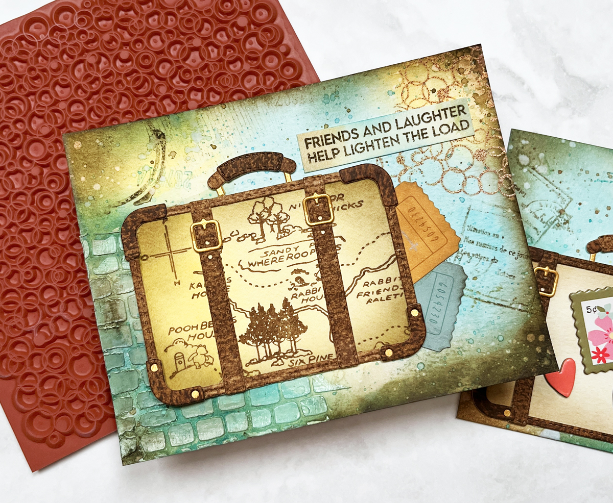
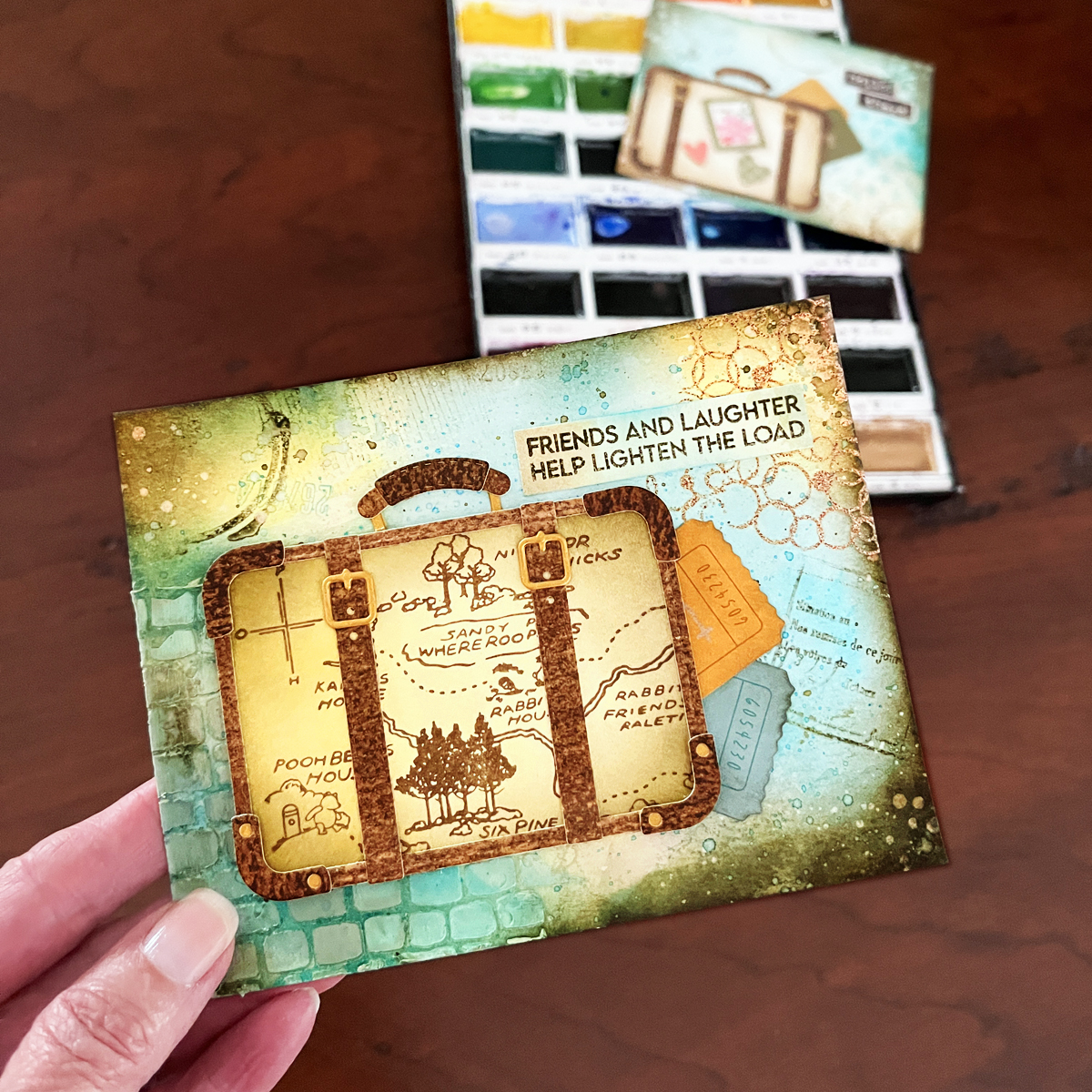
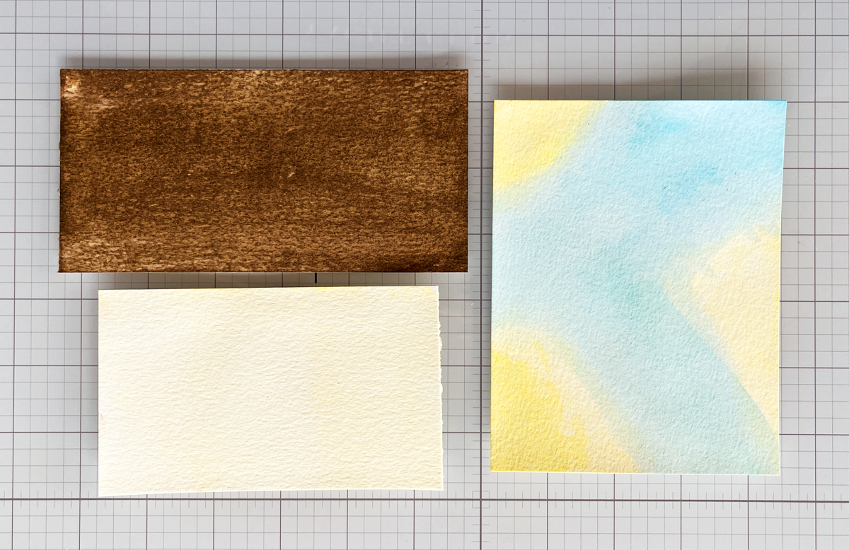
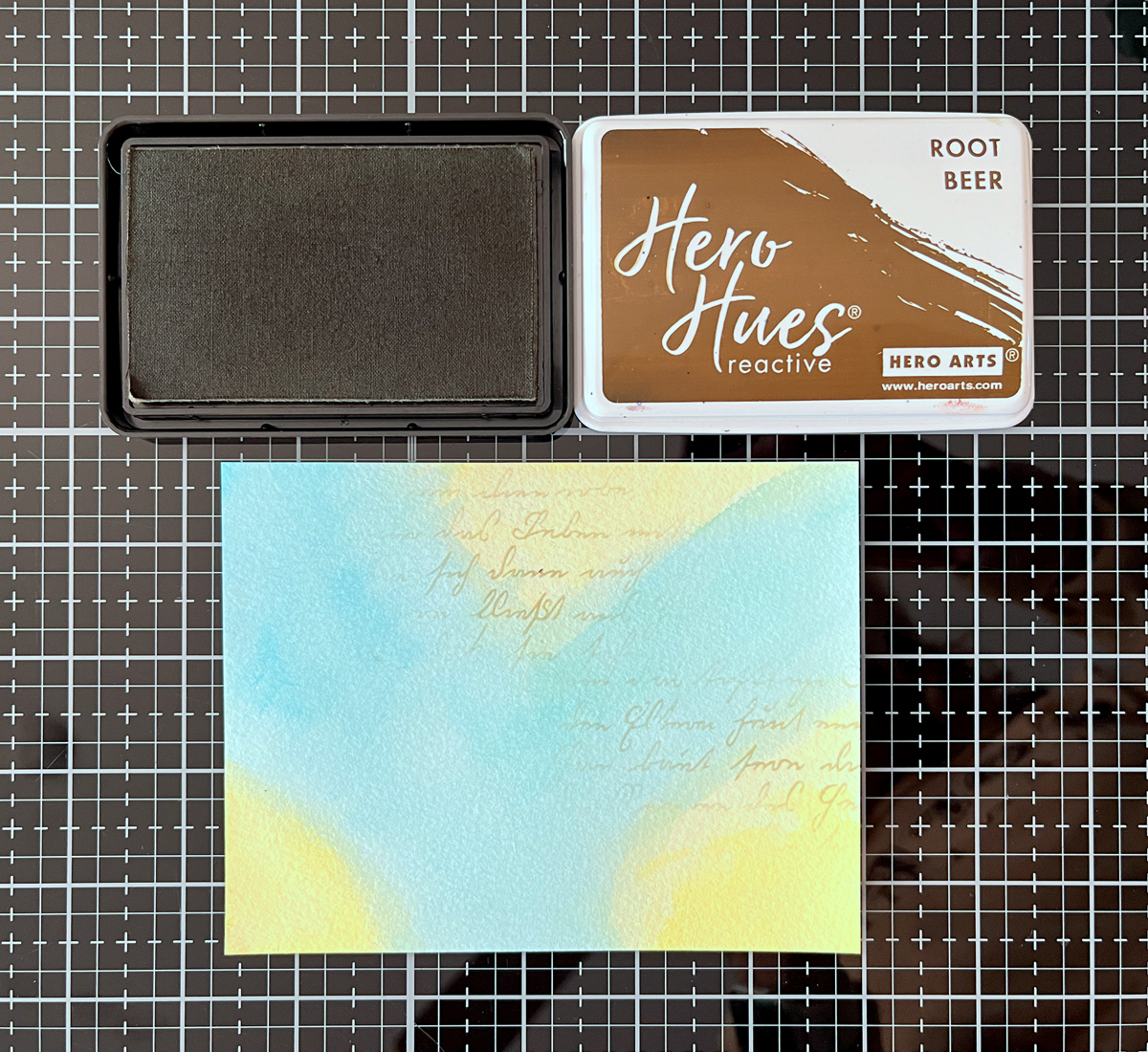
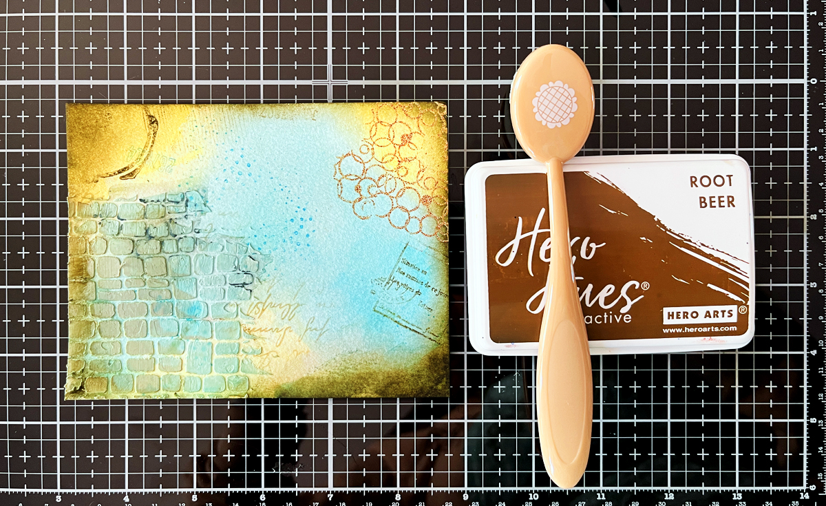
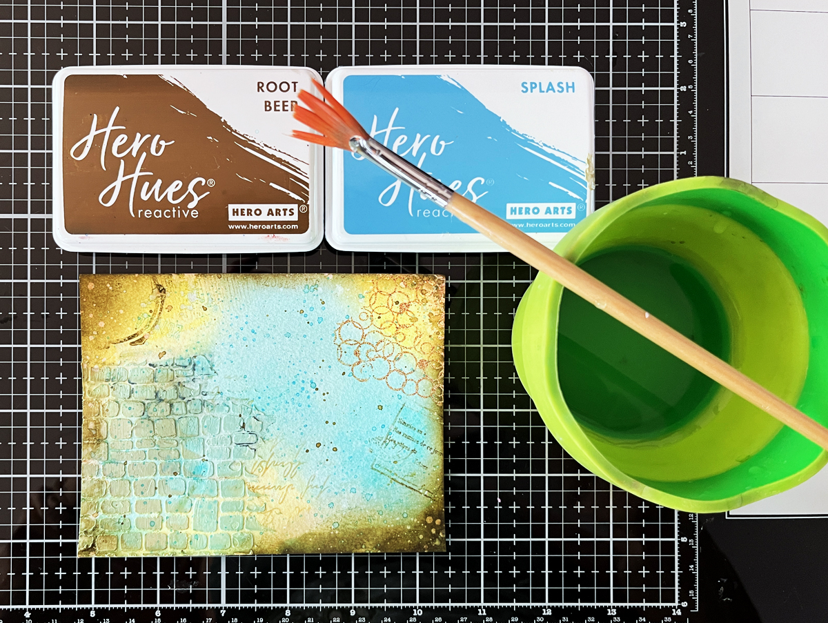
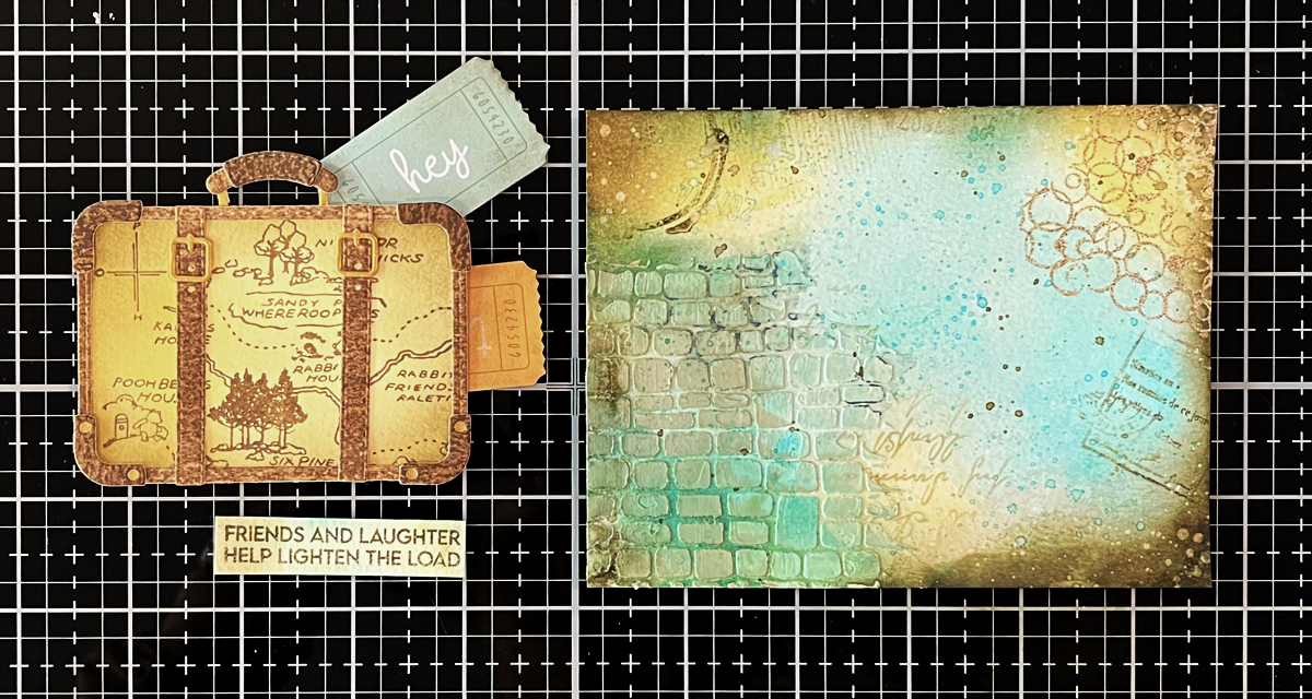
I created the background using an ink-smooshing technique with three shades of brown ink. After spritzing with water, I dipped a Bisque BetterPress panel into the ink and let it soak for about a minute (see two photos below) . Once dry (or heat set), I flattened the panel under a weight. I then used my BetterPress LetterPress System to press the map into my smooshed background.
To add even more depth, I:
Ink blended darker browns around the edges
Added splatters using brown acrylic ink and a fan brush
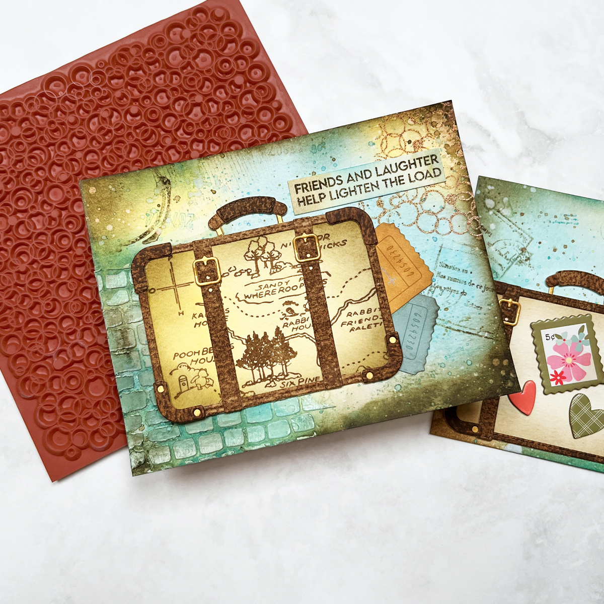
The result is a beautifully aged, mixed media map background. I mounted the panel onto a navy card base and added a bold navy “Let’s Celebrate” sentiment using the Hero Arts Hooray Birthday Cover Plate.
This card is heading to a friend who loves Winnie the Pooh, but it would also work wonderfully as a masculine birthday card.
I’ve included a photo (above) showing both map cards side by side, and I love how different they feel—even though they started with the exact same plate.
👉 My past Winnie the Pooh Die Cut Card and BetterPress Winnie the Pooh Card have always been reader favorites, and it’s easy to see why. Pooh designs feel personal, nostalgic, and meaningful—whether you’re creating for a baby, a birthday, or someone who simply loves these classic characters.
👉 I’ll be linking to my Pooh & Piglet die-cut card from last year, which is still one of my most-loved projects. If you missed it, be sure to check it out for even more Pooh inspiration.
There’s something extra special about the first blog post of a new year — a fresh start, new ideas, and (let’s be honest) a little craft room daydreaming.
Today I’m sharing 14 of my most-used, most-loved cardmaking supplies for 2026. These aren’t just trendy products — they’re the tools I reach for again and again. If you’re stocking your craft room, refining your supplies, or just love seeing what other cardmakers actually use, this list is for you.
1. Favorite Card Kit Subscription: Spellbinders Large Die of the Month
If I had to choose one subscription kit to keep, this would be it. The Spellbinders Large Die of the Month never disappoints, and January’s kit — Hummingbird Delight — truly lives up to its name.
This kit features a beautiful floral postage / polaroid-style frame paired with the cutest hummingbirds. We get loads of hummingbirds in my garden every summer, so this theme instantly stole my heart. The floral border alone makes the card feel finished and elegant with very little effort.
✨ Runner-Up Favorite Subscription: The very first kit I ever ordered — Hero Arts My Monthly Hero, now available in two versions for 2026:
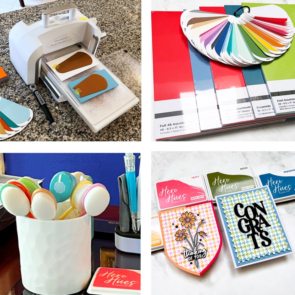
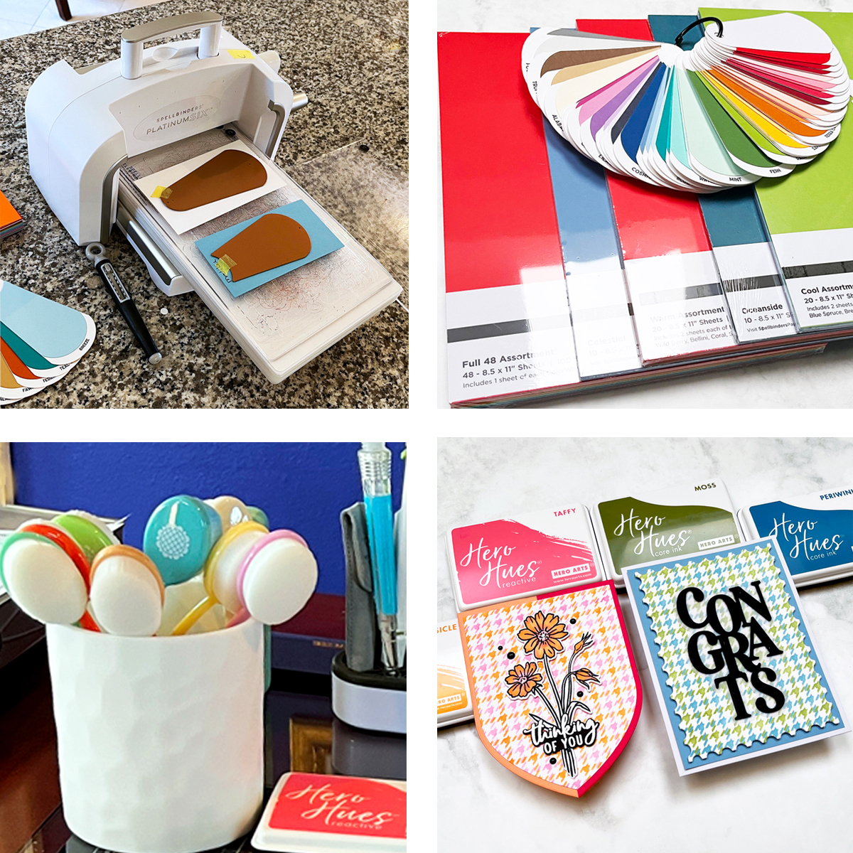
2. Best Die Cutting Machine: Spellbinders Platinum 6
I use my Platinum 6 die cutting machine almost every single day. I’ve tried other machines over the years, but this one is reliable, smooth, and powerful. The others? They’re collecting dust.
3. Best Cardstock: Spellbinders ColorWheel Cardstock
With 48 gorgeous colors, ColorWheel cardstock makes color selection easy and stress-free. I use it almost exclusively.
I recently placed a big order and am sharing a photo of my shipment, including:
I use my swatching dies on nearly every project. Being able to flip through physical cardstock swatches saves time and helps me confidently choose colors that work together.
You’ll see these swatches featured throughout this post.
5. Best Inspiration Tool: Color Cubes
Color planning is always my starting point, and Color Cubes are essential to my process. I own two volumes (1&2), a birthday gift from several years ago, and they’re well loved.
I like to start with the Color Catalogue where I can search by Color, Key Word or Collection and then I grab a few cards for inspiration.
Paired with my cardstock swatches, they make choosing beautiful color palettes effortless.
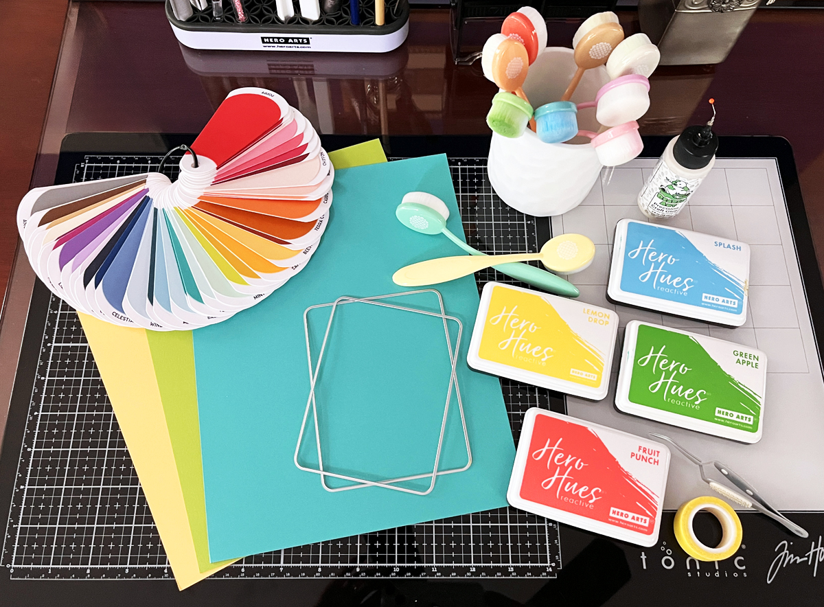
I have a large tub of Hero Arts inks — and honestly, I rarely reach for anything else. The colors are vibrant, blend beautifully, and are incredibly reliable.
I love that Waffle Flower blending brushes have color-coded handles, so I instantly know which brush goes with which ink family. Small detail, huge time saver.
8. Best Die-Cutting Staple: Hero Arts Infinity Dies
Nesting infinity dies are true craft room staples, and I use mine constantly. I’ll be linking to 8 of my most-used sets in this post with my most used at the top. I’ll also link to a card using each die.
Hands down my favorite finishing touch. I use Spellbinders and Hero Arts enamel dotsthe most — clean, modern, and endlessly versatile.
10. Best Way to Add Texture: Embossing Folders
Embossing folders are one of the easiest ways to add interest to a card. I subscribe to the Spellbinders Embossing Folder of the Month, and my collection has grown quickly.
I used January’s folder, Cloud Nine, on my Hummingbird card. It’s a stylized sky with clouds — perfect for so many scene cards.
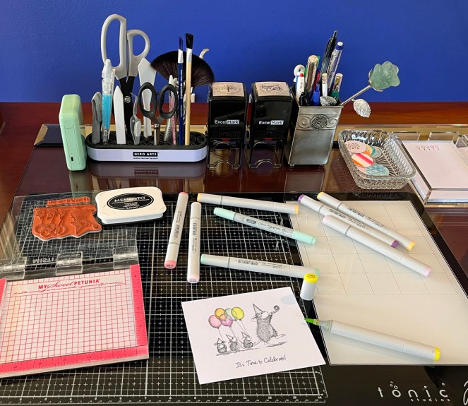
11. Best Desk Organizer: Hero Tools Handy Holder
This Handy Holder organizer keeps my scissors, tweezers, bone folder, palette knife, and brushes within arm’s reach. I love it so much… I own two!
They sit front and center on my desk.
12. Best Work Surface Organizer: Craft Stax
One tool I reach for constantly while creating is Craft Stax. There are several sizes and they’re perfect for organizing, protecting, and corralling all of my crafting components as I work.
The photo above with my Fergus Felt components is the Stash Stax. I also love this size for storing cardstock.
I use Craft Stax to hold die-cut pieces, partially assembled cards, sentiments, and embellishments so nothing gets lost or damaged mid-project. They’re especially helpful when I’m working on detailed die-cut cards or stepping away and coming back later — everything stays exactly where I left it.
Craft Stax also make it easy to stack multiple projects on my desk without creating chaos (always a win!). Simple, smart, and incredibly useful — this is one of those tools you don’t realize you need until you have it… and then you can’t imagine crafting without it.
13. Best Die Organizer: Hero Arts Magnetic Sheets & Envelopes
These are absolute must-haves for staying organized:
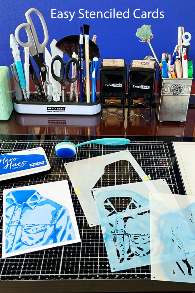
Sticky Grip Mats are perfect for stenciling and stamping. And they work great in your Misti and Mini Misti Stamp Positioners…no need for magnets anymore!
These 14 products form the backbone of my cardmaking in 2026. They help me craft more efficiently, choose colors with confidence, and enjoy the creative process even more.
If you’re building or refreshing your craft room this year, I hope this list gives you a helpful starting point — and maybe a little inspiration too. 💛
As the year wraps up, I did something both fun and fascinating — I dove into my 2025 blog posts and Instagram stats to see which projects truly stole your hearts. Likes, saves, comments… I crunched the numbers, and four projects clearly rose to the top.
And wow — the #1 project didn’t just win… it more than doubled the engagement of my #2 card! Not surprisingly, it also happens to be one of my personal favorites.
Below are my four most popular Spellbinders projects of 2025. I’ve linked each one back to its original blog post so you can find all the details, tips, and full supply lists in one place.
🏆 #1 — October Large Die of the Month: A Heartfelt Holiday Scene
This card was the runaway favorite of 2025 — with more than twice the likes and saves of any other project I shared this year.
Created with the October Large Die of the Month Kit (still available!), this charming scene features a child pulling a sled piled high with gifts through softly falling snow. I made this card especially for my daughter and son-in-law, who are expecting their very first child, and they’ll receive it on Christmas Day. I’ve had the Large Die of the Month Subscription. for several years, and each month it is still a favorite.
I think the combination of storytelling, nostalgia, and cozy winter magic really resonated — it certainly did with me.
🥈 #2 — Jack of All Trades: Queen & King of Hearts
Coming in at #2 is a deeply personal project using the Jack of All Trades Collection. I created and customized the Queen of Hearts to resemble my daughter and the King of Hearts for my son-in-law.
These regal die-cut cards are such a joy to personalize, and judging by your response, you loved seeing how adaptable this collection can be for meaningful, one-of-a-kind cards.
The scene shows Winnie the Pooh and Piglet walking together, balloon in hand — simple, sweet, and full of emotion. Sometimes a card doesn’t need to be complicated to be powerful, and your responses confirmed that completely.
Rounding out the list is Fergus the Felt Gnome, my most popular blog post of the year! Designed by the incredibly talented Sandi MacIver, Fergus is a customizable 3D felt character — and I couldn’t resist turning mine into a cheerful lemon gnome.
Seeing which projects connected most reminds me why I love sharing cardmaking and creative ideas — it’s about storytelling, emotion, and making something meaningful with our hands.
If you missed any of these projects the first time around, I hope you’ll click through and revisit them. And if you’ve already seen them — thank you for being part of my creative journey in 2025.
As we look back on 2025, I thought it would be fun to round up my best and most popular Hero Arts cards of the year. These projects were fan favorites, reader favorites, and in a few cases, personal favorites too.
Each card highlights a different Hero Arts release and cardmaking style—from bold graphic designs to cute scenes and clever techniques. I’ve linked each original blog post so you can dive deeper into supplies, step-by-step instructions, and tips if a particular card catches your eye.
🥇 Most Popular Card of 2025: Die Cut Valentine
My most popular card of 2025 was a fun die-cut Valentine created with the January 2025 Folded Love Note Kit. The playful dies, bold heart shapes, and cheerful vibe made it perfect for modern Valentine cards.
🕵️♀️ Fan Favorite: Miss Detective – Case Closed Collection
The Case Closed Collection from May was such a hit, and my Miss Detective card quickly became a fan favorite. This clever, story-driven card featured a charming sleuth and bold graphic details—and it really resonated with readers.
This collection was creative, unique, and just plain fun to work with. It’s one of those releases that sparks storytelling the moment you start crafting.
This one is especially close to my heart. Using the What’s Brewing Collection, I created a bold, graphic coffee-themed card that I sent to my daughter. With strong colors, clean die cutting, and a modern layout, this card felt fresh and fun—and it’s still one of my favorite designs of the year.
It was a close call for fourth place, so I added an Honorable Mention—a bold floral die-cut card from the Friendship Blooms Collection. This project focused on layering, color, and impactful florals, and it remains a go-to style for both beginners and experienced cardmakers.
I also created a video tutorial for this card if you’d like to see it come together: 🎥Link to Video Tutorial
These cards represent what I love most about Hero Arts: creative variety, high-quality products, and designs that truly inspire. Whether you enjoy bold graphics, clever themes, or classic florals, there was something special in every 2025 release.
If you’re new here, this post is a great place to start exploring past projects—and if you’ve been crafting along with me all year, thank you for being part of the journey.
If you love mixed media, adorable woodland critters, and any excuse to use your Gel Press prints, the December 2025 Spellbinders Small Die of the Month – Better Together is going to make your crafty heart flutter. This month’s kit includes two owls and two otters, but for today’s project, I kept things simple with a single sweet owl—perfect for a Valentine’s Day card for my daughter.
How to Use Gel Press Prints in Cardmaking
I reached into my stash of Gel Press prints (one of my favorite studio habits!) and created a simple but visually rich design. The card base is a greenish-yellow pulled print, while the Polaroid-style frame background uses a print with layers of tan, brick red, green, and white. The organic textures and imperfect blends from the prints give this card a soft art journal meets Valentine vibe.
For the focal point, I die cut the owl and assembled her with a tiny flower crown, then perched her on the included die cut branch. She’s framed inside a Polaroid-style photo using the Hero Arts Nesting Journaling Photo Frames, which provide the perfect amount of white space.
A single rub-on sentiment—“love” from the Hero Arts Ornate Frames Transfer Sheet (RT127)—sits on the bottom right of the Polaroid border for an easy, minimal look. Because the background is so full of visual interest thanks to the Gel Press print, the clean sentiment balances everything beautifully.
fabulous for using your stash of Gel Press backgrounds
perfect for mixed media fans and Valentine’s Day
totally customizable (the kit includes two owls and two otters!)
I also included a process photo showing stacks of my finished Gel Press prints. The print used for the Polaroid background is the top middle print in that photo. I love Gel Press play days, and it feels great putting those prints to use in my cardmaking.
This simple mixed media Valentine is going to my daughter—and I think she’ll love the sweet little owl with the tiny flower crown.
Today I’m sharing a cute square coffee-themed thank you card featuring the House Mouse Brew-tiful Day rubber stamp from Spellbinders. I can never resist a coffee pun, so I went with “Thanks a latte” for my sentiment—one of my all-time favorites!
I stamped the adorable image and colored it with Copic markers:
Copic Colors Used:
Cup & Spoon: YG01, YG03, YG05
Coffee: E55, E25
Glass: BG00, B00
Mouse: E40, E21, R20
Shadows: N0, N1
Before stamping, I simply trimmed the included sentiment using my Spellbinders Shears so only “Thanks a latte” remained—super easy! The little scene includes our sweet mouse taking a sip from a giant (to him!) latte cup, with a coffee bean canister behind him. Such a cute little tableau!
This card comes together very quickly and is so fun to color. House Mouse is always popular with card recipients—every little mouse scene just makes you smile!
I’ll link to several other House Mouse posts I’ve created, because I just can’t resist these sweet little critters. You can see House Mouse is a definite favorite!
Whimsy and Cheer – 3 House Mouse cards I created for the Spellbiners Blog