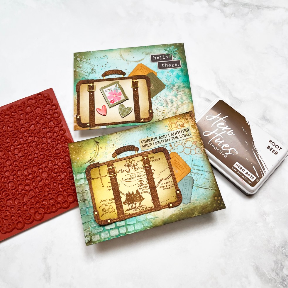
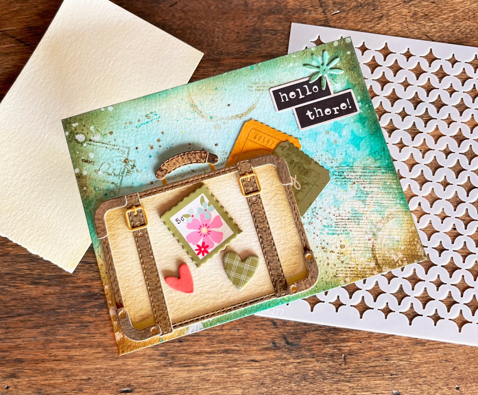
Ready to take your mixed media to the next level? In this post, I build on my “Fab 4” layering techniques and introduce three additional layers that add texture, depth, and artistic detail—perfect for transitioning from beginner to more confident mixed media designs.
Category: Mixed Media
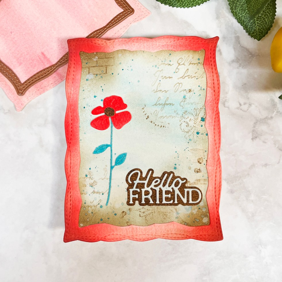
Mixed Media Made Simple: Easy Watercolor Background Panels
Learn how to create easy watercolor background panels for mixed media cards using a simple wet-on-wet technique. This beginner-friendly tutorial includes layering tips, color guidance, and a floral die-cut focal point.
Mixed Media Layering Made Simple: The 4 Layers I Use on Almost Every Project
Learn how to build beautiful mixed media card backgrounds using four simple layering techniques. This beginner-friendly guide walks you through stenciling, stamping, distressing, and splattering to create depth and cohesion in your handmade cards.
3 Easy Mixed Media Cards for Beginners | Line of Being Die
Explore three mixed media “lite” cards featuring the Line of Being die set. From hand-painted watercolor backgrounds to gel press prints, see how one dramatic focal point transforms three completely different artistic styles.
Ink Smooshing 101 — My Favorite Mixed Media Background Starter
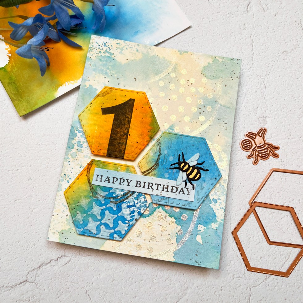
Ink Smooshing 101 — the easiest way to create beautiful mixed media backgrounds. In this post, I walk you through five beginner-friendly variations, color tips, layering ideas, and how to turn two simple panels into a stunning hexagon birthday card.
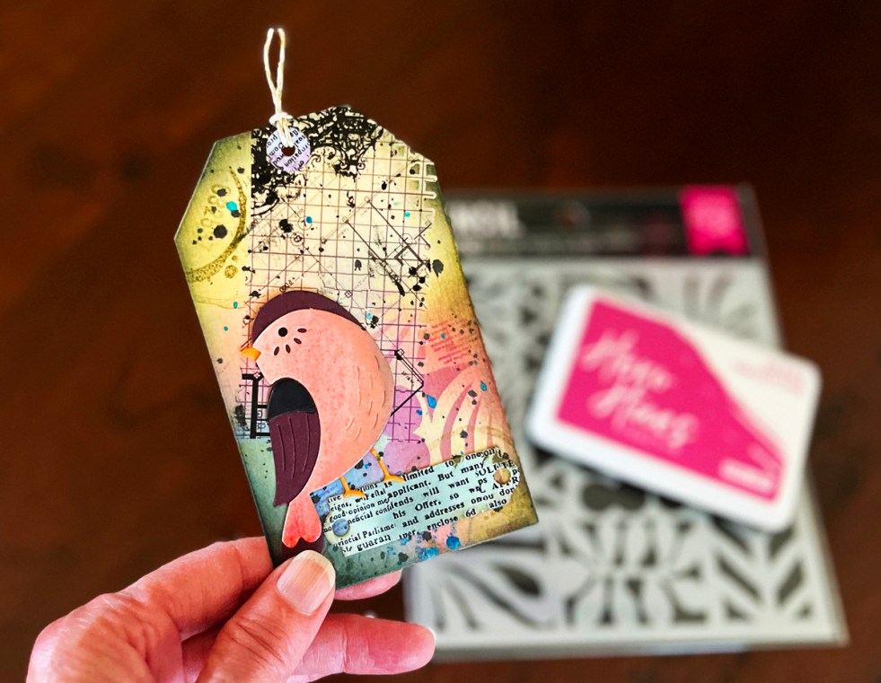
Mixed Media Made Simple: My 3-Step Recipe for Fun & Easy Tags
Discover my simple 3-step mixed media recipe for creating beautiful, layered tags. Learn how to build backgrounds, add depth with 4+ layers, and finish with a strong focal point — even if you’re a beginner.
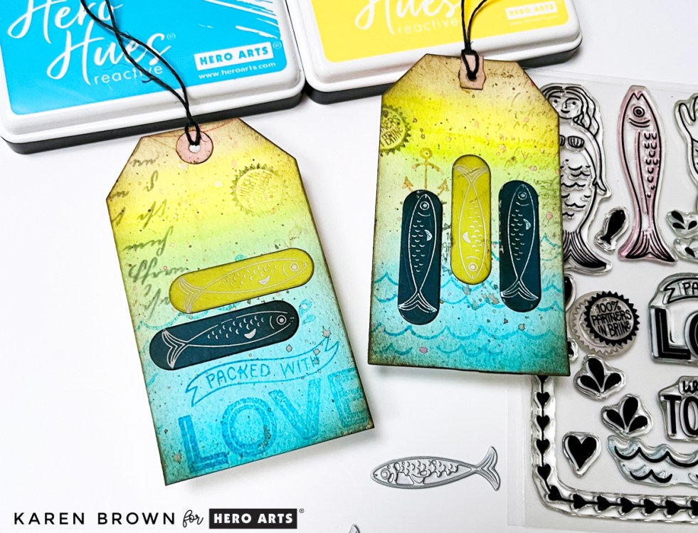
How to Create Easy Mixed Media Tags for Beginners (Step-by-Step Tutorial + Video)
Video and How To Tutorial showing how to create a stunning mixed media art tag in 11 easy steps.
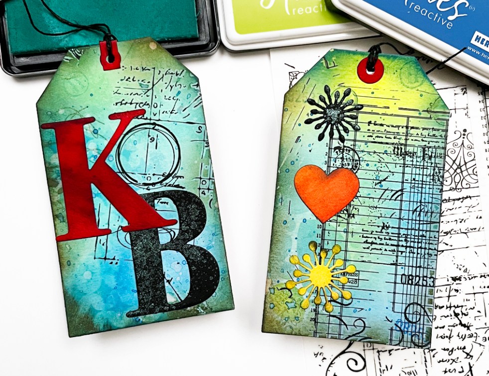
How to Make Mixed Media Tags in 9 Easy Steps | Tutorial
Create beautiful mixed media tags with this easy, step-by-step tutorial. Learn how to layer watercolor, stamping, ink splatters, and hot foil accents using the Partners in Brine stamp set. Perfect for beginners and seasoned crafters alike!

Spellbinders December 2025 Die of the Month | Gel Press Print Card Ideas
Today I’m sharing a simple mixed media Valentine using the Spellbinders December 2025 Die of the Month – Better Together. I combined one of the adorable owls with a Polaroid-style frame, a rub-on “love” sentiment, and two of my favorite Gel Press prints for a soft, artistic look full of layered texture and color.

Mixed Media Card Tutorial: A Step-By-Step Guide
A step-by-step how to tutorial on creating a torn and tattered vintage look mixed media card from upcycled and repurposed atlas maps and brown paper shopping bags. The card features a die cut bike and Hero Wax Accents.
