One kit. Three color palettes. Three completely different Halloween stories.
Halloween cards don’t all have to be orange, black and spooky.
This year, I challenged myself to create three completely different Halloween cards from one Hero Arts My Monthly Super Hero Kit. One is silly, one shakes, and one is decidedly more stylish than spooky.
September Kit Update: The September My Monthly Hero and My Monthly Super Hero subscriptions have sold out, but Hero Arts has introduced a new Save Your Spot waitlist for future subscription openings. You can reserve your place with a $5 refundable Spot Hold, which will be applied to your first kit when a subscription becomes available. Your spot reserves your place in line rather than a specific month’s kit.
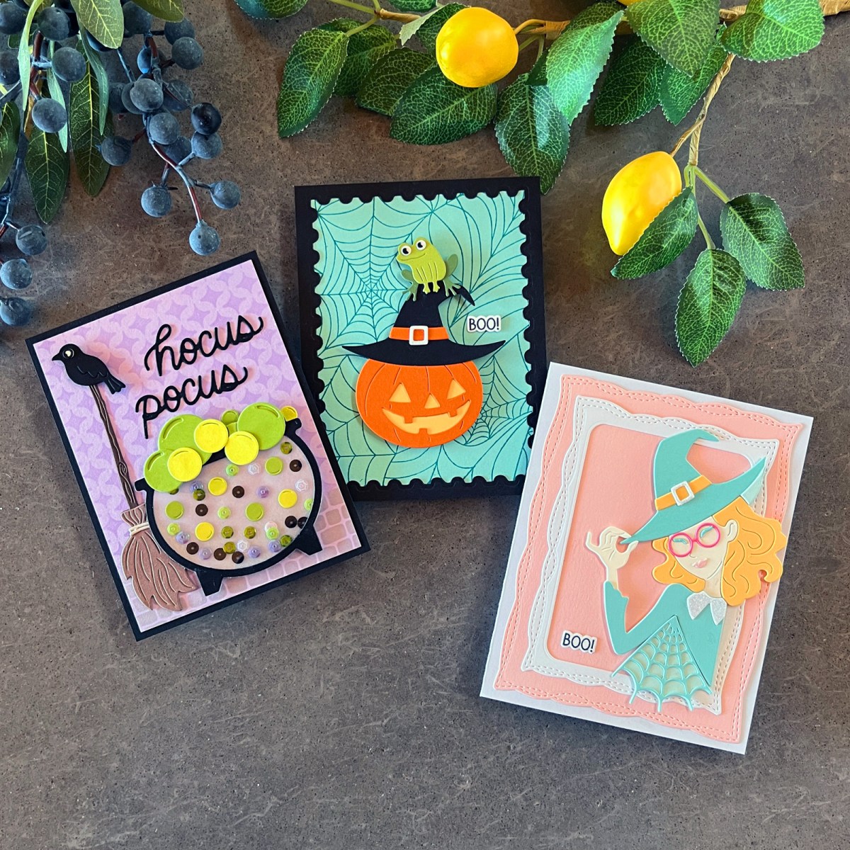
Two of my cards were designed with kids—and fun-loving adults—in mind. The third uses pastel pink, aqua and yellow for a decidedly nontraditional Halloween card inspired by Wicked.
And here’s something else I noticed when I put all three finished cards together: they don’t look like a coordinated set—and that’s exactly the point.
For years, I wanted the cards in my group photos to coordinate. But I’ve realized they don’t always need to. Each card has its own story, its own recipient and its own personality.
These three cards certainly do. Yet all three started with the same Hero Arts September My Monthly Super Hero Kit.
My Best Cardmaking Kit Subscriptions — 2026 Guide is full of information on my favorite card kits.
You might also enjoy my 3 October My Monthly Hero cards in my new blog post 5 Tips That Make Your Cards Pop.

What You’ll Learn in This Post
- How to create three completely different Halloween cards from one kit
- How traditional and unexpected color combinations can change the mood of a Halloween card
- How to add movement and personality with an easy, low-profile shaker
- How layering and Rule of Thirds placement can give die-cut cards a more polished look
Hocus Pocus Shaker Scene Card

What do you think is cooking away in the witch’s cauldron?
A love potion? A questionable nougat for Halloween candy? A bubbling potion of eye of newt?
Whatever it is, I don’t think I’m going to taste it.
For my first card, I created a fun, low-profile shaker card featuring a bubbling cauldron filled with sequins and die-cut bubbles. A broom with a raven perched on top helps set the scene, along with a die-cut Hocus Pocus sentiment.
I wanted the background to add atmosphere without competing with that wonderful cauldron, so I kept it fairly minimal. I lightly stenciled a Sparkle Weave wallcovering behind the scene and added a cobblestone floor before popping my die cuts on top.
Creating a Low-Profile Shaker
I love an interactive card, but I don’t necessarily love adding a lot of bulk—especially if I plan to mail it.
So instead of creating a traditional thick shaker well, I turned the cauldron itself into a low-profile shaker.
I die-cut the cauldron background twice: once from vellum for the back and again from acetate for the see-through front. I attached the acetate to the black cauldron base and glued several die-cut bubbles and shaker sequins directly to the vellum.
By permanently attaching a few of the shaker elements at different heights, the cauldron always looks like it’s bubbling—even when the loose shaker pieces have fallen to the bottom. It keeps the shaker from looking like a snow globe after all the snow has settled.
Then I added loose sequins for actual movement, closed up the cauldron and layered several larger decorative die-cut bubbles along the top.
My Christmas Spinner Card for Kids is another interactive card that is loads of fun.
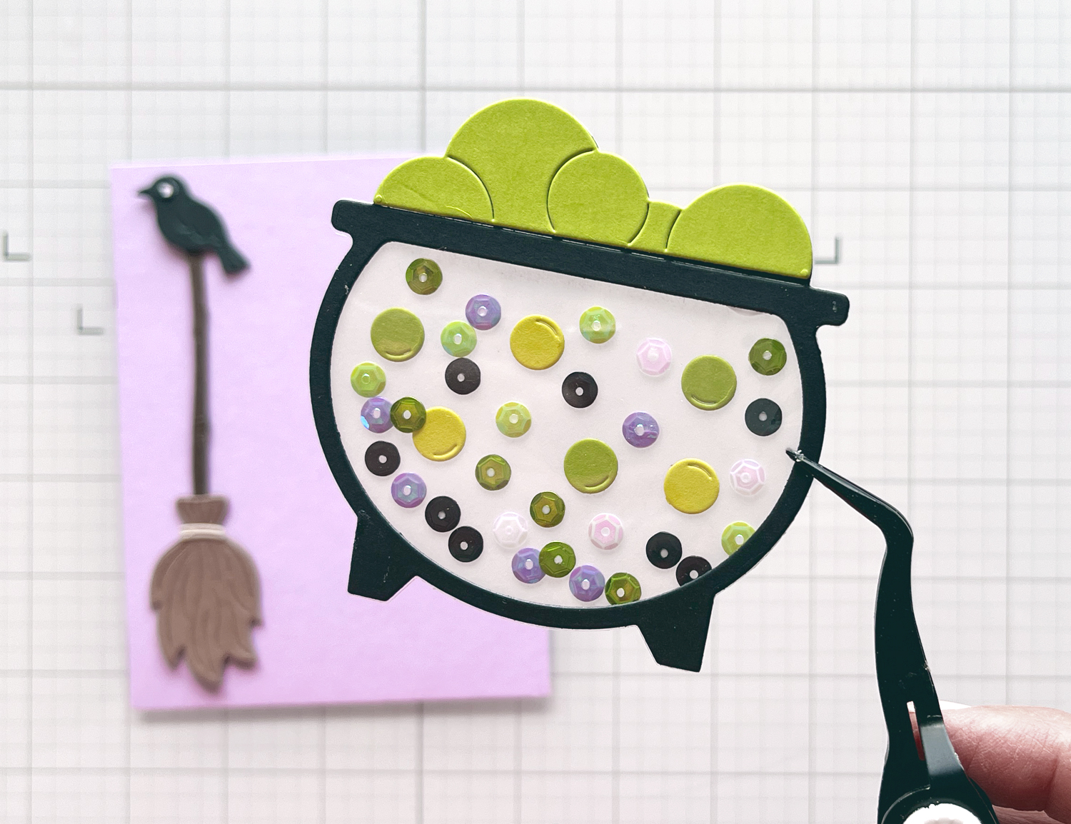
Quick Takeaway: Movement doesn’t have to mean bulk. A low-profile shaker still gives you that wonderful interactive element while keeping the finished card much easier to mail.
An Unexpected Halloween Color Combination
Instead of relying on traditional orange, I used eerie pastel lavender, electric lime green and black.
The black gives the scene a strong visual anchor, while lavender creates that slightly mysterious Halloween atmosphere. Then the acidic lime green bubbles provide a jolt of energy.
I added lavender, black and green sequins inside the cauldron to carry the color palette right into the interactive element.
It’s Halloween—but in a completely different way.
Not So “Wicked” Witch

I really enjoyed the two Wicked movies, so when I saw this die set, I thought it would be great fun to create my own not-so-wicked witch.
And I was right because I love how this card turned out.
I decided to personalize my witch to look a little like my daughter. That’s one of the things I love most about handmade cards: we can create for an actual person rather than a generic recipient.
Personalized cards are usually some of my favorites because they feel authentic.
Pretty Pastels for Halloween
There isn’t much traditional Halloween color on this card.
Instead, I chose pastel pink, aqua and yellow—a soft triadic color scheme using three colors spaced around the color wheel.
Pink and yellow bring sunny, inviting warmth, while aqua provides a cooler anchor. Because I chose soft pastel versions of all three colors, no single color overwhelms the others.
The result feels pretty, feminine and playful while still working beautifully with a witch, spider web and pointed hat.
It’s a good reminder that the die doesn’t have to dictate the color palette.
Why This Layout Works

This card also has one of my favorite backgrounds of the three.
I started with a white A2 card base and added a soft pink panel die-cut with the Playful Stitched Nesting Dies. Next came a smaller white frame cut from the same die set.
Then, instead of centering my witch, I positioned her along the right side of the white frame. Her flowing hair, the tip of her witch’s hat and part of the spider web spill beyond the frame.
That off-center placement loosely follows the Rule of Thirds, placing the focal point away from the predictable center of the card.
It creates balance but also a little energy and tension. Your eye knows immediately where to look, but the layout doesn’t feel static or expected.
Quick Takeaway: One extra layer and off-center placement can transform a layout.

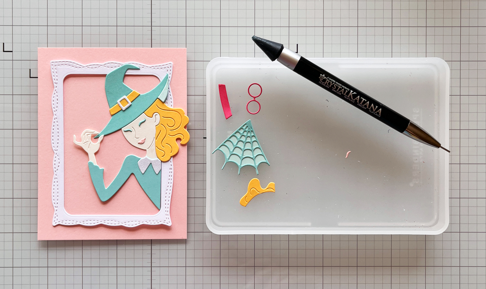
I actually took this photograph while I was working because I wasn’t sure about my layout.
My original plan was much simpler: pink card base + white frame + witch.
When I looked at the photograph, though, I realized the design needed something else.
Instead of using the pink cardstock as my card base, I die-cut it with the Playful Stitched Nesting Dies and layered it onto a white card base.
That gave me four visual layers instead of three:
white card base → stitched pink panel → white frame → witch
It was a small change, but I think the finished card looks much more polished.
This is one reason I sometimes photograph a card before I’ve finished it. Looking at the design on a screen can make it easier to notice spacing, balance—or that one little something that’s missing.
TIP: Make Intricate Die Cuts Easier to Assemble
The witch contains quite a few small die-cut pieces that fit together almost like puzzle pieces.
Instead of trying to move the completed witch onto my card one tiny piece at a time, I assembled the components and used small pieces of tape on the back to hold everything together.
Then I added foam squares and popped the entire witch onto my background.
Much easier!
Grinning Die-Cut Jack-o’-Lantern Wearing a Witch’s Hat…and a Frog
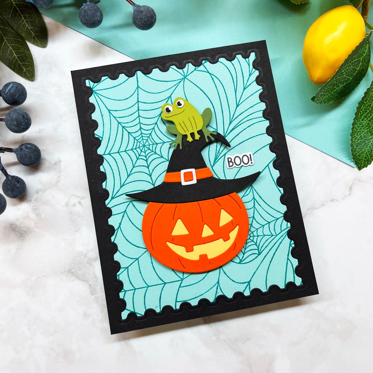
My final card had a very specific goal:
I wanted it to make someone giggle.
I started by mixing and matching two different die sets to create a grinning jack-o’-lantern wearing an oversized witch’s hat.
I added a stamped spider web background and a black postage stamp frame, which helps focus the eye right on my silly focal point.
And then, when I was almost finished, I looked at the card and decided it needed one more thing.
A frog.
More specifically, a tiny frog perched precariously on top of the witch’s hat.
Of course.
I love mixing and matching stamp and die sets when I’m building scenes. It’s one of the easiest ways to get more use from the supplies you already own—and adding something unexpected can completely change the personality of a card.
Why This Works: The Frog Doesn’t Need to Be There
The pumpkin already says Halloween.
The witch’s hat definitely says Halloween.
I didn’t need the frog to tell the story.
I needed the frog to give the story personality.
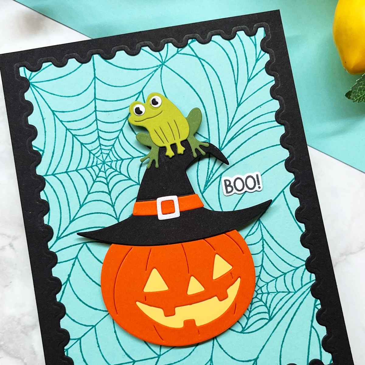
That unexpected third element takes the scene from cute to slightly ridiculous—and that’s exactly what I wanted.
It’s something worth remembering when you’re creating a scene card. Sometimes the little detail that isn’t necessary to explain the scene is the detail that makes the scene memorable.
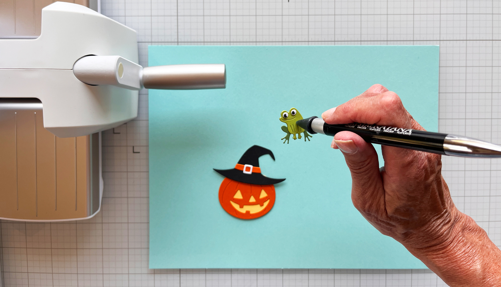
Complementary Colors Add Energy
Orange and aqua are the two dominant colors in this design, and they’re complementary colors—opposites on the color wheel.
That natural contrast makes each color appear brighter and more vivid.
The cool aqua background gives my high-energy orange jack-o’-lantern plenty of room to shine, while black anchors the scene and ties together the witch’s hat, postage stamp frame and spider web background.
It’s a much more traditional Halloween combination than my pastel Wicked witch—but still bright, playful and definitely not scary.


Karen’s Tip: Condition New Photopolymer Stamps
When I’m using a new photopolymer stamp—especially a large background stamp—I often gently condition the surface with a stamp eraser first.
New stamps can sometimes repel ink and cause it to bead on the surface. Light conditioning helps the ink coat the stamp more evenly for a crisper impression.
One Kit, Three Very Different Halloween Cards
Silly. Interactive. Pretty. Traditional. Nontraditional. Kid-friendly. Adult-friendly.
These three Halloween cards don’t look like they belong in a coordinated set.
And I’ve decided that’s perfectly okay.
Each card has its own story.
One has a bubbling cauldron that shakes. One has a pretty pastel witch inspired by Wicked. And one has a grinning pumpkin wearing a witch’s hat—with a completely unnecessary frog sitting on top.
Yet all three started with the same Hero Arts My Monthly Hero Kit.

Some of the best Halloween cards are the ones that reflect the personality of the person you’re making them for.
That’s one of my favorite things about cardmaking. Our supplies may give us a starting point, but our choices—color, layout, technique and those quirky little details—are what make the finished cards feel like ours.
And perhaps that’s a better measure of a useful cardmaking kit than whether all the finished projects coordinate: How many different stories can you tell with it?
So now I have to ask:
Are you Team Silly, Team Shaker or Team Stylish?
Let me know in the comments. I have my favorite, but I’m curious which one you’d choose!
Supplies & Tools Used
Kits & Dies
- Hero Arts September My Monthly Super Hero Kit
- Hero Arts Septmeber My Monthly Hero Kit
- Playful Stitched Nesting Dies
- Nesting Postage Stamp Infinity Dies
Stencils & Inking
Paper & Shaker Supplies
Favorite Tools
- Platinum 6 Die Cutting Machine
- Tweezers
- Crystal Ninja pickup tool
- MISTI
- Sticky Mat for Misti
- Craft Stax
My 11 Best Die-Cutting Staples Every Cardmaker Needs discusses my favorite supplies.

4 thoughts on “3 of My Favorite Handmade Halloween Card Ideas — From Silly to Stylish”