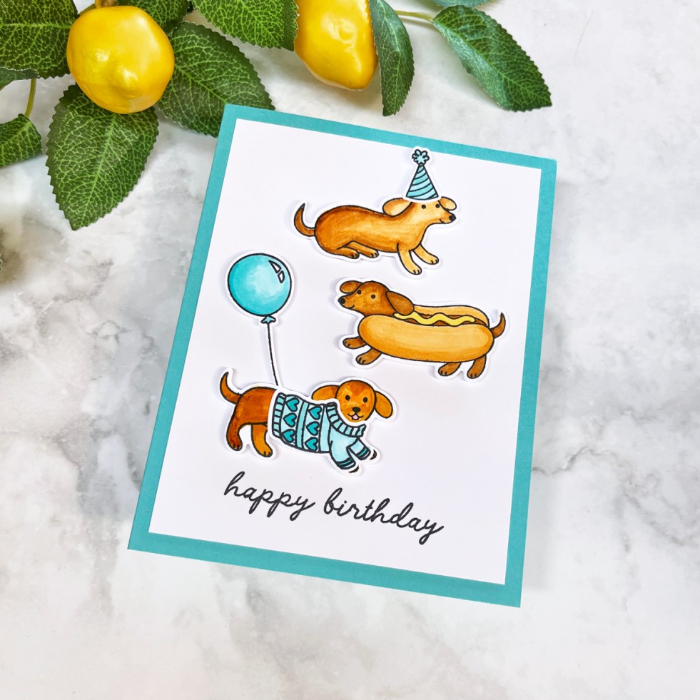
Learn how to create playful DIY birthday cards featuring adorable dachshund stamps, punny sentiments, and easy scene-building ideas. This beginner-friendly handmade card tutorial uses simple coloring, die cutting, and limited color palettes to create cheerful, memorable cards that are sure to make recipients smile.
Tag: Birthday Card
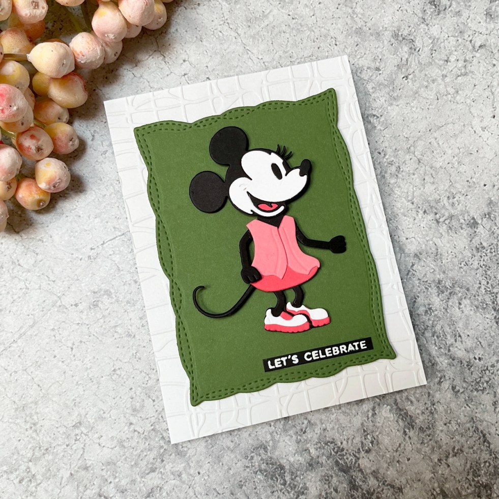
How to Make an Easy Minnie Mouse Birthday Card (One of the Best Die Sets for Beginners)
Create an easy Minnie-inspired birthday card using one of the best beginner-friendly die sets. Learn how to simplify colors, adapt die sets, and design a bold, graphic card with minimal supplies
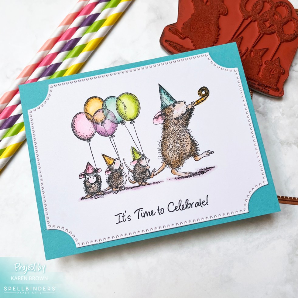
How to Make a Simple Birthday Card for Beginners (Adorable House Mouse Card)
Learn how to create an easy handmade birthday card using the adorable House Mouse Party Parade stamp set. This beginner-friendly card requires minimal supplies and comes together quickly with stamping and simple coloring.
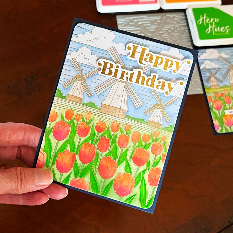
How to Create a Stunning Foiled Floral Card with Ink Blending (Frame-Worthy Results!)
Create a vibrant, eye-catching handmade card using hot foiling and stencil blending. This colorful windmill and tulips design is perfect for Mother’s Day, birthdays, or sympathy cards. See how black foil and satin gold foil create two completely different looks — plus tips for masking stencils, fixing crafting mishaps, and achieving beautiful foil results.
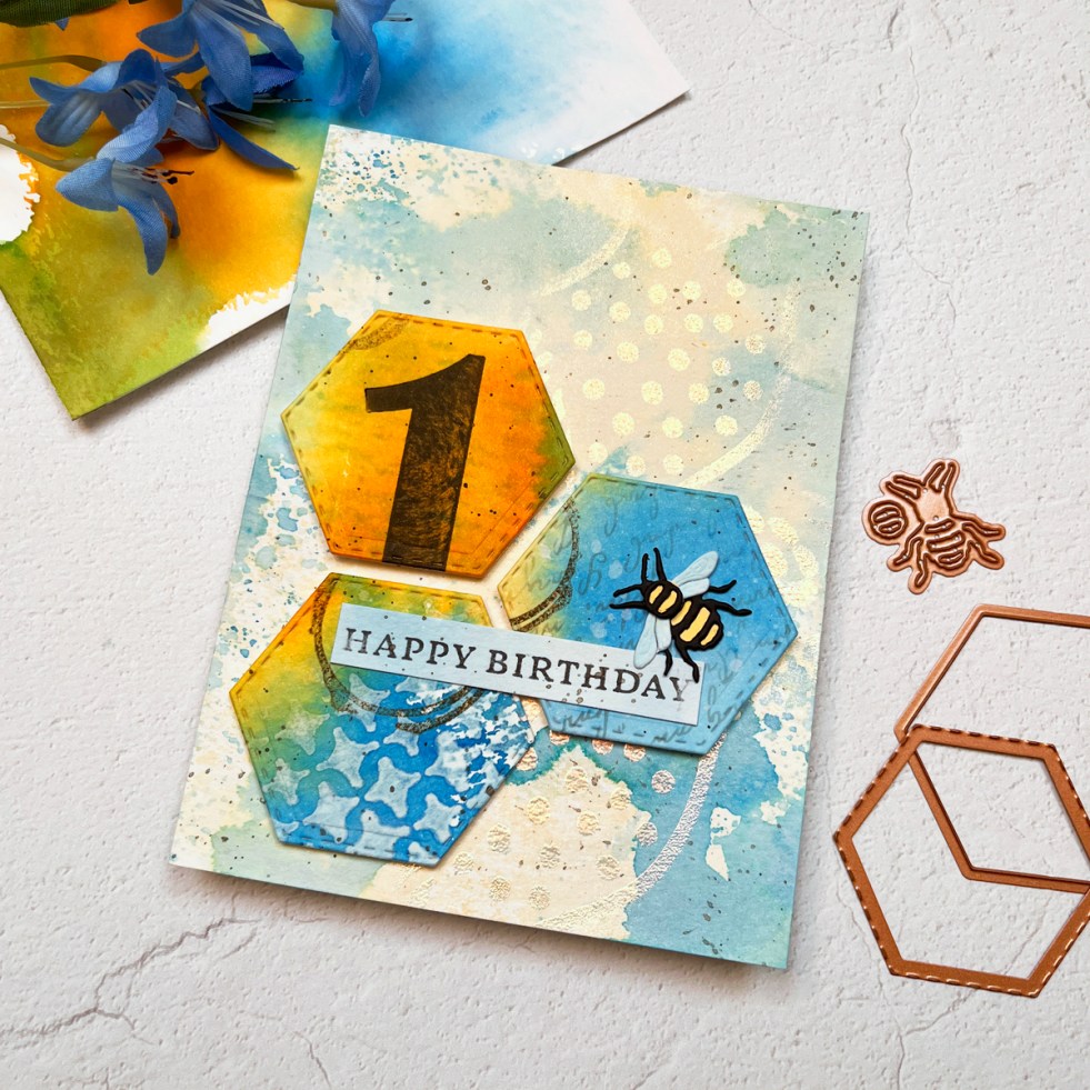
Ink Smooshing 101 — My Favorite Mixed Media Background Starter
Ink Smooshing 101 — the easiest way to create beautiful mixed media backgrounds. In this post, I walk you through five beginner-friendly variations, color tips, layering ideas, and how to turn two simple panels into a stunning hexagon birthday card.
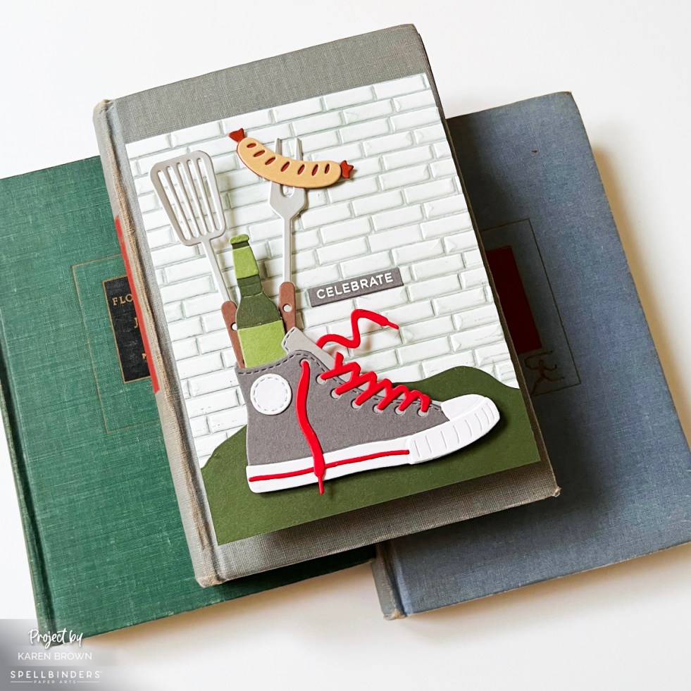
How to Create Die Cut Scene Cards: Easy Design Tips That Work Every Time
Learn how to create die cut scene cards using simple design principles that work every time. This masculine Spellbinders card features layered backgrounds, grounding foregrounds, and a playful focal point inspired by backyard cookouts. I used the Spellbinders March 2026 Large Die of the Month Club Kit called Classic Kicks.
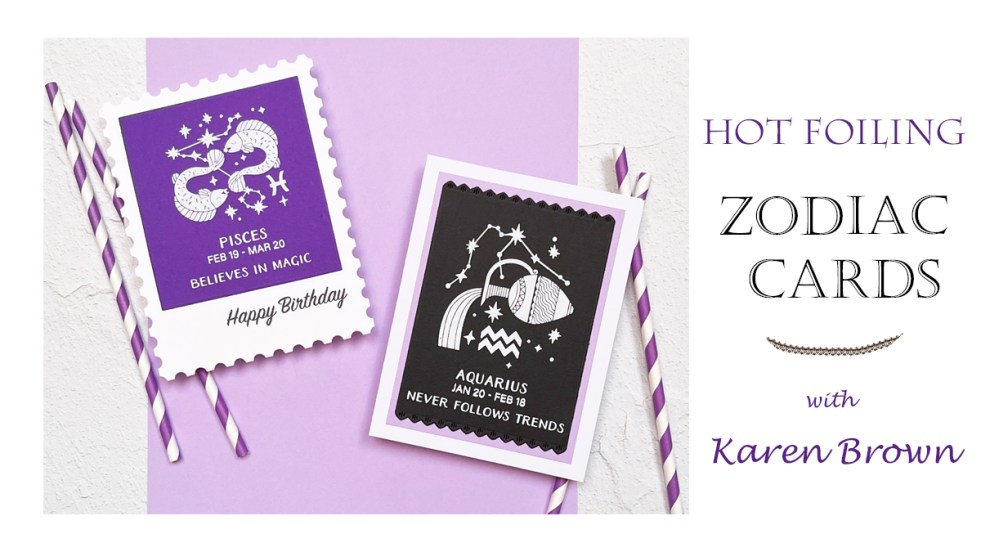
VIDEO: Zodiac Birthday Cards Made Easy with Hot Foiling (Pisces & Aquarius)
Some card ideas grab your attention… and others stick with you. With my birthday coming up this month (hello, Pisces ♓), I found myself completely drawn to Spellbinders’ Block Print Zodiac Series—a coordinated collection of 12 BetterPress and Glimmer Hot Foil kits, one for each zodiac sign. These kits create bold, graphic, and deeply personalized… Continue reading VIDEO: Zodiac Birthday Cards Made Easy with Hot Foiling (Pisces & Aquarius)
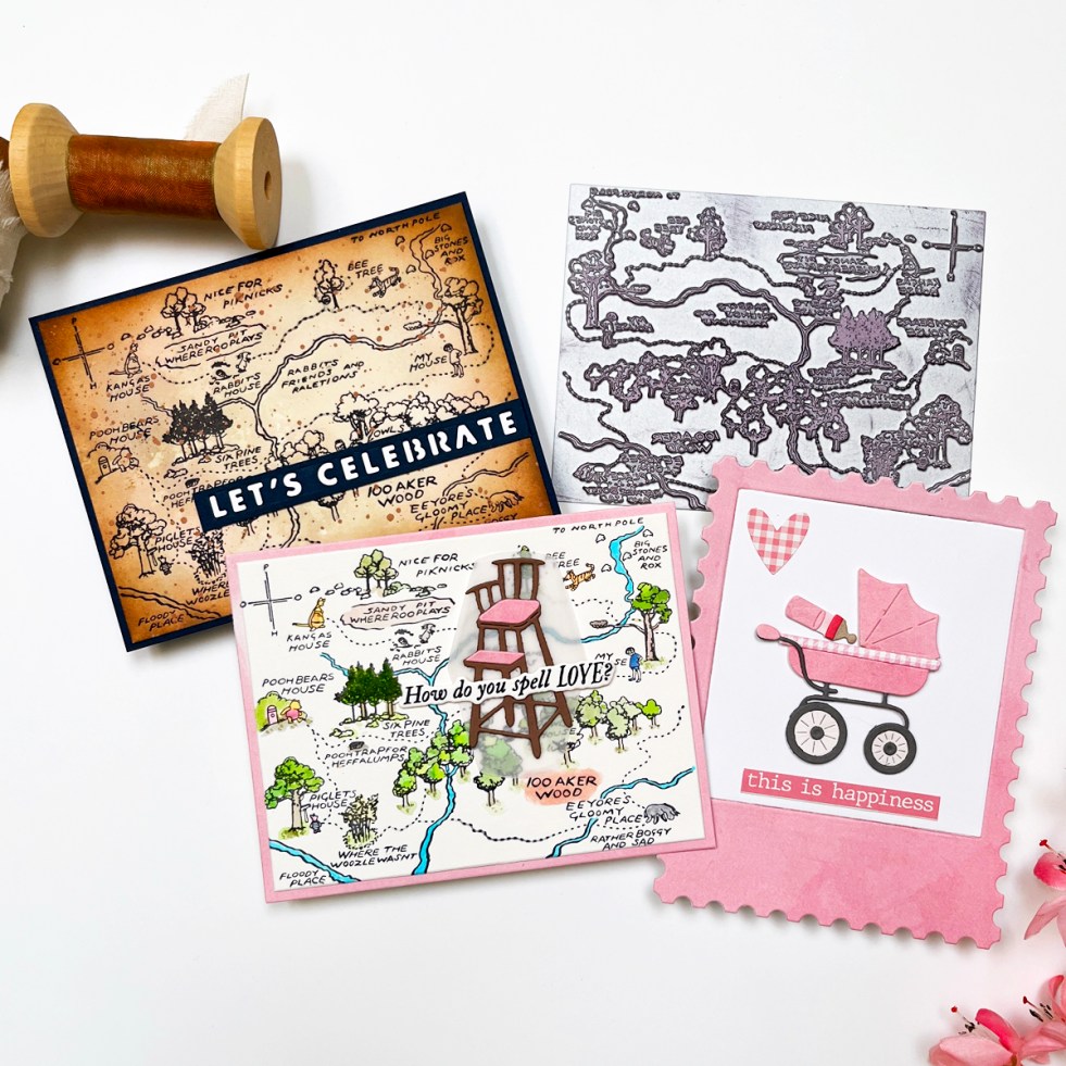
Handmade Winnie the Pooh Cards with Spellbinders Classic Pooh Baby Collection
I created three handmade cards using the newly released Spellbinders Classic Pooh Birthday Collection, including two baby girl shower cards and one rustic birthday card. Featuring the Hundred Acre Wood BetterPress Plate, watercolor details, mixed media techniques, and timeless Pooh charm, these projects show just how versatile this collection can be. From soft pink baby cards to an aged, masculine map design, there’s something for every Pooh fan.
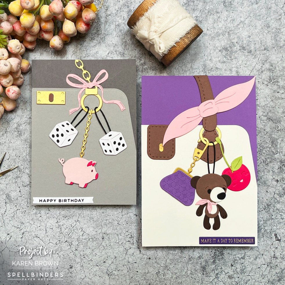
Spellbinders November 2025 Large Die of the Month – Charmed to Know You
Today I’m sharing two darling purse-themed cards using the Spellbinders November 2025 Large Die of the Month Kit – Charmed to Know You. This set is pure cuteness with so many ways to personalize your bag design. Think mini luxury handbag boutique… but in cardstock form! This die kit creates a fabulous purse with dangling… Continue reading Spellbinders November 2025 Large Die of the Month – Charmed to Know You
Spellbinders | Classic Cool: Masculine Birthday Card with a Retro Speedometer
This masculine birthday card features the retro charm of a die cut speedometer from Mindy Eggen’s new Classic Road Legends collection for Spellbinders. I used aquas, teals, and silver cardstock with a pop of coral to create a cool, monochromatic look—perfect for Father’s Day, birthdays, or celebrating life in the fast lane!
