Uncategorized

Altenew Educators "Favorite Old/New Altenew Stamp" Blog Hop and Linky Party + Giveaway


Hello friends!  I am so pleased to be participating in my first Altenew Educator Blog Hop!  I went through the certification program last year and loved every minute!  For this post, I wanted to focus on two favorite stamp sets that I purchased while I was a student in the program, Doodle Blooms and Inked Lotus

Altenew Doodle Bloom Die Cut Mixed Media Card

Using Stencils on Acrylic Gel Press Mixed Media Cards

I spent a day making 5 x 7\” acrylic gel press backgrounds in a variety of colors and using lots of Altenew stencils and stamps.  I love color and texture and wanted this \”daisy\” card to be bold and vibrant so I started with this gorgeous red panel.  With a brayer, I mixed pink, orange and brilliant red and applied to a plate that had some leftover yellow and green already on the press.  After the panel dried, I added  a layer using the Flowing Drops Stencil and then an additional layer of gold with the Narrow Brick Stencil.  You can see the lovely gold shimmer in the second photo.  

Altenew Doodle Blooms and Narrow Brick Stencil

Die Cutting Floral Images from Acrylic Gel Press Monoprints

Using the Doodle Blooms Bundle, I stamped and die-cut a bunch of blooms from some of the other hand-crafted acrylic panels.  I think this is such a happy and cheerful stamp set.  I laid the die-cut flowers on the red panel and selected the blooms I liked best on the background and adhered with foam tape.  The stems are from the Craft-A-Flower Cosmos Kit.   The flower centers are enamel dots from the  Glacier Caves and New Day collections.  I finished off by adding a sentiment with a strip of my favorite Painted Grid Washi Tape.

Tone on Tone Orange Mixed Media card.

The background from this next card is the top portion of the panel I used on the daisy card above. I die cut it with the largest Rounded Rectangle and then backed with foam for dimension.  The Inked Lotus was heat embossed and die cut from a coordinating monoprint panel for a tone-on-tone look and was adhered with foam tape.  The sentiment was die-cut from black cardstock using the Essential Sentiments Set.  

Acrylic Paint Gel Press Mixed Media Card.

I made a second similar card, but this time the Inked Lotus  was die cut from a red/orange acrylic panel where I brayered a lot of turqouise ink over the Narrow Brick Stencil.  This is my favorite stencil to use on monoprints.  The background panel was brayered with Yellow, Olive and Turquoise.  After the paint dried, layers were added with the   Leaves and Berries Stencil (blue), Mega Bloom Stencil and finally the Narrow Brick Stencil was lightly inked in gold over the background panel.  I love the dimension you get by adding layer upon layer with stencils and stamps.    

Blue and Violet Monet like Mixed Media card.

For my last card, I changed things up and used softer colors:  Sky Blue, Blue Violent, Light Purple and Brilliant Purple over a press that had some leftover Olive and Turquoise.  I then brayered over the Mega Bloom Stencil with a light coat of gold.  You can see the shimmer better in the second photo.  I again used the  Doodle Blooms Stamp and Die Bundle to stamp and cut my elements from a variety of  gel press prints.  I finished with  Glacier Caves Enamel Dots for the centers.

Blue and Violet Gel Press Card Background

Here is a photo of two of the backgrounds prior to card assembly.  You can really see how lovely the stenciled accents look on the panels.  

As I mentioned, I loved using these two stamps for my AECP class work.  Here are two homework assignments I submitted using the sets:

Prizes:

Altenew is giving away a $20 gift certificate to 5 lucky winners! Please leave a comment on the Altenew Card Blog (https://wp.me/p6Dps1-deu) by 4/4/2021 for a chance to win. 


We’ll also draw a winner to receive a $15 Altenew gift certificate from the comments left on each designer’s blog on the blog hop list below. All winners will be announced on the Altenew Winners Page on 4/6/2021.


We Want to See Your Creations Too!

What’s a hop without YOU?! We have included an Inlinkz at the Altenew blog for you to enter your gorgeous Altenew “Old/New Favorite Altenew Stamp” creations. We will pick 2 of our favorite handmade creations from those who joined the linky party and they will each receive a $15 Altenew gift certificate!


If you arrived from NatashaDavies you are right on track!  


Altenew Card Blog

Bridget Casey

Colleen Balija 

Teresa Litchfield

Katrina Howe

Rosie Neustaedter

Terri Marie Koszler

Tenia Nelson

Pam Boedeker

Nandini Karmarkar

Amy Hill

Irina Fonina

Natasha Davies

Karen Brown             You Are Here!

Helen Kalb

Patty Mello

Roteja Galvan

Eva Bussom

Fiona Duff

Jaycee Gaspar

Vicki Finger

Nenette S. Madero

Teri Wilson

Rachael Shedeed

Neha Aggarwal

Kari VanNoy

Teri Stokes

Amber Rain Davis

Virginia Lu

Sandra Woodson


There is plenty more loveliness, so keep hopping!   Be sure to head to Helen\’s  fun post next!


I would love to hear which card you liked best.  Thanks for stopping by!
Karen

Uncategorized

Altenew Academy Level 3 Workshop


Hello!  I am so excited to share the final project for my Level 3 Altenew Academy Educator Certification Program.  At left I am talking about my samples for the ink-blending card we created.  

This has been such a fun journey for me! I started the certification program in May and since then I have taken 25 classes, written 25 blog posts about what I learned and completed a final project for Level 1 and Level 2.  The class instructors taught me new techniques and improved the skills I had.  I\’ve worked hard, learned a lot and enjoyed every moment!

I invited four good friends over for a morning of card making and it became an \”international event\” with the on-line attendance of  Virginia Lu of Canada and Erum Tasneem of Pakistan.  They have been so encouraging and were with me every step of the way.  

I started by creating two beginner level card projects to teach to my participants:  faux watercolor stamping and ink blending with stencils.  I worked on my lesson plan, came up with a timeline and created sample cards which I submitted to Virginia in advance.  The day before, I set up the workspace for my class.

Each work station had a silicone mat, microfiber cloth, blending brush, stamps, stencils, washi tape, A2 card panels, two die cut sentiments, acrylic blocks, ink, liquid glue, A2 card bases, colored envelops, tags and ribbon.  

We talked about analogous, monochromatic and neutral colors and demonstrated how to use the color wheel.  Next we selected our ink colors, inked our stamps and then spritzed with water for a faux watercolor look.   We set our faux watercolors aside to dry and practiced ink blending on a panel.  Several of my friends liked their practice panel so much that they made a third card even though the class plan was for two.  I had plenty of extra card bases and sentiments so our impromptu cards came together just fine. For our planned second card we did ink blending over a stencil.  We then trimmed and assembled our cards and we made such a happy mess!
This is what the table looked like when we were done.  Liz created the three cards above.  The one on the right is faux watercolor, the middle is the practice ink blending panel and the left was the planned ink-blending over a stencil card.  Below is Liz with her three cards.

 Nancy and her cards are below.  Nancy created a bonus card also.


Rhonda created three cards as well.
Kathy\’s cards turned out great too!

Of course we needed a group photo as well.

I think my friends had a great time….as Nancy said \”Making cards is relaxing, fun and therapeutic\”.  Exactly!
A big thank you to Virginia, Erum, Kathy, Rhonda, Nancy and Liz. What a fun day!
Essential Altenew Supplies:
Block Print Stamp Set (for faux watercoloring)

Flowing Drops Stencil

Hello Die

Thanks for stopping by!  It was most enjoyable and I am happy to share the experience with you.
Karen


Uncategorized

WWC294 – Marsha\’s Challenge: Anything Goes With a Masculine Twist


Hello, hello and welcome!  This week we are creating masculine cards at Watercooler Wednesday.  I\’ve made a fun mixed media card using Altenew\’s Mega T Aphabet die and thanks die.

My Process:
  • I started with a 140 lb weight watercolor panel and then die cut the T. 
  • With a wide rough brush (I used a house painting trim brush) I applied a layer of gesso and then dried. 
  • Using a Carved Pumpkin mini distress ink cube I dabbed orange on the panel in random locations.  
  • I sprayed Iridescent Shimmer Spray to the panel which moved the distress ink around a bit and then dried with a heat tool.
  • I added another layer of randomly dabbed Carved Pumpkin Distress Ink which I again activated with the shimmer spray and then dried.
  • I then mixed gesso with Mermaid Lagoon distress ink and applied with a strip of cardstock for a rustic feel.  I then tinted the gesso a bit darker with the same distress ink and applied a bit more with the cardstock strip.  This way I have two shades of aqua on the card which I think gives added interest. Dry.
  • I dabbed a bit of Versamark ink on the panel, sprinkled on gold embossing powder and rubbed off most of it so that there were just touches of gold on the panel.  I heat set.
  • I die cut the thanks die from turquoise card stock.
  • I added the T panel to a cream colored A2 cardbase and glued on the sentiment.
This thank you card was so fun to make! There is a gorgeous shimmery sheen that does not photograph well, but the card just glows in person.

I am also playing along with:


Simon Says Stamp \”Layer It Up\”  I used 7 layers of gesso, distress ink, shimmer spray, embossing powder plus two die cut layers.  

I am so glad that you stopped by!
Karen 
Uncategorized

Multi Media Cards With Loads of Gorgeous Texture

Hello, hello and welcome!  I am excited to share a couple of cards that I made after taking Demystifying Mixed Media at Altenew Academy.  I think I can safely say this is the most fun class I\’ve taken to date.  Tania Ahmed is a wonderful and inspiring instructor and I went crazy making backgrounds!  I made 7 cards and 8 backgrounds, two of which I am showcasing in this blog post.  I will be sharing the rest of the cards in future posts.  


I love that there are really no rules with mixed media. It seems the best thing to do is lay out your messiest supplies and then select a bunch for each card.  Do not be a minimalist when experimenting with multi-media.

This first background was made by hand-dipping the background and custom tinting my embossing paste.  

  • I mixed Zig Cobalt Blue with water and Irridescent Shimmer Spray and then dipped a piece of Bristol cardstock into the colorful puddle.  I dried the panel and then repeated.
  • I tinted my Embossing Paste with Carved Pumpkin distress ink for a fallish vibe.  
  • I swiped the embossing paste over my stencil with a palette knife.  I wanted a rough look so I didn\’t cover the entire stencil and I made sure there was a variety of thickness to the paste. 
  • While the embossing paste was wet, I sprinkled just a bit of Peach Embossing Powder on the paste and then heat set. I love the texture and interest it adds. 
  • I heat embossed Altenew\’s Best Mom spray (in brown) and then watercolored and die-cut the image.  
I think the aqua, sherbet and brown make for a very striking card.

My second card uses watercolored embossing paste, tulle (a first on a card for me) and loads of paint splatters.

  • I applied texture paste through the Feathered Leaves Stencil and then heat set.
  • Using diluted watercolors mixed with shimmer spray, I loosely colored the background in blue and yellow.
  • Using a damp paint brush, I feathered the watercolor edges and then dabbed with a cloth to soften the edges.
  • I added blue, yellow and black paint splatters.  
  • I stamped, watercolored and die cut the  Weekend Doodles floral spray.
  • I cut an oval from some tulle gift wrapping ribbon and glued to the back of the floral spray and then adhered the combo to the card base.
  • I added a simple sentiment embellished with Painted Grid Washi Tape.

I am also playing along with:

Creative Artiste\’s Mixed Media Challenge I used paint, shimmer spray, embossing paste, embossing powder and of course paper.  

The Flower Challenge #49 \”Circles\”  I love the textured circles on this background.

UPDATE:  The top card won at The Flower Challenge \”Circles\” Challenge

I hope you will stop by in the near future and see the rest of the Multi-Media cards that I created.

Karen

Uncategorized

WWC292 – Dawn\’s Challenge: Anything Goes With a Feminine Twist

 Hello, hello and welcome!  I created this card for this week\’s Watercooler Wednesday Challenge.  I recently took Altenew\’s Artist\’s Watercolor 101 course taught by Emily Midgett and the last class was on painting \”white\” flowers.  Such a pretty look but I had never attempted anything like it.

I started by heat embossing these big beautiful blooms (Picket Fence Studio Lily Coloring Class stamp).  Next I created a diluted grey watercolor halo around the flowers.  I started close to the image and then pulled the water out with a damp brush.  To ensure my brush didn\’t have too much water I dabbed it on a stamp shammy. This really helps me control the amount of water I use.  I let this layer dry completely.

Next I started on the blooms.  I added very diluted grey shadows but remembered it is important to leave some uncolored white areas so the flower appears to be white.  I then added bits of diluted blue and pink. Lastly, to brighten the bloom, I added hints of yellow to the edges of the petals.

I finished the background by adding diluted blue up close the the bloom and then moving the watercolor around the panel.  I did the same with pink and yellow so the colors of the flower and background were the same. 

This watercolor technique is very delicate and understated but is beautiful in person!

I am also playing along with:

Thank you for stopping by!
Karen


Uncategorized

Quick and Simple Cards

Hello, hello and welcome!  I just completed Laurie Willison\’s Altenew Academy Class called Quick and Simple Cards and I wanted to share two of my creations.  I love making backgrounds and both of these cards focus on the backgrounds.   This first card was my homework assignment for Faux Watercoloring.  

I recently purchased  Altenew\’s Block Print stamp set and thought it would be fun to \”faux watercolor\”.  The stamp set has four vingettes and I loved this one with diagonal and vertical lines.  I inked up the stamp with Carved Pumpkin, Candied Apple and Seedless Preserves Distress Inks and then spritzed with water. 

I then pressed the stamp onto Bristol cardstock and let it sit for a few seconds.  I also did a panel on watercolor paper, but the detail was lost so on this card, I used the Bristol panel.  I really love this vibrant color combination for fall.  

I wanted the focus on the background so I kept the other elements black and white.  I stamped the darling leaves cluster from The Retro Plantines stamp and die set and then die cut.  I added a simple sentiment but added a strip of Painted Grid Washi tape to the top for a little added interest.

The second card features a three tone stenciled background.  I masked off a 3/4\” border and then taped the Feathered Leaves Stencil to the panel. Using three different analogous ink colors (Wild Honey, Carved Pumpkin, Mustard Seed), I ink blended each leaf a different color.  I thought these colors made such a pretty seasonal background.  I then heat embossed The Best Mom spray using chocolate brown embossing powder. I really like the effect on the card.  

I attached the panel to an A2 card and added a simple birthday sentiment on brown cardstock along with a couple of buttercream jewels. 

Two quick, simple and easy to make cards!  

I am also playing along with:

Thank you for stopping by!
Karen


Uncategorized

Finding and Incorporating Inspiration Into Your Project

Hello, hello and welcome!  Today I am blogging about a fascinating class I took at Altenew Academy called Mission Inspiration. Nicole Watt was our instructor and instead of focusing on technique, this class was all about finding inspiration for our creations.  

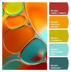
For this post I wanted to use a combination of color and layout inspiration for my cards.  I envisioned a trio layout with color selection coming from Pinterest.  Nicole had great ideas for searching for \”color combos\” and I found this quite fun! I also decided to work on staging and styling my photographs and I am pleased with the result.


I loved the graphic below and used the red, orange, citronella green and teal as the color inspiration for my card. 

I hand inked the background because I thought the result was more vibrant than the colored card stock I tried first. The center of the flower is a fun enamel dot.


The second card is very similar but I used three flowers from the same stamp set and a different color inspiration graphic.

Here is the inspiration swatch for my second card.
Again, I ink blended the background and then colored the blooms in melon and pink.  The centers are enamel dots which adds a fun detail to the card.
Here are the cards together and I think they are a bright and happy duo.  Inspiration is everywhere and I will be drawing on these six classes as I create in the future.

Altenew Products Used: Link Here

Altenew Doodle Blooms

Altenew Pinstripe (sentiment)

Altenew New Day Enamel Dots

Altenew Jet Black Crisp Die Ink

Altenew Envelope Variety Pack

I am also playing along with:

As You Like It \”Bright or Pastel\”  I almost always go with bright on my cards because I love bold colors.  🙂

Thank you for stopping by!

Karen

Uncategorized

Altenew Academy Watercolor 101

Hello, hello and welcome!  I was so pleased to learn that I passed the Altenew Academy Level 2 Final and can now begin working on Level 3 courses!  For my first level 3 class I chose to take Artist\’s Watercolor 101 taught by Emily Midgett.  It may be my favorite class to date!  Emily\’s explanations and demonstrations are excellent and so easy to follow.  I had so much fun during this class that I included two cards in this blog post encompassing three of Emily\’s lessons.

I watercolored the lotus using techniques in we learned in Lesson 2:  Basic Watercoloring and the background is from Lesson 3:  Ombre Backgrounds. I chose to use the lotus stamp because the \”sketched lines\” help indicate where the shadow should go.  
My Process:

I wanted to use fall colors so I started by heat embossing the bloom with chocolate brown embossing powder. Emily taught us to slightly elevate the panel and then slowly build layers of color starting at the inked lines and then pulling the color out with a damp brush.  The watercolors were fairly diluted.  I started with yellow, then moved to orange, then scarlet and then a more concentrated scarlet in the deepest shadows.  The first layers should have with widest application of color and each new layer should stay closer to the inked lines.

Keys to Remember:  
  1. In the past, I think I\’ve had too much water on my brush. Emily showed us that if you dab your brush on a stamp shammy you will have the correct amount of water.  This really helped me.
  2. Use fairly diluted watercolors.
  3. Keep the tip of the brush pointing away from you. Rotate the paper and use the slant of the board to move the paint.
  4. Remember to let each layer dry before beginning on the next layer.


I wanted a coordinating background so I used the same colors that I used to paint the lotus.  I taped the watercolor panel to a board to reduce warping, elevated the board and then started painting at the top with a #12 brush.  We learned to put darker color at the top and then pull the color down with a damp brush. Keep adding color and then maneuvering the color around with a damp brush.  Flip the board, skip an area and then add the third color then pull the color toward with scarlet.  Pull color down and push the middle color up.  Continue adding layers of color and keep blending.  I die cut the lotus, heat embossed a sentiment on cocoa card stock, assembled with foam tape and added some buttercream jewels.  I like how bright, intense and cohesive the color palette is.  I am very pleased with this card.

I find no-line watercoloring very intimidating so I was eager to start lesson #5.  I feel like it is an advanced technique but Emily broke the steps down in such a way that I was comfortable painting.  I thought it would be fun to compare and contrast the same lotus flower painted with the two different techniques.
            
Emily recommends no line stamping with Ink on 3 Fadeout.  This was my first time using this ink and it worked well.  The key to no line watercoloring is to maintain contrast between the light and dark areas.
I started with fairly diluted paint, put my first color down and then pulled it out with a damp brush.  Skip to an area that does not touch and then repeat the process until the first layer is down.  After the first layer is dry, start with the second color but don\’t cover all of the first layer. Dry and add color 3 to the nooks and crannies.  Do not add the third color to each petal as this keeps interesting contrast.  Add the 4th color to the darkest shadow areas.  

For the background, I randomly stamped \”mini branches\” on about half the background with pink. Next, starting at the top, I ink blended a gradient toward the bottom. The bottom third of the card does not have any color.

I assembled the card and added a navy die-cut sentiment and some water drop embellishments.  

Here are both cards side by side. Which do you like best?
Altenew Featured Products: Here
I also wanted to play along with:
The Rainbow Card Challenge #21 Autumnal Amber.  I am submitting my first card that was done in shades of autumnal amber.  
Thank you so much for stopping by!
Karen


Uncategorized

Altenew Academy Level 2 Final Project

Hello, hello….so pleased you stopped by! I finished Altenew Academy\’s Level 2 Classes and wanted to share my final project.  I was challenged to make four masculine cards for four different occasions. I had loads of ideas and had a lot of fun creating.  To make my cards masculine, I used my husband\’s favorite colors….aqua, blue and green.   Mark probably wears an aqua or blue Columbia fishing shirt five days out of seven…he calls it his uniform!    I also used lots of die-cuts because Mark loves those on cards.   The unifying elements are handcrafted backgrounds and embossed sentiments on navy cardstock.   I\’ve learned so much over the past three months but I decided to spotlight three favorite classes:

  • Beyond Basic Backgrounds – We learned to make beautiful backgrounds to enhance our cards.
  • Celebration Stencil Techniques – We learned to expand our stenciling repertoire. 
  • Masking Unleashed – We learned various masking techniques that up the \”wow\” factor of our cards.

Encouragement Card:

This first card is my husband\’s favorite of the group. Mark\’s beverages of choice are coffee and hot tea….he makes a pot of each every day and  the color yellow is very encouraging and optimistic (In The Mood For Color). My idea was to make inlaid circle die cuts that coordinated with a hand crafted background.  We worked on inlaid die-cutting in Beyond Basic Backgrounds and stencil overlays in Celebration Stencil Techniques.  

  • I started by taping my Altenew Watercolor Stripes stencil to a watercolor paper panel.  I then wet the paper with clean water and then dabbed and pounced three colors of distress ink onto the paper.  I LOVE this technique and think it makes a very fun background.  
  • Next, I took a second watercolor panel and used the wet on wet technique to dab the same three colors of distress ink on the panel.  After the paper dried, I die cut three 1 1/2\” circles.
  • I die-cut a white watercolor paper overlay for the inlaid technique.
  • I stamped, Copic colored and die cut three coffee/tea elements from Altenew\’s Tea Time stamp and die bundle.
  • I heat embossed an encouraging sentiment on navy cardstock.
  • I assembled the card using liquid glue and foam squares (for the cups and sentiment).

PRO TIP:  Don\’t over-wet the watercolor paper.  If you do, the ink will flow under the stencil and you will lose the white lines.  You do want it watery enough that you achieve a casual watercolor look.

Birthday Card:

This card was inspired by the class on Color Blocking and the negative masking we learned in Masking Unleashed.  I think the bold colors are both festive and masculine.

  • I started by negative masking three 1 1/4\” squares.  I then used ink blending brushes to liberally apply ink to the squares.
  • I stamped and die cut three images from Altenew\’s Garden Grow stamp and die bundle.  I wanted the colors to be the star so I left the images uncolored.  I think this makes for a very eye-catching look.
  • I heat embossed a birthday sentiment on blue card stock and then assembled my card.

PRO TIP:  For a sharp edge, be sure your mask is evenly and securely adhered to the card panel.

Love/Thinking of You Card:

I love ink blending and negative masking so I again drew upon the lessons learned in Masking Unleashed.

  • I masked off a large negative mask around my card panel.  I blended in a medium blue and then applied a vivid blue around the edges.  So pretty and fun to do!
  • I stamped, Copic colored and die cut two images from Altenew\’s Garden Grow stamp and die bundle.  This is one of the first stamp sets I purchased and it is still a favorite!
  • I heat embossed my sentiment, assembled my card and attached to a top folding A2 card base.

PRO TIP:  I think using two shades of blue added depth to my one layer card background.  

Anniversary Card:

I knew I wanted to use the wreath from Altenew\’s Weekend Doodles and I thought it would be beautiful colored in green.  This was the starting point for my card.  After I had stamped, Copic colored and die cut the wreath I thought about backgrounds.  I finally decided to go with another bold color coordinated stenciled background.


  • I Copic colored the wreath with 3 different shades of yellow-green and green.  
  • I started by taping my Altenew Watercolor Stripes stencil to a watercolor paper panel.  I then wet the paper with clean water and then dabbed and pounced four colors of distress ink onto the paper.  I told you above that I love this technique!  
  • I die-cut and assembled the card on a top-folding A2 base.    


Here is a photo of all the cards.  To see what I did with the muslin bag, please keep reading.

Upcycled Item:

Finally, we were asked to upcycle or alter an item. I ordered some muslin favor bags for my daughter\’s wedding and have quite a few left so I thought this would be the basis for my upcycle project.  I thought they would be cute \”envelops\” for cards given in person or fun little gift pouches. A lot of the techniques we learned at Altenew Academy can be applied to non-card projects and I would like to share the processes I used to  decorate my muslin bags:

·        Stamping on fabric

·        Coloring on fabric

·        Ink blending on fabric

·        Felt die-cuts adhered to fabric

·        Stamp layering on fabric

I started by personalizing a little bag for each of the cards that I created above. 


For the first two cards, I ironed the bag, secured it in my Misti and stamped just once.  That is all it needed and I was afraid the fabric might shift if I stamped it a second time.  I then did some easy coloring with my Tombow markers.  The fabric colors well but you can’t do much complicated shading.


For the Encouragement Card, I masked three squares and then ink blended white pigment ink inside the squares. I let the ink dry and then I stamped (with black Pigment ink) 3 coffee mugs.  I finished by drawing a black border around each square with a permanent marker.  Simple but graphic looking.

For the Color Block Card, I again masked three squares and then ink blended with the same (distress) inks I used on the cards.  It is interesting that the colors change a bit on fabric, but the result is a bright fun pouch.

PRO TIP:  I inserted a piece of paper inside the bag to prevent the ink and glue from bleeding through to the backside. 

While I was at it, I wanted to do some felt die-cutting.  For my first card I die cut five balloons from felt and glued blue thread to the back.  For the second card I die-cut a Mega Alphabet B and added a sprig of die-cut greenery.


PRO TIP:  To keep the felt from stretching and tearing while die cutting, I first glued a piece of regular paper to the back of the felt.  I let it dry overnight and did my die-cutting the next day.  This makes a huge difference in the quality of the die-cut!

My final idea was to do a bit of stamp layering on fabric.  I used pigment ink, dried with my heat tool and then moved on to the next color.  This card is definitely feminine but I wanted to try the technique on muslin and all my layering stamps are flowers. 

Featured Altenew Products:

Altenew Watercolor Stripes stencil

Altenew Tea Time stamp and die bundle

Altenew Garden Grow stamp and die bundle

Altenew Weekend Doodles stamp and die set

Altenew Bride to Be stamp and die bundle

Altenew Mega Alphabet B die


I really enjoyed putting this project together!
Karen


Uncategorized

Altenew Academy – Masking Unleashed

Hello!  Well, I am still camping out while work continues on my house, but it left me plenty of time to finish my next Altenew class called Masking Unleashed. I did have to run home to get my inks and blending brushes.  Svitlana Shayevich taught us loads of useful tips and techniques.
 For this card, I chose to work on negative masking.  In the past, I’ve done positive masking where you cover the image you are working on.  With negative masking, you cover the area surrounding an image.  In lesson 4, Svitlana also taught us how to ink blend with  Negative Masking.

 I decided Altenew’s Mega Alphaget “T” die would work well and started planning a thank you card.

My Process:
  • I trimmed a piece of masking paper to 4 1/4” x 5 1/2”,  taped the die in the center and then ran it through my die cutting machine. I then carefully adhered it to a Bristol Cardstock panel.  
  • Next, I lightly blended four shades of Distress Ink from the bottom to the top.
  • I taped the stencil at an angle over the “T” and blended 5 shades over the stencil using a much heavier hand.  I carefully peeled back the masking paper, trimmed the panel down, attached some craft foam to the back and added it to a top folding A2 panel.
  • I die cut a sentiment from navy Cardstock and glued it to the panel.  I also added three enamel dots in coordinating colors.
Pro Tip: Make sure the masking paper is firmly in place before you start ink blending so you have sharp clean lines.  I used a bone folder.
Featured Supplies:
Altenew Mega Alphabet “T” die
Altenew Watercolor Stripes stencil
Altenew Thanks die
Altenew New Day Enamel Dots
Just Add Ink “T” Challenge. My card is T for thanks.
I am so pleased that you stopped by!
Karen