I\’ve been working my way through Level 1 at The Altenew Academy and just completed my Final Project which was to create a set of \”feminine\” and \”masculine\” gifts sets. I have to say I learned so much and had loads of ideas but I would like to show you the cards I created for my final project. I incorporated lessons I learned in:
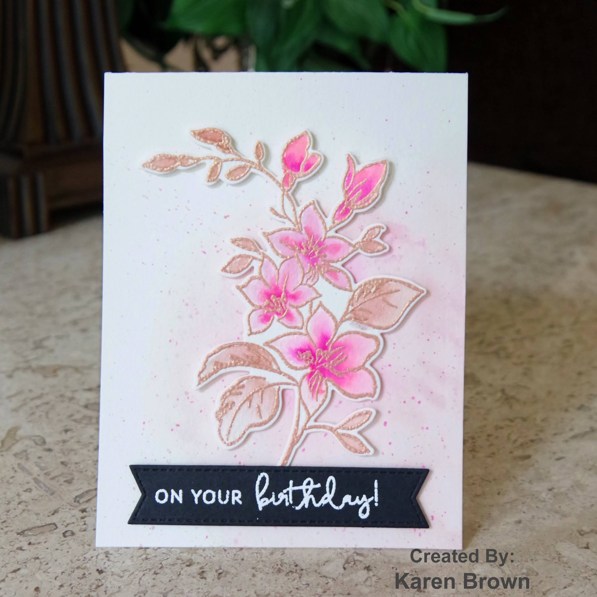
- Let It Shine where we discovered how to add just the right amount of sparkle and shine to a card. I used metallic heat embossing and metallic watercolors on my feminine cards.
- Easy Die Cutting where we learned to use die-cutting to up the \”Wow\” factor. I used die-cuts on each of my cards as I think they add loads of impact and felt this unified both card sets.
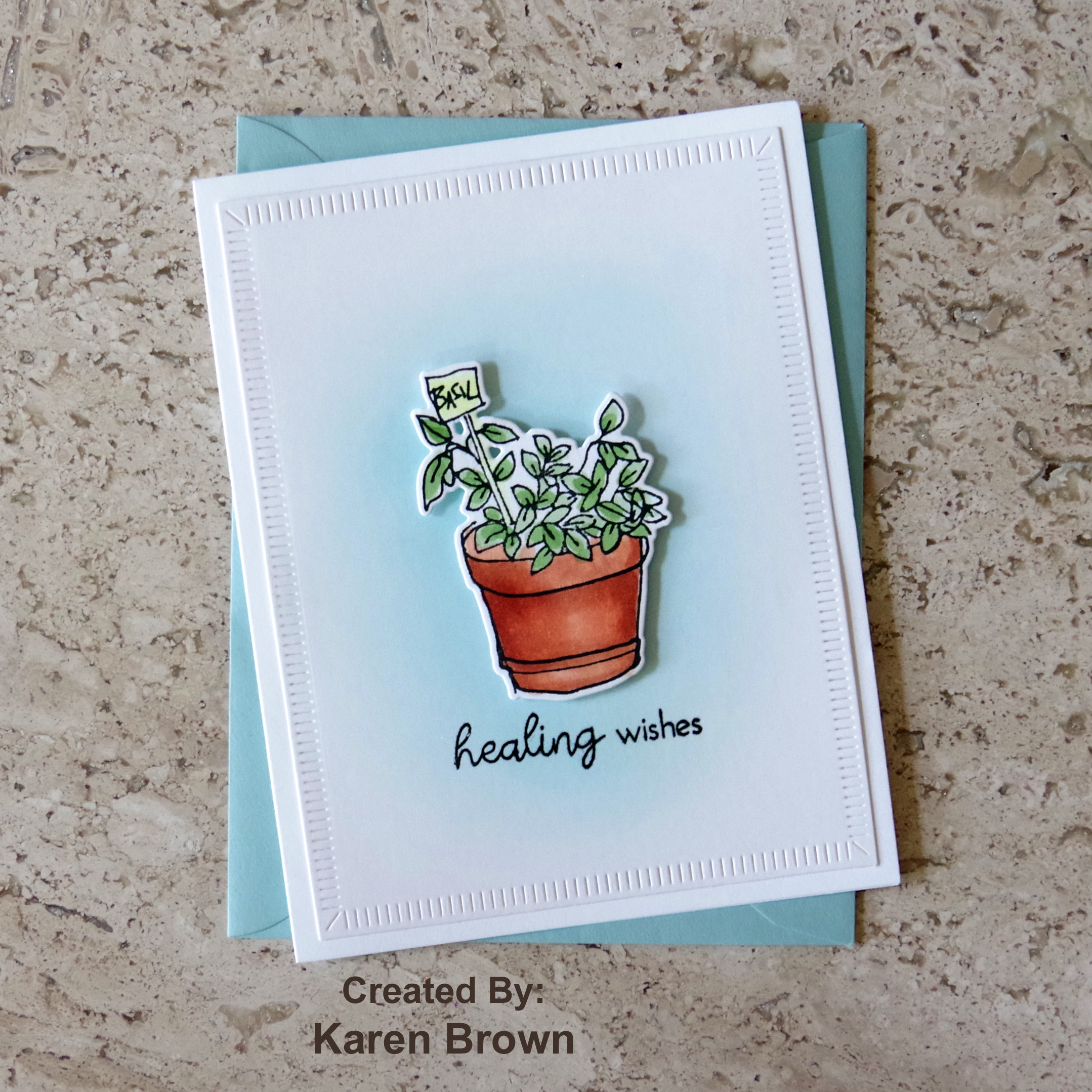
- Easy Ink Blending – I used several ink blending techniques on my masculine card set. My two favorites were the soft blue background on the Healing Wishes card and the die-cut spotlight circles on the Get Well Soon card.
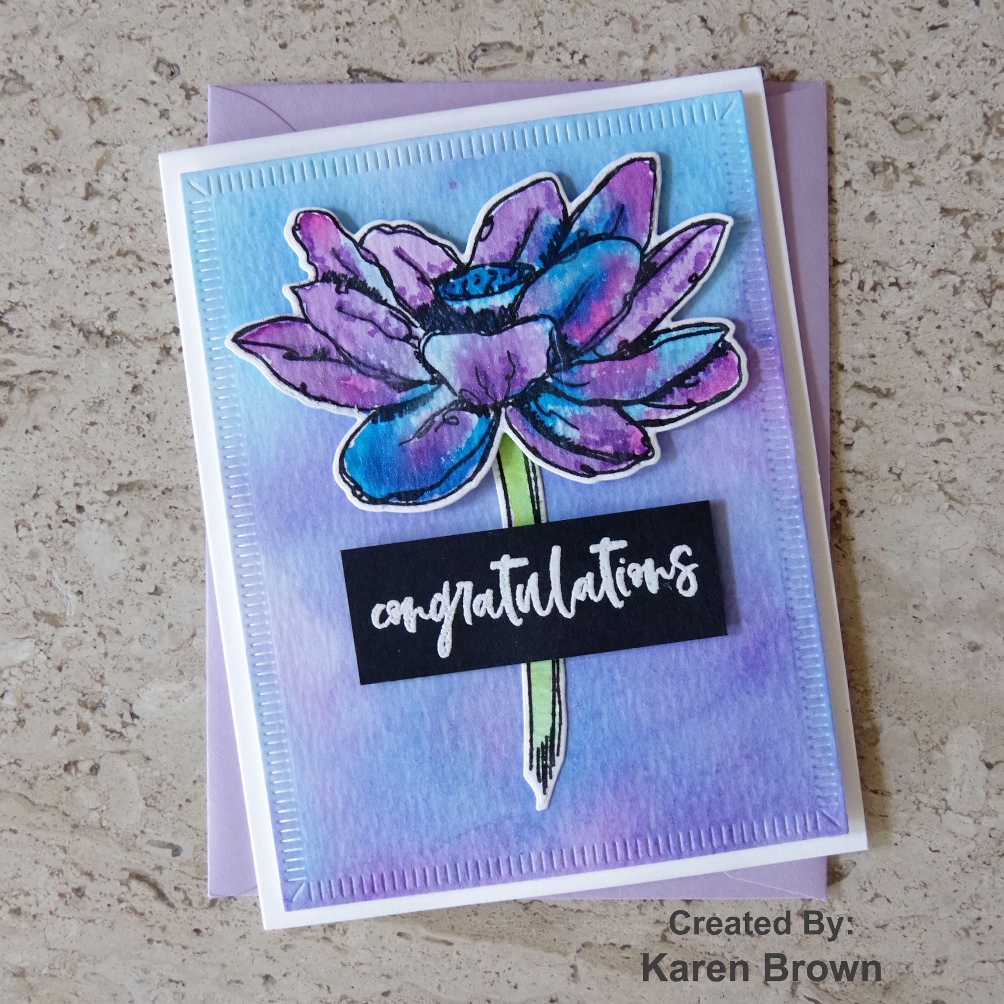
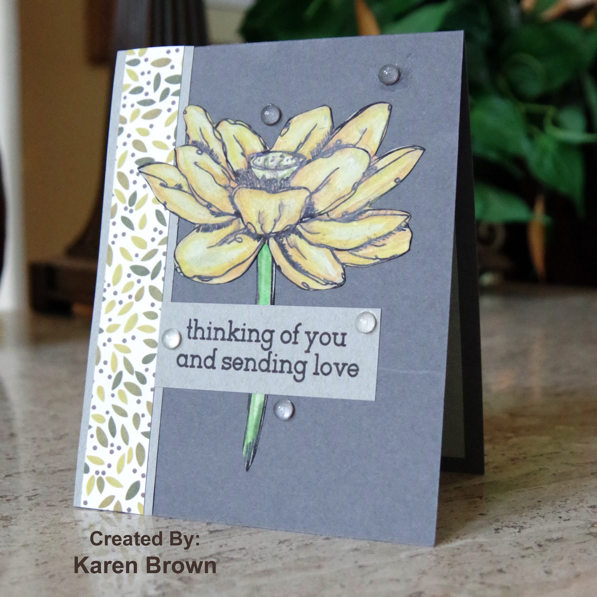
For my \”feminine\” cards I wanted subtle metallic touches combined with watercoloring. I kept the set cohesive by using cream card stock/watercolor paper, floral images, a pink and green watercolor palette and navy die-cut sentiments.
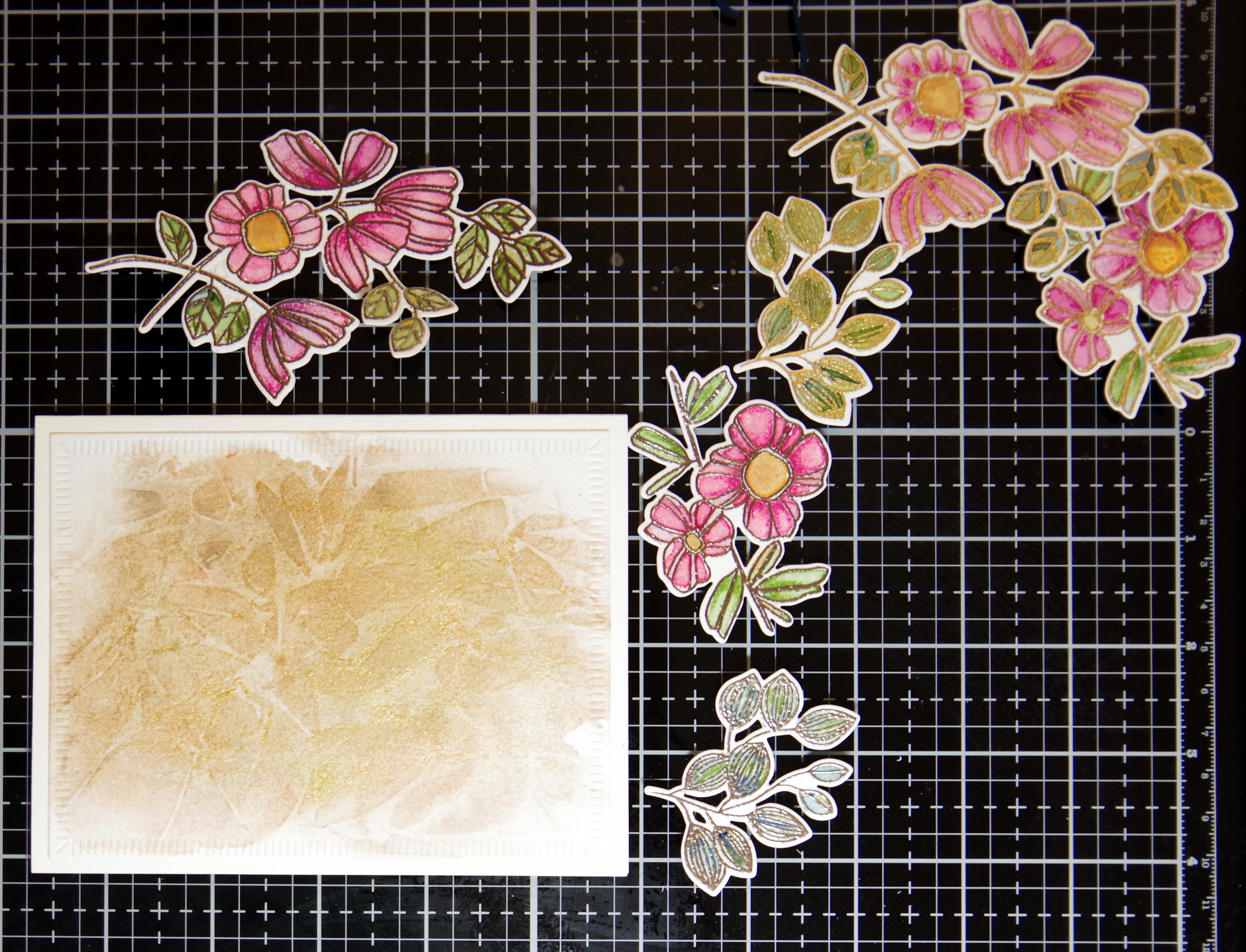
For this first card, I created a metallic watercolor background which is so pretty in person. I then stamped, heat embossed and watercolored the floral images. After the flowers dried I added a pearlescent white gold watercolor wash over the top which gave the flowers a beautiful sheen. I die cut the images and attached with foam tape. The next photo shows the first three card in process.
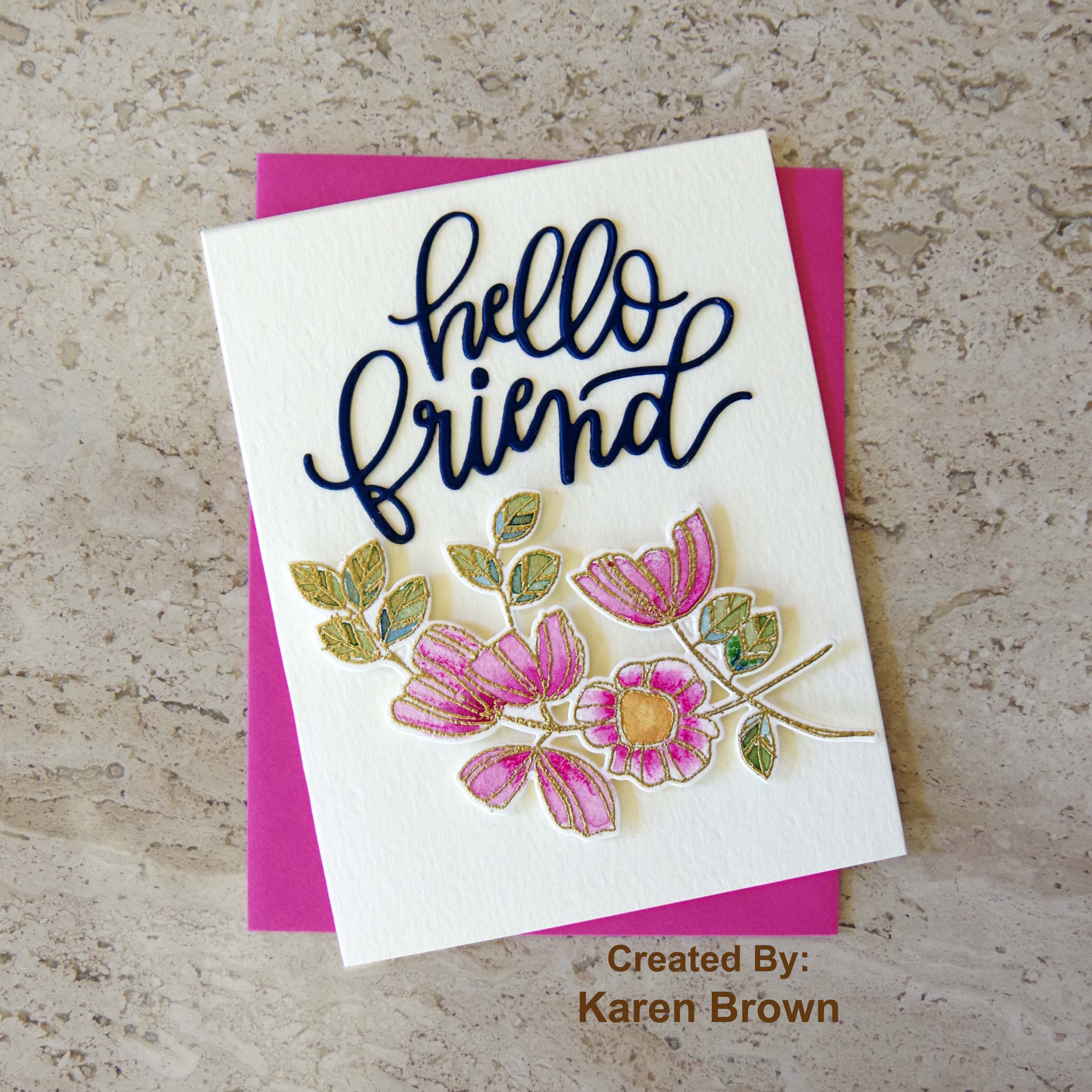
Here are the cards that round out the gift set. On each card I used big bold die-cut occasion sentiments cut from navy cardstock.
I really like this feminine spray and think the navy die-cut sentiments are beautiful and anchor the look of this set.
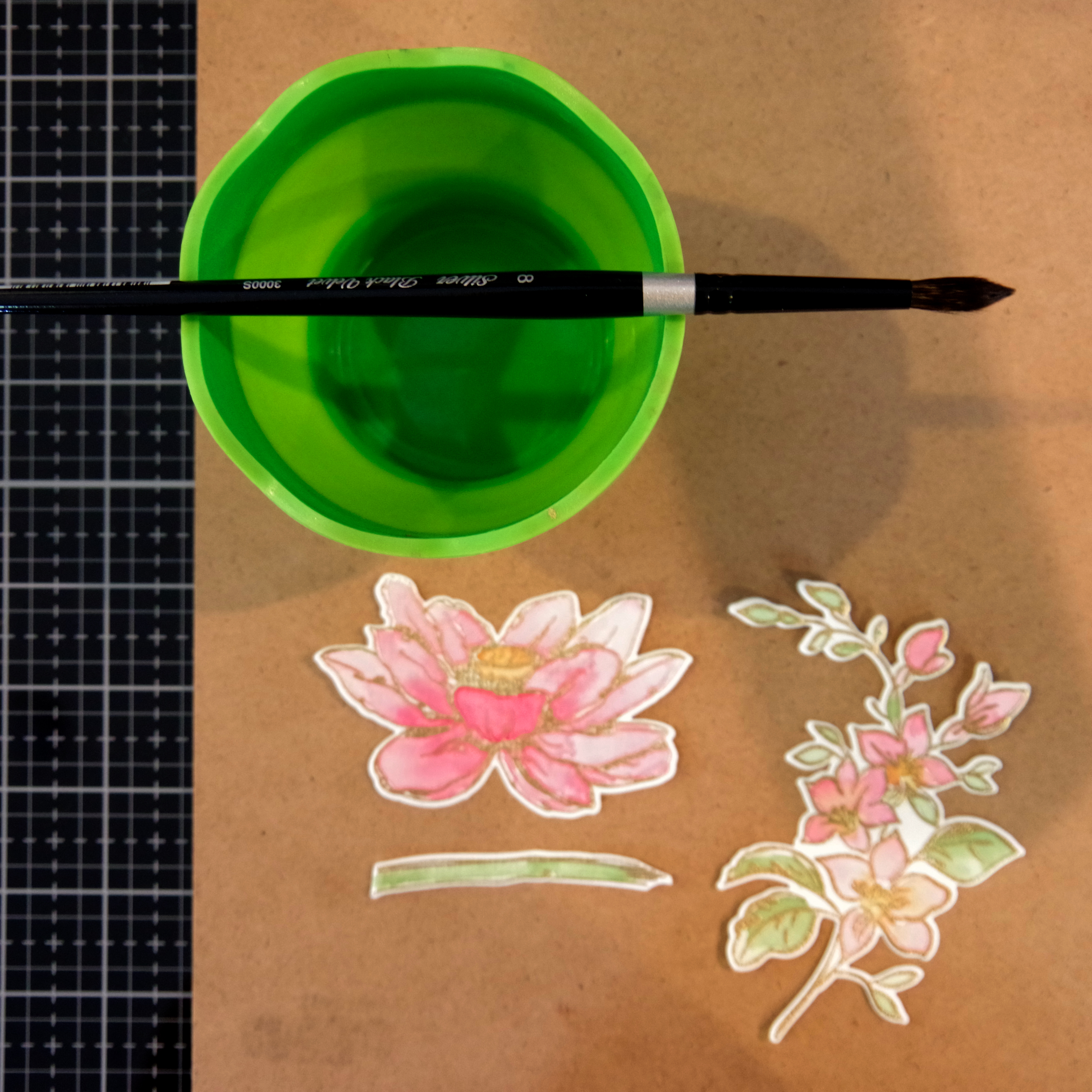
The painted Lotus die-cut is so pretty in person.
I did want to share this process photo as well.
The Feminine Set
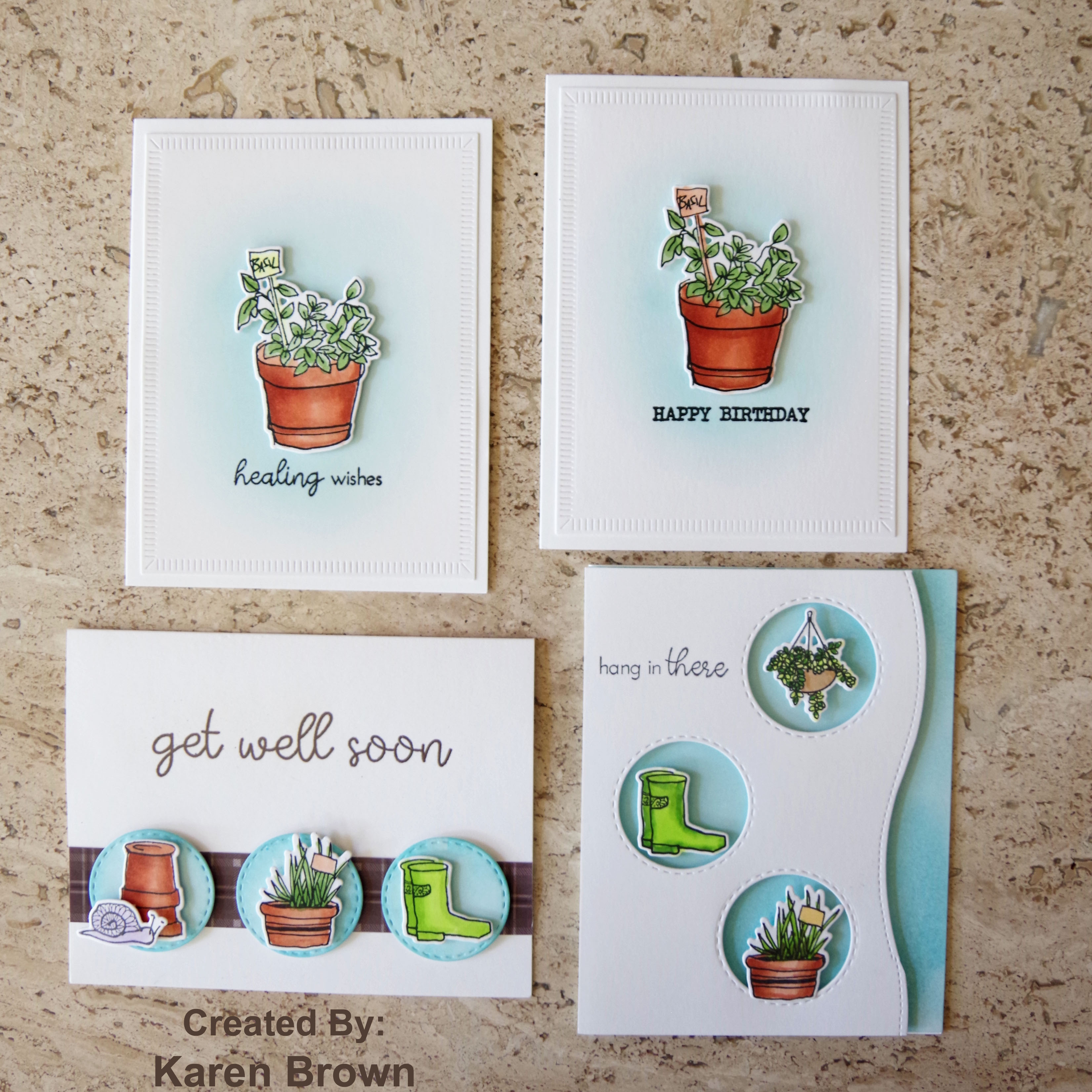
For my \”masculine\” cards I chose to use an overall blue theme with ink blending techniques and Altenew\’s Garden Grow as the unifying elements. For my first card, I ink blended a background and used peek-a-boo die cut windows to spotlight my images. During quarantine, I\’ve been sending so many encouragement cards that I wanted to include one in this set.
I made a companion card using the die-cut circles from the card above. I ink blended the spotlight circle, added die-cut images and anchored with a strip of masculine brown paper.
The next two cards have a soft ink blended background to draw the eye to the die cut.
I thought a birthday and recovery card would round out the gift set.
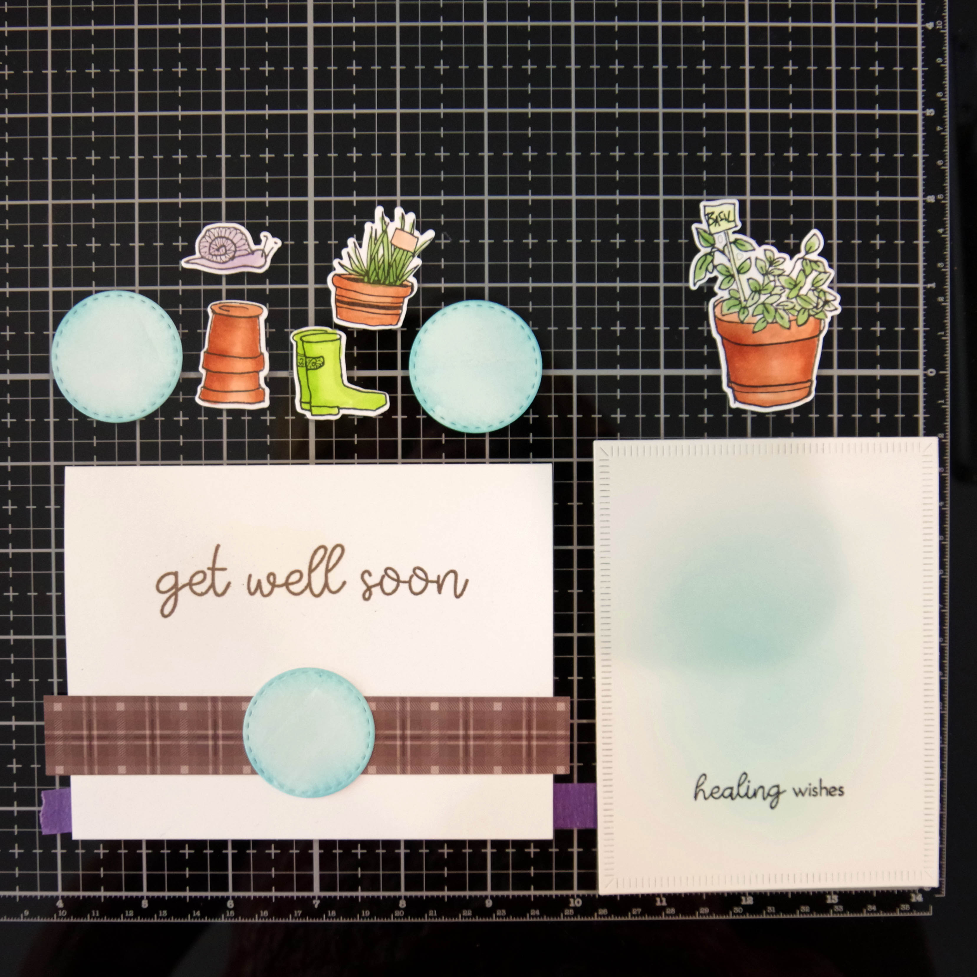
Here is an in-progress photo. The die cut elements were attached to each card with foam tape.
PRO TIP: I blended one background on Neenah (Birthday) and the second on Bristol (Healing Wishes) to see which provided a smoother look. The Neenah panel (below left panel that is now the Birthday Card) is whiter but the Bristol (right panel that is now the Healing Wishes card) is far easier to blend on and resulted in a smoother background. In the future, I will remember to blend my backgrounds on Bristol cardstock.
And here is the masculine set.
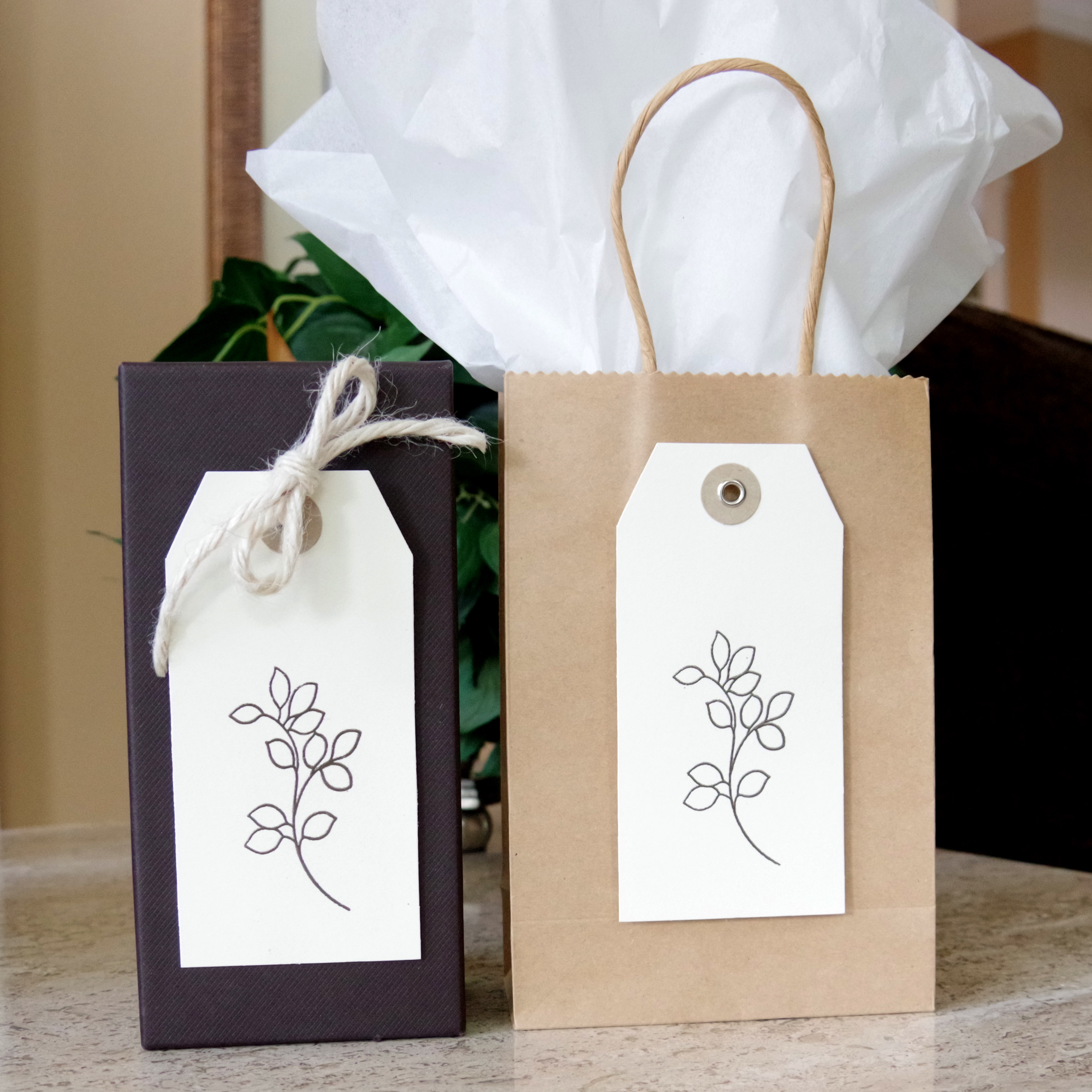
We were challenged to use a recycled element in each set. For the feminine set I recycled a small Kraft gift bag and for the masculine set I re-used an elegant chocolate brown box. I heat embossed some tags to top each set.
Altenew Products Used:
Altenew Best Mom stamp and die bundle
Altenew Inked Lotus stamp and die bundle
Altenew Garden Grow stamp and die bundle
Altenew Mini Branch stamp
Altenew Jet Black Crisp Die Ink
I am so glad you stopped by. I\’d love to hear what you think about these card sets. Thanks!
Karen