cardmaking · Die cutting

Spellbinders | Up, Up, and Adorable!

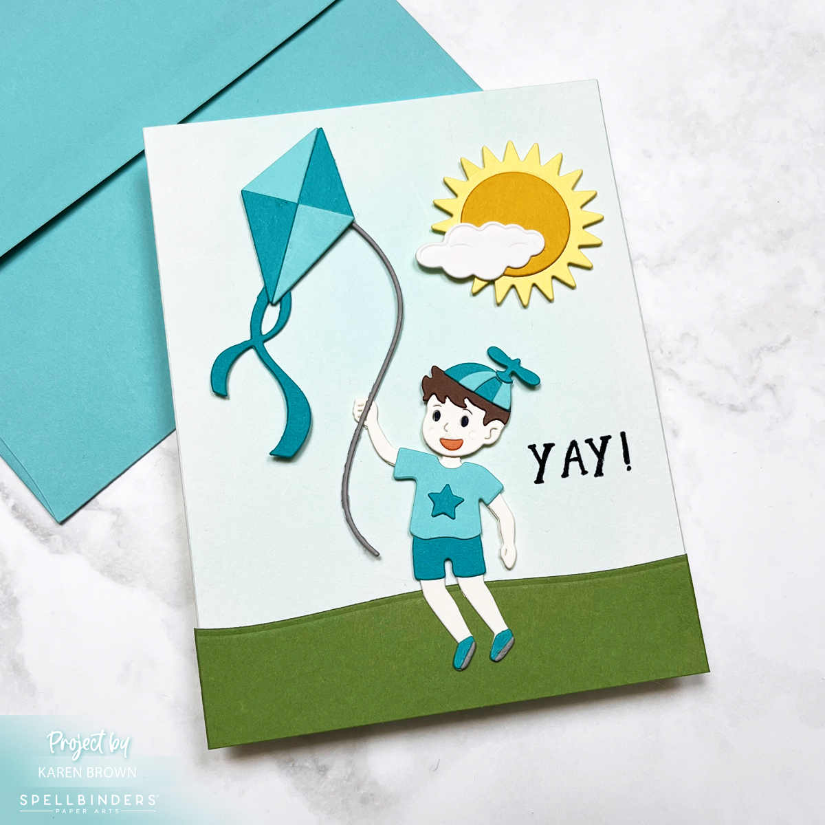
Spellbinders card using the Up and Away die set to create a scene card with a boy flying a kite.

Today, we’re soaring high with a sweet and sunny scene card, perfect for celebrating birthdays or welcoming a baby boy into the world! 🌤️🎈

This design features a playful little boy flying his kite beneath a big smiling sun and a puffy white cloud—an instant mood-lifter in card form. All the elements were crafted using the brand-new Up and Away die set from the Sky is the Limit collection by none other than the crafting wunderkind himself, Simon Hurley.

Handmade card featuring a die-cut boy flying a kite, with a die-cut sun and cloud above. Background is a soft aqua watercolor wash. Card uses teal and aqua cardstock in a playful, kite and sky-themed scene.

Color Me Happy

The card showcases a bright and breezy color palette, with Waterfall and Teal Topaz cardstock stealing the spotlight. These shades of aqua and teal give off major sky-blue vibes that feel both fresh and fun.

Background with a Breeze

For the sky, I created a soft, dreamy wash using Pool Party Reactive Ink on watercolor paper. I used a flat brush for that gentle sweep—like a serene spring sky just waiting for a kite to dance across it.

Die Cut Delight

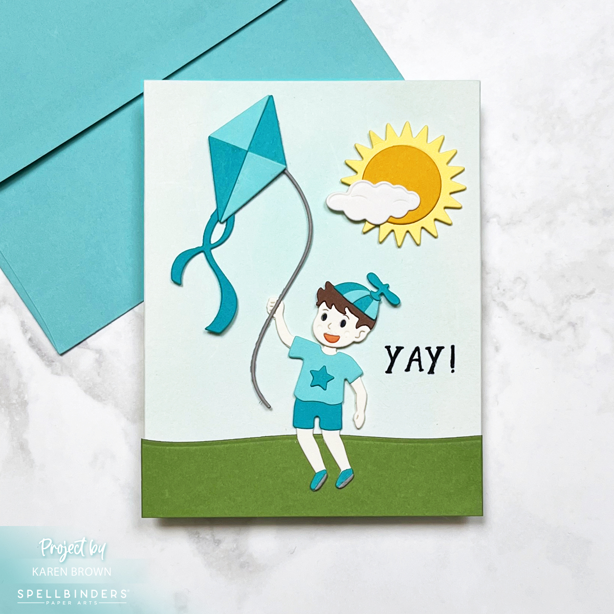
Every piece on this card—from the kite and the boy to the sun and cloud—is die cut and carefully layered for a dimensional scene that really pops. The clean lines and whimsical style of the dies make them a joy to work with. And let’s be honest: the Up and Away set is pure magic!

Die cut scene card with a boy flying a kite.  Spellbinders Up and Away die set - S4-1433.

Perfect for…

  • Baby showers (especially for little boys!) The repeating aqua and teal color palette reinforce the baby theme.
  • Kiddo birthdays
  • Or just sending sunshine and smiles on a cloudy day

This one’s going into my “make again soon” pile—because how can you not love a card that makes you want to run outside and fly a kite?

Happy crafting, and may your skies stay sunny! ☀️🪁

Die cutting · Mixed Media

Spooky Fun | Die Cut Halloween Cards

Bold colorful handmade  Halloween card backgrounds combinderd with Spellbinders Happy Haunting die kits to create 2 fun cards.

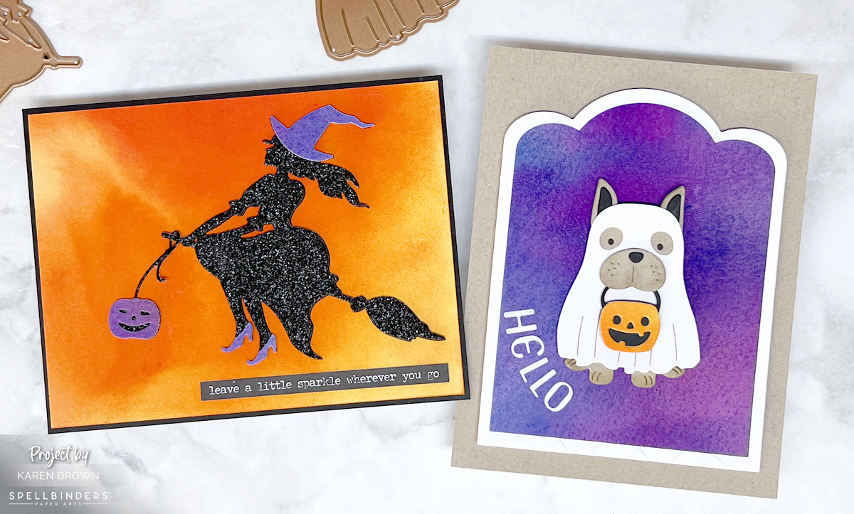
Halloween is just around the corner, and what better way to get into the spirit than by creating some spooky yet charming Halloween cards? Spellbinders has just released an adorable collection called Happy Haunting that is SO fun! I created two cards today that I am going to send to my daughters. I used Witchin” Heels (S3-525) and Woof or Treat (S3-521).

Hamdemade Halloween scene card with a witch silhouette on a broom flying though a vivid  sunset. created with orange and yellow liquid watercolor.  Witchin' Heel by Spellbinders S3-525

Spooky (and Cute!) Card Designs

For a simple yet delightful card, I created a dramatic sunset background to contrast with my sparkly witchy silhouette. I love using Liquid Watercolors because they are so vivid.

My Design Process:

  • I started my design process by creating two bold backgrounds using liquid watercolors.
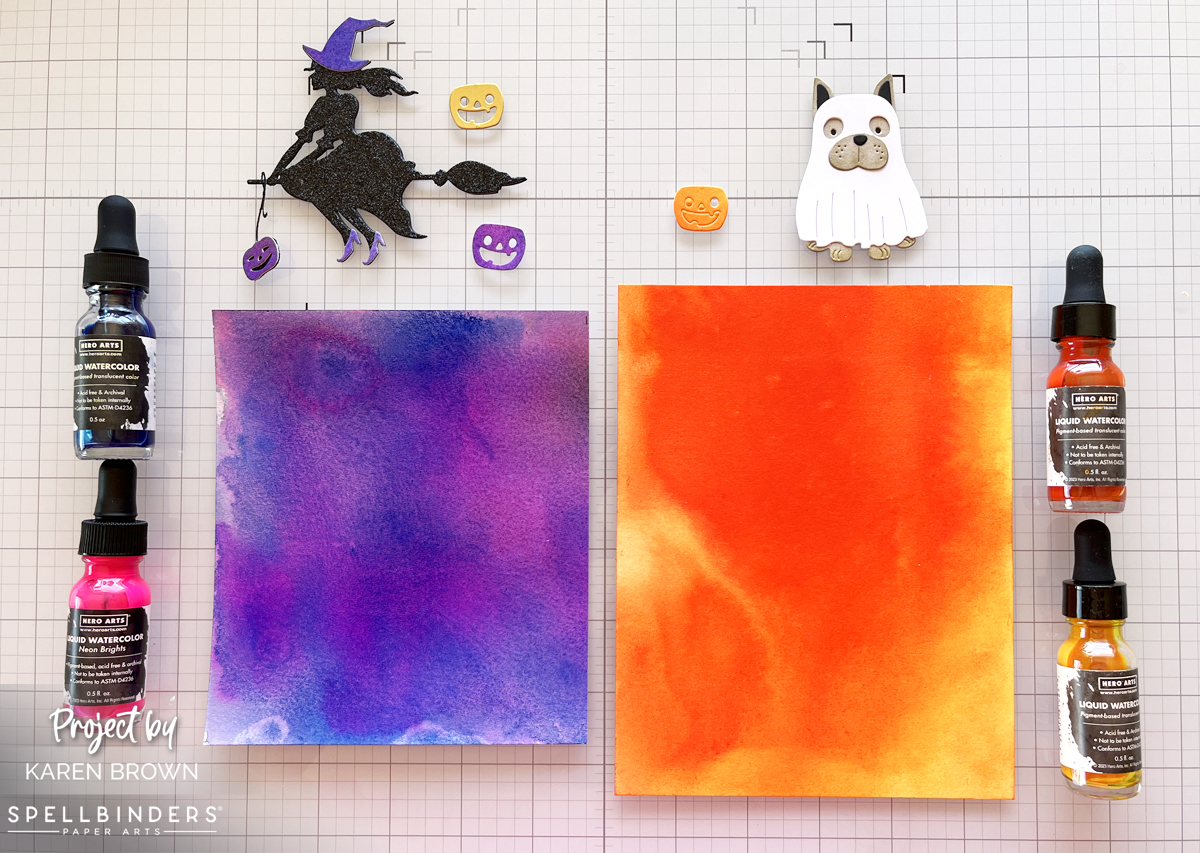
  • Witchin’ Heels background: I brushed water onto a watercolor paper panel and then used the Dandelion Yellow Liquid Watercolor eye-dropper to drop color onto the paper. I added yellow at the top and bottom of the panel and dropped Orange in the middle. I then used my mini-mister sprayer to add water to the colors, tilting different directions so that the colors blended and flowed. I repeated this process a couple of times.
  • Woof or Treat backgound: I repeated the process for my purple panel using Indigo and Neon Brights Pink Liquid Watercolors. Since I didn’t have purple watercolor I created my own by dropping a big blob of Indigo ink and then putting a smaller drop of pink in the center. I spitzed with water and then tilted to move the ink. I added several layers for an intense color.
  • I used my heat tool to speed up the drying process.
  • Below, you can see a photo of my completed backgrounds.
  • Die cutting was next. I used Black Glitter Paper for the Witch and added purple accents die cut from my purple watercolor panel. For my ghostly pup, I used khaki and added a hint of shading with a blending brush.
  • To frame my little trick-or-treater, I used my Scallop Label Infinity Dies. I also added a little dimension with foam squares and craft foam.
Adorable Woof or Treat (by Spellbinders) handmade card of a Dog trick-or-treating as a ghost with a pumpkin.  S3-521

Key Supplies Used:

How to create colorful vivid card backgrounds with liquid watercolors.

Final Thoughts:

I feel like each of these cards has a little bit of seasonal magic combined with crafty love. I adore the bold colors acheived with liquid watercolors.

I hope you found some inspiration today. Thanks for stopping by!

Karen

Mixed Media · papercrafting · Tutorial

Colorful Cityscape Mixed Media Card | Hero Arts

Cityscape Hero Arts Mixed Media Card

I recently attended Hero Arts Mixed Media Stamp Along and found it so informative! This card was inspired by @cheiron and her wonderful class. I used different products and colors so my card doesn’t look anything like Cheiron’s, but her class gave me the creative spark for my card. Sometimes it is fun to get inky and messy!

For this card, I was trying to simulate a Dove flying over a city at sunrise. I knew I wanted a bold background to contrast with the white Dove. 

My Process:

  • I put 5 sunrise colors of reactive ink (colors listed below) on my craft mat and spritzed with a bit of water and then painted bands of vertical color all over my watercolor cardstock panel. There is no right or wrong way just start painting! I dried and repeated two more times. During the process I also added drips of color.
  • I love Hero Rub-On Transfers and I added parts of the city map from Collage Backgrounds to three spots on my background.
  • Using Indigo and Splash Inks, I stamped the city grid from the Mixed Textures stamp set.
  • I added texture with the Cobblestone Stencil. In some places I used just Gold Hero Paste and on others I rubbed just a bit of Black Hero Wax on the Stencil and then added Gold Hero Paste. I really love the black wax and gold paste combined together.
  • Using a splatter box (for me a repurposed cardboard box) I added three layers of splatters and dried in between each color. White, Blue Shimmer and Orange Shimmer. I love the complexity the shimmer splatters add!
  • I trimmed my background using the Rounded Rectangles Infinity Die set and then lightly inked the edges with Indigo Core Ink.
  • I die cut my Dove and sentiment 3 times and then glued the components together.
Handmade Card with Dove and Olive Branch Die - DF192

Supplies Used:

This card has LOTS of layers, but it did not take as long to complete as I would have guessed….60-90 minutes.

What do you think?

cardmaking · Die cutting · papercrafting

Waffle Flowers | Flourish Panel Cover Die 2 Ways

Waffle Flower Crafts Flourish Panel Die:  Cards Two Ways

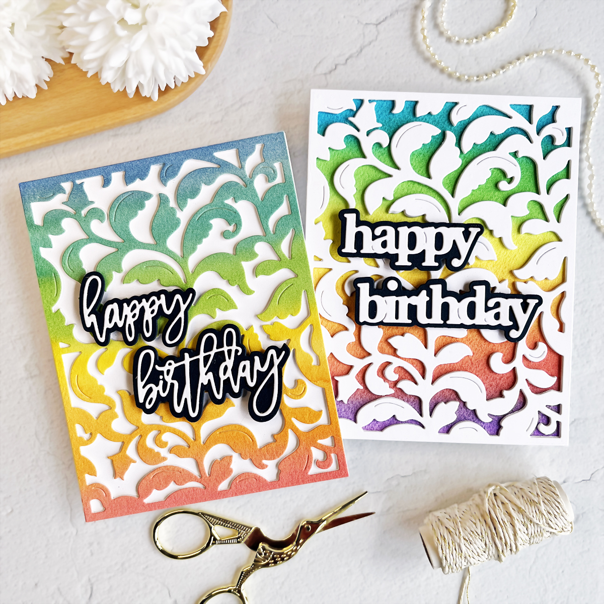
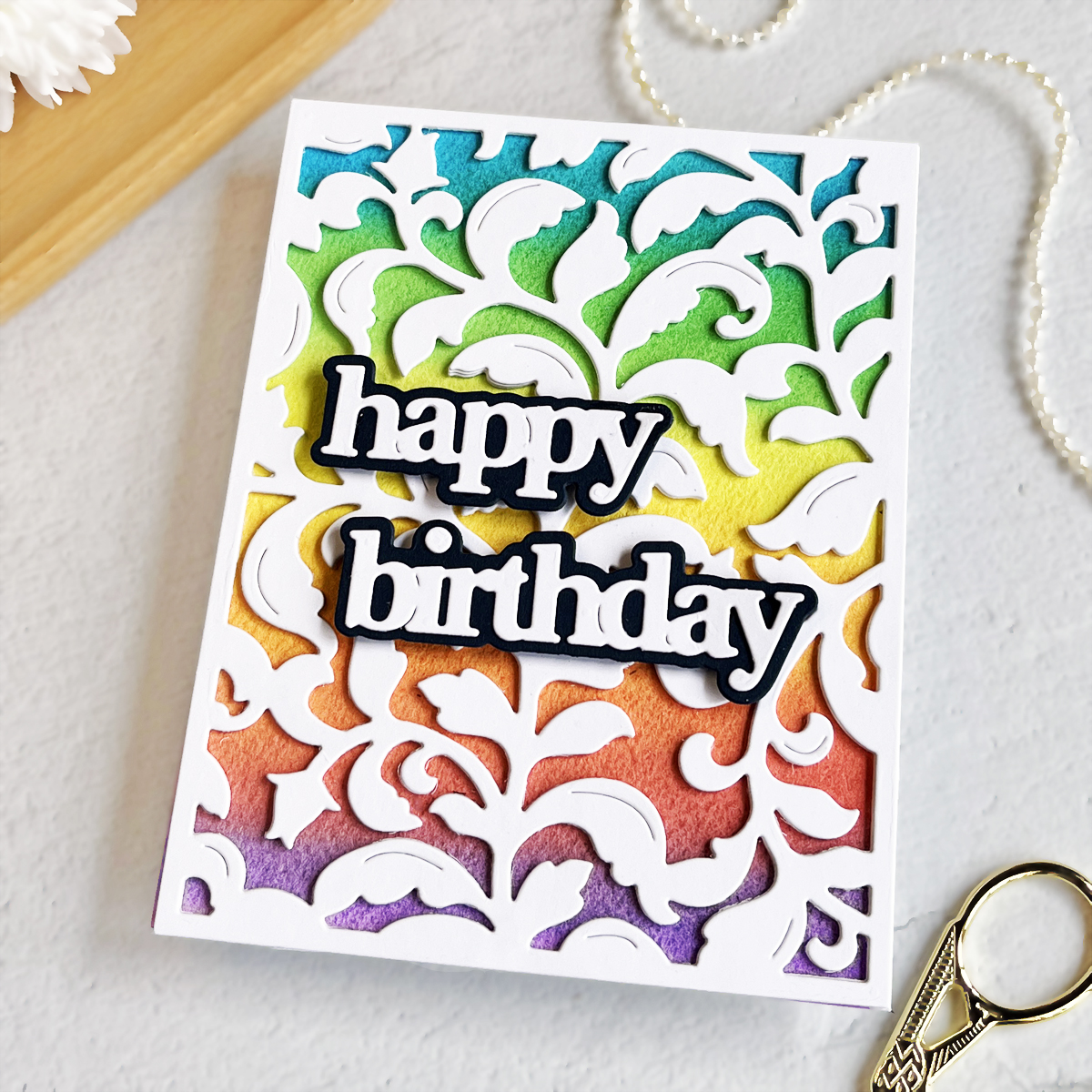
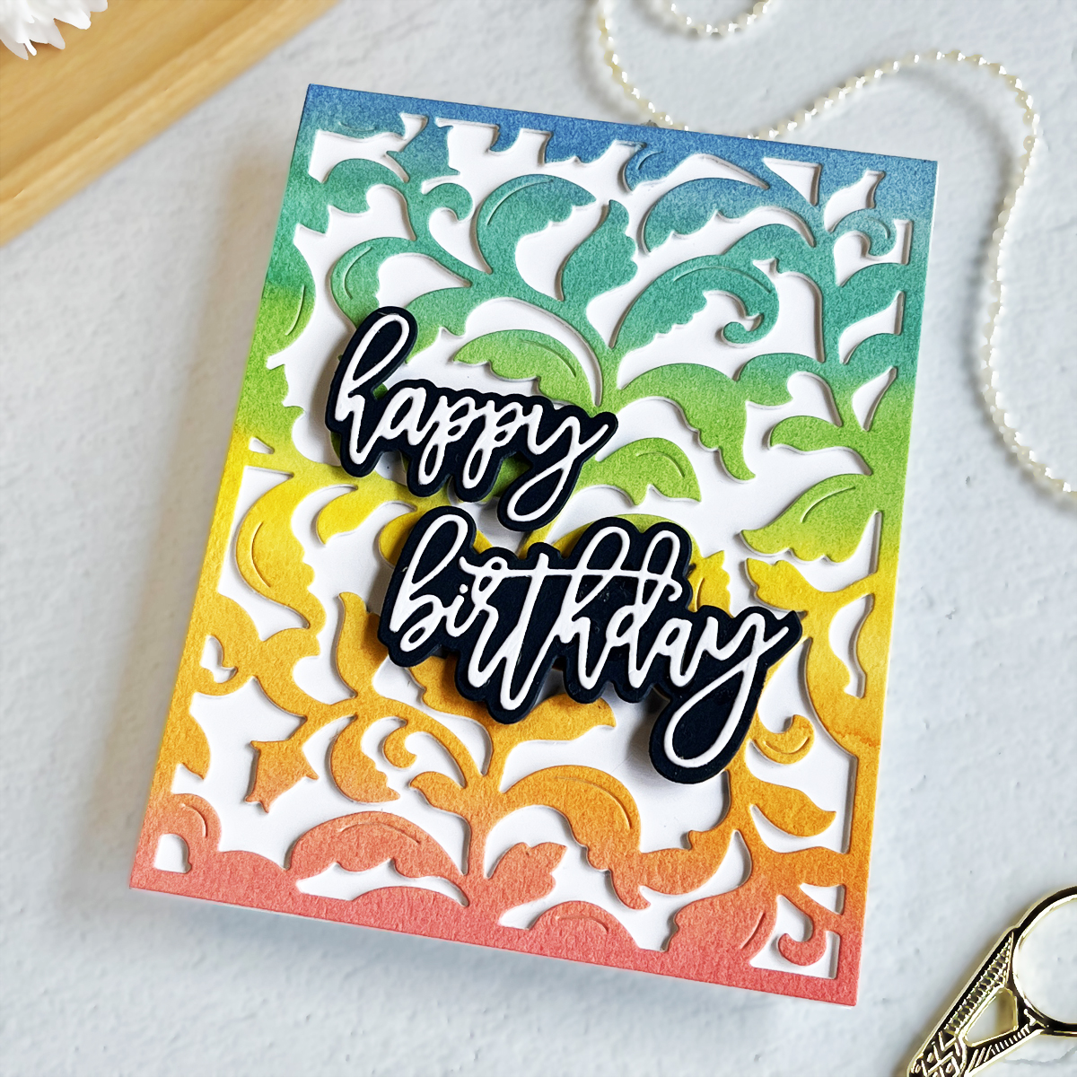
Rainbow colors in cardmaking are always a good idea! I recently received a new cover die from Waffle Flower Crafts called Flourish Panel and it is a real beauty! I couldn’t decide whether to have the rainbow panel on the top layer or below the lattice so I opted to do it both ways. I still can’t choose which way I like it better. What do you think…..I’d love to hear your thoughts in the comments.

How To Add Dimension on Die-Cut Cards

Waffle Flower Flourish Panel + Using inexpensive Crayola Watercolors in Cardmaking

I have step-by-step directions (with process photos) below. On one card I die-cut the watercolor panel and on the second card I used the rainbow colors as a background.
Waffle Flower Crafts Flourish Panel Die + Print and Script Happy Birthday Sentiment dies.

Cardmaking Tutorial: How I Made These Two Die Cut Cards

Step 1: Make Your Rainbow Watercolor Panel. Today, I used watercolors for my colorful focal point. On the panel with the rainbow on the top layer, I used Kuretake Watercolors to blend a rainbow. I went over the watercolor panel twice to get an intense color. On the second, panel, I used inexpensive Crayola Watercolors and it worked beautifully! You could also ink blend your background.
Step 2: Die-cut your top layer with Waffle Flowers Flourish Panel Die. I have an electric Gemini Junior die-cutting machine that I used.

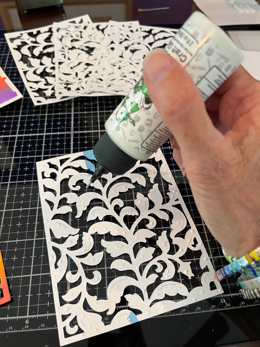
Step 3: You could stop die-cutting here, but I wanted a lot of dimension, so I die cut two additional panels so I could stack my layers.

Step 4: Glue Your Layers Together. Using Bearly Glue, I glued three lattice layers together for a substantial top panel. Be sure to weight them down after gluing so they stay nice and flat. I have a large acrylic block that I use. I also adhered the layers to an A2 Top-folding card.

Step 5: Add A Sentiment. I always need Birthday Cards so I used Waffle Flowers new Print and Script Birthday Sentiment Dies. I love that they come with both a cursive and block font with coordinating shadow dies. I cut the sentiments from white cardstock and the shadows from Navy.

Now I have two bright cheerful birthday cards to share.

Products Used:

cardmaking · papercrafting

Amazing Paper Grace December 2021 Kit

Spellbinders Amazing Paper Grace December 2021 Kit

Hello friends! Today I have some brightly colored inspiration for Spellbinders Amazing Paper Grace December 2021 Die Cutting Kit. You can also purchase just Enchanting Pocket Kit from Spellbinders.

The detail on these dies is just beautiful and I found the dies are so versatile! The three cards I made are all A2 sized, but the dies could easily make bigger cards too.

Spellbinders Amazing Paper Grace December 2021 Kit + Shimmer Powder

As many of you know, I love to create my own colored papers to use in my projects. On my first card, I created a panel by adding shimmer powders (I used Tonic Brand) to watercolor paper. The result was bold colors with a bit of subtle shimmer.


Shimmer Powder Panel

My Process:

  • I made three panels, one for each curlicue die cut plus smaller panels for the floral elements. One panel was shimmer powder on watercolor paper and the rest of the panels were watercolor on watercolor paper. For the watercolor, I applied the color, dried and then applied a second coat for a more saturated look. Prior to applying color, I did tape the watercolor paper to a hardboard to minimize warping.
  • For two cards, I die cut the curlique backdrop from the colored panels. For the third, I die cut it from white card stock and placed it over the aqua water-colored background. I like the card both ways! The backdrop was then adhered to the card with foam tape for lots of beautiful dimension.
  • Next, I die cut loads of flowers, leaves and greenery. I added a few extra die cuts from the Petite Floral Potpourri die set.
  • The sentiment is Sugar Coated Sentiments, which I heat embossed on black cardstock.
  • I used a wax tip embellishment wand and Bearly Glue to adhere white gems to the flower centers. I have tried a lot of liquid glues and found for small die-cuts that Bearly Glue is the best. The flowers were attached to the card with foam tape.
Spellbinders Amazing Paper Grace December 2021 Kit with Shimmer Powder background.
Closeup of the lovely detail on the die cuts.
Spellbinders Amazing Paper Grace December 2021 Kit with watercolor background panel
This card has the colored panel behind the die cut.
This card was die cut from watercolored panels.
Watercolor Panels

I am so happy you stopped by to see my projects.

Karen

Uncategorized

WWC296 – Michelle\’s Challenge: Anything Feminine Goes


Hello, hello and welcome!  This week we are creating feminine cards at The Watercooler Wednesday Challenge and we would love to see your creation in our gallery.  Michelle is our hostess this week.  

I\’ve had my eye on the Altenew Hibiscus Garden 3D die set for sometime and finally bought it.  I wanted to use seasonal jewel tones  so I die cut my pieces from Altenew\’s Enchanting Washes Cardstock.  I like the gorgeous colors and the fact that it is thick like cardstock.  For the leaves I ink blendeded  4 colors of green on watercolor paper.  My background is a light watercolor wash where I then softened the edges with a towel so it fades out.  I dried the panel and then  added purple and black paint spatters.  Next I mixed gesso with Iridescent Shimmer Spray and added more splatters.  I assembled and paired with a Bold Envelope and my birthday card is now ready to mail.

I am also playing along with:

Festive Friday FF0071 I included die cuts, patterned paper (hibiscus), flowers and sentiment.  

UPDATE:  I was excited to see my card was selected as a \”Festive Fave\”!

Crafty Hazel Nuts Patterned Paper Challenge  I used Altenew Enchanting Washes Patterned Cardstock for the two hibiscus.

Karen


Uncategorized

Multi Media Cards With Loads of Gorgeous Texture

Hello, hello and welcome!  I am excited to share a couple of cards that I made after taking Demystifying Mixed Media at Altenew Academy.  I think I can safely say this is the most fun class I\’ve taken to date.  Tania Ahmed is a wonderful and inspiring instructor and I went crazy making backgrounds!  I made 7 cards and 8 backgrounds, two of which I am showcasing in this blog post.  I will be sharing the rest of the cards in future posts.  


I love that there are really no rules with mixed media. It seems the best thing to do is lay out your messiest supplies and then select a bunch for each card.  Do not be a minimalist when experimenting with multi-media.

This first background was made by hand-dipping the background and custom tinting my embossing paste.  

  • I mixed Zig Cobalt Blue with water and Irridescent Shimmer Spray and then dipped a piece of Bristol cardstock into the colorful puddle.  I dried the panel and then repeated.
  • I tinted my Embossing Paste with Carved Pumpkin distress ink for a fallish vibe.  
  • I swiped the embossing paste over my stencil with a palette knife.  I wanted a rough look so I didn\’t cover the entire stencil and I made sure there was a variety of thickness to the paste. 
  • While the embossing paste was wet, I sprinkled just a bit of Peach Embossing Powder on the paste and then heat set. I love the texture and interest it adds. 
  • I heat embossed Altenew\’s Best Mom spray (in brown) and then watercolored and die-cut the image.  
I think the aqua, sherbet and brown make for a very striking card.

My second card uses watercolored embossing paste, tulle (a first on a card for me) and loads of paint splatters.

  • I applied texture paste through the Feathered Leaves Stencil and then heat set.
  • Using diluted watercolors mixed with shimmer spray, I loosely colored the background in blue and yellow.
  • Using a damp paint brush, I feathered the watercolor edges and then dabbed with a cloth to soften the edges.
  • I added blue, yellow and black paint splatters.  
  • I stamped, watercolored and die cut the  Weekend Doodles floral spray.
  • I cut an oval from some tulle gift wrapping ribbon and glued to the back of the floral spray and then adhered the combo to the card base.
  • I added a simple sentiment embellished with Painted Grid Washi Tape.

I am also playing along with:

Creative Artiste\’s Mixed Media Challenge I used paint, shimmer spray, embossing paste, embossing powder and of course paper.  

The Flower Challenge #49 \”Circles\”  I love the textured circles on this background.

UPDATE:  The top card won at The Flower Challenge \”Circles\” Challenge

I hope you will stop by in the near future and see the rest of the Multi-Media cards that I created.

Karen

Uncategorized

Altenew Academy Watercolor 101

Hello, hello and welcome!  I was so pleased to learn that I passed the Altenew Academy Level 2 Final and can now begin working on Level 3 courses!  For my first level 3 class I chose to take Artist\’s Watercolor 101 taught by Emily Midgett.  It may be my favorite class to date!  Emily\’s explanations and demonstrations are excellent and so easy to follow.  I had so much fun during this class that I included two cards in this blog post encompassing three of Emily\’s lessons.

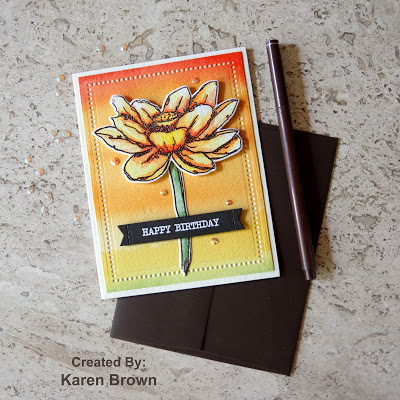
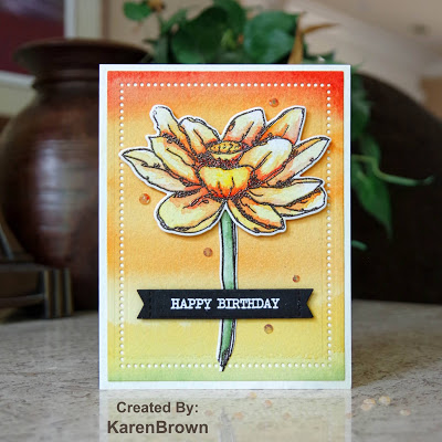
I watercolored the lotus using techniques in we learned in Lesson 2:  Basic Watercoloring and the background is from Lesson 3:  Ombre Backgrounds. I chose to use the lotus stamp because the \”sketched lines\” help indicate where the shadow should go.  
My Process:

I wanted to use fall colors so I started by heat embossing the bloom with chocolate brown embossing powder. Emily taught us to slightly elevate the panel and then slowly build layers of color starting at the inked lines and then pulling the color out with a damp brush.  The watercolors were fairly diluted.  I started with yellow, then moved to orange, then scarlet and then a more concentrated scarlet in the deepest shadows.  The first layers should have with widest application of color and each new layer should stay closer to the inked lines.

Keys to Remember:  
  1. In the past, I think I\’ve had too much water on my brush. Emily showed us that if you dab your brush on a stamp shammy you will have the correct amount of water.  This really helped me.
  2. Use fairly diluted watercolors.
  3. Keep the tip of the brush pointing away from you. Rotate the paper and use the slant of the board to move the paint.
  4. Remember to let each layer dry before beginning on the next layer.


I wanted a coordinating background so I used the same colors that I used to paint the lotus.  I taped the watercolor panel to a board to reduce warping, elevated the board and then started painting at the top with a #12 brush.  We learned to put darker color at the top and then pull the color down with a damp brush. Keep adding color and then maneuvering the color around with a damp brush.  Flip the board, skip an area and then add the third color then pull the color toward with scarlet.  Pull color down and push the middle color up.  Continue adding layers of color and keep blending.  I die cut the lotus, heat embossed a sentiment on cocoa card stock, assembled with foam tape and added some buttercream jewels.  I like how bright, intense and cohesive the color palette is.  I am very pleased with this card.

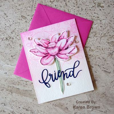
I find no-line watercoloring very intimidating so I was eager to start lesson #5.  I feel like it is an advanced technique but Emily broke the steps down in such a way that I was comfortable painting.  I thought it would be fun to compare and contrast the same lotus flower painted with the two different techniques.
            
Emily recommends no line stamping with Ink on 3 Fadeout.  This was my first time using this ink and it worked well.  The key to no line watercoloring is to maintain contrast between the light and dark areas.
I started with fairly diluted paint, put my first color down and then pulled it out with a damp brush.  Skip to an area that does not touch and then repeat the process until the first layer is down.  After the first layer is dry, start with the second color but don\’t cover all of the first layer. Dry and add color 3 to the nooks and crannies.  Do not add the third color to each petal as this keeps interesting contrast.  Add the 4th color to the darkest shadow areas.  

For the background, I randomly stamped \”mini branches\” on about half the background with pink. Next, starting at the top, I ink blended a gradient toward the bottom. The bottom third of the card does not have any color.

I assembled the card and added a navy die-cut sentiment and some water drop embellishments.  

Here are both cards side by side. Which do you like best?
Altenew Featured Products: Here
I also wanted to play along with:
The Rainbow Card Challenge #21 Autumnal Amber.  I am submitting my first card that was done in shades of autumnal amber.  
Thank you so much for stopping by!
Karen


Uncategorized

Altenew Academy: Creative Watercolor Media

Hello and welcome.  I just completed The Altenew Academy \”Creative Watercolor Media\” class and wanted to share this card with you.  

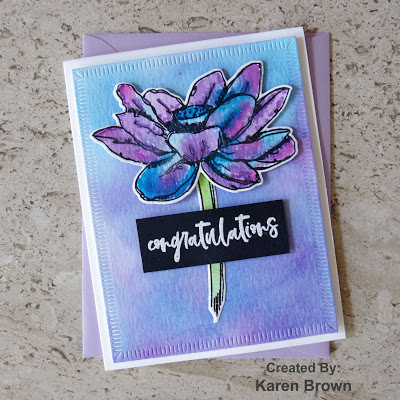
In class #4 we were taught how to watercolor with shimmer sprays.  I don\’t have any shimmer sprays so I hydrated some shimmer powders and used that instead.  In class #5, we learned to make watercolor backgrounds so I made a coordinating panel for the lotus.
My Process:
  • I thought Altenew\’s Inked Lotus would be so pretty with this technique so I stamped the images on watercolor paper using Versafine Onyx Black ink.  I then let it dry.
  • I hydrated 5 colors total, three for the lotus (pink, purple and blue) and two for the stem (green and yellow).  I then used the wet on wet technique as I dropped color into the the petals of the bloom.  The colors don\’t blend as well as watercolors, but the shimmer patina is so pretty in person.
  • I popped the watercolor panel back in my Misti and restamped the outline after the paint dried.
  • I decided to make a coordinating background so I spritzed the leftover shimmer paint on my media mat with additional water and then dipped a piece of watercolor paper into the puddle.  I dried and re-dredged until I liked the background.  I still had leftover ink so I was able to make a second background panel to keep with my \”made ahead\” backgrounds.  
  • The sentiment is from the same Inked Lotus stamp and die bundle.  I love when a stamp set has usable sentiments included.
Pro Tip:  The key to these watercolor backgrounds is to add lots of layers of color.  Dredge, dry and repeat until you like the panel.  

I am also playing along with The Flower Challenge and their Summer/Winter theme.  Summer for me!  I used cool blues and purples that remind me of a swimming pool.

I am so pleased that you stopped by!
Karen
Uncategorized

Altenew Academy: Celebration Stencil Techniques

Hello and welcome.  I just finished a wonderful Altenew Academy course and I am excited to share my card with you.   Laurel Beard taught us stencil techniques and I loved them all!  This is my favorite card from the class.  I also used my favorite Altenew stamp and die bundle called Weekend Doodles.
Bright card featuring Altenew Watercolor Stripes Stencil and Weekend Doodles stamp and die bundle.
My inspiration came from lesson 3:  Stamping with Stencils and  I chose to watercolor over my stencil.

My Process:
  1. I taped my stencil to a 6 x  6 piece of watercolor paper.  Next, I wet my watercolor paper well with a brush.  I then \”pounced\” three colors of distress ink onto the wet watercolor paper.  
  2. I haven\’t used my Zig markers in months but they were exactly what I wanted for this project because of their bright vibrant colors.  I heat embossed my floral image, colored with Zigs and then die cut.
  3. I die cut a white panel for the sentiment and to provide some contrast with the bold stripes and then heat embossed the sentiment.  I glued the white panel to the background and then used foam tape to adhere the flowers.
Supplies:
Altenew Watercolor Stripes Stencil
Distress Inks:  Salty Ocean, Mermaid Lagoon and Twisted Citron
Zig Markers:  Emerald, Green Shadow, Pale Yellow, Lemon Yellow, Yellow and Bright Yellow.
Watercolor Paper
Neenah Cardstock
Versafine Onyx Black ink and Clear Embossing Powder
Liquid Glue
Foam Tape

I am also playing along with:


I was so pleased to see this card chosen as a Top 3 at Tuesday Thowdown!


I am so pleased you stopped by and I would love to hear what you think about this card.

Karen