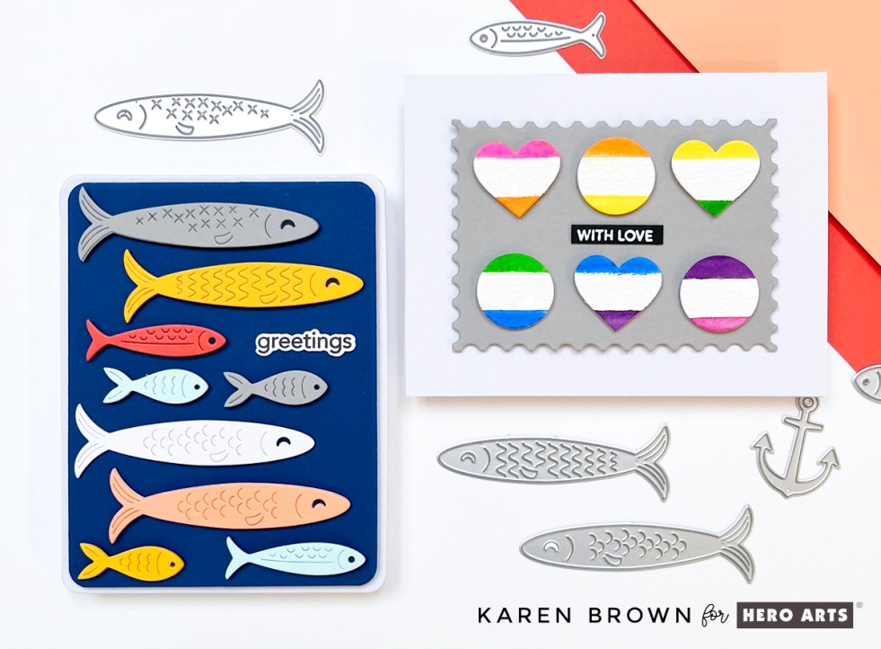
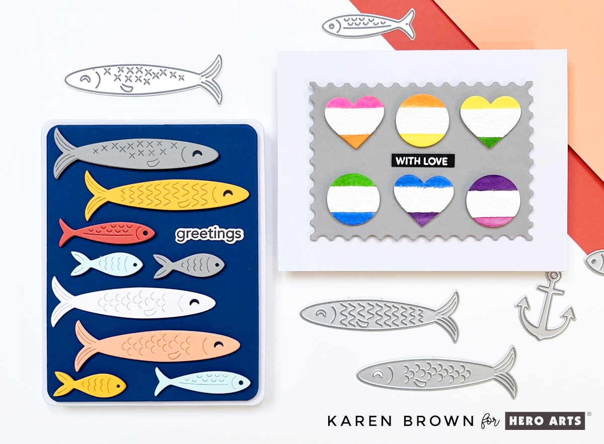
Hello friends! Karen Brown here today sharing two cheerful cards created with products from the Hero Arts Packed with Love Collection. I love when a release offers versatility, and this collection made it easy to explore different looks while keeping the designs clean, playful, and approachable.
Key Products Used:
- Big Mouth Sardine Tin Dies
- Big Mouth Sardine Tin Bundle
- Wide Stripe Background Stamp
- Packed With Love Collection
Both cards highlight simple layouts, bold color choices, and easy-to-repeat techniques—perfect whether you’re making one special card or crafting a small batch. One card leans bright and aquatic with colorful die cut fish, while the other explores a graphic, modern style with bold shapes and happy color transitions. Together, they show just how flexible this collection can be.
Let’s take a closer look at each card!
🐟 Card Details: A Happy School of Fish

For my card, I used DF274: Big Mouth Sardine Tin Dies, but instead of building the tin, I focused solely on the fish dies. I die cut nine fish in assorted sizes and colors, then arranged them swimming horizontally across the card for a playful, modern look.
The background is Cosmic Sky ColorWheel Cardstock, trimmed with my favorite Rounded Rectangle Infinity Dies and mounted onto a crisp white A2 card base. A small, simple sentiment that reads “greetings” keeps the design clean and versatile—perfect for hello cards, encouragement, or just-because mail.
This card feels colorful, cheerful, and a little bit whimsical…like a happy school of fish swimming together. 🐠🐠🐠
🎨 ColorWheel Cardstock Colors Used
- White
- Fog
- Sicily
- Coral
- Seaside
- Saffron
- Cosmic Sky (background)
To give each fish more presence and durability, I die cut every fish twice and glued the layers together. This subtle dimension makes a big difference, especially on clean and graphic designs.
If you enjoyed this, you might be interested in learning to make mixed media tags.
✂️ Die Cutting Tip
I used my Spellbinders Scout desktop cutter to cut all of the fish. When I’m working with lots of small or medium-sized dies, the Scout is my go-to—it’s fast, efficient, and perfect for batch die cutting. You might also be interested in the 14 tools that I use most often in my craftroom.

🧠 Layout Tip: Arranging Die Cuts with Ease
If you’ve ever struggled with spacing repeated die cuts, here’s the method I used—and it works every time:
- Start at the top of the panel (I placed the gray fish first).
- Move to the bottom with the smallest fish (aqua and saffron).
- Fill in the middle next.
- Work up and down from the center, adjusting spacing as you go.
This approach helps keep everything visually balanced and evenly spaced without overthinking it. I’ve included a process photo (above) of the die-cut fish and dies on my craft mat.
🧷 Assembly
I used a combination of craft foam and foam squares to attach the fish and background, adding just enough dimension to create interest while keeping the card mail-friendly.

Rainbow Watercolor Wide Stripes

I stamped the Wide Stripe Background Stamp onto watercolor paper using Unicorn White Pigment Ink, then heat embossed it with white embossing powder. I knew I wanted to watercolor in between the embossed stripes, so I taped my panel to a hardboard to help minimize warping—always a helpful step when working with lots of water.
Working in rainbow order, I watercolored each stripe band by band. The raised white heat embossing created beautiful texture and helped keep each color neatly contained. I have a process photo showing this panel alongside my watercolor palette, and at this point… that was as far as the original plan went!
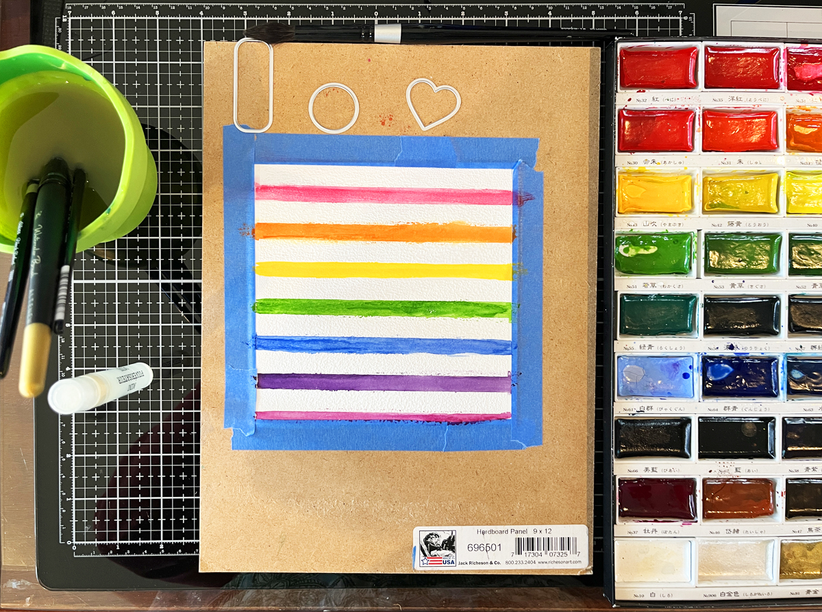
Sometimes the best ideas happen mid-project. I started thinking about repeating geometric shapes and how fun it would be to combine that idea with the striped watercolor background I had already created.
Using my Nesting Hearts Infinity Dies and Nesting Circle Infinity Dies, I die cut three 1-inch hearts and three 1-inch circles—perfect timing since we’re getting close to Valentine’s Day. Each die cut features the white heat embossed stripe running through the center, with one rainbow color above and the next color below.
I worked across the panel so that the bottom color of one shape becomes the top color of the next:
- Pink over orange
- Orange over yellow
- Yellow over green …and so on.
I alternated the shapes—heart, circle, heart—creating a playful rhythm across the design.
To ground all that color, I mounted the six die cuts (two rows of three) onto a 4″ x 3″ gray mat die cut with the Nesting Postage Stamp Infinity Dies. Yes—this card uses three different Infinity Die sets, and they all worked together beautifully. The card base is a crisp white A2, keeping the focus on the cheerful pops of color.
👉 Best Die Cutting Staple: Infinity Dies

Finishing Touches & Sentiment Tips
My sentiment is small and simple: “With Love”, white heat embossed on black cardstock. This card could easily work as a Valentine, a friendship card, or a just-because note.

TIP: I love keeping pre-made heat embossed sentiment strips on hand. Using large sentiment strip stamps that coordinate with the matching Sentiment Strip die makes it easy to stamp and die cut everything at once.
For this card, I used a leftover Christmas Sentiment Strip, but I also reach for Everyday Sentiment Strips constantly—definitely worth checking out if you haven’t already. The photo above shows how many sentiments you can make at one time.
Why I Love This Collection
These two cards show how products from one collection can go in completely different directions:
- One soft, artistic, watercolor-focused design
- One clean, graphic, and modern card with bold shapes
This is a great reminder to let yourself play and see where your ideas lead.