The June 2025 Spellbinders Club Kits are making waves—and honestly, the buzz is real. This release might just be the best in a long time. If you’ve been waiting for the perfect moment to dive into the Deluxe Caboodle (all the kits plus the bonus item and a hefty 58% savings!), now’s the time to anchor your subscription!
Set Sail with the Spellbinders June Club Kits!
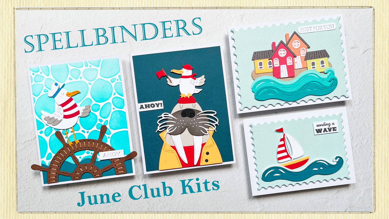
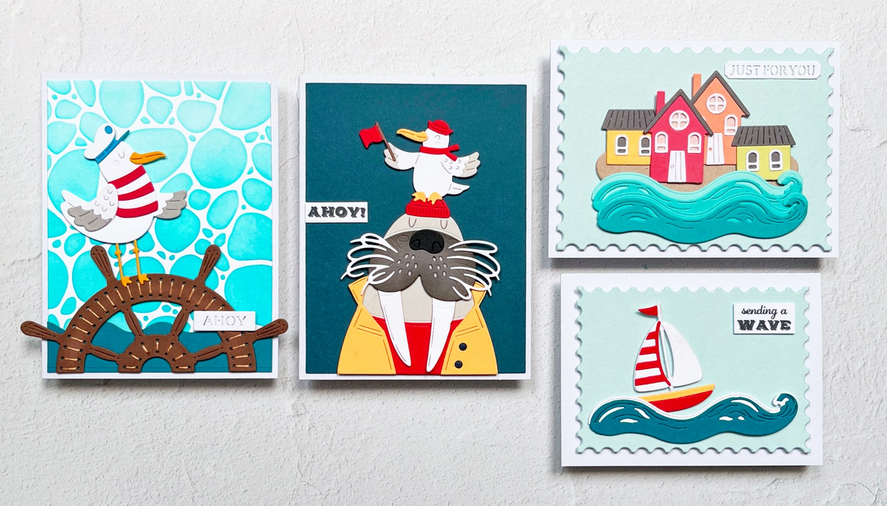
This month’s kits are delightfully nautical and full of personality. I had so much fun creating four playful and unique cards that capture everything from charming seaside scenes to silly sea life.
Card 1 – Graphic Nautical with the Die of the Month

Minimal color, maximum charm.
I created a bold and graphic card using the Die of the Month kit. The dark Oceanside cardstock background makes the characters pop—a seriously adorable walrus in a bright Beeswax yellow rain slicker and Poppy red beanie, alongside a flag-waving seagull in matching nautical flair. The clean white “Ahoy!” sentiment lets this duo shine.
The walrus was die cut from Fog and Anchor cardstocks and softly ink blended on the muzzle for extra dimension. All the cardstock is from the Color Wheel Sampler Pack.
Who knew a walrus could steal the show?

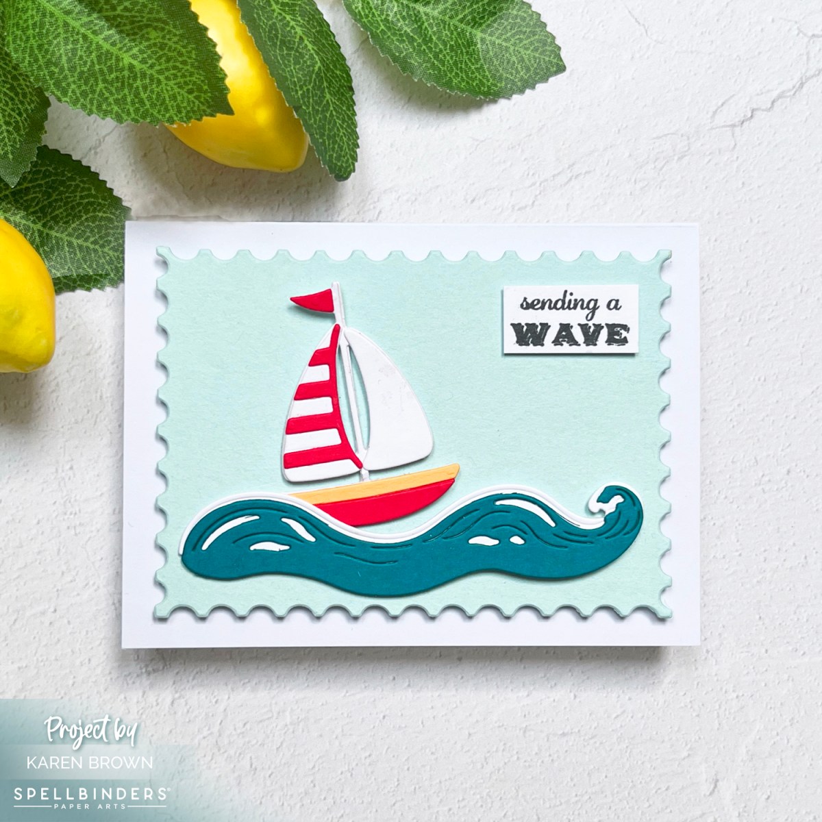
⛵ Card 2 – Cheery Sailboat with the Caboodle Bonus

This month’s Deluxe Caboodle Bonus Gift is a sweet little die cut sailboat, and I couldn’t wait to take it for a spin!
I crafted a bright red, white, and yellow boat cruising on gently layered waves of blue-green and white cardstock. Becuase the mast is somewhat delicate, I die cut the boat twice and glued together for a sturdier focal point. The wave dies are part of the Large Die of the Month Kit. The background is a soft mint green, die cut with my go-to Postage Stamp Infinity Dies. The sentiment, “sending a wave,” perfectly matches the cheerful tone. The card is slightly smaller at 4½ x 5″—perfect for a quick note.
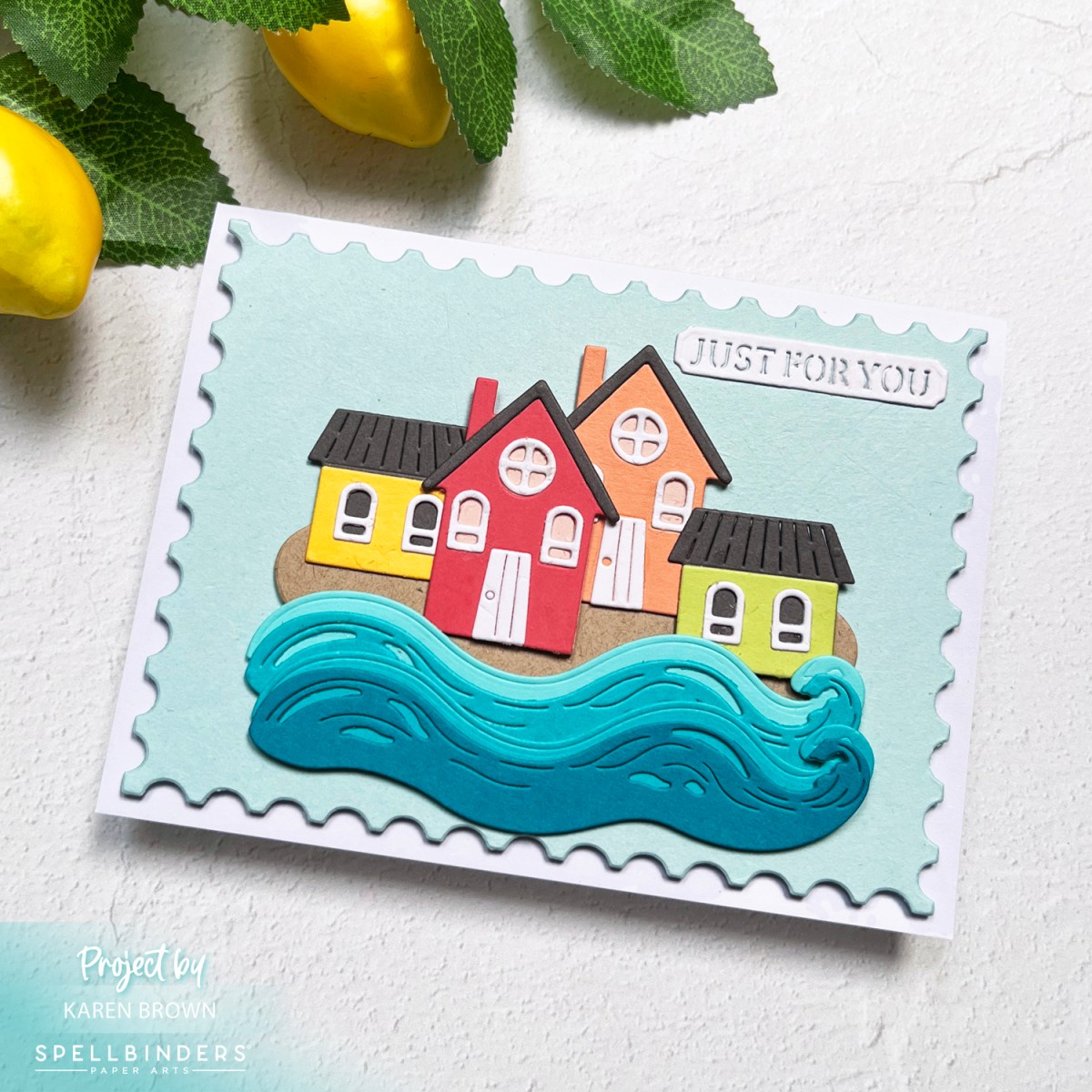
🏠 Card 3 – Rainbow Coastal Village with the Large Die of the Month

Next up: a charming seaside scene built with the Large Die of the Month kit. I assembled four tiny houses in sunny rainbow sherbet hues nestled beside rolling waves. It’s a joyful and relaxing little coastal village, with a “Just for You” die cut sentiment on top.
Once again, the background is mint green, die cut with my postage stamp die for that crisp framed finish.
⚓ Card 4 – Stitched Captain’s Wheel with a Playful Seagull
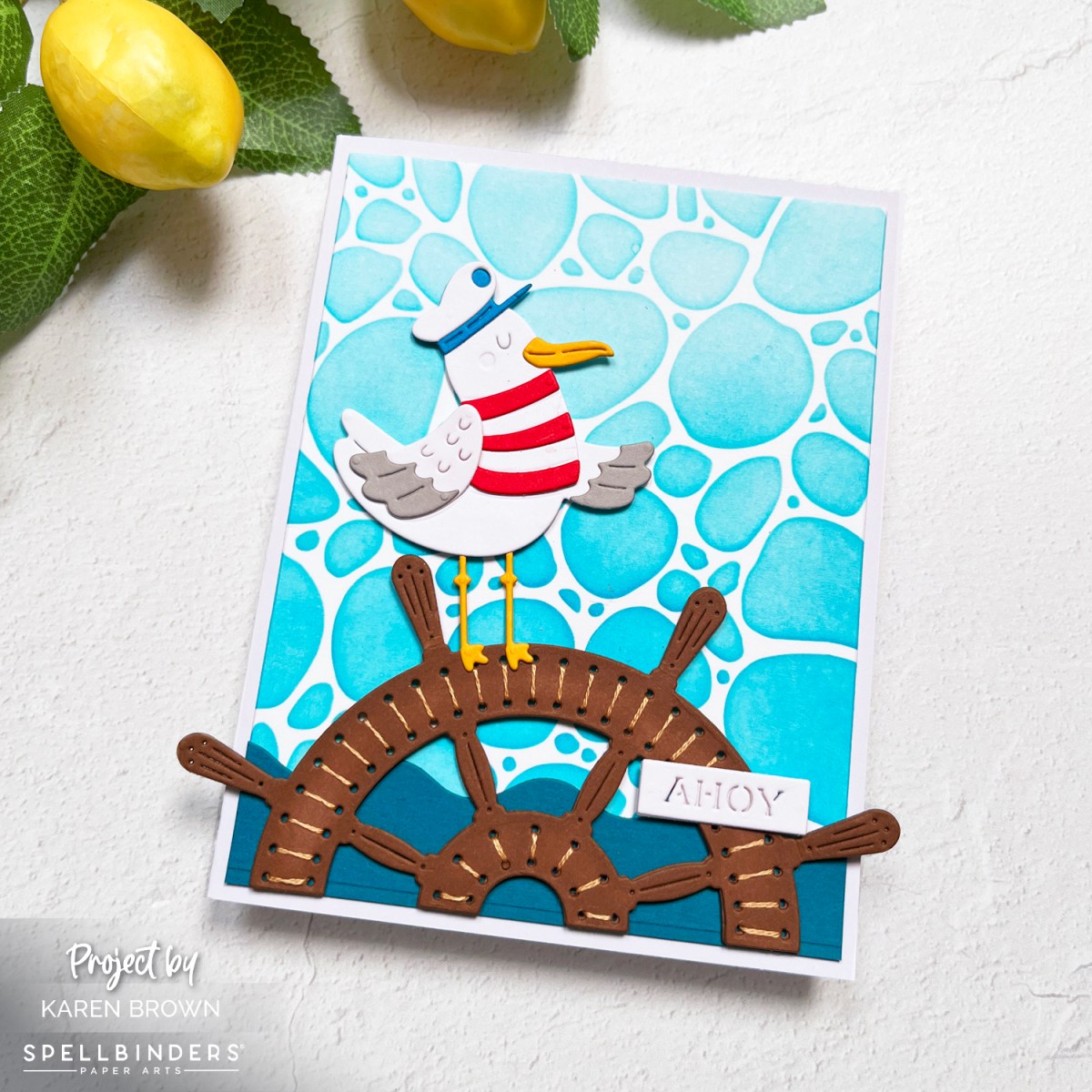
Stitch lovers, you’re going to adore this one! I used the Stitching Die of the Month to create a weathered captain’s wheel, stitched with DMC 437 (tan) using two strands of floss. I doubled up the die cuts for stability before stitching.
The background is stenciled using Hero Arts Pebbles and Stones Stencil with Splash ink, giving the look of water or bubbling seafoam. A goofy seagull in a red and white shirt and cap is perched just off center on the wheel for a fun focal point. The included “ahoy” sentiment completes the look.

Helpful Links:
- Spellbinders Small Die of the Month Kit – $30 value for just $17.50!
- Spellbinders Large Die of the Month Kit – $40 value for just $27.50!
- Spellbinders Stitching Die of the Month – $35 value for just $25!
- Spellbinders Deluxe Caboodle Kit – Get All 10 Kits, $315 value for just $130!
- Spellbinders Monthly Club Kits
- Platinum 6 Die-Cutting System
- ColorWheel Cardstock Sampler
- Spellbinders Cardstock
- Stitching Accessories
- Bearly Glue, Foam Squares and Craft Foam
- Club Overview and Club Options
- Past Club Kits
- Spellbinders Shop
- Sarah Renae Clark’s Color Cubes
Whether you’re here for the critters, the stitching, the sea breeze vibes—or all of the above—the June 2025 Club Kits deliver something truly special. ⚓💙