Featuring Yana’s Windmills & Tulips Plate with Glimmer Hot Foil and Layered Stencil Blending
There are cards… and then there are cards.
The kind with so much color and glow that they feel like a gift all on their own.
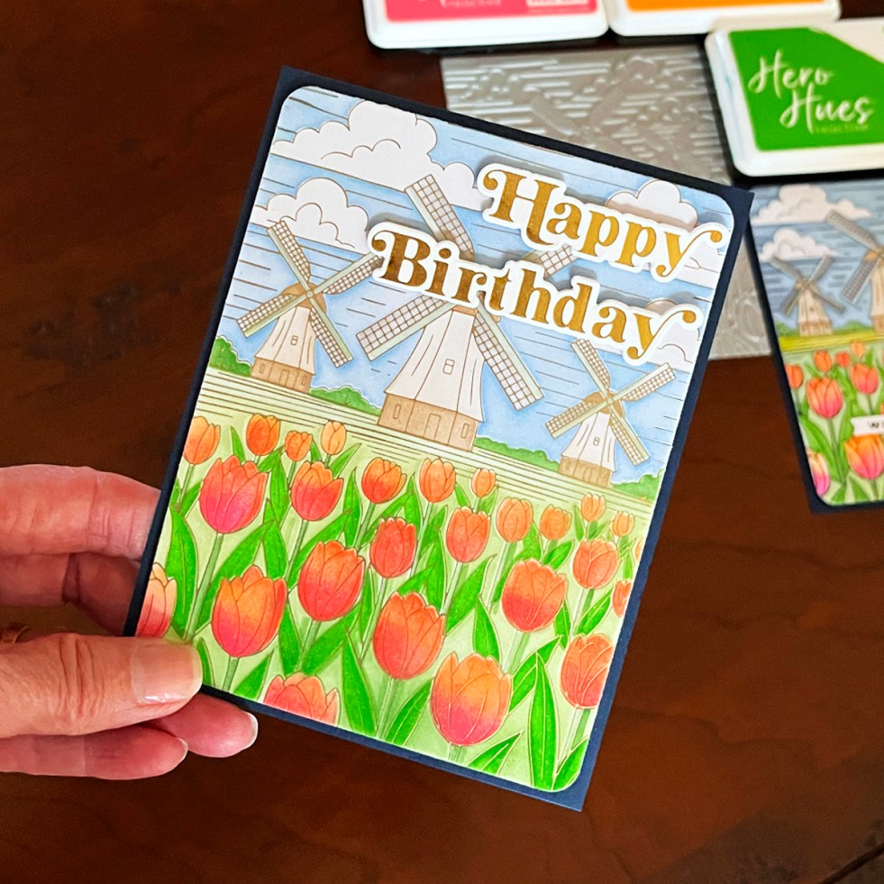
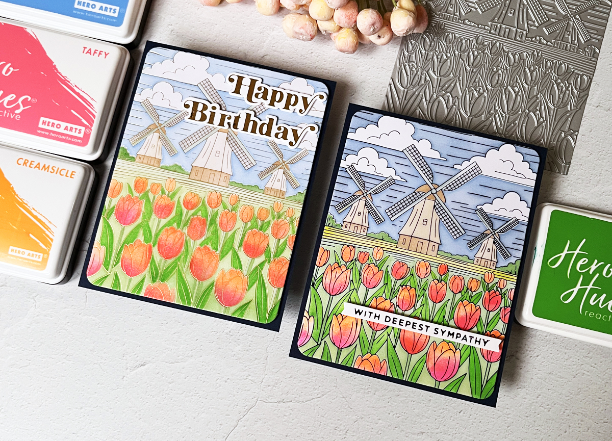
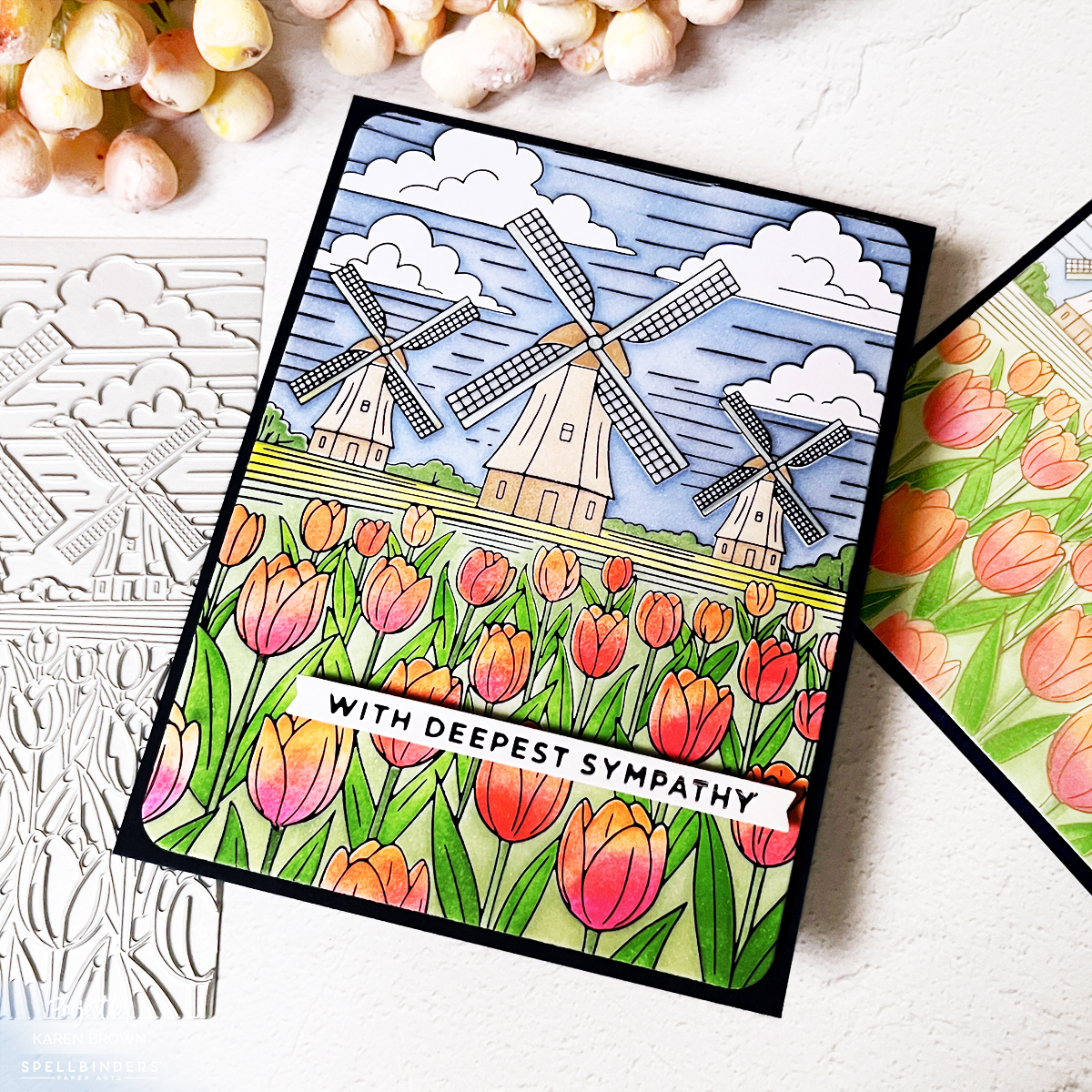
Today I’m sharing a vibrant windmill and tulips card created with the beautiful Yana’s Tulips Windmills and Tulips BetterPress Plate and coordinating coloring stencils. This design works beautifully for Mother’s Day, birthdays, sympathy, or any special woman in your life. It’s rich, luminous, and absolutely display-worthy.
The entire Yana’s Tulips Collection is gorgeous.
Honestly? It’s pretty enough to frame.
✂️ In This Post, You’ll Learn:
• The magic of hot foiling
• Easy masking tip
• Stenciling over foil
• How to fix inky mistakes
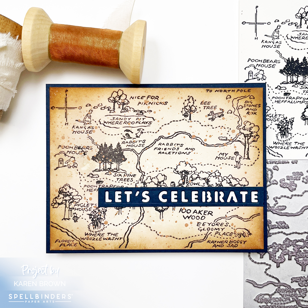
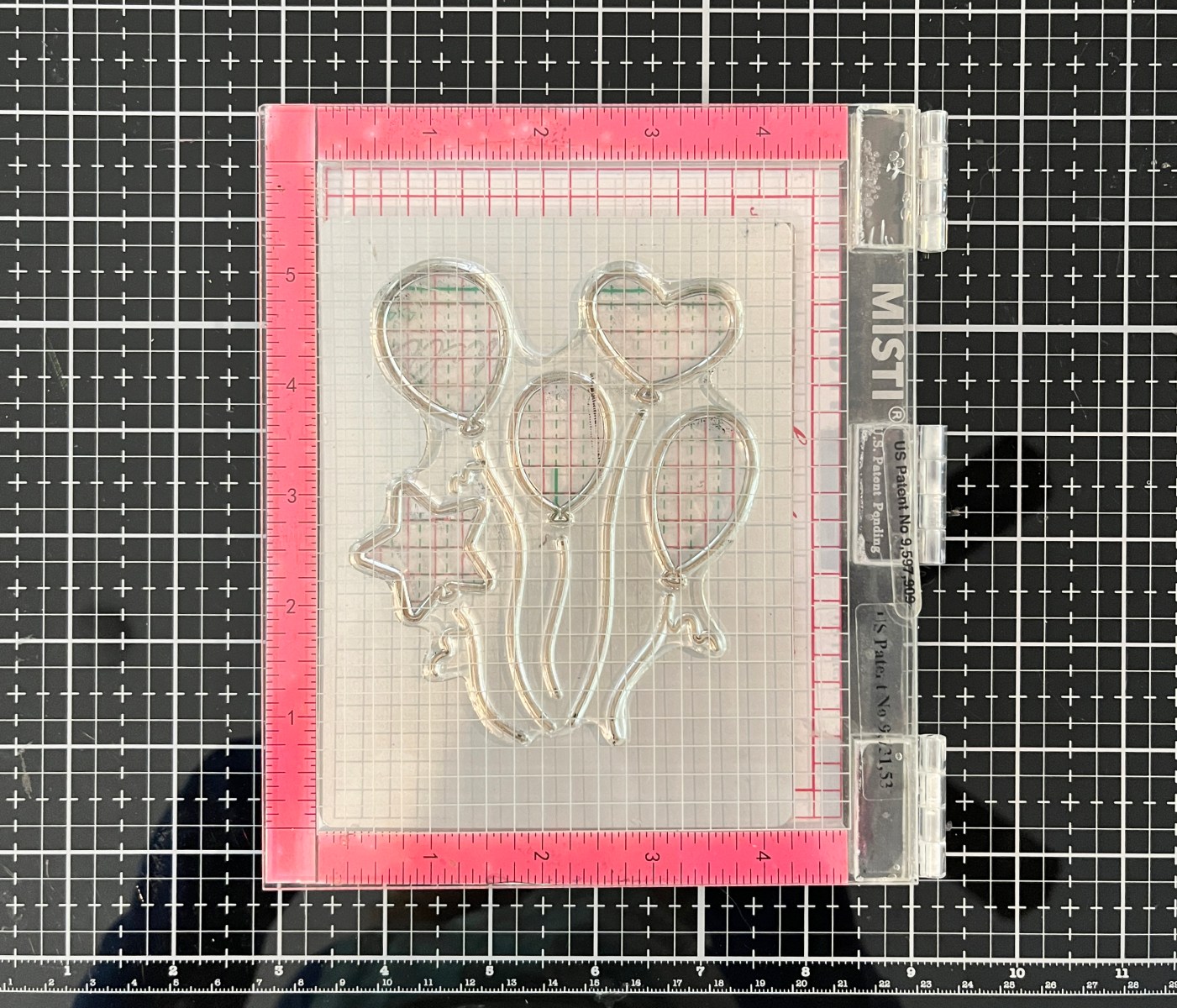
Product Spotlight: Yana’s Tulips Windmills & Tulips Plate
One of the things I love about the Yana’s Tulips Windmills and Tulips BetterPress Plate is its versatility. The design has wonderful movement and detail, which makes it perfect for both Glimmer hot foiling and BetterPress letterpress techniques.
What makes this set special:
• Large detailed floral scene that fills an A2 card front
• Coordinating coloring stencils make blending effortless
• Works beautifully with both foil and BetterPress ink impressions
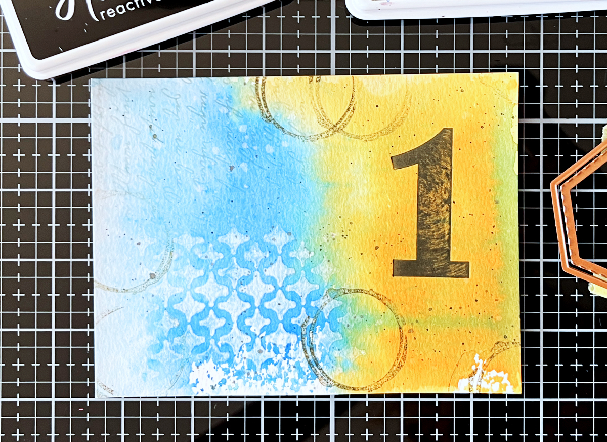
I especially love how this plate creates crisp outlines that are ideal for ink blending through the coordinating stencils.
👉 If you’re curious about the difference between the two techniques, you might enjoy my comparison post One Plate – Two Techniques, where I show foiling vs BetterPress side-by-side.
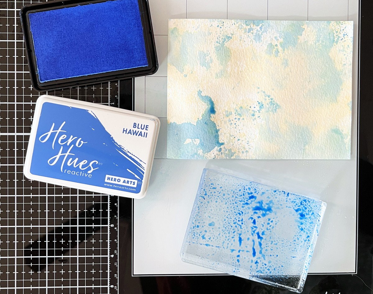
Why Foiling + Ink Blending Is Magic
I created two versions:
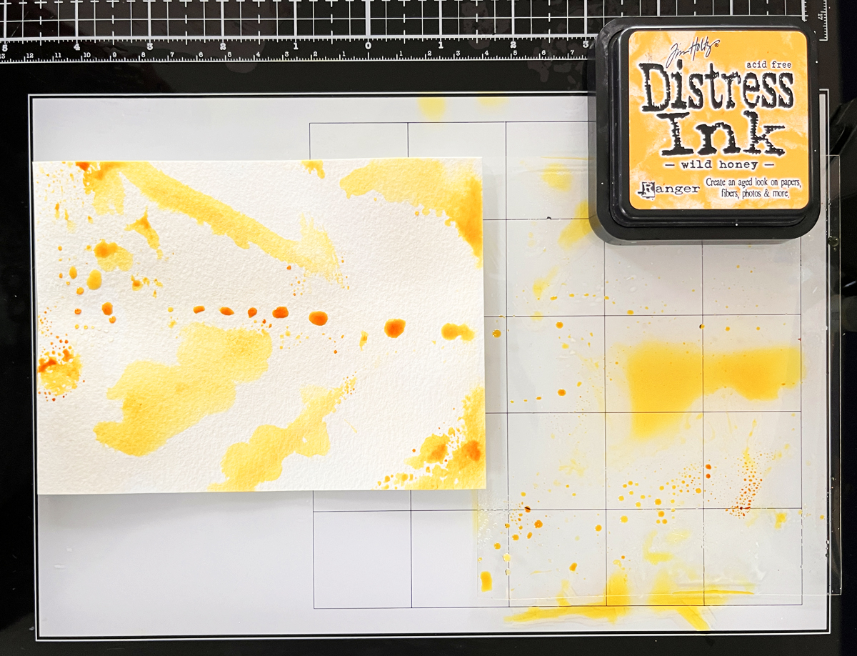
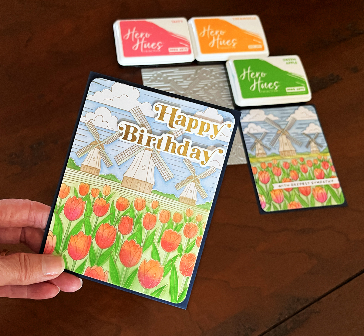
- Black foil – dramatic, high contrast, and the tulips really pop
- Satin matte gold foil – softer, with a romantic summery sky effect
Both are eye-catching. Nothing subtle here.
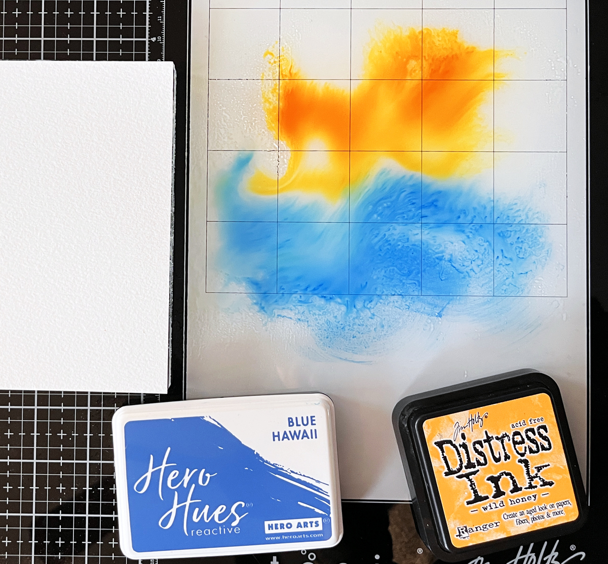
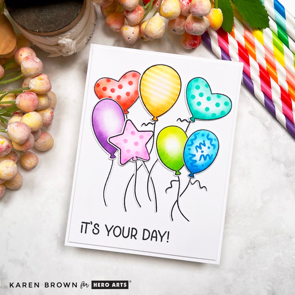
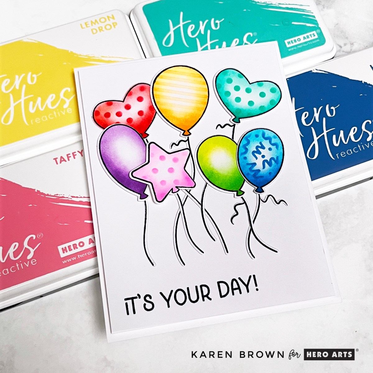
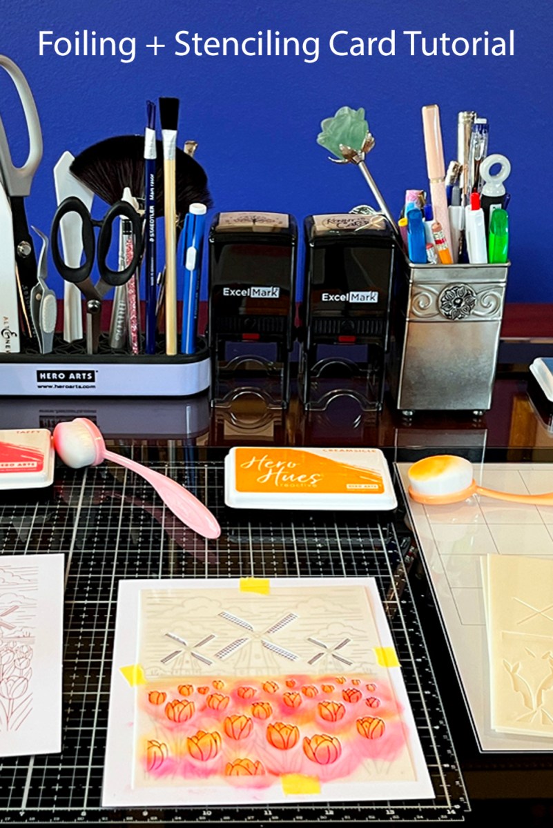
After foiling, I ink blended using the coordinating stencils. I own many brands of ink, but the ones I find myself reaching for the most are Hero Arts inks. They blend well everytime.
I used my color-coded blending brushes since this panel includes multiple areas — pink/orange tulips, fresh green foliage, windmills and a vibrant blue sky. If you’re new to blending detailed layers, I recommend starting with these brushes.
Blending through detailed stencils is surprisingly relaxing. Just layer and build color gradually.
Pin this tutorial for later:
I love foiling, but you can also use the same plates with your BetterPress System. Interested in seeing a side-by-side foil/betterpress comparsion? You can read my popular post: One Plate 2 Techniques.
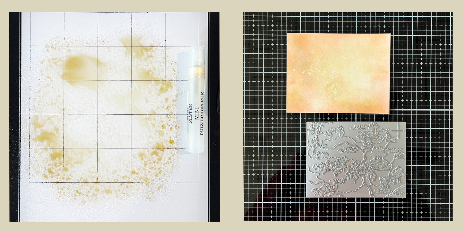
Pro Tip: Masking for Easy Color Changes
If you want to change colors within a stencil layer, simply mask off the section you’re not using.
A small Post-it note works perfectly for this.
It allows you to blend petals, leaves, or sky areas in different colors without accidentally over-blending neighboring sections.
Simple trick — big difference.
Build Your Foiling Toolkit
If you’re just getting started with hot foiling, here are the essentials I personally use:
- Glimmer Hot Foil System
- Yana’s Tulips Foil and Stencil Bundle
- Yana’s Tulips Collection
- Best Ever Craft Tape (low-tack tape)
- Black Foil
- Matte Gold Foil
- Color Coded Blending Brushes
- Platinum 6 Die Cutting Machine
- Smooth cardstock (important!) I used Xpress It Cardstock
For today’s cards I used X-Press It cardstock, which foils beautifully and blends smoothly.
If you’re building your craft room supplies, you might also enjoy my guide to the 14 Best Cardmaking Products and Supplies, where I share the tools I reach for again and again.
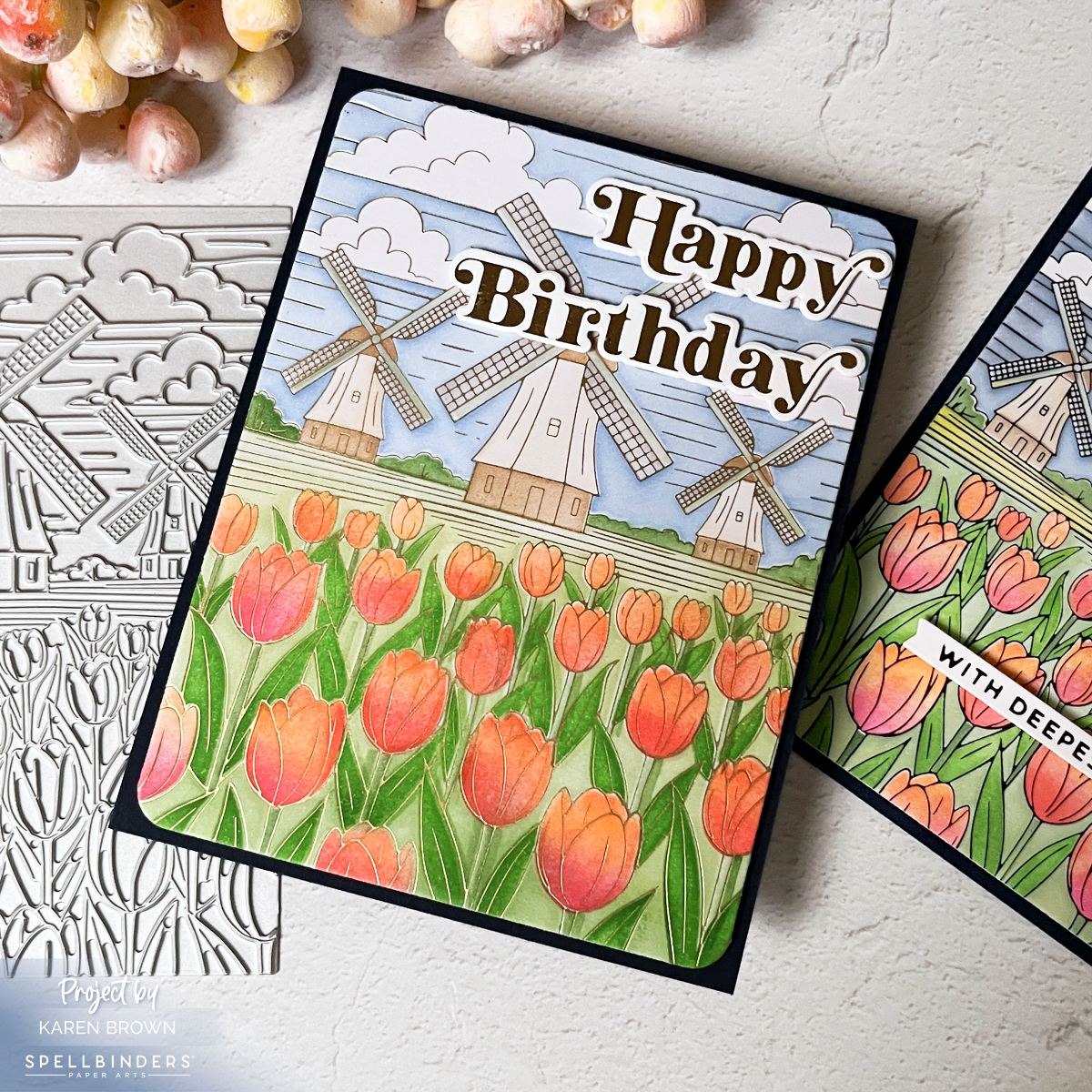
A Small Mishap (And a Save)
On my gold foil version, I somehow ended up with two pink ink spots in the blue sky.
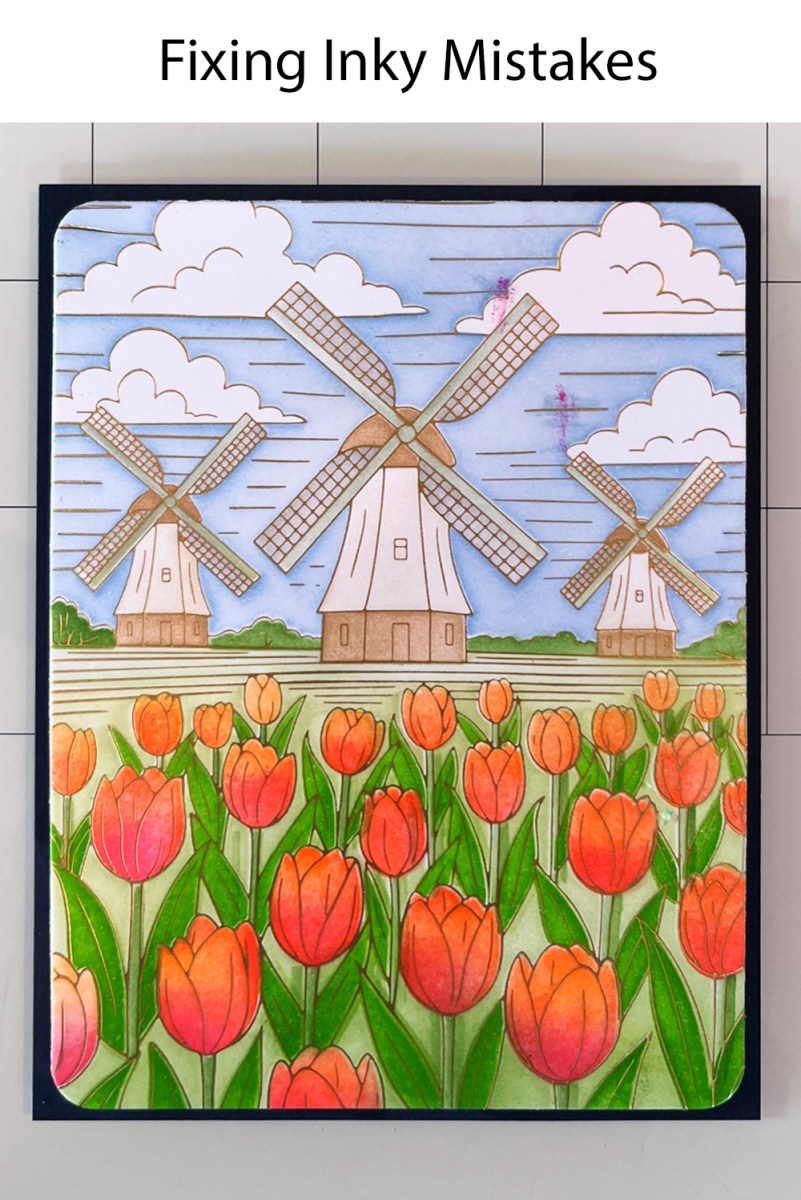
I debated starting over.
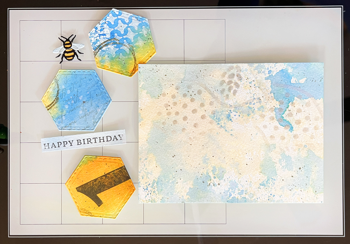
Instead, I strategically placed my die-cut Glimmer “Happy Birthday” sentiment right over the spots.
Problem solved.
And honestly? The placement improved the overall composition.
I even photographed the panel before fixing it because real crafting includes real moments. Sometimes the fix becomes part of the design.
Finishing Details
- Die cut the foiled panel with rounded rectangle dies.
- Mounted onto a blue A2 card base.
- Added die cut Glimmer sentiments for extra polish.
This card truly feels like art décor. The kind of keepsake card someone props on a dresser or bookshelf.
If You Love “Wow” Cards…
You might also enjoy my dramatic die cut chalkboard easel card — another bold, display-worthy design with serious presence.
And if you’re new to foiling, be sure to watch my 2 minute YouTube Foiling Tutorial where I share tips for flawless results every time.
There is also my creating a foiled card video or learn more about layering color in my layering stencil video.
Black Foil or Gold Foil?
I genuinely love both.
Black foil feels bold and graphic.
Gold foil is softer and more romantic.
Do you have a preference?