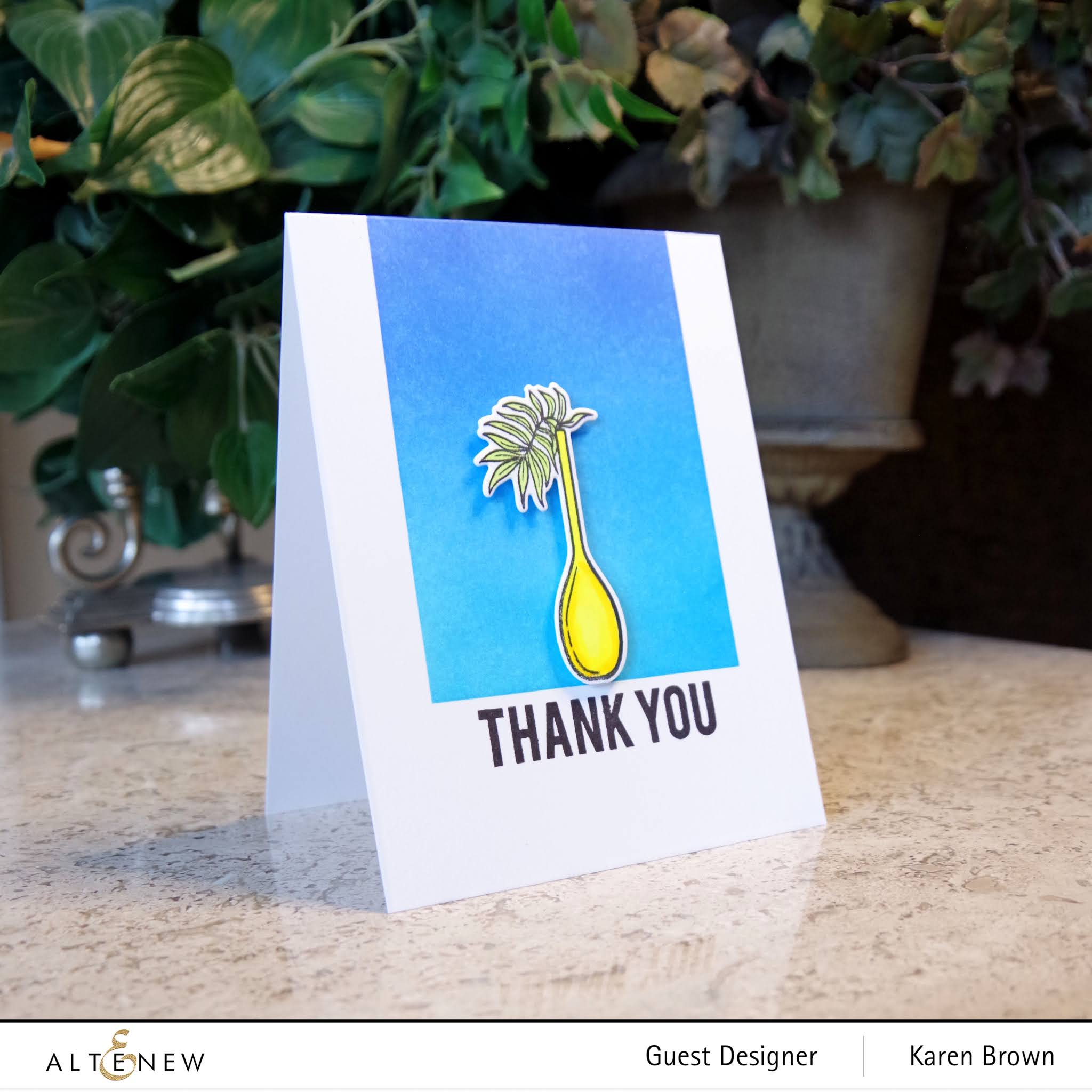
Uncategorized

Altenew Tall Vase

Altenew Tall Vase Stamp and Die

Hello and welcome!  Just a quick post today to spotlight this fun new Altenew mini-stamp set called Tall Vase.  This card was fast and easy to create.  A masked ink blended background with this beautiful die cut botanical image.  

Thanks for stopping by!
Karen


Uncategorized

WWC296 – Michelle\’s Challenge: Anything Feminine Goes


Hello, hello and welcome!  This week we are creating feminine cards at The Watercooler Wednesday Challenge and we would love to see your creation in our gallery.  Michelle is our hostess this week.  

I\’ve had my eye on the Altenew Hibiscus Garden 3D die set for sometime and finally bought it.  I wanted to use seasonal jewel tones  so I die cut my pieces from Altenew\’s Enchanting Washes Cardstock.  I like the gorgeous colors and the fact that it is thick like cardstock.  For the leaves I ink blendeded  4 colors of green on watercolor paper.  My background is a light watercolor wash where I then softened the edges with a towel so it fades out.  I dried the panel and then  added purple and black paint spatters.  Next I mixed gesso with Iridescent Shimmer Spray and added more splatters.  I assembled and paired with a Bold Envelope and my birthday card is now ready to mail.

I am also playing along with:

Festive Friday FF0071 I included die cuts, patterned paper (hibiscus), flowers and sentiment.  

UPDATE:  I was excited to see my card was selected as a \”Festive Fave\”!

Crafty Hazel Nuts Patterned Paper Challenge  I used Altenew Enchanting Washes Patterned Cardstock for the two hibiscus.

Karen


Uncategorized

WWC294 – Marsha\’s Challenge: Anything Goes With a Masculine Twist


Hello, hello and welcome!  This week we are creating masculine cards at Watercooler Wednesday.  I\’ve made a fun mixed media card using Altenew\’s Mega T Aphabet die and thanks die.

My Process:
  • I started with a 140 lb weight watercolor panel and then die cut the T. 
  • With a wide rough brush (I used a house painting trim brush) I applied a layer of gesso and then dried. 
  • Using a Carved Pumpkin mini distress ink cube I dabbed orange on the panel in random locations.  
  • I sprayed Iridescent Shimmer Spray to the panel which moved the distress ink around a bit and then dried with a heat tool.
  • I added another layer of randomly dabbed Carved Pumpkin Distress Ink which I again activated with the shimmer spray and then dried.
  • I then mixed gesso with Mermaid Lagoon distress ink and applied with a strip of cardstock for a rustic feel.  I then tinted the gesso a bit darker with the same distress ink and applied a bit more with the cardstock strip.  This way I have two shades of aqua on the card which I think gives added interest. Dry.
  • I dabbed a bit of Versamark ink on the panel, sprinkled on gold embossing powder and rubbed off most of it so that there were just touches of gold on the panel.  I heat set.
  • I die cut the thanks die from turquoise card stock.
  • I added the T panel to a cream colored A2 cardbase and glued on the sentiment.
This thank you card was so fun to make! There is a gorgeous shimmery sheen that does not photograph well, but the card just glows in person.

I am also playing along with:


Simon Says Stamp \”Layer It Up\”  I used 7 layers of gesso, distress ink, shimmer spray, embossing powder plus two die cut layers.  

I am so glad that you stopped by!
Karen 
Uncategorized

Finding and Incorporating Inspiration Into Your Project

Hello, hello and welcome!  Today I am blogging about a fascinating class I took at Altenew Academy called Mission Inspiration. Nicole Watt was our instructor and instead of focusing on technique, this class was all about finding inspiration for our creations.  

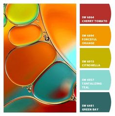
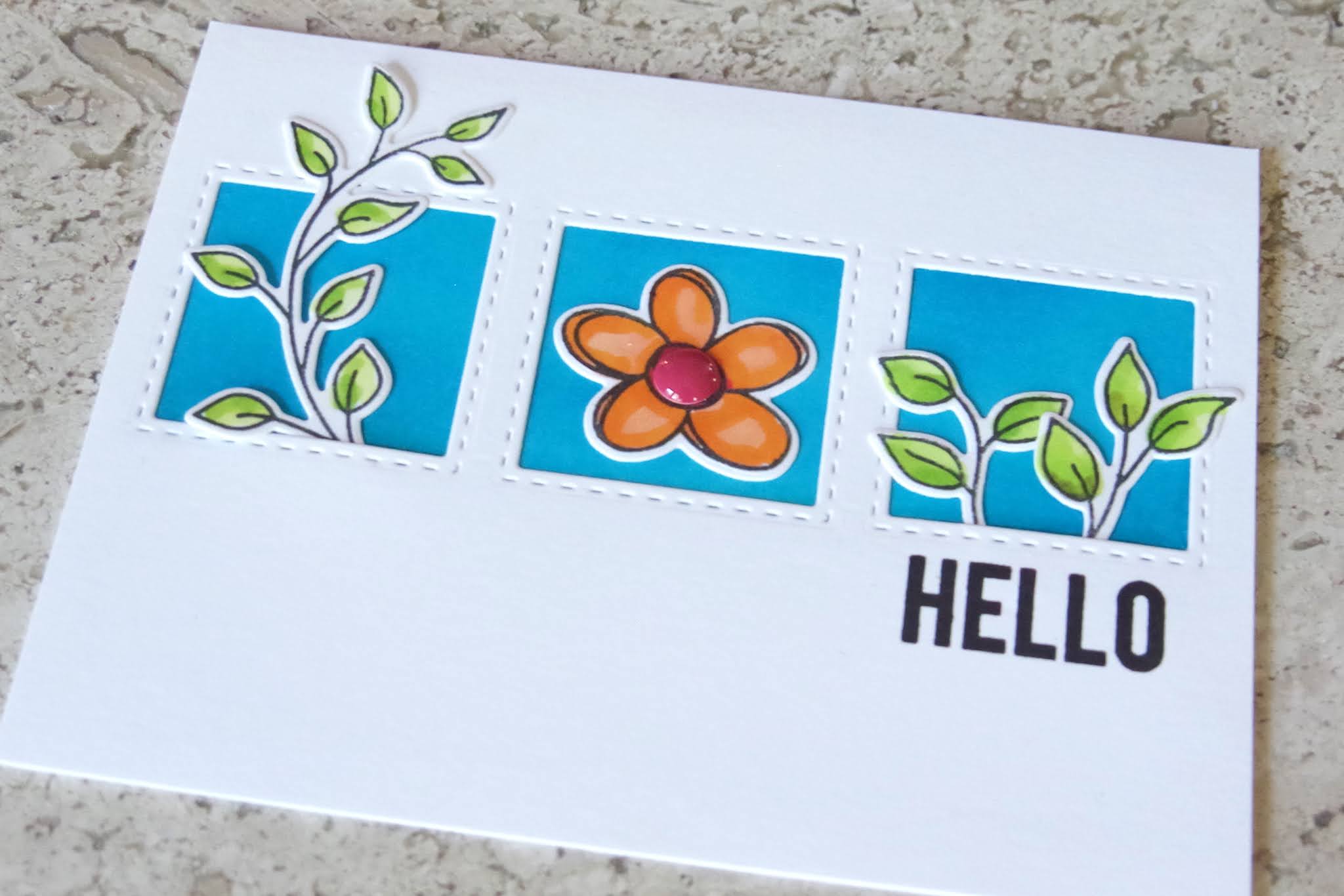
For this post I wanted to use a combination of color and layout inspiration for my cards.  I envisioned a trio layout with color selection coming from Pinterest.  Nicole had great ideas for searching for \”color combos\” and I found this quite fun! I also decided to work on staging and styling my photographs and I am pleased with the result.


I loved the graphic below and used the red, orange, citronella green and teal as the color inspiration for my card. 

I hand inked the background because I thought the result was more vibrant than the colored card stock I tried first. The center of the flower is a fun enamel dot.


The second card is very similar but I used three flowers from the same stamp set and a different color inspiration graphic.

Here is the inspiration swatch for my second card.
Again, I ink blended the background and then colored the blooms in melon and pink.  The centers are enamel dots which adds a fun detail to the card.
Here are the cards together and I think they are a bright and happy duo.  Inspiration is everywhere and I will be drawing on these six classes as I create in the future.

Altenew Products Used: Link Here

Altenew Doodle Blooms

Altenew Pinstripe (sentiment)

Altenew New Day Enamel Dots

Altenew Jet Black Crisp Die Ink

Altenew Envelope Variety Pack

I am also playing along with:

As You Like It \”Bright or Pastel\”  I almost always go with bright on my cards because I love bold colors.  🙂

Thank you for stopping by!

Karen

Uncategorized

WWC284 – Dawn\’s Challenge: All About Occasions

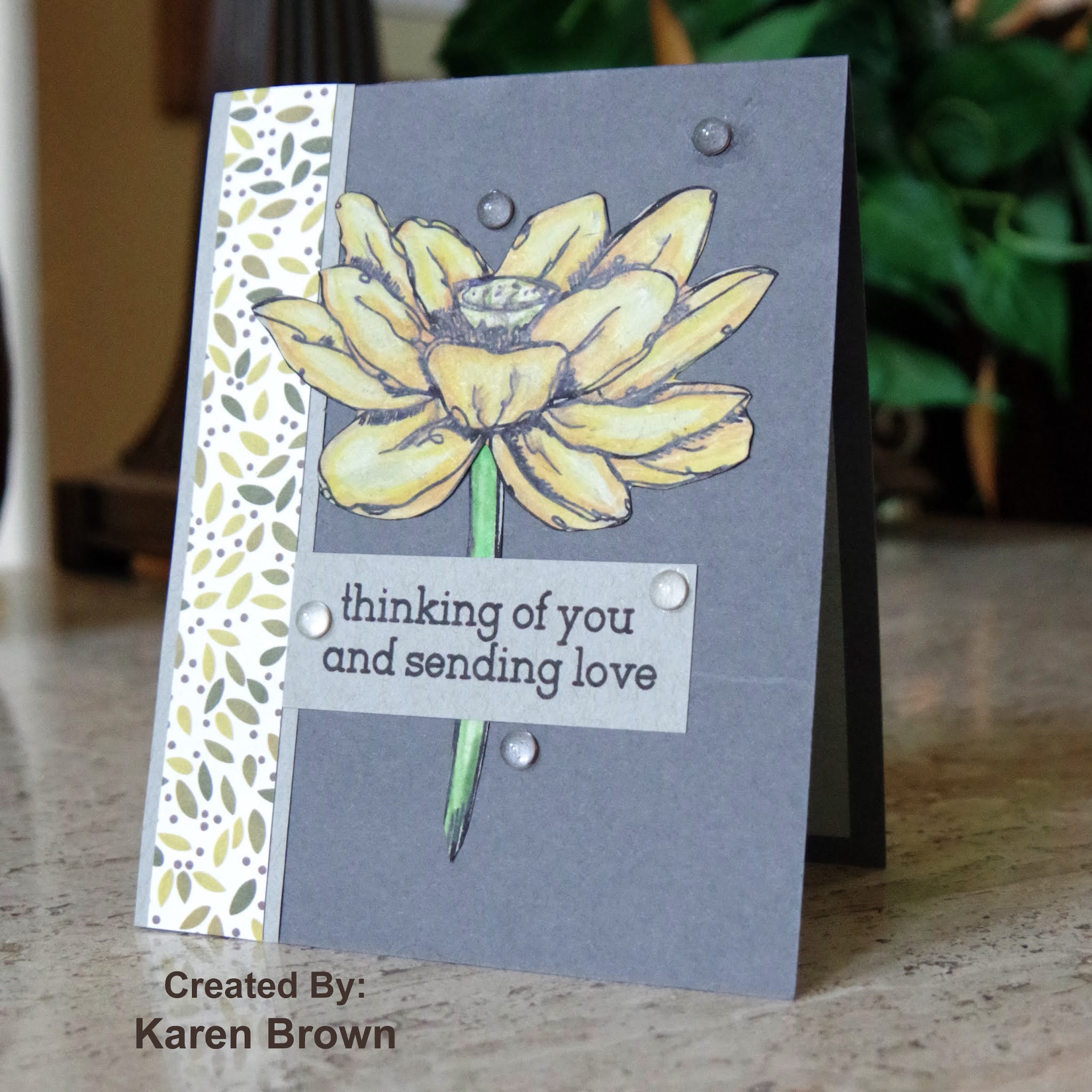
Hello and Happy Wednesday!  I created a card for my daughter, who is moving into a new home, and thought it would be perfect for this week\’s Watercooler Wednesday All About Occasions Challenge.  There are so many different cardmaking occasions and we would love to see your card in our gallery.

Supplies Used:
Altenew Garden Grow stamp and die bundle
leftover handstamped scrap
Washi Tape
WPlus9 New Home sentiment
Copic Markers
Foam Tape
I am also playing along with:
Shopping Our Stash KISS. I’ve had this Washi tape for years but this is the first time I’ve incorporated it into a card.  I also used a leftover hand stamped scrap and one of my oldest stamp sets.

UPDATE:  I was so pleased to see my card was recognized as a \”Top 3\” by Shopping Our Stash!

Thanks for stopping by!
Karen
Uncategorized

Altenew Academy: Beautiful Details

Hello!  I just finished the Altenew Academy Class \”Beautiful Details\”.  I have to say our instructor, Marika Rahtu, is quite the artist and her cards are amazing!  Marika taught us that adding details can elevate our cards.


My style is more colorful and bold, but I incorporated several of her suggestions into my card.

Details I added to make this card special:

  • I love ink blending so I ink blended a complimentary background.  I reversed the colors from the floral images so I started blending from the bottom right in yellow (top flower) then added 5 other colors so that I finished with purple to get the gradient that I wanted.  I laid down a lot of ink and think this gives a bold and cohesive look to the card.  
  • I masked the left side (1\”) of the card to give contrast to the bold colors.
  • I used foam adhesive to give dimension to the focal point.
  • I added some shimmer pen to the flowers for a bit of subtle shine.
This Altenew Weekend Doodles stamp and die bundle may be my favorite set from Altenew.  I Copic colored the blooms and arranged them where the ink blending meets the white edge. 
I am also playing along with:
 Festive Friday FF0064.  I\’ve used  pink, a sweet sentiment, die cuts and colored my card for \”summer fun\”.
Little Red Wagon #560 Give Us Your Background  I used loads of distress ink to make this bold background.  
UPDATE:  I am so please that this card was chosen as a Festive Friday Fave!


Karen
 
Uncategorized

WWC281 – Heidi\’s Challenge: All About Occasions

Hello and welcome!  This is my design team card for Watercooler Wednesday\’s All About Occasions Challenge and Heidi is our hostess.


I\’ve created a birthday card using a faux watercoloring technique.  I used bright summer colors and added a bold birthday sentiment die-cut using navy cardstock. 

Supplies Used:
Altenew Inked Lotus stamp and die bundle
Altenew Golden Peach Embossing Powder
Distress Inks:  Squeezed Lemonade, Mustard Seed, Carved Pumpkin, Pickled Raspberry, Twisted Citron, Mowed Lawn
Simon Says Stamp Happy Birthday die cut
Picket Fences Blending Brushes
Watercolor Paper
Navy Cardstock (for sentiment die cut)
Cream A2 card base

I am also playing along at:
The Flower Challenge: Summer or Fall I love summer and used bright, happy colors that I associate with summer.


Inspired By \”Pretty Blossoms\”  I was inspired by the floral theme and the colors in the bouquet.

I am so pleased you stopped by and hope to see your card in our challenge gallery.

Karen
Uncategorized

Altenew Academy "With A Twist"

I just completed Altenew Academy\’s Class \”With A Twist\” and I created a bunch of cards.  The class was all about trying the unexpected.  I am sharing my favorite card from the series and it was from Class #6 \”Die Cutting With a Twist\”.  Our instructor, Therese Calvird, showed us how to do faux embossing with die cuts.  I had never done this technique before but it does result in a dramatic and showy card.

My Process:

  • I stamped two A2 Bristol panels full of leaves and blooms from Altenew\’s Smile More stamp and die bundle.
  • I colored them with Zig markers and used a damp brush to blend the colors.
  • I die cut everything.
  • I wanted to use a big scripty sentiment so I heat embossed Enjoy on an A2 card front made of Bristol cardstock and Your Birthday on a scrap of black cardstock.
  • I played around with the layout and when I was happy, I glued the die-cuts down with liquid adhesive.  I was sure to leave all the edge images over the edge and then I took sharp scissors and trimmed  the die-cuts flush to the edge.

Pro Tips:
  • Stamp and color a lot of images.  For this card I stamped and colored two complete A2 panels worth of  blooms and leaves.  You don\’t want the card to look skimpy and there is quite a bit of waste after your trim around your card.  
  • I made my own card base out of Bristol cardstock so the cardbase and die-cuts would blend well. 
  • I stamped one panel with Ranger Archival Jet Black ink and one with Versamark Onyx black and found I got a better result with the Onyx Black. The Archival required multiple stamping and after drying for one day, one bloom still smeared a bit.
I am also playing along with:
Allsorts \”Flowers All Over\”  I \”faux embossed\”  flowers all over my cardbase.

The Flower Challenge \”Summer or Winter\”  The answer for me is summer!  I love summer…the sun, warm weather clothes, bright colors, long days….  These daisies are very summery to me.  

Thanks for stopping by!
Karen

Uncategorized

AECP Altenew Academy: In The Mood for Color

In The Mood for Color (taught by Stephanie Klauck) was such an interesting class.  We learned to select colors based on the mood we are trying to convey.  Adding the right color can add depth and nuance to your project.


I chose to make a Thinking of You card and decided to use yellow to project optimism.  

I love the look of colored pencils, but they intimidate me a bit.  Stephanie inspired me to dust off my Polychromos and give them a try.  She walked us through the technique and I was pleased with my coloring. 


My Process:
  • I put my Lotus stamp in my Misti and stamped the bloom and stem on grey paper. I left the stamps in there while I colored.
  • Stephanie taught us to start with our lightest color, then add shadows with  our darker colors and then blend with our medium tones.  The key is to add lots of layers of color.  
  • The lines blur a bit with the pencil coloring so I then put the paper back in the Misti and restamped which resulted in crisp lines.
  • I fussy cut the images and then went around the edges with a black pen.
  • I wanted an accent strip so cut a strip of this designer paper and then mounted it on a piece of the grey Strathmore.
  • I stamped my sentiment on another strip of grey Strathmore so that there was continuity across the card.
  • I made an A2 top folding card, assembled with liquid glue and added some clear drop embellishments.  
Pro Tips:
  • Strathmore Toned Grey paper works great with colored pencils.
  • Keep your stamps in the Misti so you can restamp after coloring. This makes a huge difference!

Supplies Used:
Altenew Inked Lotus stamp
Altenew Jet Black Crisp Ink
Strathmore Toned Grey paper (for flower, border and sentiment strip)
Faber Castell Polychromo colored pencils
Scrap of Designer Paper
Slate cardstock (for A2 card base)
Clear Waterdrop embellishments

I am also playing along with:
Inkspirational #217 Painting or Coloring  I chose coloring with colored pencils.

UPDATE:  I am so pleased that this card was chosen as a Rising Star by A Place to Start!

Thanks for stopping by!
Karen