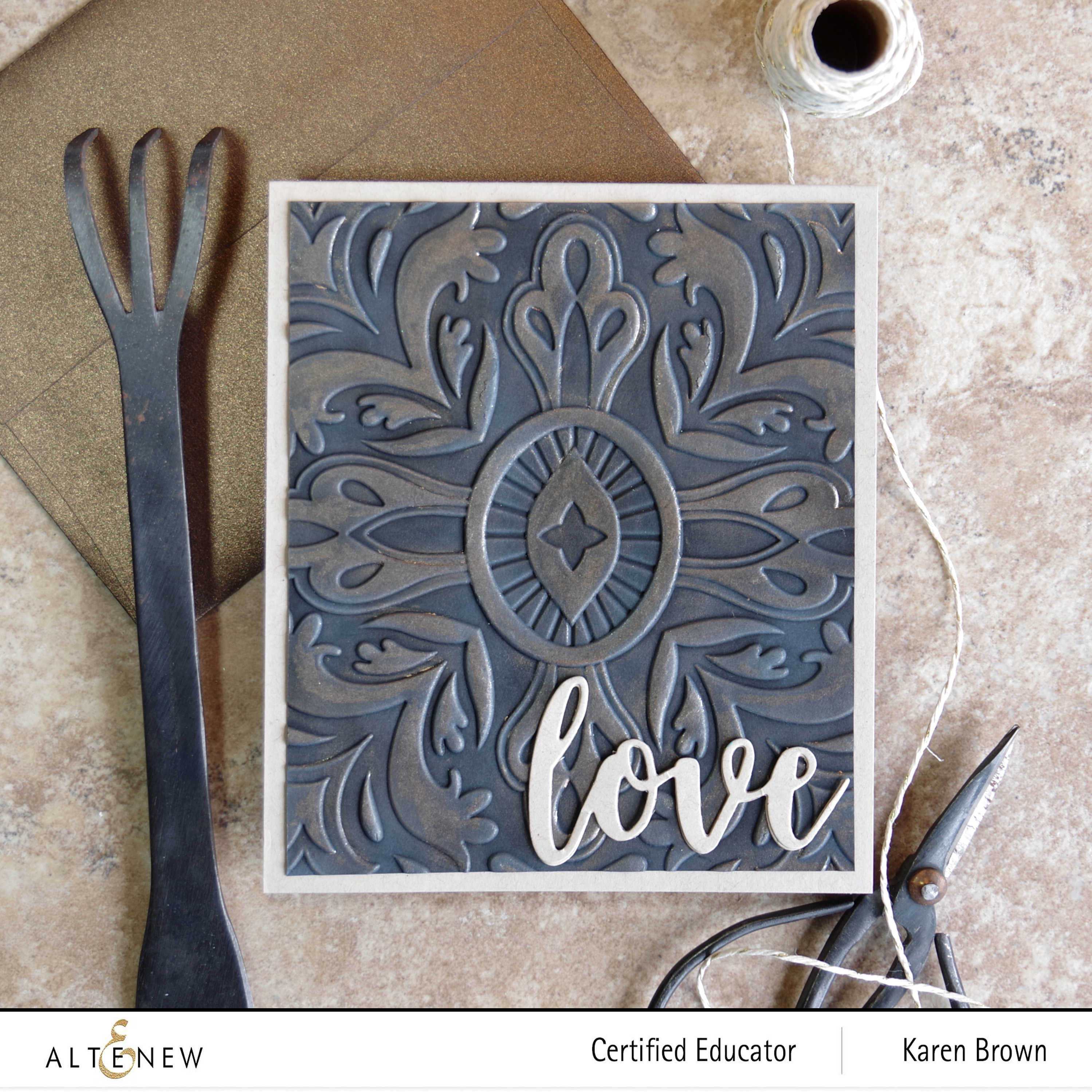
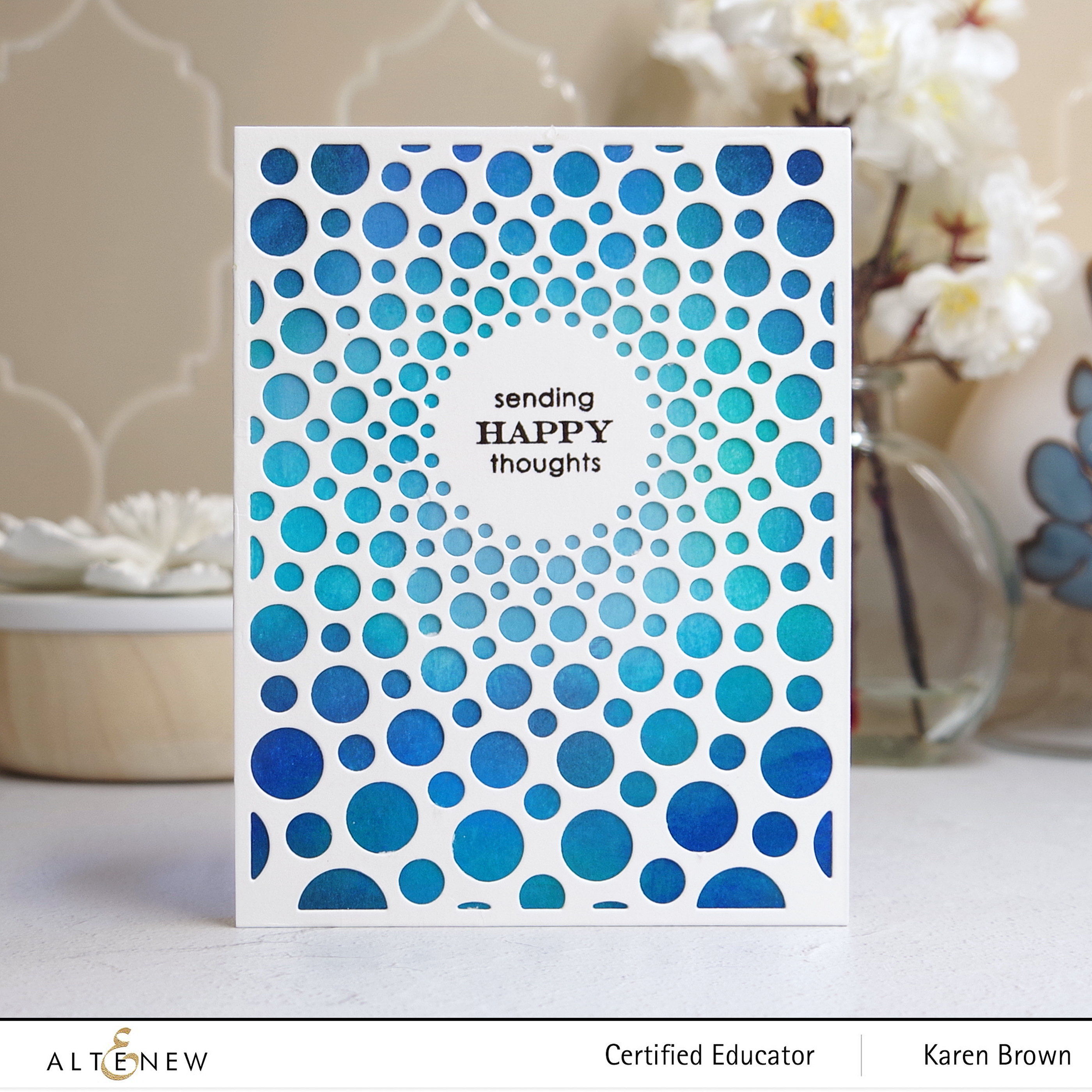
Altenew’s Radial Circles Cover Die
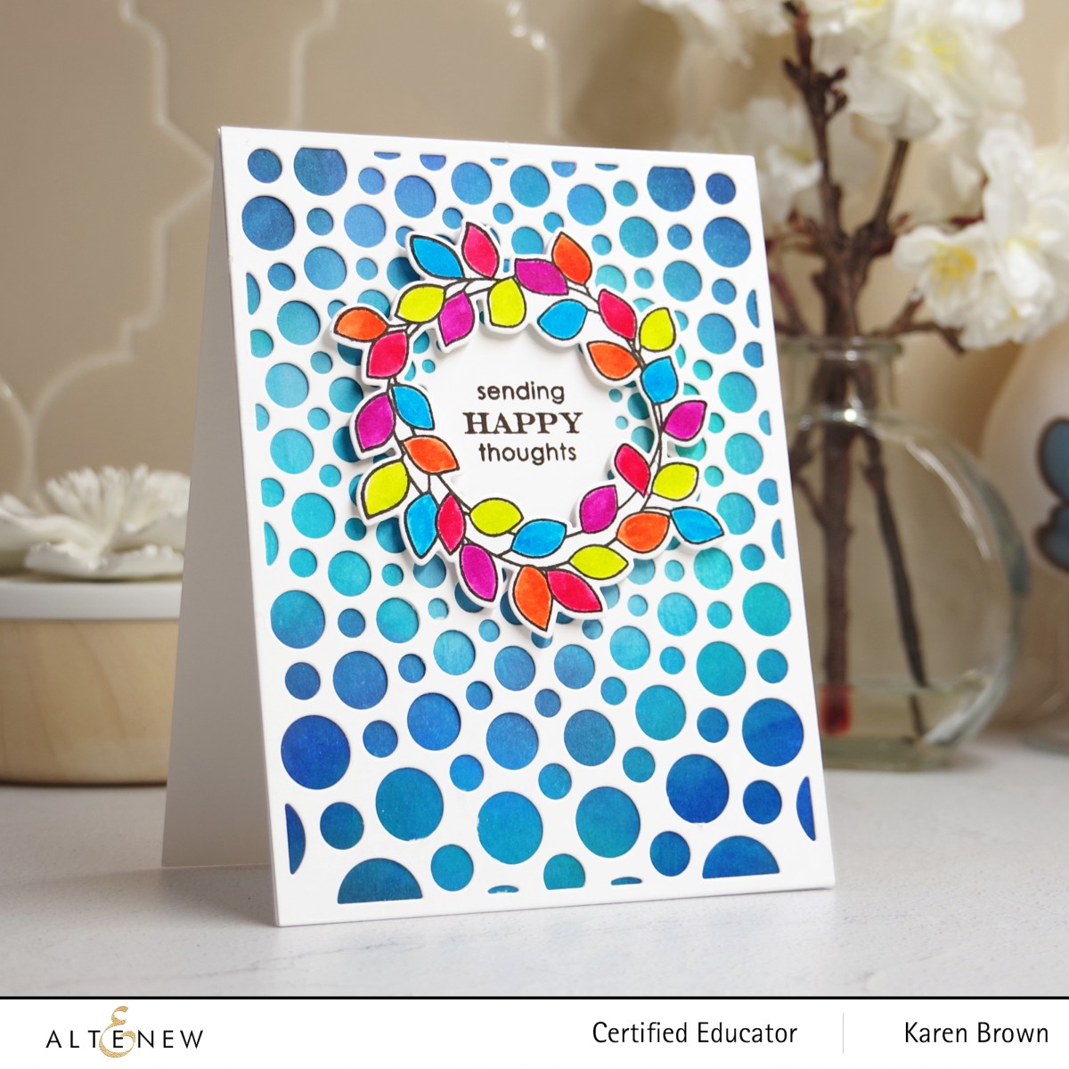
Hello and welcome to Altenew’s Simply Scientific Release and Blog Hop! There is lots of wonderfulness in this collection. I was instantly attracted to the Radial Circles Cover Die and I used it on three of my cards today.
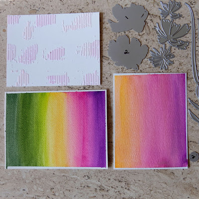
I started by making a background using the “Direct To Paper” method. I used 8 colors of Altenew Crisp Dye Inks in blues, greens and aquas and I just swipped the ink cube over my cardstock. I wanted the edges darker than the middle but that was the extent of my plan. Don’t worry about blending, it will look great under the die cut panel. I love the bold vivid color from this technique.

For the cover die, I used a metal shim for precise die cutting.
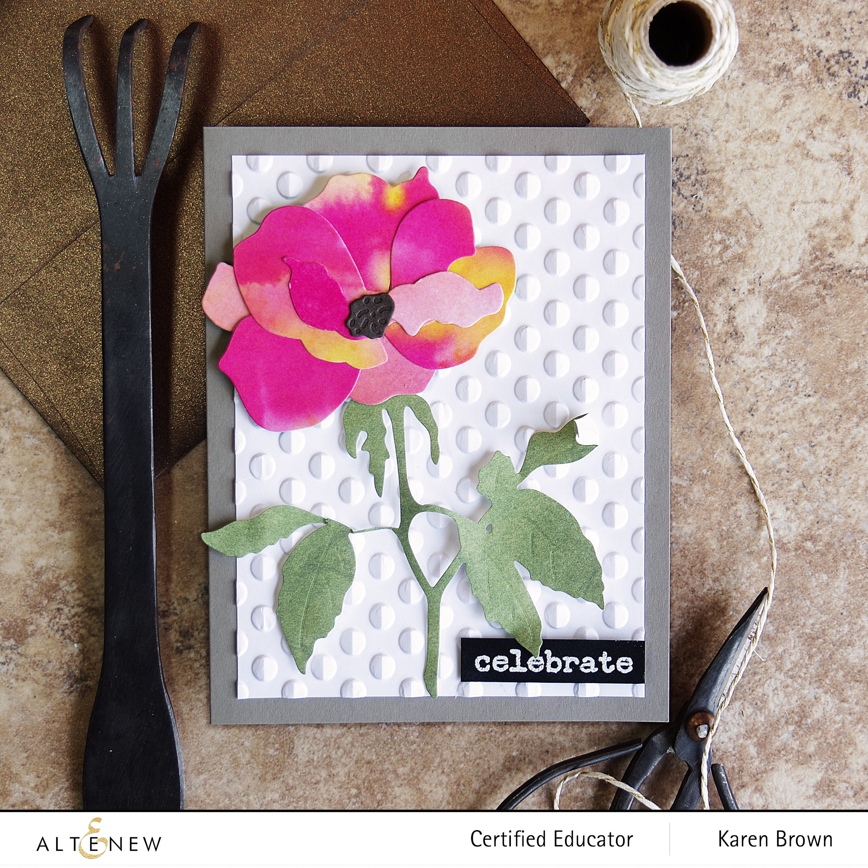
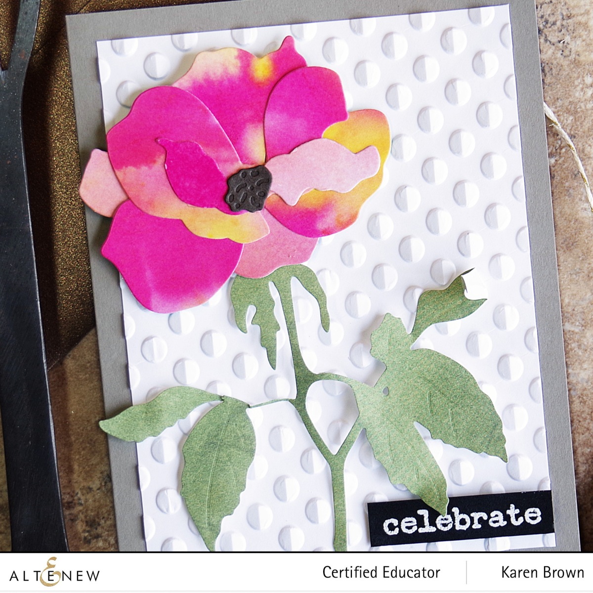
I thought a wreath would look pretty around the sentiment and I colored the leaves with my Altenew watercolor brush markers for a bright cheerful card.
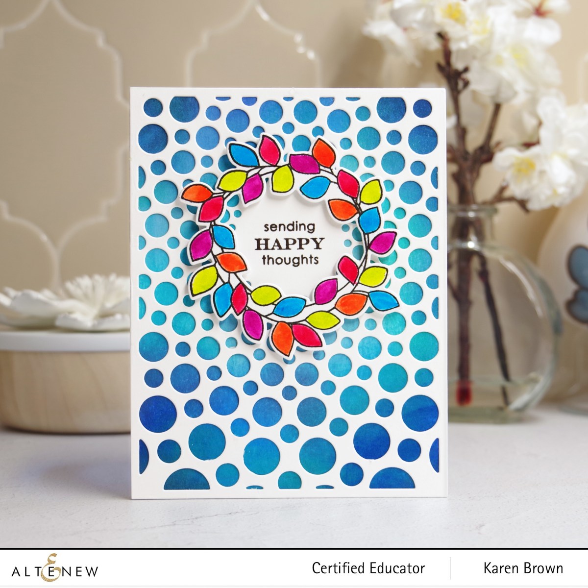
Products Used:
- Altenew Radial Circle Cover Die
- Altenew Weekend Doodles Bundle (Wreath and Sentiment)
- Altenew Watercolor Brush Markers
- Altenew Crisp Dye Inks
- Instant Dimension Foam Tape (for wreath)

Quick and Easy Card
If you want a quick and easy card with loads of impact, you can quickly make a background with the Direct to Paper technique described above and then just pop on a die cut cover panel and stamp a sentiment.
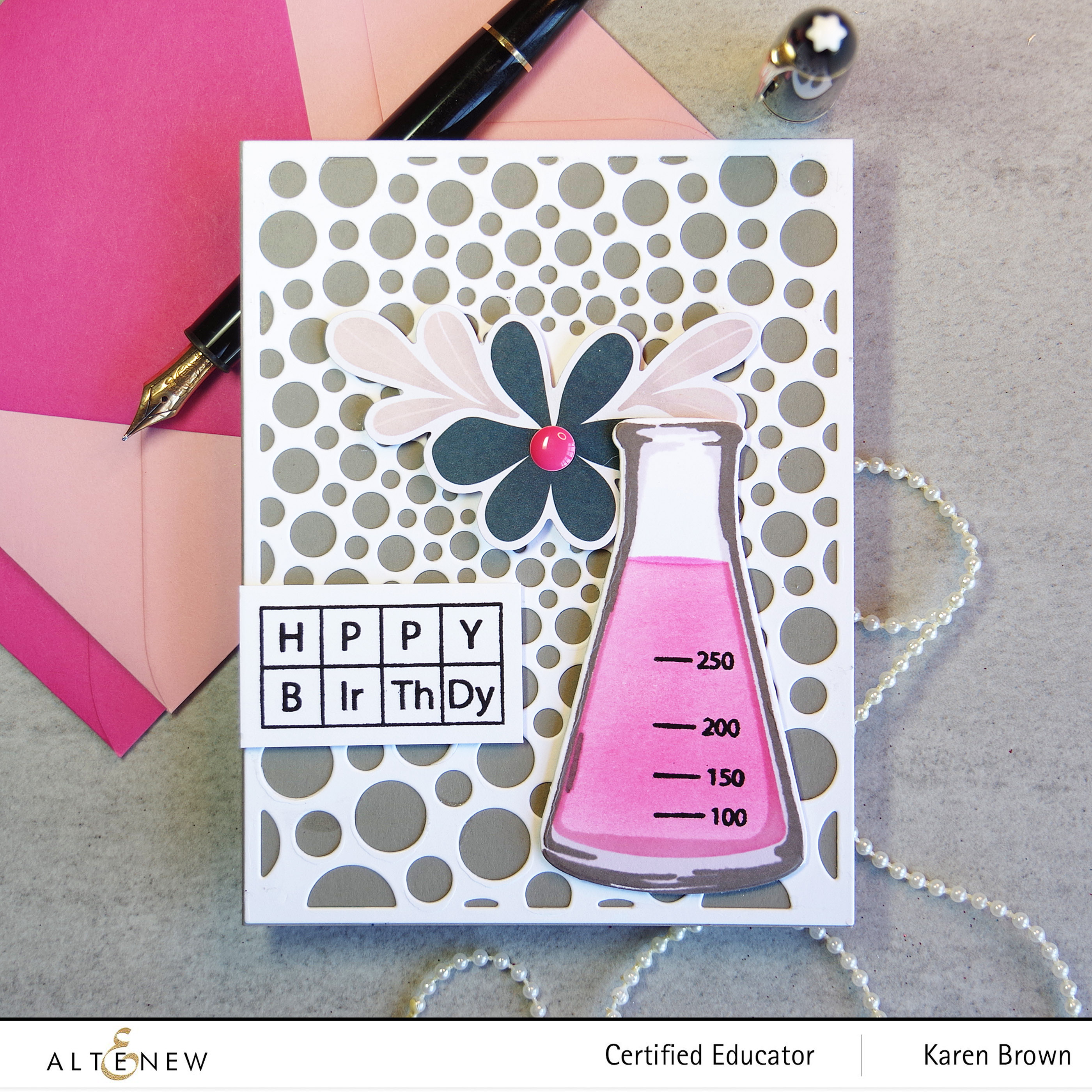
Altenew’s Chemistry Vases Stamp, Die and Coloring Stencil
For my next card, I used bright bold primary colors for a “school vibe”. My daughter is a scientist at a university and I made this card for her.
I started by making a background with strips cut from gel press prints. The background was easy to make and came together very quickly.
I used the Chemistry Vases stamp, coloring stencil and die for my beaker. I used Altenew Crisp Dye Inks in the following colors: Soft Lilac for the shadow, Coral Berry, Puffy Heart, Moon Rock for the beaker outline and Jet Black for the markings.

Products Used:
- Altenew Chemistry Vases stamp, coloring stencil and die.
- Altenew Crisp Dye Inks
- Altenew Halftone Circles Dies for the blue background element
- Altenew Creative Edges Notebook Die for the die cut piece on the left edge of the background
- Altenew Instant Dimension Foam Tape
I love the adorably punny sentiments included in this set!

For my last card, I combined Altenew’s Chemistry Vases Bundle with the Radial Circles Cover die. I have a friend who runs a medical laboratory and I thought this card would be perfect for her birthday. I used a taupe A2 card base, added a floral embellishment from the Bitty Bits Ephemera Kit and topped it with a pink enamel dot.

I think this Chemistry Vases set is perfect for students, teachers, scientists, professors, and medical professionals.
Giveaway Prizes:
$300 in total prizes! To celebrate this release, Altenew is giving away a $50 gift certificate to 2 lucky winners and a $25 gift certificate to 8 winners! Please leave a comment on the Altenew Card Blog and/or each designer’s blog post on the blog hop list below by 11/06/2022 for a chance to win.
Altenew will draw 10 random winners from the comments left on each stop of this blog hop and announce the winners on the Altenew Winners Page on 10/08/2022.
Blog Hop Order:
Karen Brown. You Are Here!
Nathalie DeSousa. Nathalie is next and I know you will love her post!
I am so pleased you stopped by!
Karen