Mixed media doesn’t have to mean messy chaos and 47 random products scattered across your desk.
I finally realized that what I needed wasn’t more supplies… I needed a formula.
I absolutely LOVE the look of mixed media—and honestly, it’s some of the most fun you can have in a craft room. There are no rules. No mistakes. Just happy little outcomes (and sometimes a few gloriously imperfect ones).
But when I first started, I had no idea where to begin. I admired so many artists’ projects… but how did they know what to add next?
After years of experimenting (and making a delightful mess of watercolor paper), I developed a simple 3-step recipe that works on almost every project.
And today, I’m sharing it with you.
✂️ In This Post, You’ll Learn:
• My 3-Step Mixed Media Recipe
• How to create easy but interesting backgrounds
• Which layers are my go-to workhorses
• How to choose a strong focal point
🧁 Karen’s 3-Step Mixed Media Recipe
Step 1: Create an Interesting Background
Step 2: Add 4+ Layers
Step 3: Add a Strong Focal Point
That’s it.
📌 Save this for later so you can come back when you’re ready to create.
This is Blog Post #1 in a new mixed media series where I’ll walk through each part in detail — visually and step-by-step. If this kind of creative play excites you, be sure to subscribe so you don’t miss the tutorials ahead.
If you try this recipe, I would love to see it.
Use #karensmixedmediarecipe so we can follow along with each other’s projects.
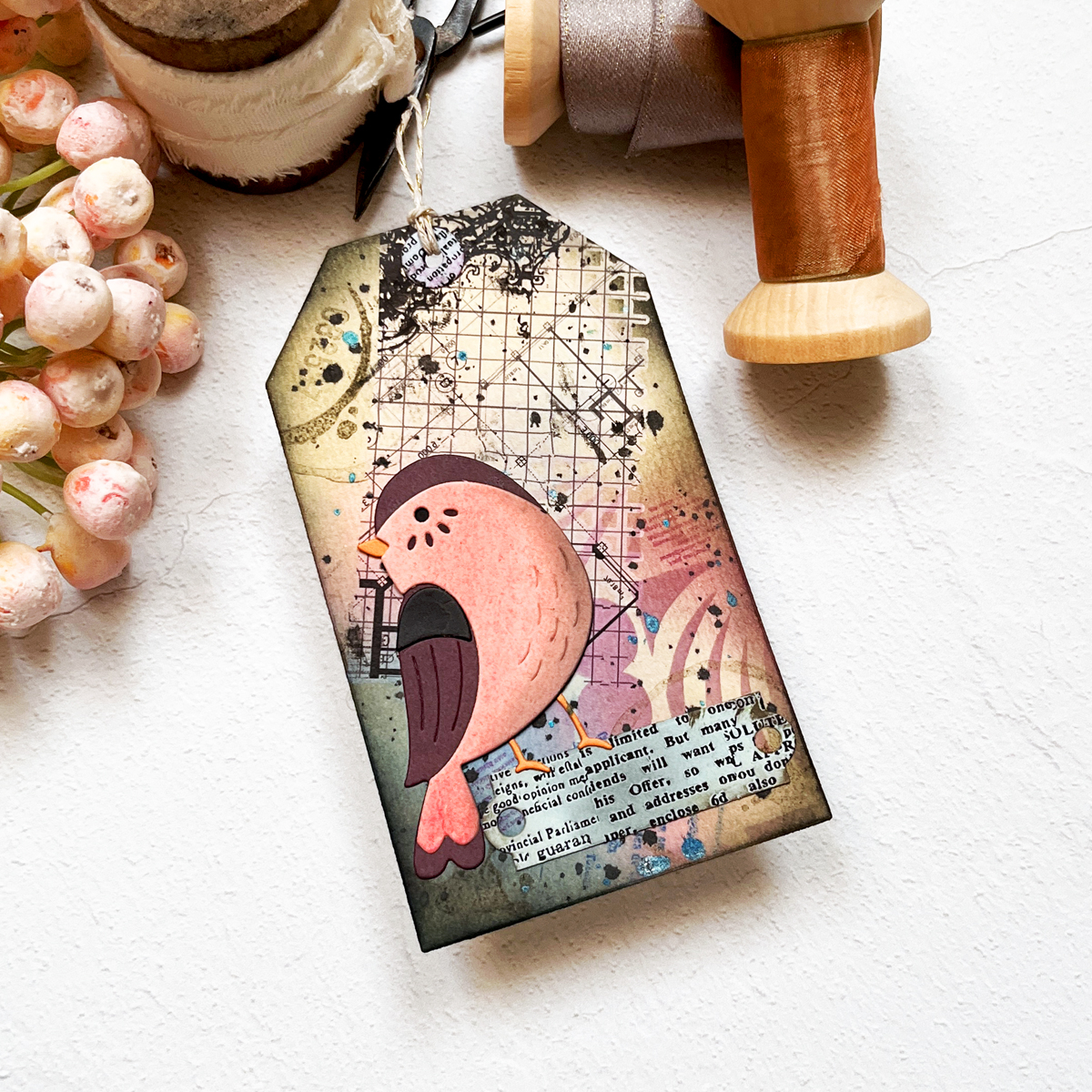
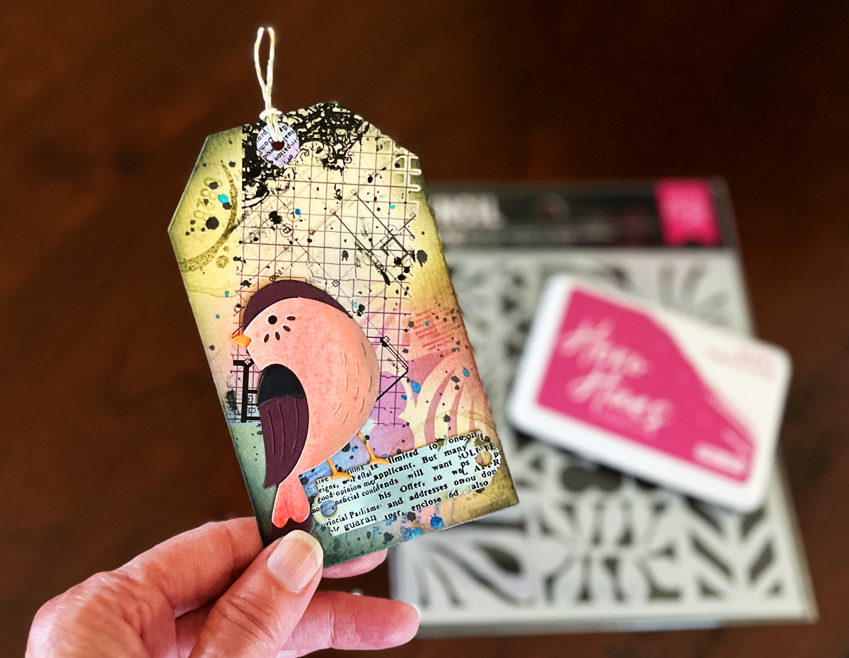
Now let’s walk through today’s tag together.
Step 1: Create an Interesting Background
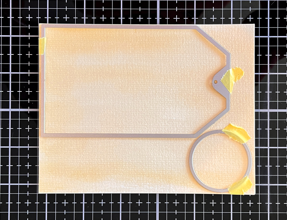
For today’s tag, I started with a watercolor wash.
I scribbled a brown watercolor marker onto my craft mat, spritzed it with water, and brushed the color onto heavy watercolor paper. If you want deeper color, simply let it dry and repeat the process.
Once dry, I die cut the panel using a 3” x 5” tag die. I love this size because it gives me plenty of creative real estate.
Tan is one of my favorite neutral starting points — it plays beautifully with layered color and keeps everything cohesive.
Step 2: Add 4+ Layers (Today I Added 7!)
Layers are where the magic happens.
On most of my mixed media projects, I use at least four layers — but often more. The key is variety, contrast, and a little bravery.
Here’s what I added today:
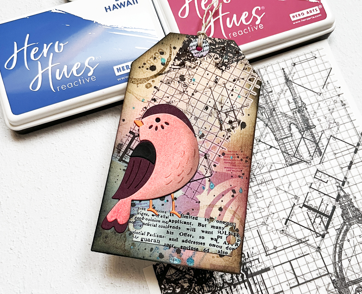
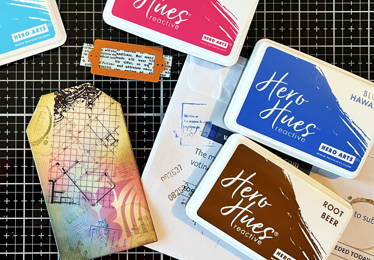
1. Ink Blending
Using water reactive inks (Berry Smoothie and Blue Hawaii) and a blending brush, I blended color onto the lower left portion of the tag — about two-thirds of the surface.
Don’t overthink this step. I started mid-left with Berry Smoothie and worked inward, then added Blue Hawaii to the bottom corner.
There is no “right” placement. Pick a spot. Add color. Assess. Adjust. Keep going.
2. Stenciling
I used the Floral Trove stencil — it’s wonderful for tags because of its 9 different rectangular designs.
Using the same two ink colors as in step 1 keeps everything soft and cohesive. Now my neutral tan base has subtle pattern and depth layered over it.
3. Hero Transfers
I trimmed a 3” x 2” grid element from the Grids and Icons Mixed Media Hero Transfers set and applied it at an angle using a bone folder.
Those black grid lines instantly add structure and contrast.
4. Stamping
This is where personality comes in.
I stamped:
- A circle coffee stain
- An ink blot
- Numbers
- A postmark
- Script text
Using Root Beer Brown, Blue Hawaii, and Berry Smoothie keeps everything coordinated.
The goal isn’t to make one stamp stand out — it’s to build subtle interest. Look for shapes, textures, numbers, partial images… don’t stress about perfection.
5. Add Words
I die cut a small scrap with printed words (leftover from a previous project — yes, I save almost everything!).
You could also use dictionary scraps, stamped text, or stencil writing. I softened the edges with brown ink.
6. Ink the Edges
Root Beer reactive ink around the edges, finished with a touch of Licorice black, frames the tag and grounds the design.
7. Splatters
I almost always finish with splatters. Today I used blue and black. I removed the top nozzle from a bottle of ink spray and gently flicked the droplets onto the tag.
They unify the layers and add that final touch of “imperfect by design.”
Step 3: Add a Strong Focal Point
For today’s focal point, I used the Love Note Birds die cut.
It’s simple, not overly detailed, and perfectly sized for a tag.
The pink panel was die cut from a leftover watercolor gradient (because scraps are creative gold). I lightly shaded it with leftover black ink on my blending brush to soften it and prevent it from feeling too bright.
I positioned the bird slightly off-center toward the lower left and adhered it directly to the tag.
Off-center placement keeps things interesting.
If you’d like more beginner-friendly inspiration…
- Mixed Media Tags for Absolute Beginners: 11 Easy Steps (YouTube Video)
- Easy & Addictive | Beginner Mixed Media Tag Tutorial
- How to Make a Mixed Media Tag in 9 Easy Steps
My Mixed Media “Cheat Sheets”
Over time, I realized I had dozens of techniques swirling in my head. So I created three sample boards:
- Background Ideas
- Layering Ideas
- Focal Point Ideas
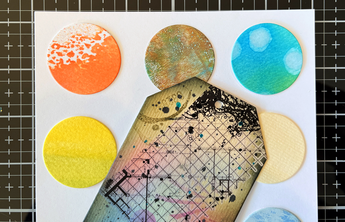
I’m a very visual person, and these boards act like my creative reference system when I sit down to craft. The middle circle on the right was the panel I used for today’s tag.
In upcoming posts, I’ll reveal them in detail — but here’s a small peek. (Just enough to inspire… not overwhelm 😉)
Mixed Media Is Imperfect by Design
Mixed media can feel intimidating.
But here’s what I’ve learned:
It’s imperfect by design.
Little missteps? They add charm. Unexpected marks? They add character.
Watching a simple piece of watercolor paper transform layer by layer is one of the most satisfying creative journeys.
And the best part? There are no mistakes — just more layers.
Coming Next in This Series
Over the next few posts, I’ll be diving deeper into:
- How to build beautiful mixed media backgrounds
- My favorite layering combinations
- How to create strong focal interest
- The best supplies for beginners
In my next post, Ink Smooshing 101, we take a deeper dive into Step 1 of my Mixed Media Recipe and explore five ways to create beautiful watercolor-style backgrounds using simple water-based inks.
You might also want to check out my Sneaker Bouquet scene card.
Stay tuned — this is going to be fun.


6 thoughts on “Mixed Media Made Simple: My 3-Step Recipe for Fun & Easy Tags”