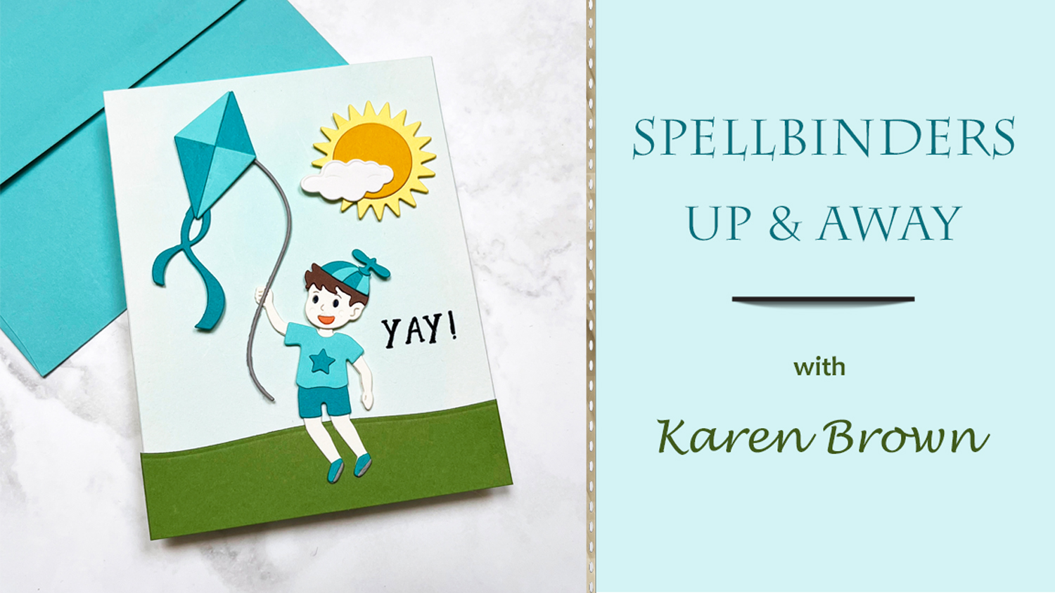
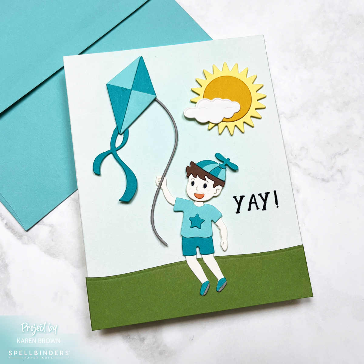
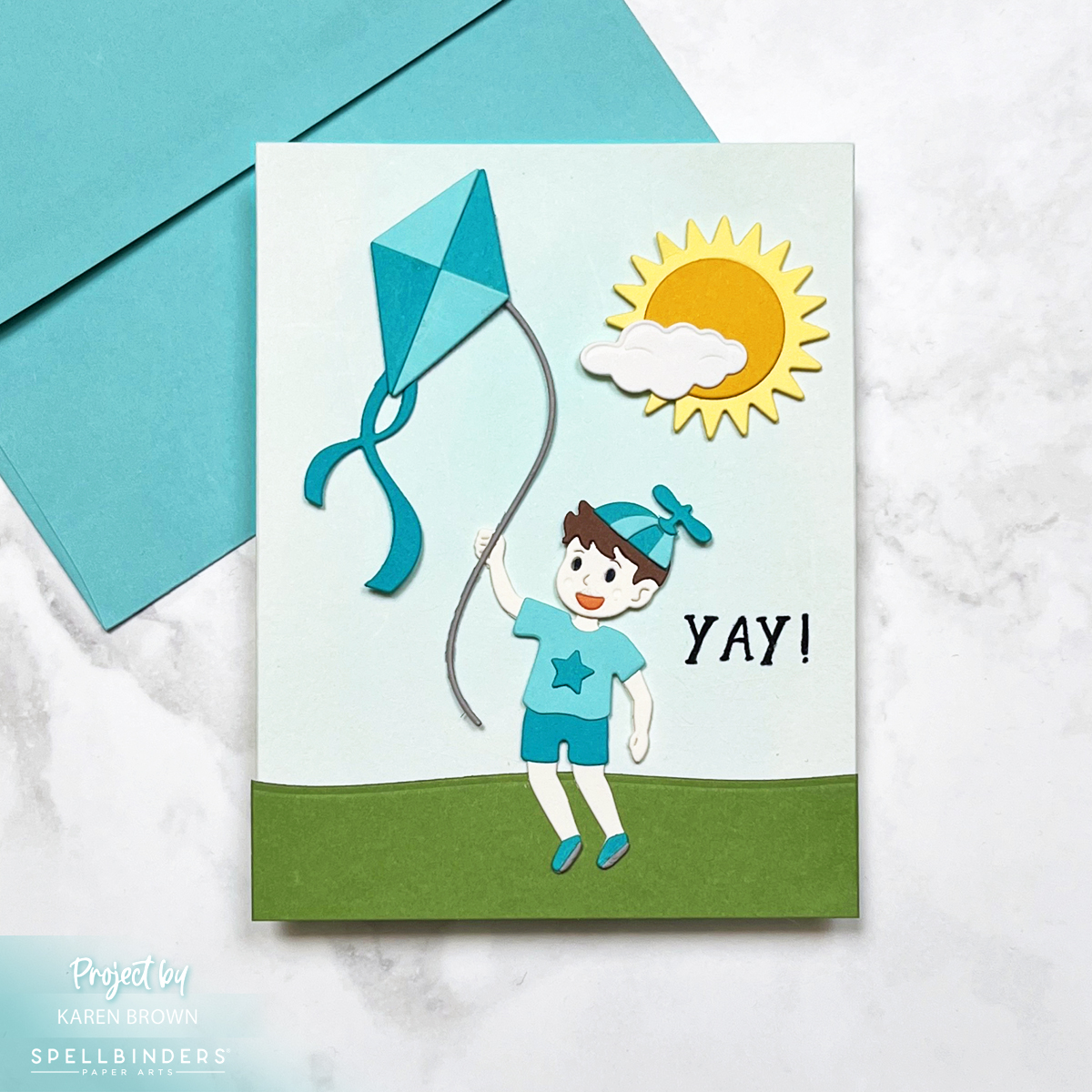
Today, we’re soaring high with a sweet and sunny scene card, perfect for celebrating birthdays or welcoming a baby boy into the world! 🌤️🎈
This design features a playful little boy flying his kite beneath a big smiling sun and a puffy white cloud—an instant mood-lifter in card form. All the elements were crafted using the brand-new Up and Away die set from the Sky is the Limit collection by none other than the crafting wunderkind himself, Simon Hurley.
Color Me Happy
The card showcases a bright and breezy color palette, with Waterfall and Teal Topaz cardstock stealing the spotlight. These shades of aqua and teal give off major sky-blue vibes that feel both fresh and fun.
Background with a Breeze
For the sky, I created a soft, dreamy wash using Pool Party Reactive Inkon watercolor paper. I used a flat brush for that gentle sweep—like a serene spring sky just waiting for a kite to dance across it.
Die Cut Delight
Every piece on this card—from the kite and the boy to the sun and cloud—is die cut and carefully layered for a dimensional scene that really pops. The clean lines and whimsical style of the dies make them a joy to work with. And let’s be honest: the Up and Away set is pure magic!
Perfect for…
Baby showers (especially for little boys!) The repeating aqua and teal color palette reinforce the baby theme.
Kiddo birthdays
Or just sending sunshine and smiles on a cloudy day
This one’s going into my “make again soon” pile—because how can you not love a card that makes you want to run outside and fly a kite?
Happy crafting, and may your skies stay sunny! ☀️🪁
Oh my goodness, I just got my new Spellbinders Color Wheel Cardstock, and I am having so much fun! If you’ve ever wanted to truly get to know your cardstock colors, swatching is the way to go. Not only is it an incredibly helpful reference for future projects, but I also found the process to be calming, relaxing, and—bonus!—it sparked my creativity in ways I didn’t expect.
I ordered the 48-pack sampler to start, and I used the Spellbinders Color Swatch Petal Dies along with color name stamps to create my swatches. I decided to organize them in rainbow order, making it easy to compare shades and find the perfect hues for my future projects. There’s something so satisfying about seeing all the colors lined up in perfect harmony!
For organization, I put my swatched colors on a ring, which makes flipping through them a breeze. I also documented my process in a reel showing my die-cutting, stamping, and assembly. If you’re on the fence about swatching, trust me—it’s worth it!
New Friends & Old Favorites
There are some shades I already know and love, but this swatching process introduced me to some stunning new favorites. I’m still deciding whether to order the 5-pack of each shade or just stock up on my must-haves. Either way, I now have a better sense of which colors I’ll be reaching for the most!
A Fun Card Example
To put my swatches to use, I created a card using my newly organized colors. You might recognize this one—it’s the Hero Arts Suitcase & Florals Card that I recently shared in another blog post. Seeing the colors in action really drives home how valuable swatching is!
Click HERE to read my blog post about creating this Vintage Suitcase & Florals Card.
Final Thoughts
Swatching might seem like a simple task, but it’s an absolute game-changer for crafting. Not only does it help you choose colors with confidence, but it also makes designing so much easier. Have you ever done a cardstock swatch? If not, I highly recommend it! Let me know in the comments which Spellbinders colors are your favorites!
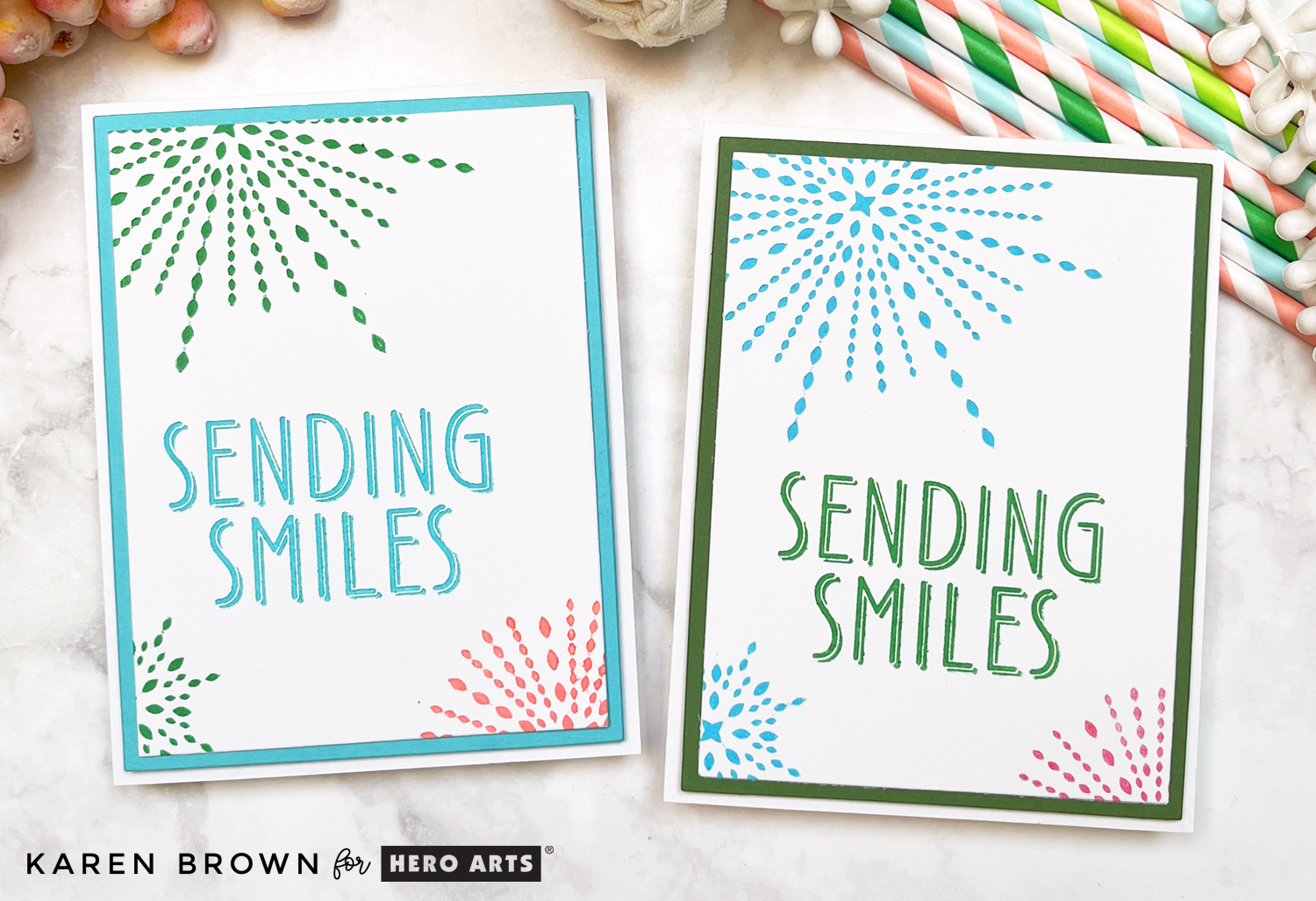
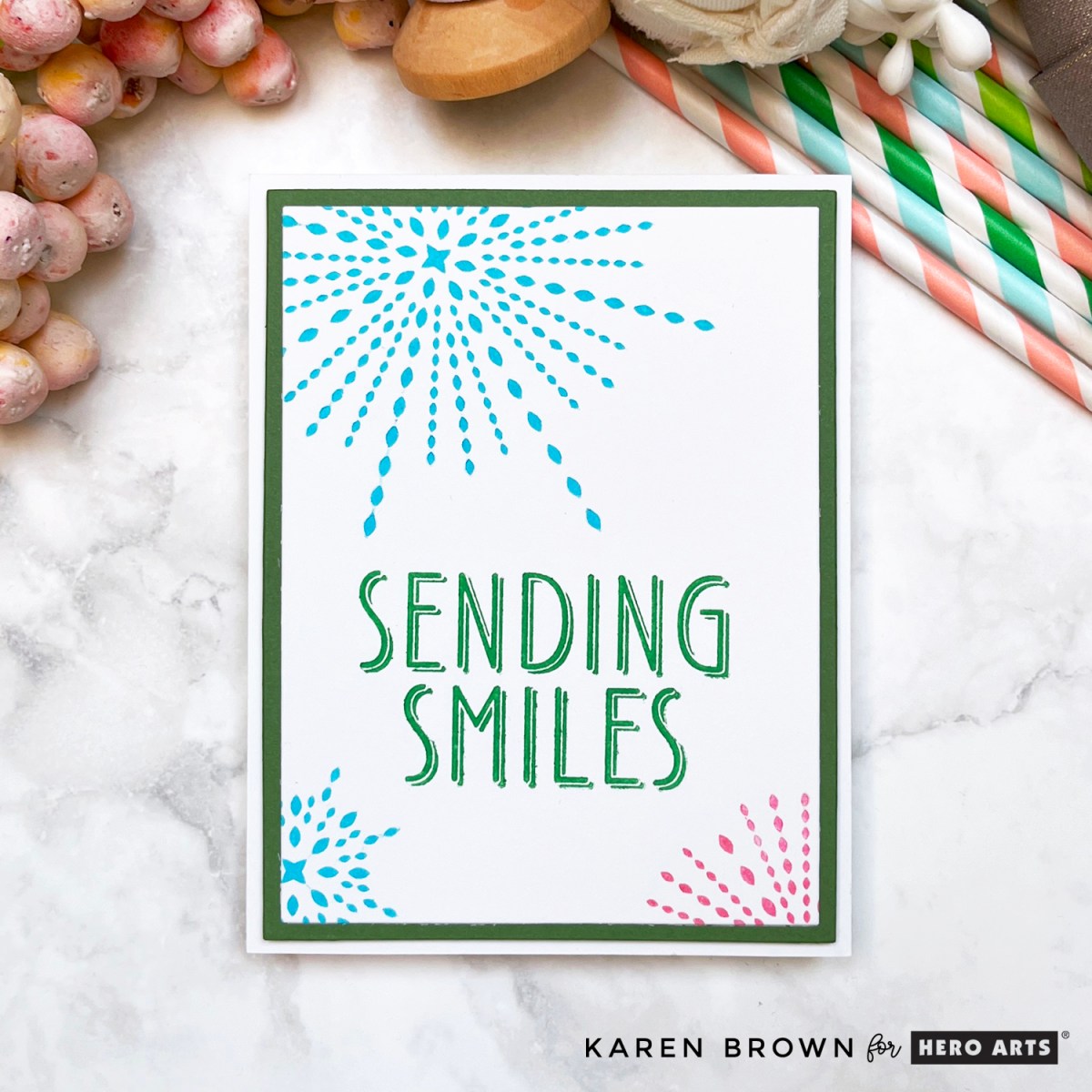
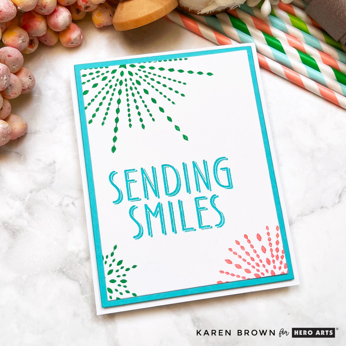
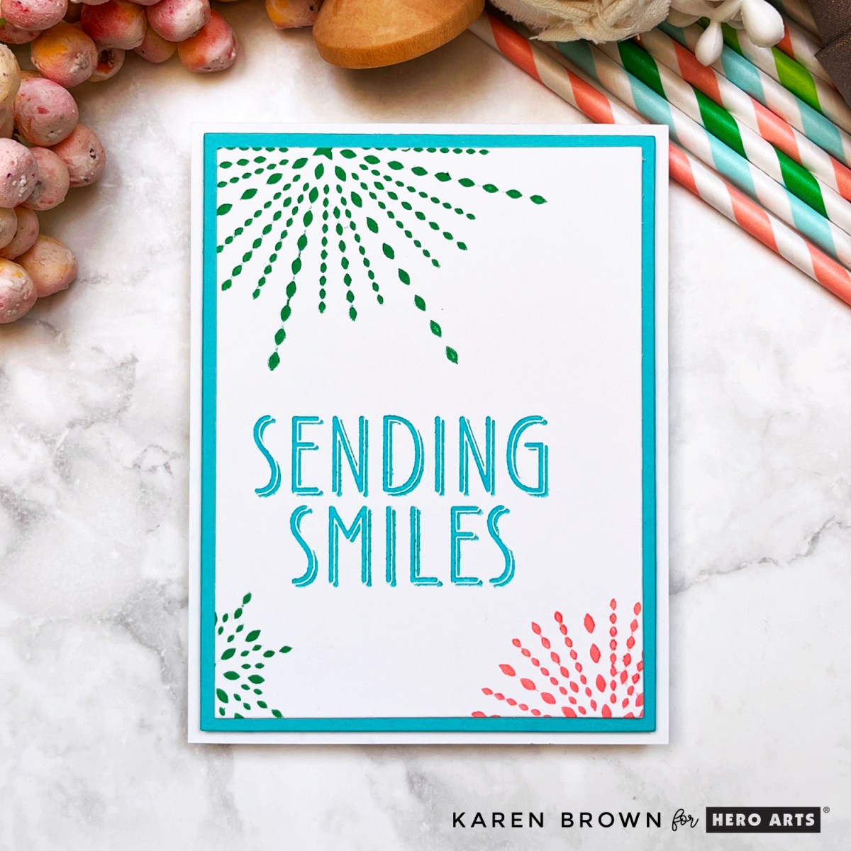
Today I’m sharing two bright and happy cards featuring the brand new Starburst LetterPress Platesfrom the Hero Arts Lovely LetterPress Collection. These four festive plates are perfect for birthdays, graduations, congratulations, or any occasion that calls for a little extra cheer. If you love fun pops of color and crisp, luxurious impressions, this set is a must-have!
And don’t forget—these colorful cards are part of an Instagram Hop! Follow along for even more creative inspiration and enter for a chance to win: Instagram Hop Link.
Which version is your favorite: Wild Berry Smiles or Aqua Cheers? I’d love to know in the comments!
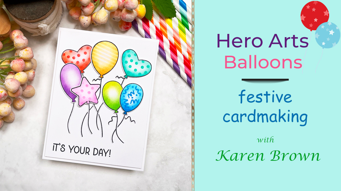
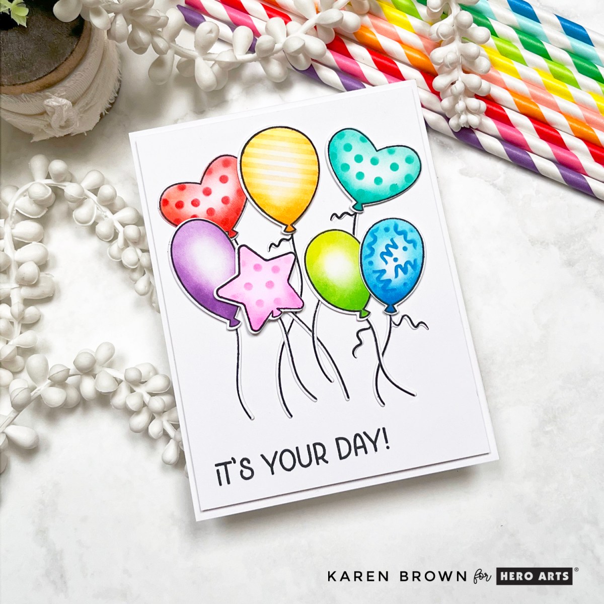
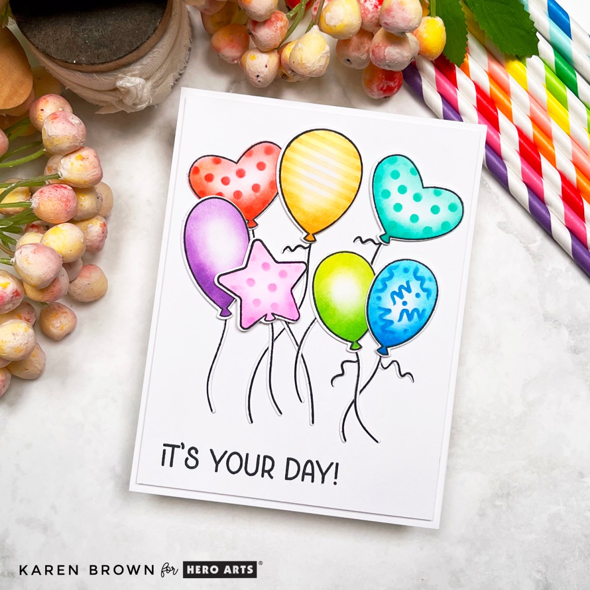
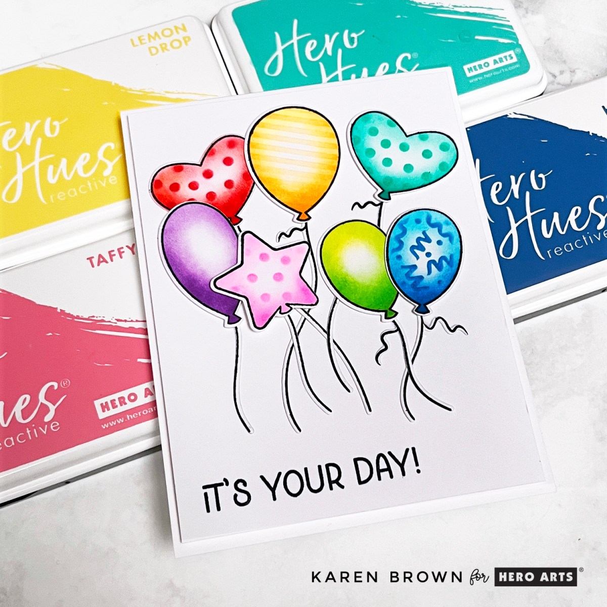
Ready to party? I had a blast creating this bright and festive birthday card using brand-new goodies from the Hero Arts Let’s Celebrate Collection! This project is perfect if you’re looking for a quick, colorful card that makes a big impact.
Card Details: Rainbow Balloons That Pop (Literally!)
This card features a happy cluster of seven stamped, ink-blended, and die-cut balloons, made with three coordinating products:
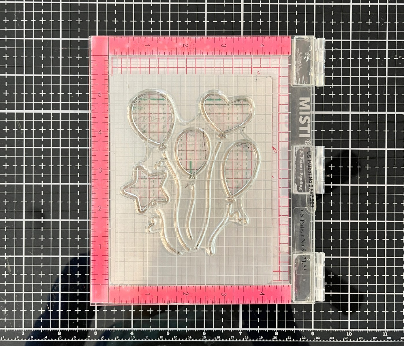
I started by placing the cover plate die in my stamp positioner and aligning the large balloon stamp (a cluster of five balloons) over the die. Once perfectly placed, I closed the lid so the stamp was now on the positioner lid, removed the die, and was ready to stamp and die cut with precision. There is a process photo below.
Since I wanted seven balloons, I stamped, inked, stenciled, and die-cut the design twice.
Color & Stencil Party
Each balloon got its own personality with Hero Arts Reactive Inks in cheerful rainbow shades. I blended two shades per balloon, adding darker ink toward the bottom for dimension. The layering stencils let me add playful squiggles, dots, and lines to five of the balloons for extra party vibes.
Reactive Inks Used: Taffy, Berry Smoothie, Lemon Drop, Creamsicle, Key Lime Fizz, Green Apple, Pool Party, Blue Raspberry, Splash, Blue Hawaii, Thistle and Grape Slush.
Two balloons are adhered flat to the background, and five are popped up with foam squares so they practically float off the page! 🎈
I finished the design with a stamped “It’s Your Day!” sentiment from the Party Fans Stamp Set.
Pro Tips for Balloon Perfection:
Use two coordinating ink colors per balloon to make them feel round and full.
Add stenciled patterns after ink blending for clean, vibrant detail.
Pop some balloons up on foam tape to add playful movement and dimension.
This design is fast, festive, and beginner-friendly—but has that pro finish thanks to the coordinated stamps, dies, and stencils.
What would you celebrate with this set? Birthday? Graduation? Just-because balloon-o-rama?
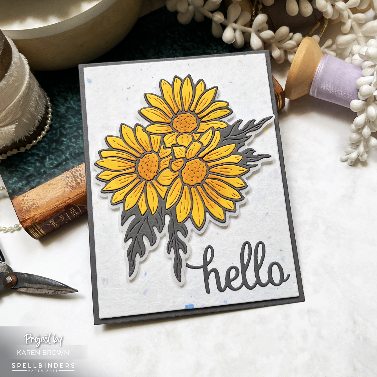
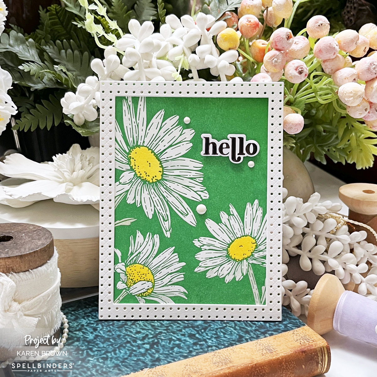
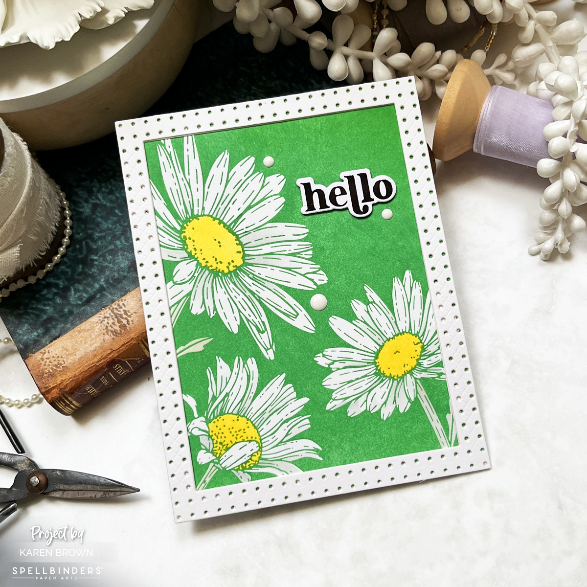
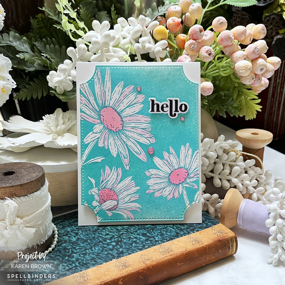
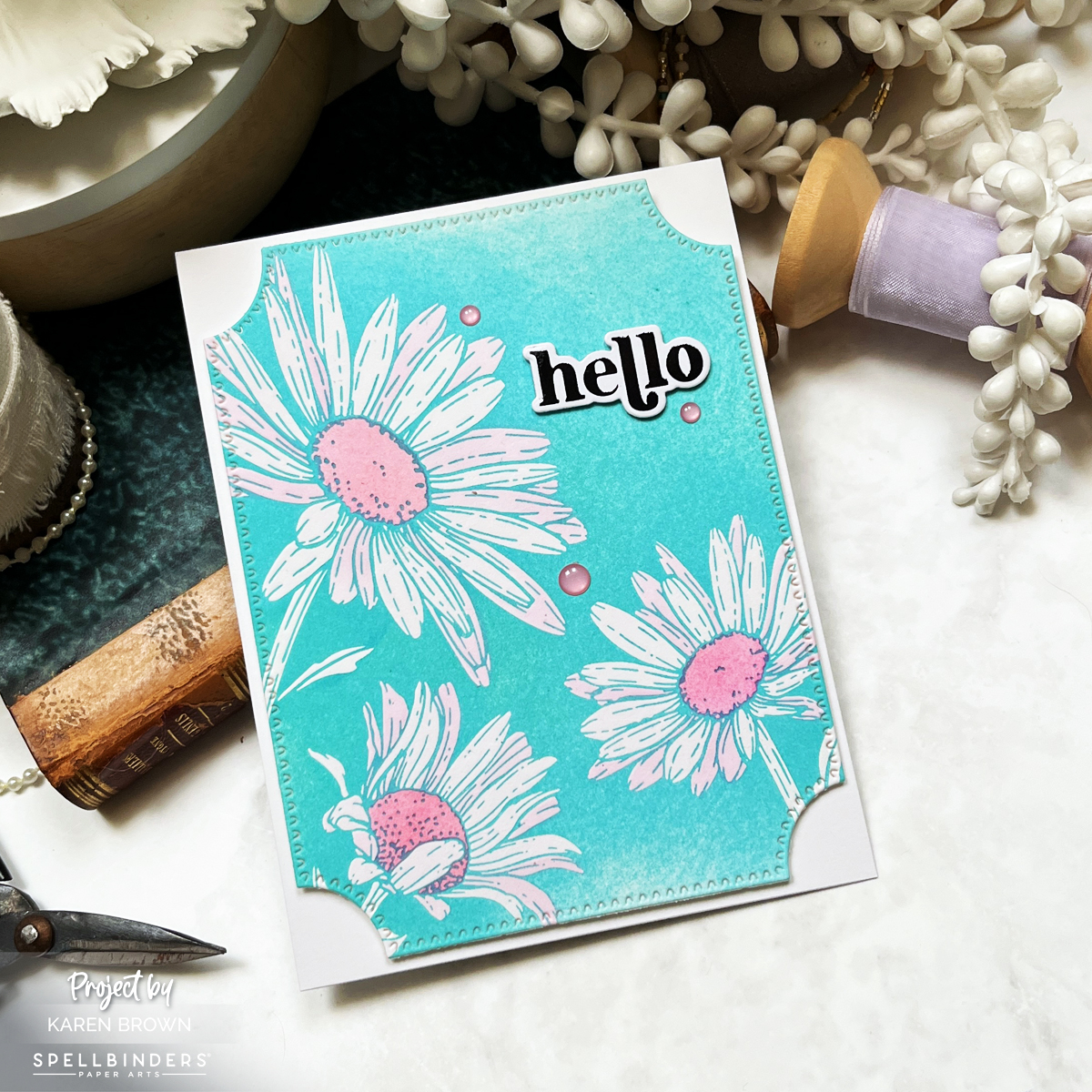
Talented cardmaker Yana Smakula has done it again! Her new Yana’s Daisies collection for Spellbinders is a fresh take on classic florals, and I was thrilled to get my hands on a few advance products for this launch.
Sunflower Yellow Cardstock petals: Using my Platinum 6, I Die-cut the trio from Sunflower Yellow Cardstock and lightly ink-blended with two shades of golden brown for dimension.
Wrought Iron Raw cardstock: Used for the intricate daisy outlines and leaves.
Vellum shadow layer: Softens the look and adds elegance.
Paper shim tip: These dies are beautifully intricate! Adding a paper shim while die-cutting ensures crisp, clean cuts.
🌼 Layered, Not Inlaid! After debating between inlaying or layering, I chose to layer the Sunflower Yellow petals onto the Wrought Iron Raw outlines—and I LOVE the result! I used Bearly Art Glue and a Ninjasticky wand for precision placement.
📜 Background Paper: I wanted something special, so I chose Blue Confetti Wildflower paper from my paper subscription. It’s 100% recycled and embedded with wildflower seeds—a perfect pairing for this floral design!
Leaf BetterPress Ink: I tapped, twisted, and generously inked the BetterPress plate before running it through my Platinum 6 machine SUPER SLOW (pro tip: slow rolling = perfect impressions).
Coordinating stencils: I added shading in Lemon Drop and Granite to bring the design to life.
White daisies (un-inked): Letting the design speak for itself.
For my third card, I experimented a bit. I wanted to try a BetterPress fade, so I inked my plate with Hydrangea BetterPress ink, but added less ink at the top and bottom. I used Taffy Reactive Ink and the coordinating stencils for my pink accents.
Final Thoughts
This collection is an absolute must-have if you love florals with a modern, sophisticated edge! The detailed etched dies are perfect for paper piecing, and the BetterPress plates create stunning impressions with minimal effort.
Which card do you love most—the layered daisy trio or the bold graphic BetterPress look? Let’s chat in the comments! 💛🌿
Spellbinders’ latest Club Kit Release is here, and this month’s dies are packed with charm, nostalgia, and creativity! I created three unique handmade cards using the Large Die of the Month, Small Die of the Month, and Stitching Club of the Month. Each design brings something different to the crafting table—from vintage-inspired letterboxes to whimsical mail carriers and stitched stationery.
Let’s get started!
Card 1: A Vintage Farmhouse Letterbox
First up, the Large Die of the Month – a stunning vintage-style letterbox that feels straight out of a charming countryside home.
I custom-mixed my colors using Hero Arts Reactive Inks, blending 50% Fog and 50% Pool Party for the perfect minty vintage hue on the letterbox. Other Reactive Inks Used: Taffy, Fruit Punch, Green Apple, Blue Raspberry and. Grape Slush. The key, sentiment frame and keyhole were painted with Gold Metallic Watercolor.
Inside the mail slot, a sweet die-cut letter with a heart and a cluster of pink flowers peeks out, adding a touch of romance.
A gold letterbox key is placed on the box for extra detail.
I mounted everything on Stellar White Groove ribbed paper (from a Your Paper Insidersubscription box) to mimic the look of house siding.
I’m a bit of a paper hoarder, so this specialty paper subscription is right up my alley! 😄
Card 2: You’ve Got (Snail) Mail!
For the Small Die of the Month, I couldn’t resist creating a playful “snail mail” scene! This one was so much fun to put together.
The star is a cute little snail, delivering happy mail in style. She holds a tiny envelope with a heart seal and wears a mail pouch and hat as she crawls along.
I started by doing my die-cutting and then I watercolored each die cut for my happy cozy scene. I watercolored with Reactive Inks : Creamsicle, Fruit Punch, Taffy, Green Apple, Blue Raspberry, Pool Party, Blue Hawaii, Splash, Granite and Fawn.
She’s accompanied by a pink worm and surrounded by red and orange tulips and a mailbox—a cozy little world in miniature.
The sentiment is a scripty “sending” + an enamel heart.
I finished the card with diluted white acrylic paint splatters, adding a touch of whimsy.
The theme? A punny “You’ve Got (Snail) Mail”—a crafty nod to the classic rom-com! 💌 🐌
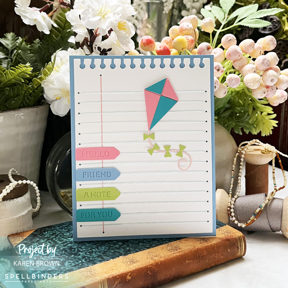
Card 3: Stitched Notebook Paper & Die-Cut Page Tabs
For my final card, I used the Stitching Club of the Month to create a notebook-inspired stitched background—a must for any stationery lover!
The stitched blue horizontal lines and pink vertical margin line replicate lined notebook paper.
The top edge is die-cut to look like it was torn from a wirebound notebook for extra realism.
The sentiments are die-cut page pointers die cut from ColorWheel Cardstock, reading:
Hello (pink)
Friend (blue)
A Note (lime)
For You (teal)
To add movement, I included a pink and teal kite, die-cut from last summer’s Fly Away Kite Kit.
I stitched with two pieces of floss for extra texture and die-cut the background twice (and glued together) for a sturdy base. I used DMC #162 (light blue) and #776 (pink) floss.
This design is a fun way to send a cheerful, handwritten-style note in card form!
This month’s Spellbinders Club Kits are filled with endless creative possibilities—from elegant vintage letterboxes to playful snail mail and nostalgic stitched stationery.
Which card is your favorite this month? Let me know in the comments! 💌 ✂️
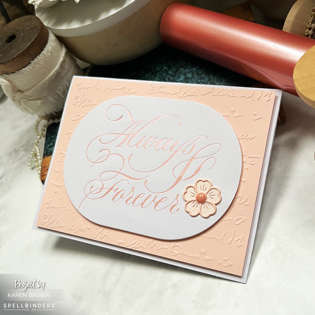
A few months ago, a follower asked me for wedding card inspiration, and I couldn’t resist diving into the timeless elegance of Spellbinders’ Copperplate on Your Wedding Day Collection by Paul Antonio. This collection, featuring gorgeous calligraphy BetterPress plates, was the perfect starting point for creating romantic, foiled wedding cards.
Monochromatic Elegance in Peach
For both cards, I used Peach Satin Matte Foil on smooth white cardstock. I embossed Bellini cardstock, creating a soft, monochromatic look that feels warm and sophisticated. The large, scripty sentiments—”Always and Forever” and “On Your Wedding Day“—take center stage, adding a touch of calligraphic artistry.
To enhance the elegance, I embossed the backgrounds with the Scribbled Letters Embossing Folder—a new favorite in my craft room! The subtle texture adds depth without overpowering the delicate foiling.
Finishing Touches
For the “On Your Wedding Day” card, I die-cut the sentiment using the Scallop Labels Die, which frames the lettering beautifully. I also added a few die-cut flowers in Bellini and Chiffon cardstock, softening the design with delicate floral accents.
Foiling Tips for a Flawless Finish
✨ Trim and round the edges of the foil before using a Glimmer Machine to prevent unwanted over-foiling marks. ✨ Roll slowly through the Platinum 6 Machine for even pressure and a crisp foiled impression.
These simple steps make a huge difference in achieving that professional, high-end look!
I love how these cards turned out—elegant, timeless, and perfect for celebrating love. Whether you’re making wedding cards for a special couple or building your card stash, this collection is a dream for anyone who loves calligraphy and foiled details.
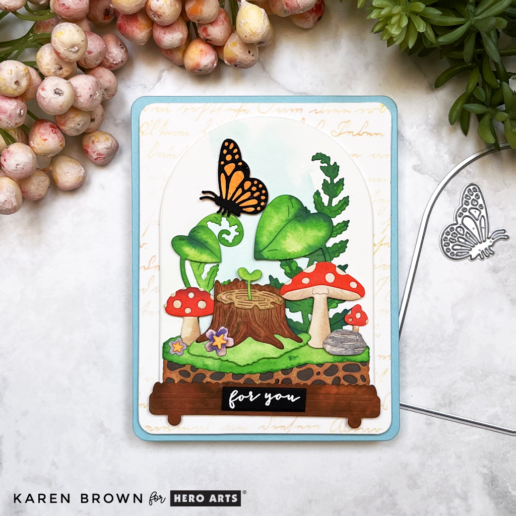
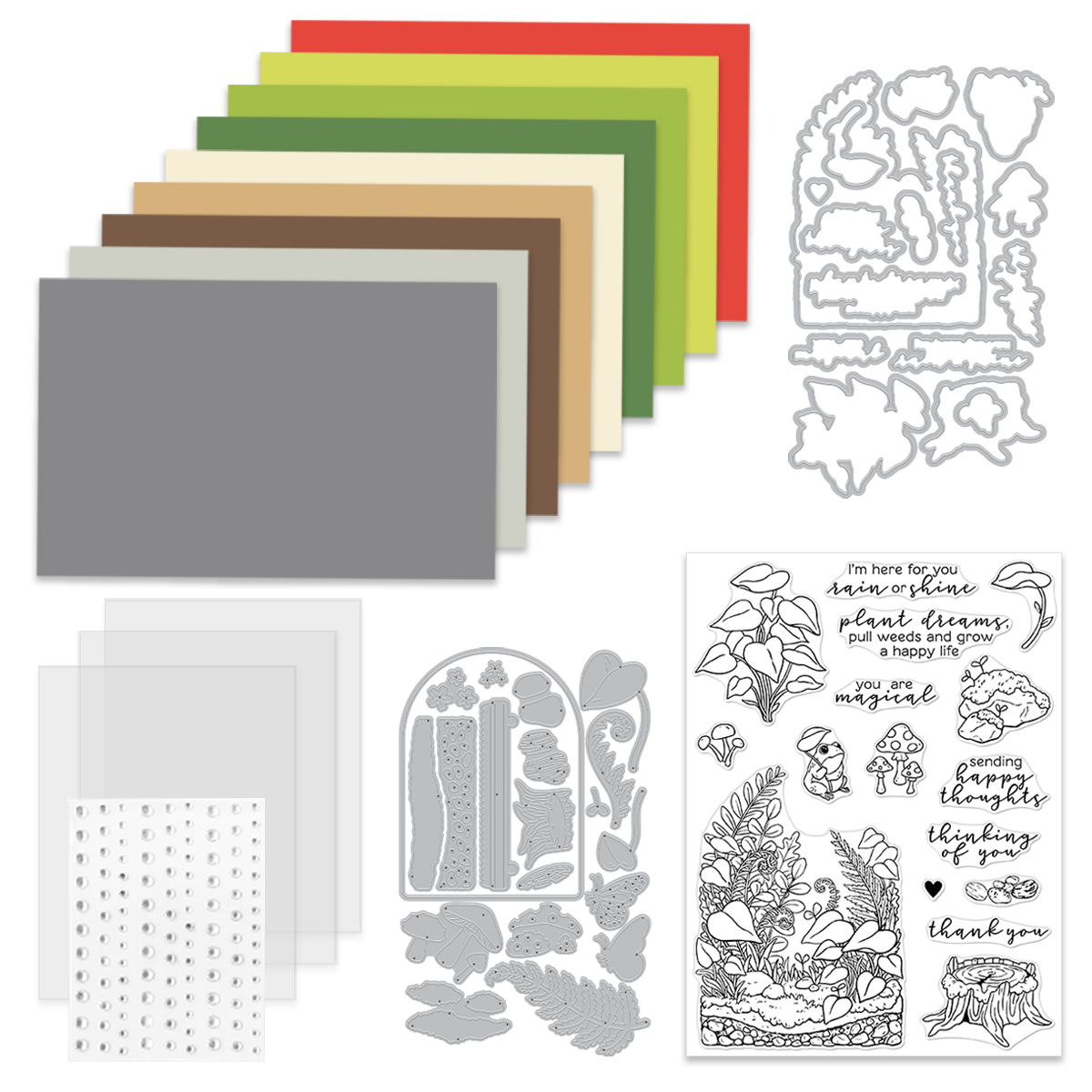
Once upon a time, in a land filled with ink and creativity, a whimsical cardmaker (that’s me!) discovered the Hero Studio April Release and its magical Tranquil Terrarium Kit. With a wave of my die-cutting wand and a splash of watercolor, I crafted a dreamy terrarium scene—one fit for a fairy tale!
Step into a Paper Fairy Tale: A Lush, Layered Terrarium
Picture this: a tiny enchanted world encased in glass (well, cardstock), teeming with lush leaves, charming red and tan mushrooms, green grass, rustic rocks, and a tiny tree stump. Perched on a delicately curled leaf is a radiant orange butterfly, completing this little forest wonderland.
Die-cut magic: Every element was cut from watercolor paper, allowing for beautifully blended, organic colors.
Coloring adventure: I used brightly colored reactive inks to hand-paint each die cut piece, adding depth and dimension. I enjoyed painting each piece individually, but you could also paint several card panels and then die cut the elements. Reactive inks used: Green Apple, Key Lime Fizz, Blue Hawaii, Granite, Purple Galaxy, Fawn, Fruit Punch,
Serene background: I put a light Pool Party watercolor wash on the rounded terrarium panel. It shows up better in person and adds a lovely subtle dimension.
Vintage charm: The background panel features a subtle Script Stencil in tan ink, lending a storybook feel to this enchanted setting. Stencil Used: Script Stencil
Rounded elegance: To echo the terrarium’s shape, I rounded the corners of both the panel and card base using Rounded Rectangle Infinity Dies.
The final touch: Layered on a dreamy Mist blue card base, this card is a burst of color, depth, and whimsy.
✨ Pro Tip: When layering die-cut scenes, use thin foam squares on select elements (like the butterfly) to create a natural sense of depth without overwhelming the design.
What’s Inside the April 2025 Hero Studio Card Kit?
20 Terrarium Fancy Dies
Terrarium Clear Stamp Set, 6″ x 8″
16 Terrarium Coordinating Dies
Clear Hero Enamel Dots
3 Clear Card Panels, 4.25″ x 5.5″
9 Sheets of Cardstock, 5.5″ x 8.5″ (Poppy, Peridot, Rainforest, Fern, Alabaster, Fawn, Truffle, Fog, Anchor)
The Whole Studio includes ALL 5 of the monthly subscriptions in one discounted bundle. Cling of the Month, Stamp & Cut of the Month (new name for the subscription!), Layering Stencil of the Month, Fancy Dies of the Month, and the Card Kit of the Month.
This month, receive a FREE adorable “froggy” stamp & die set when you purchase The Whole Studio!
Hero Arts has many different Monthly Kits that you can subscribe to including:
The WHOLE Studio – All 5 Kits ($130 subscription + Free Shipping)
For my second card, I embraced bold color and graphic design with the Fancy Dies of the Month Kit. This set features five striking leaf dies and a scripty “hello” with a shadow layer.
Hand-painted beauty: Each leaf was die cut from watercolor paper and hand-painted in vibrant greens and blue-greens. Reactive Inks Used: Splash, Key Lime Fizz, Blue Hawaii, Blue Raspberry, Green Apple. I started with the lightest color and then layered on darker shades.
A pop of fun: To contrast the cool tones, I painted the “hello” with Fruit Punch Reactive Ink-blended cardstock, giving it a lively coral-red pop.
Artful splatter: I added Licorice Reactive Ink splatters for an artsy, organic touch. I simply dabbed the ink on an acrylic block and flicked splatters on my die cuts with a fine wet watercolor brush. I turned my splatter box for even splatter distribution.
Design balance: The leaves are arranged in a radiating composition, leading the eye toward the bottom-right hello.
Crisp and clean: Everything is anchored on an Adriatic blue card base, making those greens pop!
🎨 Pro Tip: When adding splatters, dab the ink on an acrylic block and flick splatters on the die cuts with a fine wet watercolor brush. Thie results in controlled yet artistic splatters. Don’t forget to rotate your splatter box to get an even, natural distribution!
BLOG HOP!
Don’t forget, this is part of a blog hop, so there’s plenty more enchanting inspiration ahead! Be sure to follow along for more crafty adventures. ✂️✨
Giveaway:
Hero Arts will give away a $50 gift card, drawn from the comments left across the hop. Enter by Sunday, April 6 at 11:59pm PST, and the winner will be announced on the Hero Arts blog the following week. Leave a comment on all stops for more chances to win!
These cards brought to life the whimsy of a storybook forest and the bold beauty of botanical art, all with the magic of the Hero Arts April Release. Whether you love layered die cuts, ink blending, or just an excuse to play with paint, this kit delivers endless creative inspiration!
I’d love to hear your thoughts—which card is your favorite? Let’s chat in the comments!