Mixed Media · papercrafting · Tutorial

How to Make Mixed Media Tags in 9 Easy Steps | Tutorial

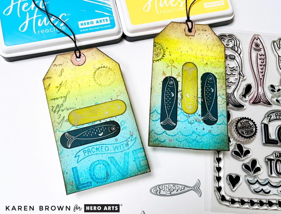
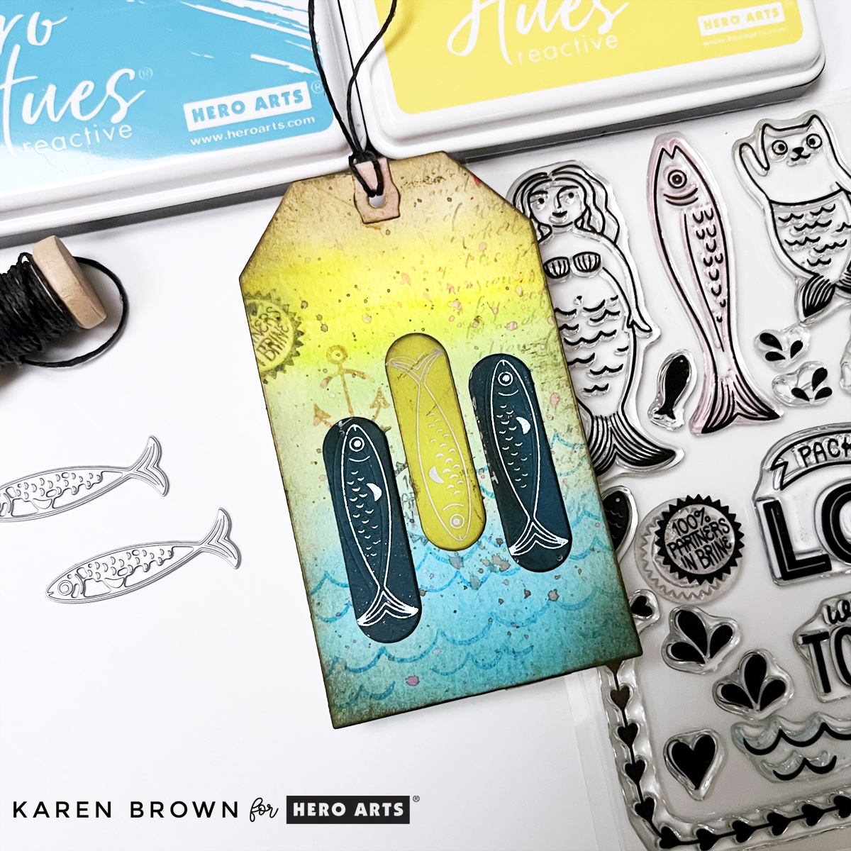
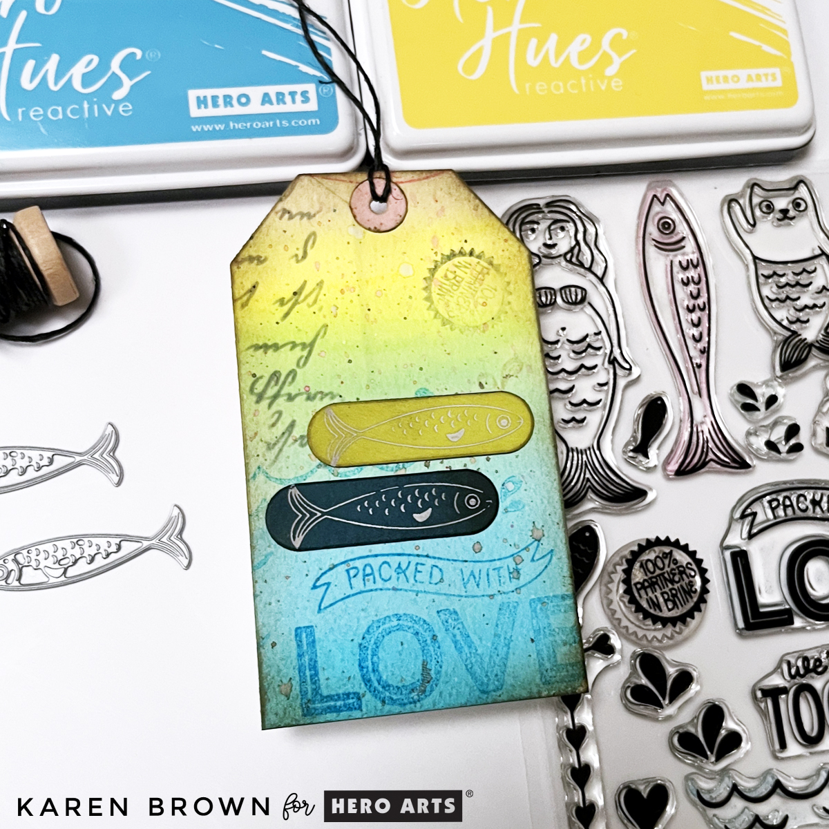
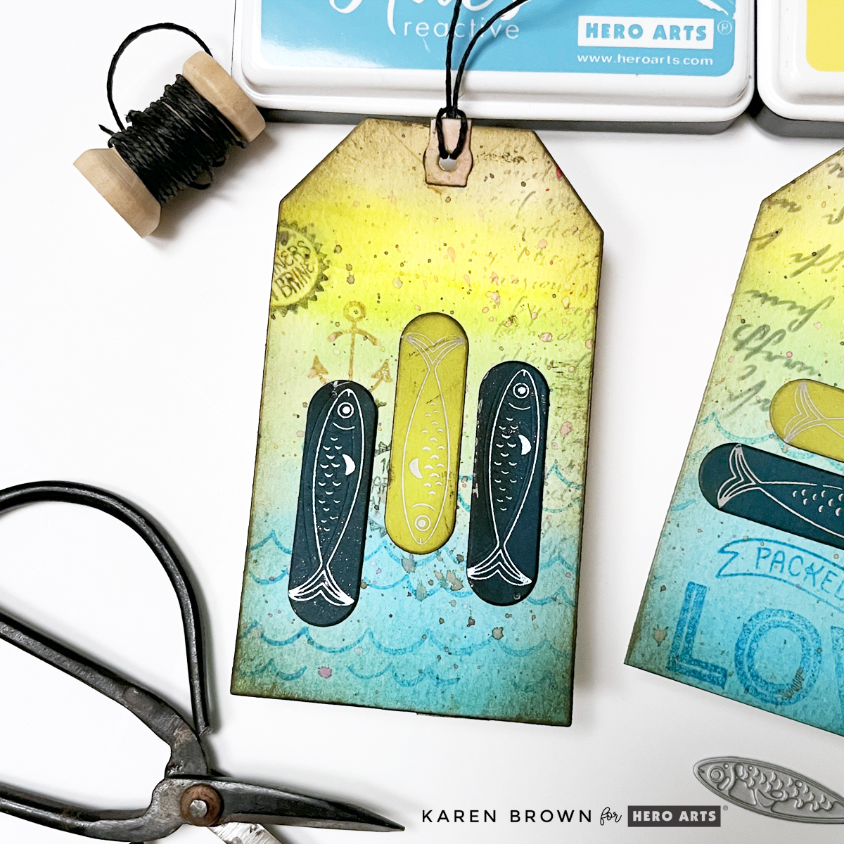
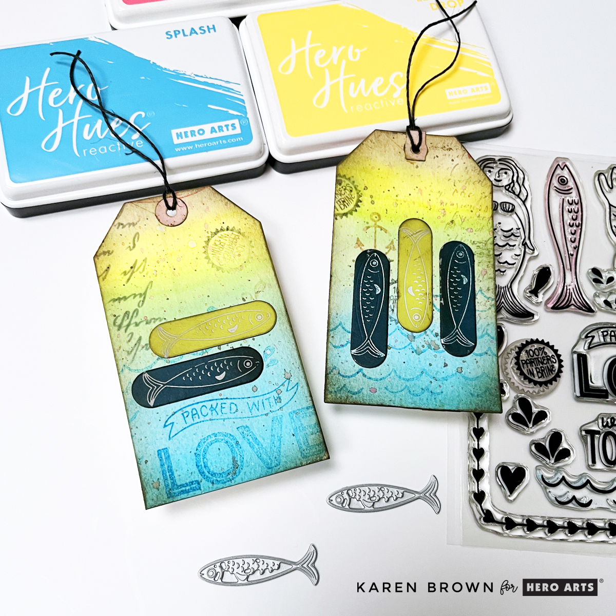
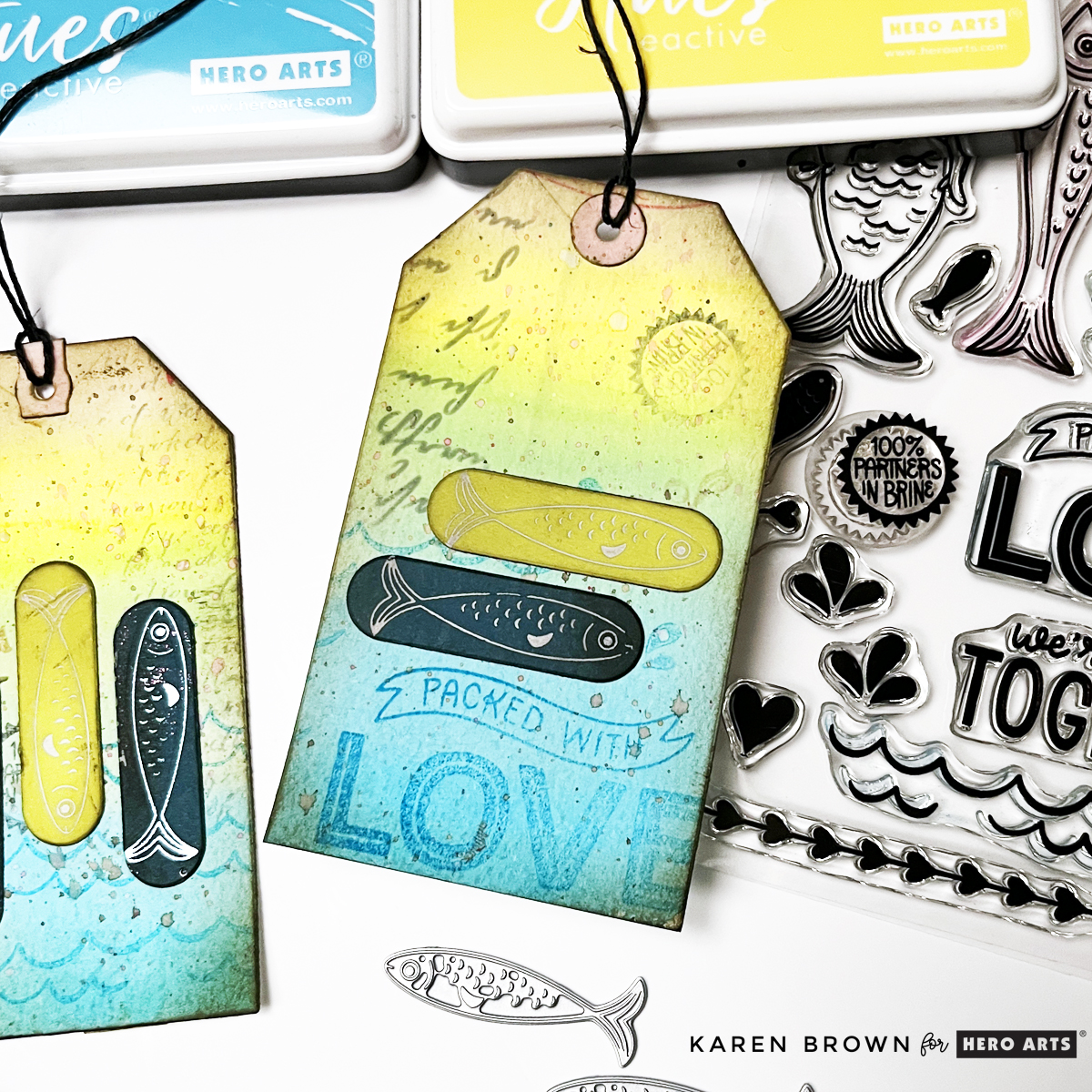
Two handmade mixed media tags featuring Hero Arts Partners in Brine stamps, watercolor gradients in blue, yellow, and pink, layered stamping, ink splatters, and foiled fish accents.

Creating stunning, multi-layered mixed media tags is easier than you think—here is an easy to follow 9-step tutorial.

The techniques I’m sharing today can be used with almost any stamp set or focal elements you already have.

If mixed media feels a little intimidating—don’t worry. This project is about building layers slowly, having fun with color, and letting the process guide you. Let’s walk through it step by step!

👉 I’ll link to the exact supplies at the bottom of this post.

Aquatic theme mixed media tag using Hero Arts Partners in Brine Stamp set and Glad We Are Tight BetterPress letterpress fish plates.

Step 1: Create a Watercolor Gradient Background

When I saw the Hero Arts Partners in Brine Stamp Set, I immediately pictured a colorful, summery mixed media background filled with texture, stamping, and playful details.

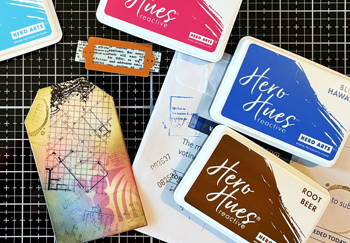
I began by taping a 6″ x 6″ panel of watercolor paper to a hardboard using washi tape. On my craft mat, I dabbed Hero Arts Reactive Ink, spritzed it with water, and used a brush to watercolor a smooth gradient.

I blended the colors so they flowed from blue into green, yellow, orange, and finally pink. Since this stamp set has an aquatic theme (which always feels like summer to me), I wanted bright, happy, sun-washed color.

Dry your panel naturally or speed things up with a heat gun. If your paper warps, simply flatten it later with a book.

Close-up of mixed media tag featuring layered stamping, script texture, inked edges, and a foiled fish accent on a colorful watercolor background.

Step 2: Stamp in Coordinating Colors

Once dry, I stamped images from the CM834 Partners in Brine stamp set using the same inks:

I especially loved the Packed with Love, waves, anchor, fish, and “packed in brine” images. Stamping in matching colors keeps the look layered but cohesive.

Step 3: Add Second-Generation Stamping

To deepen the texture, I used Black and Root Beer Reactive Ink and stamped a few images using second-generation stamping (inking the stamp, stamping once on scrap paper, then stamping again on the background).

Second Generation Stamping adds subtle depth without overpowering the colors.

Step 4: Add Ink Splatters

Next came one of my favorite steps—ink splatters! Using a fan brush, I flicked Splash, Lemon Drop, and Taffy onto the panel.

Ink Splatters add movement, texture, and that perfectly imperfect mixed media charm.

Watercolor background Mixed Media tag with script stenciling, second generation stamping and die cut fish.

Step 5: Die Cut the Tags

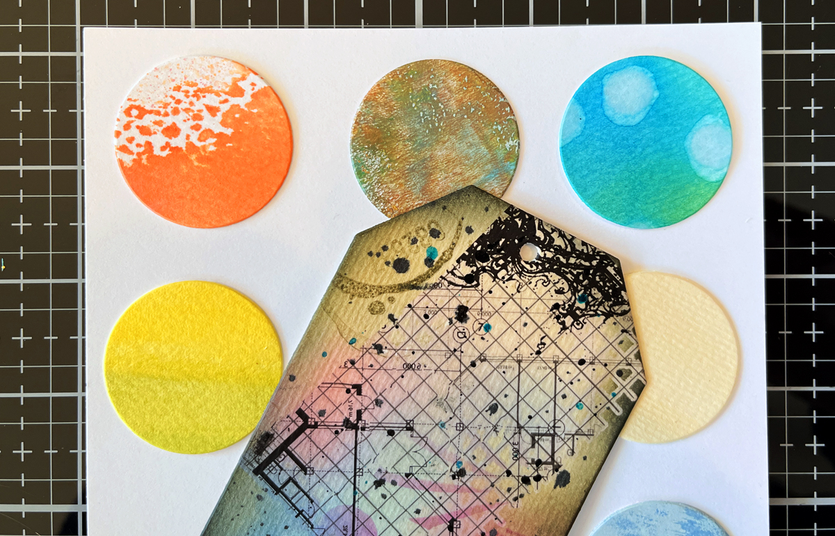
Before cutting, I used my Hero Arts Tag Infinity Die as a viewfinder to decide which parts of the background I wanted to showcase. Once I had the section I wanted to use, I taped my tag die to the watercolor panel and ran it through my Platinum 6 die cutting matchine.

I die cut two tags (4½” x 2⅜”), making sure one included the “Packed with Love” area as a focal point.

Step 6: Ink the Edges

To give the tags a vintage, worn look, I ink blended Root Beer Reactive Ink around all the edges. This step instantly adds depth and contrast,

👉 Root Beer Reactive Ink is my go-to shade for “grunging up” a project.

Mixed Media Tag tutorial showing how to create a tag in 9 easy steps.

Step 7: Add Script for Extra Texture

After studying my tags, I felt they needed a bit of visual “writing,” so I added:

  • CG830 Script Bold Print stamped in Granite Ink on the top right of one tag
  • SA225 Script Stencil (sadly sold out) stenciled in Granite on the top left of the Packed with Love tag
  • But, you can use any stamp or stencil with words that you have. Look through your supplies and see what calls to you.

Subtle script details enhance the mixed media feel without distracting from the main design.

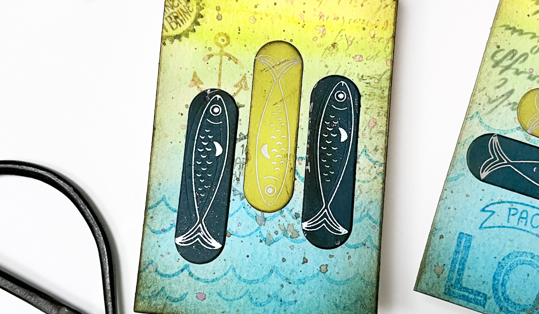
Using distressed Glimmer Hot Foil elements on mixed media tags and cards.

Step 8: Add Foiled Die Cut Focal Points

For something completely new (and honestly, adorable), I added Glimmer hot foiled accents—something I’d never tried on a mixed media project before!

I foiled the two sweet fish from HP131 Glad We Are Tight using white and metallic blue foil with my Spellbinders Glimmer System. I then:

The mix of soft watercolor, stamping, and shiny foil adds beautiful contrast.

Step 9: Finish with Twine or Ribbon

To complete the tags, I simply added twine through the top. This final touch makes them perfect for gift wrapping, journaling, mini albums—or even framing as tiny art pieces.


two mixed media tags with a summery fish/aquatic theme.

You might also be interested in my other blog post where I create with the Packed With Love Collection: Tips and Tricks for Making Two Playful Die Cut Card Designs.

Products Used:

Final Thoughts

Mixed media doesn’t have to be complicated. By working in layers, repeating colors, and letting each step build naturally, you can create beautiful, dimensional projects that feel artistic without being overwhelming.

If you enjoyed this tutorial, I’ll link a couple of my other mixed media posts below for more inspiration. And remember—these techniques work with any stamps, any colors, and any theme. The process is what makes it magic.
Happy crafting!

Die cutting · papercrafting

How to Design a Stunning Handmade Card | Process and Inspiration

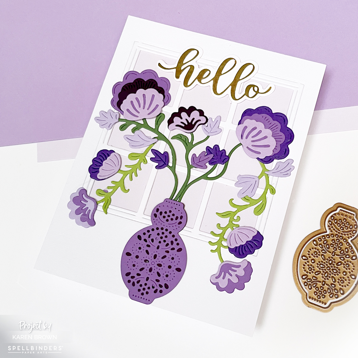
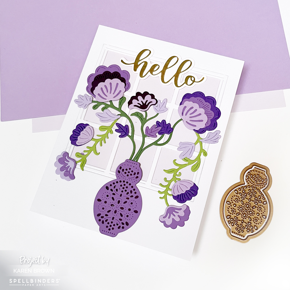
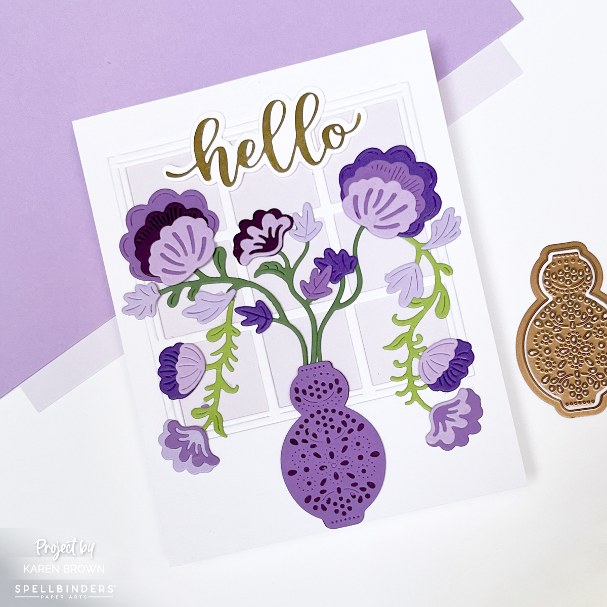
Handmade floral card featuring purple Regal Blooms flowers in a vase in front of a nine-pane window, with a glimmer hot foil “hello” sentiment and a soft lavender background

Creating a beautiful handmade card doesn’t require a studio full of supplies, but rather a simple, creative process that turns paper into a work of art.
👉 I wanted to walk you through my inspiration and thought process.

This card features (Spellbinders Regal Blooms die set (S4-1465) and a vase of elegant purple blooms basking in sunlight in front of a nine-pane window, that feels equally perfect for Mother’s Day, birthdays, or a thoughtful get-well card.

Design Inspiration: A Sunlit Floral Scene

Card background created with the Hero Arts Elegant Window Fancy Die layered over a Fairy Tale lavender cardstock panel for a soft, sunlit effect that showcases the die cut flower vase.

For this card, I wanted to create a moment—almost like looking through a window on a quiet afternoon and catching sight of a bouquet glowing in the light. The Regal Blooms dies make that easy. The flowers are graceful, detailed, and feminine, with just the right amount of structure to feel refined without being fussy.

👉 I chose a purple color palette for a soft, girly, and classic look. Using Spellbinders ColorWheel cardstock in Lavender, Lilac, and Fairy Tale, along with a few coordinating purple scraps, allowed me to build beautiful tonal variation throughout the card.

👉 Mixing multiple shades of the same color family adds richness and depth while keeping the overall design calm and cohesive.

👉 To finish the card, I added a glimmer hot foil sentiment—a scripty “hello”—for a touch of elegance and shine.

Thoughts on Creating the Window Backdrop

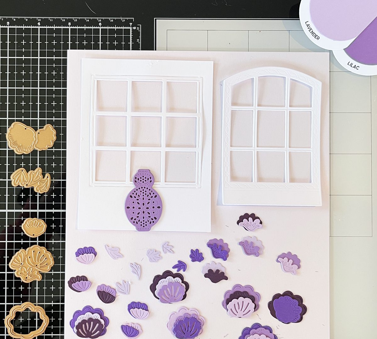
Die cut floral card process photo showing two die cut window options for the background.

As I mentioned above, I wanted my flower vase to be sitting in front of a sunny window.

👉 I love that a window instantly adds structure, light, and architectural interest to a card. I had two window dies in mind, but couldn’t decide which one to use:

👉 I am a visual person, so I die cut both and chose to go with Hero Arts Elegant Window.

👉 Behind the window panes, I layered a soft panel of Fairy Tale ColorWheel cardstock. This pale lavender shade helps the purple flowers stand out while reinforcing the gentle, airy mood of the scene. The window gives the card the feeling of an interior moment—flowers sitting quietly in the sunlight.

Handmade floral card using the Spellbinders Regal Blooms die set (S4-1465), featuring elegant purple flowers in a vase set against a sunlit window backdrop.

Adding Dimension: Two-Tone Vase Technique

One of my favorite details on this card is the vase. I wanted it to have subtle dimension without overwhelming the florals.

👉 To achieve this:

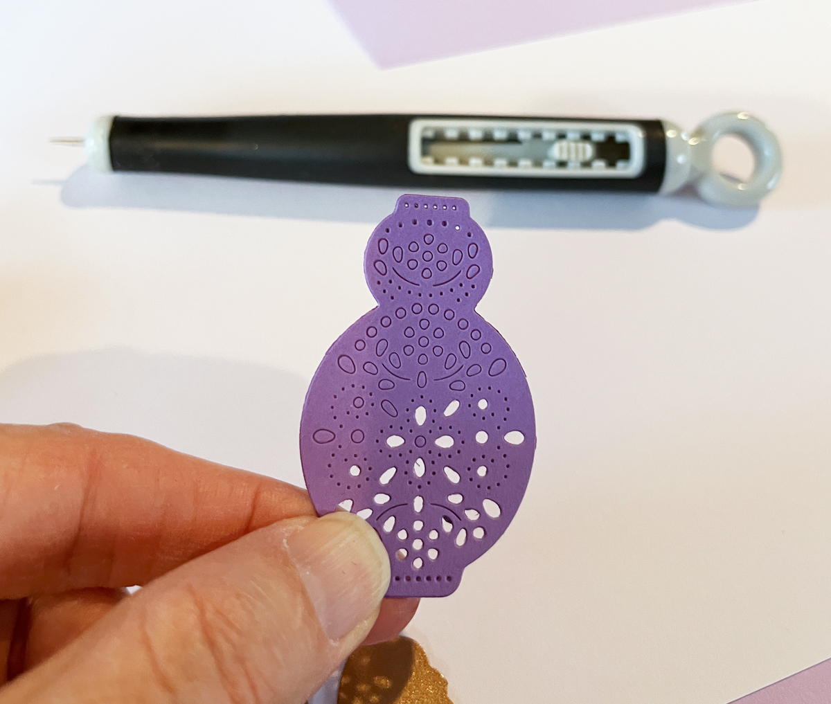
  • I pierced the vase die cut using a pokey tool.
  • Then I placed a darker purple shadow layer behind the pierced openings.
Process photo showing a pierced die-cut vase that will be used on a floral homemade card.

This simple technique creates a two-tone effect that adds depth and interest while keeping the design clean and elegant. I’ve included a process photo above so you can see exactly how this detail comes together.

Why I Love the Regal Blooms Die Set

The Spellbinders Regal Blooms (S4-1465) die set is incredibly versatile. With just a change in color palette or background style, this design could shift from:

  • Soft and romantic (perfect for Mother’s Day),
  • to fresh and cheerful (great for birthdays),
  • to gentle and comforting (ideal for a get-well card).

This card may be purple and feminine, but the structure of the design makes it easy to adapt for many styles and recipients.


Final Thoughts

This floral window card feels cheerful, classic, and heartfelt—the kind of design that never goes out of style. Between the layered purples, the glowing window backdrop, and the elegant foiled sentiment, it’s a project that looks intricate while still being approachable.

Whether you’re creating for a sister, a friend, or someone who simply loves flowers, the Regal Blooms die set is one you’ll reach for again and again.

cardmaking · Die cutting · Stamping

Tips and Tricks for Making Two Playful Die Cut Card Designs | Packed with Love

Hello friends! Karen Brown here today sharing two cheerful cards created with products from the Hero Arts Packed with Love Collection. I love when a release offers versatility, and this collection made it easy to explore different looks while keeping the designs clean, playful, and approachable.

Key Products Used:

Both cards highlight simple layouts, bold color choices, and easy-to-repeat techniques—perfect whether you’re making one special card or crafting a small batch. One card leans bright and aquatic with colorful die cut fish, while the other explores a graphic, modern style with bold shapes and happy color transitions. Together, they show just how flexible this collection can be.

Let’s take a closer look at each card!

🐟 Card Details: A Happy School of Fish

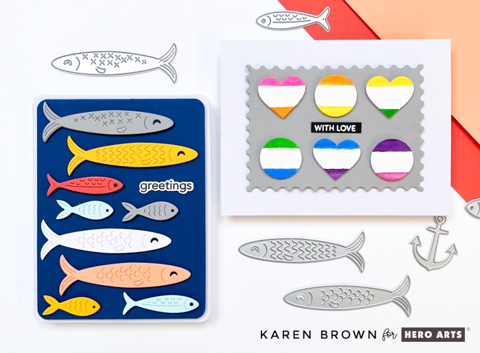
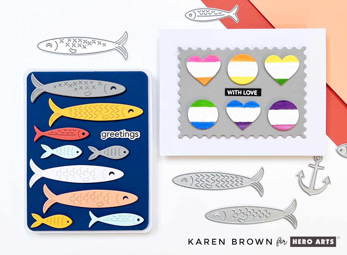
Colorful die cut fish card featuring nine fish in assorted cardstock colors swimming across a Cosmic Sky background with a simple “greetings” sentiment.

For my card, I used DF274: Big Mouth Sardine Tin Dies, but instead of building the tin, I focused solely on the fish dies. I die cut nine fish in assorted sizes and colors, then arranged them swimming horizontally across the card for a playful, modern look.

The background is Cosmic Sky ColorWheel Cardstock, trimmed with my favorite Rounded Rectangle Infinity Dies and mounted onto a crisp white A2 card base. A small, simple sentiment that reads “greetings” keeps the design clean and versatile—perfect for hello cards, encouragement, or just-because mail.

This card feels colorful, cheerful, and a little bit whimsical…like a happy school of fish swimming together. 🐠🐠🐠

🎨 ColorWheel Cardstock Colors Used

  • White
  • Fog
  • Sicily
  • Coral
  • Seaside
  • Saffron
  • Cosmic Sky (background)

To give each fish more presence and durability, I die cut every fish twice and glued the layers together. This subtle dimension makes a big difference, especially on clean and graphic designs.

✂️ Die Cutting Tip

I used my Spellbinders Scout desktop cutter to cut all of the fish. When I’m working with lots of small or medium-sized dies, the Scout is my go-to—it’s fast, efficient, and perfect for batch die cutting.

🧠 Layout Tip: Arranging Die Cuts with Ease

If you’ve ever struggled with spacing repeated die cuts, here’s the method I used—and it works every time:

  1. Start at the top of the panel (I placed the gray fish first).
  2. Move to the bottom with the smallest fish (aqua and saffron).
  3. Fill in the middle next.
  4. Work up and down from the center, adjusting spacing as you go.

This approach helps keep everything visually balanced and evenly spaced without overthinking it. I’ve included a process photo (above) of the die-cut fish and dies on my craft mat.

🧷 Assembly

I used a combination of craft foam and foam squares to attach the fish and background, adding just enough dimension to create interest while keeping the card mail-friendly.

Rainbow Watercolor Wide Stripes

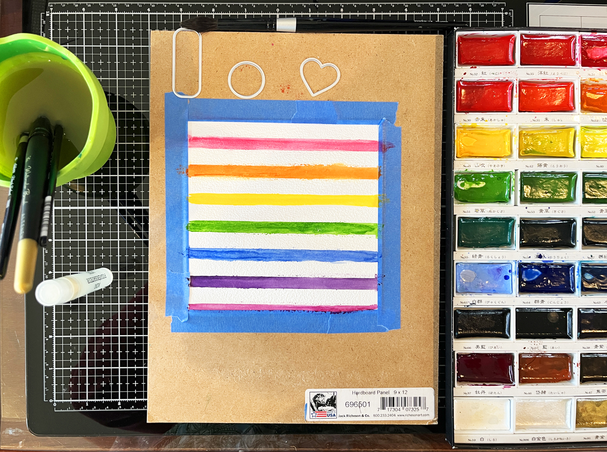
I stamped the Wide Stripe Background Stamp onto watercolor paper using Unicorn White Pigment Ink, then heat embossed it with white embossing powder. I knew I wanted to watercolor in between the embossed stripes, so I taped my panel to a hardboard to help minimize warping—always a helpful step when working with lots of water.

Working in rainbow order, I watercolored each stripe band by band. The raised white heat embossing created beautiful texture and helped keep each color neatly contained. I have a process photo showing this panel alongside my watercolor palette, and at this point… that was as far as the original plan went!

Sometimes the best ideas happen mid-project. I started thinking about repeating geometric shapes and how fun it would be to combine that idea with the striped watercolor background I had already created.

Using my Nesting Hearts Infinity Dies and Nesting Circle Infinity Dies, I die cut three 1-inch hearts and three 1-inch circles—perfect timing since we’re getting close to Valentine’s Day. Each die cut features the white heat embossed stripe running through the center, with one rainbow color above and the next color below.

I worked across the panel so that the bottom color of one shape becomes the top color of the next:

  • Pink over orange
  • Orange over yellow
  • Yellow over green …and so on.

I alternated the shapes—heart, circle, heart—creating a playful rhythm across the design.

To ground all that color, I mounted the six die cuts (two rows of three) onto a 4″ x 3″ gray mat die cut with the Nesting Postage Stamp Infinity Dies. Yes—this card uses three different Infinity Die sets, and they all worked together beautifully. The card base is a crisp white A2, keeping the focus on the cheerful pops of color.


✨ I recently wrote a blog post titled 14 Best Cardmaking Products & Supplies for 2026 (Must-Have Craft Room Staples) and it is my all time most popular blog post. I have a section on Infinity Dies where I list my 8 most used sets with links to a post using each die set.

👉 Best Die Cutting Staple: Infinity Dies

Finishing Touches & Sentiment Tips

My sentiment is small and simple: “With Love”, white heat embossed on black cardstock. This card could easily work as a Valentine, a friendship card, or a just-because note.

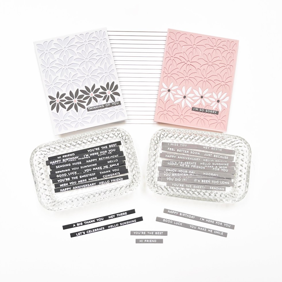
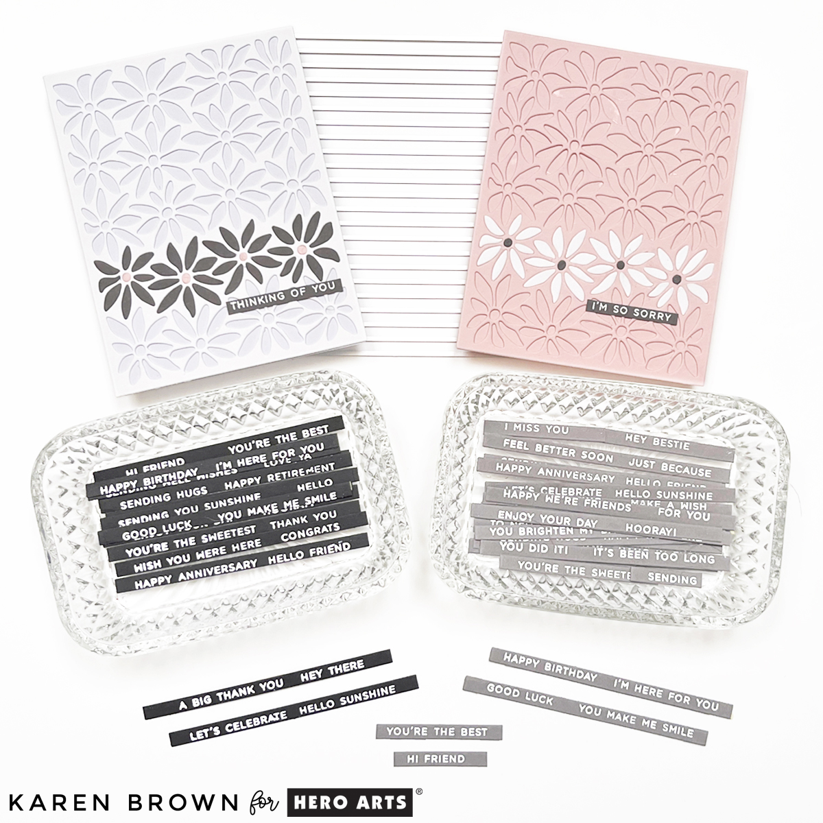
TIP: I love keeping pre-made heat embossed sentiment strips on hand. Using large sentiment strip stamps that coordinate with the matching Sentiment Strip die makes it easy to stamp and die cut everything at once.

For this card, I used a leftover Christmas Sentiment Strip, but I also reach for Everyday Sentiment Strips constantly—definitely worth checking out if you haven’t already. The photo above shows how many sentiments you can make at one time.

Why I Love This Collection

These two cards show how products from one collection can go in completely different directions:

  • One soft, artistic, watercolor-focused design
  • One clean, graphic, and modern card with bold shapes

This is a great reminder to let yourself play and see where your ideas lead.

cardmaking · Die cutting · Tutorial

4 Tips for Christmas Cardmaking

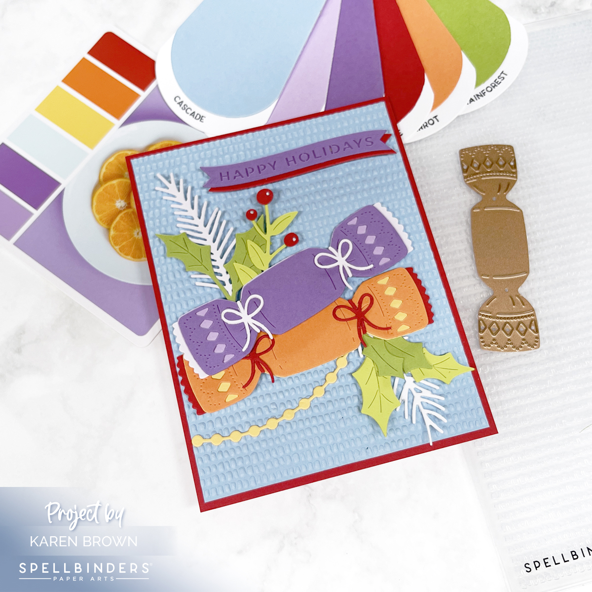
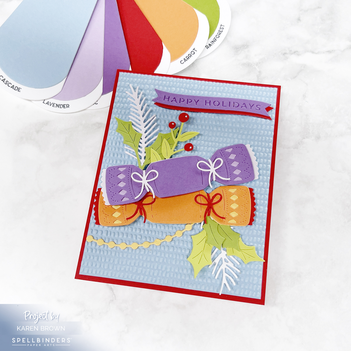
Bright, colorful Christmas card with a blue "dimpled" background, purple and orange die cut Christmas Crackers and a folliage accents.

Featuring the Christmas Cracker Die Set + Dimpled Embossing Folder

The holidays are the perfect time to get crafty, and Spellbinders’ new Christmas releases make it so much fun! Today I’m sharing a festive card I created with the Christmas Cracker Die Set from Yana’s Christmas Collection and the Dimpled 3D Embossing Folder from Suzanne Hue’s Texture and Foliage Collection.

Along the way, I’ll walk you through 4 tried-and-true tips that will make your holiday cardmaking easier, more enjoyable, and more beautiful.

Tip 1: Use Quality Cardstock

Handmade Christmas card featuring a colorful die cut Christmas cracker in shades of purple, orange, blue, and green. The background is embossed with a dimpled 3D pattern, and some die cuts are raised on foam for added dimension

The foundation of any good die cut is quality cardstock. Thin or flimsy paper isn’t substantial enough for die cutting. For this project, I used Spellbinders’ Color Wheel Cardstock—which is heavyweight, smooth, and cuts like butter.

Here are some of the gorgeous shades I pulled:

  • 🌊 Cascade
  • 💜 Fairy Tale
  • 🌸 Lavender & Lilac
  • 🌞 Beeswax
  • 🍊 Carrot
  • 🍎 Pomegranate
  • 🌿 Peridot & Rainforest

Together these created a vibrant, cheerful, and slightly unexpected holiday palette.

Tip 2: Swatch Your Cardstock

Handmade die cut Christmas card using Spellbinders Yana's Christmas Cracker set with the Dimpled 3D Embossing folder.

Having your cardstock organized and swatched makes choosing colors so much faster. I’ll link HERE to a post where I go into detail on how I keep my swatches handy and easy to use.

For this project, I flipped through my swatches until I landed on the perfect non-traditional holiday mix. Seeing them side by side helped me visualize how the colors would work layered on the Christmas cracker.

Products Used:

Tip 3: Use Color Inspiration

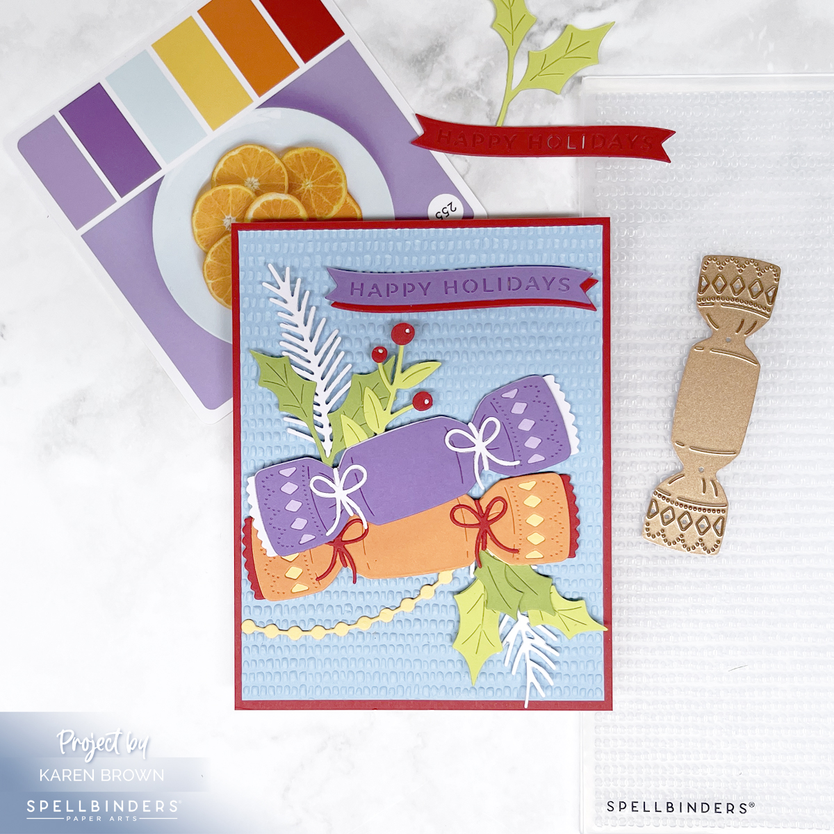
Handmade die cut Christmas Card created with the non-traditional colors of blue, purple, orange, red and green.

When in doubt, let a color system do the heavy lifting! For this card, I turned to Color Cubes Volume 2, specifically palette card #252, which inspired the purple, red, orange, yellow, blue color mix. I also own Volume 1. You can find the Color Cubes Bundle HERE.

I’ll also link to a previous blog post that features Spellbinders’ Color Deck System, another fabulous way to spark ideas when you feel stuck or want to try something different.

Click HERE if you’d like to see another Christmas Card using the same #252 Color Cubes palette card.

Tip 4: Add Texture and Dimension

Die Cut Christmas cracker card with loads of texture, dimension and vivid colors.

Flat die cuts are nice, but texture and lift make a card pop. For this background, I embossed a panel with the new Dimpled 3D Embossing Folder—a subtle yet impactful pattern that catches the light beautifully.

I also used foam squares behind some of the cracker die cuts to add depth and shadow. Craft foam also works great, especially on larger die cuts. The best glue for smaller die cuts is Bearly Glue. I love the fine nozzle! Simple details like these can make your handmade card feel polished and professional.

cardmaking · Die cutting · Stamping

Case Closed! An Adorably Crafty Mystery with Hero Arts

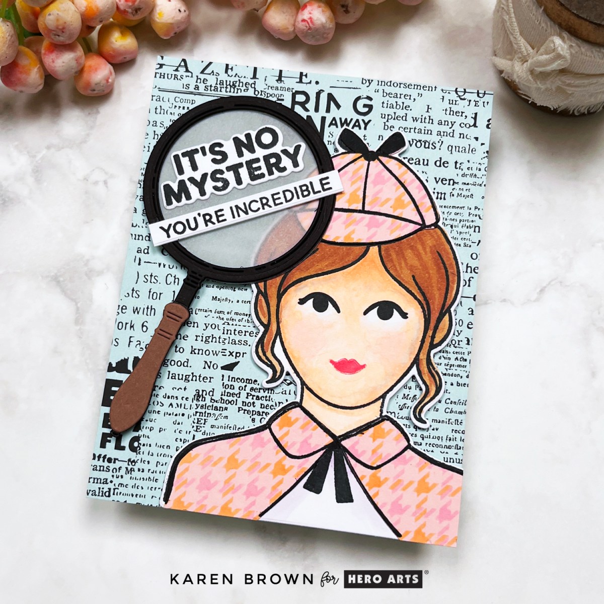
Card featuring Hero Arts Miss Detective stamp with custom stenciled plaid clothing, rub-on vintage newsprint background, and magnifying glass die cut with sentiment.

The case is cracked, the sleuth is on the scene, and this crafty caper is officially adorable! I’m thrilled to be part of the Hero Arts Instagram HopLink to Instagram Hop – celebrating the launch of the Case Closed Collection. My card today features the delightful Curious Crafter Bundle and its star: Miss Detective.

Key Products:

Card Tutorial: The Curious Case of the Custom Cape

Card created with Hero Arts Curious Crafter Bundle and  Miss Detective stamps and featuring a female sleuth with a magnifying glass sentiment and vintage newsprint background.

Say hello to my favorite cardmaking detective—a stylish sleuth (inspired by my own daughter!) ready to crack any case with flair. She’s decked out in a stenciled houndstooth plaid cape and Sherlock Holmes-inspired hat, thanks to the Curious Crafter Bundle. The finished look? Think Nancy Drew meets crafty couture!

Here’s how the case unfolded:

  • Clothing Construction: I stenciled a custom houndstooth pattern over Peony cardstock, then stamped and fussy cut the pieces to dress Miss Detective.
  • Copic Coloring: I brought her to life with Copic markers: E00, E21, E25, E55, R000, BV000, and BV02.
  • Vintage Vibes: My background is one of my absolute favorites — the Collage Backgrounds Rub-On Transfers applied to Arctic cardstock. The vintage newspaper style is the perfect setting for some crafty sleuthing.
  • Spotlight on Sentiment: A large die cut magnifying glass with vellum “glass” focuses attention on the stamped sentiment: “It’s No Mystery, You’re Incredible” — just one of the many clever sayings in this charming Sentiment Stamp Set.
  • Finishing Touches: I used Precision Glue and craft foam to give the layers dimension and used a bone folder for flawless rub-on application.

Assembling Miss Detective (a step-by-step recap):

  1. Stencil the plaid onto Peony cardstock.
  2. Stamp and color Miss Detective.
  3. Stamp and fussy cut clothes from plaid panel.
  4. Die cut Miss Detective and adhere clothing.
  5. Die cut magnifying glass from cardstock and vellum.
  6. Stamp and die cut sentiment.
  7. Apply rub-on transfers to Arctic cardstock.
  8. Assemble card with dimension and precision.

Click HERE if you’d like to see my post on how to customize your Hounstooth stenciled background.

Pro Tip: These rub-ons are pure magic! They transfer easily with a bone folder and give a rich, detailed finish — no ink needed!


The Verdict?

The Case Closed Collection is a creative knockout—quirky, clever, and a total blast to work with. Whether you’re channeling your inner sleuth, crafting a personalized card, or just in it for the vintage vibes, this collection offers so many possibilities.

Thanks for hopping along with us on Instagram today! Be sure to follow the trail (aka the hashtag) for more clever creations and inspiration from this fun Hero Arts release.

Click Link to Instagram Hop – My IG handle is @karens_mini


cardmaking · Rainbow Colors · Tutorial

Rainbows & Glitter: Tips on Making Your Own Glitter Cardstock

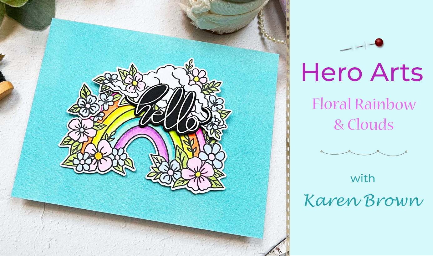
Tips and Tutorial on how to make a floral rainbow card with a custom tinted DIY glitter cardstock background.

Hi there! I’m so happy to share a card project that combines whimsical charm with vibrant color. If you love crafting as much as I do, you’ll want to stick around for all the dreamy details.

The Star of the Show: A Floral Rainbow

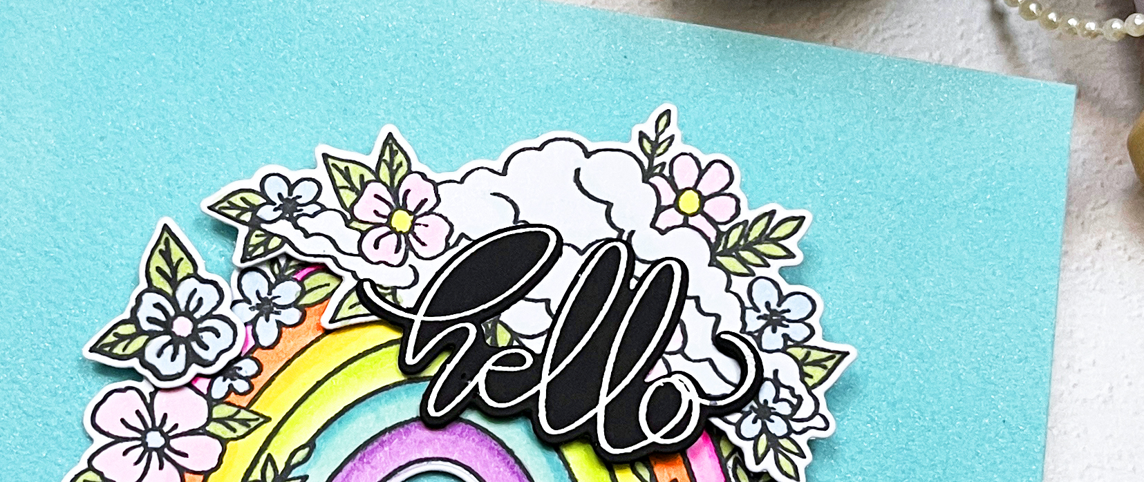
A handmade card featuring a colorful die-cut floral rainbow with fluffy white clouds, set against a sparkling custom glitter cardstock background and a bold scripty 'hello' sentiment

To me, Hero Arts Floral Rainbow and Clouds stamp and die bundle feels like a burst of happiness! I perched my rainbow and clouds on a custom background made of handmade glitter cardstock. By combining blue and green metallic shimmer sprays on watercolor paper, I created a sparkling, ethereal look that mimics a sunny sky. Now, let’s dive into the details of this colorful creation!

Key Products Used:

A colorful handmade card featuring Hero Arts Floral Rainbow stamp and die bundle.

At the heart of this design is a vibrant rainbow that I stamped and brought to life with Copic markers. The colors are rich yet soft, evoking a dreamy vibe that’s both uplifting and playful. After coloring, I used coordinating dies to cut out the floral arc, ensuring clean lines and perfect dimension. It’s not just a rainbow; it’s a celebration of color and joy!

Copic Colors Used: RV02, RV04, RV10, YR02, YR07, Y06, Y08, YG01, YG03, G43, BG11, BG45, B0000, B41, V01, V15

How To Make Your Own Custom Glitter Cardstock

Creative Process Photo: "An in-progress shot of painting blue and green shimmer sprays onto watercolor paper to create a custom glitter cardstock background."

Creating your own glitter cardstock is easier than you think and adds a personalized touch to your projects. Here is how I created my background:

  • I taped a panel of watercolor paper to a hard board and brushed water over the surface with a flat brush. I didn’t saturate the paper, but I did add a light coating of water.
  • Next, I mixed Blue + Shimmer Tone on Tone Metallic Spray with just a hint of Green + Shimmer Tone on Tone Metallic Spray in a paint palette and then painted the mixture on the wet watercolor paper with a damp flat brush. These sprays are very pigmented, so start with a little and add additional spray if you want more intense color, or more water if you want a more muted shade. I applied two layers but I didn’t bother to let it dry in between.
  • I let my shimmer panels dry overnight, but you could speed up the drying with your heat tool.

Experiment with different color combinations to make your custom glitter cardstock truly one-of-a-kind!

A shimmering custom-made glitter cardstock background in blue  green hues, adding sparkle and dimension to the card design.

To finish my focal point, I heat embossed the beautiful scripty “hello” sentiment that is included in the bundle.

Glitter can be tricky to capture on camera, but I hope you can see shimmer and sparkle in this close-up photo.

Close up shot of DIY handmade glitter cardstock to use in cardmaking, papercrafting and scrapbooking.

Who wouldn’t love a little rainbow magic in their mailbox? Let’s keep spreading those handmade vibes, one card at a time! 🌈✨


cardmaking · Video

VIDEO: 3 Creative Ways to Stencil Butterfly Cards

Video tutorial with step-by-step instructions on how to make 3 creative cards using layering stencils.

Hello friends, Karen Brown here with a colorful new video. Butterflies and stencils—can you name a more dynamic duo? The December (Butterfly) Layering Stencil of the Month is SO much fun!

Or you can click HERE to watch the video.

Textured Flights of Fancy

In this post/video, we’re spreading our creative wings and sharing three unique ways to stencil butterflies that’ll make your cards flutter with charm. From bold and dramatic to soft and dreamy, these techniques will have your projects soaring to new heights! 🦋✨

The butterfly outline is layer one and then there are 3 additional detail layers to add on top to customize your projects. I show you how to use all three top layers in the video.

Beautiful butterfly cards created with layering stencils + Hero Wax and Hero Paste.

I thought it would be fun to make some non-traditional Christmas cards featuring butterflies AND pastel colors. I always love to stretch my supplies beyond the predictable!

For my first two cards, I stenciled a panel of Deluxe Smooth Cardstock with a gradient of 3 colors and then added White Hero Wax (card on the left) and Hero Glitter Paste (card on the right). I used Thistle, Taffy and Creamsicle for the card on the left. For the card on the right, I wanted a frosty, icy, wintry blend so I used Amethyst, Thistle and Splash.

The mats are Amethyst with a Granite base.

I also think the duo pictured above would make great Get Well, Thinking of You or Sympathy cards.

Let Your Creativity Soar

Stenciled and Ink blended non-traditional butterfly Christmas card.

And, I had to make at least one traditional green and red Christmas butterfly card. I stenciled with Fresh Lawn and Cherry Ink, matted with Crimson cardstock and added a sentiment from the Swirly Christmas Tree Bundle.

Other Supplies Used in the Video:

Hero Studio December Layering Stencil of the Month - 3 handmade butterfly cards.

The Final Flutter

With just a stencil and a splash of creativity, you can bring butterflies to life in endless, colorful ways. So, go ahead—spread your crafting wings, experiment with colors, and let your cards shine as bright and beautiful as a butterfly in full flight. Happy stenciling! 🦋✨

cardmaking · Stamping

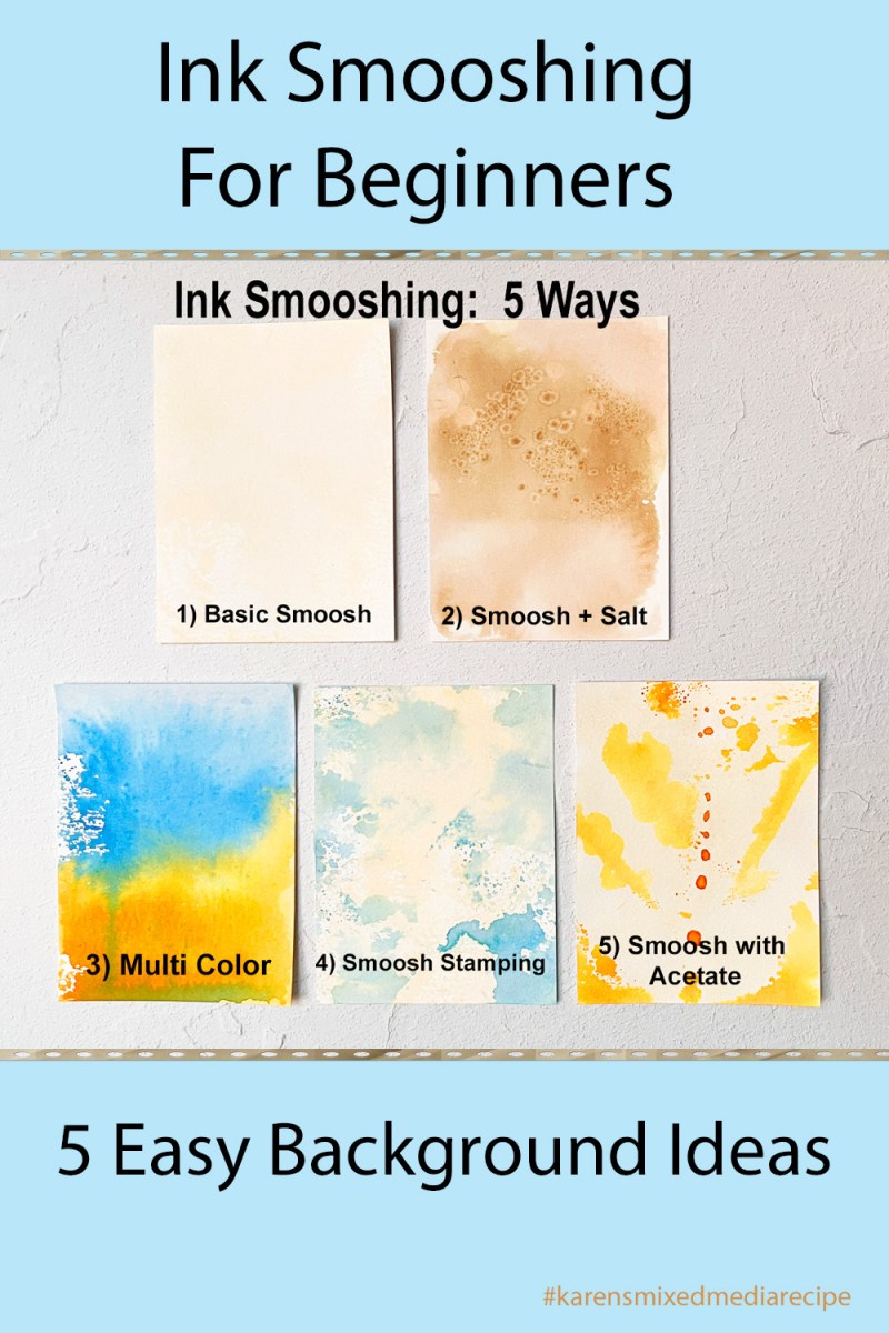
Fabulous Floral Backgrounds | Ink Smooshing + Stamping Tutorial

Two colorful floral cards using Hero Arts August 2024 Cling Stamp of the Month "Orchids" + Ink Smooshing Technique Tutorial.

Hello lovely crafters! Karen Brown here and today I am excited to share with you a simple yet stunning way to create a floral background with a gorgeous new cling stamp called Orchids.

Easy Yet Eye-Catching Ink Smooshing

Easy yet eye-catching floral background in pinks and oranges + Orchids Cling Background Stamp of the Month for August 2024.

Step-By-Step Tutorial:

I will walk you through how to make two colorful cards using the August Cling of the Month: Orchids.

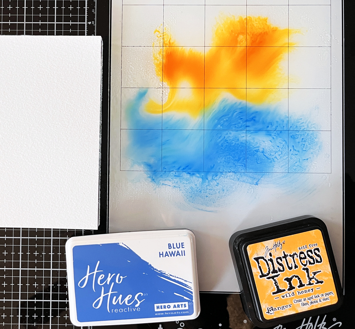
  • I started by making two background panels. I took a Clear Acetate Window Card Panel, dabbed Reactive Ink on the acetate and then spritzed with water. Some spots were watery and others were a bit dryer, and think I think this combination adds more character to backgrounds.
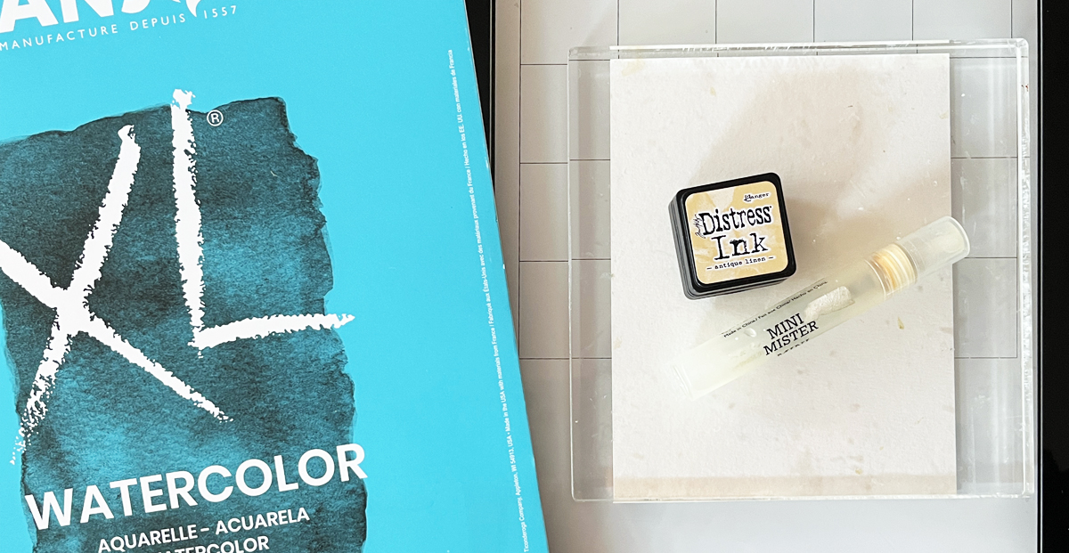
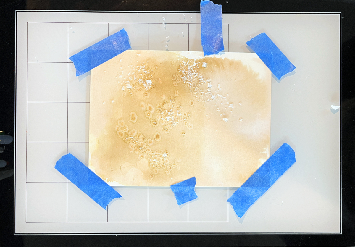
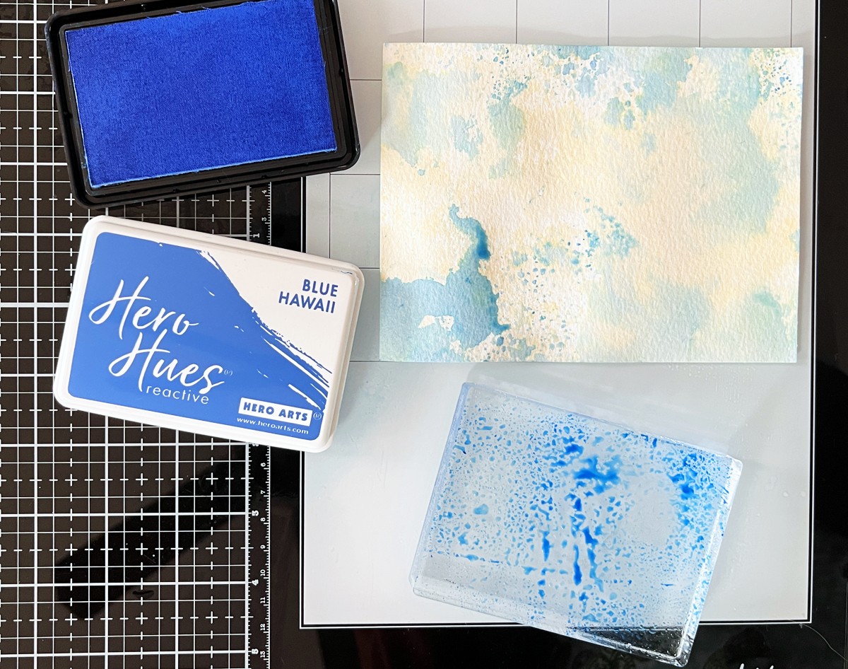
  • I turned the acetate over, bent it so that it touched just a portion of my background, and applied a section of the diluted ink onto Luxe Watercolor Paper. I continued adding different colors until I liked the look of my panel. I wanted contrast so I made sure to leave some white space. You can see my process photo below.

Below is a photo of my completed ink smooshing. I used Fruit Punch, Creamsicle and Taffy for card 1 and Blue Hawaii, Paradise and Pool Party for card 2.

  • I let my backgrounds dry overnight but you could speed things up with a heat tool.
  • I find I get a better result if I season my cling stamps prior to stamping my project. I inked up the Orchids stamp and stamped on plain computer paper and then discarded this test paper.
  • I put my ink smoosh background and cling stamp in my stamp positioner and stamped three times with Intense Black Ink. I wanted a nice dark impression that really penetrated the paper.
  • Next, using my August Card Kit of the Month, I die cut my elements from Pitch Black cardstock.
  • I cut two 2″ x 3″ white panels, and two black mats.
  • I stamped my sentiment (also from the August Card Kit) near the bottom of the white panel and then attached my die cuts with foam squares.
  • I assembled my card, adding a bit of craft foam behind the small black mat.
Floral Background + Blue Ink Smooshing for an eye-catching Hello card with die cut accents.

Here is a final photo of both cards.

How to make colorful ink smoosh backgrounds for your handmade cards.

I hope you enjoy trying out this technique. Happy stamping!

cardmaking · Rainbow Colors

Review: Waffle Flower’s Sticky Grip Mat – A Crafting Essential (Just Updated)!

A review and tutorial for Waffle Flower's new and improved sticky Grip Mats + a die cut Window Scene Card.

As a passionate crafter, I’m always on the lookout for tools that make the creative process smoother and more enjoyable. Recently, I had the pleasure of testing out an updated re-released product that gently holds cardstock and stencils in place for stamping and ink blending— Waffle Flowers new and improved Grip Mats.

This innovative mat has been specifically designed to keep your cardstock firmly in place, eliminating the need for pesky adhesives or awkward hand placements that can often lead to smudges or uneven ink application. After putting the sticky Grip Mat through its paces, I’m excited to share my experience and why I believe it’s a must-have for any serious crafter.

Previously, I purchased a Grip Mat for both my Misti and Mini Misti and I found them invaluable. Waffle Flowers recently asked it they could send me two NEW mats, no strings attached. I was happy to test and play with two sizes of the new mats.

👉 TIP: With Grip Mats, there is no need to use magnets anymore when using my Misti Stamp Positioners!

Products Used and Referenced in This Review:

Waffle Flower die cut Window Scene Grid Card with ink blended Rainbow Panels + die cut trees.

The Testing Process

To truly test the Sticky Grip Mat’s capabilities, I decided to embark on an colorful project: ink blending six small rainbow-colored panels, which I would then assemble into a vibrant card. Here’s a step-by-step look at how the mat performed throughout the process:

  1. Securing the Cardstock: The Sticky Grip Mat held each piece of cardstock firmly in place, preventing any slipping or movement. This was a game-changer for achieving precise, even ink blending. Small panels and die cuts are difficult to work with so I die cut 6 small windows with Waffle Flower Window Scene Die for my testing purpose. I have a process photo below. I tested both the 7.5″ x 11″ mat (easily holds half letter size paper) and 4″ x 4″ mat for ink blending. The 4″ x 4″ mat was also very handy for holding my ink pads in place.
  2. Ink Blending: As I blended various rainbow hues onto the panels, I noticed how smoothly the ink applied. I used Hammermill’s smooth cardstock, which worked extremely well. I selected my favorite Hero Arts ink colors for my project. The stability provided by the mat allowed me to focus entirely on the blending process without worrying about the cardstock shifting. This resulted in beautifully blended panels with seamless color transitions.
  3. Stamping: Stamping on the secured cardstock was equally impressive. The mat kept the cardstock in place, ensuring crisp, clear impressions every time. I didn’t have to reposition or realign the cardstock, which saved me a significant amount of time and frustration. I stamped longtime favorite Warm Wishes using my Mini Misti Grip Mat.
  4. Assembly: After completing the six panels, assembling them into a card was a breeze. I used Waffle Flowers Window Scene Die to finish my card. The consistent, high-quality ink blending and stamping made the final product look professional and polished.
Review and Tutorial for Waffle Flowers new 7.5" x 11" sticky Grip Mat.

Pros and Cons

Pros:

  • Excellent Grip: The mat’s adhesive surface effectively holds cardstock in place, allowing for precise and effortless ink blending and stamping.
  • Reusable and Durable: After several uses, the mat maintained its tackiness and showed no signs of wear, making it a long-term investment for any crafter.
  • Easy to Clean: Any residual ink or debris wiped off easily with a damp lint free cloth, restoring the mat to its original condition.

Cons:

  • Initial Tackiness: The mat is extremely tacky when first used, which might cause lighter weight cardstock to tear upon removal. None of my panels tore during my testing process.
Notes:
  • To minimize cardstock warping, peel the mat off the cardstock. I didn’t touch the cardstock but gently bent the ends of the grip mat and slowly pulled away from my inked panel.
  • The mats each come with two guides that you can add above or below the mat. To prevent the print from transfering to your mat, apply the guide to the mat with the reverse side facing away from the grip mat.
  • The new mats are a bit cloudier than the 1st generation.
  • Air bubbles are expected and fine.
  • If the mat starts to lose it’s cling, clean with water or photopolymer safe cleaner.
  • Store your Grip Mats on the transparent sheets.
  • Do not stack heavy items on top of your grip mats.

I have another blog post and video coming this month that demonstrate using two sizes of Grip Mats in action for ink blending with layering stencils.

Bright colorful Warm Wishes Grid Scene card using Waffle Flower's Window Scene Die.

Products Used Today:

I hope you found this review helpful. Thanks for stopping by.

Karen

cardmaking · Rainbow Colors

Hero Arts | Stunning Stenciling Magic with Vibrant Rainbow Colors

Rainbow stenciling with Hero Arts Floral Trove Stencil.

Do you ever find yourself craving a burst of color and creativity in your life? Look no further than the art of stenciling! It’s a simple yet profoundly satisfying technique that allows you to transform a background into a cardmaking masterpiece. And what better way to dive into stenciling than with the vibrant hues of the rainbow? Today I am using Hero Arts wonderful new Floral Trove Stencil (SA-274), and it is stunning in rainbow colors!

Hero Arts Floral Trove Stencil Design Ideas:

This stencil is 6″ x 6″, so it is large enough to make most any card size you desire, but one portion is perfect for A2 cards.

I created a short reel showing my process that you can VIEW HERE:

Tips and Tricks for Stenciled Card Designs:

  • I almost always start my cardmaking process with color selection. Today, I knew I wanted to use bright rainbow colors so I grabbed my color swatches and began picking. I chose Amethyst, Taffy, Creamsicle, Lemon Drop, Green Apple, Pool Party and Blue Hawaii.
  • I used an A2 size panel of Deluxe Smooth Cardstock as my base. I placed this on the sticky mat of my StampWheel, so the cardstock would not shift.
  • In rainbow order, I rotated around the Floral Trove stencil, starting in the top left hand corner with Amethyst. I went left to right, dropped down a row and went right to left, dropped a row and finished going left to right again.
  • To keep from inadvertently stenciling in the wrong section, I masked off with Post-It Note squares. You can see the process in the Instagram reel I referenced above.
  • I experimented with all my blending brushes using small, medium, large and XL to see which size worked best on my project. My choice was medium, but they all worked just fine, so use what you have. Hero Arts does sell a blending brush sampler pack, which is so handy to have in my craft room.
  • I trimmed my background down and mounted on a Peacock A2 cardbase that I created.
  • I added my Friend sentiment, which I die-cut 3 times and glued together. I also added a stamped Happy Birthday sentiment above the friend.
Bright, vivid rainbow color stenciled card with hero Arts Floral Trove stencil.

Products Used:

There’s no limit to what you can create with a little imagination and a splash of color!

Karen