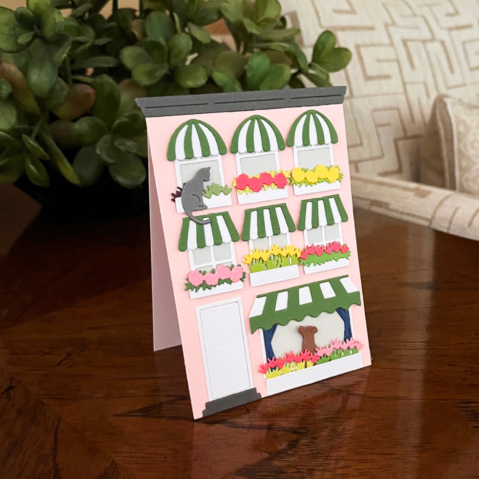
cardmaking · Die cutting

How to Create a Cozy Die Cut Scene Card (Beautiful House Card Ideas & Tips)

Design tips, color inspiration, and creative ways to personalize a charming city house scene card

We all have favorite cardmaking themes—and one of mine is homes, houses, and charming little villages.

There’s something so inviting about a cozy house scene. It instantly tells a story.

Die cut house scene card with pink building, green striped awnings, white windows, and colorful flower boxes
Cozy scenes make charming cherished cards

The Spellbinders City Holiday Collection immediately captured my attention with its detailed three-story home façade—an incredibly versatile base that can be customized for different seasons, occasions, and recipients.

In today’s post, I’m sharing how to create a beautiful die cut scene card, along with design tips and ideas to help you personalize your own.

scene card series badge

This post is part of my Scene Card Series where I share layout ideas, design tips, and inspiration for creating beautiful, story-driven card scenes.

Homes and villages create storybook perfect cards.


📌 In This Post

  • How to create a cozy die cut scene card
  • Tips for organizing your workflow
  • Color ideas for a harmonious design
  • Creative ways to customize your scene
  • Tips to keep your die cuts organized

📌 Save this post for later when you’re ready to create your own scene card!


✨ Product Spotlight: City Holiday Collection

The City Holiday base die set features a charming three-story house (or apartment façade) along with classic decorative elements like wreaths, pets, and architectural details.

To give my project a fresh, summery feel, I incorporated additional elements from the Everyday City Holiday add-ons, including:

  • Festive awnings
  • Additional window styles
  • Curtains and window treatments
  • Flower boxes

Everything mixes and matches beautifully, creating a cohesive and highly customizable design.

This collection was designed by the incredibly talented Yana Smakula, and her thoughtful details really shine in this set.

You can use the base to create:

  • a shaped card (like I did here)
  • a stand-up display card
  • or a traditional card base

This particular card looks especially lovely displayed on a bookshelf—it truly feels like a miniature piece of décor.


House shaped die cut card with pink house, green awnings + a cat and dog.
Easel cards are recipient favorites

🌟 Why This Die Set Works

This is the kind of die set that keeps giving long after the first project.

  • Starts with a universally loved theme
  • Endless customization possibilities
  • Thoughtfully designed for cohesive results
  • Creates a strong focal point instantly
  • Minimal additional supplies needed
  • Produces a “wow” card that recipients will keep and display

This is a fantastic choice for more experienced die cutters who enjoy building detailed, personalized scenes.


Spellbinders Everyday City Holiday die-cut card.

🎨 Let’s Talk Color

My color inspiration came from a photo of a pink stucco house with green and white striped awnings—such a welcoming, cheerful look.

This palette works beautifully because it’s based on complementary colors:

  • Pink → warmth, love, charm
  • Green → freshness, nature, balance

Together, they create a vibrant yet harmonious design that feels both lively and inviting.

I added:

  • crisp white window frames and boxes
  • pops of color in the flowers

I used ColorWheel cardstock (a staple in my craft room) because the colors coordinate effortlessly.

👉 You can find it in my Go-To Cardmaking Supplies page and 14 Best Supplies post


✂️ Design & Assembly

For a more detailed project like this, organization makes all the difference.

I started by placing each die element on the house base to understand how everything fit together. Then I sorted pieces by color before beginning die cutting.

Doing most of the die cutting in one session saves time and keeps the process smooth.

💡 Tip: When cutting window frames, tape the frame and pane dies together and run them through your machine in one pass. It’s much faster and ensures perfect alignment.

For organization, I used my Craft Stax containers—they keep everything contained and easy to revisit if you step away mid-project.

I turned mine into an easel card that looks great sitting on a table, counter or bookcase.

Organized die cut pieces stored in Craft Stax container during cardmaking process

✨ Why This Design Works

  • Strong focal point with the house façade
  • Relatable, story-driven scene
  • Balanced and harmonious color palette
  • Layered details create depth and interest
  • Flexible design that works for many occasions

Charming die cut house apartment building card.

🌞 More Ways to Use This Die Set

One of the best things about this collection is how versatile it is.

You can easily adapt it for:

  • Christmas or winter scenes
  • Shaped cards, stand-up cards, or A2 designs
  • Mixing window styles and treatments for variety
  • Larger 5×7 cards with full backgrounds
  • Storybook-style birthday cards
  • Cozy “thinking of you” designs
  • Charming thank you cards
  • Custom homes inspired by the recipient

You can even simplify the design for a clean and simple look using just a single window.


🔗 More Card Themes You Might Love

If you enjoy scene cards, you might also love some of my other favorite themes:

☕ Coffee-Themed Cards

🍋 Lemon & Citrus Cards

🧺 Food-Inspired Cards


🧰 Supplies I Used

These are the tools I reach for again and again when creating detailed die cut scene cards:

⭐ Featured Products

🎨 Cardstock & Storage

👉 These are the primary products I used on this product, but below you can find the basic tools and supplies I use daily.


📌 Save this post for later so you can come back when you’re ready to create!

🏆 Proud to be ranked among the Top 75 Cardmaking Blogs by Feedspot


Thanks so much for stopping by!

What occasion would you create first with this charming house scene?


>

cardmaking · Tutorial

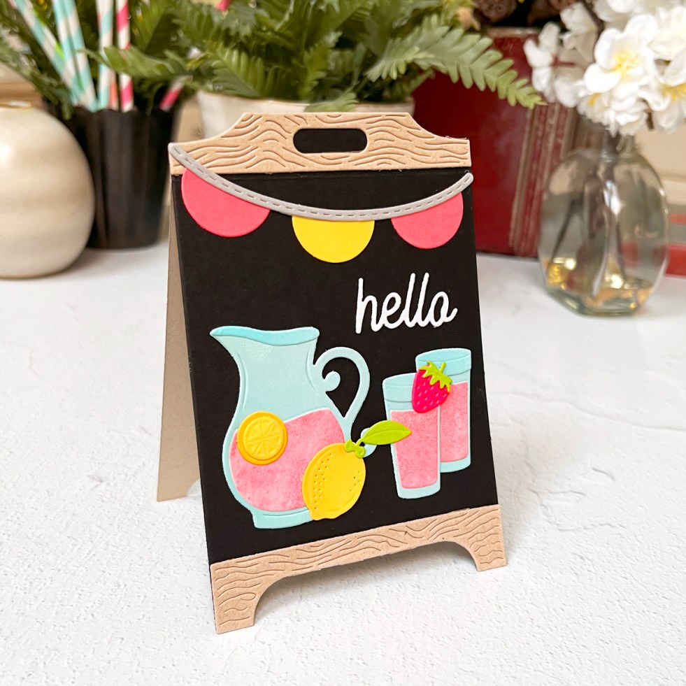
1 Die Set, 2 Moods: Coffee Shop Chalkboards & a Lemonade Easel Card

Create Dimensional Keepsake Cards That Will Wow Your Recipient

Some die sets are fun. Others quietly become craft room staples—the kind you reach for again and again because they just work.

The new Spellbinders Pink Lemonade Stand Collection falls firmly into that second category.

With its stand-up easel chalkboard design, customizable accessories, and endless styling options, this set can go modern or playful, graphic or cozy, bold or soft. Its both eye-catching and surprisingly easy to create—even if you’ve never made a dimensional card before.

Today, I’m sharing how to turn this versatile die set into a dimensional chalkboard easel card that’s both eye-catching and surprisingly easy to create.

Die-cutting series badge

This post is part of my Die Cutting Series where I share tools, tips, and card ideas to help you create beautiful die-cut cards.

4 versions of chalkboard easel die-cut cards from Spellbinders Pink Lemonade Stand Collection

In This Post, You’ll Learn:

• How to create a dimensional chalkboard-style easel card
• Tips for building a stable stand-up design
• Ways to customize your card for different occasions
• How To Get Professional Heat Embossing Every Time


I’ve created two dimensional easel card designs using the same kit:
• a bright, cheerful stand-up strawberry-lemonade easel card that practically begs to be displayed

• a trio of bold, graphic coffee shop thank-you cards featuring dramatic black cardstock and heat embossing

Along the way, I’m also sharing a reliable heat embossing tutorial, tips for building sturdy easel cards, and ideas to help you get the most mileage possible out of this die set.

Angled side view of pink lemonade stand easel card standing upright for display

Product Spotlight: Pink Lemonade Stand Die Set

The chalkboard easel card featured today is built with the delightful Pink Lemonade Stand Die Set from Spellbinders.

What makes this set so versatile is the dimensional stand design and the mix-and-match accessories that allow you to style it for everything from summer lemonade stands to cozy coffee shop scenes.

Why I love it:

• Creates dimensional easel cards that display beautifully
• Includes fun accessory pieces for customizing your stand
• Works with many different themes and occasions

See the die set here.


Lemonade Stand Easel Card (Bright, Happy, Display-Worthy)

For my first card, I used the Lemonade Stand die set traditionally—and it’s a show-stopper.

Design Details

  • Black chalkboard center
  • Tan “wood” frame top and bottom
  • Die-cut pitcher of pink lemonade, glasses, lemons, and a strawberry
  • Included hello sentiment
  • Pink and yellow banner across the top

Color palette: pink, yellow, and pale blue—bright, happy, and eye-catching without being busy.

Lemonade stand easel card with pink lemonade pitcher, lemons, banner, and black chalkboard background.  Spellbinders S6-269
Dimensional stand-up easel cards beg to be displayed.

I cut many of my elements from lightly inked scraps, which keeps everything from looking flat. I also added a touch of ink blending to the lemons for dimension.

If lemons are your thing too, you might enjoy this favorite from last year → Lovely Lemons: Die Cutting, Ink Blending & a Touch of Gold.

I am sharing a diecutting process photo and I talk more about why I love my Platinum 6 in my must-have cardmaking list.

process photo of die-cutting
Die cutting lemonade embellishments creates fun interest on chalkboard easel display cards.

Up-Right Easel Assembly Tip

  • Die cut a second chalkboard backer from tan cardstock
  • Score just below the top wood header on the front and back panel
  • Glue only the top headers together to create a sturdy stand

These display-worthy cards are the kind recipients keep out long after the occasion.

Trio of Coffee Shop Thank-You Cards (Black Cardstock = Instant Drama)

For my trio of cards, I leaned fully into a coffee shop chalkboard vibe—modern, graphic, and cozy all at once.

coffee themed handmade easel cards.

Design Details

I trimmed the coffee cup image slightly, which instantly made the design feel more like a real café chalkboard. The glossy white embossing against deep black cardstock is one of those combinations that never fails.

If you love coffee-themed cards too, you might enjoy my bold espresso-inspired project here → What’s Brewing? A Bold & Graphic Coffee Card.

Individual coffee shop chalkboard easel card in turquoise, black, and white.  Spellbinders Pink Lemonade Stand die kits:  S6-269 & S4-1532

Color Breakdown (why it works)

Each card is mostly black (about 70%), with:

  • one strong accent color (~15%)
  • crisp white embossing
  • one tiny pop of contrast (flower center or heart)

That balance is what keeps these dramatic but still cheerful.

Which color combo is your favorite—pink, turquoise, or yellow?

Heat Embossing on Black Cardstock

Because these cards rely on bold embossing, I wanted to include a go-to heat embossing method you can reference again and again.

Individual coffee shop chalkboard easel card in hot pink, black, and white.  Coffee theme "thanks a latte".

How I Get Clean, Professional Heat Embossing Every Time

  • Prep stamps with a stamp conditioning eraser (today I used the Hero Arts Coffee or Tea stamp set)
  • Prep cardstock with an anti-static powder tool
  • Use a 1″ flat brush to apply powder horizontally, then vertically
  • Stamp with Unicorn White Pigment Ink
  • Use white embossing powder (double white = best results)
  • Preheat heat tool for at least 1 minute
  • Use the easel die as a viewfinder to place images
  • Stamp twice with a stamp positioner using light, even pressure
  • Pour embossing powder generously, tilt panel in all directions, tap gently
  • Heat emboss while constantly moving the heat tool
  • Let cool, then polish lightly with a microfiber cloth

💡 Tip I’ve used for years: catch excess embossing powder in a coffee filter—easy pour-back, no mess.

I’m sharing:

  • a candid workspace photo showing all three layouts “percolating” overnight
Process photo showing chalkboard card layouts, dies, cardstock, and die cutting machine
Heat embossing white pigment ink and embossing powder on black cardstock creates that bold chalkboard look I love for coffee themed cards.
  • a mid-assembly shot with one chalkboard drying under an acrylic block
Heat embossing a coffee cup stamp with white embossing powder on black cardstock for chalkboard style thank you card.
Bright pops of color contrast nicely with blackcardstock.

If you are looking for easy relaxed cardmaking, you might be interested in some other products I used from The Pink Lemonade Collection in this Using Pre-Printed Supplies blog post.

If you love scene-building, you’ll definitely want to check out my Sneaker Bouquet scene card tutorial.

Craft Supplies Featured on This Card:

Die Cutting:

Stamps and Cardstock:

Ink: