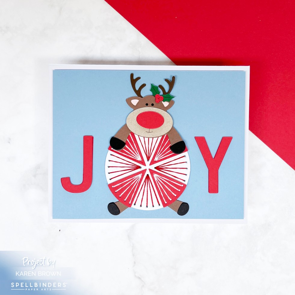
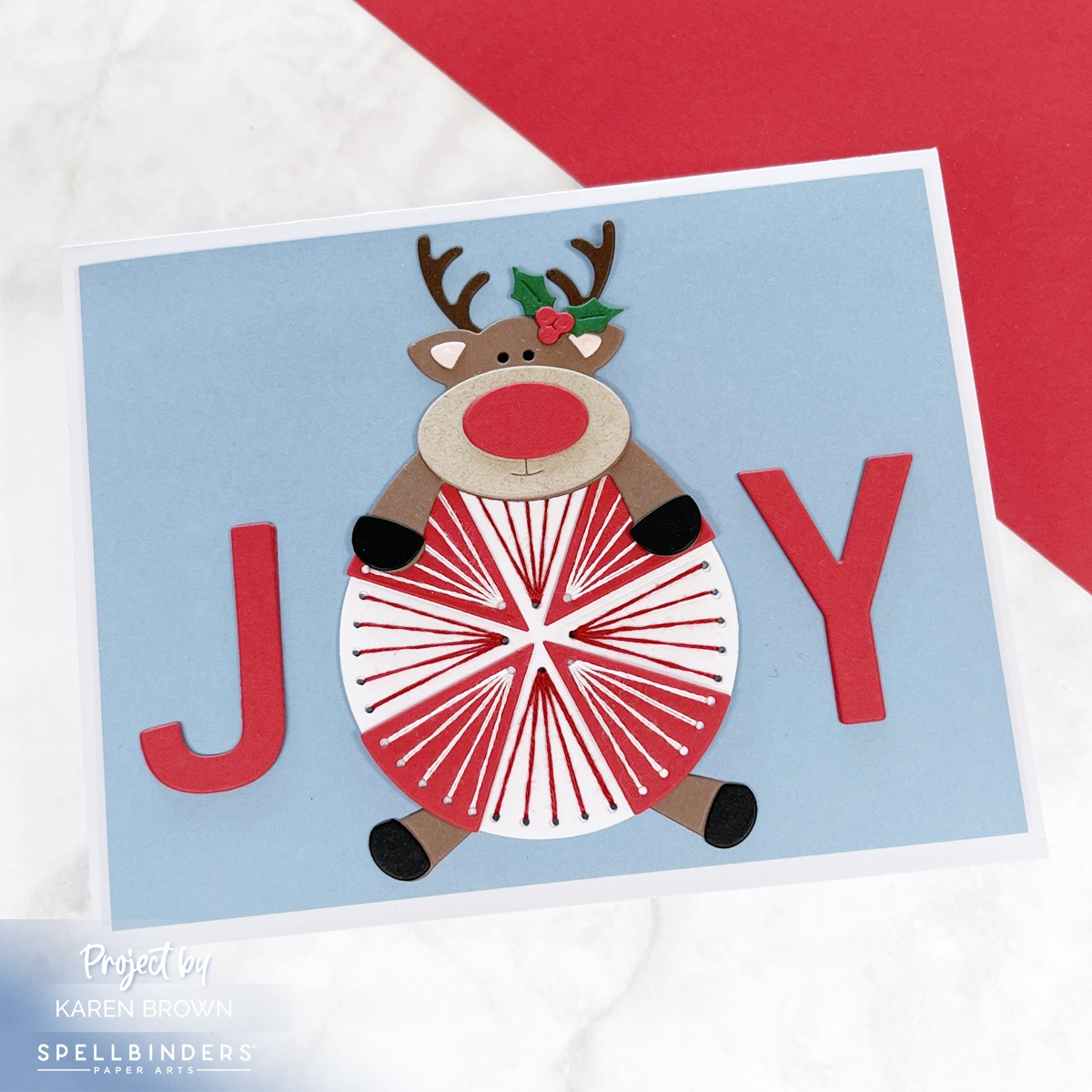
The October 2025 Stitching Die of the Month is called Peppermint Prancer, and it’s as festive as it sounds! This month’s design combines the sweetness of peppermint candy with the whimsy of a playful reindeer—perfect for cheerful holiday cards.
🍬 The Peppermint
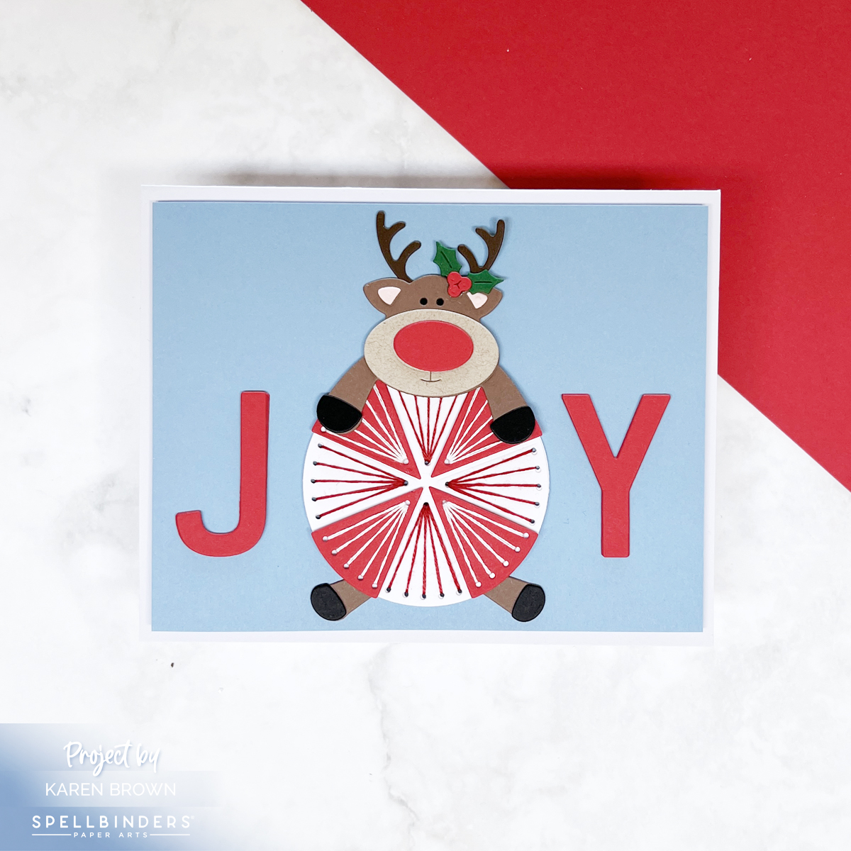
I started with a Cascade blue background to give my card a crisp winter feel. The stitched peppermint takes center stage: alternating red and white cardstock wedges stitched with contrasting thread—red stitches on the white wedges and white stitches on the red wedges. The result is a bold, candy-like design that feels dimensional and playful.
🦌 The Reindeer
Of course, no holiday peppermint is complete without a reindeer! I gave my prancer a bright red die cut nose to turn him into Rudolph, and I positioned him sprawled out across the peppermint as if he’s hanging on for dear life. It makes the whole card feel lighthearted and full of energy.
🎄 The Sentiment
Here’s where the fun twist comes in: the stitched peppermint doubles as the “O” in the word JOY. I die cut a bold J and Y (included in the kit) from the same red cardstock as the peppermint so the word stretches across the entire card front. The peppermint pulls double duty as both candy and sentiment—an easy way to make your design more impactful.

✂️ Stitching Details & Supplies
I stitched with two strands of embroidery floss and recommend keeping thread taut but not tight for smooth stitches. For those new to stitching dies, I’ll be linking to my favorite stitching accessories and tools so you can jump right in.
Helpful Links:
- Spellbinders Stitching Die of the Month
- Spellbinders Deluxe Caboodle Kit – Get All 10 Kits at a Great Value!
- Stitching Accessories
- ColorWheel Cardstock
- Club Overview and Club Options
- Past Club Kits
- Platinum 6 Die Cutting System
- Spellbinders Shop
- Sarah Renae Clark’s Color Cubes
And if you’d like to see more from the October Club Kits, I’ll also link my other projects using this month’s dies.