cardmaking · Tutorial

1 Die Set, 2 Moods: Coffee Shop Chalkboards & a Lemonade Easel Card

Create Dimensional Keepsake Cards That Will Wow Your Recipient

4 versions of chalkboard easel die-cut cards from Spellbinders Pink Lemonade Stand Collection

Some die sets are fun. Others quietly become craftroom staples—the kind you reach for again and again because they work for everything.

The new Spellbinders Pink Lemonade Stand Collection is firmly in the second category. With its stand-up easel chalkboard design, customizable accessories, and endless styling options, this die set can go modern or playful, graphic or cozy, bold or soft.

Today I’m sharing two dimensional easel card designs using the same kit:
• a bright, cheerful stand-up strawberry-lemonade easel card that practically begs to be displayed

• a trio of bold, graphic coffee shop thank-you cards featuring dramatic black cardstock and heat embossing

Along the way, I’m also sharing a reliable heat embossing tutorial, tips for building sturdy easel cards, and ideas to help you get the most mileage possible out of this die set.

Angled side view of pink lemonade stand easel card standing upright for display

Product Spotlight: Pink Lemonade Stand Die Set

The chalkboard easel card featured today is built with the delightful Pink Lemonade Stand Die Set from Spellbinders.

What makes this set so versatile is the dimensional stand design and the mix-and-match accessories that allow you to style it for everything from summer lemonade stands to cozy coffee shop scenes.

Why I love it:

• Creates dimensional easel cards that display beautifully
• Includes fun accessory pieces for customizing your stand
• Works with many different themes and occasions

See the die set here.


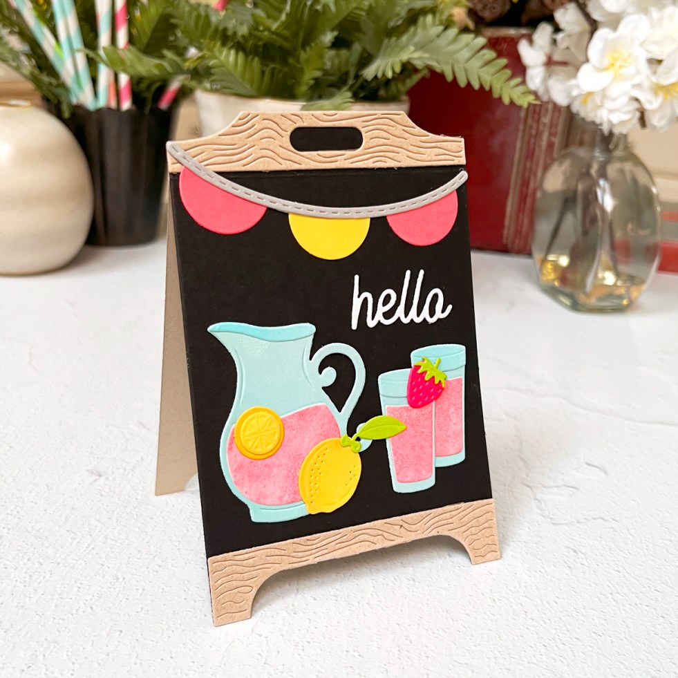
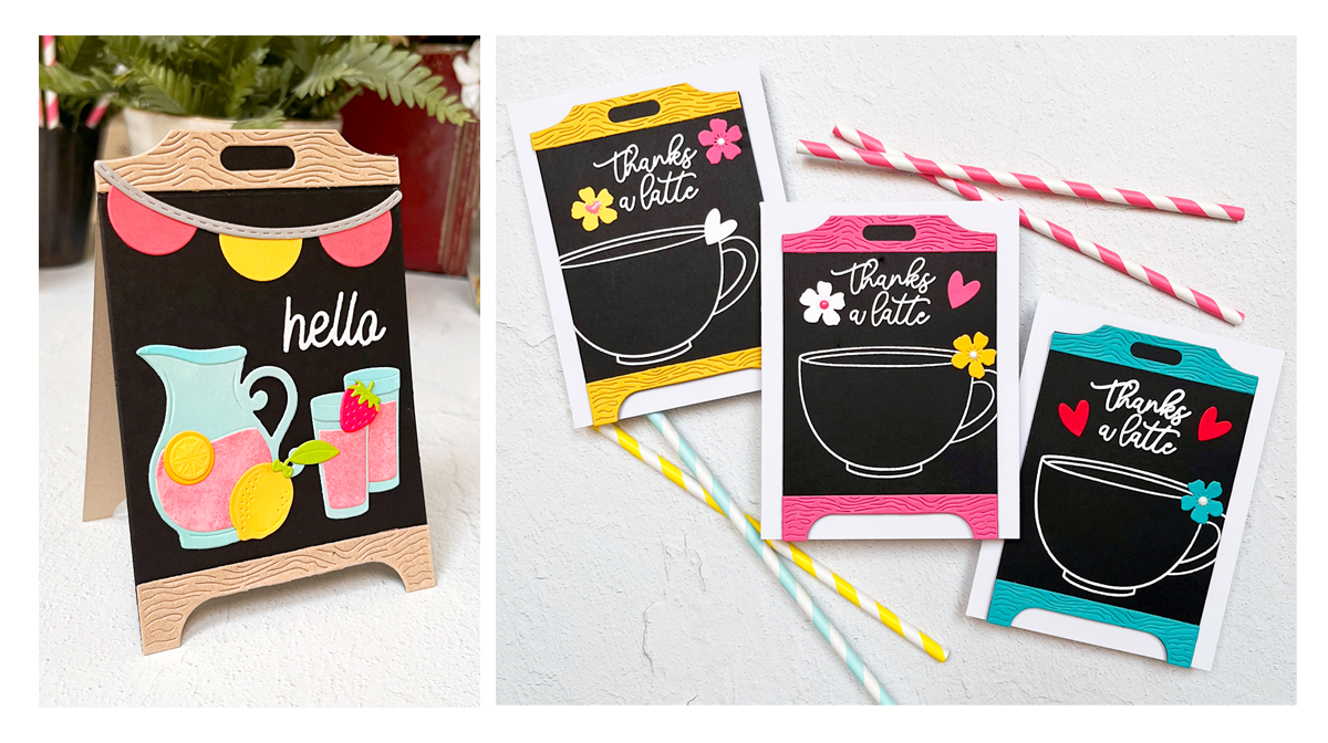
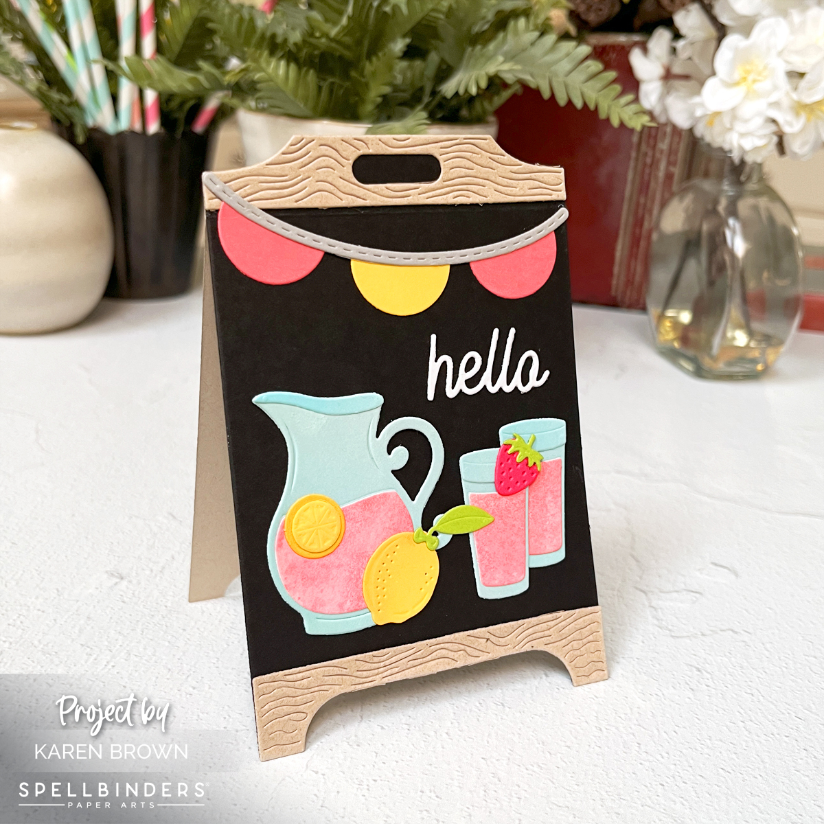
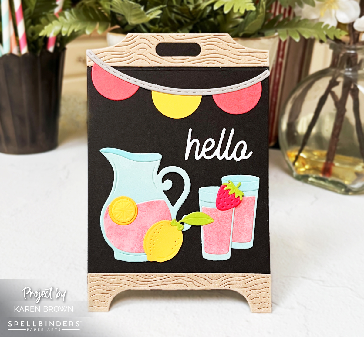
Lemonade Stand Easel Card (Bright, Happy, Display-Worthy)

For my first card, I used the Lemonade Stand die set traditionally—and it’s a show-stopper.

Design Details

  • Black chalkboard center
  • Tan “wood” frame top and bottom
  • Die-cut pitcher of pink lemonade, glasses, lemons, and a strawberry
  • Included hello sentiment
  • Pink and yellow banner across the top

Color palette: pink, yellow, and pale blue—bright, happy, and eye-catching without being busy.

Lemonade stand easel card with pink lemonade pitcher, lemons, banner, and black chalkboard background.  Spellbinders S6-269
Dimensional stand-up easel cards beg to be displayed.

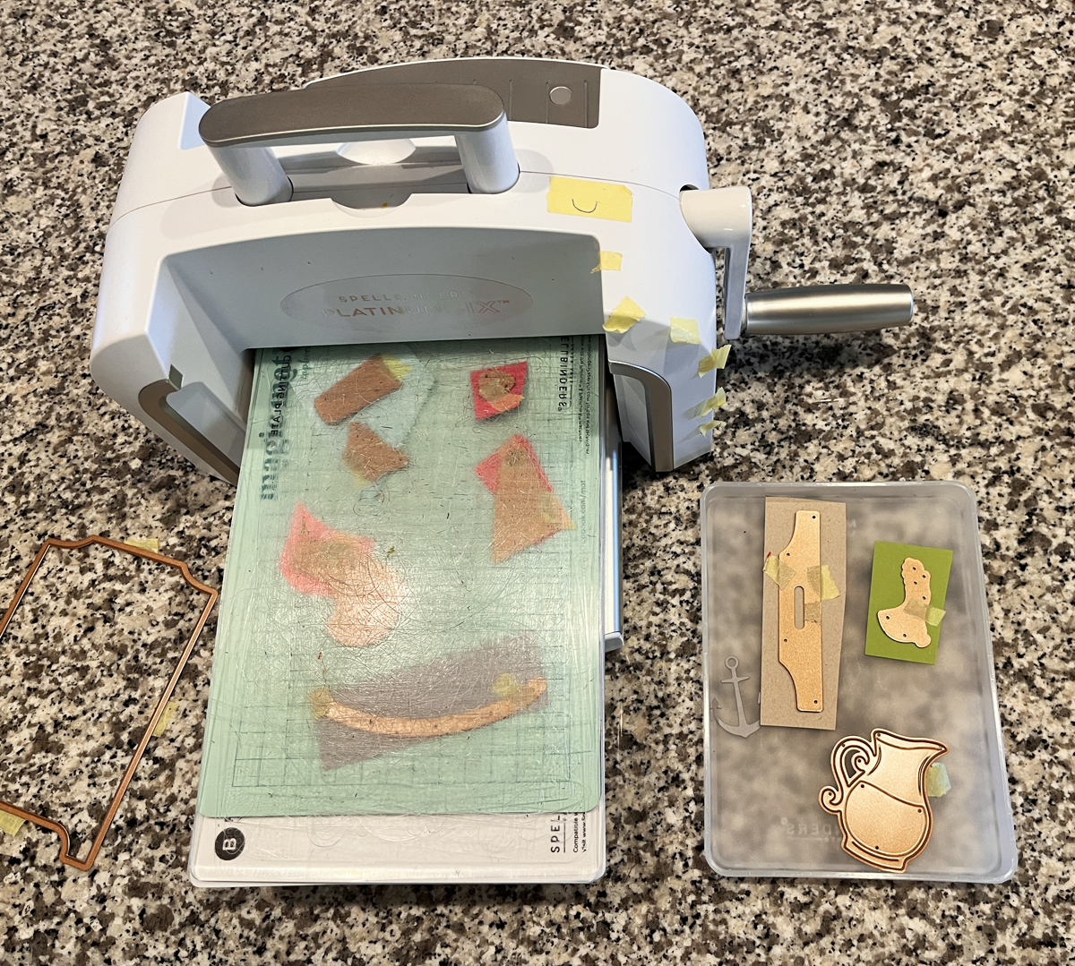
I cut many of my elements from lightly inked scraps, which keeps everything from looking flat. I also added a touch of ink blending to the lemons for dimension.

If lemons are your thing too, you might enjoy this favorite from last year → Lovely Lemons: Die Cutting, Ink Blending & a Touch of Gold.

I am sharing a diecutting process photo and I talk more about why I love my Platinum 6 in my must-have cardmaking list.

process photo of die-cutting
Die cutting lemonade embellishments creates fun interest on chalkboard easel display cards.

Up-Right Easel Assembly Tip

  • Die cut a second chalkboard backer from tan cardstock
  • Score just below the top wood header on the front and back panel
  • Glue only the top headers together to create a sturdy stand

These display-worthy cards are the kind recipients keep out long after the occasion.

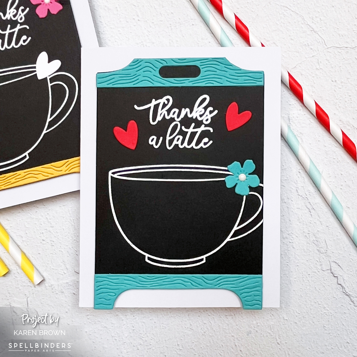
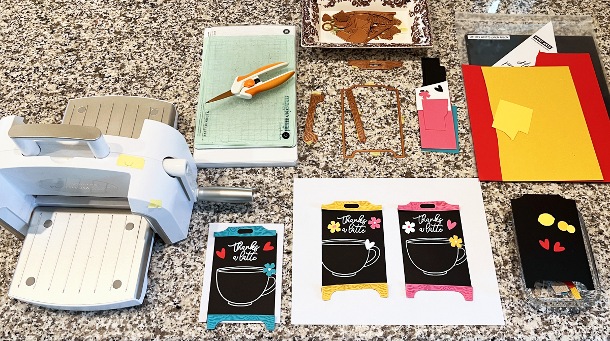
Trio of Coffee Shop Thank-You Cards (Black Cardstock = Instant Drama)

For my trio of cards, I leaned fully into a coffee shop chalkboard vibe—modern, graphic, and cozy all at once.

coffee themed handmade easel cards.

Design Details

I trimmed the coffee cup image slightly, which instantly made the design feel more like a real café chalkboard. The glossy white embossing against deep black cardstock is one of those combinations that never fails.

If you love coffee-themed cards too, you might enjoy my bold espresso-inspired project here → What’s Brewing? A Bold & Graphic Coffee Card.

Individual coffee shop chalkboard easel card in turquoise, black, and white.  Spellbinders Pink Lemonade Stand die kits:  S6-269 & S4-1532

Color Breakdown (why it works)

Each card is mostly black (about 70%), with:

  • one strong accent color (~15%)
  • crisp white embossing
  • one tiny pop of contrast (flower center or heart)

That balance is what keeps these dramatic but still cheerful.

Which color combo is your favorite—pink, turquoise, or yellow?

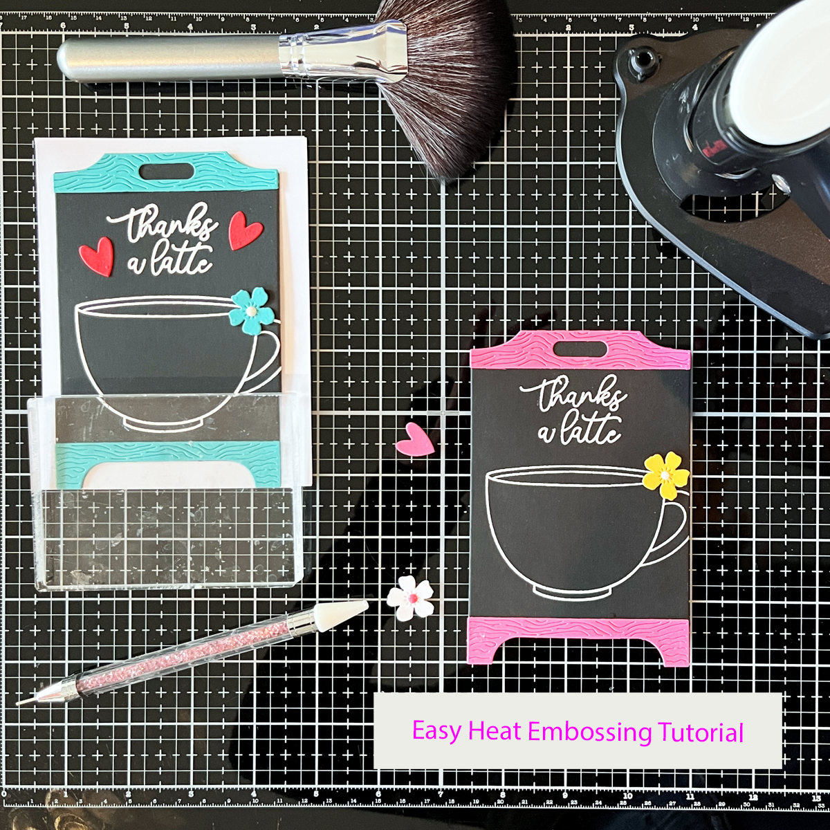
Heat Embossing on Black Cardstock

Because these cards rely on bold embossing, I wanted to include a go-to heat embossing method you can reference again and again.

Individual coffee shop chalkboard easel card in hot pink, black, and white.  Coffee theme "thanks a latte".

How I Get Clean, Professional Heat Embossing Every Time

  • Prep stamps with a stamp conditioning eraser (today I used the Hero Arts Coffee or Tea stamp set)
  • Prep cardstock with an anti-static powder tool
  • Use a 1″ flat brush to apply powder horizontally, then vertically
  • Stamp with Unicorn White Pigment Ink
  • Use white embossing powder (double white = best results)
  • Preheat heat tool for at least 1 minute
  • Use the easel die as a viewfinder to place images
  • Stamp twice with a stamp positioner using light, even pressure
  • Pour embossing powder generously, tilt panel in all directions, tap gently
  • Heat emboss while constantly moving the heat tool
  • Let cool, then polish lightly with a microfiber cloth

💡 Tip I’ve used for years: catch excess embossing powder in a coffee filter—easy pour-back, no mess.

I’m sharing:

  • a candid workspace photo showing all three layouts “percolating” overnight
Process photo showing chalkboard card layouts, dies, cardstock, and die cutting machine
Heat embossing white pigment ink and embossing powder on black cardstock creates that bold chalkboard look I love for coffee themed cards.
  • a mid-assembly shot with one chalkboard drying under an acrylic block
Heat embossing a coffee cup stamp with white embossing powder on black cardstock for chalkboard style thank you card.
Bright pops of color contrast nicely with blackcardstock.

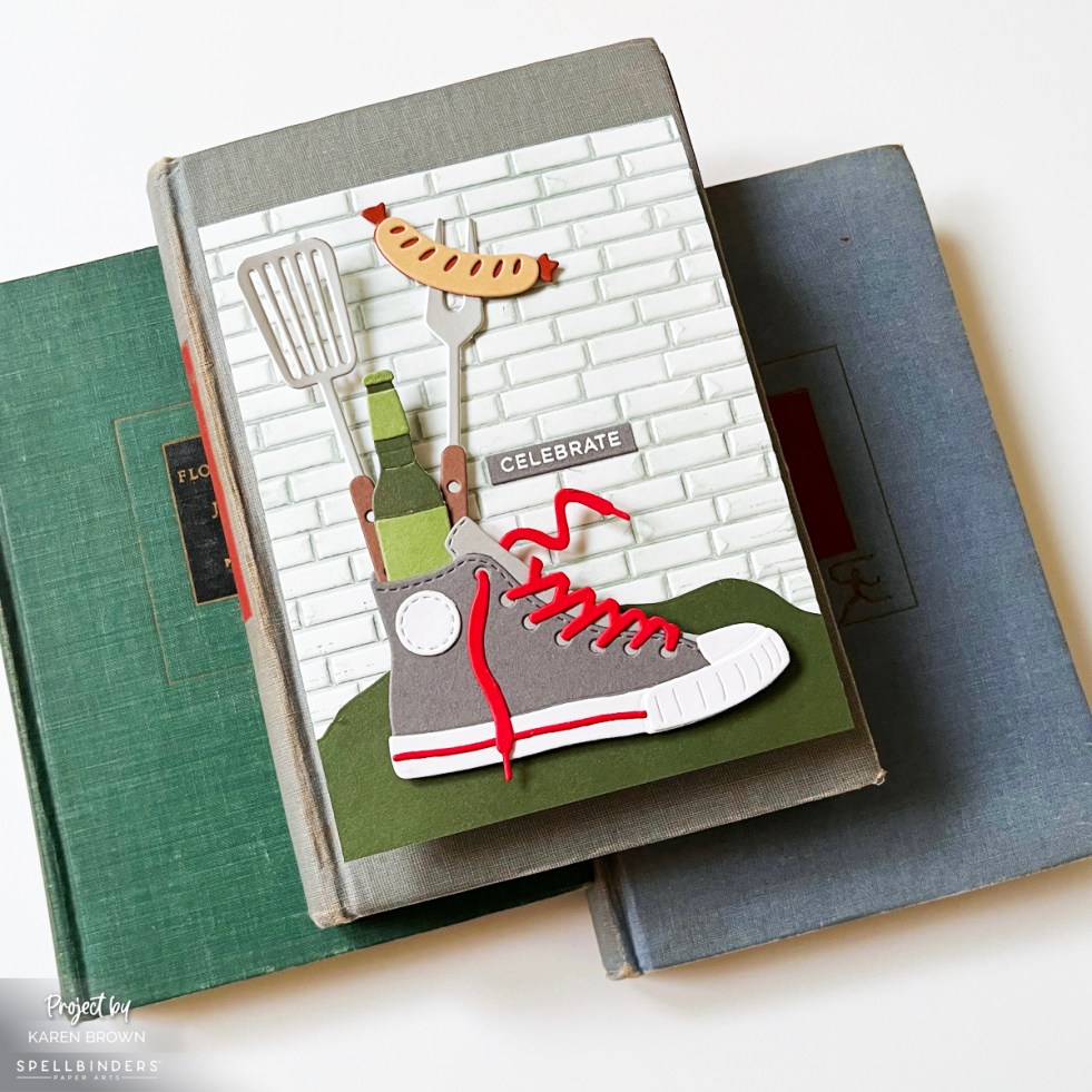
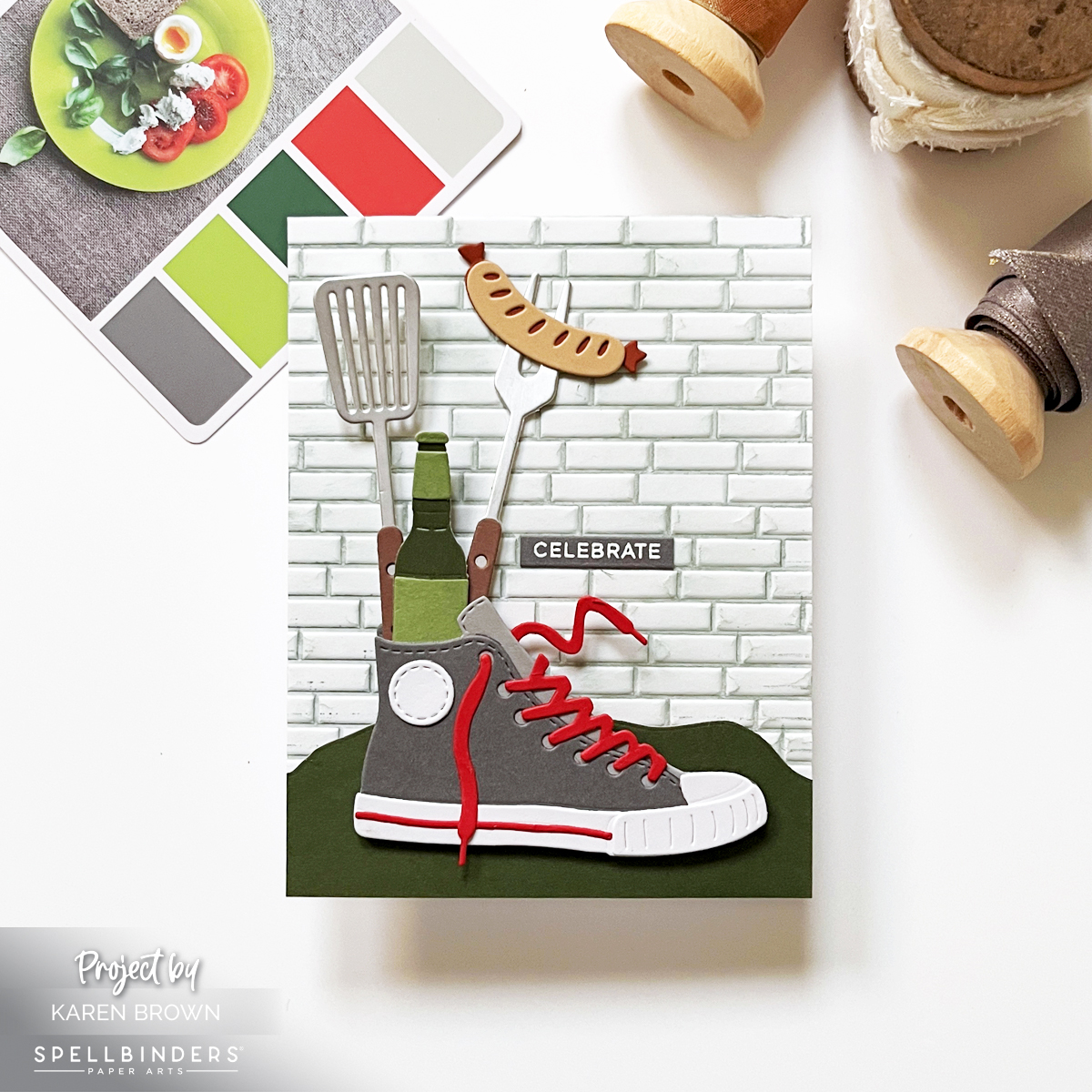
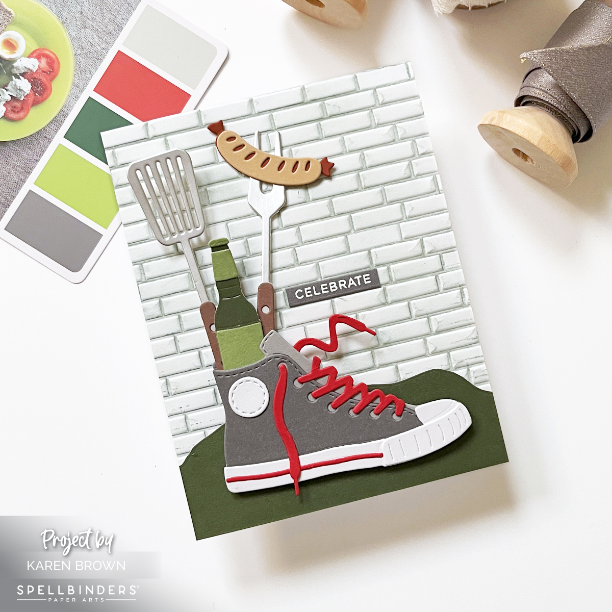
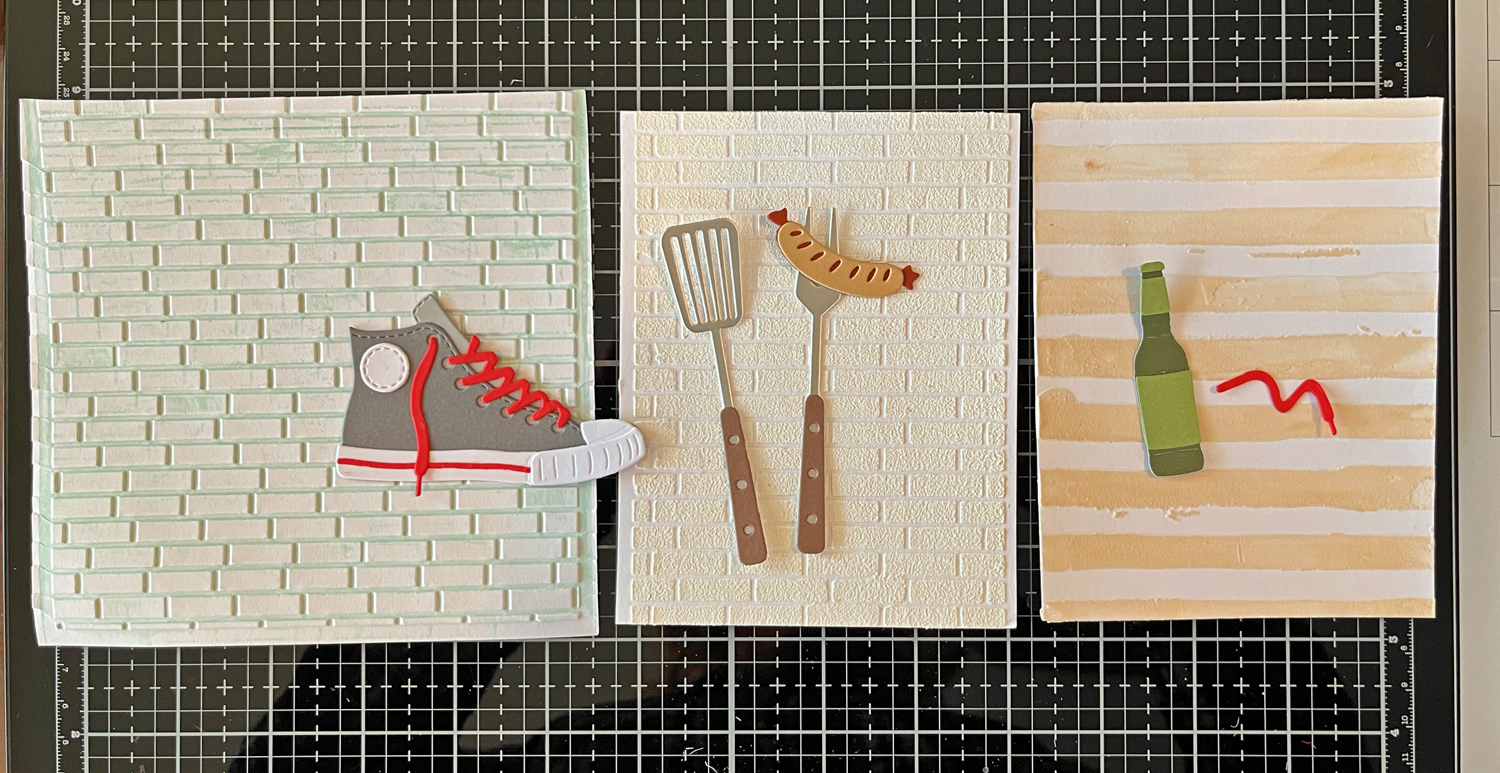
If you love scene-building, you’ll definitely want to check out my Sneaker Bouquet scene card tutorial.

Craft Supplies Featured on This Card:

Die Cutting:

Stamps and Cardstock:

Ink:

Cardmaking Kit · Die cutting · Tutorial

How to Create Die Cut Scene Cards: Easy Design Tips That Work Every Time

Masculine die cut scene card featuring a gray high top sneaker filled with grilling tools and a hot dog on an embossed brick background perfect for Father's Day or Birthdays.

Die cut scene cards are one of the most eye-catching styles in cardmaking, and with a few simple design principles, they’re surprisingly easy to create. Today I’m sharing tips for building a cohesive, masculine die cut scene card using the Spellbinders March 2026 Large Die of the Month: Classic Kicks.

This kit made me smile instantly—a gray high-top sneaker stuffed with backyard cookout favorites like a spatula, grilling fork, hot dog, and bottled drink. It feels nostalgic, playful, and perfect for celebrating the men in our lives.


Why Scene Cards Are Always a Hit

Scene cards are:

  • Recipient favorites
  • Great for storytelling
  • Ideal for birthdays, celebrations, and “just because”

This particular scene instantly evokes backyard cookouts, summer evenings, and casual gatherings—paper crafting at its best.

Die cutting is especially great for other masculine designs, like this Speedometer card I shared.

Spellbinders March 2026 Large Die of the Month Club Kit called Classic Kicks

Choosing a Limited Color Palette

Because this kit has a bold, graphic style, I kept my color palette intentionally tight:

  • Gray
  • Green
  • A pop of bright red

I was inspired by Color Cubes Palette #23, and as a general rule, I try to stick to 2–5 colors per card. This keeps the design cohesive and prevents a busy look—especially important for scene cards with lots of elements.

I talk more about using color in my video and blog post about stenciling and color theory.


The Key Parts of a Die Cut Scene Card

1. Background: Setting the Scene

The background sets the mood. You can use:

  • Stenciling
  • Stamping
  • Embossing
  • Die cutting
  • Texture paste

For this card, I used a 3D brick embossing folder, pressing Fog Ink directly onto the folder before running it through my Platinum 6. After embossing, I lightly ink blended more Fog ink over the panel to add subtle distressing and depth.

Before committing, I auditioned several premade backgrounds from my stash (you can see this in a process photo below). I love making two backgrounds at once—one for the project and one for later.

Premade embossed background panels auditioned behind die cut elements for scene card design, two brick backgrounds and one tan stripe.

If you’d like an idea for an additional background to add to your stash, this video demonstrates a versatile but easy glimmer hot foil background. I store my extra background panels in rainbow order, which saves so much time and makes design decisions easier.


2. Foreground: Grounding the Scene

Foreground elements help anchor your focal point so it doesn’t feel like it’s floating.

I tested several green die-cut options and ultimately chose a simple grassy horizon cut from dark green cardstock. This small step made a huge difference visually. You could easily cut a foreground freehand if you don’t have a die.

Green die cut foreground options used to ground a die cut scene card....choosing which foreground to use.

I adhered the foreground directly to the embossed background.


3. Focal Point: The Star of the Card

The die-cut sneaker bouquet is the star here. I even used silver cardstock for the grilling utensils, which adds a realistic metallic look.

I attached the sneaker with foam squares to give it dimension and help it stand out from the scene.

My Platinum 6 Die Cutting Machine is one of the tools I rely on regularly and is included in my list of the best cardmaking supplies for 2026.


4. Charming Details: Where the Fun Happens

This kit includes:

  • Flowers
  • Backyard cookout elements

These little details are my favorite part of scene card building. I always arrange everything loosely before gluing—it’s like solving a fun paper puzzle.


5. Sentiment: Keep It Simple

I finished the card with a small white heat-embossed “celebrate” sentiment on gray cardstock, using Everyday Sentiment Strips 2 and the coordinating die.

Two batches of heat embossed sentiment strip strips.  White on gray and black cardstock.

These sentiment strips are a huge time saver, which I demonstrate in this recent post.


Handmade card for men and foodies featuring a gray high top sneaker stuffed with grilling utensils.  Backyard cookout scene card.

Design Tip: Use the Rule of Thirds

To guide placement, I followed the rule of thirds, positioning the taller elements (spatula, fork, bottle) along the left vertical third of the card—about 1 1/3” from the edge of an A2 card. This adds balance and visual interest without overthinking the layout.


Final Thoughts

Scene cards may look complex, but when you break them into backgrounds, foregrounds, focal points, and details, they become incredibly approachable—and so fun to create.

If you enjoyed this, you might be interested in this popular Winnie the Pooh post.


Die cutting · papercrafting

How to Design a Stunning Handmade Card | Process and Inspiration

Handmade floral card featuring purple Regal Blooms flowers in a vase in front of a nine-pane window, with a glimmer hot foil “hello” sentiment and a soft lavender background

Creating a beautiful handmade card doesn’t require a studio full of supplies, but rather a simple, creative process that turns paper into a work of art.

👉 I wanted to walk you through my inspiration and thought process.

This card features (Spellbinders Regal Blooms die set (S4-1465) and a vase of elegant purple blooms basking in sunlight in front of a nine-pane window, that feels equally perfect for Mother’s Day, birthdays, or a thoughtful get-well card.

You might also be interested in the 14 tools that I use most often in my craftroom and The One Cardmaking Step That Saves Me The Most Time.

Design Inspiration: A Sunlit Floral Scene

Card background created with the Hero Arts Elegant Window Fancy Die layered over a Fairy Tale lavender cardstock panel for a soft, sunlit effect that showcases the die cut flower vase.

For this card, I wanted to create a moment—almost like looking through a window on a quiet afternoon and catching sight of a bouquet glowing in the light. The Regal Blooms dies make that easy. The flowers are graceful, detailed, and feminine, with just the right amount of structure to feel refined without being fussy.

👉 I chose a purple color palette for a soft, girly, and classic look. Using Spellbinders ColorWheel cardstock in Lavender, Lilac, and Fairy Tale, along with a few coordinating purple scraps, allowed me to build beautiful tonal variation throughout the card. Here is how I swatched my cardstock, which is a real time saver when I am planning my color palette.

👉 Mixing multiple shades of the same color family adds richness and depth while keeping the overall design calm and cohesive.

👉 To finish the card, I added a glimmer hot foil sentiment—a scripty “hello”—for a touch of elegance and shine. If you’ve been considering learning to foil, my video is a great introduction.

Thoughts on Creating the Window Backdrop

Die cut floral card process photo showing two die cut window options for the background.

As I mentioned above, I wanted my flower vase to be sitting in front of a sunny window.

👉 I love that a window instantly adds structure, light, and architectural interest to a card. I had two window dies in mind, but couldn’t decide which one to use:

👉 I am a visual person, so I die cut both and chose to go with Hero Arts Elegant Window.

👉 Behind the window panes, I layered a soft panel of Fairy Tale ColorWheel cardstock. This pale lavender shade helps the purple flowers stand out while reinforcing the gentle, airy mood of the scene. The window gives the card the feeling of an interior moment—flowers sitting quietly in the sunlight.

Handmade floral card using the Spellbinders Regal Blooms die set (S4-1465), featuring elegant purple flowers in a vase set against a sunlit window backdrop.

Adding Dimension: Two-Tone Vase Technique

One of my favorite details on this card is the vase. I wanted it to have subtle dimension without overwhelming the florals.

👉 To achieve this:

  • I pierced the vase die cut using a pokey tool.
  • Then I placed a darker purple shadow layer behind the pierced openings.
Process photo showing a pierced die-cut vase that will be used on a floral homemade card.

This simple technique creates a two-tone effect that adds depth and interest while keeping the design clean and elegant. I’ve included a process photo above so you can see exactly how this detail comes together.

Why I Love the Regal Blooms Die Set

The Spellbinders Regal Blooms (S4-1465) die set is incredibly versatile. With just a change in color palette or background style, this design could shift from:

  • Soft and romantic (perfect for Mother’s Day),
  • to fresh and cheerful (great for birthdays),
  • to gentle and comforting (ideal for a get-well card).

This card may be purple and feminine, but the structure of the design makes it easy to adapt for many styles and recipients.


Final Thoughts

This floral window card feels cheerful, classic, and heartfelt—the kind of design that never goes out of style. Between the layered purples, the glowing window backdrop, and the elegant foiled sentiment, it’s a project that looks intricate while still being approachable.

Whether you’re creating for a sister, a friend, or someone who simply loves flowers, the Regal Blooms die set is one you’ll reach for again and again.

cardmaking · Die cutting · Stamping

Tips and Tricks for Making Two Playful Die Cut Card Designs | Packed with Love

Hello friends! Karen Brown here today sharing two cheerful cards created with products from the Hero Arts Packed with Love Collection. I love when a release offers versatility, and this collection made it easy to explore different looks while keeping the designs clean, playful, and approachable.

Key Products Used:

Both cards highlight simple layouts, bold color choices, and easy-to-repeat techniques—perfect whether you’re making one special card or crafting a small batch. One card leans bright and aquatic with colorful die cut fish, while the other explores a graphic, modern style with bold shapes and happy color transitions. Together, they show just how flexible this collection can be.

Let’s take a closer look at each card!

🐟 Card Details: A Happy School of Fish

Colorful die cut fish card featuring nine fish in assorted cardstock colors swimming across a Cosmic Sky background with a simple “greetings” sentiment.

For my card, I used DF274: Big Mouth Sardine Tin Dies, but instead of building the tin, I focused solely on the fish dies. I die cut nine fish in assorted sizes and colors, then arranged them swimming horizontally across the card for a playful, modern look.

The background is Cosmic Sky ColorWheel Cardstock, trimmed with my favorite Rounded Rectangle Infinity Dies and mounted onto a crisp white A2 card base. A small, simple sentiment that reads “greetings” keeps the design clean and versatile—perfect for hello cards, encouragement, or just-because mail.

This card feels colorful, cheerful, and a little bit whimsical…like a happy school of fish swimming together. 🐠🐠🐠

🎨 ColorWheel Cardstock Colors Used

  • White
  • Fog
  • Sicily
  • Coral
  • Seaside
  • Saffron
  • Cosmic Sky (background)

To give each fish more presence and durability, I die cut every fish twice and glued the layers together. This subtle dimension makes a big difference, especially on clean and graphic designs.

If you enjoyed this, you might be interested in learning to make mixed media tags.

✂️ Die Cutting Tip

I used my Spellbinders Scout desktop cutter to cut all of the fish. When I’m working with lots of small or medium-sized dies, the Scout is my go-to—it’s fast, efficient, and perfect for batch die cutting. You might also be interested in the 14 tools that I use most often in my craftroom.

🧠 Layout Tip: Arranging Die Cuts with Ease

If you’ve ever struggled with spacing repeated die cuts, here’s the method I used—and it works every time:

  1. Start at the top of the panel (I placed the gray fish first).
  2. Move to the bottom with the smallest fish (aqua and saffron).
  3. Fill in the middle next.
  4. Work up and down from the center, adjusting spacing as you go.

This approach helps keep everything visually balanced and evenly spaced without overthinking it. I’ve included a process photo (above) of the die-cut fish and dies on my craft mat.

🧷 Assembly

I used a combination of craft foam and foam squares to attach the fish and background, adding just enough dimension to create interest while keeping the card mail-friendly.

Rainbow Watercolor Wide Stripes

I stamped the Wide Stripe Background Stamp onto watercolor paper using Unicorn White Pigment Ink, then heat embossed it with white embossing powder. I knew I wanted to watercolor in between the embossed stripes, so I taped my panel to a hardboard to help minimize warping—always a helpful step when working with lots of water.

Working in rainbow order, I watercolored each stripe band by band. The raised white heat embossing created beautiful texture and helped keep each color neatly contained. I have a process photo showing this panel alongside my watercolor palette, and at this point… that was as far as the original plan went!

Sometimes the best ideas happen mid-project. I started thinking about repeating geometric shapes and how fun it would be to combine that idea with the striped watercolor background I had already created.

Using my Nesting Hearts Infinity Dies and Nesting Circle Infinity Dies, I die cut three 1-inch hearts and three 1-inch circles—perfect timing since we’re getting close to Valentine’s Day. Each die cut features the white heat embossed stripe running through the center, with one rainbow color above and the next color below.

I worked across the panel so that the bottom color of one shape becomes the top color of the next:

  • Pink over orange
  • Orange over yellow
  • Yellow over green …and so on.

I alternated the shapes—heart, circle, heart—creating a playful rhythm across the design.

To ground all that color, I mounted the six die cuts (two rows of three) onto a 4″ x 3″ gray mat die cut with the Nesting Postage Stamp Infinity Dies. Yes—this card uses three different Infinity Die sets, and they all worked together beautifully. The card base is a crisp white A2, keeping the focus on the cheerful pops of color.


👉 Best Die Cutting Staple: Infinity Dies

Finishing Touches & Sentiment Tips

My sentiment is small and simple: “With Love”, white heat embossed on black cardstock. This card could easily work as a Valentine, a friendship card, or a just-because note.

TIP: I love keeping pre-made heat embossed sentiment strips on hand. Using large sentiment strip stamps that coordinate with the matching Sentiment Strip die makes it easy to stamp and die cut everything at once.

For this card, I used a leftover Christmas Sentiment Strip, but I also reach for Everyday Sentiment Strips constantly—definitely worth checking out if you haven’t already. The photo above shows how many sentiments you can make at one time.

Why I Love This Collection

These two cards show how products from one collection can go in completely different directions:

  • One soft, artistic, watercolor-focused design
  • One clean, graphic, and modern card with bold shapes

This is a great reminder to let yourself play and see where your ideas lead.

Best Of · cardmaking

Top 5 Hero Arts Cards of 2025 (Fan Favorites & Personal Picks)

Best and Most Popular Hero Arts Cards of 2025

As we look back on 2025, I thought it would be fun to round up my best and most popular Hero Arts cards of the year. These projects were fan favorites, reader favorites, and in a few cases, personal favorites too.

Each card highlights a different Hero Arts release and cardmaking style—from bold graphic designs to cute scenes and clever techniques. I’ve linked each original blog post so you can dive deeper into supplies, step-by-step instructions, and tips if a particular card catches your eye.


🥇 Most Popular Card of 2025: Die Cut Valentine

Die cut Valentine card created with the Hero Arts January 2025 Card Kit featuring bold colorful heart shapes and playful design.

My most popular card of 2025 was a fun die-cut Valentine created with the January 2025 Folded Love Note Kit. The playful dies, bold heart shapes, and cheerful vibe made it perfect for modern Valentine cards.

👉 Link to original Valentine blog post


🕵️‍♀️ Fan Favorite: Miss Detective – Case Closed Collection

Handmade card featuring a stamped and die detective-themed design from the Hero Arts Case Closed Collection

The Case Closed Collection from May was such a hit, and my Miss Detective card quickly became a fan favorite. This clever, story-driven card featured a charming sleuth and bold graphic details—and it really resonated with readers.

👉 Link to original Miss Detective blog post

This collection was creative, unique, and just plain fun to work with. It’s one of those releases that sparks storytelling the moment you start crafting.

Key Products:


☕ Personal Favorite: What’s Brewing Card

Bold graphic coffee latte themed handmade die cut card created with the Hero Arts What’s Brewing Collection

This one is especially close to my heart.
Using the What’s Brewing Collection, I created a bold, graphic coffee-themed card that I sent to my daughter. With strong colors, clean die cutting, and a modern layout, this card felt fresh and fun—and it’s still one of my favorite designs of the year.

👉 Link to original What’s Brewing blog post

Coffee-themed cardmaking is always popular, and this release delivered in the best way.

Key Products Used:


🐚 Two-for-One Favorite: Scattered Shells

 Two handmade cards using the Hero Arts Scattered Shells plate—one letterpress and one hot foil design using the same seashell plate.

This entry actually includes two cards, both created using the Scattered Shells plate from the Summer by the Sea Collection. I loved showing how one design can be used in different ways:

  • One card created with BetterPress LetterPress
  • One card created with Glimmer Hot Foil

👉 Link to original Scattered Shells blog post

Same plate. Two completely different looks. This is a great example of stretching your supplies and getting more mileage from your favorite tools.

Key Products:


🌸 Honorable Mention: Friendship Blooms + Video

Bold floral die cut handmade card created with the Hero Arts Friendship Blooms Collection.  With corresponding video tutorial.

It was a close call for fourth place, so I added an Honorable Mention—a bold floral die-cut card from the Friendship Blooms Collection. This project focused on layering, color, and impactful florals, and it remains a go-to style for both beginners and experienced cardmakers.

I also created a video tutorial for this card if you’d like to see it come together:
🎥Link to Video Tutorial

👉 Link to original Friendship Blooms blog post

Key Products Used:


Final Thoughts

These cards represent what I love most about Hero Arts: creative variety, high-quality products, and designs that truly inspire. Whether you enjoy bold graphics, clever themes, or classic florals, there was something special in every 2025 release.

If you’re new here, this post is a great place to start exploring past projects—and if you’ve been crafting along with me all year, thank you for being part of the journey.


Cardmaking Kit · Die cutting · Mixed Media

Spellbinders December 2025 Die of the Month | Gel Press Print Card Ideas

Die cut owl with a flower crown sitting on a branch, framed inside a white Polaroid-style border with a rub-on ‘love’ sentiment. Background and card base are made from textured green, red, tan, and white Gel Press prints

If you love mixed media, adorable woodland critters, and any excuse to use your Gel Press prints, the December 2025 Spellbinders Small Die of the Month Better Together is going to make your crafty heart flutter. This month’s kit includes two owls and two otters, but for today’s project, I kept things simple with a single sweet owl—perfect for a Valentine’s Day card for my daughter.

How to Use Gel Press Prints in Cardmaking

I reached into my stash of Gel Press prints (one of my favorite studio habits!) and created a simple but visually rich design. The card base is a greenish-yellow pulled print, while the Polaroid-style frame background uses a print with layers of tan, brick red, green, and white. The organic textures and imperfect blends from the prints give this card a soft art journal meets Valentine vibe.

For the focal point, I die cut the owl and assembled her with a tiny flower crown, then perched her on the included die cut branch. She’s framed inside a Polaroid-style photo using the Hero Arts Nesting Journaling Photo Frames, which provide the perfect amount of white space.

A single rub-on sentiment—“love” from the Hero Arts Ornate Frames Transfer Sheet (RT127)—sits on the bottom right of the Polaroid border for an easy, minimal look. Because the background is so full of visual interest thanks to the Gel Press print, the clean sentiment balances everything beautifully.

Handmade Owl Valentine Card using Spellbinders December 2025 Die of the Month Kit + Gel Press Prints.

Key Products Used


Spellbinder Small Die of the Month
Hero Arts Nesting Journaling Photo Frames
Hero Arts RT127 Ornate Frames Rub-On Transfers
✨ Gel Press Prints (my favorite kind of stash!)

Why I Love This Project

This card is:

  • beginner-friendly
  • fabulous for using your stash of Gel Press backgrounds
  • perfect for mixed media fans and Valentine’s Day
  • totally customizable (the kit includes two owls and two otters!)

I also included a process photo showing stacks of my finished Gel Press prints. The print used for the Polaroid background is the top middle print in that photo. I love Gel Press play days, and it feels great putting those prints to use in my cardmaking.

Stacks of completed Gel Press prints in various colors. The top middle print is tan, brick red, green, and white—the print used for the card’s Polaroid background

This simple mixed media Valentine is going to my daughter—and I think she’ll love the sweet little owl with the tiny flower crown.

Cardmaking Kit · Die cutting · papercrafting

Bold Color Block Brunch Theme Card | Spellbinders November Kit

Handmade brunch-themed card with bold color-block rectangles in pink, green, lilac, and blue, featuring die-cut egg, bacon, champagne glass, and waffle with stick arms and legs, plus a 'Thanks a Brunch' sentiment.

Let’s Do Brunch! | Spellbinders November 2025 Small Die of the Month

If you love playful cardmaking and adorable food-themed dies, this month’s Spellbinders Die of the Month — Let’s Do Brunch — is going to spark so much joy! This clever die set is packed with cheeky breakfast and brunch icons, complete with arms, legs, and serious personality. Think cute eggs, dancing bacon, bubbly champagne… all ready to brunch and boogie.

And the sentiment?
“Thanks a Brunch.”

Brunch food theme die cut card created with Spellbinders November 2025 Die of the Month Kit.

My Bold + Graphic Brunch Card

For today’s project, I leaned into a bold, graphic color-block look to really spotlight each quirky character. I trimmed and pieced together four vibrant cardstock quadrants to create a modern grid background. The clean, high-contrast shapes make the little food friends shine!

Card Details

  • Theme: Foodie / Brunch / Thank You
  • Style: Modern color-block + cute character die cuts
  • Colors:
  • Characters:
    ✅ Smiling sunny-side-up egg
    ✅ Dancing bacon strip
    ✅ Cheerful champagne glass (cut from vellum for fun transparency!)
    ✅ Sweet little waffle

Each food item gets tiny stick arms and legs — a charming little detail that gives them so much life.

📐 Measurements

To create the crisp color-blocked effect:

  • Cut four rectangles: 2 1/8″ x 2 ¾” each
  • Tape all four from the back
  • Adhere the full panel to an A2 card base to stabilize

Simple steps, big visual impact!

Close-up of smiling die-cut breakfast characters on a modern graphic card with vellum champagne glass and bright pastel cardstock blocks

Design Tips

  • Vellum = perfect for glasses, bottles, and any glass objects
  • Foam Squares behind your food characters adds dimension and personality
  • Mixing playful images with clean graphic lines = fresh modern design

Don’t Miss This Kit!

If you’ve been looking for a unique, fun die set that works for birthdays, thank-yous, brunch invites, foodie friends, or just-because cards — this one’s a winner.

Be sure to check out my post for the November Stitching Die of the Month too — my favorite stitching kit of the year!

Thanks a brunch for stopping by today — and tell me, which cute brunch buddy is your favorite?

Helpful Links:

cardmaking · Video

Craft Lounge Live #4 Video Recap | Great Sentiment Stamps

Pink baby card with die-cut tags, bows, and flowers made using Hero Arts Just Because Stamp & Cut set.

Hello crafty friends! Karen Brown here with a fun recap from Craft Lounge LIVE #4! If you missed our live session, no worries — you can still catch the replay right here 👉 Watch the rerun on Facebook.

The Hero Arts Collective Facebook group is the place to stay connected, share inspiration, and see what’s new in the Hero Arts world.

Channin, Natasha, Michelle, and I had such a great time chatting and crafting together! We all worked with products from the Best Ever Collection, and even though we started with the same collection, our projects turned out completely different:

  • 🎁 Channin created a beautiful stack of gift boxes.
  • 🎨 Natasha made a stunning mixed media background.
  • 🧝‍♀️ Michelle designed an adorable “peeking elf” card.
  • 👶 And I crafted a sweet pink baby card!

My design features two stamped and die-cut tags and bows, embellished with three dainty die-cut flowers. The sentiment — “Just a little something for baby” — comes from one of my favorite sets this season, DC329 Just Because Stamp & Cut. I die cut the tags and a soft pink frame from Tutu ColorWheel Cardstock, then stamped in crisp black ink for a clean, cheerful look.

Screen shot of 4 Hero Arts Creative Team members participating in Craft Lounge LIVE #4,
Screenshot

I’ll be taking this card to a baby shower later this month, and I know I’ll be reaching for these sentiments again and again. The “birthday,” “thank you,” and “just because” options in this set are so versatile — perfect for every occasion!

Screenshot collage of Channin, Natasha, Michelle, and Karen (Kenny's Cards) from Craft Lounge LIVE #4.
Screenshot

Thanks to everyone who joined us live — and if you couldn’t make it, grab your favorite drink, tune in to the replay, and enjoy an hour of crafty conversation and inspiration. 💕

Link to: Craft Lounge LIVE #4

Photo of handmade Baby card with stamped tags with black sentiment reading “Just a little something for baby."
Cardmaking Kit · stitching

My Favorite Stitching Kit Yet! | Spellbinders November 2025 Stitching Die of the Month

Adorable handmade card with a Chihuahua dog peeking out of a die cut handstitched purse with colors in 4 shades of aqua.

If you love stitching dies and adorable pups, you’re in for a treat with the Spellbinders November 2025 Stitching Die of the Month. This kit is pure joy — it features the most darling Chihuahua peeking out of a stitched purse, complete with a tiny sweater and irresistible details. I think this might be my favorite stitching kit of the year!

If you enjoyed this darling Chihuahua themed card you might enjoy a cute card for kids.

✂️ A Stitch Above the Rest

For the purse, I followed the etched diamond stitching guide using DMC #964 aqua floss (two strands). I like to die cut each stitched panel twice and glue them together before I start stitching — it gives the piece a nice sturdy base and helps it hold its shape.

The stitching adds beautiful texture, and the aqua floss blends perfectly with the Teal Topaz ColorWheel cardstock.

🎨 My Color Recipe

Here’s the cardstock and stitching palette I used:

Fun dog theme hand stitched die cut card created with Spellbinders November Stitching Die of the Month Club Kit.

👜 The Perfect Sentiment & Finishing Touches

For the sentiment, I used the “Hello” Die from Hero Arts’ November Fancy Die Kit — it’s the perfect elegant touch without stealing focus from the little pup. The background features the Hero Arts Elegant Window Fancy Die, which frames the scene beautifully.

The main ColorWheel palette of aquas and neutrals (Teal Topaz, Blue Spruce, Waterfall and Fawn) keeps everything cohesive while letting that sweet Chihuahua shine. The stitched purse adds just the right amount of dimension, making this card one of those “pick up and look closer” moments.

This one’s going to my daughter’s mother-in-law, who happens to have two Chihuahuas — so I know it’ll be a hit!

I have an adorable Color Block Food Theme card coming on November 11th…come back and take a peek.

Helpful Links:

Cardmaking Kit · Give Away · papercrafting

One More Chapter! Hero Arts November 2025 Release + Blog Hop


Book theme cards created with the November 2025 Hero Arts Hero Studio Card Kits.

Hello, Karen Brown here — and I am curling up with a good card kit! The November Hero Studio Release is a dream come true for book lovers. This month’s theme, “One More Chapter,” celebrates cozy reading nooks, favorite stories, and the joy of escaping into a good book.

Even better, there’s a Hero Arts Blog Hop to celebrate — and prizes! So grab a cup of tea (or coffee), and come along for some page-turning inspiration.

Die-cut handmade scene card featuring a girl reading a book framed with a postage stamp border and scripty hello sentiment

📖 Card 1: My Happy Place

For my first project, I used the “Happy Place” die set from the November Card Kit of the Month to create a cozy die-cut scene.

Picture this: a girl tucked in with her favorite book, surrounded by soft periwinkle blue and warm orange tones. The card has a charming, feminine feel — like a Saturday morning spent lost in a good story.

I framed the scene with the Nesting Postage Stamp Dies to give it that “happy mail” vibe and added a sweet scripty Hello from the Fancy Die Book Bag set.

This one’s heading to a book club friend who, like me, can never resist reading just one more chapter!

Handmade book theme scene card created with Hero Arts November 2025 Card Kit.  Colors are periwinkle blue, orange and brown.

What’s Included in the Kit?


                       • To Be Read Pile 4×6 Clear Stamp Set and Coordinating Dies
                       • Happy Place Die Set
                       • Professional Bookworm 3×4 Stamp & Cut
                       • Gold Hero Wax, 1 oz.
                       • 10 Sheets of Cardstock- 1 of each color, 5.5″ x 8.5″

>>> Receive a FREE Do Not Disturb Stamp and Cut  when you purchase The Whole Studio!

Hero Arts has many different Monthly Kits that you can subscribe to including:

Card 2: Escaping Reality One Page at a Time

Bold die cut  and stamped typographic card spelling “JOY” with the O as a stamped oval reading “Escaping Reality One Page at a Time,” layered over a blue checkerboard background.

Next, I pulled out the Stamp & Cut of the Month: One Page at a Time. I love this set — it’s perfect for pairing bold typography with clever bookish sentiments.

I stamped the oval sentiment “Escaping Reality One Page at a Time” and used it as the O in my big JOY design. Then I die cut a bold J and Y from the Letter Fancy Die sets (J–N and W–Z) in bright orange, adding white shadows behind them to tie in the stamped oval.

The letters are large, 2 1/2″, creating a bold and dynamic visual card.

Stamped and die cut reading theme card created with Hero Arts November 2025 Stamp and Cut Kit called "One Page at a Time".

For the background, I created a tone-on-tone checkerboard using the November Cling of the Month — stamped Cornflower ink on Periwinkle cardstock for a crisp, graphic finish.

The result? A bold, cheerful, and clever card that feels fresh and literary — perfect for your favorite reader.

JOY  sentiment card created using Hero Arts large alphabet Letter Fancy Dies with blue and orange color palette.

GIVEAWAY 

Hero Arts will give away a $50 gift card, drawn from the comments left across the hop. Enter by Wednesday, November 5th at 11:59pm PT, and the winner will be announced on the Hero Arts blog the following week. Leave a comment on all stops for more chances to win!
  

BLOG HOP ORDER


Hero Arts
Anna Mahtani
Channin Pelletier
Charlene Madrid
Jeannie Lieu
Jennifer Kotas
Karen Brown <<<< You Are Here!
Lisa Tilson
Michelle Lupton
Michelle Short
Mindy Eggen
Natasha Polite
Rachel Kleinman
Rosie Lopez
Seeka
Nichol Spohr

💡 Final Thoughts

I adore how all the November Hero Studio kits coordinate beautifully — from cozy die-cut scenes to playful sentiments and graphic backgrounds. Whether you love to stamp, die cut, or mix both, this release has something for every creative reader at heart.

And if you’re tempted by all the coordinating goodness, consider the Whole Studio Bundle — it’s a $240 value for just $130. That’s a deal worth bookmarking!

You might also want to take a peek at Past Club Kits that are still available.