Cardmaking Kit · Die cutting · papercrafting

Bold Color Block Brunch Theme Card | Spellbinders November Kit

Handmade brunch-themed card with bold color-block rectangles in pink, green, lilac, and blue, featuring die-cut egg, bacon, champagne glass, and waffle with stick arms and legs, plus a 'Thanks a Brunch' sentiment.

Let’s Do Brunch! | Spellbinders November 2025 Small Die of the Month

If you love playful cardmaking and adorable food-themed dies, this month’s Spellbinders Die of the Month — Let’s Do Brunch — is going to spark so much joy! This clever die set is packed with cheeky breakfast and brunch icons, complete with arms, legs, and serious personality. Think cute eggs, dancing bacon, bubbly champagne… all ready to brunch and boogie.

And the sentiment?
“Thanks a Brunch.”

Brunch food theme die cut card created with Spellbinders November 2025 Die of the Month Kit.

My Bold + Graphic Brunch Card

For today’s project, I leaned into a bold, graphic color-block look to really spotlight each quirky character. I trimmed and pieced together four vibrant cardstock quadrants to create a modern grid background. The clean, high-contrast shapes make the little food friends shine!

Card Details

  • Theme: Foodie / Brunch / Thank You
  • Style: Modern color-block + cute character die cuts
  • Colors:
  • Characters:
    ✅ Smiling sunny-side-up egg
    ✅ Dancing bacon strip
    ✅ Cheerful champagne glass (cut from vellum for fun transparency!)
    ✅ Sweet little waffle

Each food item gets tiny stick arms and legs — a charming little detail that gives them so much life.

📐 Measurements

To create the crisp color-blocked effect:

  • Cut four rectangles: 2 1/8″ x 2 ¾” each
  • Tape all four from the back
  • Adhere the full panel to an A2 card base to stabilize

Simple steps, big visual impact!

Close-up of smiling die-cut breakfast characters on a modern graphic card with vellum champagne glass and bright pastel cardstock blocks

Design Tips

  • Vellum = perfect for glasses, bottles, and any glass objects
  • Foam Squares behind your food characters adds dimension and personality
  • Mixing playful images with clean graphic lines = fresh modern design

Don’t Miss This Kit!

If you’ve been looking for a unique, fun die set that works for birthdays, thank-yous, brunch invites, foodie friends, or just-because cards — this one’s a winner.

Be sure to check out my post for the November Stitching Die of the Month too — my favorite stitching kit of the year!

Thanks a brunch for stopping by today — and tell me, which cute brunch buddy is your favorite?

Helpful Links:

Mixed Media · papercrafting

Colorful Collaged Journal Covers: How I Made My Handcrafted Gifts

Color-Blocked Collaged Journal Covers.

I recently signed up for Willa Wanders Fodder Challenge 2023 and I was so inspired by Instructor Barb Smucker and her Collaged Notebooks. I knew I wanted to try this technique and I am so glad that I did!

Collaged Mixed Media Notebook Covers

Color-Blocked Collaged Notebook Journal Covers.

My “How To” Process:

  • I started by creating colorful papers for my cover. Instead of using a gelli plate, I put acrylic paint on my mixed media paper and then used a scraper to move the paint around. On a palette, I started with basic primary colors and then had loads of fun custom mixing my colors. I was going for coral but wound up with several really pretty melon colored pages. On some pages I smoothed out the paint and on others I left it a bit rough with slight ridges of acrylic. I also painted marks (circles, lines, Xs and doodles…) on additional pages.
  • I also went through my gelli prints and selected some more papers that I used. The dark blue and bright orange were both gelli prints.
  • Once I selected a bunch of papers that I liked, I started playing around with layouts. I was going for a contemporary color-block look. Using a metal ruler, paper trimmer and 1 1/2″ circle punch I trimmed the pages to the sizes and shapes I wanted.
  • I laid a piece of plain paper inside the cover to protect the journal pages from excess glue during my assembly process.
  • Next, it was time to start covering my journal. I started with the the papers that would go along the spine. This journal has a cool open spine that did not need to be covered so the paper edge went directly up to the edge of the spine, but I left a 1/2″-1″ overhang for the other side. To get a nice smooth cover I dipped the paper in a pan of water for 2 seconds, blotted off the excess water, and on the back, brushed on a 50% mixture of Matte Modge Podge and Matte Medium with a flat brush. Then, I carefully put the paper up against the spine, leaving the overhang off the edge. Next, I put a piece of wax paper over the glued piece and brayered over the area to remove air bubbles and excess glue. Finally, I dabbed up the excess glue that seeped out.
  • I repeated this process until the front and back covers were complete. This journal has a nice black elastic band, but it was a little trickier to cover the back because of the grommets. For my next journals, I ordered notebooks without the elastic band. I will report back which style I like better.
  • To finish the notebooks, I folded the overhung edges (starting at the corners) toward the inner face pages and then glued securely with the glue mix I used above.
  • Last step was to glue a facing page to the front and back inside covers. I again used my mixed media painted pages for this.
  • I let my journals dry and then placed books on top overnight to keep the notebook nice and flat.
Mixed Media Collage Journal

These two journals are gifts and I plan to make more for Christmas. I hope to have another post about them this fall.

Collage Mixed Media Notebook Covers

I bought all my own supplies, but I am including links to the products used in case you’d like to give it a try.

Products Used in This Tutorial:

Products Available on Amazon:

Soho Open Spine Notebook

Liquitex BASICS Paint I used 3 Primary Colors and white

Liquitex Matte Medium

Matte Modge Podge

Brayers

Metal Ruler for Cutting and Tearing Paper

Scraper

Karen

Uncategorized

Altenew Academy Level 2 Final Project

Hello, hello….so pleased you stopped by! I finished Altenew Academy\’s Level 2 Classes and wanted to share my final project.  I was challenged to make four masculine cards for four different occasions. I had loads of ideas and had a lot of fun creating.  To make my cards masculine, I used my husband\’s favorite colors….aqua, blue and green.   Mark probably wears an aqua or blue Columbia fishing shirt five days out of seven…he calls it his uniform!    I also used lots of die-cuts because Mark loves those on cards.   The unifying elements are handcrafted backgrounds and embossed sentiments on navy cardstock.   I\’ve learned so much over the past three months but I decided to spotlight three favorite classes:

  • Beyond Basic Backgrounds – We learned to make beautiful backgrounds to enhance our cards.
  • Celebration Stencil Techniques – We learned to expand our stenciling repertoire. 
  • Masking Unleashed – We learned various masking techniques that up the \”wow\” factor of our cards.

Encouragement Card:

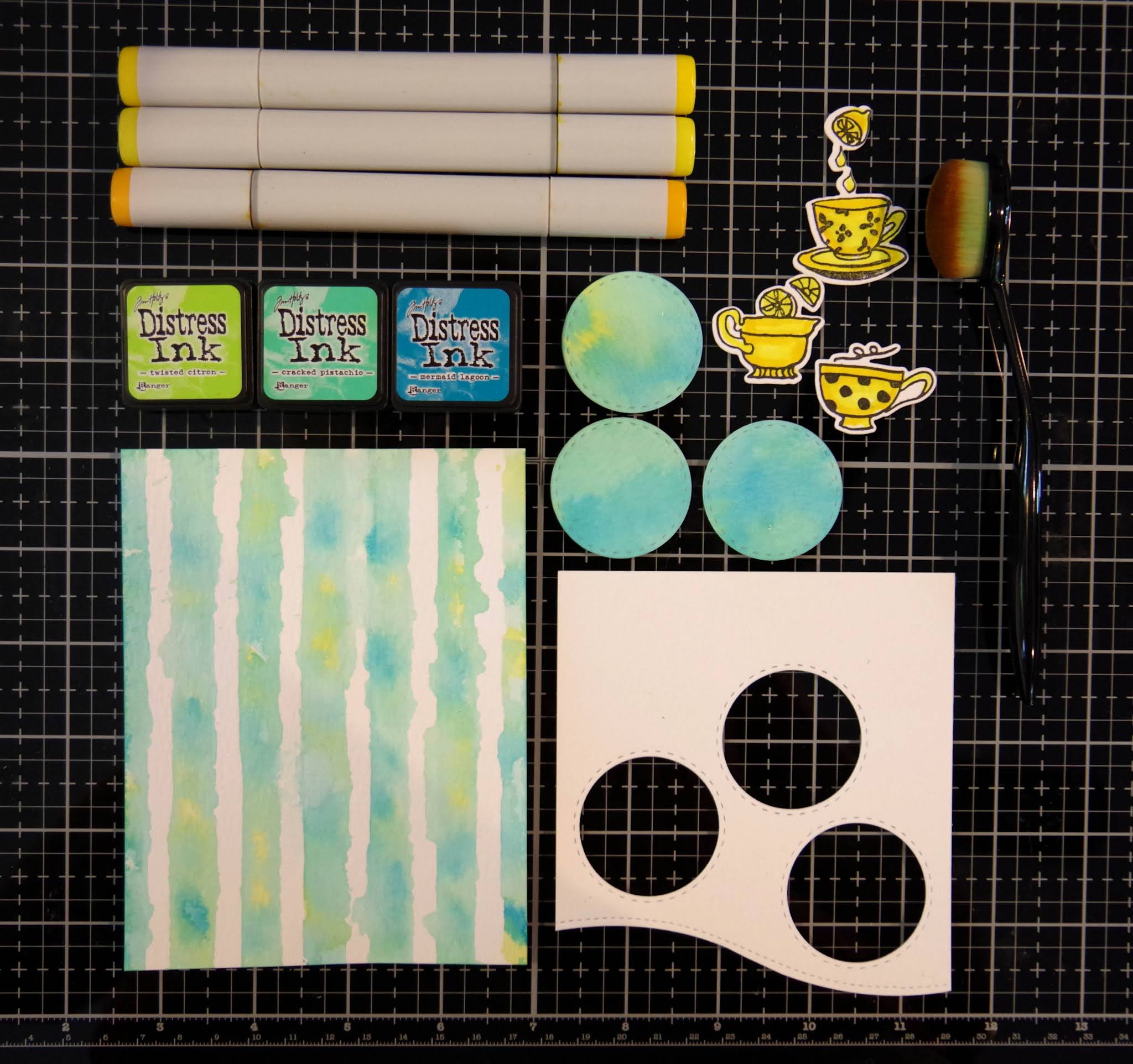
This first card is my husband\’s favorite of the group. Mark\’s beverages of choice are coffee and hot tea….he makes a pot of each every day and  the color yellow is very encouraging and optimistic (In The Mood For Color). My idea was to make inlaid circle die cuts that coordinated with a hand crafted background.  We worked on inlaid die-cutting in Beyond Basic Backgrounds and stencil overlays in Celebration Stencil Techniques.  

  • I started by taping my Altenew Watercolor Stripes stencil to a watercolor paper panel.  I then wet the paper with clean water and then dabbed and pounced three colors of distress ink onto the paper.  I LOVE this technique and think it makes a very fun background.  
  • Next, I took a second watercolor panel and used the wet on wet technique to dab the same three colors of distress ink on the panel.  After the paper dried, I die cut three 1 1/2\” circles.
  • I die-cut a white watercolor paper overlay for the inlaid technique.
  • I stamped, Copic colored and die cut three coffee/tea elements from Altenew\’s Tea Time stamp and die bundle.
  • I heat embossed an encouraging sentiment on navy cardstock.
  • I assembled the card using liquid glue and foam squares (for the cups and sentiment).

PRO TIP:  Don\’t over-wet the watercolor paper.  If you do, the ink will flow under the stencil and you will lose the white lines.  You do want it watery enough that you achieve a casual watercolor look.

Birthday Card:

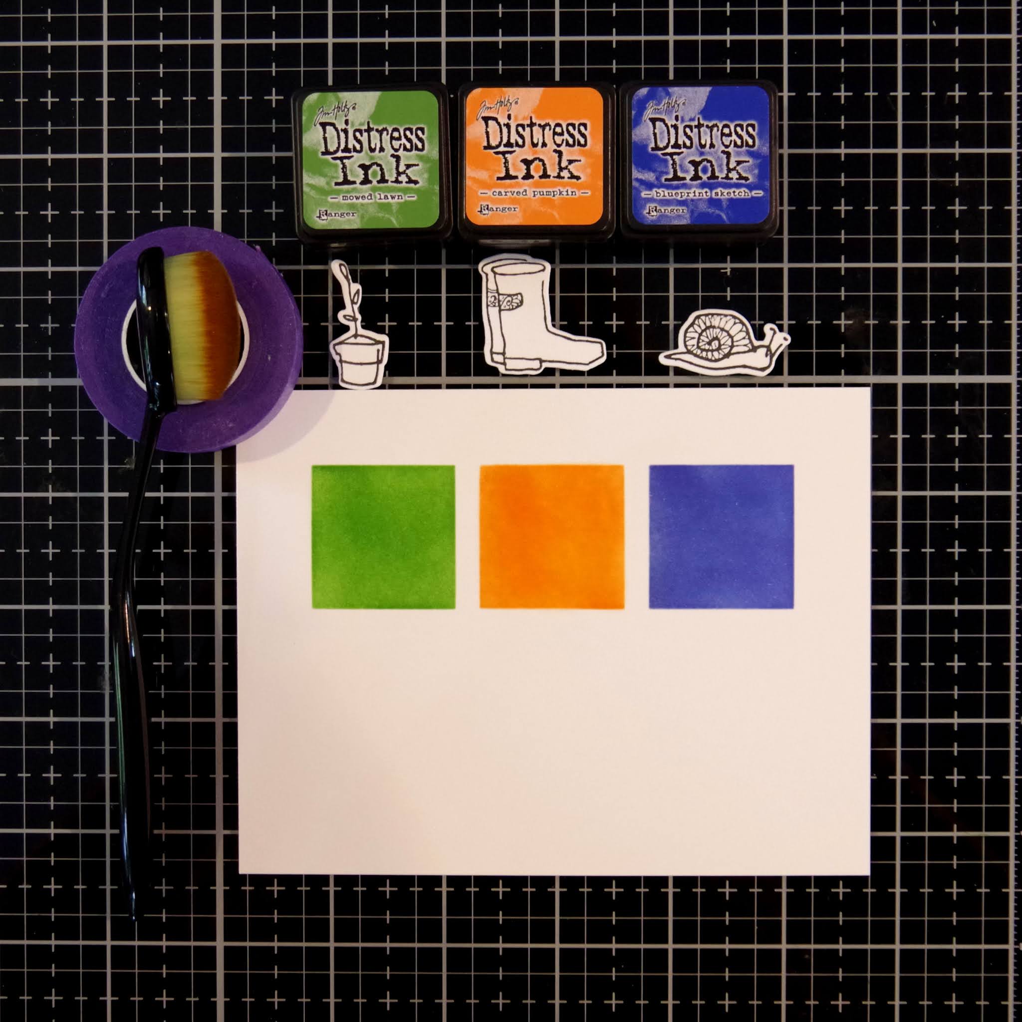
This card was inspired by the class on Color Blocking and the negative masking we learned in Masking Unleashed.  I think the bold colors are both festive and masculine.

  • I started by negative masking three 1 1/4\” squares.  I then used ink blending brushes to liberally apply ink to the squares.
  • I stamped and die cut three images from Altenew\’s Garden Grow stamp and die bundle.  I wanted the colors to be the star so I left the images uncolored.  I think this makes for a very eye-catching look.
  • I heat embossed a birthday sentiment on blue card stock and then assembled my card.

PRO TIP:  For a sharp edge, be sure your mask is evenly and securely adhered to the card panel.

Love/Thinking of You Card:

I love ink blending and negative masking so I again drew upon the lessons learned in Masking Unleashed.

  • I masked off a large negative mask around my card panel.  I blended in a medium blue and then applied a vivid blue around the edges.  So pretty and fun to do!
  • I stamped, Copic colored and die cut two images from Altenew\’s Garden Grow stamp and die bundle.  This is one of the first stamp sets I purchased and it is still a favorite!
  • I heat embossed my sentiment, assembled my card and attached to a top folding A2 card base.

PRO TIP:  I think using two shades of blue added depth to my one layer card background.  

Anniversary Card:

I knew I wanted to use the wreath from Altenew\’s Weekend Doodles and I thought it would be beautiful colored in green.  This was the starting point for my card.  After I had stamped, Copic colored and die cut the wreath I thought about backgrounds.  I finally decided to go with another bold color coordinated stenciled background.


  • I Copic colored the wreath with 3 different shades of yellow-green and green.  
  • I started by taping my Altenew Watercolor Stripes stencil to a watercolor paper panel.  I then wet the paper with clean water and then dabbed and pounced four colors of distress ink onto the paper.  I told you above that I love this technique!  
  • I die-cut and assembled the card on a top-folding A2 base.    


Here is a photo of all the cards.  To see what I did with the muslin bag, please keep reading.

Upcycled Item:

Finally, we were asked to upcycle or alter an item. I ordered some muslin favor bags for my daughter\’s wedding and have quite a few left so I thought this would be the basis for my upcycle project.  I thought they would be cute \”envelops\” for cards given in person or fun little gift pouches. A lot of the techniques we learned at Altenew Academy can be applied to non-card projects and I would like to share the processes I used to  decorate my muslin bags:

·        Stamping on fabric

·        Coloring on fabric

·        Ink blending on fabric

·        Felt die-cuts adhered to fabric

·        Stamp layering on fabric

I started by personalizing a little bag for each of the cards that I created above. 


For the first two cards, I ironed the bag, secured it in my Misti and stamped just once.  That is all it needed and I was afraid the fabric might shift if I stamped it a second time.  I then did some easy coloring with my Tombow markers.  The fabric colors well but you can’t do much complicated shading.


For the Encouragement Card, I masked three squares and then ink blended white pigment ink inside the squares. I let the ink dry and then I stamped (with black Pigment ink) 3 coffee mugs.  I finished by drawing a black border around each square with a permanent marker.  Simple but graphic looking.

For the Color Block Card, I again masked three squares and then ink blended with the same (distress) inks I used on the cards.  It is interesting that the colors change a bit on fabric, but the result is a bright fun pouch.

PRO TIP:  I inserted a piece of paper inside the bag to prevent the ink and glue from bleeding through to the backside. 

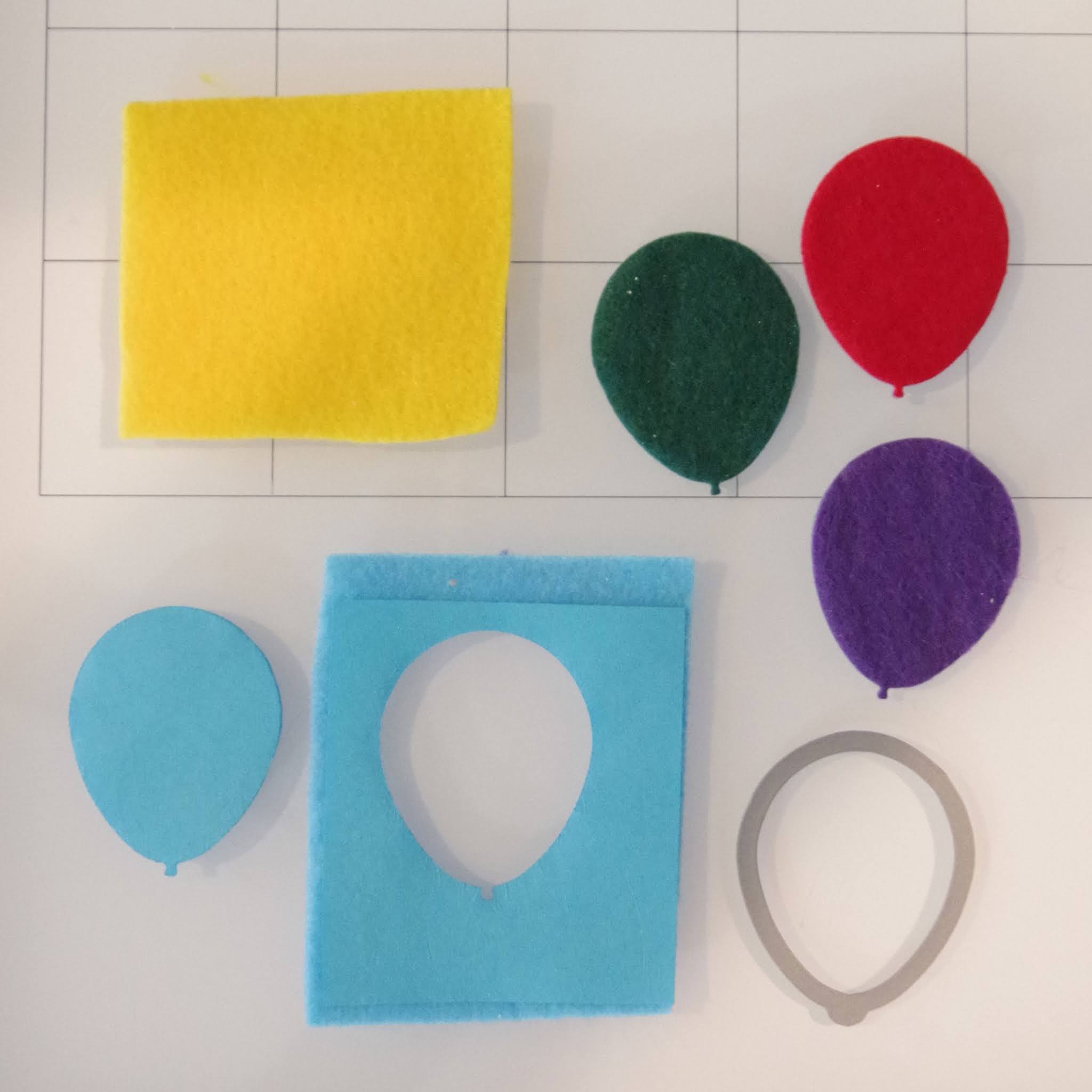
While I was at it, I wanted to do some felt die-cutting.  For my first card I die cut five balloons from felt and glued blue thread to the back.  For the second card I die-cut a Mega Alphabet B and added a sprig of die-cut greenery.


PRO TIP:  To keep the felt from stretching and tearing while die cutting, I first glued a piece of regular paper to the back of the felt.  I let it dry overnight and did my die-cutting the next day.  This makes a huge difference in the quality of the die-cut!

My final idea was to do a bit of stamp layering on fabric.  I used pigment ink, dried with my heat tool and then moved on to the next color.  This card is definitely feminine but I wanted to try the technique on muslin and all my layering stamps are flowers. 

Featured Altenew Products:

Altenew Watercolor Stripes stencil

Altenew Tea Time stamp and die bundle

Altenew Garden Grow stamp and die bundle

Altenew Weekend Doodles stamp and die set

Altenew Bride to Be stamp and die bundle

Altenew Mega Alphabet B die


I really enjoyed putting this project together!
Karen


Uncategorized

Altenew Academy – Cards For the Guys

Hello and welcome.  Today, my blog post is about making masculine cards and I\’ve chosen to do a color blocking background.  Fun, bright and eye-catching.  
Altenew Academy Cards for the Guys using Color Blocking with Altenew Mega Alphabet T die and Large Thanks Sentiment die.
I started by cutting four 2×2 squares from brightly colored card stock.  My inspiration came from Jennifer Rzasa and her class on Pop Art Color Blocking.  Once the squares were cut, I taped them together, trimmed the edges for a nice even line and then backed with craft foam for dimension.  

Next, I die cut the \”T\” from bright blue card stock and the \”thanks\” from lavender cardstock.  I die-cut each three times and then carefully glued them together for nice dimension.   I initially was going to back them with foam but didn\’t like the white shadow which I thought distracted from all the bright bold colors.  

I made a 4 1/4\” x 4 1/4\” card base and then attached the color blocked panel.  I weighted it for a few minutes with an acrylic block
Supplies Used:
Altenew Mega Alphabet T die
Altenew Large Thanks sentiment die
6 shades of brightly colored card stock
tape
liquid glue
craft foam
white cardstock for base.

I am also playing along with: Try It On Tuesday \”Cut It Out!\” Challenge  This card is all about cutting as every element was either cut with a paper trimmer or die cut.  

I really like how the card turned out and think I will do some more color blocking in the near future.

I am so pleased that you stopped by!
Karen