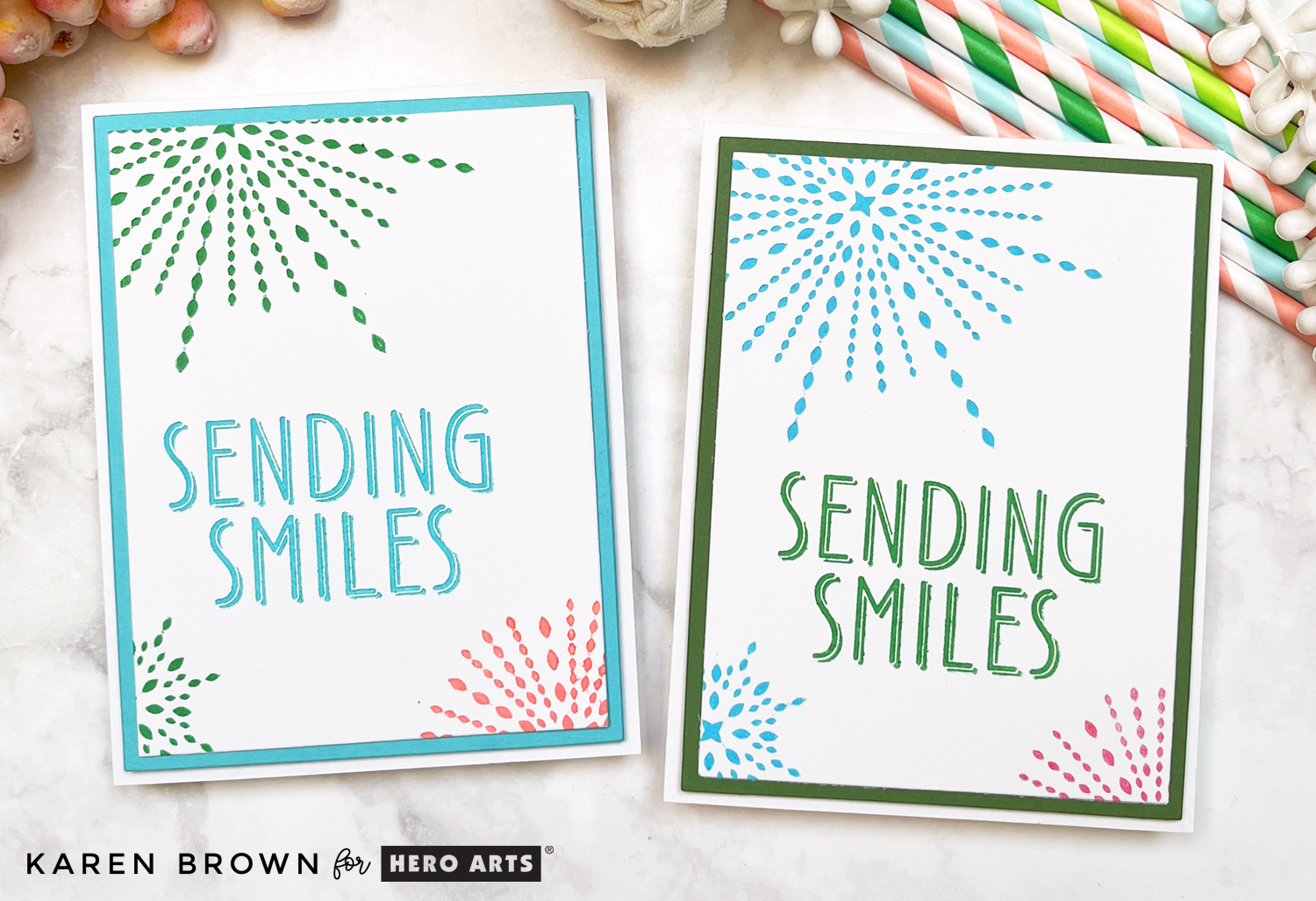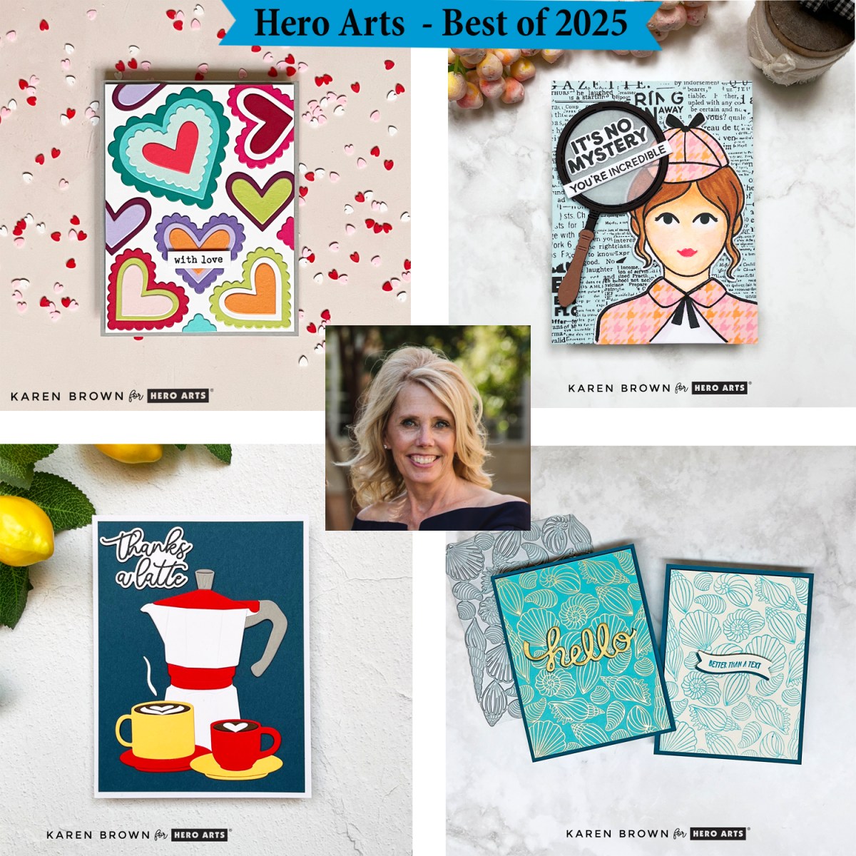
Best and Most Popular Hero Arts Cards of 2025
As we look back on 2025, I thought it would be fun to round up my best and most popular Hero Arts cards of the year. These projects were fan favorites, reader favorites, and in a few cases, personal favorites too.
Each card highlights a different Hero Arts release and cardmaking style—from bold graphic designs to cute scenes and clever techniques. I’ve linked each original blog post so you can dive deeper into supplies, step-by-step instructions, and tips if a particular card catches your eye.
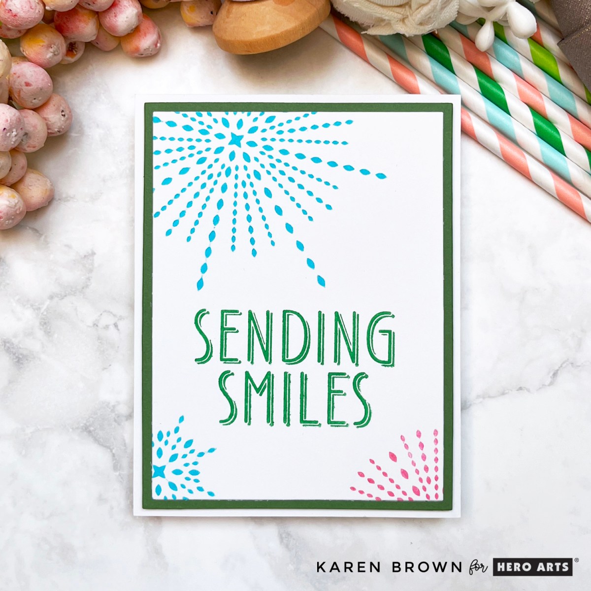
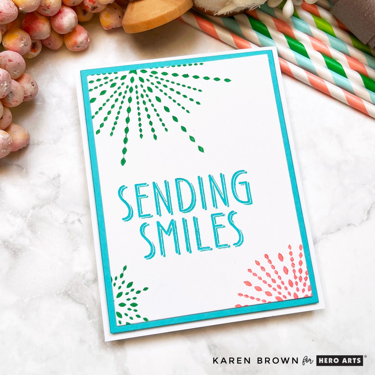
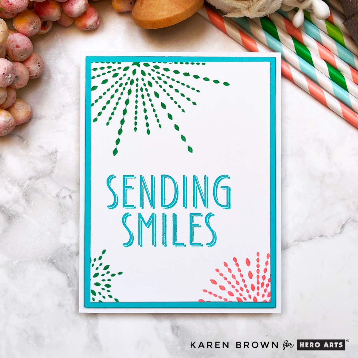
🥇 Most Popular Card of 2025: Die Cut Valentine
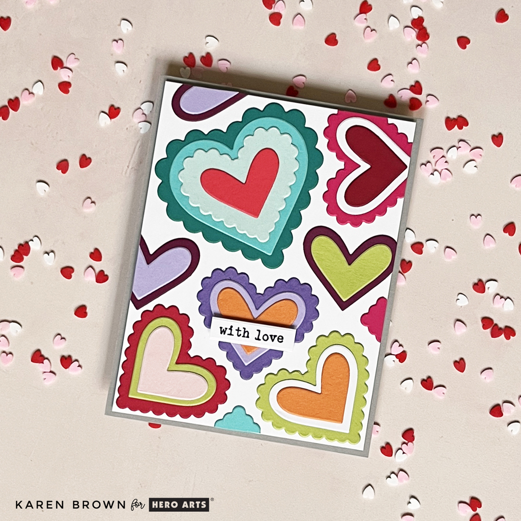
My most popular card of 2025 was a fun die-cut Valentine created with the January 2025 Folded Love Note Kit. The playful dies, bold heart shapes, and cheerful vibe made it perfect for modern Valentine cards.
👉 Link to original Valentine blog post
🕵️♀️ Fan Favorite: Miss Detective – Case Closed Collection

The Case Closed Collection from May was such a hit, and my Miss Detective card quickly became a fan favorite. This clever, story-driven card featured a charming sleuth and bold graphic details—and it really resonated with readers.
👉 Link to original Miss Detective blog post
This collection was creative, unique, and just plain fun to work with. It’s one of those releases that sparks storytelling the moment you start crafting.
Key Products:
- Curious Crafter Bundle
- Miss Detective Stamp and Die Set
- Miss Detective Stamp Set
- It’s No Mystery Sentiment Stamp and Die Set
- Houndstooth Layering Stencils
- Magnifying Glass Die Set
- Collage Backgrounds Hero Transfer Set
☕ Personal Favorite: What’s Brewing Card
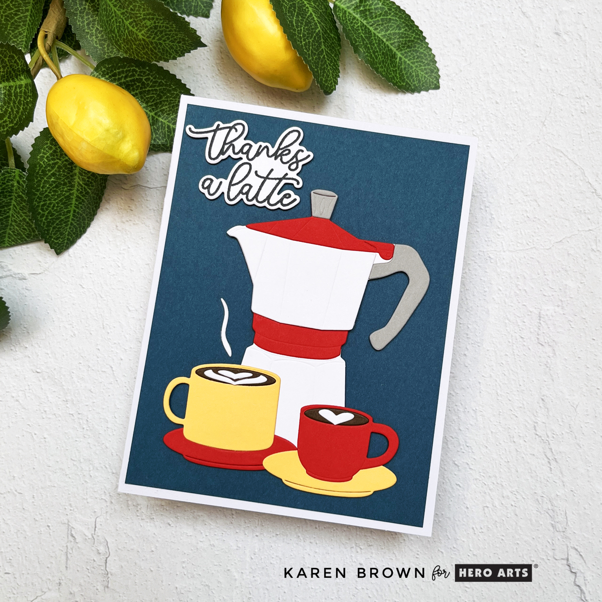
This one is especially close to my heart.
Using the What’s Brewing Collection, I created a bold, graphic coffee-themed card that I sent to my daughter. With strong colors, clean die cutting, and a modern layout, this card felt fresh and fun—and it’s still one of my favorite designs of the year.
👉 Link to original What’s Brewing blog post
Coffee-themed cardmaking is always popular, and this release delivered in the best way.
Key Products Used:
- What’s Brewing Collection
- Stove Top Die Set
- Coffee or Tea Stamp and Cut Set
- ColorWheel Cardstock Sampler
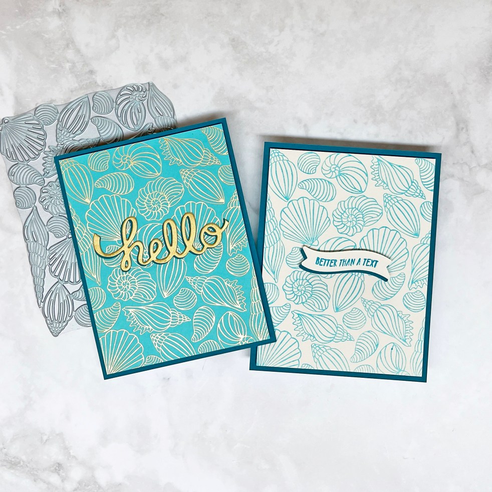
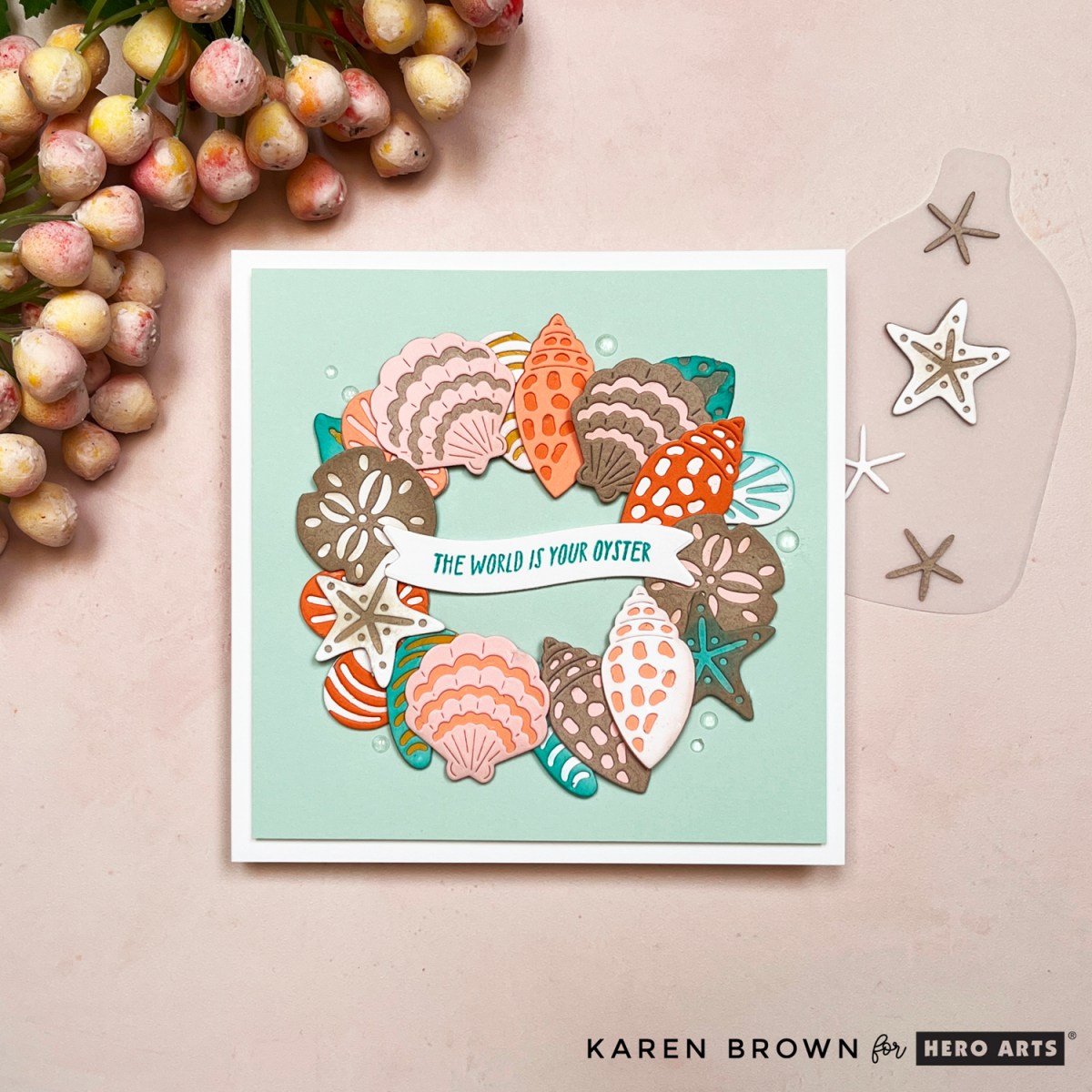
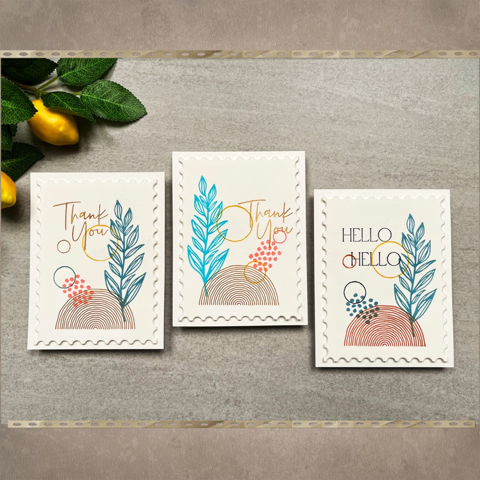
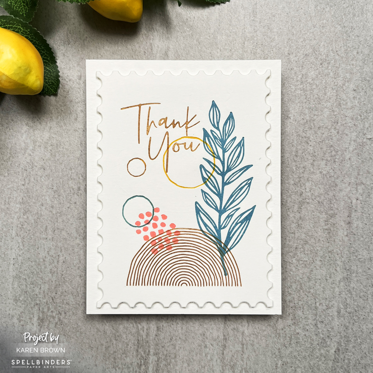
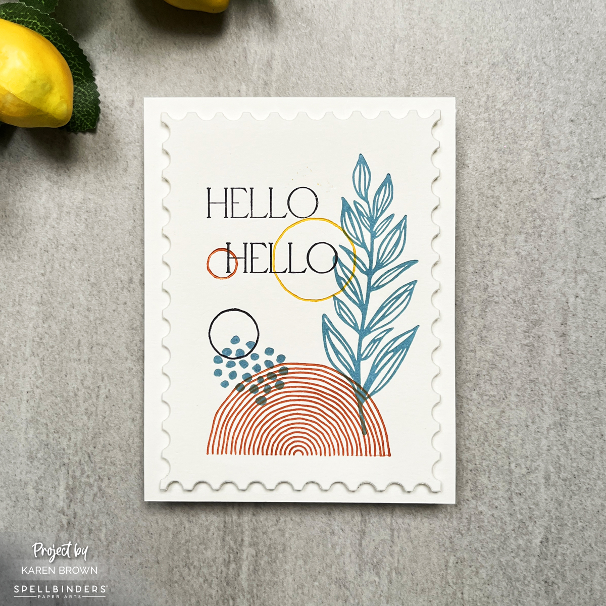
🐚 Two-for-One Favorite: Scattered Shells

This entry actually includes two cards, both created using the Scattered Shells plate from the Summer by the Sea Collection. I loved showing how one design can be used in different ways:
- One card created with BetterPress LetterPress
- One card created with Glimmer Hot Foil
👉 Link to original Scattered Shells blog post
Same plate. Two completely different looks. This is a great example of stretching your supplies and getting more mileage from your favorite tools.
Key Products:
- Summer by the Sea collection
- Scattered Shells LetterPress + Foil Plate
- Spellbinders Glimmer System
- BetterPress system
- matte gold foil
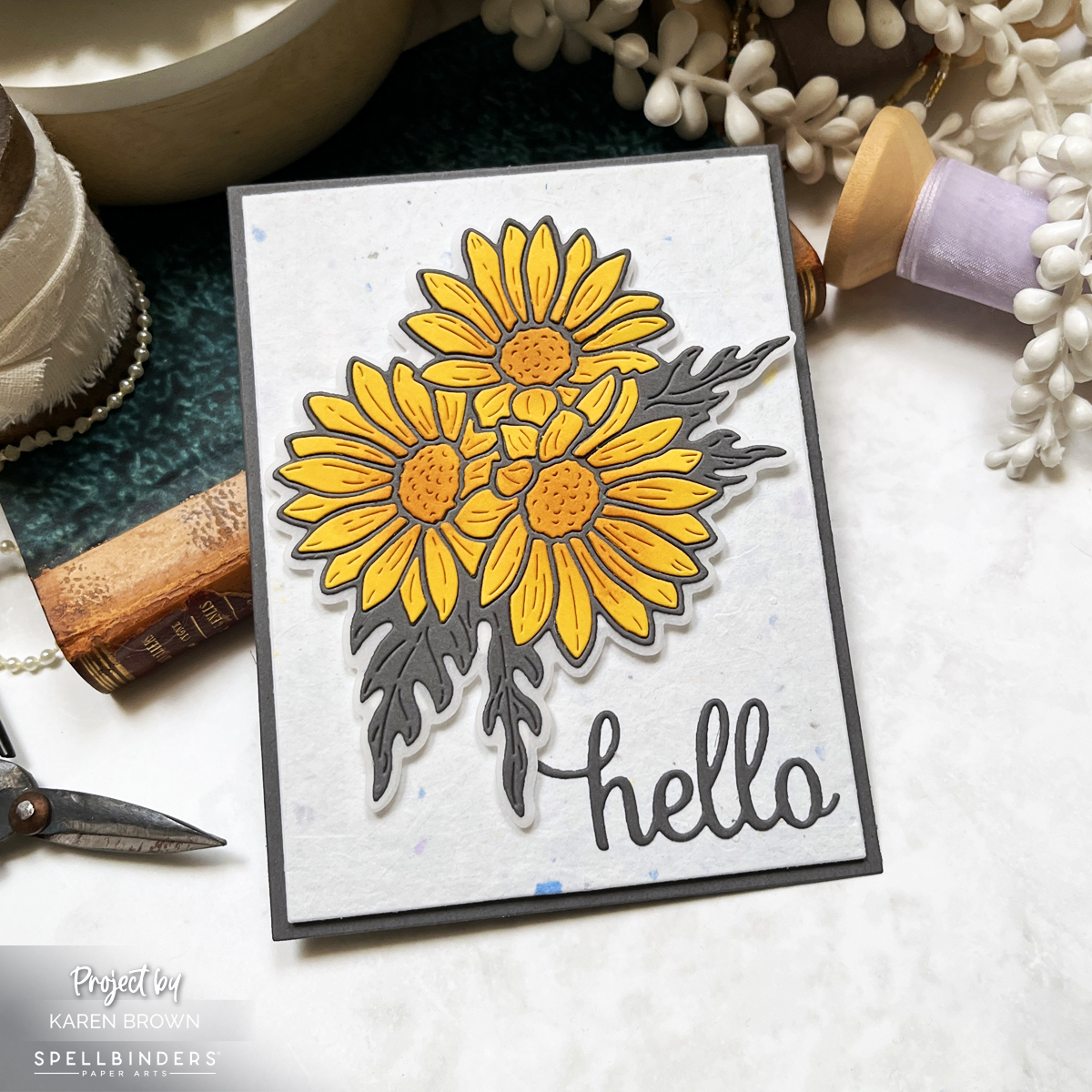
🌸 Honorable Mention: Friendship Blooms + Video

It was a close call for fourth place, so I added an Honorable Mention—a bold floral die-cut card from the Friendship Blooms Collection. This project focused on layering, color, and impactful florals, and it remains a go-to style for both beginners and experienced cardmakers.
I also created a video tutorial for this card if you’d like to see it come together:
🎥Link to Video Tutorial
👉 Link to original Friendship Blooms blog post
Key Products Used:
- Hero Arts Small Floral Layering Fancy Dies
- Hero Arts Large Floral Layering Fancy Dies
- Hero Arts Friendship Blooms Collection
Final Thoughts
These cards represent what I love most about Hero Arts: creative variety, high-quality products, and designs that truly inspire. Whether you enjoy bold graphics, clever themes, or classic florals, there was something special in every 2025 release.
If you’re new here, this post is a great place to start exploring past projects—and if you’ve been crafting along with me all year, thank you for being part of the journey.