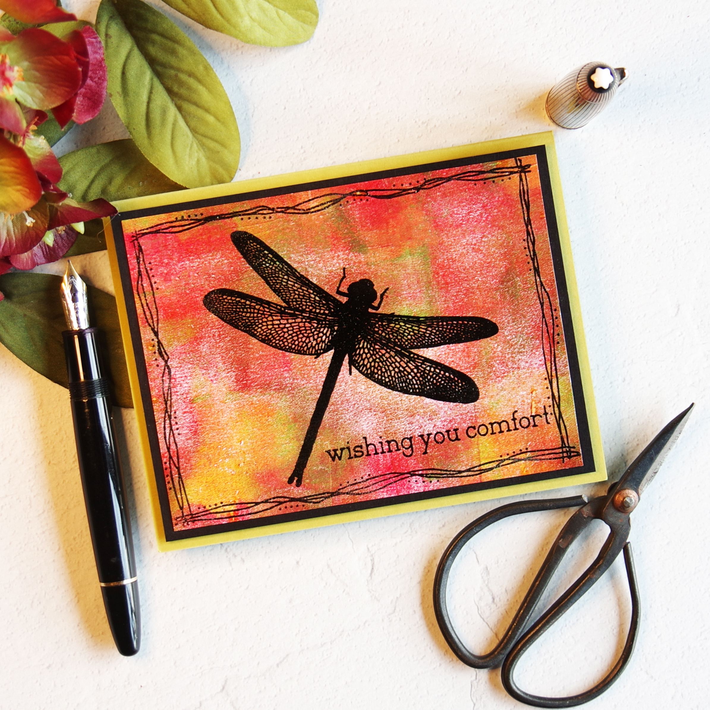
Don’t you just love Dragonflies? I really like how this sympathy card turned out. I heat embossed the dragonfly from Visible Images “Live in the Moment” stamp set on a gel press print and added a Rubbernecker Three Line Frame border.
My sister-in-law loves dragonflies too so I made this card for her birthday this month. I ink blended my background and then heat embossed the dragonflies and sentiment.
I had a strip of background left over so I made a third card…I love bonus cards!
Happy 8th Anniversary Altenew! I am so happy to be participating in Altenew’s Birthday Hop again this year! You probably arrived from Bridget Casey’s lovely BLOG. If not, you might want to start at the beginning with Altenew’s BLOG.
Giveaway Prizes: Look at all the lovely prizes from the Hop Sponsors:
Over $2,000 in total prizes! Altenew is giving away a $80 Gift Certificate to 5 lucky winners and one Altenew Academy Online Class($8.95 value) to 15 lucky winners. There are also 26 awesome companies/crafty friends who are celebrating with us, and they are offering the following prizes:
Be sure to leave comments by 4/15/2022 for a chance to win one of 50 prizes! To make the hop more exciting, start your comment with “Hi from (city or country where you’re from)!” 50 winners will be chosen at random from the comments left on any of the blogs listed below and will be announced on the Altenew Card Blog on 4/21/2022.
Hello! I recently spent a most enjoyable afternoon making acrylic gel press prints and then I turned four panels into cards. For my first card, I used Altenew’s Bubble Wrap Stencil to add varation to my background. I die cut my background using The Greetery’s Crimped Frame die, and then die cut blooms using WPlus9 Doodle Buds stamp and die bundle. I drew in stems with paint pens and assembled my card with foam squares.
For my second card, I put 7 dots of acrylic paint on my gel press and brayered one direction horizontally so the ink would gently blend but would also maintain the bands of color. I brayered the excess ink onto a second page. I added a die cut bloom, stem and Hello sentiment.
The background on Card #3 used Altenew’s Leaves and Berries stencil. My bottom layer was orange, yellow and green. Next, I placed the stencil on the wet paint and blotted most of the orange that showed through onto a piece of copy paper. I let the paint dry a minute and then gently brayered on light blue acrylic paint, removed the stencil and pulled the print. I think the background is so beautiful for a floral card. The sentiment is from Altenew’s Birthday Greetings.
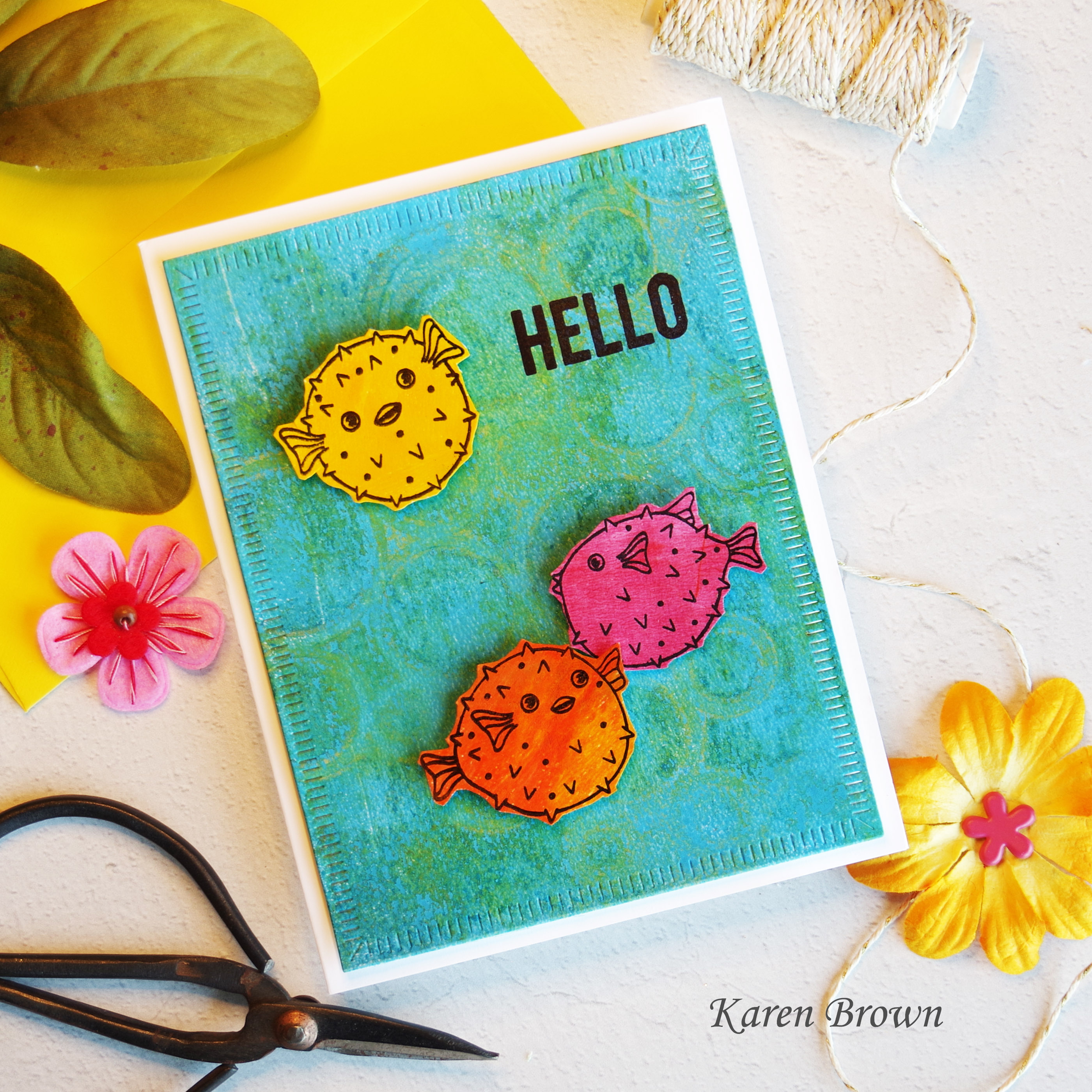
The background on card #4 started with yellow and green paint on layer 1. I placed Simons Says Stamp’s Ring Cluster Stencil on the wet paint and then blotted most of the paint that showed through the stencil with a sheet of copy paper. I then brayered on light blue paint, removed the stencil and pulled the print. It was bright and fun and reminded me of the ocean so I went with an aquatic theme. The cute little puffer fish (Hero Arts I am Puffer For You) were stamped and fussy cut and a Hello sentiment was stamped on the background.,
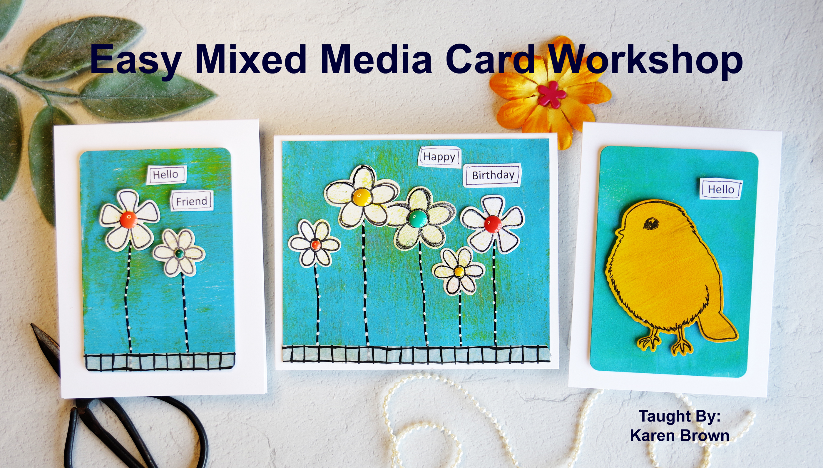
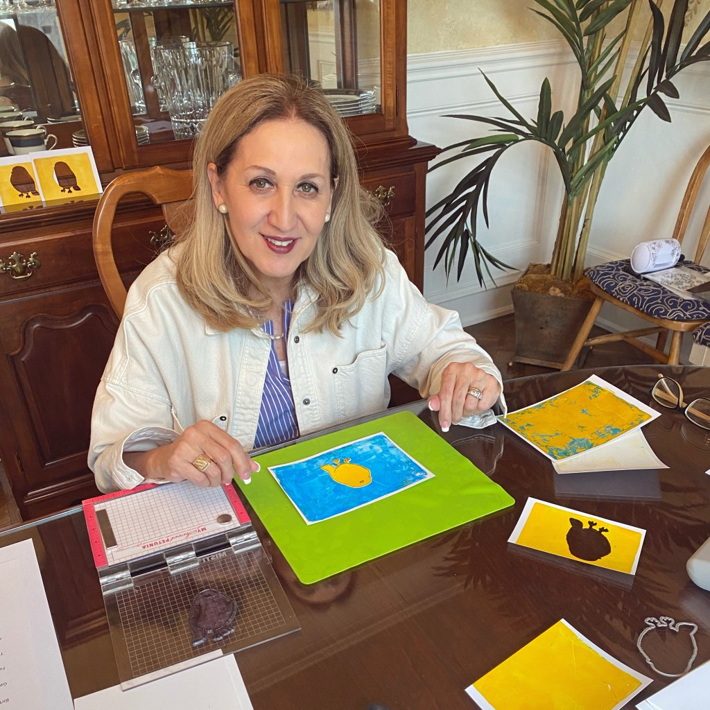
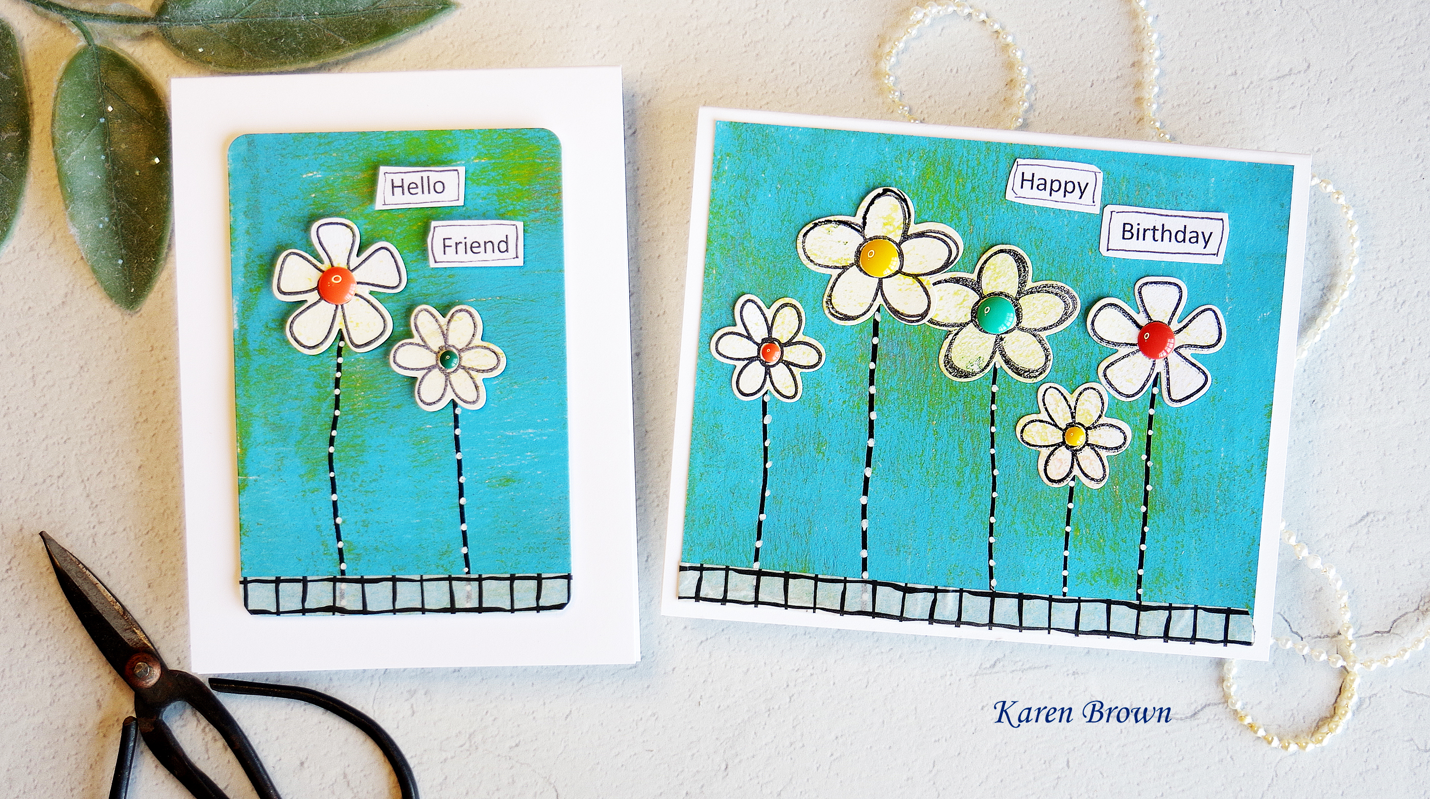
Last week, I taught a workshop on creating Easy Mixed Media cards. The participants had never done Gel Press printing before so I guided them through the printing process.
And then we turned the prints into cards.
Some of the participant cardsLots of decisions to make in cardmakingBrainstormingWorking on the layout
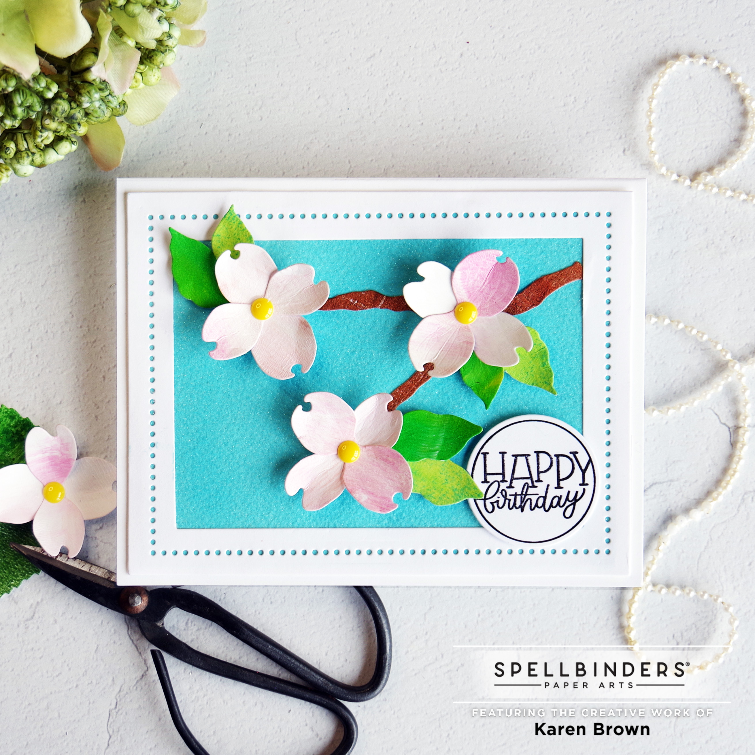
I just love bright happy colors and I think they pair so well with Spring cards. Today I am sharing two Dogwood themed cards from Spellbinders new collection called Susan’s Garden Favorites.
DIY Glitter Paper Background
My Process:
I started by making pale pink and green Gel Press prints for my flowers and leaves. The branch is cut from a copper gel print because I thought brown was too plain.
I also wanted a bright fun background so I made my own glitter paper. First, I taped some watercolor paper to a hard board and brushed water over the surface. Then I mixed Salty Ocean and Mermaid Lagoon Distress Inks with Shimmer Spray (no water was added) and I painted it on the watercolor paper. I wanted an intense color so I applied three layers but I didn’t bother to let it dry in between. The background is so pretty in person but its hard to see the sparkle in the photos so I added a quick video below.
I die cut the blooms/leaves and then, using a bone folder, I molded and shaped them.
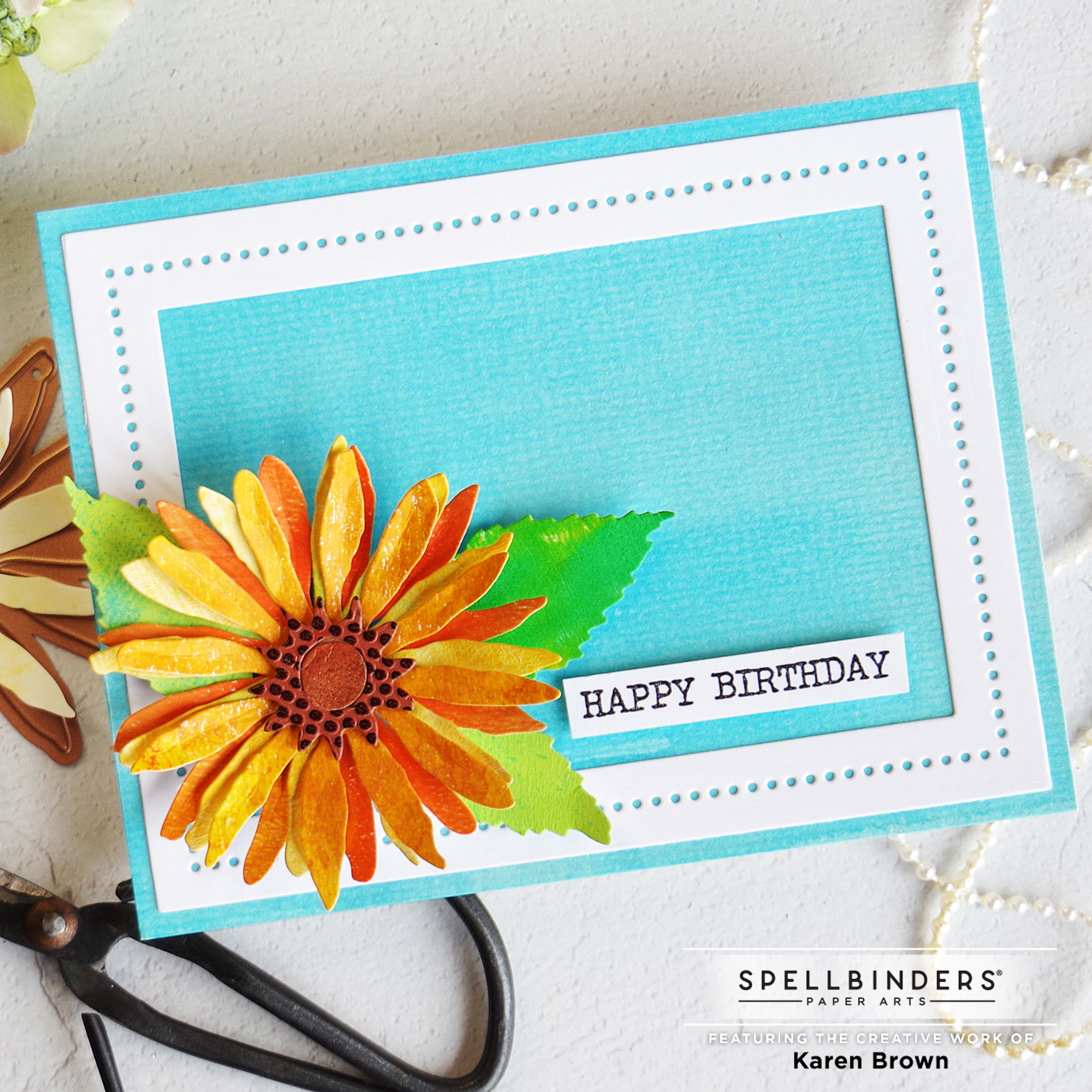
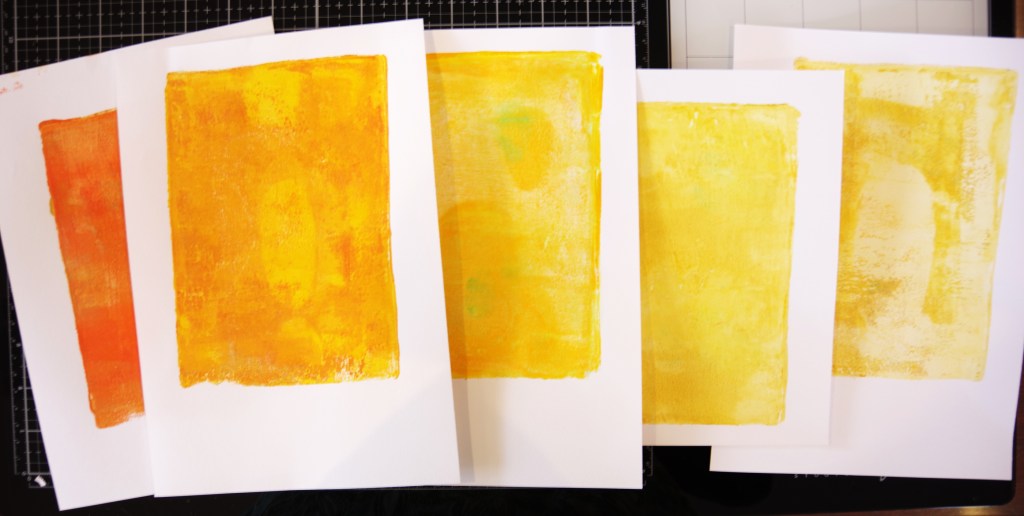
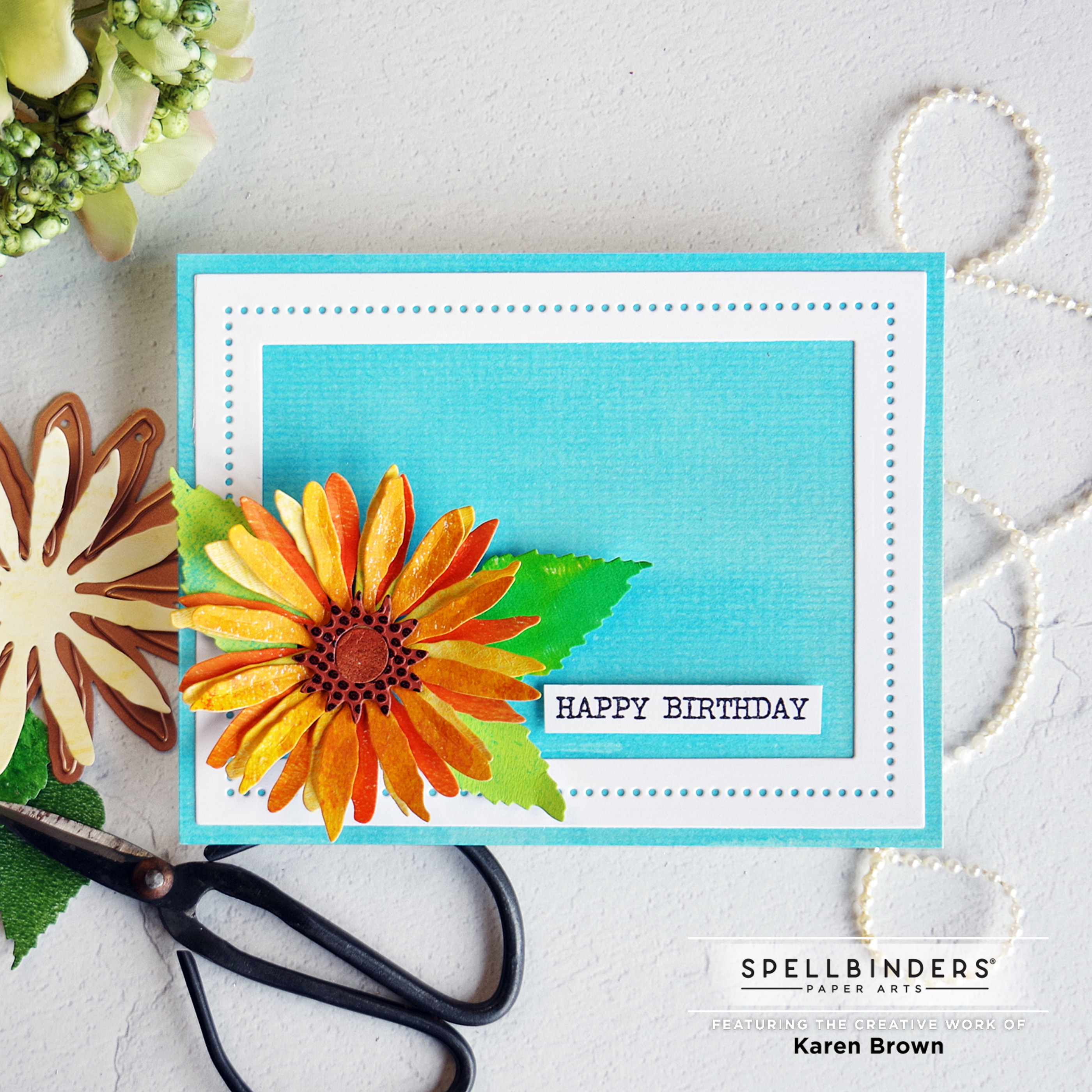
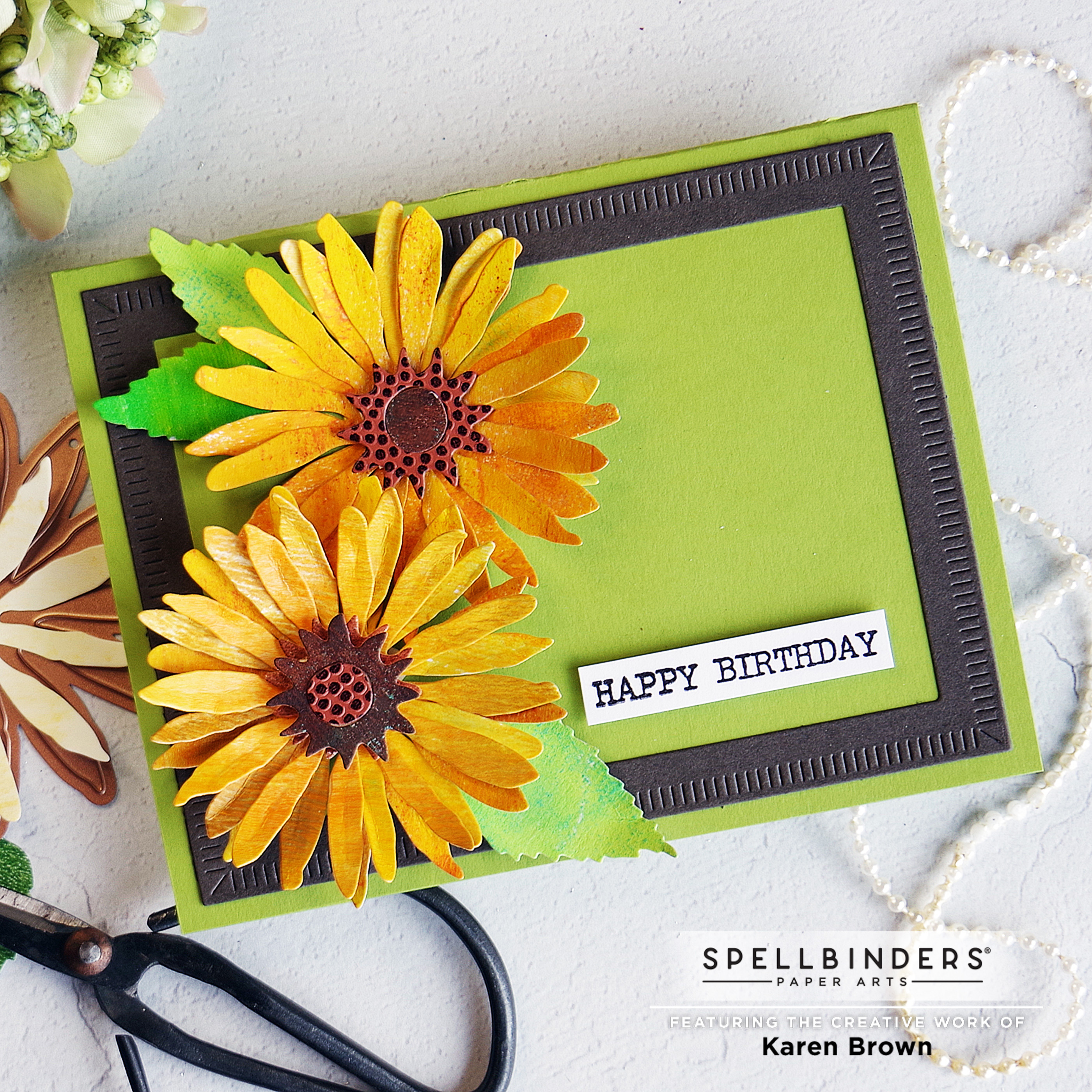
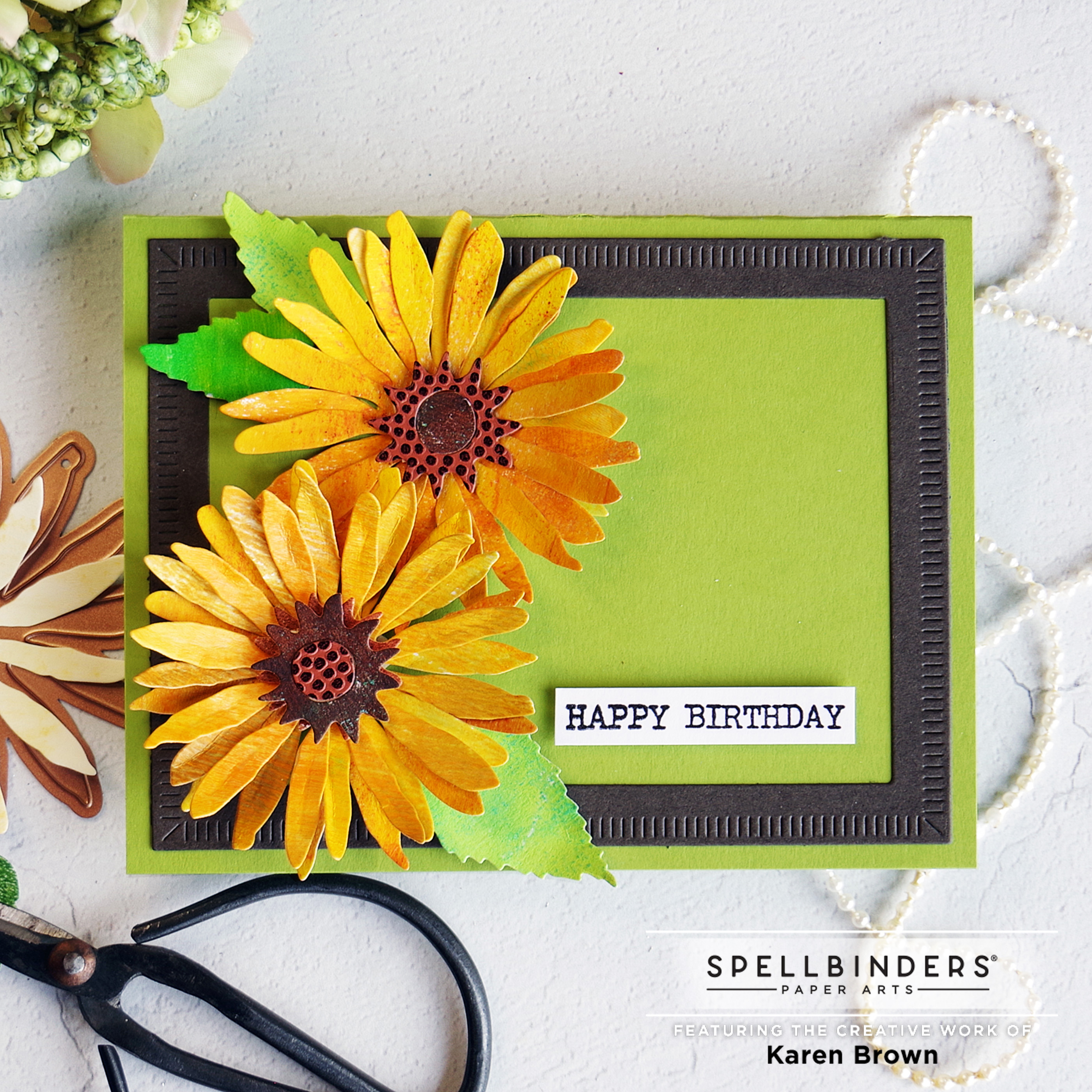
I started by making a bunch of yellow and green Gel Press prints for my flower and leaves. I’ve inlcuded a photo of some of my prints below.
I also wanted a bright fun background so I taped some watercolor paper to a hard board and brushed water over the surface. Then I mixed Salty Ocean and Mermaid Lagoon Distress Inks with Shimmer Spray (no water was added) and I painted it on the watercolor paper. I wanted an intense color so I applied three layers but I didn’t bother to let it dry in between. The background is so pretty in person but its hard to see the sparkle in the photos.
I die cut the bloom three times for each sunflower. Using a bone folder I shaped the blooms and leaves.
The flower center is die cut from and a brown gel press print and a specialty “football” paper that has the texture of a football
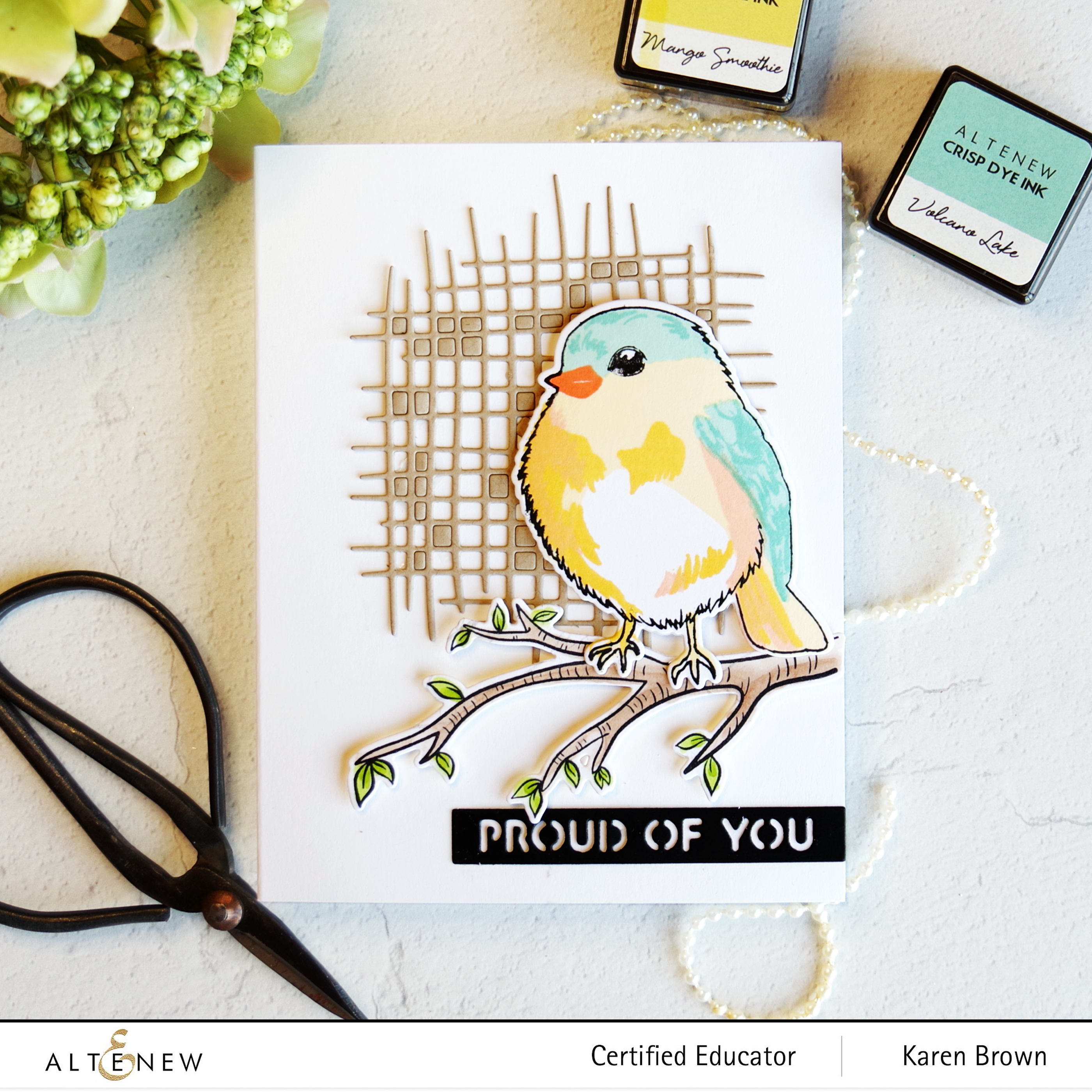
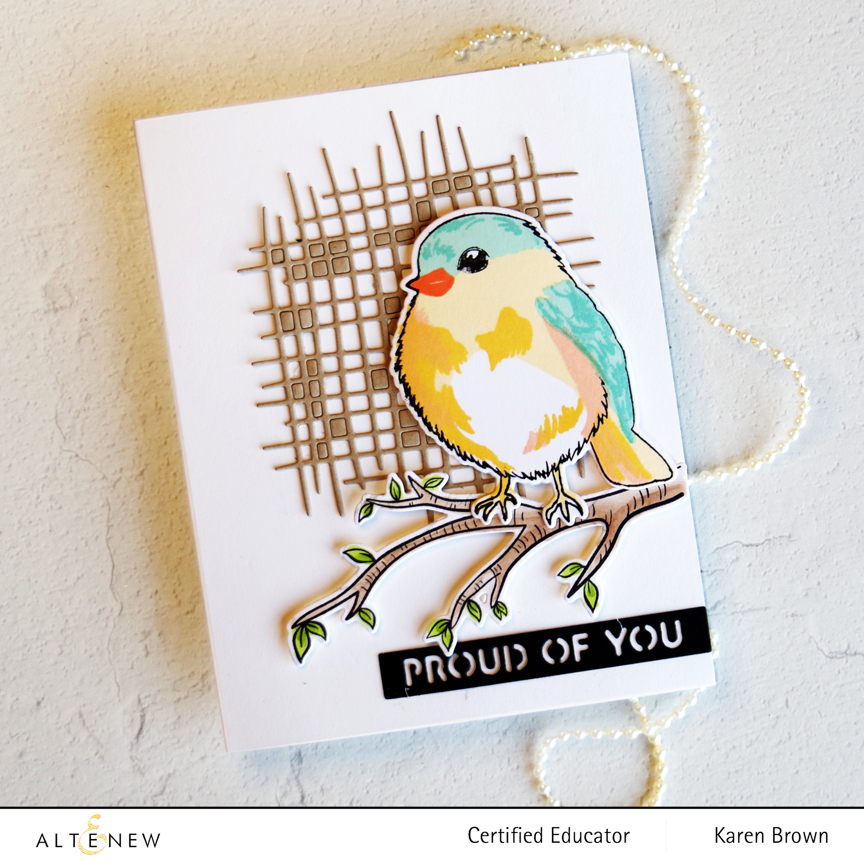
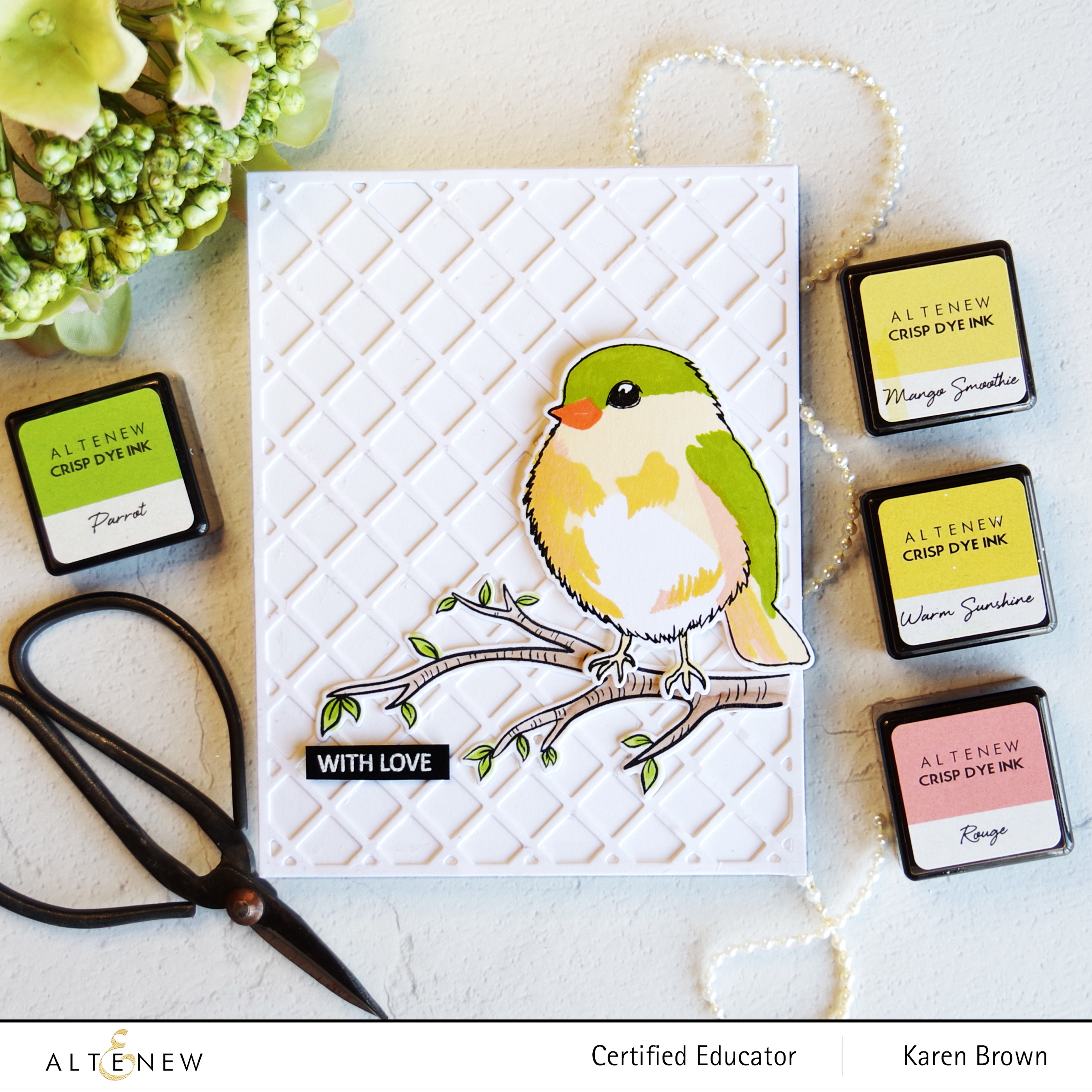
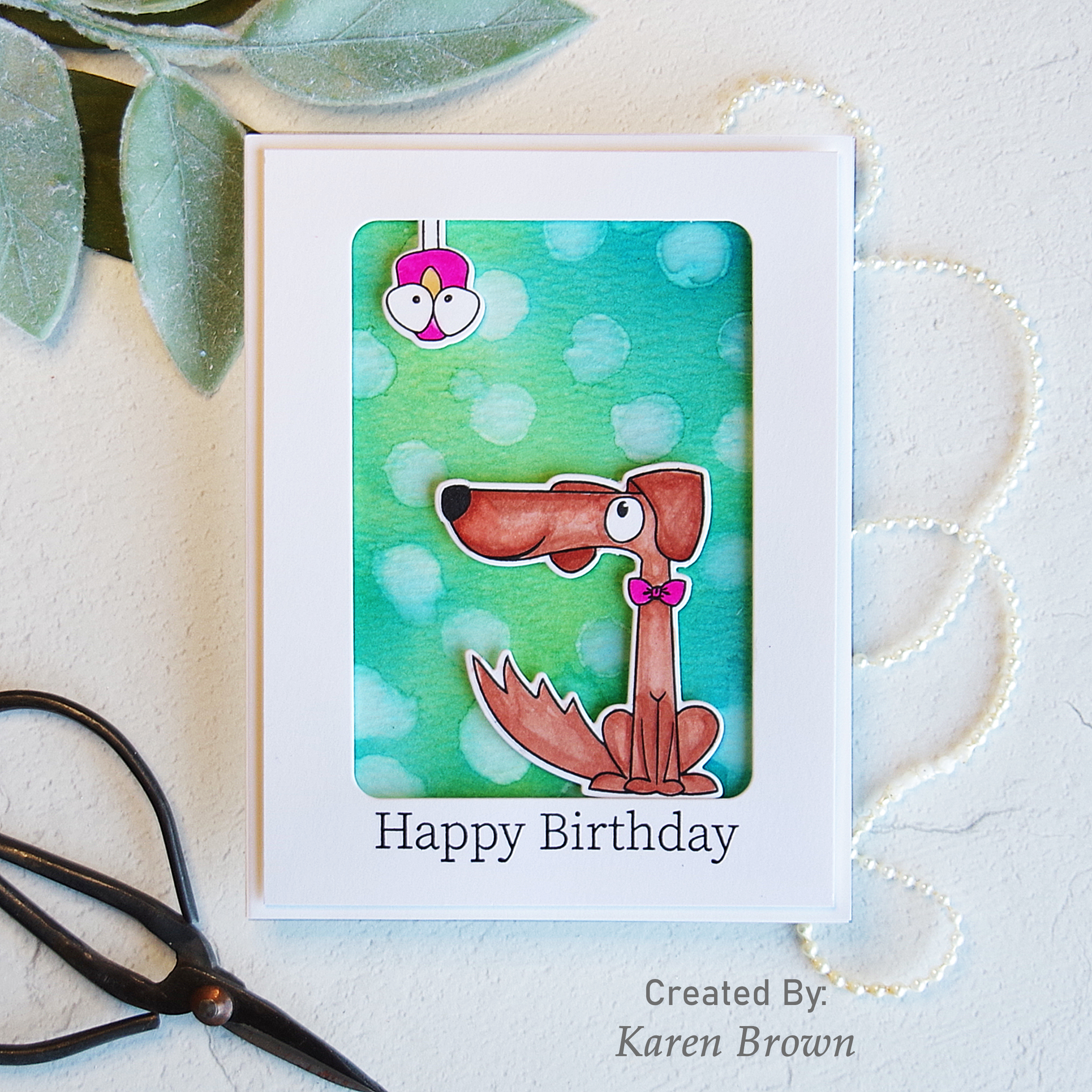
This card is for my future son-in-law. Masculine cards can be difficult and my go-to for men is fun and whimsical. I achieved that by using two old favorites: Photoplay Fetch combined with Simon Says Stamp Stacking Animals. I love that bird!
My Process:
I started by stamping the silly dog and bird, then colored them with Copics and lastly die cut them.
The background is both fun and vibrant. I ink blended distress ink onto watercolor paper and then I “bleached” circles for a bokeh look. For the bleaching, I took a circle stamp, painted water on with a paint brush and then stamped the circle onto my background.
I had so much fun creating this card and it required minimal supplies.
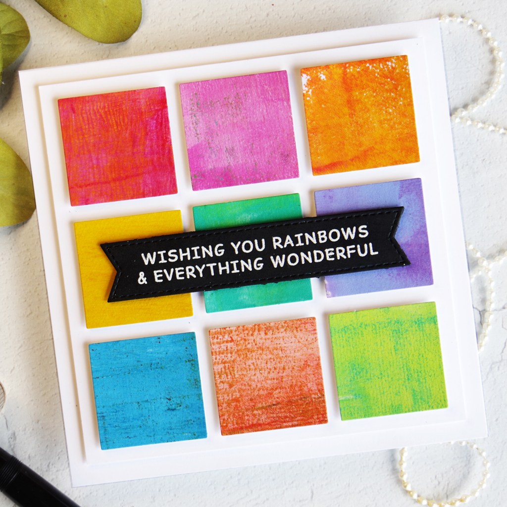
I started by selecting colorful leftover gel press scraps and then I used a 1 1/2” square die to cut my elements. You could easily use a paper trimmer to cut the squares.
I glued a white cardstock square to the back of each die cut for a more substantial feel and then laid out the squares and came up with my grid. There was no rhyme or reason, I just went the grid that appealed to me visually.
PRO TIP: I selected scraps with a lot of variation to add texture and interest to my card.
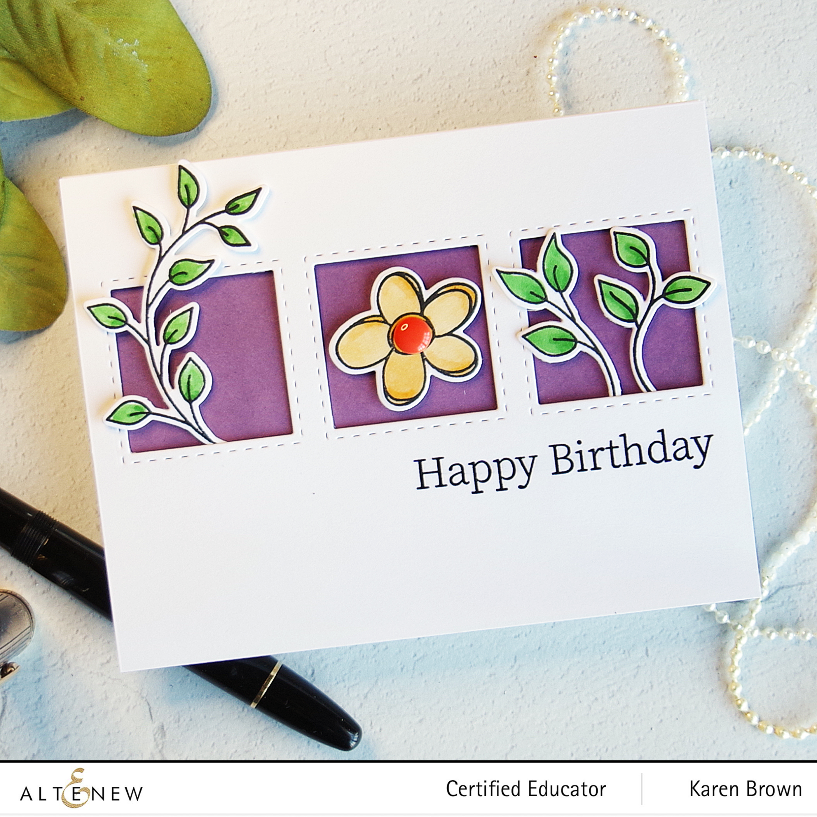
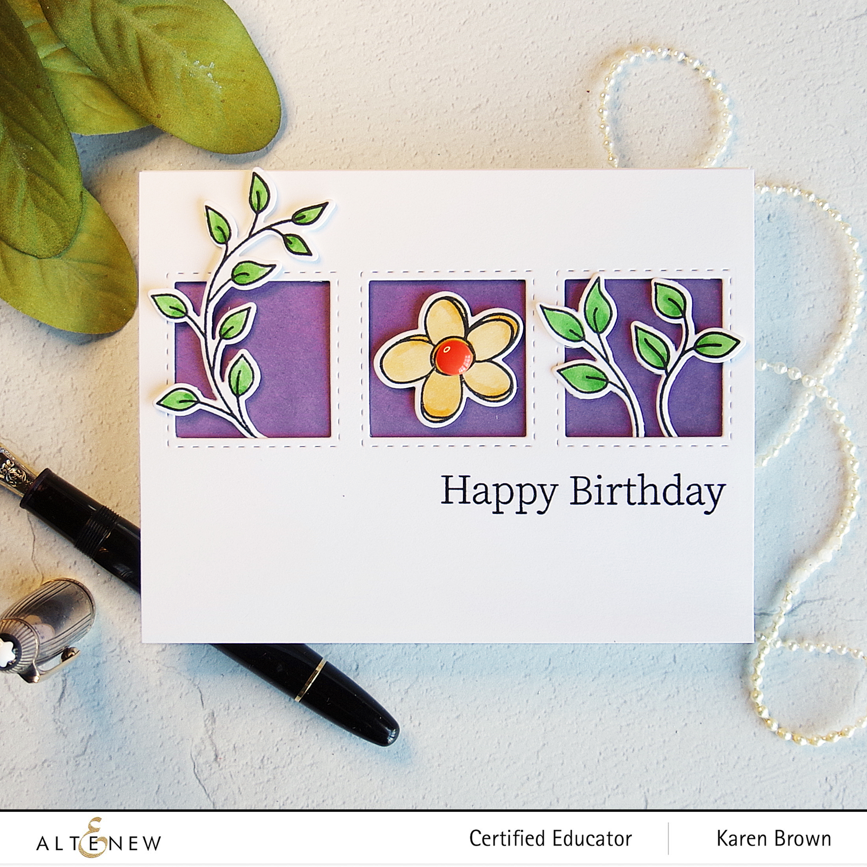
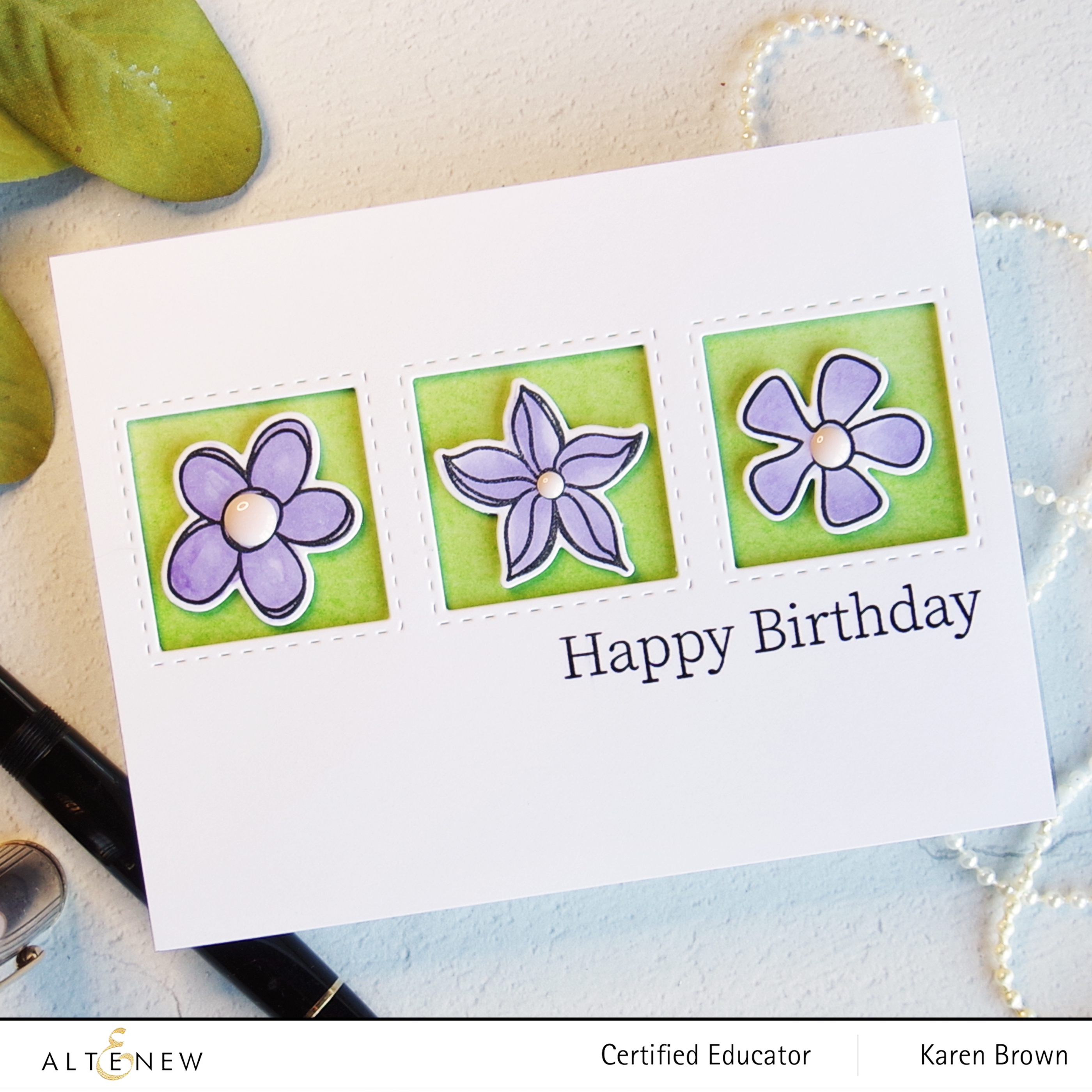
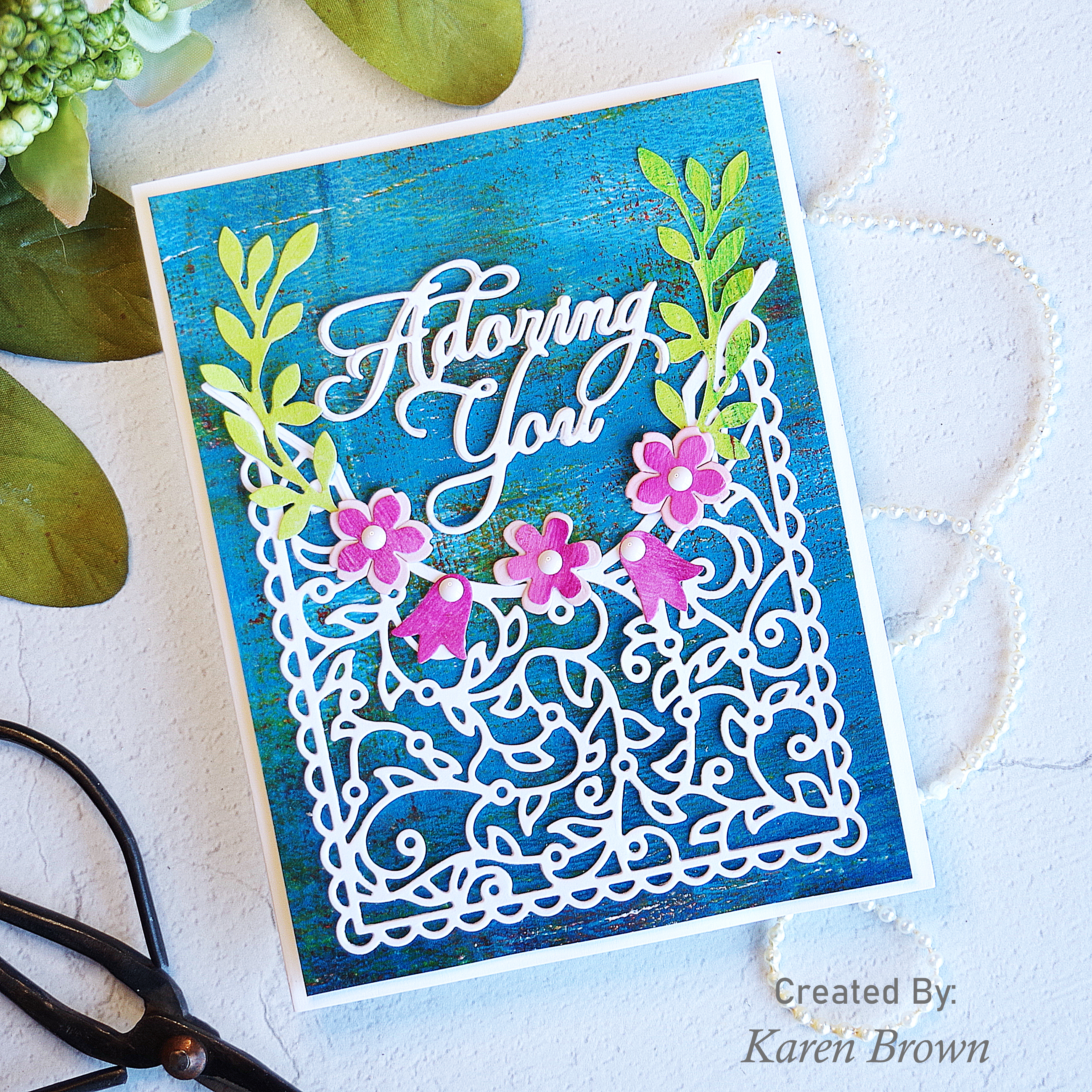
I started by sorting through my gel press prints. I really liked the blue print for my background and thought pink and green would look great as accent colors. The lattice die is so beautiful and I wanted to show it off so I went for a high contrast look. I like that the lattice die is the focal point of the card.
My Process:
The lattice die is both intricate and delicate, so I ran it through my die-cutting machine three times to ensure a crisp clean cut.
I die cut flowers and leaves. The tulips are from the this kit and I added flowers and greenery from Spellbinders Petite Floral Potpourri, which is a favorite of mine.
I also die cut (2X) the Adoring You sentiment included in this kit.
I wanted an A2 card so I cut my background down to 4 x 5 1/4″. I added a layer of craft foam to my card base and then attached my background.
Next I layered the elements of my card using the fine tip of Bearly Glue.
To finish the card I added enamel dots to the flower centers. I used the lightest color from Shades of Purple. I think enamel dots really help finish a project and they are probably my most used embellishment.