Uncategorized

AECP Altenew Academy: In The Mood for Color

In The Mood for Color (taught by Stephanie Klauck) was such an interesting class.  We learned to select colors based on the mood we are trying to convey.  Adding the right color can add depth and nuance to your project.


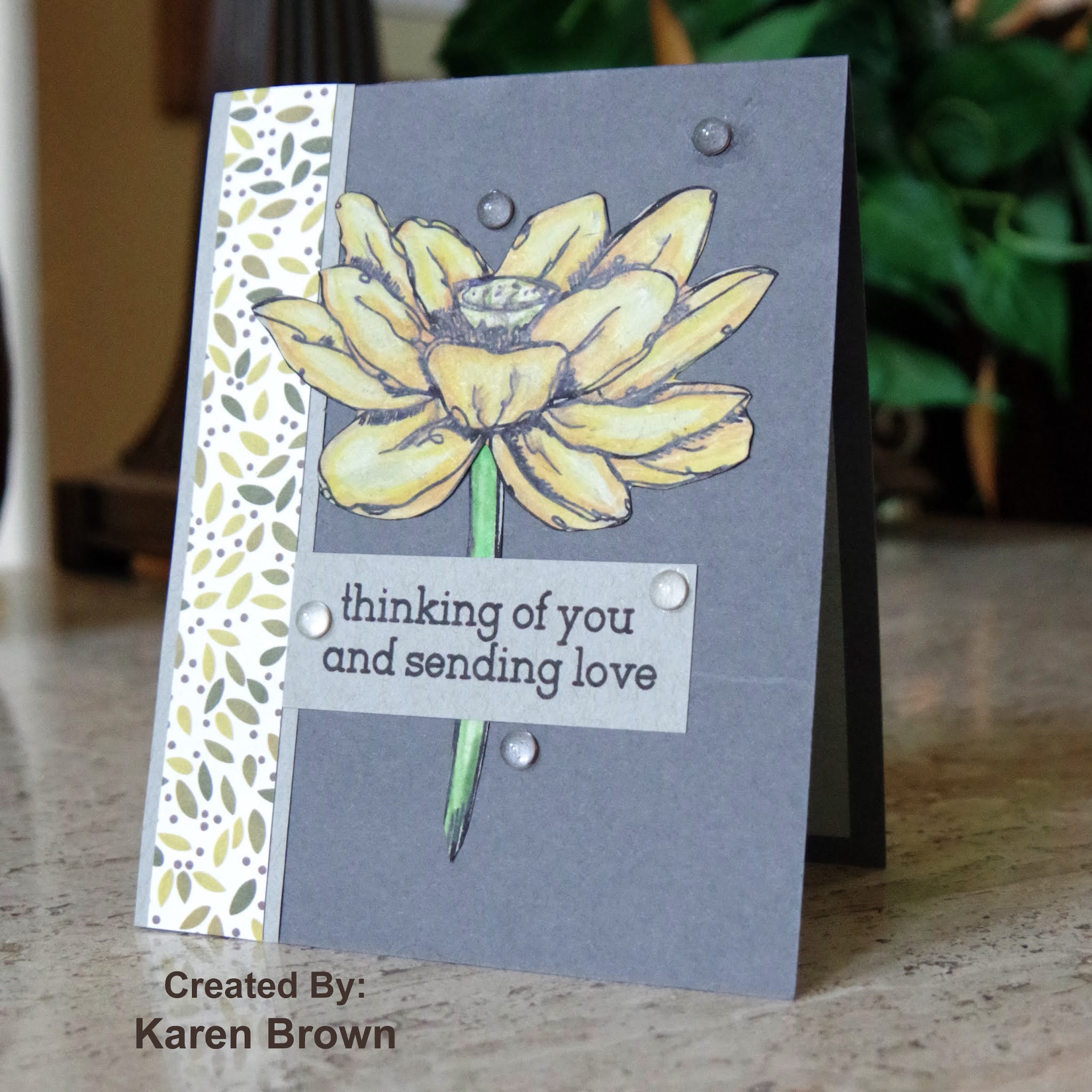
I chose to make a Thinking of You card and decided to use yellow to project optimism.  

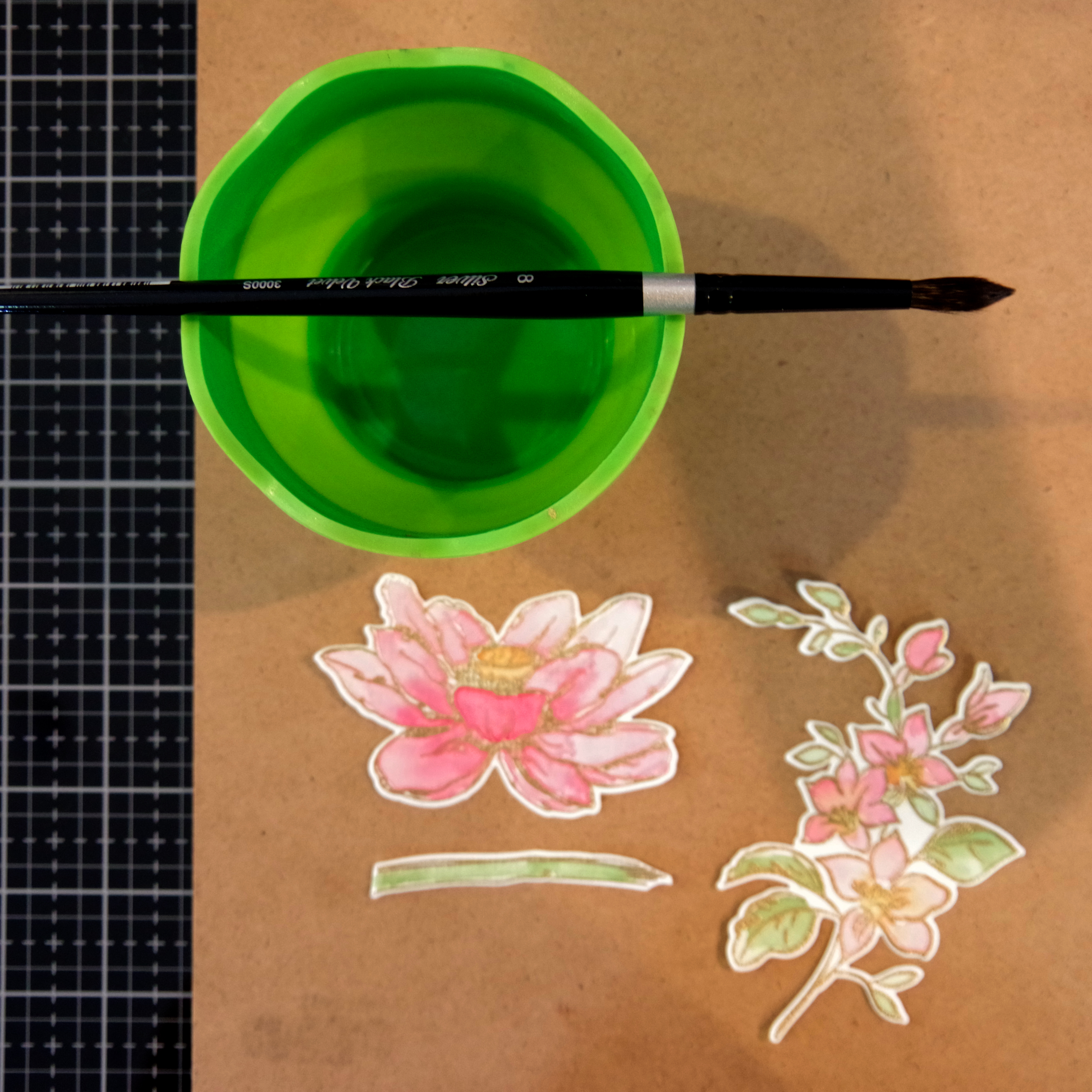
I love the look of colored pencils, but they intimidate me a bit.  Stephanie inspired me to dust off my Polychromos and give them a try.  She walked us through the technique and I was pleased with my coloring. 


My Process:
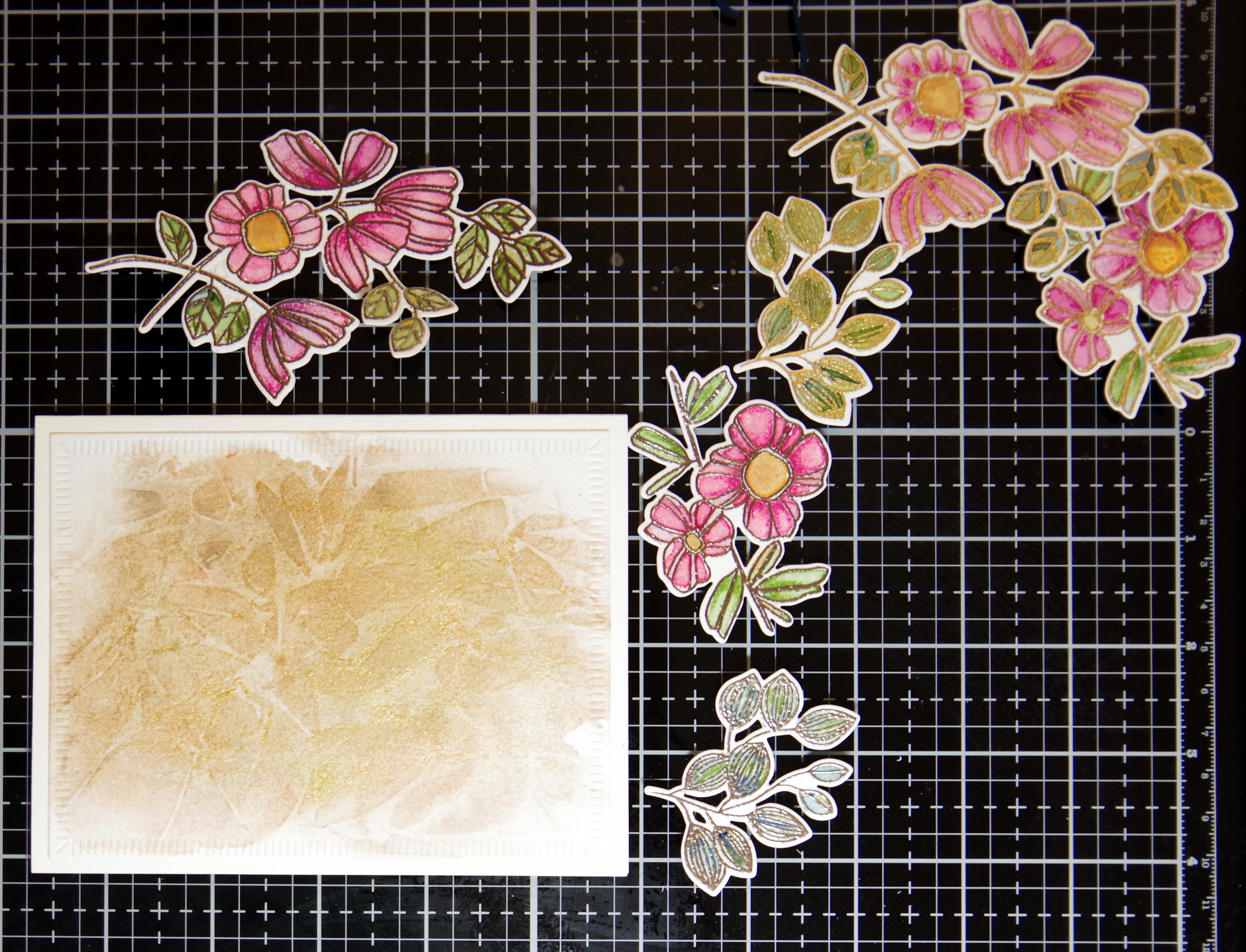
  • I put my Lotus stamp in my Misti and stamped the bloom and stem on grey paper. I left the stamps in there while I colored.
  • Stephanie taught us to start with our lightest color, then add shadows with  our darker colors and then blend with our medium tones.  The key is to add lots of layers of color.  
  • The lines blur a bit with the pencil coloring so I then put the paper back in the Misti and restamped which resulted in crisp lines.
  • I fussy cut the images and then went around the edges with a black pen.
  • I wanted an accent strip so cut a strip of this designer paper and then mounted it on a piece of the grey Strathmore.
  • I stamped my sentiment on another strip of grey Strathmore so that there was continuity across the card.
  • I made an A2 top folding card, assembled with liquid glue and added some clear drop embellishments.  
Pro Tips:
  • Strathmore Toned Grey paper works great with colored pencils.
  • Keep your stamps in the Misti so you can restamp after coloring. This makes a huge difference!

Supplies Used:
Altenew Inked Lotus stamp
Altenew Jet Black Crisp Ink
Strathmore Toned Grey paper (for flower, border and sentiment strip)
Faber Castell Polychromo colored pencils
Scrap of Designer Paper
Slate cardstock (for A2 card base)
Clear Waterdrop embellishments

I am also playing along with:
Inkspirational #217 Painting or Coloring  I chose coloring with colored pencils.

UPDATE:  I am so pleased that this card was chosen as a Rising Star by A Place to Start!

Thanks for stopping by!
Karen


Uncategorized

WWC280 – Kath\’s Challenge: Anything Goes with a Masculine Twist

Hello and welcome.   We are making \”masculine\” cards this week at The Watercooler Wednesday and this is my design team card.  I was in need of some masculine get well cards and came up with this idea.  
I started by stamp block inking, but I used a minimal amount of water to get this speckled look.  I made a similar background (same ink color but more water here).  I trimmed the panel down and then inked the edges with the same ink as the background to give the panel a bit more definition.  I added a sentiment and then stamped, Copic colored and die cut the plant and snail and attached with foam tape.  I like how the card turned out.
Supplies Used:
Altenew Garden Grow
Papertrey Get Well Soon Sentiemnt
acrylic block to stamp the background
Altenew Sand Dunes Crisp Die Ink for background and edges
Copic Markers
Neenah cardstock
Foam tape

I am playing along at:


Thanks for stopping by!
Karen
Uncategorized

Altenew Academy Level 2: Beyond Basic Backgrounds

I was so pleased to learn that I passed my Level 1 Final Exam Project so I am able to start on Level 2.  The first course I took in Level 2 is Beyond Basic Backgrounds.  My two favorite lessons were Perfect Spacing and Water Bleaching.  Lydia Evans had great projects and tips and I was inspired to create a pattern stamped background.  These rainboots are a favorite stamp and I thought they would make a cheery get well card. 


In Lesson 2, we learned how to use a grid to evenly space our images.

  • I made an \”X\” on my panel by using a clear ruler.  I lined up the top edge in the upper left corner and the bottom of the ruler in the bottom right corner and then I drew a light pencil line.  I repeated this from top right to bottom left.
  • I then stamped my boot in the center of the X so I could decide how to space the rest of the images.  
  • I chose to space my lines 7/8\” apart, so I used my ruler to draw lines parallel to my first \”X\” 7/8\” apart.
  • Once my grid was complete, I started freehand stamping with an acrylic block by placing a boot in the middle of each intersection.  
  • Once the ink was dry, I used a good eraser to erase my grid and then Copic colored in a variety of colors.
  • I finished by adding a black heat embossed sentiment strip and mounting on a fog A2 card base. 

After studying my card, I wondered if the spacing was too close so I decided to make a second card adding an additional 1/8\” so that my grid lines were 1\” apart.  I was surprised to see that 1/8\” really changed the layout of the card!  On the second card I added a die cut sentiment that fit in between the boots.

Here is a side by side of the 7/8\” and 1\” spacing.
I wanted to include this process photo also as it has the gridlines still intact.
Supplies used:
Altenew Garden Grow stamp set
Altenew Jet Black Crisp Die Ink
Tim Holtz Clear Ruler
Pencil
Arch Foam Eraser

I am so pleased you stopped by.  Let me know which spacing/card you like better.

Karen


Uncategorized

Altenew Academy Level 1 Final Project

I\’ve been working my way through Level 1 at The Altenew Academy and just completed my Final Project which was to create a set of \”feminine\” and \”masculine\” gifts sets.  I have to say I learned so much and had loads of ideas but I would like to show you the cards I created for my final project.  I incorporated lessons I learned in:
  •  Let It Shine where we discovered how to add just the right amount of sparkle and shine to a card.  I used metallic heat embossing and  metallic watercolors on my feminine cards.
  •   Easy Die Cutting where we learned to use die-cutting to up the \”Wow\” factor.  I used die-cuts on each of my cards as I think they add loads of impact and felt this unified both card sets.
  •  Easy Ink Blending – I used several ink blending techniques on my masculine card set. My two favorites were the soft blue background on the Healing Wishes card and the die-cut spotlight circles on the Get Well Soon card.  

For my \”feminine\” cards I wanted subtle metallic touches combined with watercoloring. I kept the set cohesive by using cream card stock/watercolor paper, floral images, a pink and green watercolor palette and navy die-cut sentiments.
For this first card, I created a metallic watercolor background which is so pretty in person.  I then stamped, heat embossed and watercolored the floral images.  After the flowers dried I added a pearlescent  white gold watercolor wash over the top which gave the flowers a beautiful sheen.  I die cut the images and attached with foam tape. The next photo shows the first three card in process.

Here are the cards that round out the gift set.  On each card I used big bold die-cut occasion sentiments cut from navy cardstock. 


I really like this feminine spray and think the navy die-cut sentiments are  beautiful and anchor the look of this set.

The painted Lotus die-cut is so pretty in person.

I did want to share this process photo as well.

The Feminine Set

For my \”masculine\” cards I chose to use an overall blue theme with ink blending techniques and Altenew\’s Garden Grow as the unifying elements.  For my first card, I ink blended a background and used peek-a-boo die cut  windows to spotlight my images.  During quarantine, I\’ve been sending so many encouragement cards that I wanted to include one in this set. 

I made a companion card using the die-cut circles from the card above.  I ink blended the spotlight circle, added die-cut images and anchored with a strip of masculine brown paper.

The next two cards have a soft ink blended background to draw the eye to the die cut.

I thought a birthday and recovery card would round out the gift set.

Here is an in-progress photo.  The die cut elements were attached to each card with foam tape.

PRO TIP:  I blended one background on Neenah (Birthday) and the second on Bristol (Healing Wishes) to see which provided a smoother look.  The Neenah panel (below left panel that is now the Birthday Card) is whiter but the Bristol (right panel that is now the Healing Wishes card) is far easier to blend on and resulted in a smoother background.  In the future, I will remember to blend my backgrounds on Bristol cardstock.

And here is the masculine set.


We were challenged to use a recycled element in each set.  For the feminine set I recycled a small Kraft gift bag and for the masculine set I re-used an elegant chocolate brown box.  I heat embossed some tags to top each set.  

Altenew Products Used:
Altenew Best Mom stamp and die bundle
Altenew Inked Lotus stamp and die bundle
Altenew Garden Grow stamp and die bundle
Altenew Mini Branch stamp
Altenew Jet Black Crisp Die Ink

I am so glad you stopped by.  I\’d love to hear what you think about these card sets.  Thanks!
Karen


Uncategorized

WWC278 – Michelle\’s Challenge: Anything Goes with a Feminine Twist

Do you ever have a leftover scrap that you just love?  That is how this card came to be….I made a pretty background  (link to card here) and had a bit left so that was the starting point for this creation.  I thought it was a pretty feminine card so I selected it to be my design team card for this week\’s Watercooler Wednesday \”Feminine\” Challenge.
I added a bold floral focal point, heat embossed a sentiment, created a layered look with foam tape and added a couple of embellishments from my scrapbooking days.  
Supplies Used:
Altenew Watercolor Stripes Stencil
Altenew Smile More stamp and die bundle
Spellbinder\’s Sentiment
Distress Inks (Salty Ocean, Mermaid Lagoon, Twisted Citron)
Zig Markers:  Emerald, Green Shadow, Pale Yellow, Yellow, Bright Yellow
Initial Embellishments

Make My Monday \”Use Stencils\” Challenge My background is watercoloring with distress ink over a stencil.

Festive Friday FF0062  I picked CAS design, birthday theme and floral theme.


I am so pleased that you stopped by!
Karen
Uncategorized

WWC277 – Tristan\’s Challenge: All About Occasions

Hello and Welcome!  This week we are making occasion cards at Watercooler Wednesday and Kath is our hostess.  I\’ve chosen to make a birthday card for my daughter.  Kristen has the most adorable Corgi name Newton, and he was the inspiration for this card.
Lawn Fawn Quilted Backdrop background die

 A while back I saw this Corgi stamp and purchased it right away. I wanted to put together a little birthday scene so I thought a birthday cake on a bench would be cute.  I stamped, Copic colored, fussy cut and die cut the elements.  The background is a pretty cover die.   The sentiment is new to me, but I am really happy with it. I added some Tonic Nuvo glaze to the frosting and candles and I really like the shine it added.

I wanted to make the card extra special, so I put a second \”pop-up\” Corgi inside.

Supplies:
Stamps of Life: Corgis2Stamp stamp
WPlus9 \”New Home\” bench stamp and die
Jane\’s Doodles \”Party Time\” cake stamp
MFT \”Lucky Dog\” stamp and die (pop-up Corgi)
Lawn Fawn Quilted Backdrop die
Sentiment:  Jillibean Soup (heat embossed and die cut)
Tonic Nuvo Glaze
Black Gel Pen for accents
Neenah Paper
Copic Markers

Allsorts \”Pet Challenge\” This birthday card is for my daughter who has a Corgi named Newton.

Cut it Up \”Perfect Pet\” Challenge  Newton the Corgi is the friendliest pet you are sure to meet and he is die-cut twice (front and pop-up inside).
Happy Little Stampers Die Cutting Challenge Lots of die-cutting on this card:  background, sentiments, images and pop-up Corgi.

Try it on Tuesday – Create a Scene a fun little birthday scene.

UPDATE:I was so pleased to discover this card was selected as a \”top cut\”!


I am happy with the card and am looking forward to putting it in the mail to Kristen.  

I am so pleased that you stopped by!
Karen


Uncategorized

WWC276 – Marsha\’s Challenge: Anything Goes with a Masculine Twist

Hello and welcome.  Today we are making masculine cards at The Watercooler Wednesday Challenge and Marsha is our hostess.  I like the look of grunge/mixed media cards but I\’ve never made one myself.  I decided to give it a try with this dragonfly.
My Process:
  • I started by inking my glass media mat with various shades distress ink.  I sprayed with water and then laid a sheet of watercolor paper on the ink/water.  I dried with a heat tool and repeated this process a couple of times.
  • After the panel was dry I stenciled and stamped random elements on the panel
  • I then heat embossed the dragonfly and sentiment.
Supply List:
Visible Images \”Live In the Moment\” dragonfly stamp
Visible Images circle stamps
SSS Sketchy Lines background stamp
Tim Holtz Brick Layering Stencil
Ancient rubber stamp numbers
Stamps of Life sentiment
Nuvo Hot Chocolate Embossing Powder
Various colors of Distress Ink
Watercolor paper

I am playing along with:


This is a fun technique that I want to do again in the future.

I am so pleased that you stopped by!
Karen
Uncategorized

Altenew Academy: Easy Die Cutting

Hello and Welcome!  I just finished the Altenew Academy class titled Easy Die Cutting.  Yana Smakula was the instructor and she shared six wonderful lessons.   I chose to write this blog post about lesson #5:  Inlaid Die Cutting, which I found very inspirational.  I just purchased this large beautiful scripty thank you die (Altenew\’s Simply Thank You) and thought it would work great with the inlaid die cutting technique.  I learned to save all the pieces from both panels so you can can create two cards from the positive and negative die cutting.  Don\’t you just love two-for-one projects!  🙂

My Process:
I started by ink blending a bright colorful gradient on Bristol cardstock.  I didn\’t want it to smear so I let it dry overnight.  The next day I die cut the \”thank you\” from the inked panel.  I also die cut the same sentiment  from a white panel.  Then I just swapped the sentiments and glued the white die-cut into the opening on the inked panel and glued the inked sentiment onto the white panel.  I was careful to save all the die cut pieces so I could piece everything back together.  Voila…two cards!  Yana also loves embellishments so I felt encouraged to add buttercream jewels to the white background.  
These cheerful cards will come in so handy on my next thank you notes.
I am so pleased that you stopped by!
Karen
Uncategorized

WWC275 – Karen\’s Challenge: All About Occasions

Hello!  I am so pleased you stopped by.  Today we are showcasing \”Occasion\” cards at The Watercooler Wednesday Challenge and I am this week\’s hostess.

Offset Ink blended background:  squeezed lemonade, mustard seed, twisted citron, cracked pistachio, salty ocean and blueprint sketch
I recently won several stamps from Crackerbox and Suzy and this is my first card with my new haul.  I think the tree is just gorgeous.  I have been doing a lot of ink blending lately and knew this tree would be perfect for this technique.  I started by masking off a 1 1/2\” border on the left of the card and then started ink blending from the bottom right to the top left.  I was very heavy handed and put down a lot of ink.  I added a navy mat as I didn\’t want the clean white swath to fade into the card base.
Supplies Used:
Crackerbox and Suzy Tree Whimsey stamp
The Greetery Crimped Frame die
Distress Inks:  Squeezed Lemonade, Mustard Seed, Twisted Citron, Cracked Pistachio, Salty Ocean, Blueprint Sketch
Neenah cardstock
Navy Mat
Versafine Onyx Black Pigment Ink
Clear Embossing Powder
SSS Birthday Mix 1 sentiment stamp and die
Masking tape

NBUS Challenge – This is my first time to use Crackerbox and Suzy\’s beautiful Tree Whimsy stamp.

I am so pleased that you stopped by!
Karen