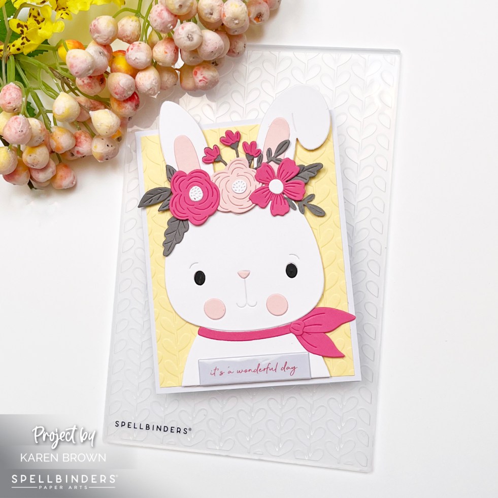
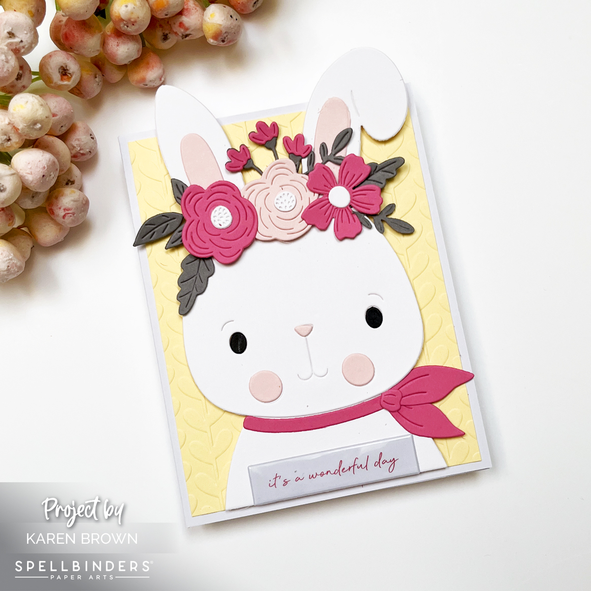
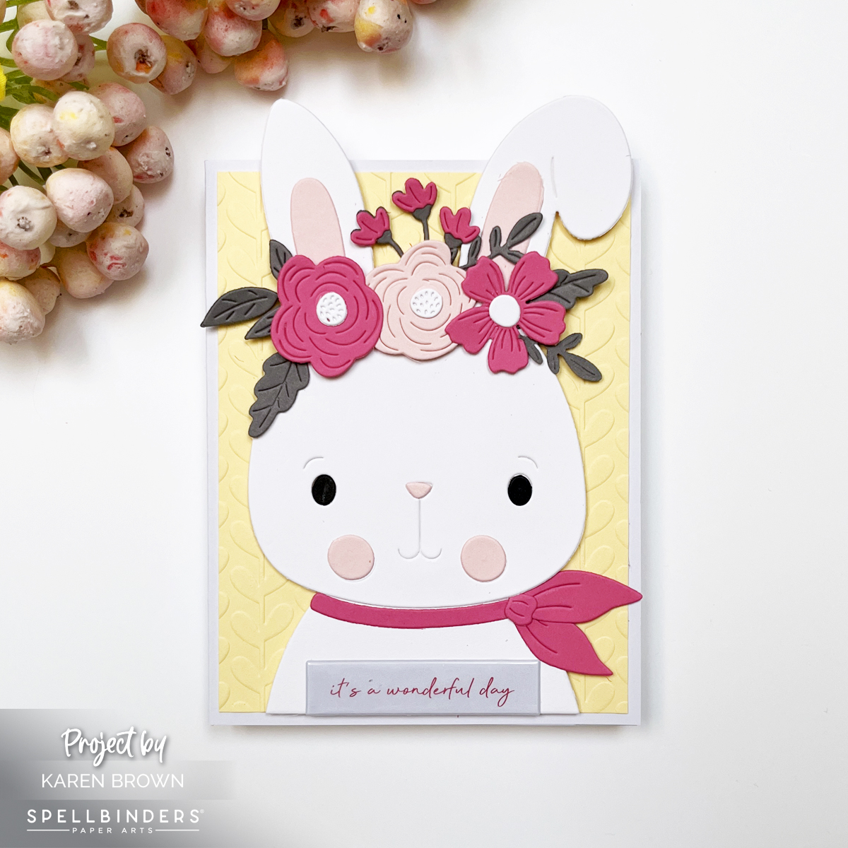
Mixed Media · papercrafting · Tutorial

How to Make Mixed Media Tags in 9 Easy Steps | Tutorial

Two handmade mixed media tags featuring Hero Arts Partners in Brine stamps, watercolor gradients in blue, yellow, and pink, layered stamping, ink splatters, and foiled fish accents.

Creating stunning, multi-layered mixed media tags is easier than you think—here is an easy to follow 9-step tutorial.

The techniques I’m sharing today can be used with almost any stamp set or focal elements you already have.

If mixed media feels a little intimidating—don’t worry. This project is about building layers slowly, having fun with color, and letting the process guide you. Let’s walk through it step by step!

👉 I’ll link to the exact supplies at the bottom of this post.

Aquatic theme mixed media tag using Hero Arts Partners in Brine Stamp set and Glad We Are Tight BetterPress letterpress fish plates.

Step 1: Create a Watercolor Gradient Background

When I saw the Hero Arts Partners in Brine Stamp Set, I immediately pictured a colorful, summery mixed media background filled with texture, stamping, and playful details.

I began by taping a 6″ x 6″ panel of watercolor paper to a hardboard using washi tape. On my craft mat, I dabbed Hero Arts Reactive Ink, spritzed it with water, and used a brush to watercolor a smooth gradient.

I blended the colors so they flowed from blue into green, yellow, orange, and finally pink. Since this stamp set has an aquatic theme (which always feels like summer to me), I wanted bright, happy, sun-washed color.

Dry your panel naturally or speed things up with a heat gun. If your paper warps, simply flatten it later with a book.

Close-up of mixed media tag featuring layered stamping, script texture, inked edges, and a foiled fish accent on a colorful watercolor background.

Step 2: Stamp in Coordinating Colors

Once dry, I stamped images from the CM834 Partners in Brine stamp set using the same inks:

I especially loved the Packed with Love, waves, anchor, fish, and “packed in brine” images. Stamping in matching colors keeps the look layered but cohesive.

Step 3: Add Second-Generation Stamping

To deepen the texture, I used Black and Root Beer Reactive Ink and stamped a few images using second-generation stamping (inking the stamp, stamping once on scrap paper, then stamping again on the background).

Second Generation Stamping adds subtle depth without overpowering the colors.

Step 4: Add Ink Splatters

Next came one of my favorite steps—ink splatters! Using a fan brush, I flicked Splash, Lemon Drop, and Taffy onto the panel.

Ink Splatters add movement, texture, and that perfectly imperfect mixed media charm.

Watercolor background Mixed Media tag with script stenciling, second generation stamping and die cut fish.

Step 5: Die Cut the Tags

Before cutting, I used my Hero Arts Tag Infinity Die as a viewfinder to decide which parts of the background I wanted to showcase. Once I had the section I wanted to use, I taped my tag die to the watercolor panel and ran it through my Platinum 6 die cutting matchine.

I die cut two tags (4½” x 2⅜”), making sure one included the “Packed with Love” area as a focal point.

Step 6: Ink the Edges

To give the tags a vintage, worn look, I ink blended Root Beer Reactive Ink around all the edges. This step instantly adds depth and contrast,

👉 Root Beer Reactive Ink is my go-to shade for “grunging up” a project.

Mixed Media Tag tutorial showing how to create a tag in 9 easy steps.

Step 7: Add Script for Extra Texture

After studying my tags, I felt they needed a bit of visual “writing,” so I added:

  • CG830 Script Bold Print stamped in Granite Ink on the top right of one tag
  • SA225 Script Stencil (sadly sold out) stenciled in Granite on the top left of the Packed with Love tag
  • But, you can use any stamp or stencil with words that you have. Look through your supplies and see what calls to you.

Subtle script details enhance the mixed media feel without distracting from the main design.

Using distressed Glimmer Hot Foil elements on mixed media tags and cards.

Step 8: Add Foiled Die Cut Focal Points

For something completely new (and honestly, adorable), I added Glimmer hot foiled accents—something I’d never tried on a mixed media project before!

I foiled the two sweet fish from HP131 Glad We Are Tight using white and metallic blue foil with my Spellbinders Glimmer System. I then:

The mix of soft watercolor, stamping, and shiny foil adds beautiful contrast.

Step 9: Finish with Twine or Ribbon

To complete the tags, I simply added twine through the top. This final touch makes them perfect for gift wrapping, journaling, mini albums—or even framing as tiny art pieces.


two mixed media tags with a summery fish/aquatic theme.

You might also be interested in my other blog post where I create with the Packed With Love Collection: Tips and Tricks for Making Two Playful Die Cut Card Designs.

Products Used:

Final Thoughts

Mixed media doesn’t have to be complicated. By working in layers, repeating colors, and letting each step build naturally, you can create beautiful, dimensional projects that feel artistic without being overwhelming.

If you enjoyed this tutorial, I’ll link a couple of my other mixed media posts below for more inspiration. And remember—these techniques work with any stamps, any colors, and any theme. The process is what makes it magic.

Happy crafting!

Die cutting · papercrafting

How to Design a Stunning Handmade Card | Process and Inspiration

Handmade floral card featuring purple Regal Blooms flowers in a vase in front of a nine-pane window, with a glimmer hot foil “hello” sentiment and a soft lavender background

Creating a beautiful handmade card doesn’t require a studio full of supplies, but rather a simple, creative process that turns paper into a work of art.

👉 I wanted to walk you through my inspiration and thought process.

This card features (Spellbinders Regal Blooms die set (S4-1465) and a vase of elegant purple blooms basking in sunlight in front of a nine-pane window, that feels equally perfect for Mother’s Day, birthdays, or a thoughtful get-well card.

Design Inspiration: A Sunlit Floral Scene

Card background created with the Hero Arts Elegant Window Fancy Die layered over a Fairy Tale lavender cardstock panel for a soft, sunlit effect that showcases the die cut flower vase.

For this card, I wanted to create a moment—almost like looking through a window on a quiet afternoon and catching sight of a bouquet glowing in the light. The Regal Blooms dies make that easy. The flowers are graceful, detailed, and feminine, with just the right amount of structure to feel refined without being fussy.

👉 I chose a purple color palette for a soft, girly, and classic look. Using Spellbinders ColorWheel cardstock in Lavender, Lilac, and Fairy Tale, along with a few coordinating purple scraps, allowed me to build beautiful tonal variation throughout the card.

👉 Mixing multiple shades of the same color family adds richness and depth while keeping the overall design calm and cohesive.

👉 To finish the card, I added a glimmer hot foil sentiment—a scripty “hello”—for a touch of elegance and shine.

Thoughts on Creating the Window Backdrop

Die cut floral card process photo showing two die cut window options for the background.

As I mentioned above, I wanted my flower vase to be sitting in front of a sunny window.

👉 I love that a window instantly adds structure, light, and architectural interest to a card. I had two window dies in mind, but couldn’t decide which one to use:

👉 I am a visual person, so I die cut both and chose to go with Hero Arts Elegant Window.

👉 Behind the window panes, I layered a soft panel of Fairy Tale ColorWheel cardstock. This pale lavender shade helps the purple flowers stand out while reinforcing the gentle, airy mood of the scene. The window gives the card the feeling of an interior moment—flowers sitting quietly in the sunlight.

Handmade floral card using the Spellbinders Regal Blooms die set (S4-1465), featuring elegant purple flowers in a vase set against a sunlit window backdrop.

Adding Dimension: Two-Tone Vase Technique

One of my favorite details on this card is the vase. I wanted it to have subtle dimension without overwhelming the florals.

👉 To achieve this:

  • I pierced the vase die cut using a pokey tool.
  • Then I placed a darker purple shadow layer behind the pierced openings.
Process photo showing a pierced die-cut vase that will be used on a floral homemade card.

This simple technique creates a two-tone effect that adds depth and interest while keeping the design clean and elegant. I’ve included a process photo above so you can see exactly how this detail comes together.

Why I Love the Regal Blooms Die Set

The Spellbinders Regal Blooms (S4-1465) die set is incredibly versatile. With just a change in color palette or background style, this design could shift from:

  • Soft and romantic (perfect for Mother’s Day),
  • to fresh and cheerful (great for birthdays),
  • to gentle and comforting (ideal for a get-well card).

This card may be purple and feminine, but the structure of the design makes it easy to adapt for many styles and recipients.


Final Thoughts

This floral window card feels cheerful, classic, and heartfelt—the kind of design that never goes out of style. Between the layered purples, the glowing window backdrop, and the elegant foiled sentiment, it’s a project that looks intricate while still being approachable.

Whether you’re creating for a sister, a friend, or someone who simply loves flowers, the Regal Blooms die set is one you’ll reach for again and again.

Cardmaking Kit · Die cutting · papercrafting

Bold Color Block Brunch Theme Card | Spellbinders November Kit

Handmade brunch-themed card with bold color-block rectangles in pink, green, lilac, and blue, featuring die-cut egg, bacon, champagne glass, and waffle with stick arms and legs, plus a 'Thanks a Brunch' sentiment.

Let’s Do Brunch! | Spellbinders November 2025 Small Die of the Month

If you love playful cardmaking and adorable food-themed dies, this month’s Spellbinders Die of the Month — Let’s Do Brunch — is going to spark so much joy! This clever die set is packed with cheeky breakfast and brunch icons, complete with arms, legs, and serious personality. Think cute eggs, dancing bacon, bubbly champagne… all ready to brunch and boogie.

And the sentiment?
“Thanks a Brunch.”

Brunch food theme die cut card created with Spellbinders November 2025 Die of the Month Kit.

My Bold + Graphic Brunch Card

For today’s project, I leaned into a bold, graphic color-block look to really spotlight each quirky character. I trimmed and pieced together four vibrant cardstock quadrants to create a modern grid background. The clean, high-contrast shapes make the little food friends shine!

Card Details

  • Theme: Foodie / Brunch / Thank You
  • Style: Modern color-block + cute character die cuts
  • Colors:
  • Characters:
    ✅ Smiling sunny-side-up egg
    ✅ Dancing bacon strip
    ✅ Cheerful champagne glass (cut from vellum for fun transparency!)
    ✅ Sweet little waffle

Each food item gets tiny stick arms and legs — a charming little detail that gives them so much life.

📐 Measurements

To create the crisp color-blocked effect:

  • Cut four rectangles: 2 1/8″ x 2 ¾” each
  • Tape all four from the back
  • Adhere the full panel to an A2 card base to stabilize

Simple steps, big visual impact!

Close-up of smiling die-cut breakfast characters on a modern graphic card with vellum champagne glass and bright pastel cardstock blocks

Design Tips

  • Vellum = perfect for glasses, bottles, and any glass objects
  • Foam Squares behind your food characters adds dimension and personality
  • Mixing playful images with clean graphic lines = fresh modern design

Don’t Miss This Kit!

If you’ve been looking for a unique, fun die set that works for birthdays, thank-yous, brunch invites, foodie friends, or just-because cards — this one’s a winner.

Be sure to check out my post for the November Stitching Die of the Month too — my favorite stitching kit of the year!

Thanks a brunch for stopping by today — and tell me, which cute brunch buddy is your favorite?

Helpful Links:

Cardmaking Kit · Give Away · papercrafting

One More Chapter! Hero Arts November 2025 Release + Blog Hop


Book theme cards created with the November 2025 Hero Arts Hero Studio Card Kits.

Hello, Karen Brown here — and I am curling up with a good card kit! The November Hero Studio Release is a dream come true for book lovers. This month’s theme, “One More Chapter,” celebrates cozy reading nooks, favorite stories, and the joy of escaping into a good book.

Even better, there’s a Hero Arts Blog Hop to celebrate — and prizes! So grab a cup of tea (or coffee), and come along for some page-turning inspiration.

Die-cut handmade scene card featuring a girl reading a book framed with a postage stamp border and scripty hello sentiment

📖 Card 1: My Happy Place

For my first project, I used the “Happy Place” die set from the November Card Kit of the Month to create a cozy die-cut scene.

Picture this: a girl tucked in with her favorite book, surrounded by soft periwinkle blue and warm orange tones. The card has a charming, feminine feel — like a Saturday morning spent lost in a good story.

I framed the scene with the Nesting Postage Stamp Dies to give it that “happy mail” vibe and added a sweet scripty Hello from the Fancy Die Book Bag set.

This one’s heading to a book club friend who, like me, can never resist reading just one more chapter!

Handmade book theme scene card created with Hero Arts November 2025 Card Kit.  Colors are periwinkle blue, orange and brown.

What’s Included in the Kit?


                       • To Be Read Pile 4×6 Clear Stamp Set and Coordinating Dies
                       • Happy Place Die Set
                       • Professional Bookworm 3×4 Stamp & Cut
                       • Gold Hero Wax, 1 oz.
                       • 10 Sheets of Cardstock- 1 of each color, 5.5″ x 8.5″

>>> Receive a FREE Do Not Disturb Stamp and Cut  when you purchase The Whole Studio!

Hero Arts has many different Monthly Kits that you can subscribe to including:

Card 2: Escaping Reality One Page at a Time

Bold die cut  and stamped typographic card spelling “JOY” with the O as a stamped oval reading “Escaping Reality One Page at a Time,” layered over a blue checkerboard background.

Next, I pulled out the Stamp & Cut of the Month: One Page at a Time. I love this set — it’s perfect for pairing bold typography with clever bookish sentiments.

I stamped the oval sentiment “Escaping Reality One Page at a Time” and used it as the O in my big JOY design. Then I die cut a bold J and Y from the Letter Fancy Die sets (J–N and W–Z) in bright orange, adding white shadows behind them to tie in the stamped oval.

The letters are large, 2 1/2″, creating a bold and dynamic visual card.

Stamped and die cut reading theme card created with Hero Arts November 2025 Stamp and Cut Kit called "One Page at a Time".

For the background, I created a tone-on-tone checkerboard using the November Cling of the Month — stamped Cornflower ink on Periwinkle cardstock for a crisp, graphic finish.

The result? A bold, cheerful, and clever card that feels fresh and literary — perfect for your favorite reader.

JOY  sentiment card created using Hero Arts large alphabet Letter Fancy Dies with blue and orange color palette.

GIVEAWAY 

Hero Arts will give away a $50 gift card, drawn from the comments left across the hop. Enter by Wednesday, November 5th at 11:59pm PT, and the winner will be announced on the Hero Arts blog the following week. Leave a comment on all stops for more chances to win!
  

BLOG HOP ORDER


Hero Arts
Anna Mahtani
Channin Pelletier
Charlene Madrid
Jeannie Lieu
Jennifer Kotas
Karen Brown <<<< You Are Here!
Lisa Tilson
Michelle Lupton
Michelle Short
Mindy Eggen
Natasha Polite
Rachel Kleinman
Rosie Lopez
Seeka
Nichol Spohr

💡 Final Thoughts

I adore how all the November Hero Studio kits coordinate beautifully — from cozy die-cut scenes to playful sentiments and graphic backgrounds. Whether you love to stamp, die cut, or mix both, this release has something for every creative reader at heart.

And if you’re tempted by all the coordinating goodness, consider the Whole Studio Bundle — it’s a $240 value for just $130. That’s a deal worth bookmarking!

You might also want to take a peek at Past Club Kits that are still available.

cardmaking · Die cutting · papercrafting

Spellbinders | Classic Cool: Masculine Birthday Card with a Retro Speedometer

Buckle up, cardmakers—because today we’re putting the pedal to the cardstock with a sleek and fun masculine birthday card featuring the Speedometer from the Classic Road Legends collection by the incredibly talented Mindy Eggen! This is Mindy’s debut collection with Spellbinders, and it’s already racing to the top of my favorites list.

The star of the card? A bold, retro-inspired die cut speedometer with some of the coolest sentiments I’ve seen in a while.

Die cut birthday card featuring a retro-style speedometer in aqua, teal, and silver cardstock with a coral needle. Background is white cardstock embossed with a script design. Sentiment reads “Cruisin' by to say Happy Birthday"

🛠️ Building this Masculine Birthday Card

I wanted to create something unique and masculine with a fresh, modern color palette—so I went with monochromatic aquas and teals, using Adriatic, Paradise, and Arctic cardstocks from Hero Arts. To give the speedometer some shine and dimension, I added silver cardstock accents, and then for a bit of unexpected flair, I die cut the needle in coral cardstock—it’s just the right pop of contrast!

This die set includes tons of clever sentiments like:

  • “Have a Classic Day”
  • “Another Year in the Fast Lane”
  • “Enjoy Your New Adventure”
  • I chose “Cruisin’ by to say Happy Birthday” for this card

Perfect for Father’s Day, birthday cards, or anyone who appreciates a good throwback moment.

Once I finished assembling the speedometer, I mounted it onto a clean white background embossed with the Spellbinders Scribbled Letters Embossing Folder. The subtle texture adds just enough interest without taking the spotlight off the die cuts.

This card is headed straight to my brother for his birthday—he’s a car guy, and I think he’s going to love it!

Masculine die card retro Speedometer card with scribbled embossed background.  Cardstock colors of teals, aquas, white and silver

💬 Why I Love It

Masculine cards can be a bit of a creative challenge, but this design was a total joy to put together. The bold shapes, retro vibes, and clever details made this one of my favorite guy cards I’ve ever made!

papercrafting · Rainbow Colors

Exploring Spellbinders’ 48 Colors – A Swatching Adventure!

Swatching Spellbinders 48 colors of cardstock was relaxing and stimulated my creativity.

Oh my goodness, I just got my new Spellbinders Color Wheel Cardstock, and I am having so much fun! If you’ve ever wanted to truly get to know your cardstock colors, swatching is the way to go. Not only is it an incredibly helpful reference for future projects, but I also found the process to be calming, relaxing, and—bonus!—it sparked my creativity in ways I didn’t expect.

Products Used:

48 hues of Spellbinders cardstock awatched and organize on a ring in rainbow order.  Also shown: 
 a card created using my new inspirational cardstock swatches.

Swatching Setup: Let the Color Journey Begin!

I ordered the 48-pack sampler to start, and I used the Spellbinders Color Swatch Petal Dies along with color name stamps to create my swatches. I decided to organize them in rainbow order, making it easy to compare shades and find the perfect hues for my future projects. There’s something so satisfying about seeing all the colors lined up in perfect harmony!

For organization, I put my swatched colors on a ring, which makes flipping through them a breeze. I also documented my process in a reel showing my die-cutting, stamping, and assembly. If you’re on the fence about swatching, trust me—it’s worth it!

New Friends & Old Favorites

There are some shades I already know and love, but this swatching process introduced me to some stunning new favorites. I’m still deciding whether to order the 5-pack of each shade or just stock up on my must-haves. Either way, I now have a better sense of which colors I’ll be reaching for the most!

A Fun Card Example

Vintage mixed media handmade card with a lovely die cut hat box luggage piece.  Travel theme, hello card with floral accents.

To put my swatches to use, I created a card using my newly organized colors. You might recognize this one—it’s the Hero Arts Suitcase & Florals Card that I recently shared in another blog post. Seeing the colors in action really drives home how valuable swatching is!

Click HERE to read my blog post about creating this Vintage Suitcase & Florals Card. 
Process photo showing how I created my Spellbinders Color Wheel Cardstock swatches with my Platinum 6 die cutting machine.

Final Thoughts

Swatching might seem like a simple task, but it’s an absolute game-changer for crafting. Not only does it help you choose colors with confidence, but it also makes designing so much easier. Have you ever done a cardstock swatch? If not, I highly recommend it! Let me know in the comments which Spellbinders colors are your favorites!

Happy crafting! 🎨✨

Cardmaking Kit · papercrafting

Spellbinders April Club Kit Release – Snail Mail, Vintage Letterboxes & Stitched Stationery!

Spellbinders April 2025 Club Kit handmade cards that are watercolored and hand stitched.

Spellbinders’ latest Club Kit Release is here, and this month’s dies are packed with charm, nostalgia, and creativity! I created three unique handmade cards using the Large Die of the Month, Small Die of the Month, and Stitching Club of the Month. Each design brings something different to the crafting table—from vintage-inspired letterboxes to whimsical mail carriers and stitched stationery.

Let’s get started!

Card 1: A Vintage Farmhouse Letterbox

Vintage farmhouse letterbox card – A handmade card featuring a minty vintage-style letterbox with a die-cut letter, pink flowers, and a gold key, mounted on ribbed white paper that resembles house siding.

First up, the Large Die of the Month – a stunning vintage-style letterbox that feels straight out of a charming countryside home.

  • I custom-mixed my colors using Hero Arts Reactive Inks, blending 50% Fog and 50% Pool Party for the perfect minty vintage hue on the letterbox. Other Reactive Inks Used: Taffy, Fruit Punch, Green Apple, Blue Raspberry and. Grape Slush. The key, sentiment frame and keyhole were painted with Gold Metallic Watercolor.
  • Inside the mail slot, a sweet die-cut letter with a heart and a cluster of pink flowers peeks out, adding a touch of romance.
  • A gold letterbox key is placed on the box for extra detail.
  • I mounted everything on Stellar White Groove ribbed paper (from a Your Paper Insider subscription box) to mimic the look of house siding.

I’m a bit of a paper hoarder, so this specialty paper subscription is right up my alley! 😄

Spellbinders April 2025 Large Die of the Month vintage farmhouse letterbox Hello card.

Card 2: You’ve Got (Snail) Mail!

Snail mail delivery scene – A die-cut snail with a mail pouch and hat, holding a tiny letter with a heart seal, alongside a pink worm, tulips, and a mailbox. Sentiment reads "sending" + an enamel heart.

For the Small Die of the Month, I couldn’t resist creating a playful “snail mail” scene! This one was so much fun to put together.

  • The star is a cute little snail, delivering happy mail in style. She holds a tiny envelope with a heart seal and wears a mail pouch and hat as she crawls along.
  • I started by doing my die-cutting and then I watercolored each die cut for my happy cozy scene. I watercolored with Reactive Inks : Creamsicle, Fruit Punch, Taffy, Green Apple, Blue Raspberry, Pool Party, Blue Hawaii, Splash, Granite and Fawn.
  • She’s accompanied by a pink worm and surrounded by red and orange tulips and a mailbox—a cozy little world in miniature.
  • The sentiment is a scripty “sending” + an enamel heart.
  • I finished the card with diluted white acrylic paint splatters, adding a touch of whimsy.

The theme? A punny “You’ve Got (Snail) Mail”—a crafty nod to the classic rom-com! 💌 🐌

Spellbinders April 2025 Small Die of the Month "Snail Mail" scene card that is die cut and then watercolored with Reactive Inks and splattered with white paint.

Card 3: Stitched Notebook Paper & Die-Cut Page Tabs

Snail mail delivery scene – A die-cut snail with a mail pouch and hat, holding a tiny letter with a heart seal, alongside a pink worm, tulips, and a mailbox. Sentiment reads "sending" + an enamel heart.

For my final card, I used the Stitching Club of the Month to create a notebook-inspired stitched background—a must for any stationery lover!

  • The stitched blue horizontal lines and pink vertical margin line replicate lined notebook paper.
  • I have a Stitching Tutorial that you might find helpful.
  • The top edge is die-cut to look like it was torn from a wirebound notebook for extra realism.
  • The sentiments are die-cut page pointers die cut from ColorWheel Cardstock, reading:
    • Hello (pink)
    • Friend (blue)
    • A Note (lime)
    • For You (teal)
  • To add movement, I included a pink and teal kite, die-cut from last summer’s Fly Away Kite Kit.
  • I stitched with two pieces of floss for extra texture and die-cut the background twice (and glued together) for a sturdy base. I used DMC #162 (light blue) and #776 (pink) floss.

This design is a fun way to send a cheerful, handwritten-style note in card form!

Spellbinders April 2025 Stitched Die of the Month Kit Card featuring a background that looks like notebook paper with die cut page pointer sentiments and a die cut kite.

Helpful Links:

Final Thoughts

This month’s Spellbinders Club Kits are filled with endless creative possibilities—from elegant vintage letterboxes to playful snail mail and nostalgic stitched stationery.

Which card is your favorite this month? Let me know in the comments! 💌 ✂️

cardmaking · papercrafting

Fast, Fun & Fabulous: Cardmaking with Printed Paper & Stickers

Some days, you want to craft without fuss—no fussy cutting, no intricate techniques, just pure creative fun. That’s where printed paper and stickers come in! These supplies make it easy to create layered, dimensional cards that look anything but basic. Bonus: they’re beginner-friendly and perfect for a cardmaking party!

>>>You may also be interest in my Flower Shoppe Cart Card from the same collection.

I have links to the products used at the end of this post. Each of my cards features 3-5 layers, creating rich dimension in no time. Let’s take a look!

Card 1: Lavender Rain Boots in Bloom

This sweet card features a pair of lavender chipboard rain boots, filled with flowers. The background is a vintage-look mint printed paper, layered over a lavender and white polka dot card base.

Details that make this card shine:

Card 2: Framed Florals & Soft Details

For this design, I used a chipboard galvanized bucket filled with soft pink, coral, and muted red flowers. The postage frame die cut background adds a touch of vintage charm.

🖌 Layers & Textures:

  • The background is a vintage lined school paper
  • The card base is chiffon and brown plaid printed paper
  • The layered elements make it feel warm and rustic

Card 3: A Galvanized Bucket of Blooms

This card carries over the chiffon paper and lined school paper from Card #2, tying the collection together. The chipboard enameled pitcher works well for a Get Well Card.

💖 Finishing Touches:

  • Chipboard butterflies and hearts for a sweet, dimensional effect
  • A vintage look frame that enhances the soft, romantic feel

Printed cardstock gives you instant color, pattern, and texture, while chipboard stickers add depth and detail without extra effort. These elements are substantial and high quality, making them perfect for layering without feeling flimsy.

The Magic of Printed Paper & Stickers: Products Used in This Post

Why You’ll Love These Supplies

  • Fast & Easy: No stamping or coloring required—just layer and stick!
  • Beginner-Friendly: Perfect for all skill levels.
  • Great for Scrapbooking Too! These elements work beautifully in memory keeping.

Which card is your favorite? Let me know in the comments! And if you’ve tried crafting with stickers and printed paper, I’d love to hear your tips.

Happy crafting! ✂️✨

Die cutting · papercrafting · Video

VIDEO HOP | Bold Floral Die Cutting | Hero Arts

Bold colors, layered florals, and die-cutting magic—this card has it all! In this post, I’m sharing how I used the Hero Arts Small and Large Floral Layering Fancy Dies to create a vibrant, dimensional floral card with a striking meadow green background.

Welcome to a burst of bold color and creative inspiration! In my latest video, Bold Floral Die Cutting, I’m excited to share how I created a vibrant, layered floral card that’s both eye-catching and easy to make. This post is part of a fun Video Hop, so be sure to check out the other amazing creators linked below.

You can watch the video below or HERE on my YouTube Channel.

The Supplies That Make It All Happen

For this project, I used the Hero Arts Small and Large Floral Layering Fancy Dies from their new Friendship Blossoms Collection. These dies are incredibly versatile, offering a mix of intricate floral designs that layer beautifully to create dimension and texture. The combination of the small and large dies allowed me to build a dynamic floral arrangement that feels lush and full of life.

Crafting the Bold Floral Card

"Bold floral handmade card featuring die-cut coral, soft pink, navy, and white flowers layered on a rich meadow green background, with a 'Have a Lovely Day' sentiment

In the video, I start by selecting my color palette, focusing on bold, contrasting shades that complement the meadow green background. Then, it’s on to die cutting—lots of it! I show how to layer the floral die cuts to add depth and interest, arranging them into a cohesive design. Finally, I assemble the card, finishing with the sentiment “Have a Lovely Day” for a cheerful touch.

Handmade Floral card with Bold Layered Die-Cut flowers on a striking green background using Hero Arts Small and Large Floral Layering Fancy Dies

Join the Video Hop!

This video is part of a fun video hop featuring talented creators sharing their unique takes on cardmaking. I’d love for you to:

Handmade Die Cut floral card in Meadow Green, Coral, Papaya Orange, Peony Pink, Nautical Blue and Dove White Cardstock.

Thank you for stopping by, and I hope you feel inspired to create your own bold floral cards!

cardmaking · Die cutting · papercrafting

Vintage Flower Shoppe Cart | Spellbinders

Handmade square card featuring a die-cut retro French inspired flower cart with a 'Fresh Flowers' sign, filled with coral, pink, blue and white blooms. Baskets of flowers surround the cart, and black enamel dots add detail to the wheels.

Today, I’m sharing a square card featuring the Flower Cart die set from Spellbinders’ Vintage Flower Shoppe collection. With a retro French inspired flower cart, coral, pink, blue and white blooms, and ink-blended details, this project is bursting with charm!

Key Products Used on This Card:

Bringing the Flower Cart to Life

Handmade square card featuring a die-cut retro French inspired flower cart with a 'Fresh Flowers' sign, filled with coral, pink, blue and white blooms. Baskets of flowers surround the cart, and black enamel dots add detail to the wheels.  Dies are from Spellbinders Vintage Flower Shoppe Collection and the Flower Cart Die Set.  S6-253

I fell in love with the Flower Cart die set the moment I saw it—there are so many creative possibilities! For this design, I started by die-cutting all the elements and then ink blending them to add depth and dimension. The soft shading makes the hand cart and baskets of coral, pink, blue and white blooms pop beautifully!

To give the cart a little extra personality, I added black enamel dots as the wheel nuts—a tiny detail that makes a big difference. And of course, the “Fresh Flowers” sign ties everything together with a market-fresh feel.

My completed card is 5 1/2″ x 5 1/2″ and the Teal Topaz background mat is 5 1/4″ x 5 1/4″.

Charming handmade die card featuring a darling flower card surrounded by baskets of colorful flower blooms + a Fresh Flowers sign.

Try It Yourself!

The Vintage Flower Shoppe collection has so many ways to mix and match floral elements. What colors would you use for your dream flower cart?