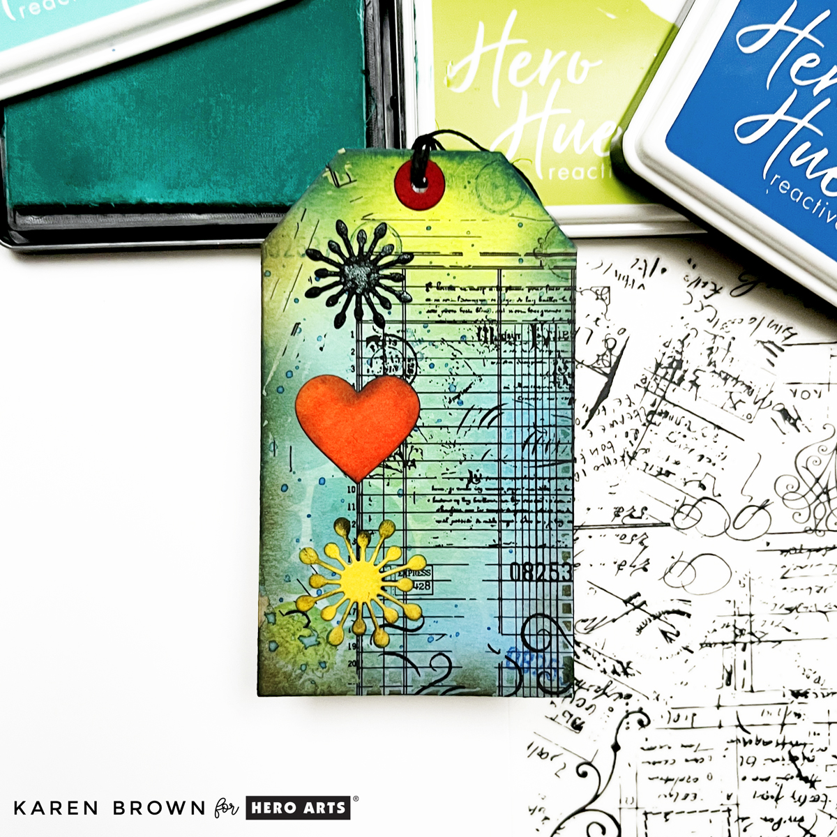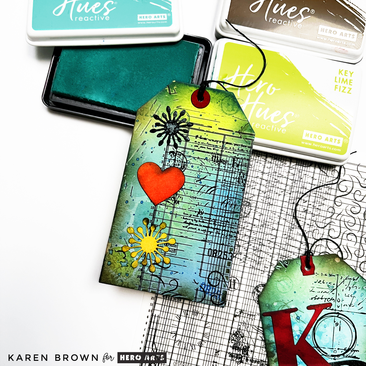
Part of My Continuing Series: My 3-Step Mixed Media Recipe
Sometimes a die set arrives and your brain immediately starts firing off ideas.
That was me with Spellbinders Line of Being die set from Jaycee’s All My Senses Collection.
It’s minimalist. Abstract. Unexpected. Just a few delicate lines forming eyes, a nose, lips… and that tiny heart on the cheek.
It felt modern and artistic — and I knew it deserved something special.
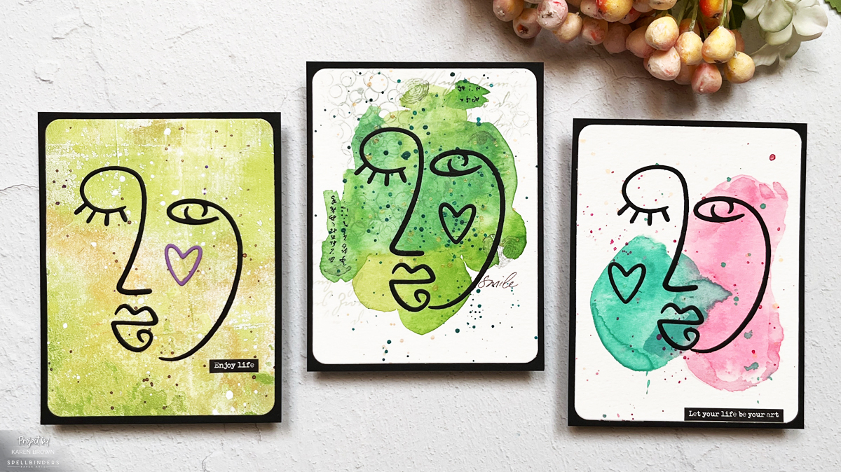
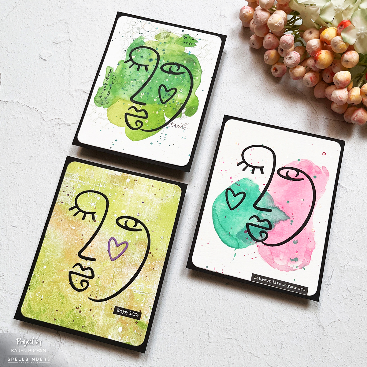
So instead of making one card, I made three.
Three different artistic mixed media takes on the same striking focal point.
And interestingly? Each one feels completely different.
This Line of Being Die Set from Spellbinders creates the most eye-catching cards that are both unique and artistic.
I love that this set creates simple but bold focal points that work well in beginner level cards and mixed media creations.
A Little Mixed Media Context
If you’ve been following along in my new series:
- In Mixed Media Made Simple: My 3-Step Recipe for Fun and Easy Tags, I introduced my background + 4 layers + focal point framework.
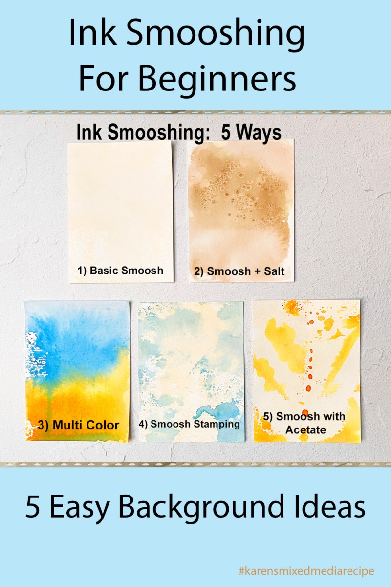
- In Ink Smooshing 101: My Favorite Mixed Media Starter, we did a deep dive into beginner-friendly backgrounds.
Today’s cards are a little different.
They’re what I’d call Mixed Media Lite.
Understated.
Modern.
Intentional.
Artsy without being busy.
Use #karensmixedmediarecipe so we can follow along with each other’s projects.
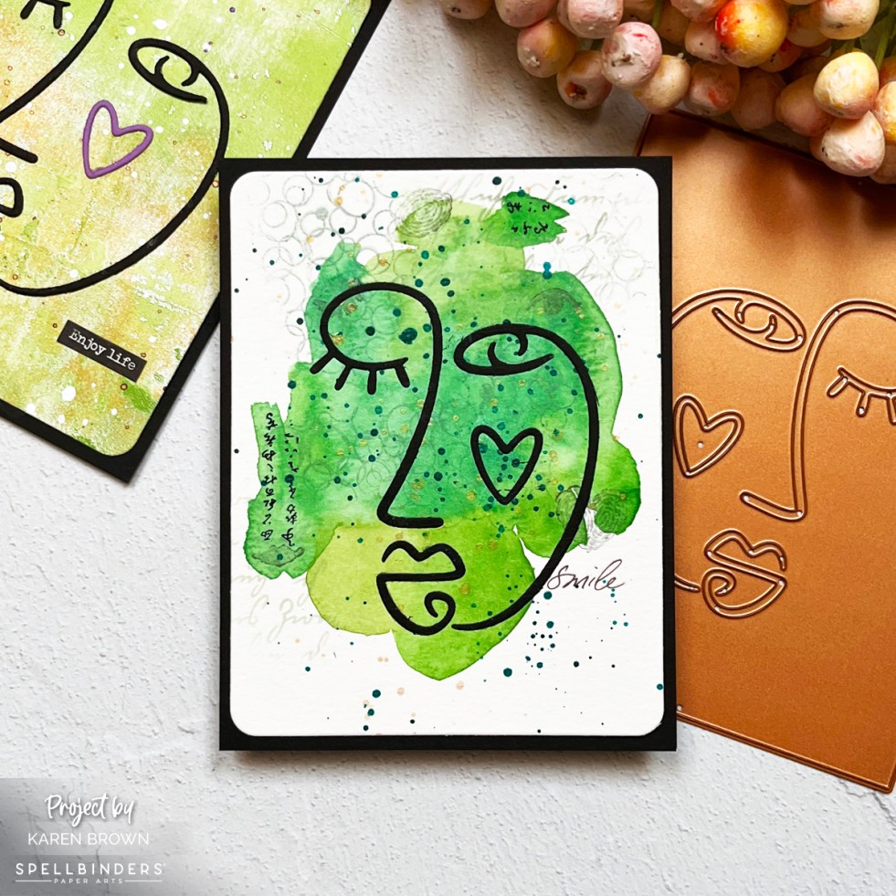
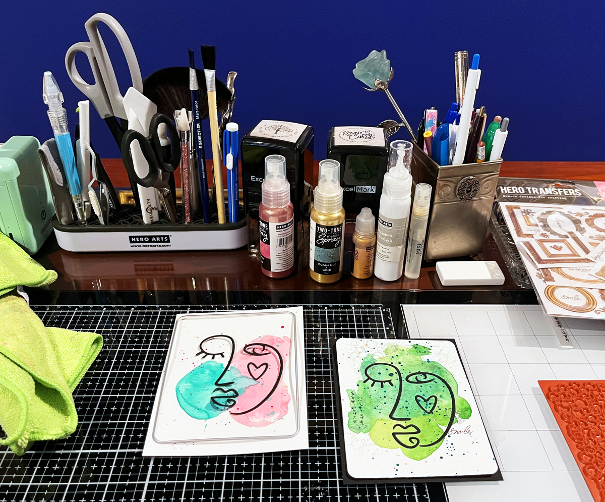
Card One: The “Green Picasso” Card
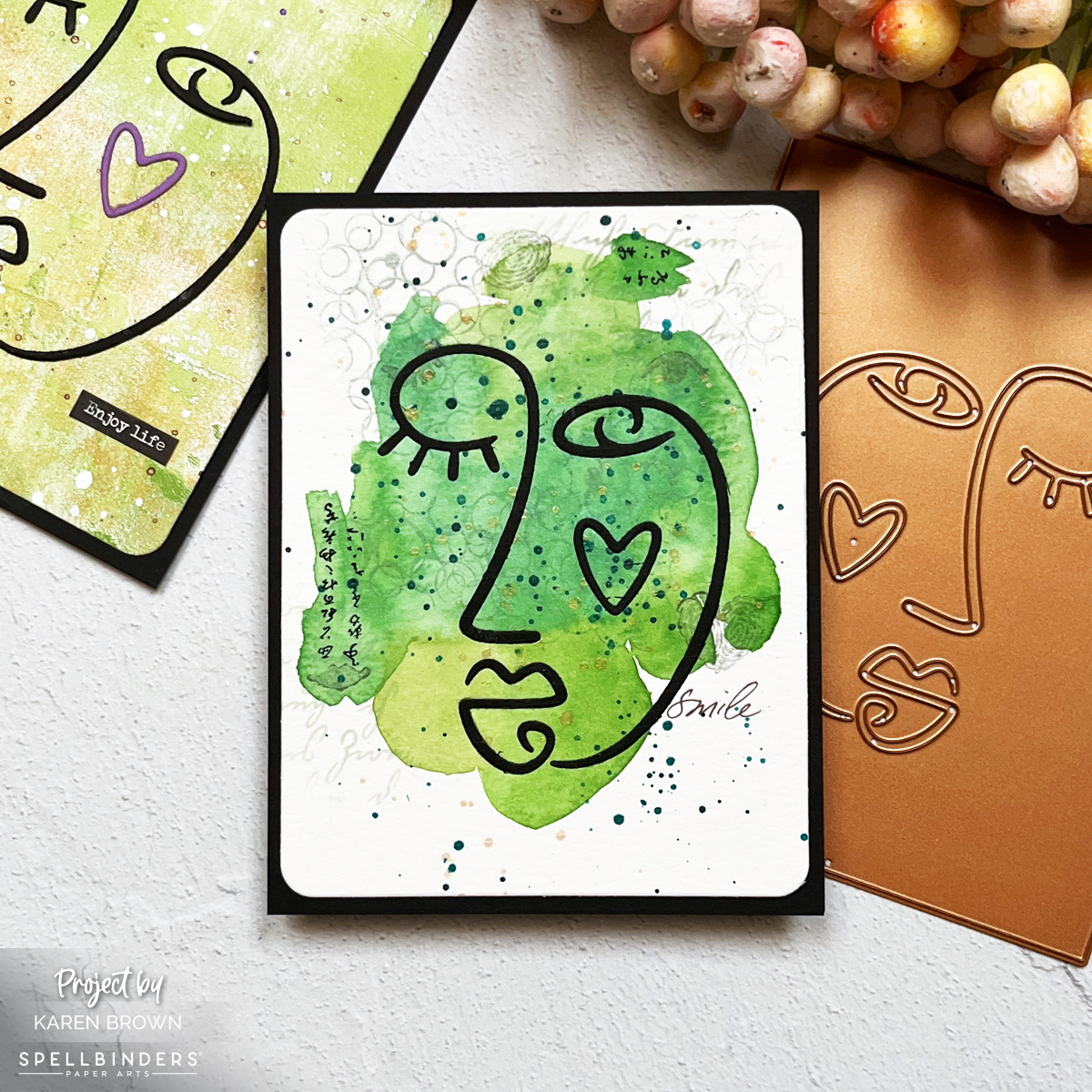
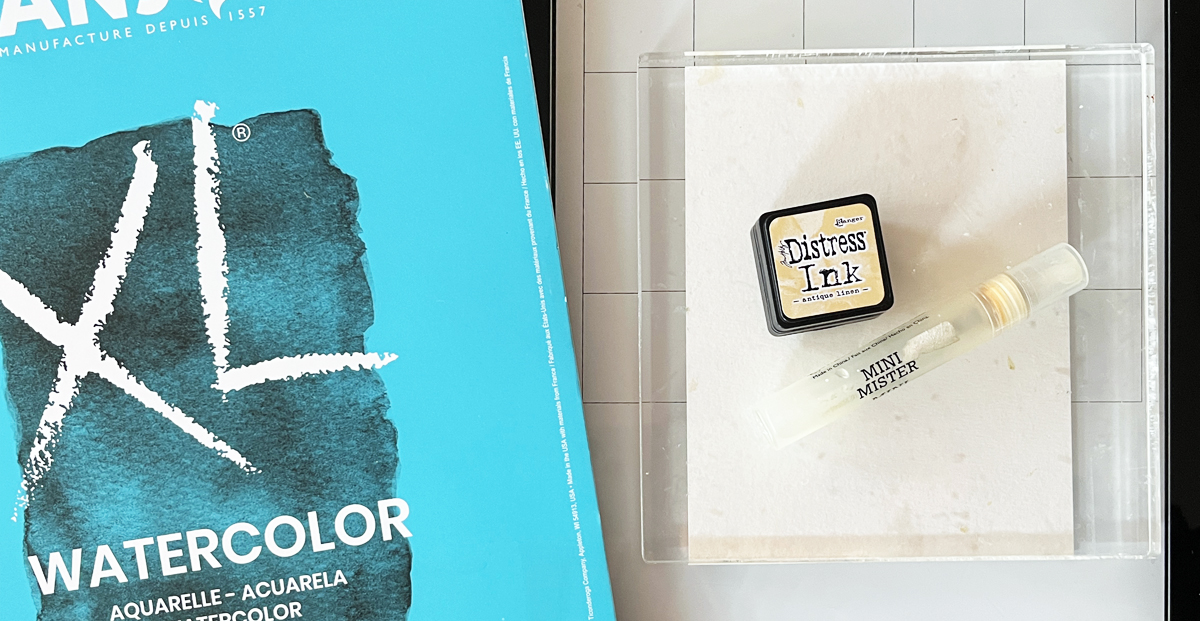
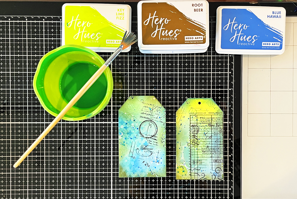
This card started with a hand-painted watercolor background.
I taped my watercolor paper to a hardboard using painter’s tape and lightly dampened the area where I wanted color.
Using various shades of green, I let the paint move organically — blobs, peninsulas, soft edges. No strict shape.
I used the die plate as a guide to estimate the size of my watercolor “face” (approximately 3 ¼” x 4 ½”).
Once dry, it felt very Picasso-meets-Buddha to me.
There’s quite a bit of white space around the painted area, which keeps the composition modern and breathable.
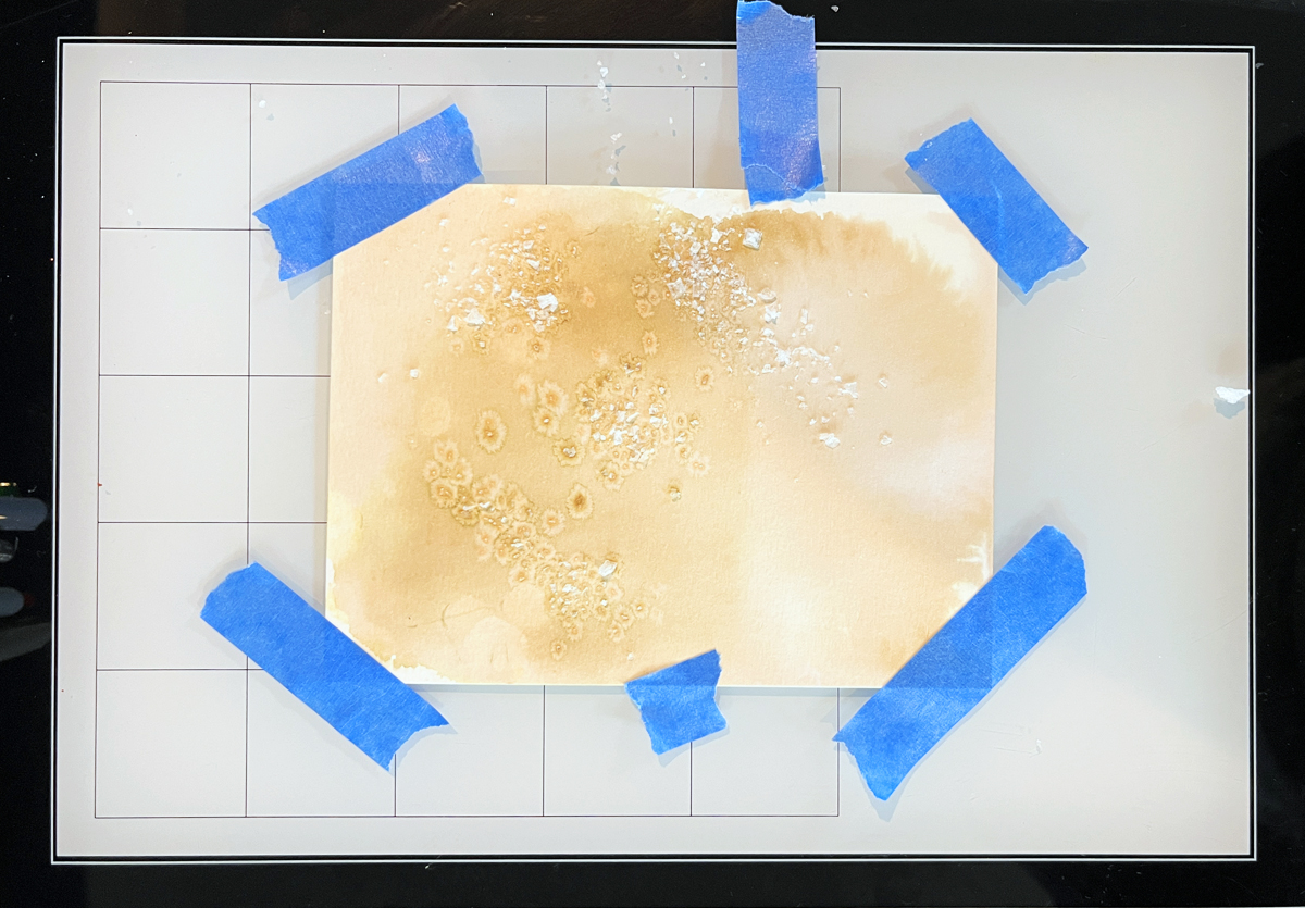
While brainstorming, I created 3 watercolor backgrounds. I went with the right two and filed the left panel in my premade backgrounds bin.
Subtle Layers (5 Total)
Even though this card feels simple, I added five quiet layers — because as you know, my recipe suggests 4+ layers.
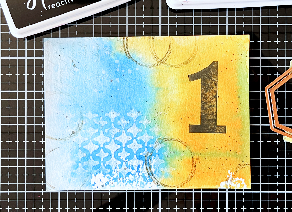
- Light Script Stenciling
Using Fog Reactive Ink, I stenciled two small areas of script. The pattern flows from watercolor into white space, about 1” sections. - Tiny Rub-On Transfers
Small Asian characters placed strategically. Just enough to intrigue. - Second Generation Stamping
Miss Detective small eyes, lips, fingerprints, and a heart stamped lightly in black reactive ink. Soft texture — not bold imagery. - Partial Background Stamping
I inked only portions of a bubble background stamp with Fog ink, bending the stamp to touch the paper selectively. Some impressions land on watercolor, some on white space. - Splatters
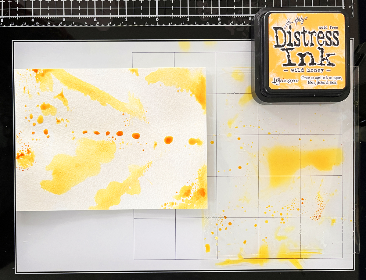
Blue-green and gold splatters to finish.
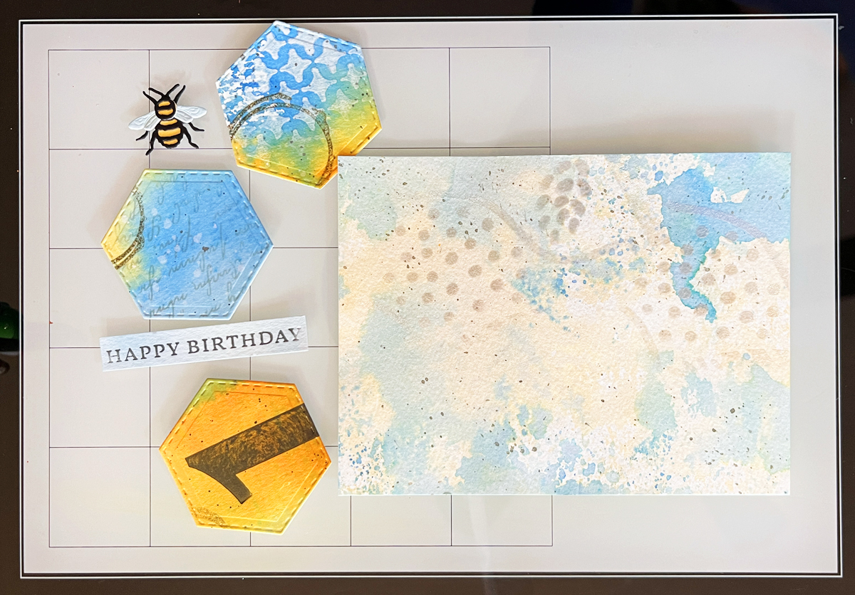
The Line of Being focal point — die cut from black cardstock — creates dramatic contrast against the organic green.
The sentiment? A small artistic rub-on that says “smile.”
Mounted onto a black A2 base using rounded rectangle infinity dies.
Bold. Modern. Graphic.
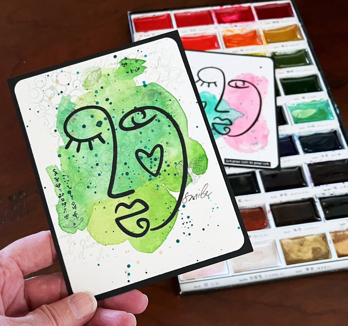
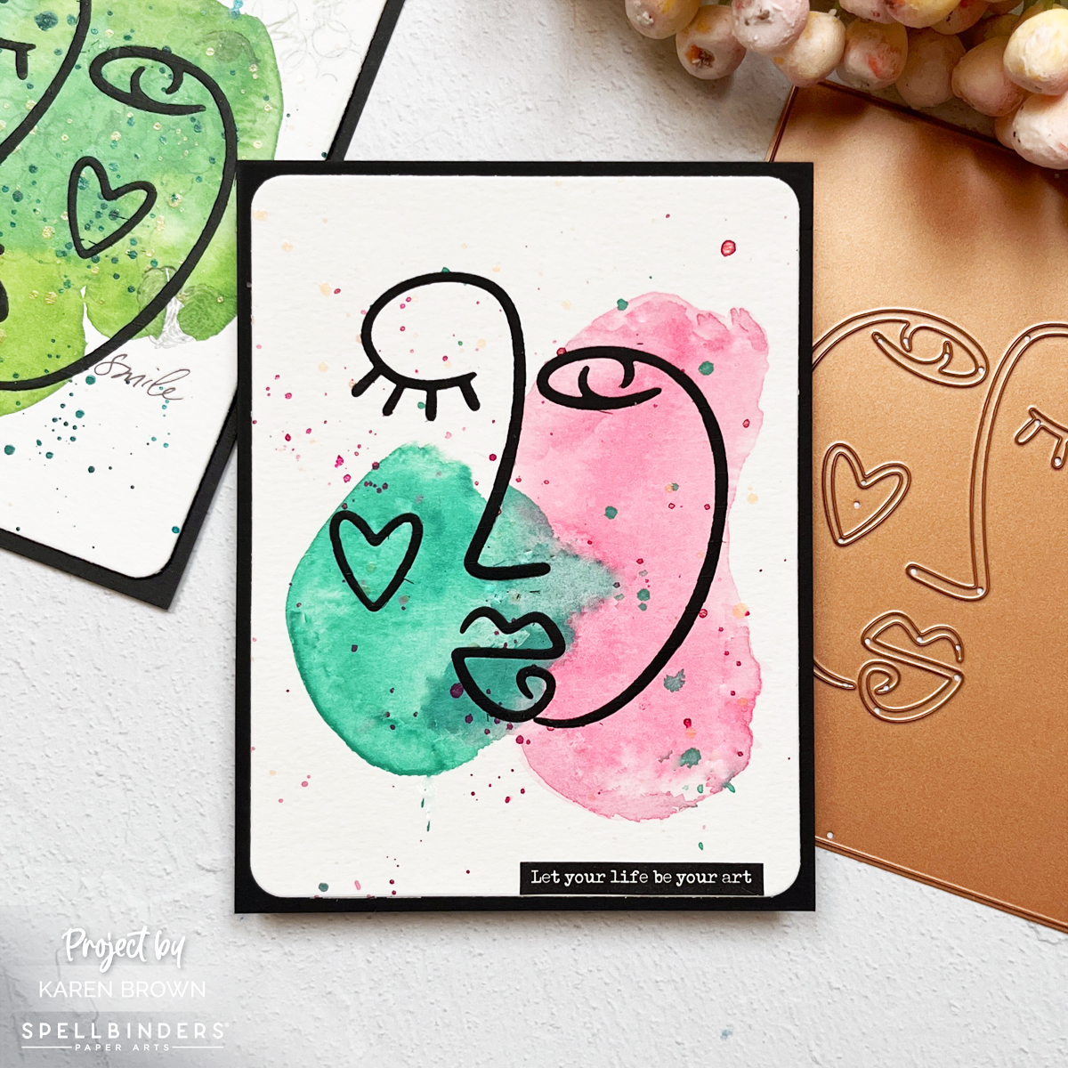
Card Two: Pink & Green Modern Minimal
This card takes a lighter approach.
I painted:
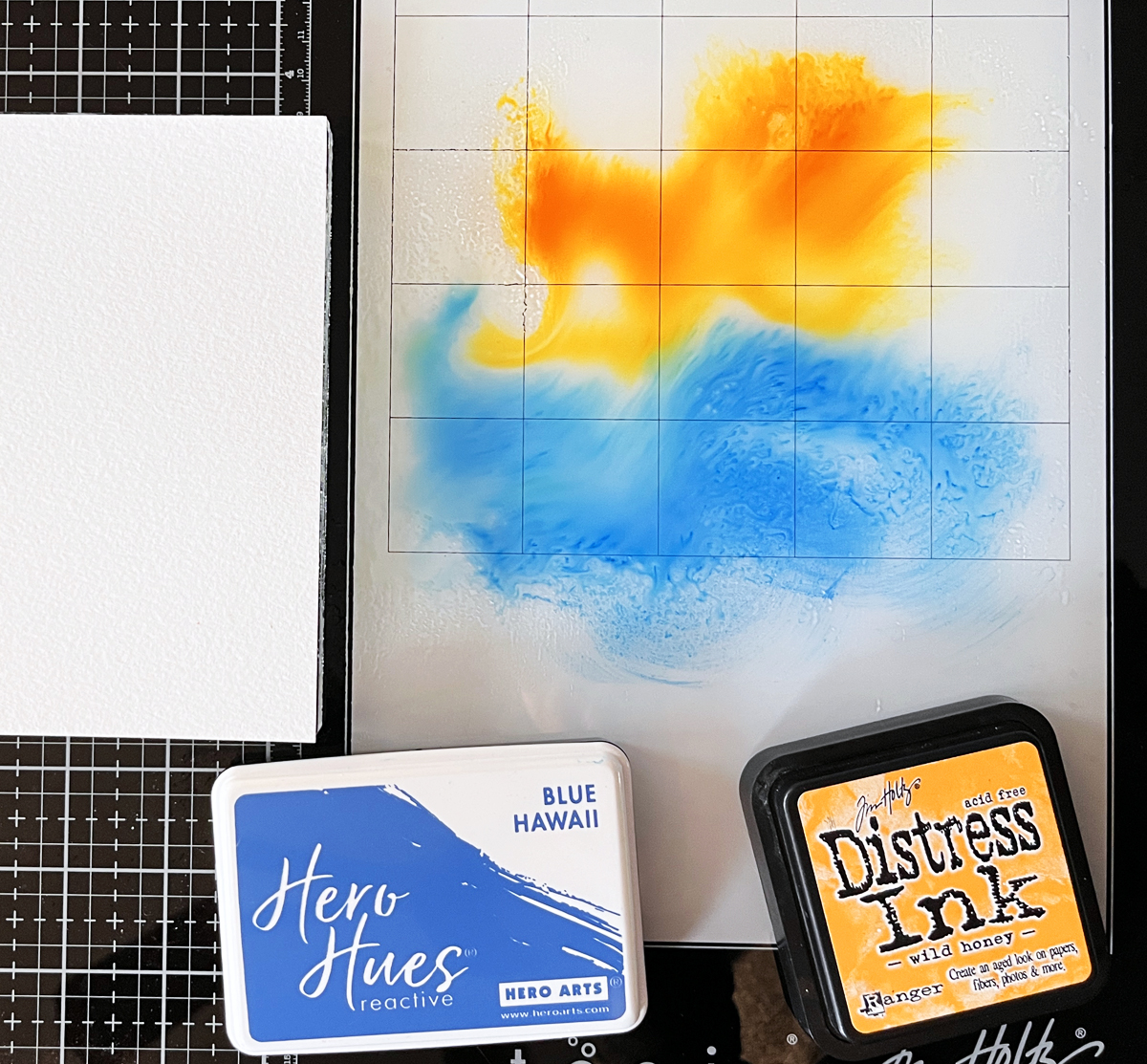
- A kidney-shaped pink wash on the right
- A smaller irregular green circle blending slightly into the pink on the left
Lots of white space.
Lots of breathing room.
Then I added:
- Matching pink and green watercolor splatters
- Fuchsia splatters
- Gold splatters
- The same black Line of Being die cut
No heavy layering.
No traditional mixed media build-up.
Just artistic restraint.
And I love how eye-catching it feels despite its simplicity.
This card is proof that there’s no strict rule for how many layers a mixed media project must have.
Sometimes less truly is more.
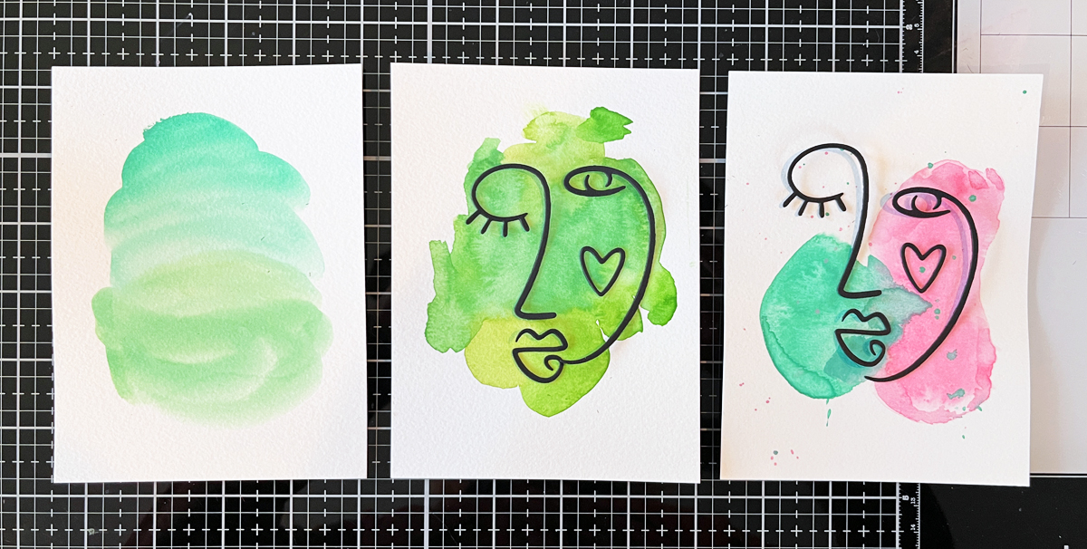
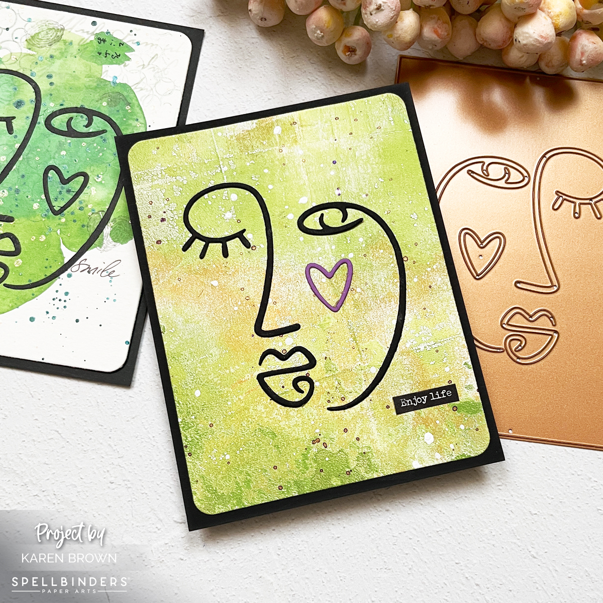
Card Three: Gel Press Version
I thought I was finished at two cards.
But overnight I had that creative whisper:
“What about a gel press background?”
So I shopped my stash of gel press prints (this is why I keep them!) and chose one with beautiful movement and color variation.
I:
- Die cut it with a rounded rectangle
- Added purple metallic and white splatters
- Mounted onto black A2
- Added the black Line of Being die cut
- Swapped the cheek heart for purple
The premade sentiment sticker finished it effortlessly.
Same focal point.
Completely different mood.
Why I Love Making Variations
Creating the same card multiple ways is incredibly instructive.
You learn:
- How background weight changes a design
- How much layering is “enough”
- How focal points behave against organic vs graphic surfaces
- What feels like you
It’s creative experimentation without pressure.
If you’re new to mixed media, I highly recommend starting with something approachable like my Easy & Addictive | Beginner Mixed Media Tag Tutorial and VIDEO.
For those building their stash, I also shared my 14 Best Cardmaking Products and Supplies for 2026, which might be helpful.
Build Your Cardmaking Toolkit:
If you are looking to equip your crafting space for new projects, these are the products I used today:
Diecutting:
- Line of Being Die Set
- Rounded Rectangle Nesting Dies
- All My Senses Collection at Spellbinders
- Platinum 6 Die Cutting Machine
Stamps:
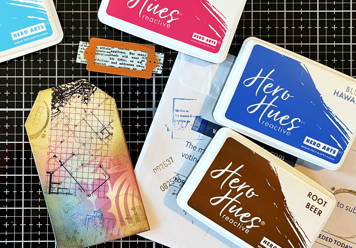
Inks:
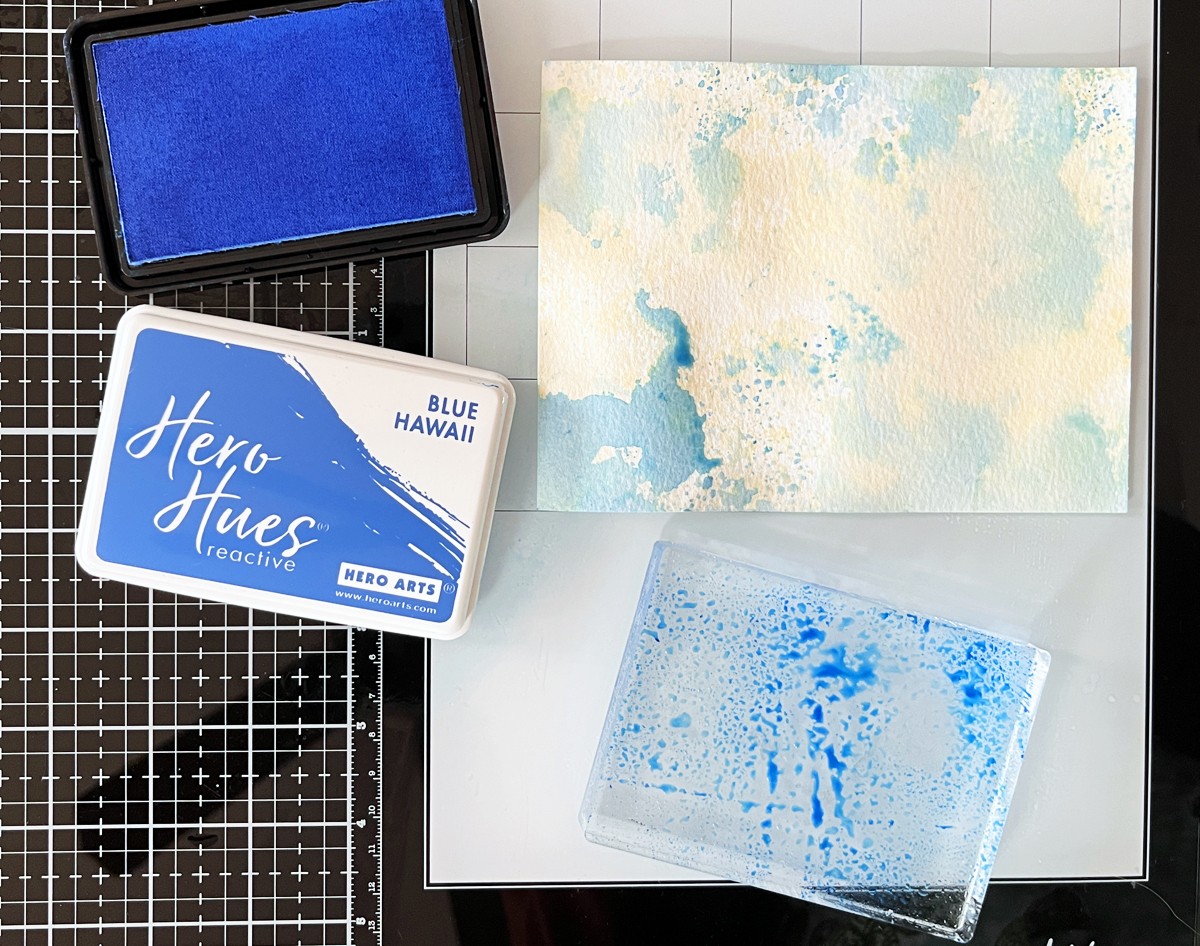
- Fog Reactive Ink
- Rub-on Transfers
- Shimmer Spray for Splatters
Which One Is Your Favorite?
The layered Green Picasso?
The modern Pink & Green?
Or the bold Gel Press version?
I’d truly love to know.