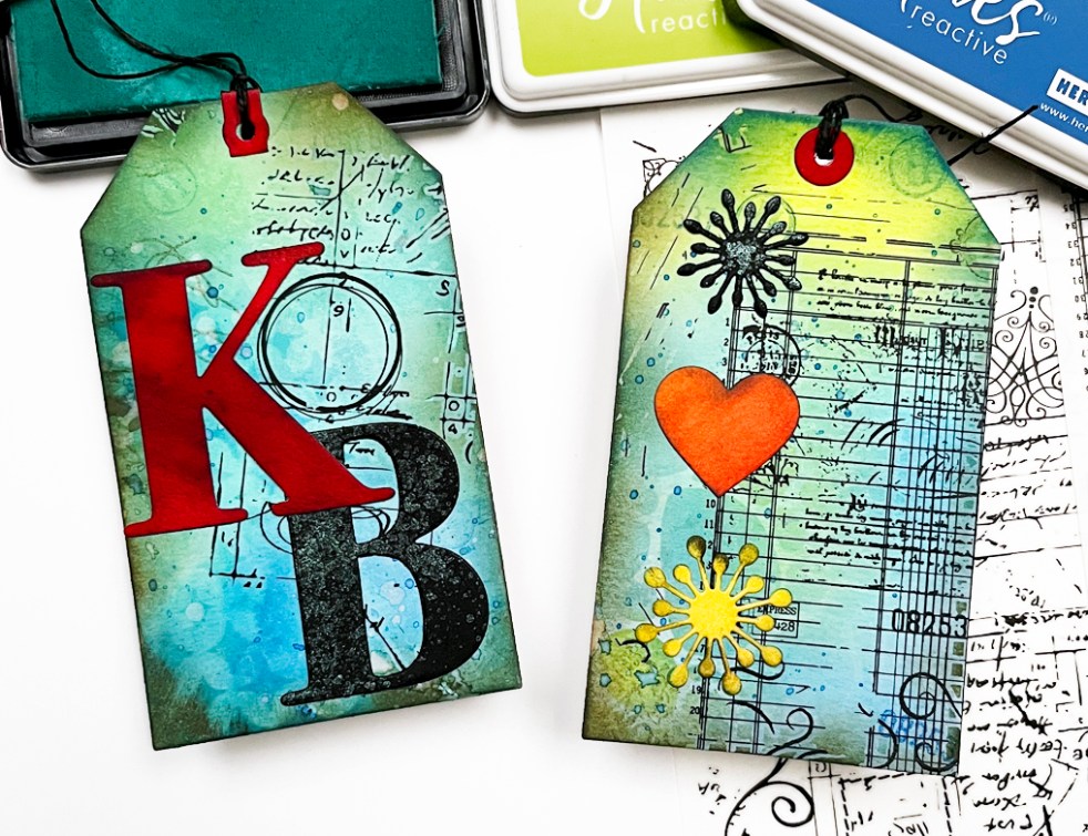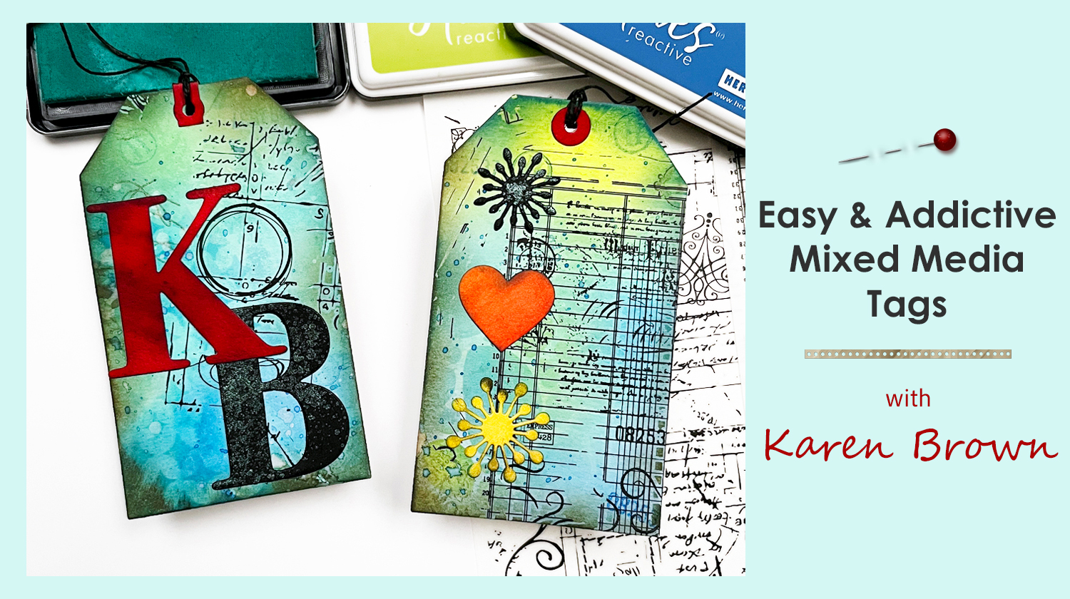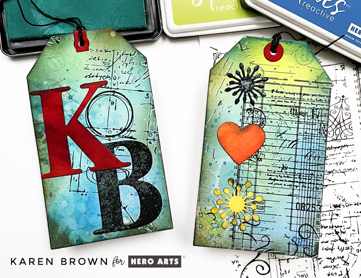
Learn to Create Easy But Beautiful Mixed Media Cards: Part 2 in my Karen’s 3-Step Recipe Series
Have you ever looked at a mixed media project and thought, “That’s beautiful… but I have no idea where to start”?
I’ve been there.
After years of playing with inks, stamps, stencils, and paper, I finally realized something important:
Mixed media doesn’t have to be complicated.
That’s when I developed my own simple framework that I now call:
Karen’s Mixed Media Recipe
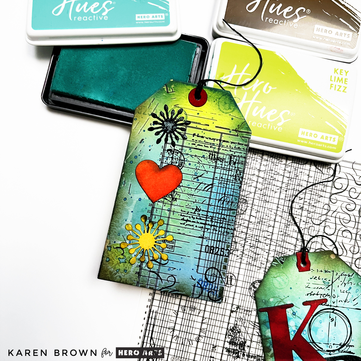
Step 1: Create an Interesting Background
Step 2: Add 4+ Layers
Step 3: Add a Strong Focal Point
That’s it.
If you missed the introduction to this series, you can read it here:
Mixed Media Made Simple: My 3-Step Recipe for Fun & Easy Tags.
In This Post, You’ll Learn:
• What ink smooshing is and why it’s perfect for beginners
• 5 easy ink smooshing techniques to try
• How to choose colors that blend beautifully
• How to turn your backgrounds into a finished card
📌 Save this for later so you can come back when you’re ready to try it.
Now today we are diving deep into Step 1 — Backgrounds, and I’m starting with my absolute favorite beginner technique:
Ink Smooshing.
Why Ink Smooshing Is Perfect for Beginners
If you are new to mixed media, this is the technique I always recommend first.
Why?
• No precision required
• Fast and easy to create
• Extremely forgiving
• Every panel turns out unique and interesting
There are no mistakes here. Just layers of beautiful, organic color.
And the more water you use?
The softer and dreamier your background becomes.
You might also enjoy watching my YouTube video: Mixed Media Tags for Absolute Beginners, where I walk you through the ink smoosh process on camera.
Let’s Talk Color (Without Adding a Step 4 😉)
You might be wondering if I should add a Step 4 to my recipe:
Use 1–3 colors.
Color restraint is absolutely important in mixed media.
Most cohesive projects use 1–3 colors. More than that and things can start to feel muddy or chaotic.
But visually, I love the simplicity of a 3-Step Recipe.
So instead of adding a formal Step 4, I treat color choice as a design principle that supports every step.
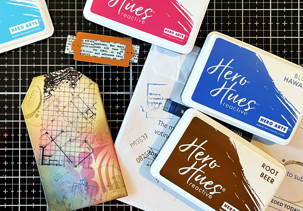
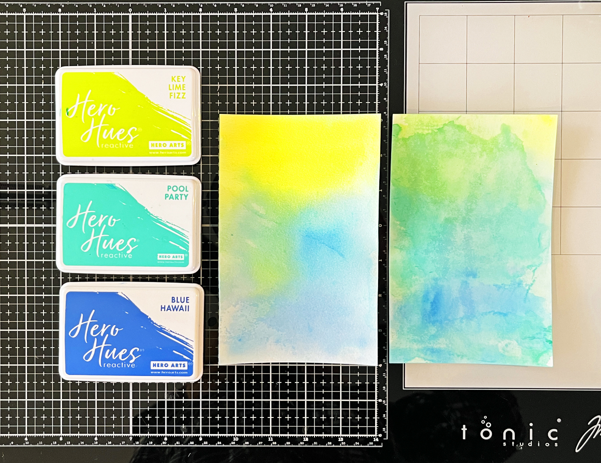
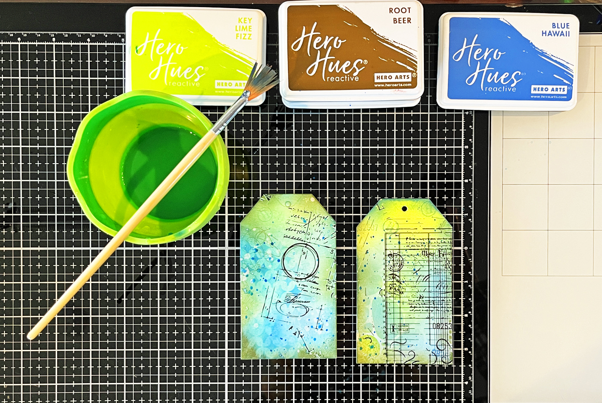
For today’s project, I chose:
• A neutral tan
• Honey golden yellow (Wild Honey Distress Ink)
• Blue Hawaii Reactive Ink
The blue feels calming.
The yellow has energy.
Together they create a beautiful balance.
When choosing multiple colors, try using colors that are next to each other on the color wheel (analogous colors). They blend naturally and beautifully.
Avoid mixing complementary colors (opposites like blue + orange, red + green, yellow + purple) unless you intentionally want a neutral brown — because they will neutralize each other quickly.
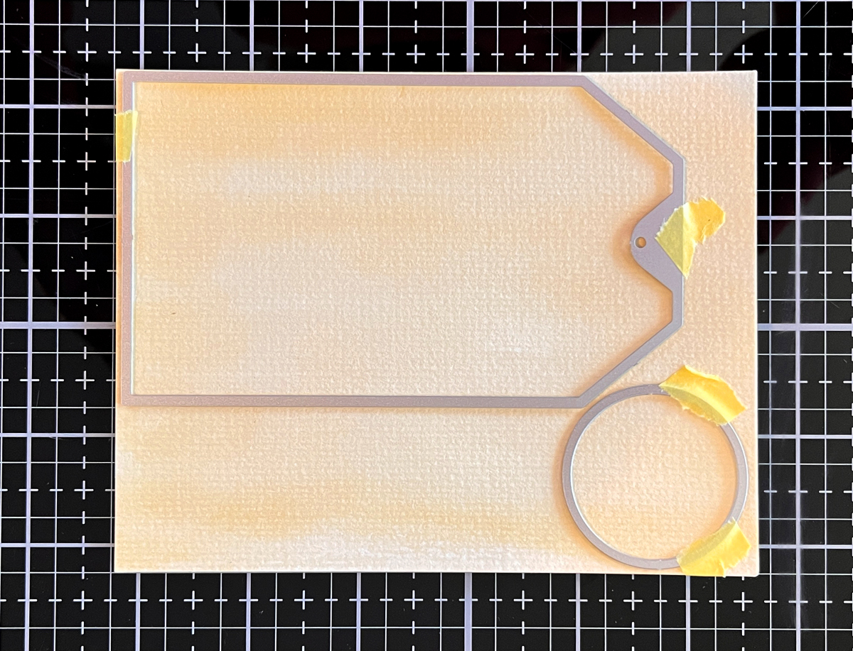
Basic Ink Smoosh (Step-by-Step)
Ink smooshing is wonderfully simple.
- Dab a water-based ink (Distress Ink or Reactive Ink) onto your craft mat, acrylic block, or acetate.
- Spritz with water.
- Press watercolor cardstock into the puddle.
- Let it sit for 1–5 minutes.
- Lift and dry.
That’s it.
The result is a soft, watercolor-style panel full of movement and variation.
Practice Makes Better — We’re Making TWO Backgrounds
Since this post is all about backgrounds, I decided to create a project using two ink smoosh panels.
One panel will become the card background.
The second panel will be die cut into hexagons for our focal point.
This gives us double the practice — and far more visual interest than die cutting from solid cardstock.
Because we created both panels together, the colors coordinate beautifully.
And yes… this is where my hashtag comes in:
If you try this technique, I would love to see it.
Use #karensmixedmediarecipe so we can follow along with each other’s projects.
I think it will be such a fun way to build this series together.
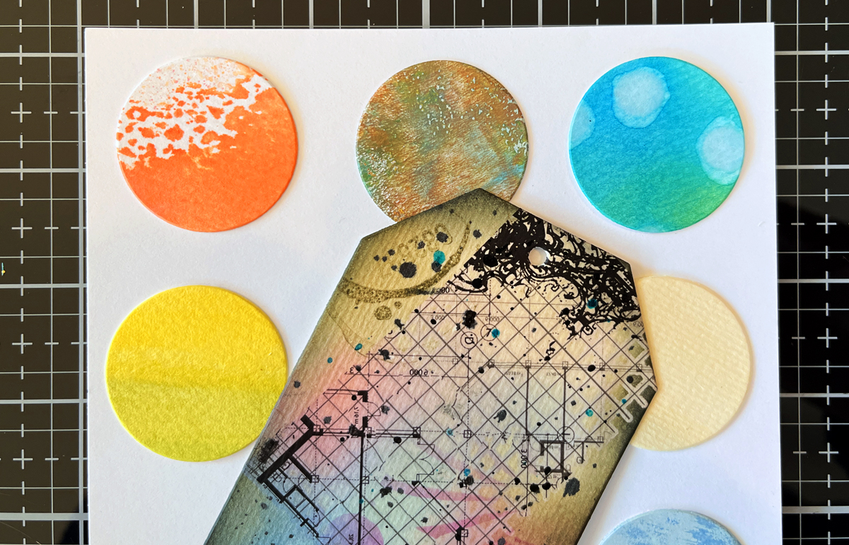
5 Ink Smoosh Variations
I created five variations for this post. Not because you need to do all five every time — but to show how versatile one technique can be.
Pin this graphic for future reference
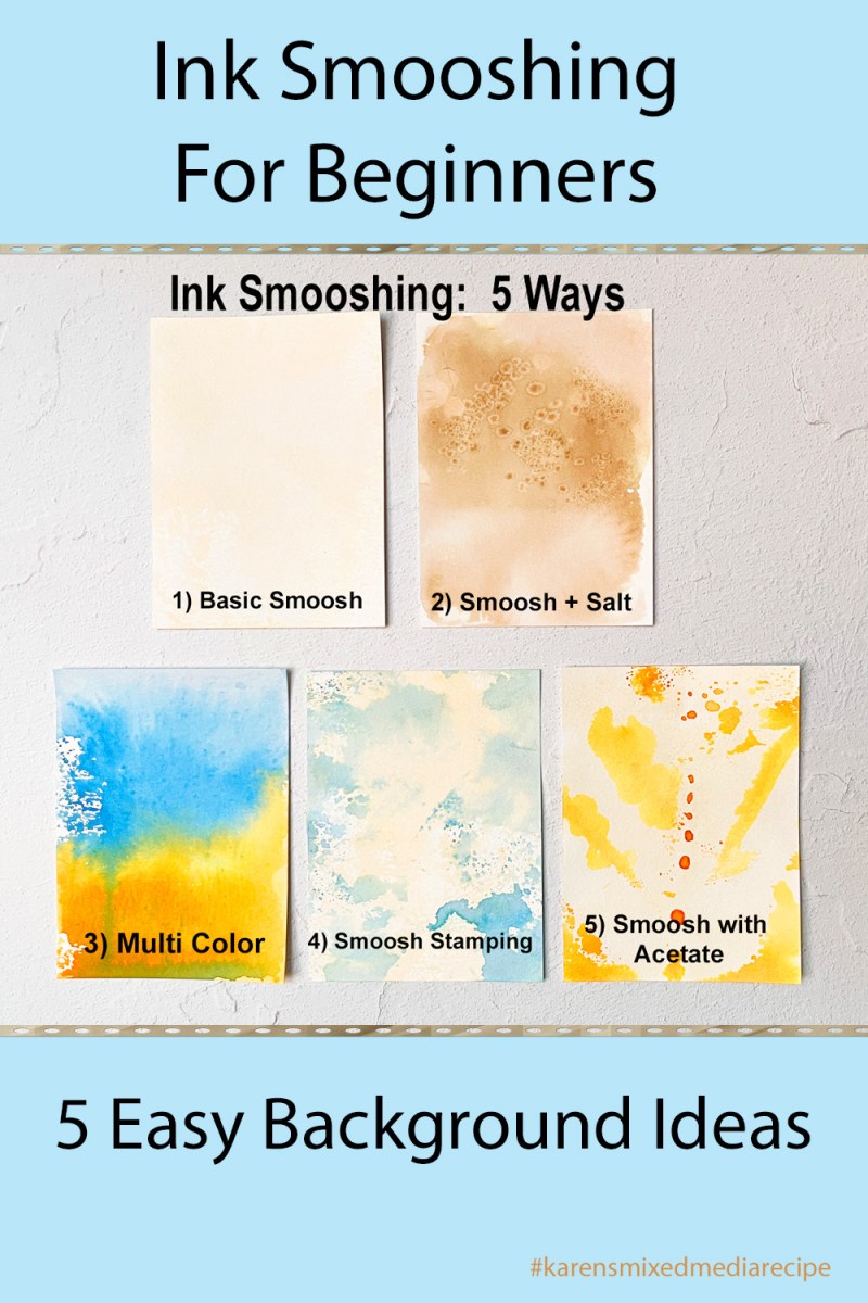
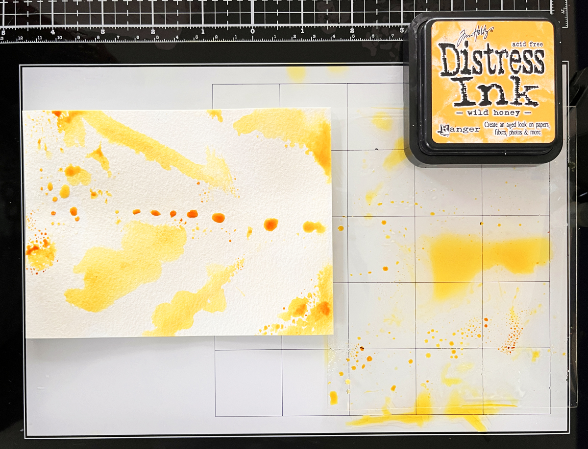
1. Single Color Basic Smoosh
I used a neutral cream ink.
Dab ink on mat → spritz → lay panel into puddle → weight with acrylic block → wait 1–5 minutes.
This is a total workhorse background.
Consider making extras for your premade background bin.
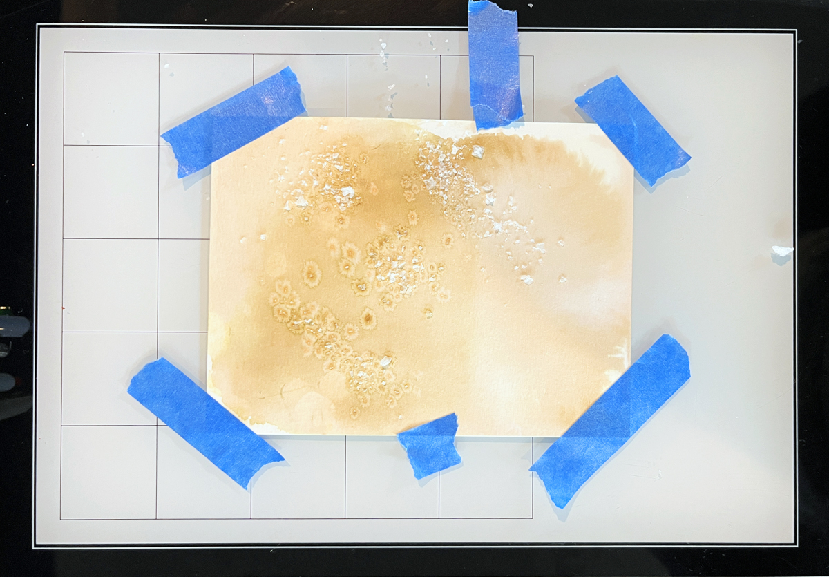
2. Ink Smoosh + Salt Texture
Create a basic panel.
While still wet, sprinkle salt.
Let dry completely.
Brush off the salt.
The salt absorbs pigment and creates beautiful mottling.
The darker the ink, the more dramatic the effect.
Instant vintage texture.
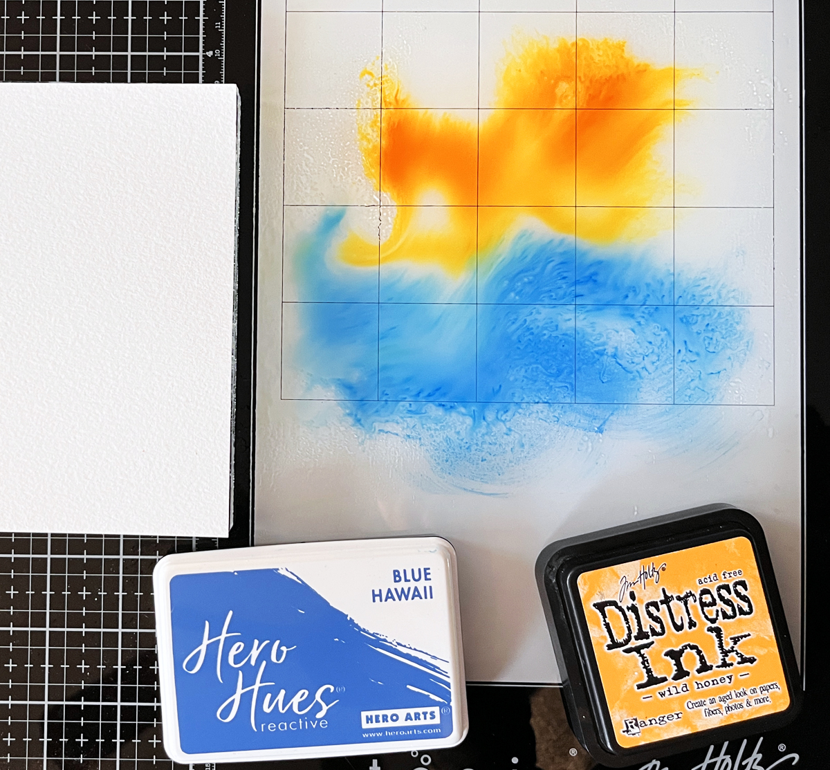
3. Multi-Color Smoosh
Start like the basic version, but add 2–3 colors in bands or random placement.
This panel is vivid and dynamic — and it’s the one I used to die cut my hexagons.
Remember:
Stick to 1–3 colors that blend nicely.
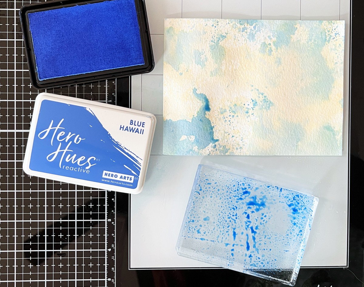
4. Two-Color Ink Smoosh Stamping
Dab ink onto an acrylic block.
Spritz.
“Stamp” onto watercolor cardstock.
Repeat with same or new color until satisfied.
I used tan and blue here — and this panel became the main card background.
5. Ink Smoosh with Acetate
Dab ink on acetate.
Spritz.
Bend so only part “kisses” the paper.
This is fantastic for controlled color placement.
I also gently shook the acetate for larger splatters.
Shop Your Stash
I keep a bin full of premade backgrounds so I can “shop” when I start a new project.
On Background Days, I make extras.
Today I added three panels to my premade background bin.
Future Karen will thank me.
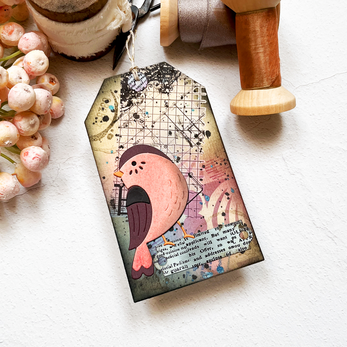
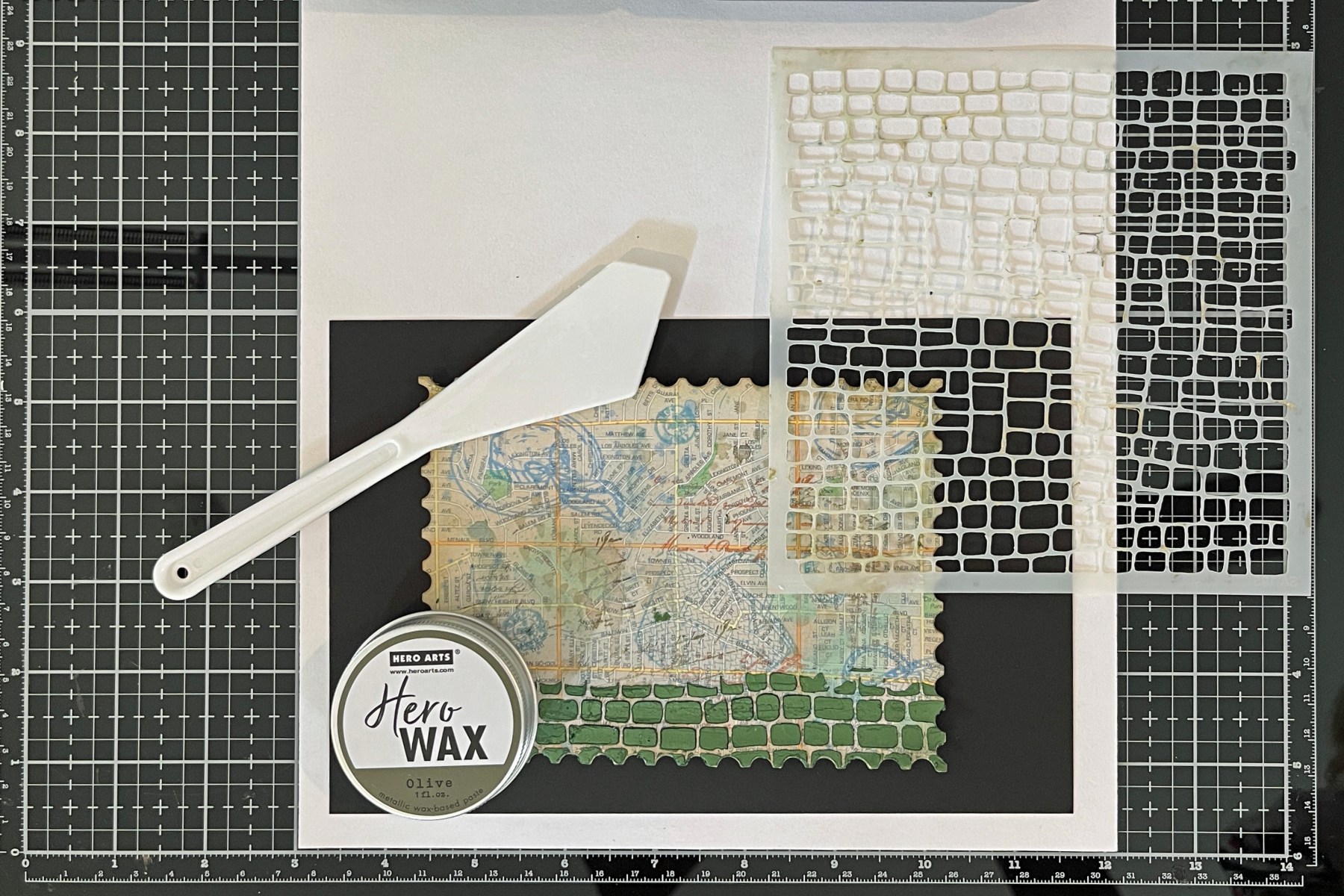
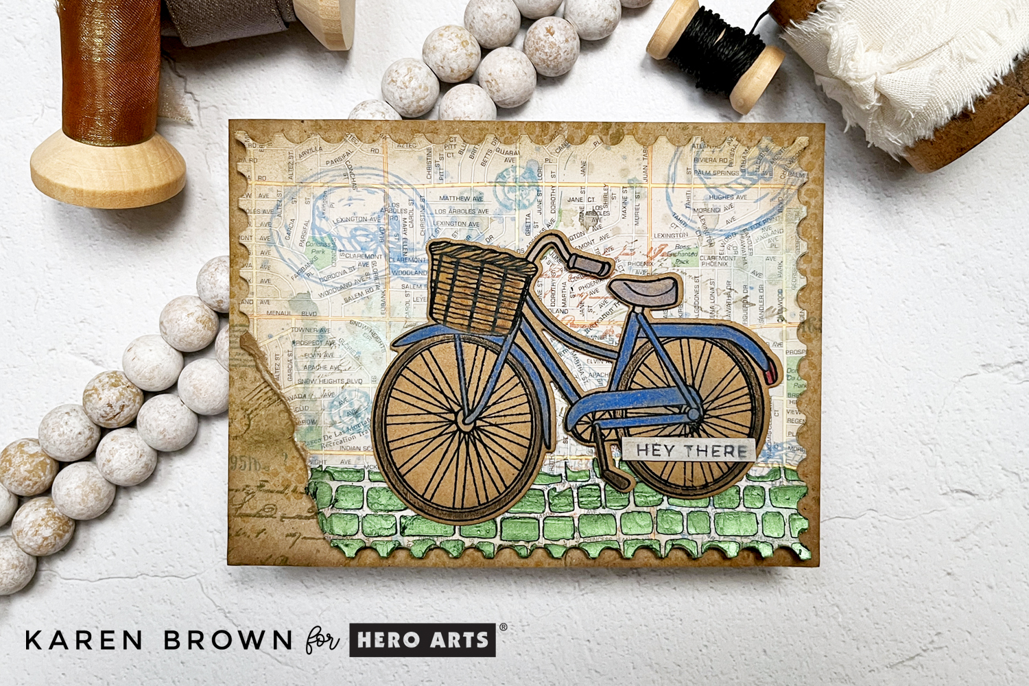
Let’s Add Layers
Layers are the magic in mixed media.
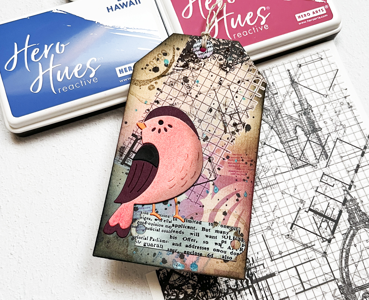
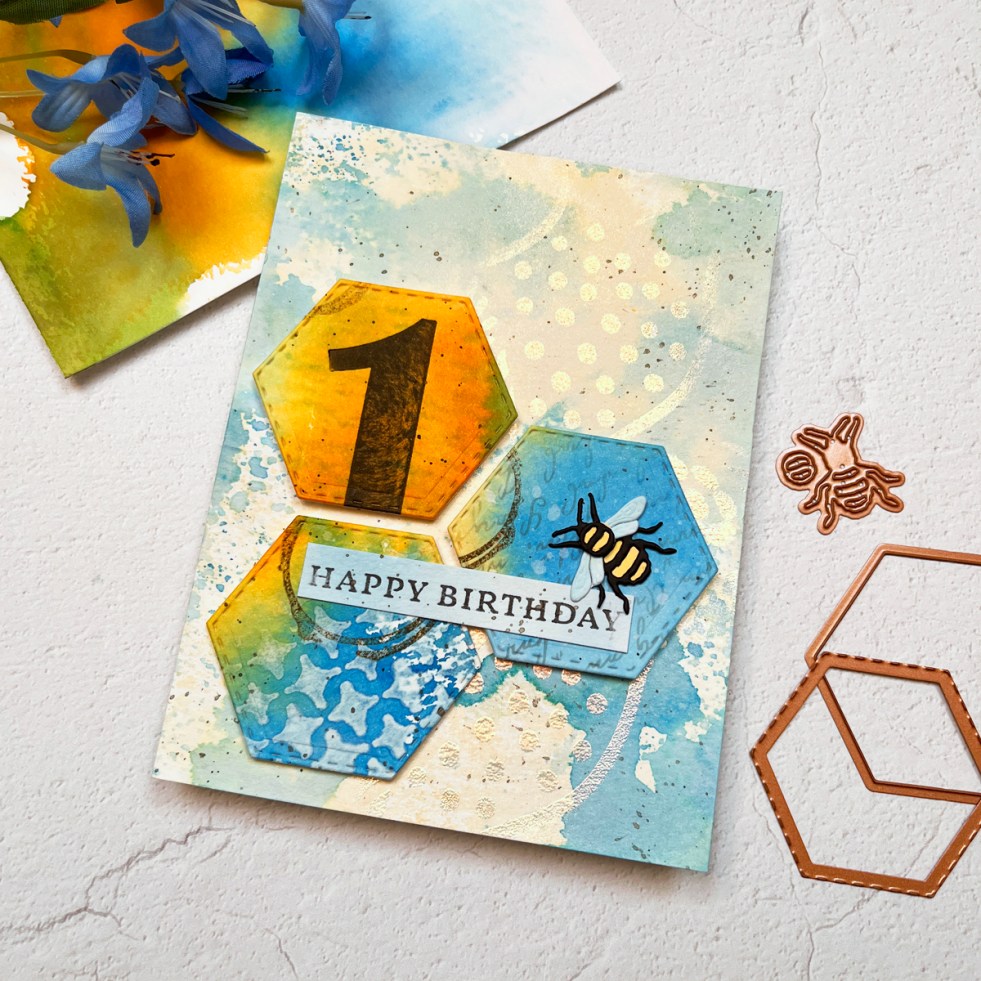
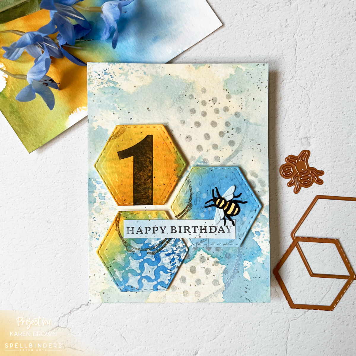
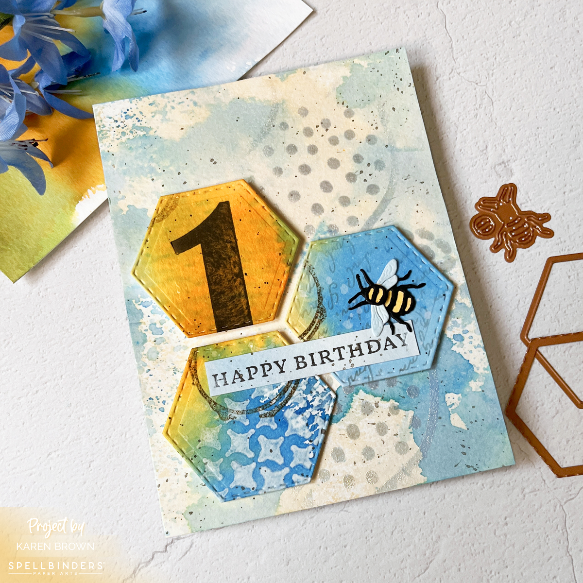
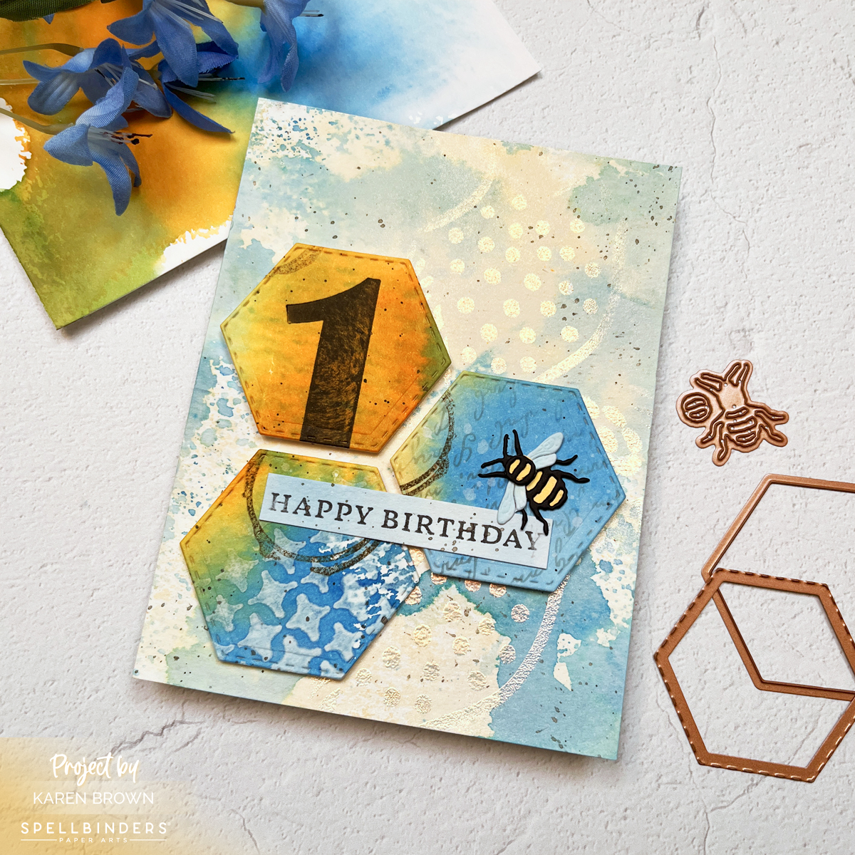
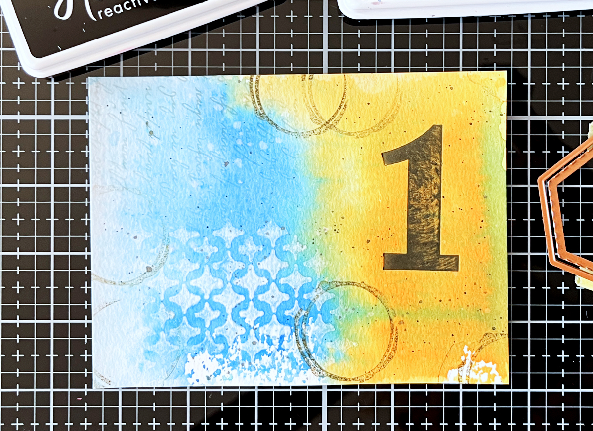
Here’s what I added to the blue and gold panel (the one I die cut from):
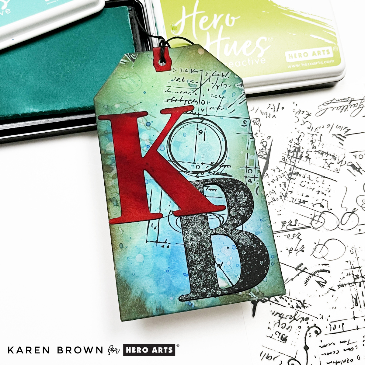
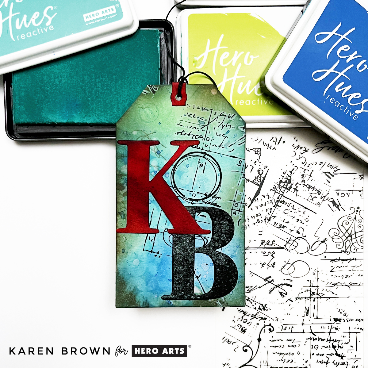
- BetterPress Number (Bold Color Mix Numbers BP-243) using Licorice Reactive Ink
- Script stencil on about 20% of the card
- Removed color through Sparkle Weave stencil using a baby wipe
- Stamped coffee stains with Root Beer ink
- Water splatters (blotted)
- Black splatters
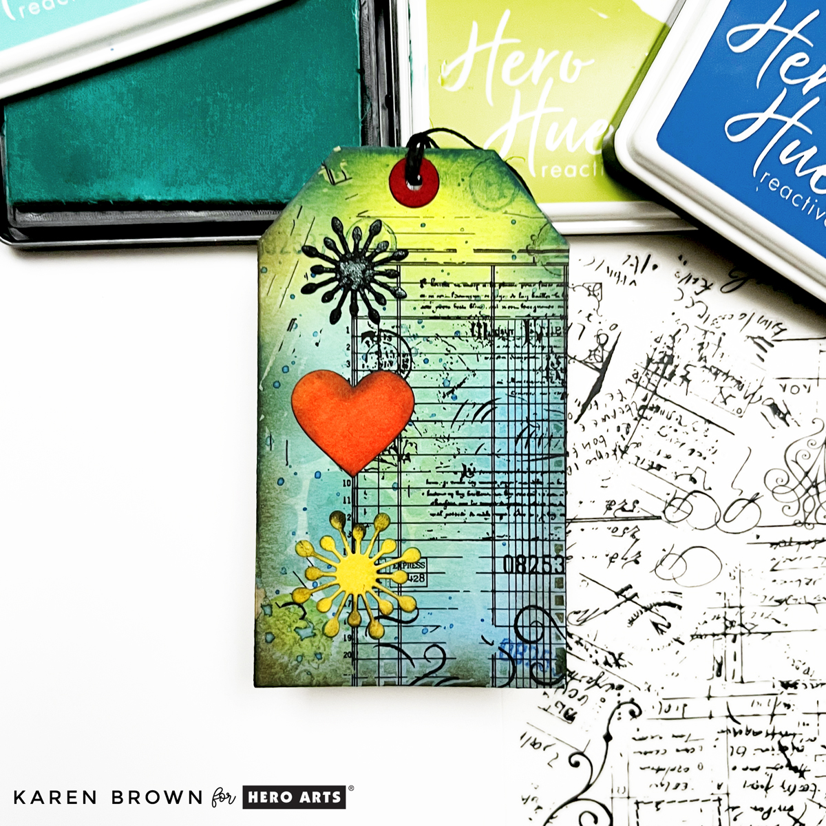
To the card background panel, I added:
• Dots and squiggles stenciled with iridescent bronze embossing powder
• Fine black splatters
Layers create depth.
Depth creates interest.
And the shine on the background is SO beautiful in person.
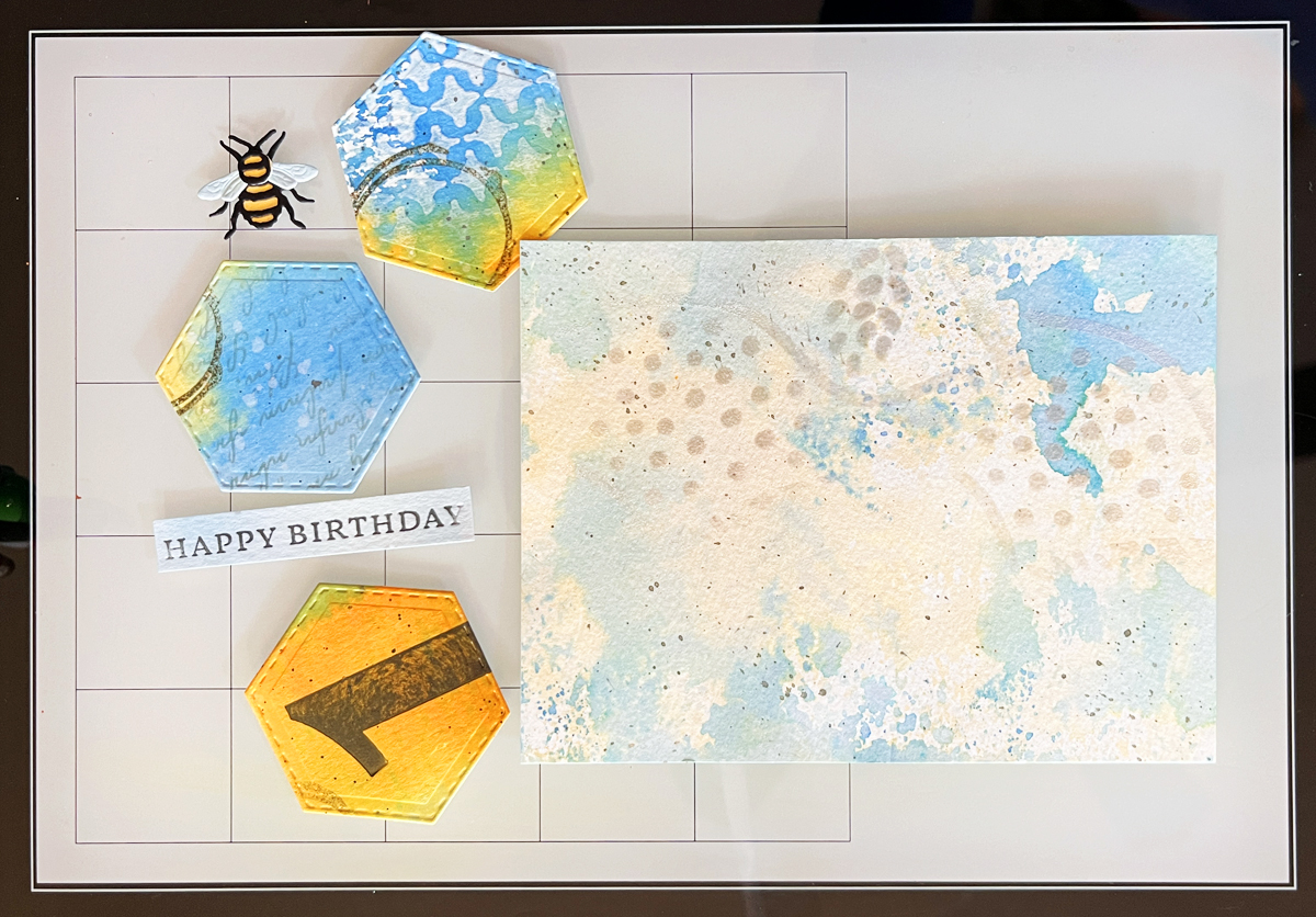
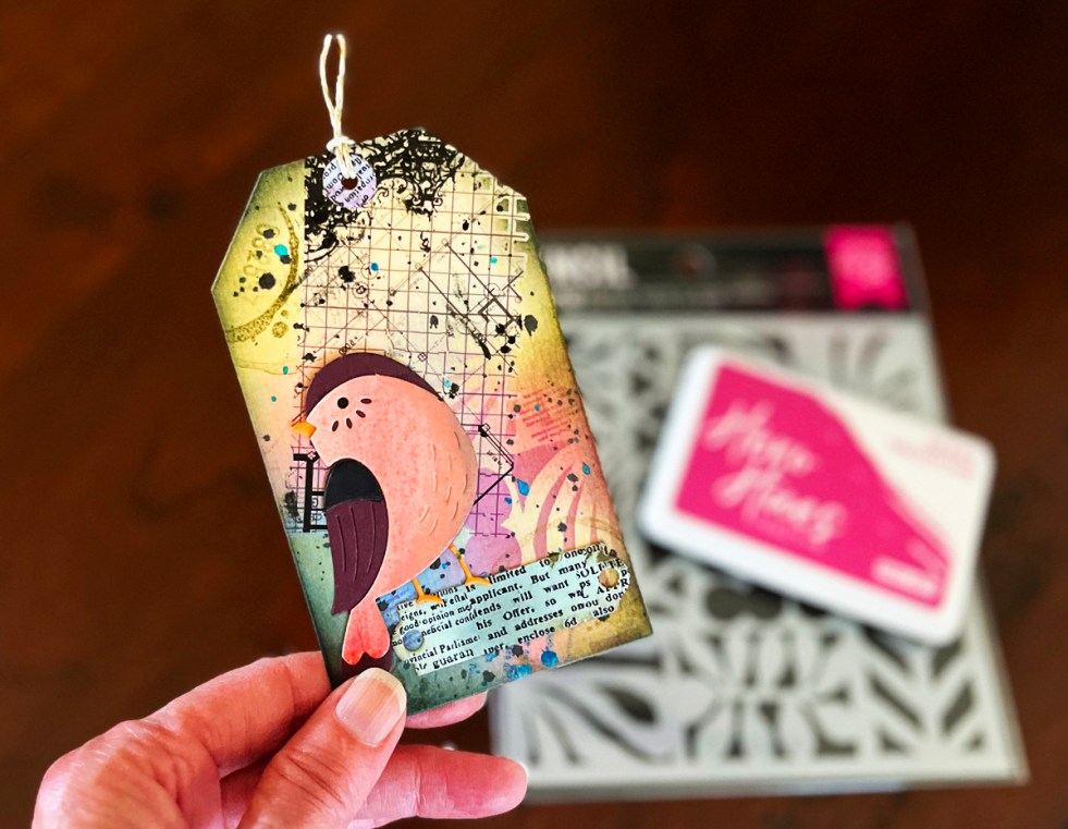
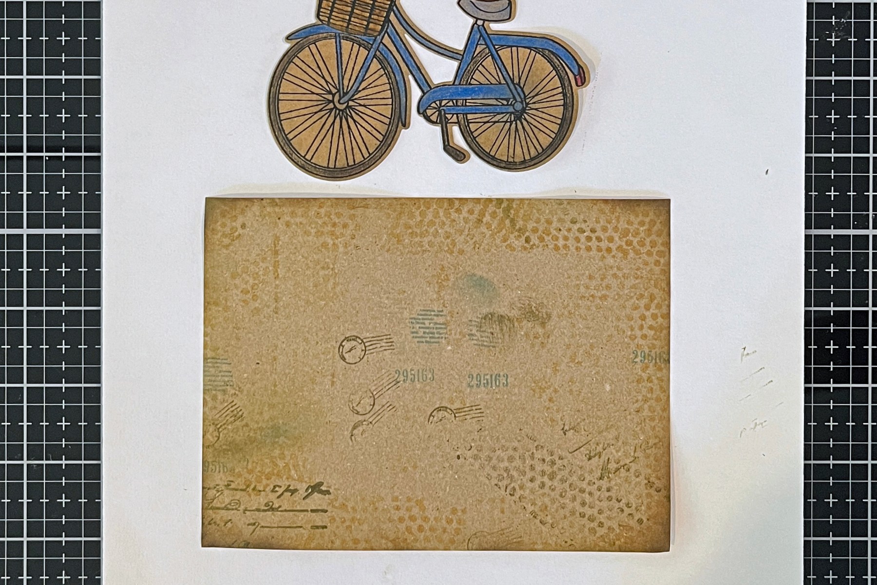
Focal Point — Hexagons
I love using shapes as focal points.
Hexagons are wonderful because they interlock — almost like puzzle pieces.
I die cut three stitched hexagons from my layered panel.
Two are stacked.
The third nestles into the “V” space.
Then I added the sweetest little bee, die cut from leftover scraps.
Because we created our panels first, the hexagons feel cohesive and integrated — not pasted on.
The blue and honey gold palette moves beautifully across the design.

Build Your Mixed Media Toolkit
If you’re just getting started with mixed media, here are a few of the essentials I personally use.
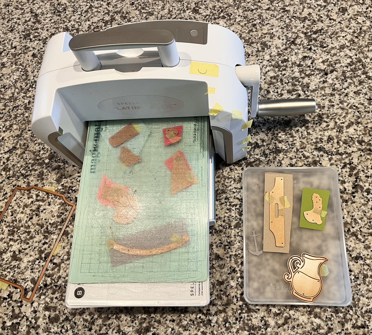
Die Cutting:
My Favorite Mixed Media Inks:
- Reactive Inks
- Root Beer Reactive Ink (my favorite for “grunging” up a project)
- Licorice Reactive Ink
- Metallic Shimmer Spray (great for splatters and backgrounds)
Essential Supplies:
Layering Staples:
- Vintage Maps and Ledgers Stamp Set
- Postmarks and Tickets Stamp Set
- Sparkle Weave Stencil
- Leaves and Abstract Shapes (Dots and Squiggles that were heat embossed)
- Pebbles and Stones Stencil
- Grids and Icons Hero Transfer
- Hero Transfers
- Bold Color Mix Numbers BetterPress Plate
If you’re building your craft room supplies, you might also enjoy my guide to the 14 Best Cardmaking Products and Supplies, where I share the tools I reach for again and again.
I have a 25 second fast paced reel of this card.
Final Thoughts
If you are new to mixed media, start here.
Ink smooshing builds confidence.
Confidence builds creativity.
And creativity builds layers.
If you try this technique, tag your project with #karensmixedmediarecipe — I would truly love to see what you create.
Next up in this series, we’ll dive deeper into layering magic.