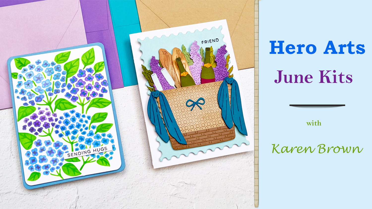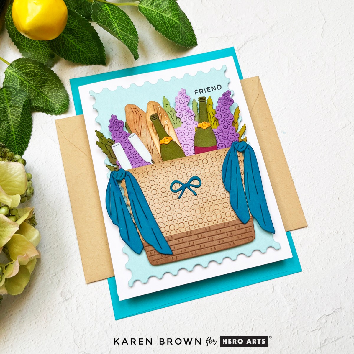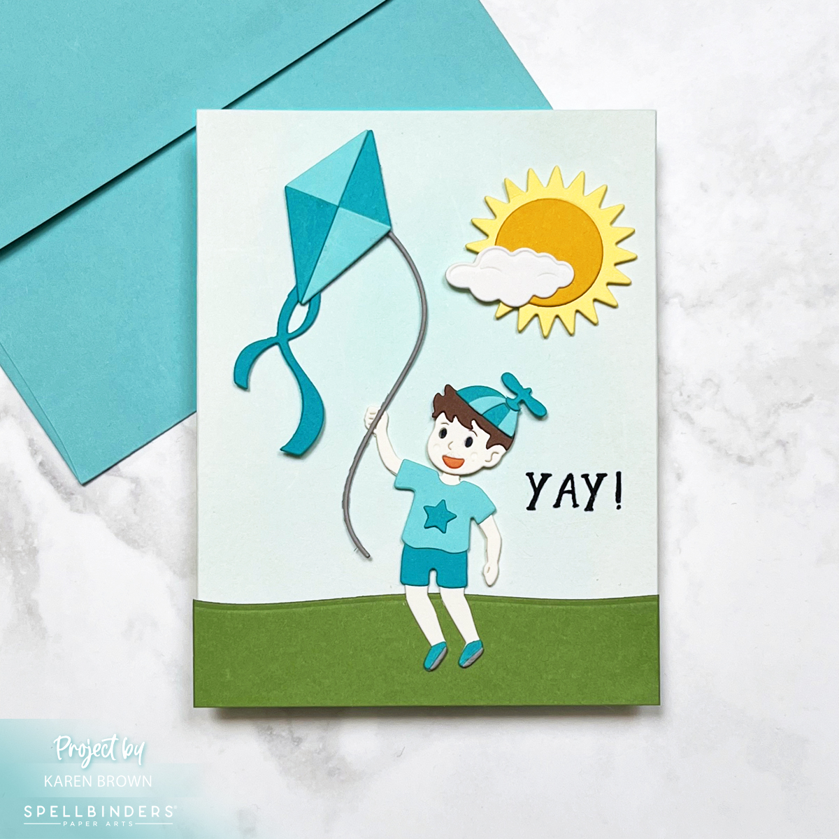
Pack your crafty bags, because this month Hero Arts is taking us on a road trip! I’m thrilled to be part of the July 2025 Club Kit Blog Hop where we celebrate this month’s travel-inspired theme. The kits are full of scenic surprises, clever sentiments, and summery fun—and I’m here to show you four creative ways to use them.
>>>> Hero Arts Club Kits Overview <<<<
You might also be interested in my VIDEO using the July Layering Stencil Kit.
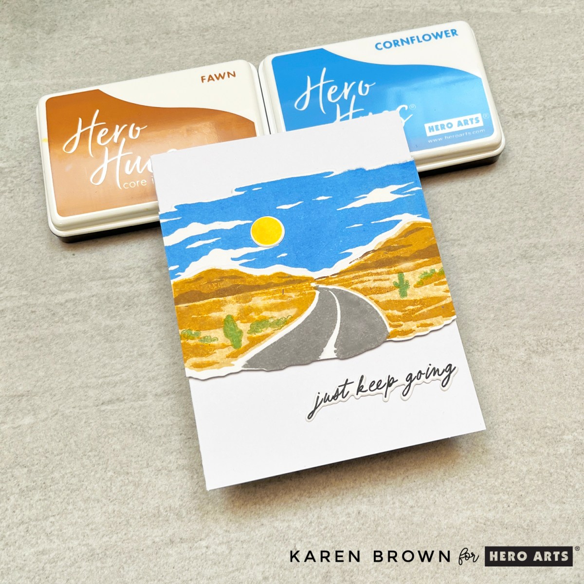
Card 1: Desert Dreams Heroscape
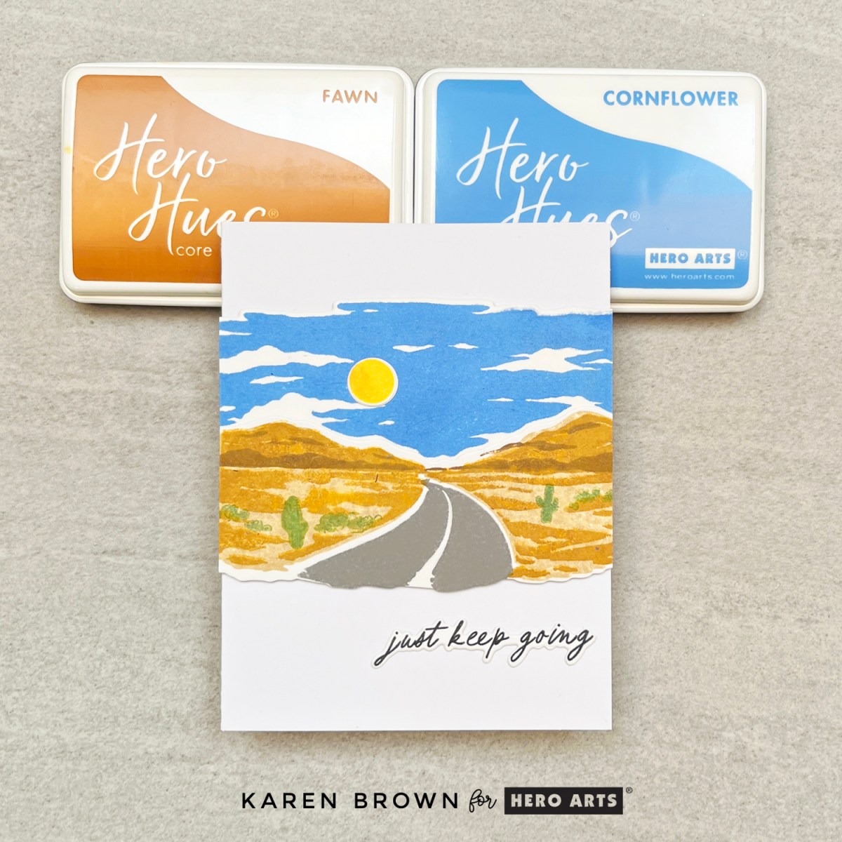
I started with the Card Kit of the Month, which features a stunning “On the Road” Heroscape. Imagine a desert road winding into the distance with low-slung mountains and a bright blue sky. These Heroscapes are layered stamps that create dimension and realism with every step.
I kept the palette natural and sun-drenched, and chose the sentiment “just keep going” — a perfect message for road trips and life journeys alike. Heroscapes are always crowd-pleasers and this one is no exception!
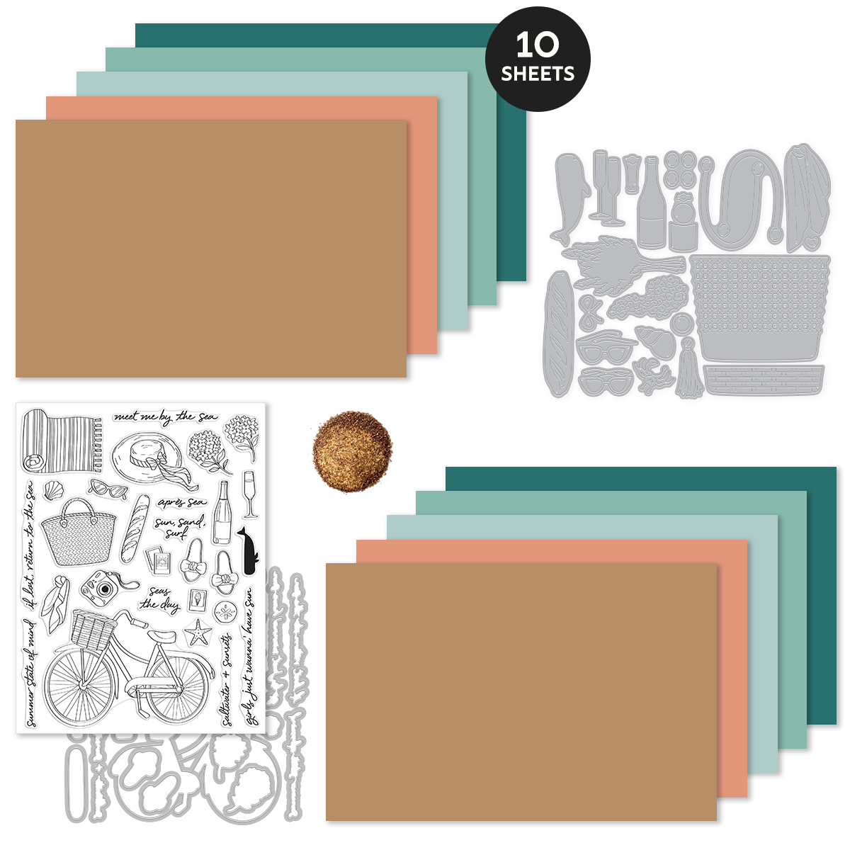
What’s Inside the July 2025 Hero Studio Card Kit?
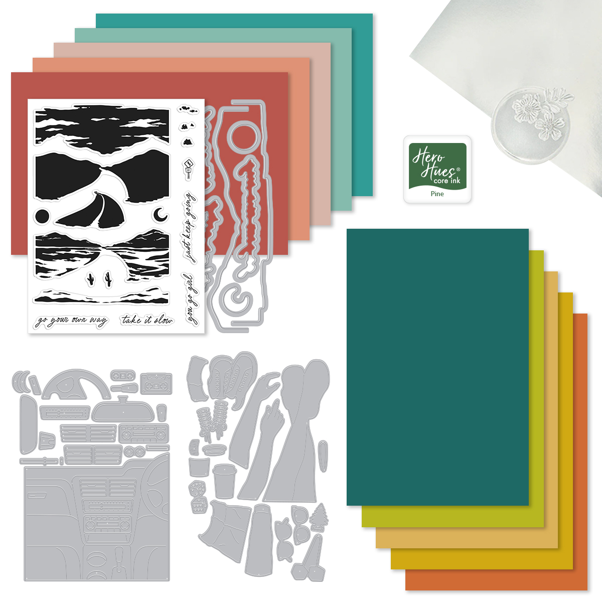
- On the Road HeroScape Coordinating Dies
- On the Road HeroScape 6×8 Stamp Set
- Let’s Go Die Set
- Pine Core Ink Cube
- 10 Sheets of Cardstock (1 of each color), 5.5″ x 8.5″ (Sicily, Coral, Bellini, Waterfall, Teal Topaz, Blue Spruce, Peridot, Beeswax, Saffron, Carrot) These are some of my absolute favorite cardstock colors and I used Carrot and Teal Topaz on two cards below.
- Mirror Paper, 1 sheet – 5.5″ x 8.5″
The Whole Studio includes ALL 5 of the monthly subscriptions in one discounted bundle. Cling of the Month, Stamp & Cut of the Month (new name for the subscription!), Layering Stencil of the Month, Fancy Dies of the Month, and the Card Kit of the Month.
Receive a FREE Everything’s Pine stamp & die set when you purchase The Whole Studio!
Hero Arts has many different Monthly Kits that you can subscribe to including:
- The WHOLE Studio – All 5 Kits ($130 subscription + Free Shipping)
- Card Kit of the Month ($60 Subscription + Free Shipping)
- Stamp and Cut of the Month ($27.50 Subscription + Free Shipping)
- Fancy Studio Dies of the Month ($25 Subscription + Free Shipping)
- Cling Stamp of the Month ($20 Subscription + Free Shipping)
- Layering Stencil of the Month ($17.50 Subscription + Free Shipping)
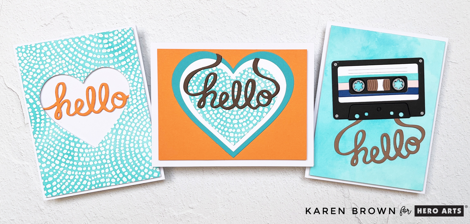
Cards 2 & 3: Cobblestone Courtyard Two-Fer
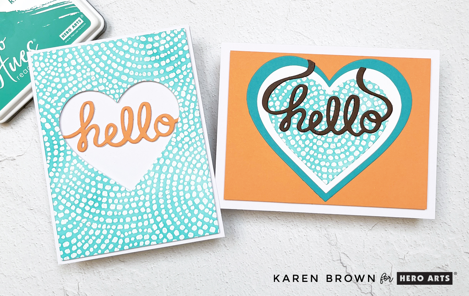
Next up is what may be my favorite Cling of the Month EVER: Cobblestone Courtyard. This rubber background stamp is a pattern of concentric circles that looks like a cozy plaza or mosaic.
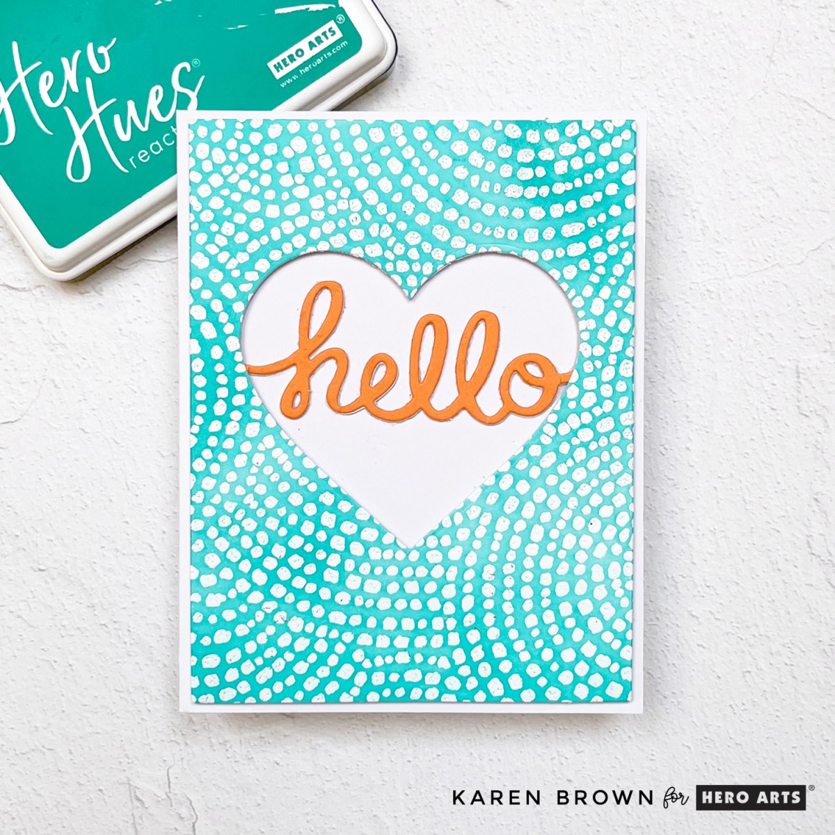
For my first card, I stamped it in Unicorn White Pigment Ink and heat embossed with White Embossing Powder on Bristol Smooth cardstock. Then I ink blended over the top using Blue Raspberry ink to create a vibrant turquoise and white background. I polished the embossing with a microfiber cloth, and the crisp, clean results had me swooning.
I couldn’t resist making a “two-fer”: I die cut a heart (from the Heart Infinity Die set) from the center of the panel and inset a scripty “hello” from the Fancy Die Kit: Mix Tape using Carrot cardstock.
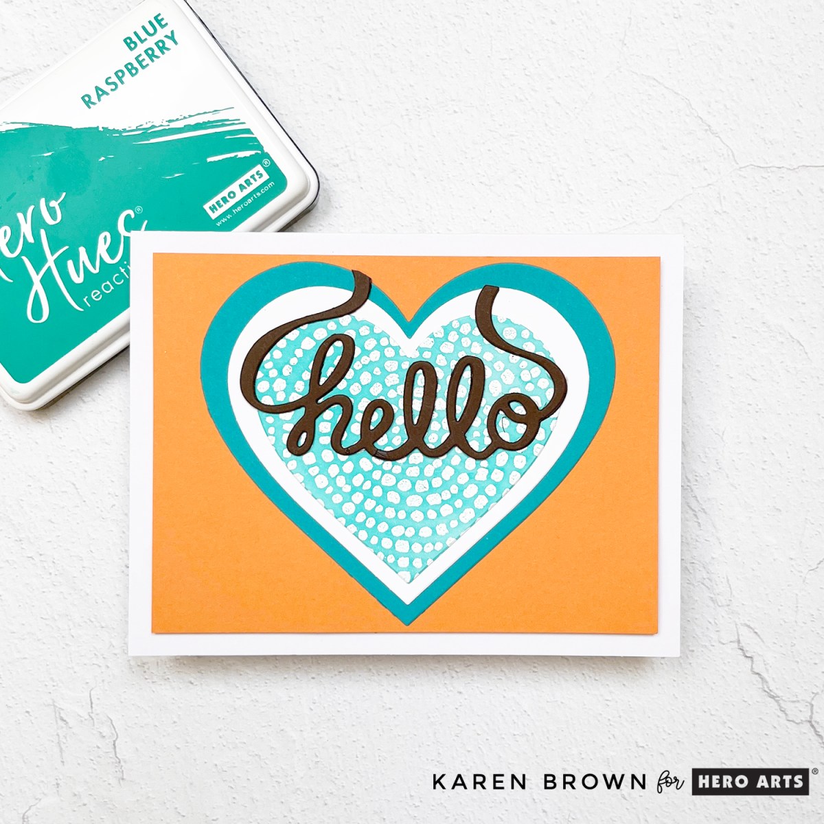
For the second card, I used the leftover heart die cut and layered it over a Teal Topaz heart, then a smaller white heart, and finally topped it with the turquoise Cobblestone heart. Another “hello” sentiment (this time in Woodland cardstock) finishes the look. The swooping tails of the sentiment are so charming! Two cards with a fresh, summery vibe!
📼 Card 4: Mix Tape Magic
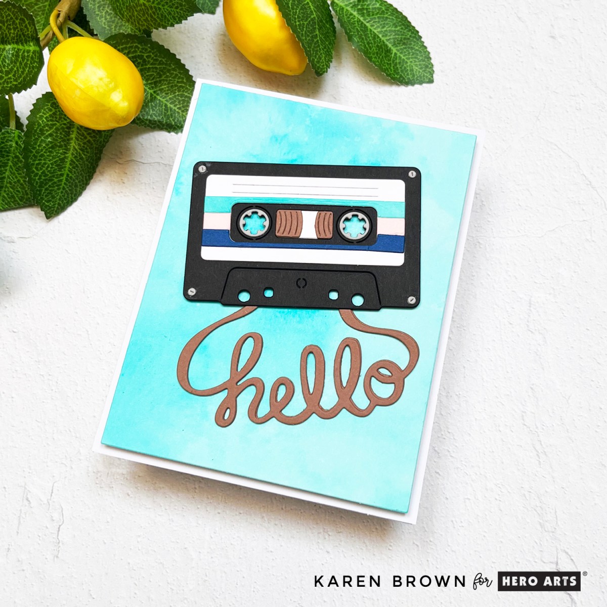
For my final card, I had fun with the Fancy Die of the Month: Mix Tape. This playful set includes a cassette tape die with the word “hello” cleverly shaped from the tape itself. I used this hello sentiment on three of my cards today.
I placed the cassette on a handmade ink-smooshed background using Blue Raspberry, Splash, and Pool Party inks. I wanted my background to look like a shimmery swimming pool. Want to try ink smooshing? Here’s how:
Ink Smooshing Quick Steps Tutorial:
- I liberally inked a 6×6″ acrylic block with Blue Raspberry, Pool Party and Splash inks. This is the panel I used for my background.
- I spritzed the ink with water and “smooshed” the block onto a piece of watercolor paper
- I weighted the inked block with a book for 5 minutes
- I uncovered my panel. If the ink pooled, I dabbed with a paper towel.
- I made a “second generation” panel for a future project by taking a piece of Bristol Cardstock and soaking up the excess ink on my work space. So this is another Two-Fer!
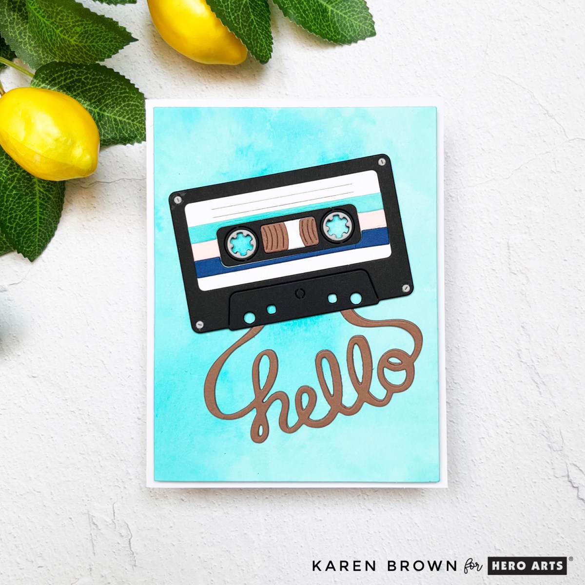
The retro vibe of the tape plus the dreamy summer colors made this card a total blast to create.
You might be interested in another popular Ink Smooshing post I wrote.
GIVEAWAY
Hero Arts will give away a $50 gift card, drawn from the comments left across the hop. Enter by Saturday, July 5th at 11:59pm PT, and the winner will be announced on the Hero Arts blog the following week. Leave a comment on all stops for more chances to win!
BLOG HOP ORDER
Hero Arts
Hero Arts Creative Team:
Anna Mahtani
Channin Pelletier
Charlene Madrid
Jeannie Lieu
Jennifer Kotas
Karen Brown <<<You Are Here
Lisa Tilson
Michelle Lupton
Michelle Short
Mindy Eggen
Natasha Polite
Rachel Kleinman
Rosie Lopez
Seeka
Special Guests:
Nichol Spohr
Lea Lawson
Sheri Gilson
🚗 Final Thoughts
Whether you love to layer, emboss, smoosh or die cut, the July 2025 Hero Arts Club Kits have something inspiring for every type of cardmaker. Don’t forget to follow along the Blog Hop to see even more road trip-ready inspiration. Thanks for stopping by—and remember: Just keep going!