There’s nothing quite like sending a little handmade kindness when someone isn’t feeling their best. Today’s card features the always-adorable House Mouse stamps in a sweet and simple Healing Thoughts Get Well design. With its soft monochromatic colors and heartwarming scene, this card is as charming as it is easy to make!

A Look at the Design
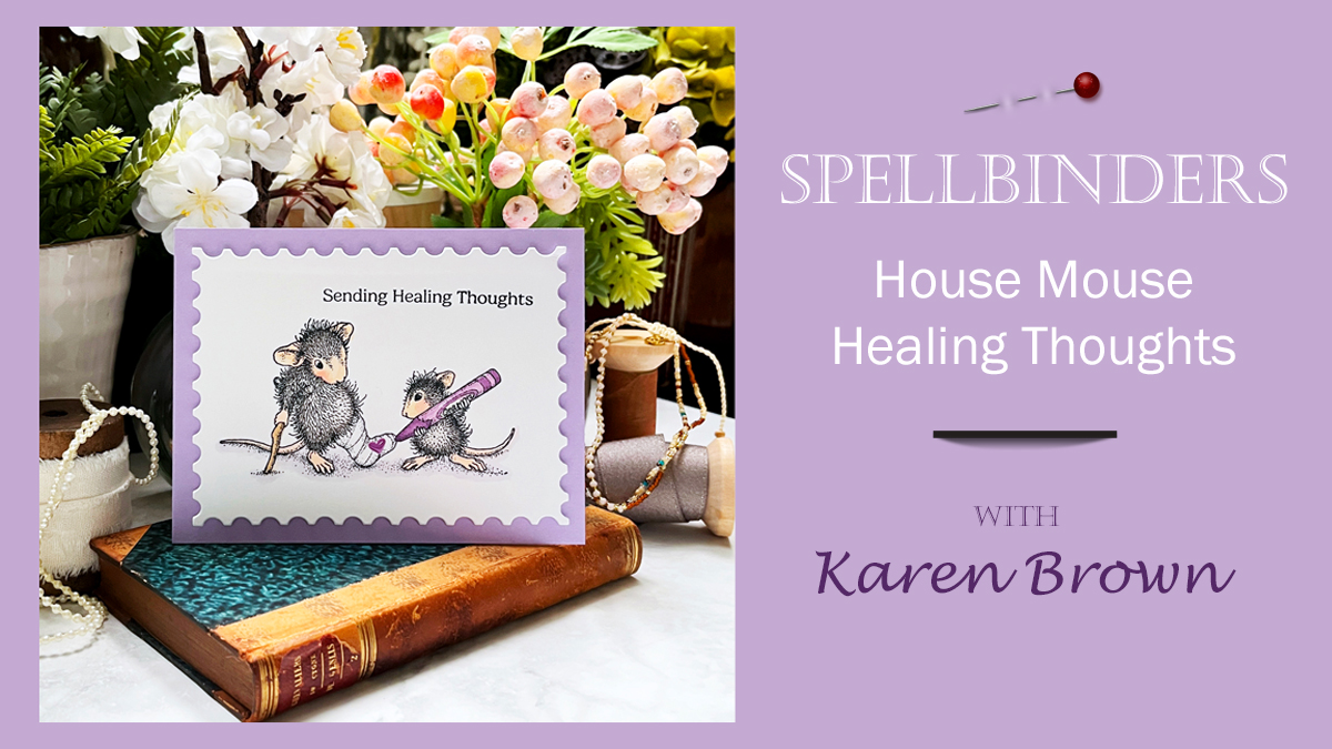
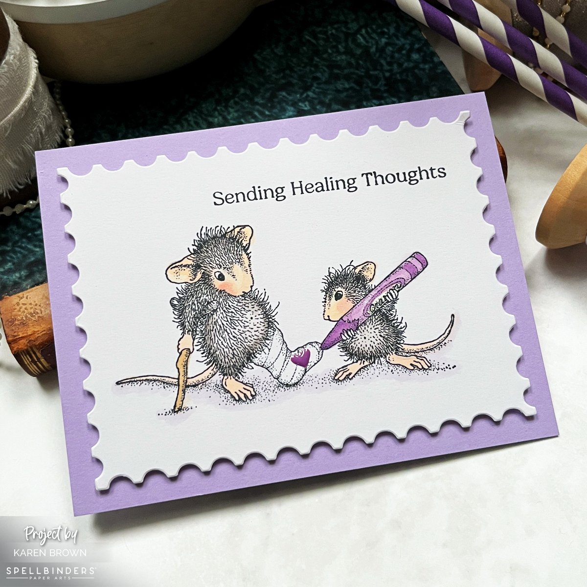
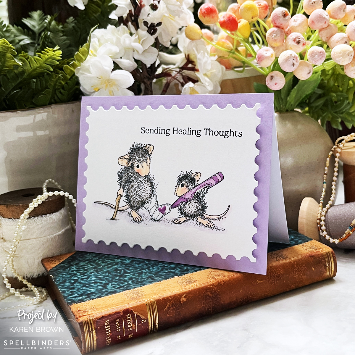
The stamped image showcases an adult mouse with a cast on his left leg, while a juvenile mouse signs the cast with a giant purple crayon—adding a little heart for extra love. It’s a scene that captures both the innocence and warmth of these stamps so well!
To keep the design clean and simple, I used the Nesting Postage Stamp Infinity Die to cut out the panel and mounted it on a Passion Flower lavender card base. The soft lavender hue adds a soothing touch, making this card perfect for lifting someone’s spirits.
The sentiment, “Sending Healing Thoughts,” ties everything together beautifully—because sometimes, a thoughtful card is just the thing to brighten someone’s day.
Why I Love House Mouse Stamps
There’s just something irresistible about House Mouse stamps! 🐭💜 These little critters bring so much warmth, charm, and personality to every card. Whether they’re getting into mischief, sharing a sweet moment, or—like in today’s card—spreading a little cheer, they always manage to bring a smile.
I love how these stamps work for so many occasions. Their soft, sketchy details make them a joy to color, whether you go for bold tones or a simple, monochromatic look like I did here.
House Mouse cards are always a hit with recipients, and I can’t wait to share more of my little mousey creations with you!
Copic Colors Used
- Mice: W0, W3, W5, E00, E50, R000, R20
- Crayon: V01, V15, V17
- Cane: E31
- Shadows: BV0000
Final Thoughts
Having a few Get Well cards on hand is always a great idea, and this quick and easy House Mouse design is perfect for the job! Sometimes simple is best, and this card proves that a heartfelt sentiment and a sweet image can go a long way in brightening someone’s day.
Do you love House Mouse as much as I do? Let me know in the comments! And if you’re looking for more inspiration, check out these previous House Mouse creations: