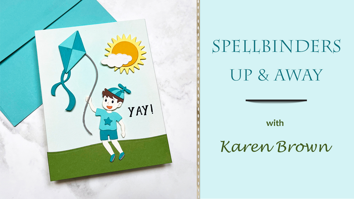
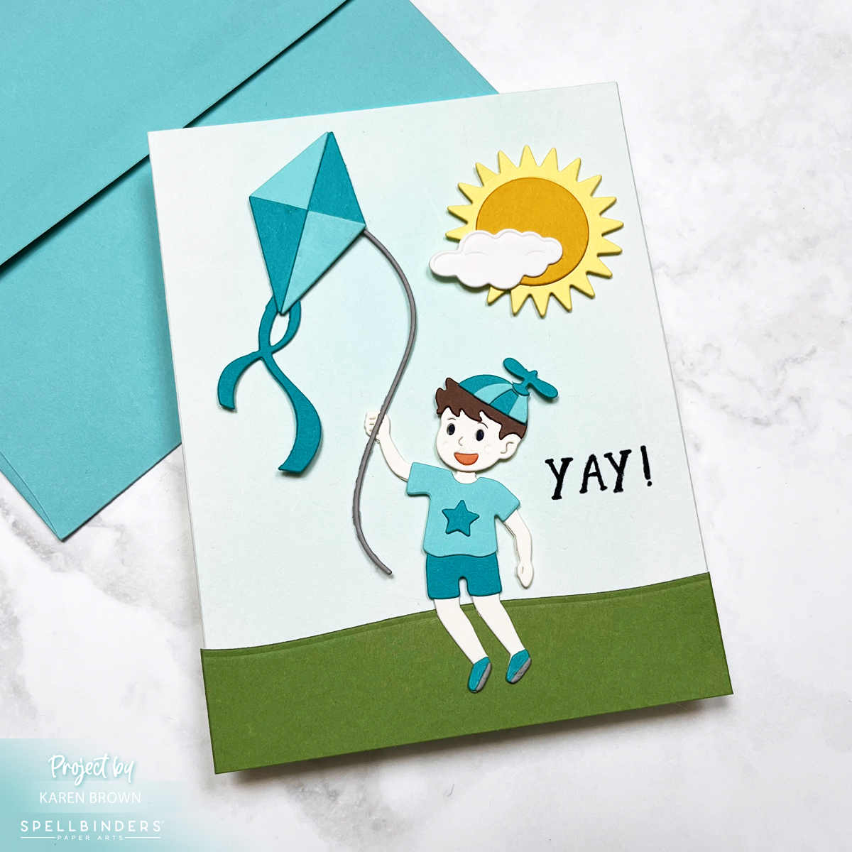
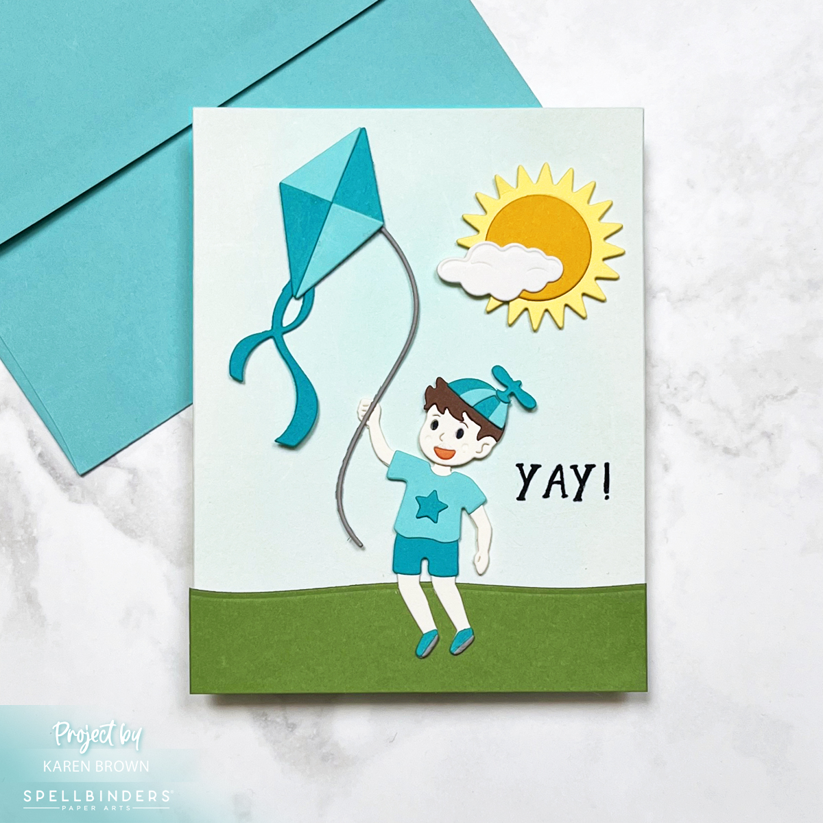
Today, we’re soaring high with a sweet and sunny scene card, perfect for celebrating birthdays or welcoming a baby boy into the world! 🌤️🎈
This design features a playful little boy flying his kite beneath a big smiling sun and a puffy white cloud—an instant mood-lifter in card form. All the elements were crafted using the brand-new Up and Away die set from the Sky is the Limit collection by none other than the crafting wunderkind himself, Simon Hurley.
Color Me Happy
The card showcases a bright and breezy color palette, with Waterfall and Teal Topaz cardstock stealing the spotlight. These shades of aqua and teal give off major sky-blue vibes that feel both fresh and fun.
Background with a Breeze
For the sky, I created a soft, dreamy wash using Pool Party Reactive Inkon watercolor paper. I used a flat brush for that gentle sweep—like a serene spring sky just waiting for a kite to dance across it.
Die Cut Delight
Every piece on this card—from the kite and the boy to the sun and cloud—is die cut and carefully layered for a dimensional scene that really pops. The clean lines and whimsical style of the dies make them a joy to work with. And let’s be honest: the Up and Away set is pure magic!
Perfect for…
Baby showers (especially for little boys!) The repeating aqua and teal color palette reinforce the baby theme.
Kiddo birthdays
Or just sending sunshine and smiles on a cloudy day
This one’s going into my “make again soon” pile—because how can you not love a card that makes you want to run outside and fly a kite?
Happy crafting, and may your skies stay sunny! ☀️🪁
Spellbinders’ latest Club Kit Release is here, and this month’s dies are packed with charm, nostalgia, and creativity! I created three unique handmade cards using the Large Die of the Month, Small Die of the Month, and Stitching Club of the Month. Each design brings something different to the crafting table—from vintage-inspired letterboxes to whimsical mail carriers and stitched stationery.
Let’s get started!
Card 1: A Vintage Farmhouse Letterbox
First up, the Large Die of the Month – a stunning vintage-style letterbox that feels straight out of a charming countryside home.
I custom-mixed my colors using Hero Arts Reactive Inks, blending 50% Fog and 50% Pool Party for the perfect minty vintage hue on the letterbox. Other Reactive Inks Used: Taffy, Fruit Punch, Green Apple, Blue Raspberry and. Grape Slush. The key, sentiment frame and keyhole were painted with Gold Metallic Watercolor.
Inside the mail slot, a sweet die-cut letter with a heart and a cluster of pink flowers peeks out, adding a touch of romance.
A gold letterbox key is placed on the box for extra detail.
I mounted everything on Stellar White Groove ribbed paper (from a Your Paper Insidersubscription box) to mimic the look of house siding.
I’m a bit of a paper hoarder, so this specialty paper subscription is right up my alley! 😄
Card 2: You’ve Got (Snail) Mail!
For the Small Die of the Month, I couldn’t resist creating a playful “snail mail” scene! This one was so much fun to put together.
The star is a cute little snail, delivering happy mail in style. She holds a tiny envelope with a heart seal and wears a mail pouch and hat as she crawls along.
I started by doing my die-cutting and then I watercolored each die cut for my happy cozy scene. I watercolored with Reactive Inks : Creamsicle, Fruit Punch, Taffy, Green Apple, Blue Raspberry, Pool Party, Blue Hawaii, Splash, Granite and Fawn.
She’s accompanied by a pink worm and surrounded by red and orange tulips and a mailbox—a cozy little world in miniature.
The sentiment is a scripty “sending” + an enamel heart.
I finished the card with diluted white acrylic paint splatters, adding a touch of whimsy.
The theme? A punny “You’ve Got (Snail) Mail”—a crafty nod to the classic rom-com! 💌 🐌
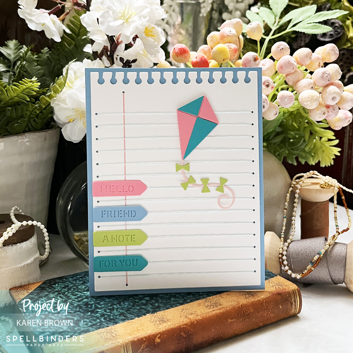
Card 3: Stitched Notebook Paper & Die-Cut Page Tabs
For my final card, I used the Stitching Club of the Month to create a notebook-inspired stitched background—a must for any stationery lover!
The stitched blue horizontal lines and pink vertical margin line replicate lined notebook paper.
The top edge is die-cut to look like it was torn from a wirebound notebook for extra realism.
The sentiments are die-cut page pointers die cut from ColorWheel Cardstock, reading:
Hello (pink)
Friend (blue)
A Note (lime)
For You (teal)
To add movement, I included a pink and teal kite, die-cut from last summer’s Fly Away Kite Kit.
I stitched with two pieces of floss for extra texture and die-cut the background twice (and glued together) for a sturdy base. I used DMC #162 (light blue) and #776 (pink) floss.
This design is a fun way to send a cheerful, handwritten-style note in card form!
This month’s Spellbinders Club Kits are filled with endless creative possibilities—from elegant vintage letterboxes to playful snail mail and nostalgic stitched stationery.
Which card is your favorite this month? Let me know in the comments! 💌 ✂️
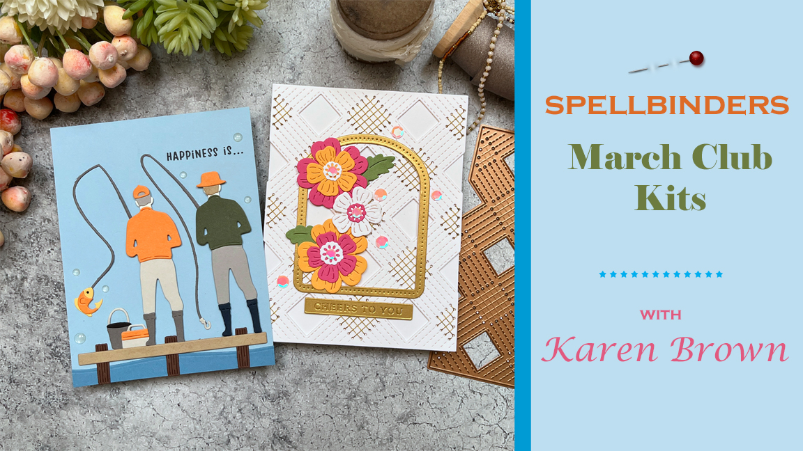
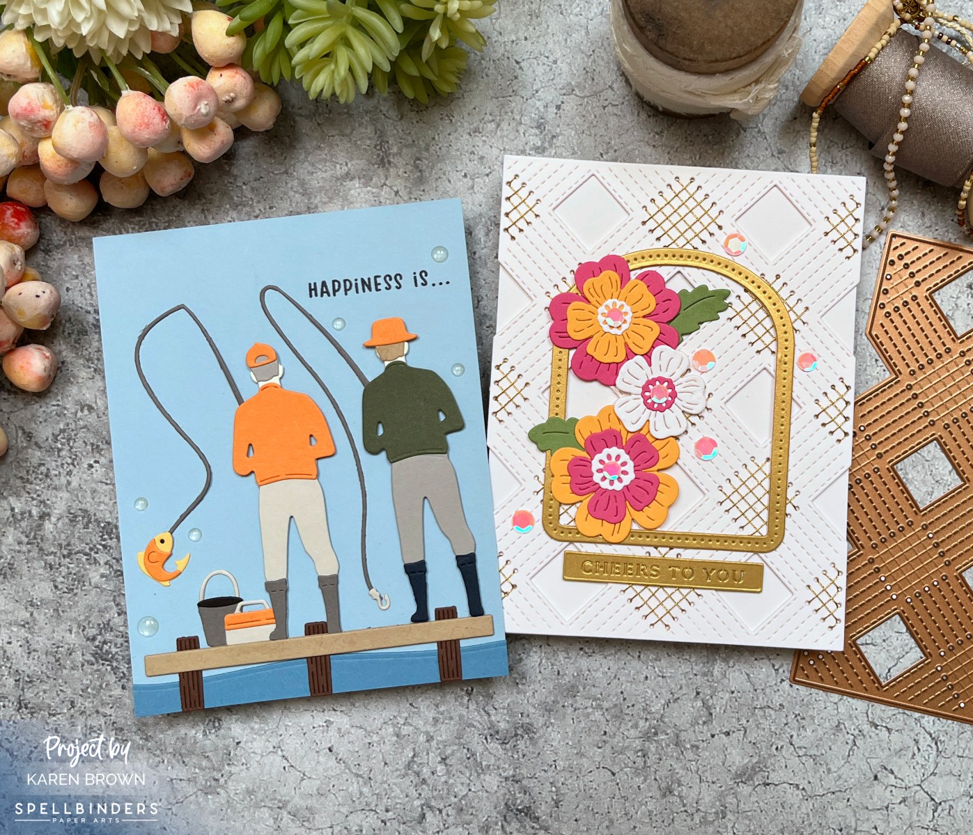
March is here, and with it comes Spellbinders’ March 2025 Club Kits,featuring some truly exciting club kits! This month, I crafted two very different—but equally fun—cards: one celebrating the great outdoors and another bringing stitched floral elegance to life. Let’s dive in!
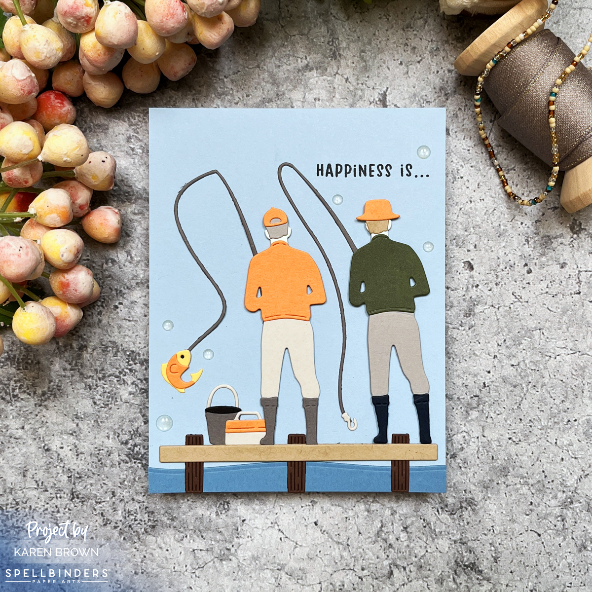
For my first card, I used the Die of the Month Club Kit – Fairways and Fish Tales, a perfect choice for masculine cards. This set brings all the charm of a peaceful fishing trip, complete with fishing rods, tackle boxes, and two friends casting their lines from a dock.
Since my husband is a fly-fishing enthusiast, this card is especially meaningful. The “Happiness is…” sentiment captures the joy of a day spent on the water. The color palette leans into lovely blues, accented with pops of orange and green, giving the scene a fresh and lively look. If you’re looking for a kit that’s perfect for the men in your life, this one is a winner!
For my second card, I combined the Stitching Club of the Month Kit with the Large Die of the Month, which offers three design options: floral, dog, and dinosaur. I chose the floral dies and paired them with the intricate stitching background for a stunning, textured effect.
The stitching panel was cut from white cardstock and hand-stitched with gold thread, giving it a luxe feel. Then, I added die-cut flowers in pink, orange, and white, accented with gold, to create a truly elegant design. Stitched cards always have that “WOW” factor, and this one is no exception—handmade beauty that recipients love!
One thing I love about the stitching die background is that it’s just as beautiful unstiched. I plan to use it that way in the future for a more subtle yet equally stunning effect.
Notes About This Card:
I started by die-cutting all my components with my Platinum 6 System.
March’s Spellbinders release has something for everyone—whether you’re crafting for the outdoorsman in your life or making a stitched masterpiece. Which of these styles speaks to you the most? Let me know in the comments!
Get ready to fall in love with theSpellbinders February 2025 Club Kits! This month’s releases are packed with charm and creativity, and I’m thrilled to share two whimsical scene cards that will have you reaching for your die-cutting machine in no time.
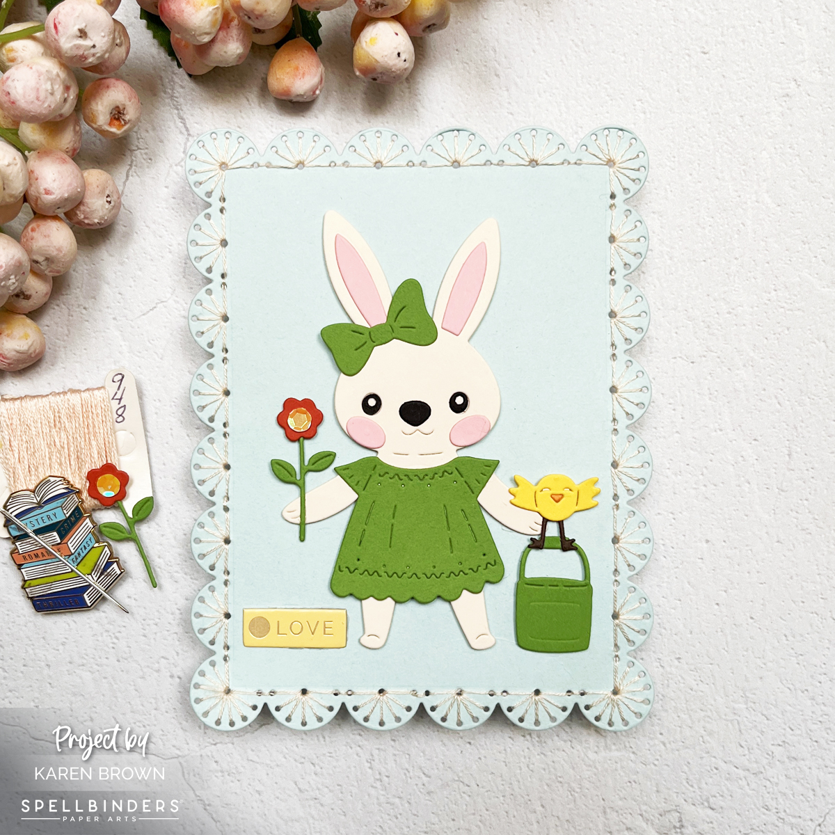
Easy Stitched Die Cut Bunny Card Full of Charm
This first card features the Stitching Die of the Monthpaired with the Large Die of the Month, creating a darling stitched frame. Inside the frame, a sweet die-cut bunny dressed in a spring green dress steals the spotlight. She’s holding a delicate flower, making this design ideal for Easter, baby showers, or even get-well cards. The soft blues, vivid greens, and warm yellows lend a fresh spring vibe, while the stitched frame adds texture and an elegant touch.
The second card takes a playful turn with a pair of olive green shoes, complete with stylish blue and olive anklet socks. The SmallDie of the Month works its magic, letting you create a unique scene where die-cut flowers are tucked into the patterned socks. You’ll spot the calves of a lady walking confidently into spring, and the sentiment “Hello” ties everything together. Perfect for birthdays, get-well wishes, or just saying hi, this design showcases the versatility of these dies.
Quick Notes About This Card:
I started by looking through my patterned paper for some fun “sock material”. I chose this eye-catching circular pattern, but a small floral or plaid would also work great!
Once I had my socks, I pulled together other colors that would work well for my scene. I frequently use my Color Cubes when selecting my color palette.
Both cards highlight the magic of die-cutting, with intricate details and stitching that bring each scene to life. Whether it’s the textured frame around the bunny or the whimsical floral shoes, these designs are sure to inspire intermediate and advanced crafters alike.
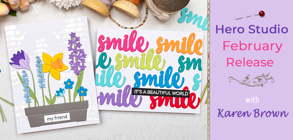
Hello, crafty friends! It’s time to shake off those winter blues as we play with the new Hero Studio February Release!
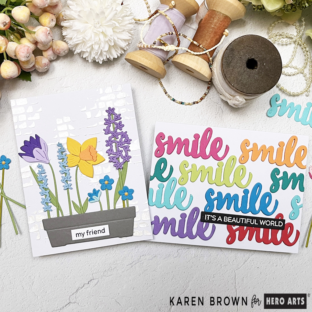
Smile, It’s a Beautiful World
For my first card, I used the Hero Studio February 2025 Card Kit of the Month, which is packed with fabulous sentiments. My design features repeating die-cut “smile” sentiments in a rainbow of colors, arranged in perfect rainbow order.
How I Made This Repeating Die Cut Sentiment Card:
Each sentiment was die cut three times per color, stacked, and glued together for added dimension and impact.
I used my favorite Hero Hues Cardstock Colors: Ultra Pink, Papaya, Kiwi, Bermuda, Paradise, Peacock, Amethyst and Cherry.
I found the card layout worked best by gluing in the following order: pink, lime, orange, peacock, paradise, bermuda, red, amethyst.
To complete the design, I added a heat-embossed sentiment that reads “It’s a beautiful world”, which is also included in this month’s kit. The result is a bright and happy card that’s sure to bring a smile to anyone’s face
What’s Inside the February 2025 Hero Studio Card Kit?
February 2025 Card Kit of the Month: Tulips • Tulip HeroScapes Clear Stamp Set, 6” x 8” • Circling Clouds Cling Stamp, 6″x 6″ • Messages Clear Stamp Set, 4″ x 6″ • 7 Tulip HeroScape Coordinating Dies • 4 Word Fancy Dies with Frame Cuts • 5 Messages Coordinating Dies • 4 Ink Cubes (Thistle, Azalea, Moss, Blue Raspberry
February 2025 Hero Studio Kits:
The Whole Studio includes ALL 5 of the monthly subscriptions in one discounted bundle. Cling of the Month, Clear + Dies of the Month, Layering Stencil of the Month, Fancy Dies of the Month, and the Card Kit of the Month.
This month, receive a FREE adorable “bug” die set when you purchase The Whole Studio!
Hero Arts has many different Monthly Kits that you can subscribe to including:
The WHOLE Studio – All 5 Kits ($120 subscription + Free Shipping)
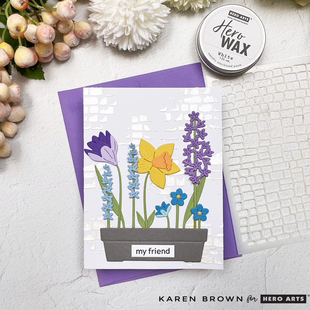
The February Fancy Die Kit is a gorgeous planter box brimming with vibrant spring flowers like wisteria, daffodils, and delicate blue blossoms.
How to Create a Cheerful Floral Scene Card:
The Kit die cuts are layered with care to create a dimensional, cheerful garden scene.
I used Hero Hues cardstock in the following colors: Charcoal, Amethyst, Passion Flower, Iris, Meadow, Periwinkle, Peacock, Mist, Mustard and Papaya.
To add texture and interest, I stenciled a Cobblestone background with white Hero Wax, placing it “here and there” for a soft, rustic touch. I love the pearlessence that the wax adds to my project and the crisp white background makes the floral colors—shades of purple, yellow, and blue—pop beautifully.
A sweet “My Friend” sentiment (February Card Kit) ties the whole design together, making this card perfect for brightening someone’s day.
These designs are packed with die-cutting fun and stenciled charm, making them perfect for crafters who want to try something fresh.
Join the Blog Hop Fun!
Don’t miss out on the February Blog Hop—a celebration of creativity featuring incredible projects from the Hero Arts Creative Team. Be sure to hop along, leave a comment, and check out the other amazing designs. Who knows? You might just discover your next favorite crafting idea!
Hero Arts will give away a $50 gift card, drawn from the comments left across the hop. Enter by Saturday, February 8 at 11:59pm PST, and the winner will be announced on the Hero Arts blog the following week. Leave a comment on all stops for more chances to win!
Few things evoke a sense of nostalgia and warmth quite like the timeless charm of Winnie the Pooh. Using Spellbinders new Friendly Moments BetterPress letterpress plates, I created three unique hello cards that capture moments from the Hundred Acre Wood. Each design features a distinct artistic style, from sepia simplicity to watercolor wonder, and they’re all perfect for sending a heartfelt note.
I have links to the key products at the bottom of this blog post.
Now let’s take a closer look at these enchanting creations!
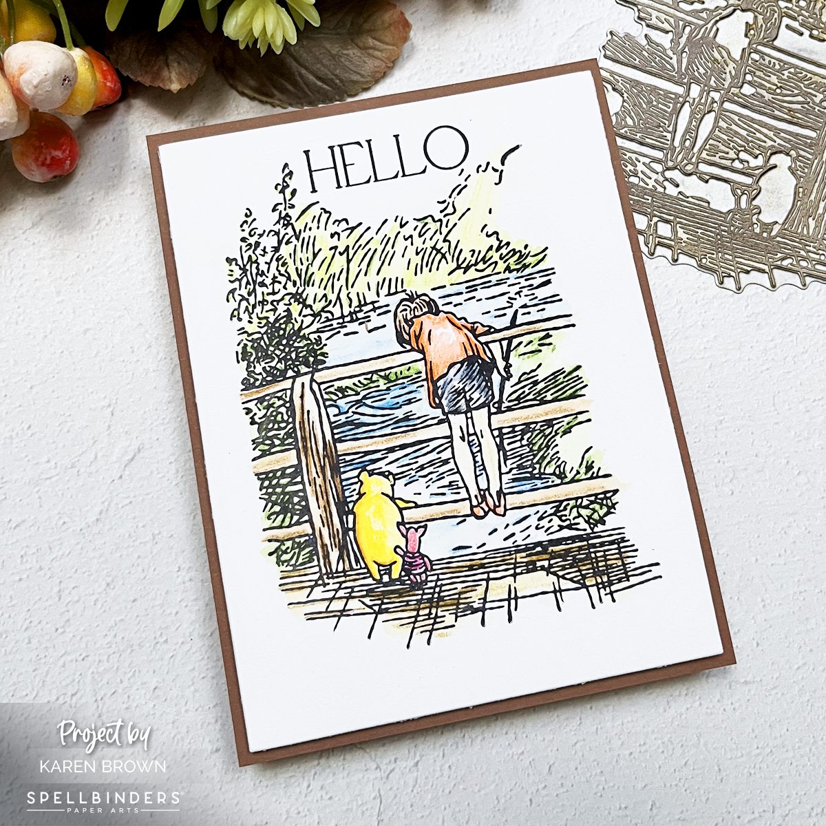
Card 1:Watercolor Wonder
I used a heartwarming scene of Christopher Robin and Pooh on the bridge and added a pop of color with Inktense Watercolor Pencils and a damp round paint brush. Pressed with Black ink on Watercolor Paper, the BetterPress impression provides crisp lines that beautifully anchor the soft, vibrant hues of the watercolors. And there was no ink bleeding when watercoloring with the BetterPress Inks! The river sparkles in shades of blue, the bridge has rustic wooden tones, and Pooh’s honey-yellow fur shines against the greenery. The Hello Sentiment is from A Friend Like You set. The card base is Cup O Joe, which is a perfect pairing for this scene. This card is a great way to add touch of whimsy and joy to someone’s day.
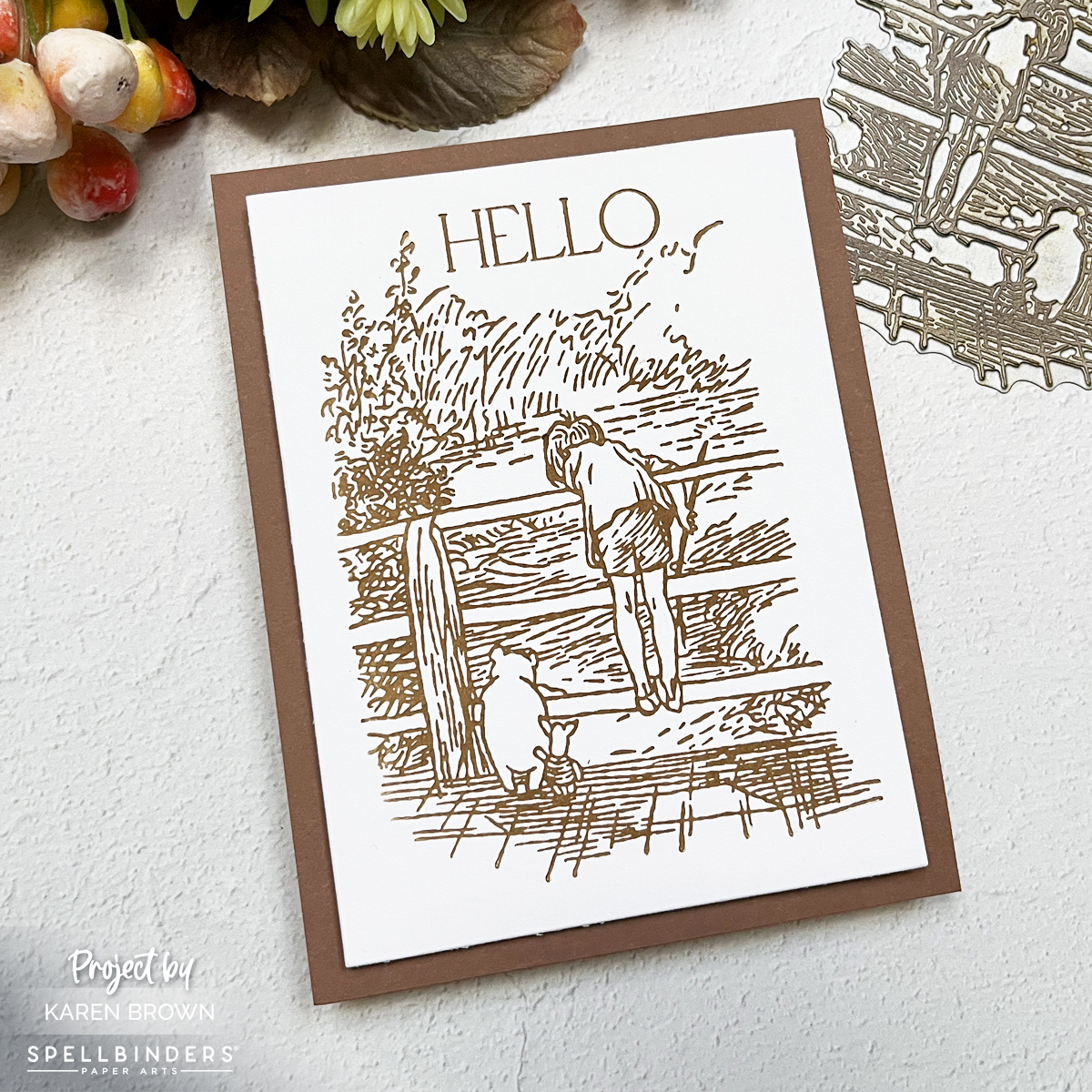
Card 2: Sepia Simplicity…So Quick and Easy to Make!
This second card exudes vintage charm with a sepia-inspired look. The scene of Christopher Robin and Winnie the Pooh on a bridge, gazing at a flowing river, is pressed with Bark brown ink for a classic, monochromatic feel. The texture and detail of the BetterPress plate truly shine, creating a design that’s simple yet sophisticated. Paired with a Cup O Joe card base, this card is a perfect nod to Pooh’s timeless stories.
This second card was so quick and easy to create and I think it would make a wonderful set of notecards to give as a gift.
Card 3: Polaroid Nostalgia
The third card captures a tender moment of Winnie the Pooh and Piglet walking down a quiet road, their backs turned to the viewer. To frame this scene, I used a Polaroid-style die cut frame and label, which adds a playful, nostalgic touch. After pressing the scene in Black ink onto Watercolor Paper, I brought it to life with Derwent Inktense Watercolor Pencils, creating a soft, storybook aesthetic. The vivid colors and the Polaroid look make this card feel like a treasured memory captured in time.
Sometimes, a handmade card can transport us to a place of pure nostalgia and joy. That’s exactly what this Winnie the Pooh-inspired birthday card does! With die cuts, soft ink blending, and a cheerful color palette, this whimsical creation captures a moment straight out of the Hundred Acre Wood.
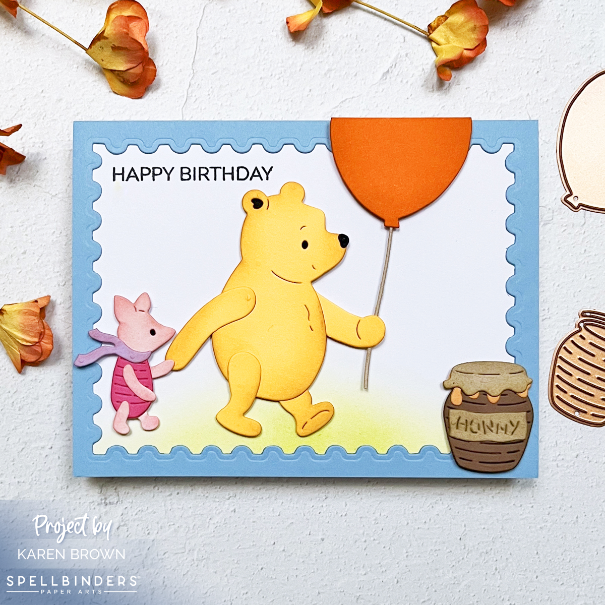
This card brings to life a heartwarming scene of Winnie the Pooh and Piglet holding hands, walking side by side. The duo is accompanied by a playful orange balloon on a string, gently floating above. A honey pot rests on the ground, completing the sweet and simple vignette. The background features softly ink-blended green grass, framed by a charming postage stamp-style border in periwinkle blue, adding just the right touch of whimsy.
Techniques for Dimension and Charm
The die cuts are the stars of this card, and a touch of light ink blending adds depth and dimension to each element. Winnie the Pooh’s honey-colored body gets a subtle gradient to make him pop, while Piglet’s pink details are gently shaded for softness. The balloon shines bright in orange, with its string creating a delightful sense of movement.
The grass is ink blended in gentle greens, giving the scene a soft, storybook feel. Meanwhile, the periwinkle frame ties everything together with its postage stamp shape, reminiscent of a cherished letter from the Hundred Acre Wood.
Why This Card is a Classic
This Pooh-themed birthday card is more than just a greeting; it’s a tiny piece of nostalgia wrapped in creativity. Perfect for anyone who loves the timeless tales of Winnie the Pooh, this card is sure to bring a smile to their face and a touch of magic to their special day.
Today’s card is for a friend’s birthday, but I think it would also be great as a Get Well Card.
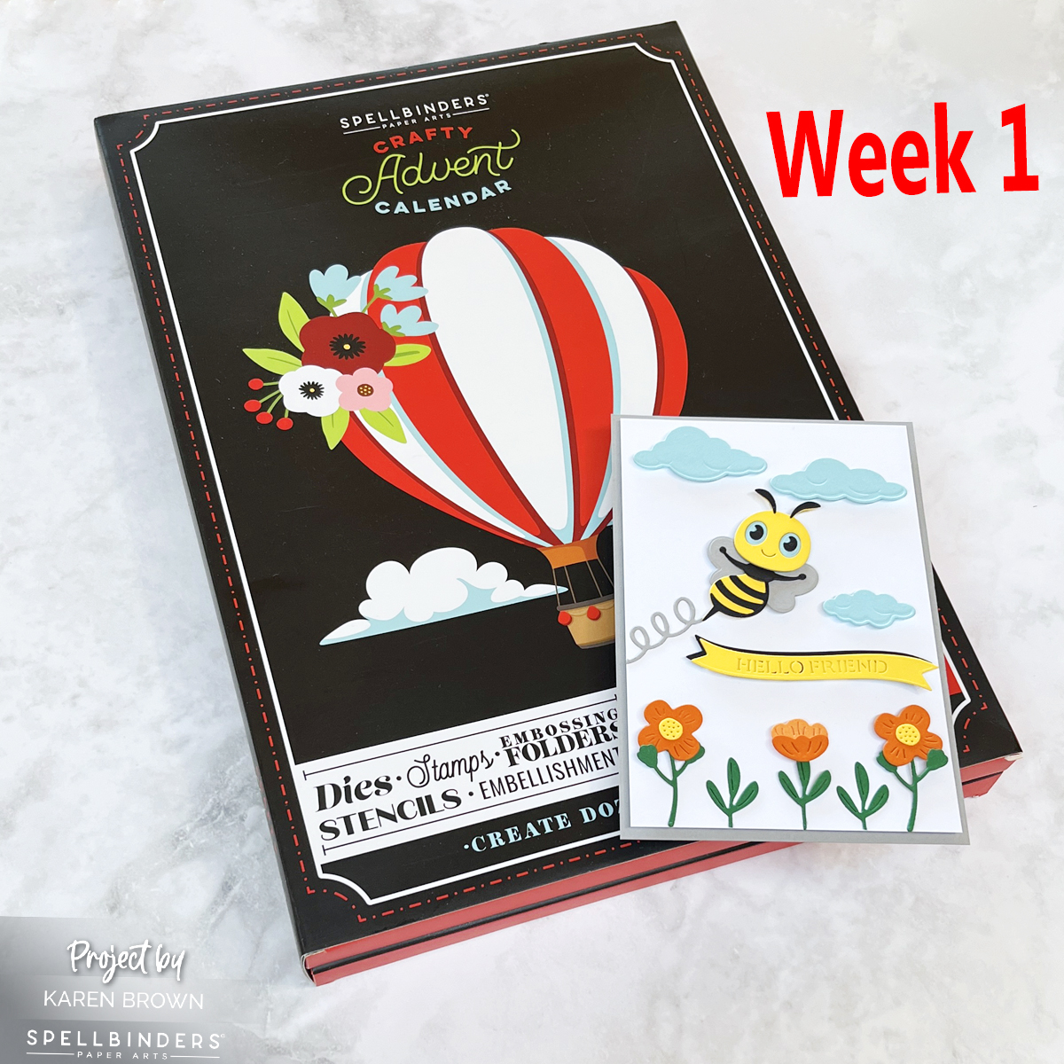
I recently opened my SpellbindersCrafty Advent Calendar and, oh my, I can already tell this is going to be an exciting month filled with DIY fun! For those who might not be familiar, a Crafty Advent Calendar contains 24 days of creative supplies and surprises, all designed to inspire your crafting. This week, I dove into the first few projects, and I can’t wait to share the magic of it all with you.
Opening the Advent Calendar: Day 1 to Day 7
The anticipation of opening each little door in the calendar is half the fun! Each day has revealed a mix of supplies and cute embellishments. I could feel my creativity bubbling the moment I opened Day 1.
If you missed it, you can read my Day 1 post HERE.
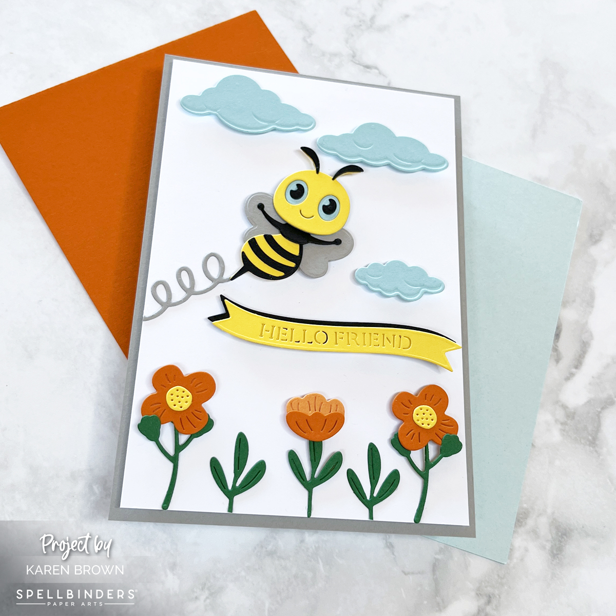
The adorable bee (day 6) captured my heart and I used those dies along with days 3, 4 and 5 to create this cute Hello Friend scene card. The clouds from the Fly Away die set were the only things I added that were not included in the Crafty Advent Calendar.
I wanted a little more vertical room for my scene, so my white panel is 4″ x 6″.
I loved the inspiration that came with each day’s reveal. I’m excited to continue opening the calendar and discovering what new projects await in the coming weeks. Stay tuned for more fun holiday crafts—I’ll be sharing new projects each week!
Have you opened a Crafty Advent Calendar this season? What are you making with yours? Let me know in the comments—I’d love to see your creations!
December is finally here, and I couldn’t be more excited to kick off the festive season with my Spellbinders Paper ArtsCrafty Advent Calendar! If you’re anything like me, the thought of crafting something new each day leading up to Christmas brings so much joy—and this year, the fun starts with a surprise die inside Day 1. Let’s open it together and make a holiday card!
The anticipation is real. As I carefully peel open Day 1, I reveal… a beautiful hot air balloon die! It’s intricate yet versatile, perfect for adding that extra touch of winter magic to any holiday card.
This balloon die is just adorable with tons of detail! So here is a quick tutorial on how I created this bright happy card:
I started by die cutting my balloon 3 times in the following combinations: orange and hot pink, aqua and lime, lavendar and purple. This project is perfect for my compact desk top Scout Die Cutting Machine.
The only die I added is the cloud from the Fly Away die set. I use this cloud on a lot of projects and find it is a great accent to have in my craft room.
My background panel is 4 1/4″ x 6″. I little longer than an A2 card but I like the layout better with a bit more vertical space.
My card base is charcoal grey for a bit of lovely contrast.
And There You Have It!
I can’t wait to see what’s behind the other doors! Stay tuned for more crafty inspiration as we count down to Christmas together. I will be back in a few days with more Crafty Advent Inspiration.
Phenom Ralph Tyndall collaborated with Hero Arts for a fun new Fall Release. I created two iconic cards that are part of Hero Arts Instagram Hop that you can participate in HERE.
You can find Ralph Tyndall’s Fall Collection HERE.
Retro GameBoy-Themed Card 🎮
As a 90s kid at heart, I couldn’t pass up the chance to create a card inspired by the iconic GameBoy! The nostalgic colors, the pixelated graphics, and that satisfying ‘click’ of the buttons—this card was such a blast to make.
Tip 1: I snipped the star, heart, pull tab and game cartridge from the die set and then die cut the rest of the elements as one piece. This ensured that I had perfect placement for the buttons and screen. If you don’t snip the above mentioned components, they will die cut the back of the card.
I die cut the screen frame and buttons 3 times each and glue the pieces together for a realistic 3D look.
The die set has a great coordinating Retro Game Stamp Set that really makes the game come alive. I chose Winner for my Screen plus A & B, Select and Start Buttons. There are LOTS of Game related words included in the stamp set.
I added an Antique Ivory liner to inside of my card.
This GameBoy inspired card was one of my favorites to create, and I have to say Tetris was my favorite back in the day! It’s the perfect card for any gamer or someone who loves a throwback to the good ol’ days of handheld gaming.
Urban Heroscape Card
For my second card, I went in a completely different direction with a graphic linear urban Heroscape design. Ralph designed this set too and it is called Street View Heroscape. I’ve always been fascinated by cityscapes, especially the way modern architecture plays with lines and geometric shapes. So, I wanted to create a card that captured the energy of an urban environment using simple, clean lines.
I chose not to use the base stamp because I wanted to emphasize the linear grapic look of this stamp set. The set also comes with coordinating dies that you can find HERE.
TIP: Prior to stamping the Pool Party color building, I masked the Indigo and Purple Galaxy buildings with post it notes for clean stamping.