Create cheerful handmade cards in minutes using pre-printed elements from the Pink Lemonade collection.
Some days you just want to craft with no fuss and no complicated techniques.
No messy mediums.
No challenging layouts.
Just pure creative fun.
That’s where pre-printed cardmaking supplies really shine.
The new Pink Lemonade Collection from Simple Stories is bright, cheerful, and incredibly easy to use — making it perfect for beginner cardmaking, quick cards, and even scrapbooking projects.
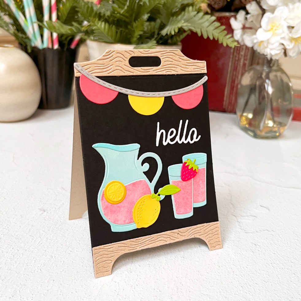
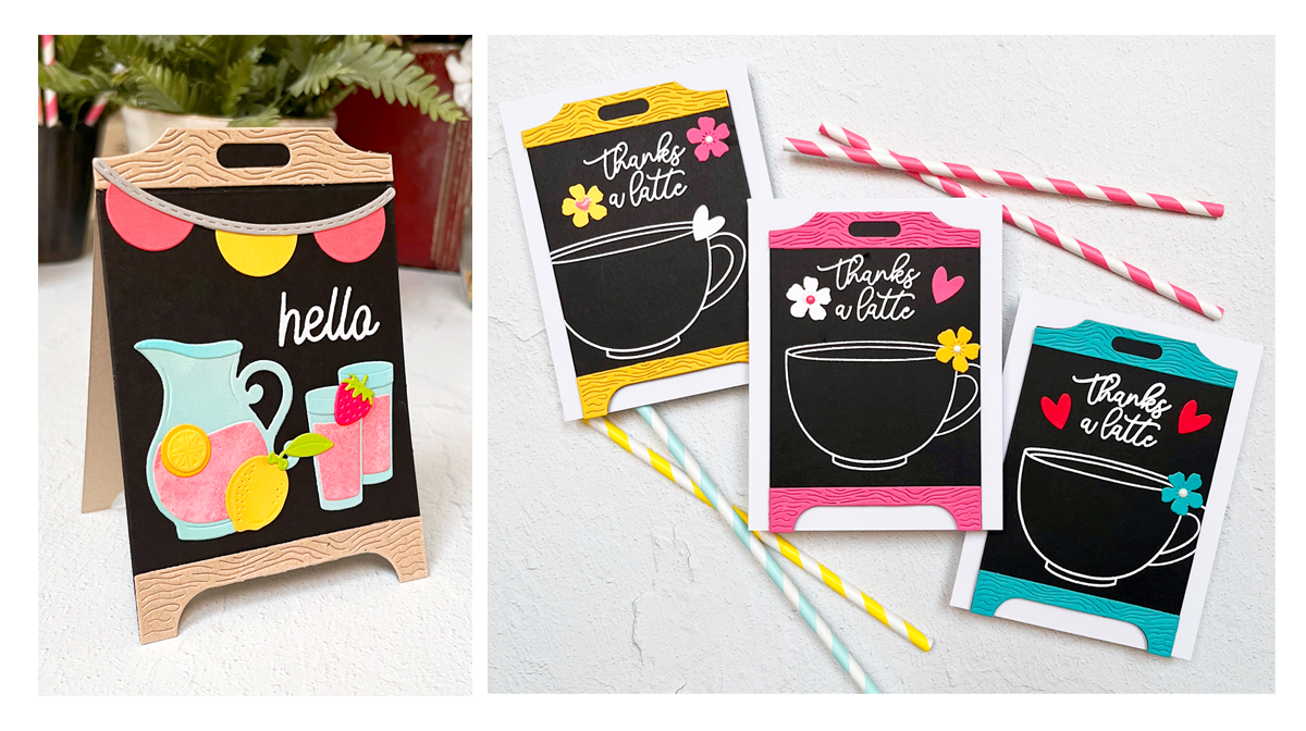
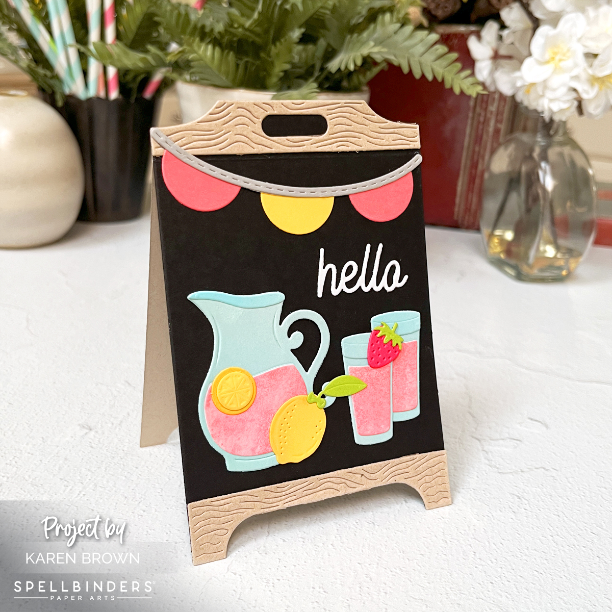
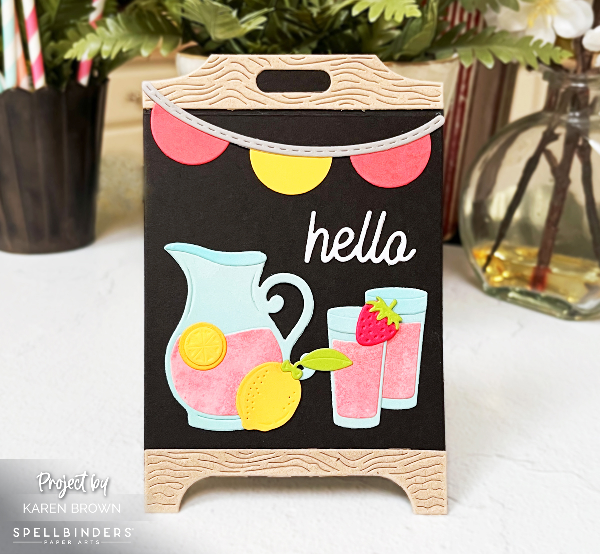
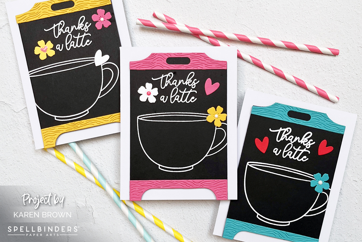
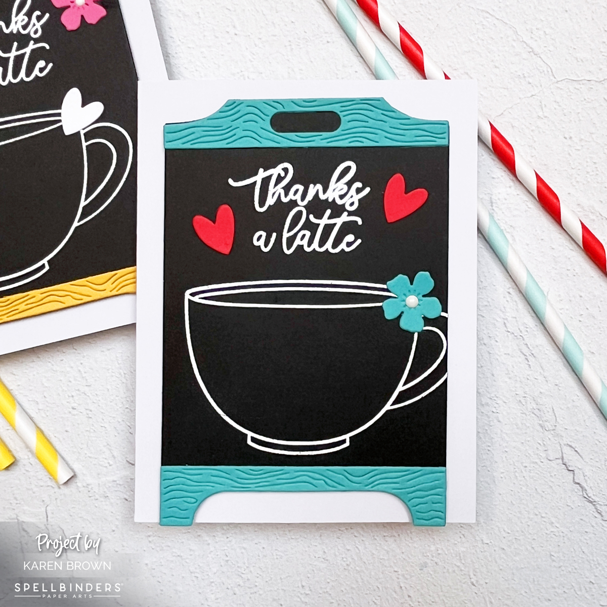
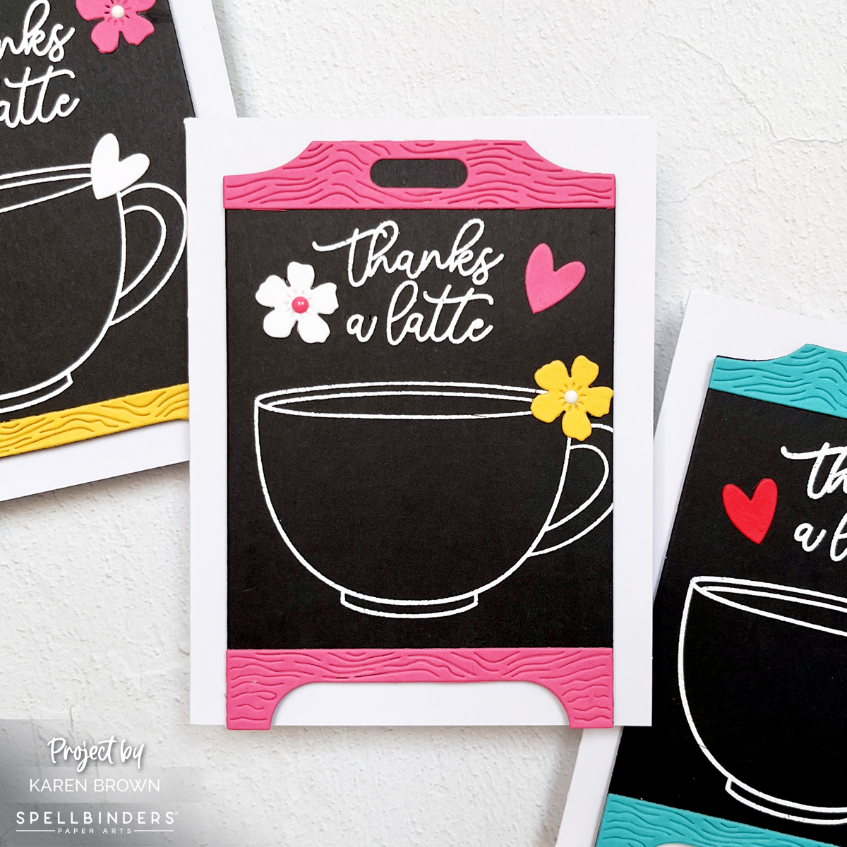
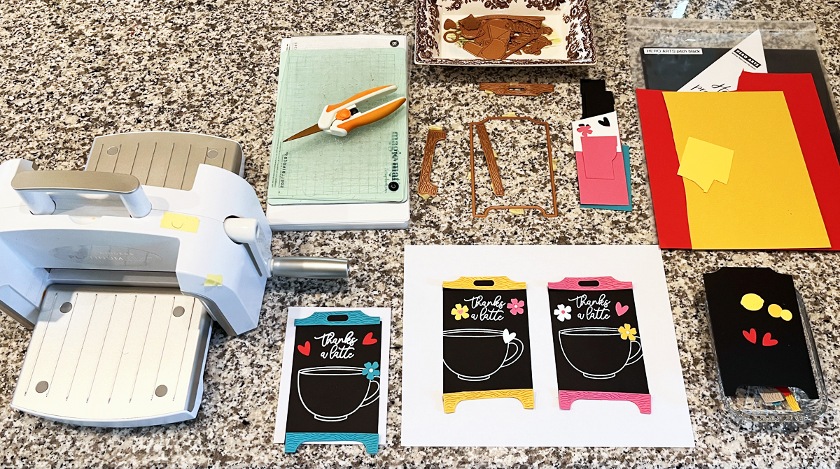
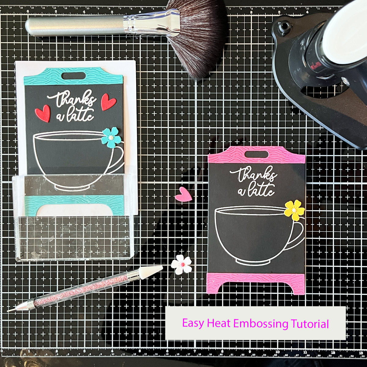
I’ve been having so much fun with this collection lately. In fact, I’ve already created six cards this month using these products — two in today’s post and four in my Lemonade Stand Easel Cards and Chalkboard Coffee Thank You Cards post from earlier this month.
If you’re just starting out in cardmaking, you may also enjoy my 14 Best Cardmaking Products and Supplies for Beginners, where I share the tools I reach for again and again in my craft room.
In This Post
• Why Pre-Printed Papers Are Perfect for Beginners
• Pink Lemonade Card Designs: Same Supplies, Two Quick Cards
• Fast and Easy Card Layouts
• More Beginner Card Ideas
Product Spotlight: Pink Lemonade Collection
Today’s cards feature elements from the Pink Lemonade Collection by Simple Stories.
This collection bursts with bright color, playful lemons, cheerful florals, and adorable embellishments that make cardmaking almost effortless.
One of the things I love most about this collection is how beautifully coordinated everything is. The colors, patterns, and embellishments all work together, so you can assemble several cards quickly without worrying about matching papers or layouts.
This collection works wonderfully for many occasions:
• birthdays
• hello cards
• thank you cards
• thinking of you
• get well cards
And it’s just as perfect for scrapbooking layouts as it is for cardmaking.
There’s even a Simple Cards Card Kit available that includes everything needed to create eight card designs with step-by-step instructions, which makes it especially beginner friendly.
Why Pre-Printed Elements Are Perfect for Beginner Cardmaking
If you’re new to cardmaking, pre-printed supplies make it incredibly easy to create polished cards quickly.
Here’s why they work so well:
• Focal point images are already designed and printed
• Minimal supplies required
• Coordinated colors and themes
• Variety of images in different sizes
• Fast and stress-free card assembly
All of the pieces in this collection work beautifully together, so the process becomes simple:
sort the pieces → experiment with layouts → glue and go.
The set includes everything from large statement sentiments and focal images to charming little embellishments like lemons, strawberries, butterflies, pinwheels, and florals.
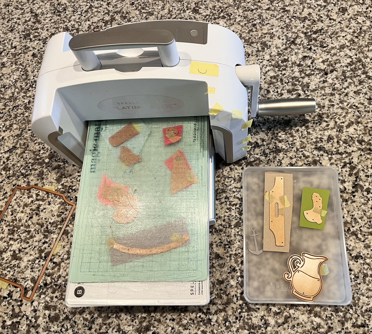
I especially love the sturdy chipboard pieces, which instantly add dimension to a card.
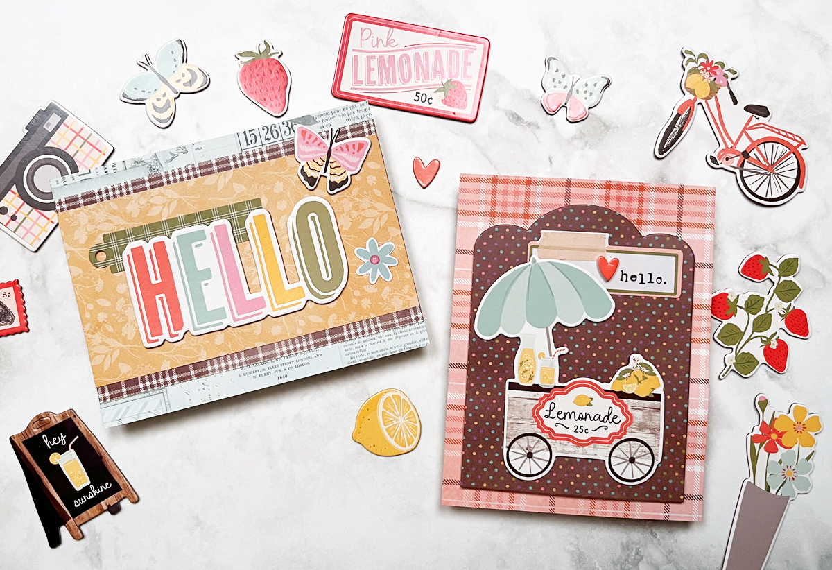
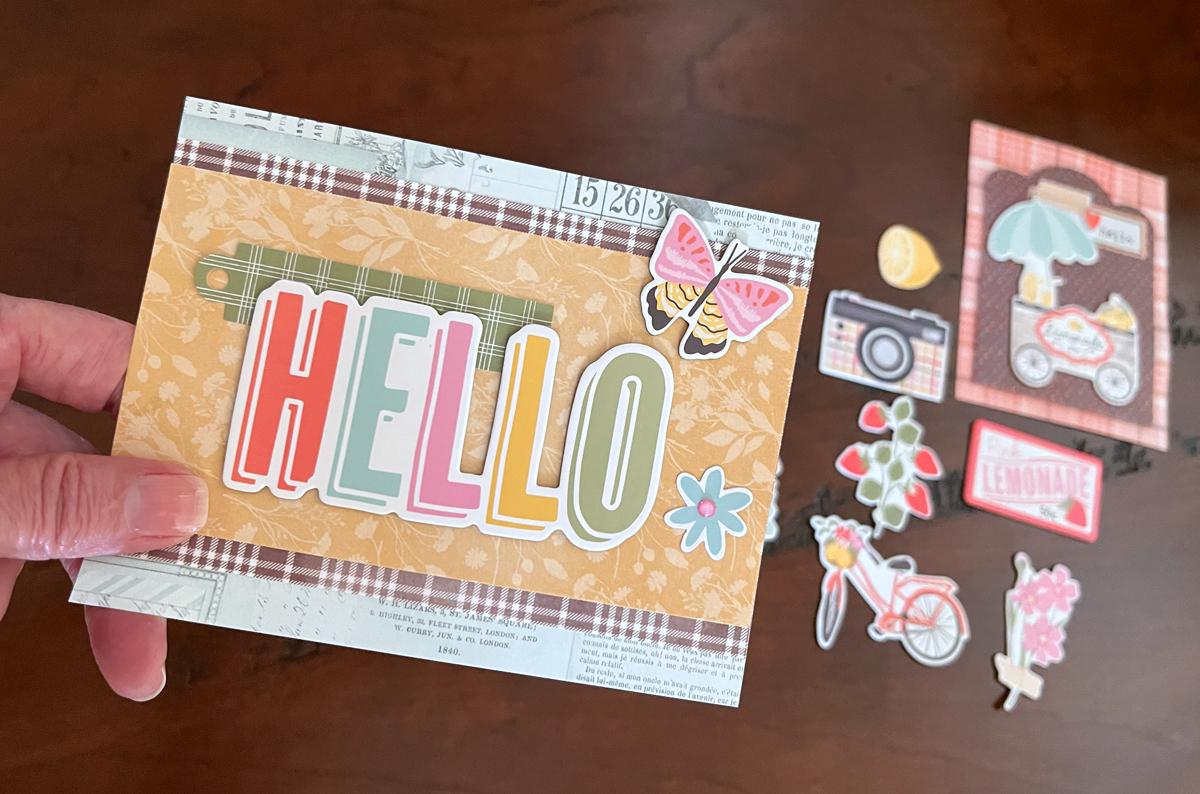
Card Design 1
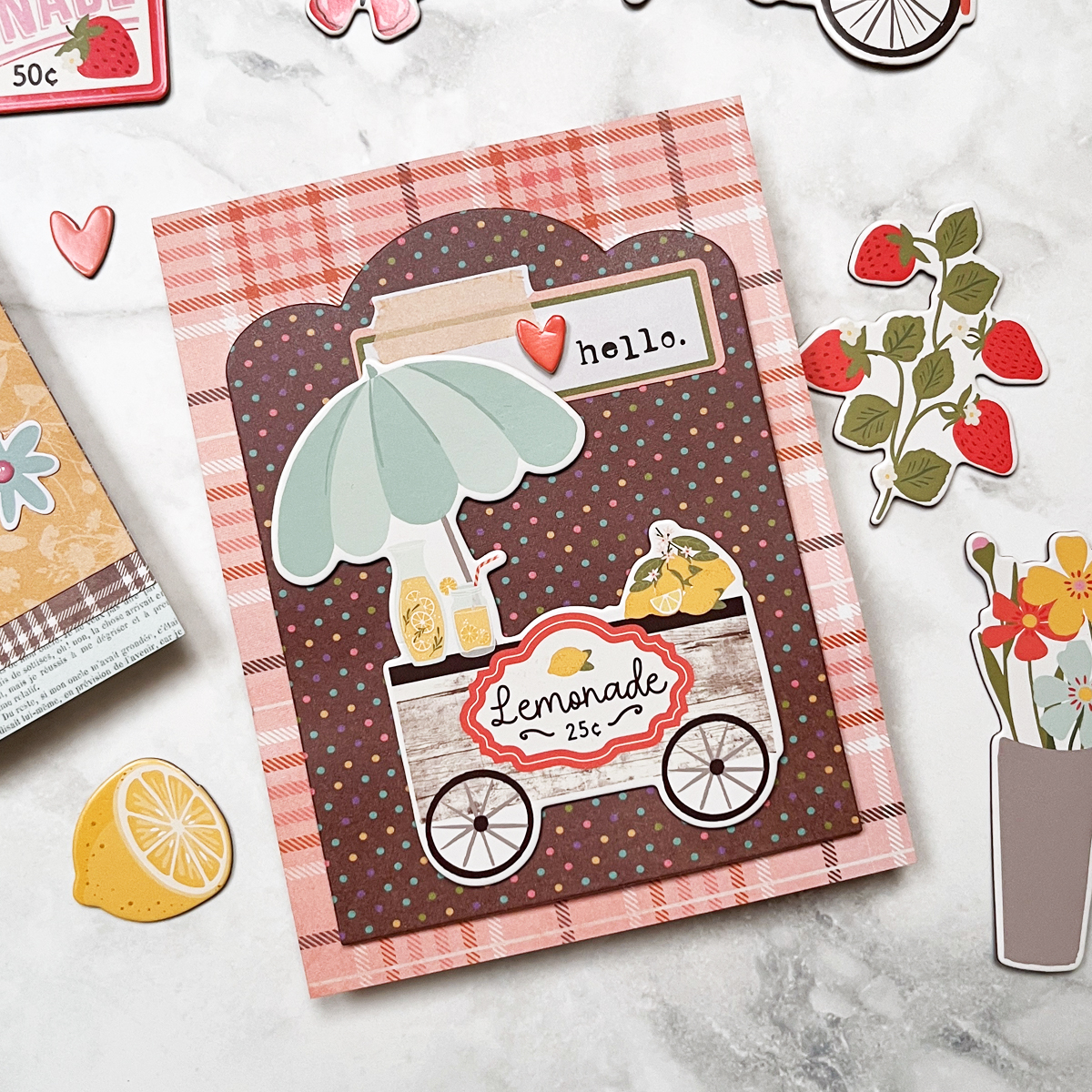
For my first card, I used two pieces of pre-printed designer paper for the card base and mat.
To add a little extra visual interest, I die cut the mat with a decorative frame die — but this step is completely optional. A simple rectangle trimmed with a paper trimmer would work just as well.
To finish the design I layered:
• a vintage-style chipboard lemonade cart
• a cheerful “hello” sentiment
• a small pink heart accent
The result is a bright and playful card that came together in just a few minutes.
Card Design 2
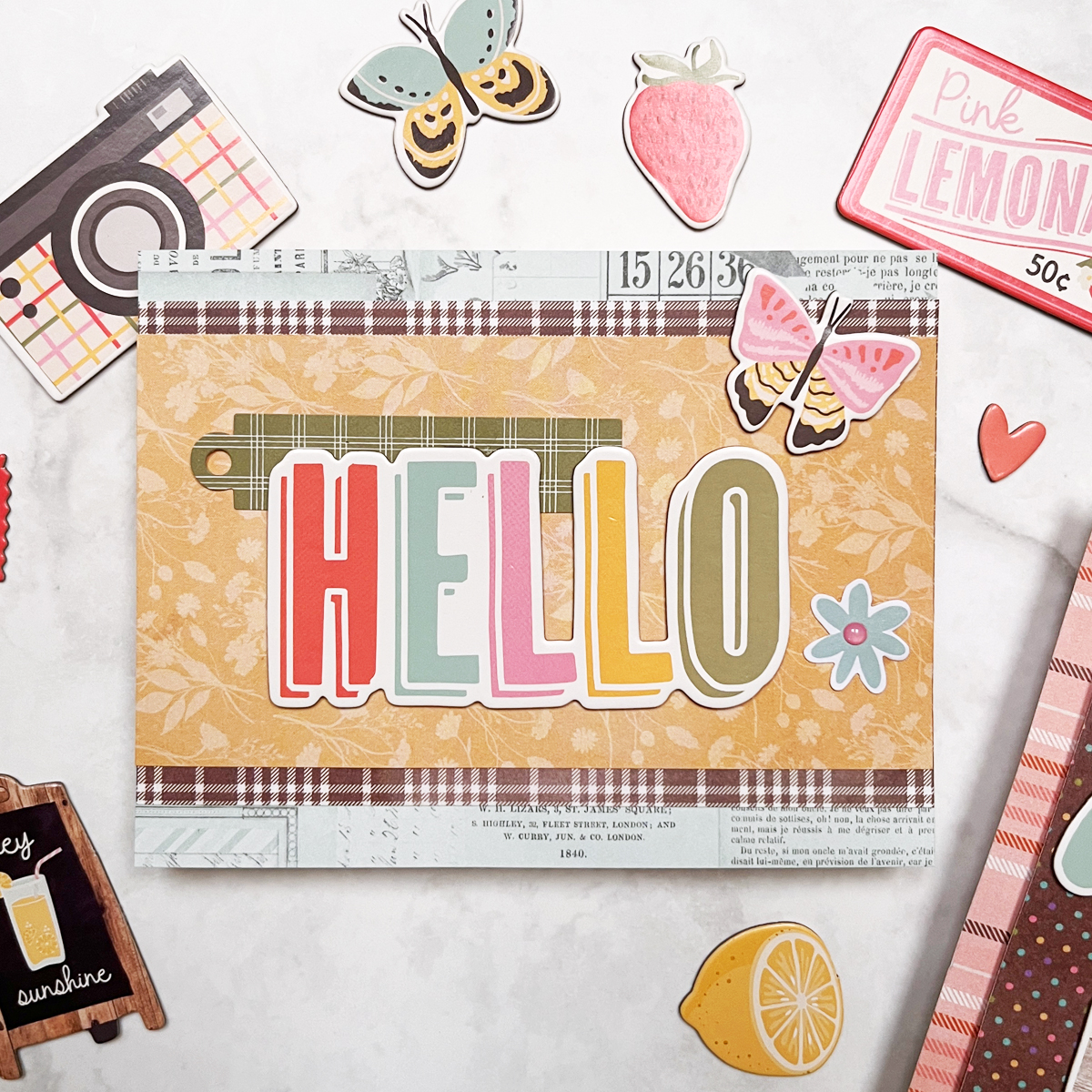
For the second card I created a layered background using three pieces of patterned paper.
Measurements:
• 5½ × 4¼″ aqua base
• 3½ × 5½″ brown plaid mat
• 3 × 5½″ floral background
Once those layers were glued together, I added:
• a green plaid tag
• blue flower die cuts
• a rainbow “hello” sentiment
• a butterfly chipboard accent
I also added enamel dots to the flower centers, which is one of my favorite simple ways to add a finishing touch.
The layered patterns create a cheerful, eye-catching design while still being incredibly easy to assemble.
A Fun Part of the Process
📌 Save this for later on Pinterest.
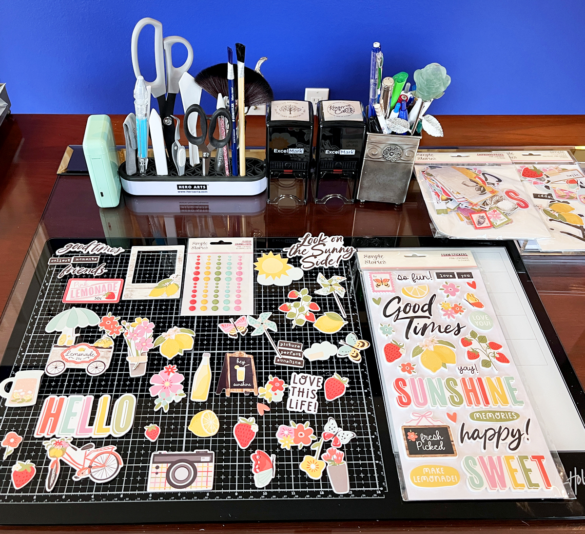
One of my favorite parts of using collections like this is sorting through the embellishments.
The Pink Lemonade chipboard set includes over 50 pieces, and laying them out on my desk while planning the cards was honestly a little mood-boosting.
Sometimes the simple tactile process of arranging colorful pieces is just as enjoyable as making the card itself.
More Easy Cardmaking Ideas
If you enjoy quick and beginner-friendly card designs, you might also like these projects:
• Easy Stenciled Masculine Jean Jacket Cards
• Charming House Mouse Birthday Card
• Mixed Media Card for Beginners
Building Your Cardmaking Toolbox
Here are the supplies I used for today’s cards:
- Chipboard Pieces – 51 pieces
- Page Pieces – 17 cardstock die cuts
- Journal Bits Pack (80 pieces)
- Foam Stickers – 50 pieces
- Glossy Enamel Dots
There are also several other coordinating products in the collection:
• Collection Kit (patterned paper + stickers)
• Card Kit (makes eight cards)
If you are interested in adding to your toolbox, these are the exact supplies I use in my craftroom.
I’m actually working on another project using the Journal Bits Pack, so be sure to check back soo
📌 Save this for later so you can come back when you’re ready to try this technique.
I always love hearing what readers think — so feel free to leave a comment and let me know which card you like best.
Happy crafting!