BetterPress · cardmaking

Bursting with Smiles: Celebrating with the Hero Arts Starburst LetterPress Plates

2 festive Hero Arts Starburst BetterPress letterpress cards in aquas, greens and pinks.

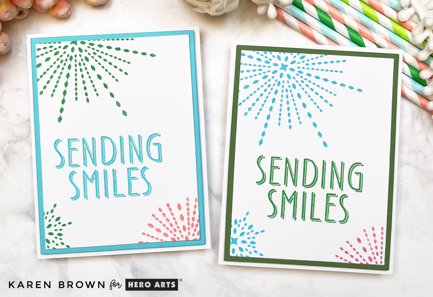
Today I’m sharing two bright and happy cards featuring the brand new Starburst LetterPress Plates from the Hero Arts Lovely LetterPress Collection. These four festive plates are perfect for birthdays, graduations, congratulations, or any occasion that calls for a little extra cheer. If you love fun pops of color and crisp, luxurious impressions, this set is a must-have!

Key Products Used:

Best BetterPress Celebratory Card

Sending Smiles Starburst card in bright happy shades of green, aqua and pink.

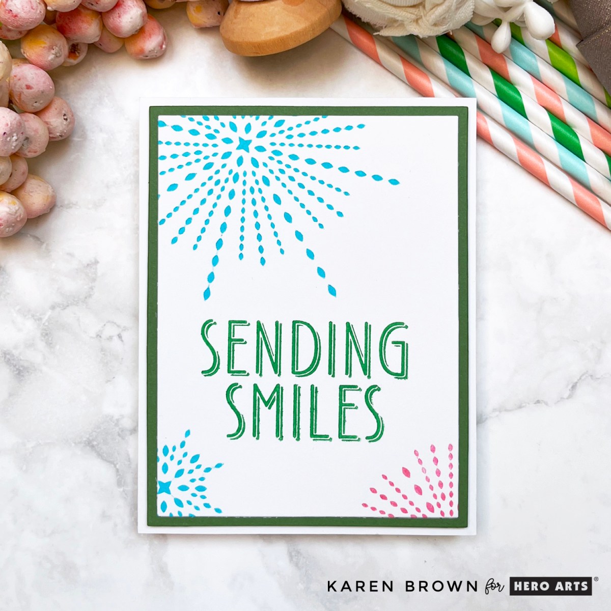
For the first card, I chose a vibrant Leaf Green BetterPress Ink for the sentiment, which reads “sending smiles” from the Best Wishes LetterPress Set. To surround it in celebratory style, I pressed three starbursts in Hydrangea and Wild Berry.

  • The layout features a large starburst in the top right, with two smaller bursts dancing below the sentiment.
  • I trimmed my Porcelain BetterPress panel with the Hero Arts Rectangle Infinity Dies, giving it clean, crisp edges.
  • A coordinating green matting layer ties the whole palette together.

The end result? A card bursting with joy and perfect for any feel-good occasion!

Bright Happy BetterPress LetterPress card with 3 large starbursts in aqua and pink with a large pressed "sending smiles" sentiment in green, perfect for birthdays, graduations or Get Well.

Aqua Cheers

Aqua, green and coral starburst BetterPress LetterPress card from Hero Arts Lovely LetterPress Collection.

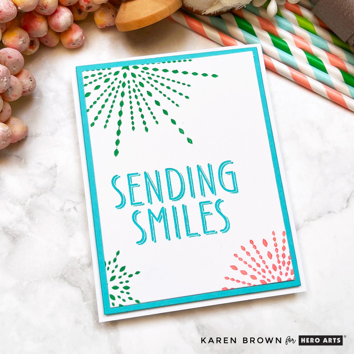
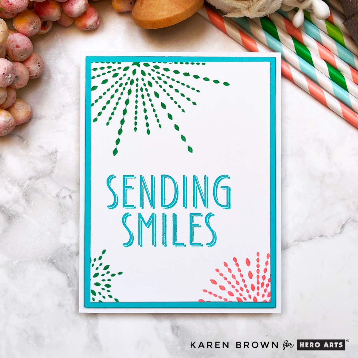
My second card flips the color focus for a totally different feel using the same design.

  • This time, I pressed the “sending smiles” sentiment in beautiful Hydrangea ink (a soft aqua blue).
  • The starbursts are done in cheerful Leaf Green and Azalea, creating a fresh springy vibe.
  • Once again, the design features a top-right burst and two bottom bursts, echoing the layout of the first card.
  • I framed this one with a coordinating aqua matting layer to match the pressed sentiment.

Whether you love greens, blues, pinks or berries, these plates play so well with all your favorite BetterPress Inks.

Best BetterPress LetterPress Birthday and Graduation card in festive aqua, green and coral.

Tools of the Trade

These cards were made using the Spellbinders BetterPress System with Porcelain BetterPress Paper, and inked with vibrant shades of BetterPress Inks. My Platinum 6 Die Cutting Machine helped apply perfect pressure, and the Hero Arts Rectangle Infinity Dies made trimming panels a breeze.

Pro Tip: You don’t need to overload the ink! These plates are so well-designed that a light inking creates beautifully crisp results every time.

Want More BetterPress Magic?

Be sure to check out my 9 Tips and Tricks for Your BetterPress System blog post for all my favorite ways to get flawless results with every press.

And don’t forget—these colorful cards are part of an Instagram Hop! Follow along for even more creative inspiration and enter for a chance to win: Instagram Hop Link.

Which version is your favorite: Wild Berry Smiles or Aqua Cheers? I’d love to know in the comments!

Happy pressing, friends! 🌟

Uncategorized

Altenew Academy Level 1 Final Project

I\’ve been working my way through Level 1 at The Altenew Academy and just completed my Final Project which was to create a set of \”feminine\” and \”masculine\” gifts sets.  I have to say I learned so much and had loads of ideas but I would like to show you the cards I created for my final project.  I incorporated lessons I learned in:
  •  Let It Shine where we discovered how to add just the right amount of sparkle and shine to a card.  I used metallic heat embossing and  metallic watercolors on my feminine cards.
  •   Easy Die Cutting where we learned to use die-cutting to up the \”Wow\” factor.  I used die-cuts on each of my cards as I think they add loads of impact and felt this unified both card sets.
  •  Easy Ink Blending – I used several ink blending techniques on my masculine card set. My two favorites were the soft blue background on the Healing Wishes card and the die-cut spotlight circles on the Get Well Soon card.  

For my \”feminine\” cards I wanted subtle metallic touches combined with watercoloring. I kept the set cohesive by using cream card stock/watercolor paper, floral images, a pink and green watercolor palette and navy die-cut sentiments.
For this first card, I created a metallic watercolor background which is so pretty in person.  I then stamped, heat embossed and watercolored the floral images.  After the flowers dried I added a pearlescent  white gold watercolor wash over the top which gave the flowers a beautiful sheen.  I die cut the images and attached with foam tape. The next photo shows the first three card in process.

Here are the cards that round out the gift set.  On each card I used big bold die-cut occasion sentiments cut from navy cardstock. 


I really like this feminine spray and think the navy die-cut sentiments are  beautiful and anchor the look of this set.

The painted Lotus die-cut is so pretty in person.

I did want to share this process photo as well.

The Feminine Set

For my \”masculine\” cards I chose to use an overall blue theme with ink blending techniques and Altenew\’s Garden Grow as the unifying elements.  For my first card, I ink blended a background and used peek-a-boo die cut  windows to spotlight my images.  During quarantine, I\’ve been sending so many encouragement cards that I wanted to include one in this set. 

I made a companion card using the die-cut circles from the card above.  I ink blended the spotlight circle, added die-cut images and anchored with a strip of masculine brown paper.

The next two cards have a soft ink blended background to draw the eye to the die cut.

I thought a birthday and recovery card would round out the gift set.

Here is an in-progress photo.  The die cut elements were attached to each card with foam tape.

PRO TIP:  I blended one background on Neenah (Birthday) and the second on Bristol (Healing Wishes) to see which provided a smoother look.  The Neenah panel (below left panel that is now the Birthday Card) is whiter but the Bristol (right panel that is now the Healing Wishes card) is far easier to blend on and resulted in a smoother background.  In the future, I will remember to blend my backgrounds on Bristol cardstock.

And here is the masculine set.


We were challenged to use a recycled element in each set.  For the feminine set I recycled a small Kraft gift bag and for the masculine set I re-used an elegant chocolate brown box.  I heat embossed some tags to top each set.  

Altenew Products Used:
Altenew Best Mom stamp and die bundle
Altenew Inked Lotus stamp and die bundle
Altenew Garden Grow stamp and die bundle
Altenew Mini Branch stamp
Altenew Jet Black Crisp Die Ink

I am so glad you stopped by.  I\’d love to hear what you think about these card sets.  Thanks!
Karen


Uncategorized

Handmade Get Well Card

Its time to replenish my stash of homemade get well cards.

I started by making a background with a stencil and Distress Ink and then stamped the Feel Better sentiment.  Next, I stamped and colored four images from Lawn Fawn\’s Get Well Soon set.  I fussy cut the images, topped the red lids with Nuvo Crystal Glaze for some shine and used foam squares to adhere them to the card base.

My color inspiration came from the current Color Throw Down #509 challenge, which uses vibrant red, orange and blue.

 Update:  I was pleased to see this card featured on the Color Throwdown site!

I think the result is a cheery little card.

Thanks for stopping by!

Karen

Uncategorized

Experimenting with New Techniques

Lots of experimentation on this card.  I was interested in entering the Muse Challenge #268 so I spent a day thinking about what direction my card should take.  I knew I would use the floral theme, but the rest came to me in bits and pieces.

Embossed Get Well Card

Ultimately, I chose to focus on the following:

  • Pink and Green Color Scheme
  • Embossing
  • Black Sentiment Band
  • Floral Theme
What I changed:

  • I\’ve never done pink embossing but had been thinking about trying it for a while. The pink flowers seemed to be the perfect time.  I wasn\’t sure if my method would work, but I used Color Box Pink Pigment Ink and clear embossed on top.  I think it turned out bright and cheery, which is a plus for a Get Well card.
  • The flower and  leaf looked bland on a white card base so I made a custom background.  Again, I\’ve never done this before, but I used my Green Apple Inktense watercolor pencil and made a lightly striated background to complement the Copic greens.   
I used my new favorite stamp set:  Botanical Love By Create a Smile.
Thanks for stopping by!
Karen