cardmaking · Stenciling

How to Use Analogous and Complementary Colors in Cardmaking | Tutorial

A book/reading theme handmade card created with Hero Arts Hero Studio November 2025 Kits:  On the Shelf Layering Stencils and Book Bag Die Kit.

Hello, Karen here, back with another card inspired by the November 2025 Hero Studio “One More Chapter” release! I’ve been absolutely loving this book and reading-themed collection — so much so that I couldn’t resist making one more card. (Here’s a link to my previous post where I shared two other projects from this release!)

This time, I reached for the “On the Shelf” 4-Layer Stencil Kit to build my own bold bookshelf background. I wanted a crisp, postage-themed layout, so I began by masking off a 3″ x 4⅜” rectangle on a piece of Deluxe Smooth White Cardstock — giving me a clean white frame around my stenciling.

🎨 Inky Layers

I chose four analogous ink colors (adjacent on the color wheel) that flow beautifully together for a cohesive look:

Once the inky layers were dry, I die cut the panel with the 2nd largest Nesting Postage Stamp Die to give my bookish scene a framed, mail-art feel.

Bright handmade card featuring a layered blue and green stenciled bookshelf background, orange bookworm, and scripty “Hello” sentiment framed in a white postage border

🧡 Complementary Pops of Color

For contrast, I reached for my ColorWheel Cardstock and added Carrot and Cosmic Sky accents. The playful bookworm with glasses and the scripty “Hello” sentiment (from the Book Bag Die Kit) are both cut from Carrot, with a Cosmic Sky shadow layer that really makes the greeting pop. Orange and blue are complementary colors (opposite on the color wheel), which makes the whole design lively and eye-catching.

Everything is layered with a bit of craft foam for dimension, then mounted onto a Cosmic Sky A2 card base.

Cute card featuring a stenciled book shelf background and a smiling book worm die cut accent.

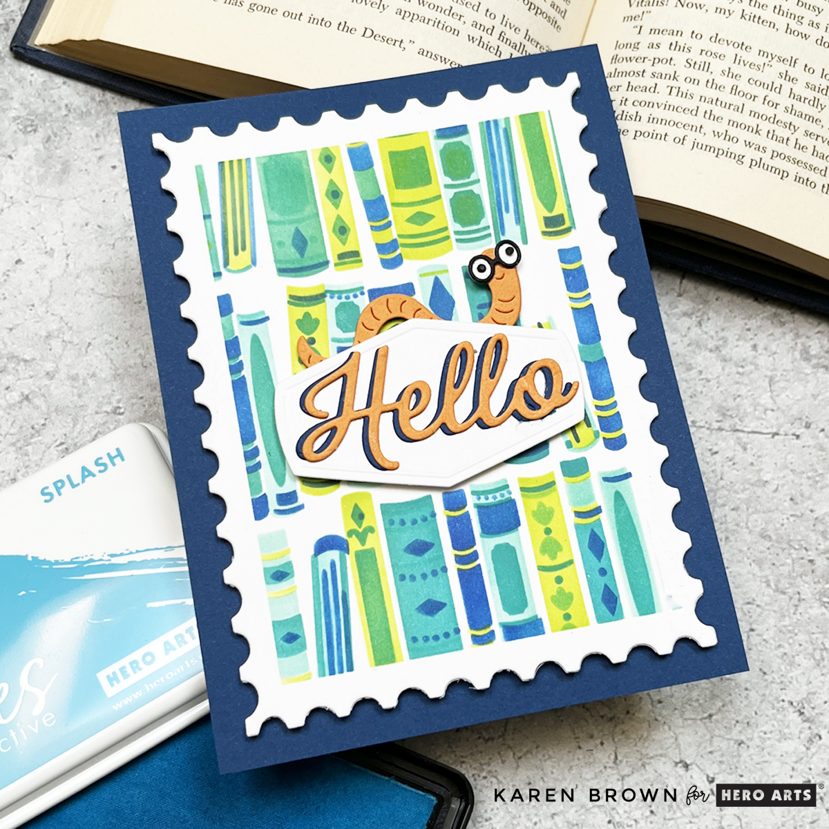
The end result? A bright, cheeky, and happy card that would be perfect for a reader of any age — man, woman, or child.

Hero Arts has many different Monthly Kits that you can subscribe to including:

cardmaking · Video

VIDEO | Spring Floral Stenciling & Color Theory: Create with Confidence!

Welcome back, crafty friends! Today, I’m diving into stenciled floral backgrounds with a focus on color theory and shimmering inks. If you’ve ever struggled with picking colors that pop or wondered how to make your stenciled backgrounds shine, this post (and my video!) is for you!

If you are having difficulty watching the video above, click HERE to watch on YouTube.

Three Ways to Use a Stenciled Floral Background

I’m using the Spring Floral Stencil and Large and Small Floral Layering Dies from the new Hero Arts Friendship Blooms Collection to create three different looks. Each one explores color, contrast, and shimmer, so let’s get into it!

3 bold floral stenciled backgrounds turned into cards with bold die cut focal elements.

Card #1: Byzantine Green Glitz + Bold Plum Congrats

A handmade card with a shimmering Byzantine Green floral stenciled background, featuring a bold Plum die-cut ‘Congrats’ sentiment with a vellum shadow.

For my first card, I wanted a rich, elegant background with plenty of shine. I stenciled with Byzantine Green Glitz Ink, which gives a gorgeous shimmer, and paired it with a bold Plum “Congrats” sentiment. Here’s the magic:

  • The background is a mossy olive hue.
  • The sentiment is red-violet, which is directly opposite on the color wheel—hello, instant contrast!
  • The large vellum shadow behind the sentiment softens everything just enough.

Pro Tip: When in doubt, check your color wheel! Using complementary colors creates high-impact contrast, making your card visually striking.

Card #2: 3. Aqua Gradient for a Fresh Take

A soft and elegant aqua gradient stenciled card featuring a layered white and aqua die-cut bloom, perfect for Mother’s Day.

For the next card, I switched things up with a cool-toned, gradient background using Pool Party, Paradise, and Blue Raspberry inks. The result? A soft, dreamy floral backdrop that’s perfect for spring!

Pro Tip: If you’re unsure which colors to use, swatching your cardstock makes a world of difference! I swatched mine with Spellbinders Color Swatch Petal Dies, and it made choosing my die-cut colors so much easier.

Card #3: Layered Floral Mother’s Day Card

A Mother’s Day card with a rich plum and eggplant stenciled background, adorned with delicate die-cut flowers in shades of plum, eggplant, and white.

Since I was loving that Byzantine Green shine, I stenciled a second background—but this time, I turned it into a Mother’s Day card!

Spring Floral stenciling 3 ways for bold Mother's Day and Congrats cards.

I am so pleased you stopped by today!