cardmaking · papercrafting

Cheerful Shine Bright Card | Spellbinders

Shine Bright layer stenciled card with bold die cut sentiment all from Spellbinders.

Hey crafty friends!

Are you ready to let your creativity shine? Today, we’re making a fun project that will have you glowing—literally! We’re going to create a stenciled and die-cut handmade card themed “Shine Bright.” Perfect for birthdays, encouragement, or just because, this card is sure to brighten anyone’s day. And I wanted to mention that the Shine Bright Collection was created by the great Carissa Wiley!

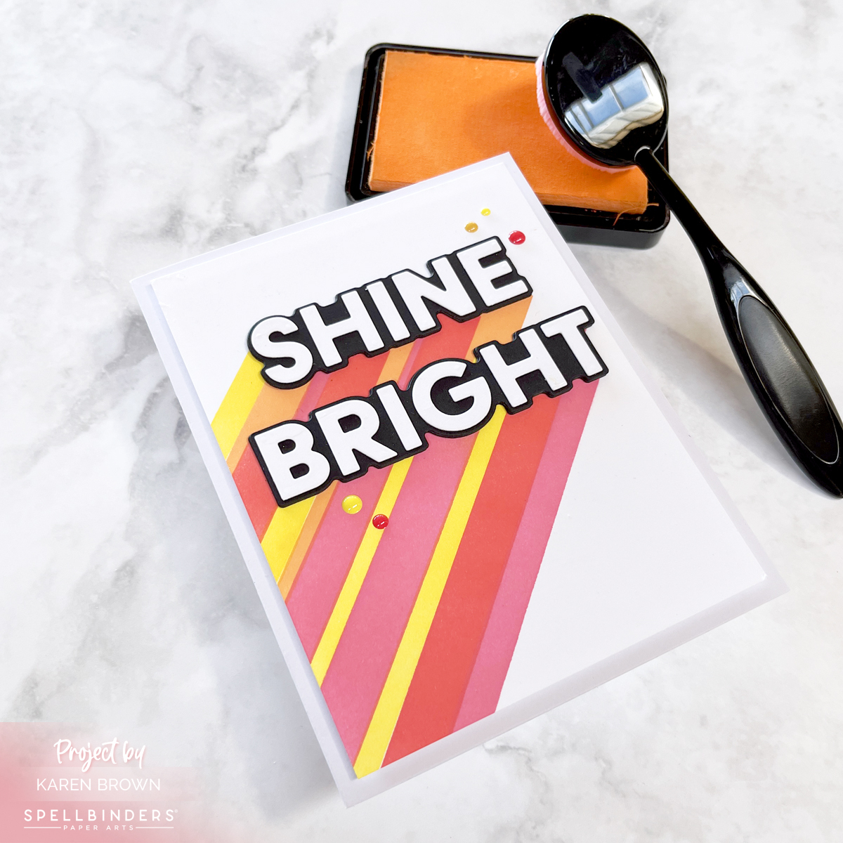
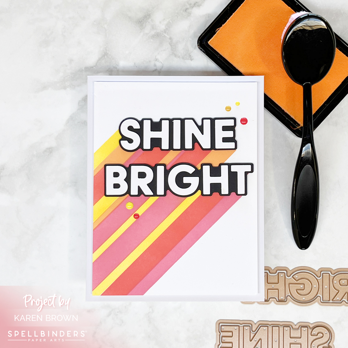
Colorful Analagous Stenciling

Analagous stenciling on a bright, happy, colorful chandmade card perfect for many occasions.

This card came together quickly!

  • I used the Layered Shine Bright Stencils to create my base, and I have to say the stencils lined up perfectly! I used Lemon Drop on layer 1, Creamsicle on #2, Fruit Punch on layer 3 and Taffy with the final stencil. I preplanned my colors and labeled my chosen color on each stencil so I wouldn’t get confused during my stenciling. I used Best Ever Craft Tape to both label my stencils and secure them to my craft mat.
  • Next I die cut my gorgeous sentiment. I die cut the black shadows three times and glued the layers together for nice dimension. I die cut the letters once from white cardstock. I used my Crystal Katana to pick up and place the letters.
  • I finished by using Sunset Enamel Dots embellishments.

You can buy the Shine Bright Bundle (stencil and die) or the Sentiment Dies separately.

Shine bright, and let your creativity light up the world!

Thanks for stopping by and happy crafting!

Karen

cardmaking · Video

Video: Crafting with Color | Selecting Fabulous Color Combinations for Ink Blending

Hero Arts Color Layering Tile Stencil handmade cards in 2 Analogous color palettes (yellow, orange and coral) and (aquas, blues and greens).

Hello fellow crafters, Karen Brown here with a new How-To Video!  I am excited to dive into the world of layering stencils, specifically focusing on how to select analogous colors that will bring harmony to your designs.  Do you struggle selecting colors?  Taking a quick peek at your color wheel can assist in making cardmaking projects that are both visually pleasing and polished.  So let’s get started!

If you are having trouble viewing the video, please click HERE.

Today we will be using Hero Arts beautiful new Color Layering Tile Stencils.  This set comes with 4 stencils that are extremely easy to line up.  I thought it would be fun to use two different analogous color palettes and I added in some Hero Paste for added interest.  

Layering stencil tutorial with Hero Arts new Color Layering Tile Stencils + Gold Hero Paste.

I started with a 5 1/2″ x 5 1/2″ panel of Deluxe Smooth Cardstock.  For Card #1 I used Lemon Drop, Creamsicle and Taffy inks. For my top layer, I applied Hero Gold Paste for a pop of shine and shimmer. 

Handmade birthday layering stencil card in aquas, blues and greens + a custom blended Hero Paste accent layer.

On Card #2, I selected Pool Party, Splash and Blue Hawaii. For my top layer, I custom blended White Hero Paste with a combination of Blue Hawaii and Pool Party.

Both cards are perfect for summer!  Card 1 is bright and festive and Card 2 is calm and serene. It’s interesting how color selection can change the tone of your cards.  To see all my tips and process details, please watch the video.

My sentiments were die cut using two sentiment strips from the Hooray Birthday Cover Plate.  I used Nautical and Coral cardstock.

Other helpful supplies were my Palette Knife, Blending Brushes, Compact Cutter, Precision Glue  and Magnetic Storage Envelops

Happy crafting everyone!

Uncategorized

Analogous Botanical Love Card

I\’ve been wanting to create a card using analogous coloring, so I sat down today and came up with this design.  I am entering it in the  Just Add Ink Inspiration Challenge.  I selected Create a Smile\’s Botanical Love because of the dot accents on each of the floral images which paired nicely with the circles in the inspiration photo.  The photo also had a flower on the wall and small arrangement on the cubby unit so that reinforced my decision to make a floral card.    I loved the inspiration color scheme and used it in executing my analogous coloring  (Y17 for yellow,  RV4 for the pink, YR2 for the light orange and BG23 for the aqua).

Analogous coloring using Create a Smile Stamps.

 The WPlus9 Doodle Buds sentiment is one of my favorites.  This is going to be a birthday card and there is a birthday sentiment inside.

UPDATE:
My card was chosen as \”Honorable Mention\” by Just Add Ink.  This were the comments they posted: \”Here\’s what some of the design team had to say…

\”Seamless colours transitions and bright beautiful colours make this a one layer beauty!\”

\”The black details and vibrant colours really make this lovely scene pop\”

 \”Lovely bright flowers, beautifully coloured\”

Thanks for stopping by today!
Karen