Uncategorized

WWC276 – Marsha\’s Challenge: Anything Goes with a Masculine Twist

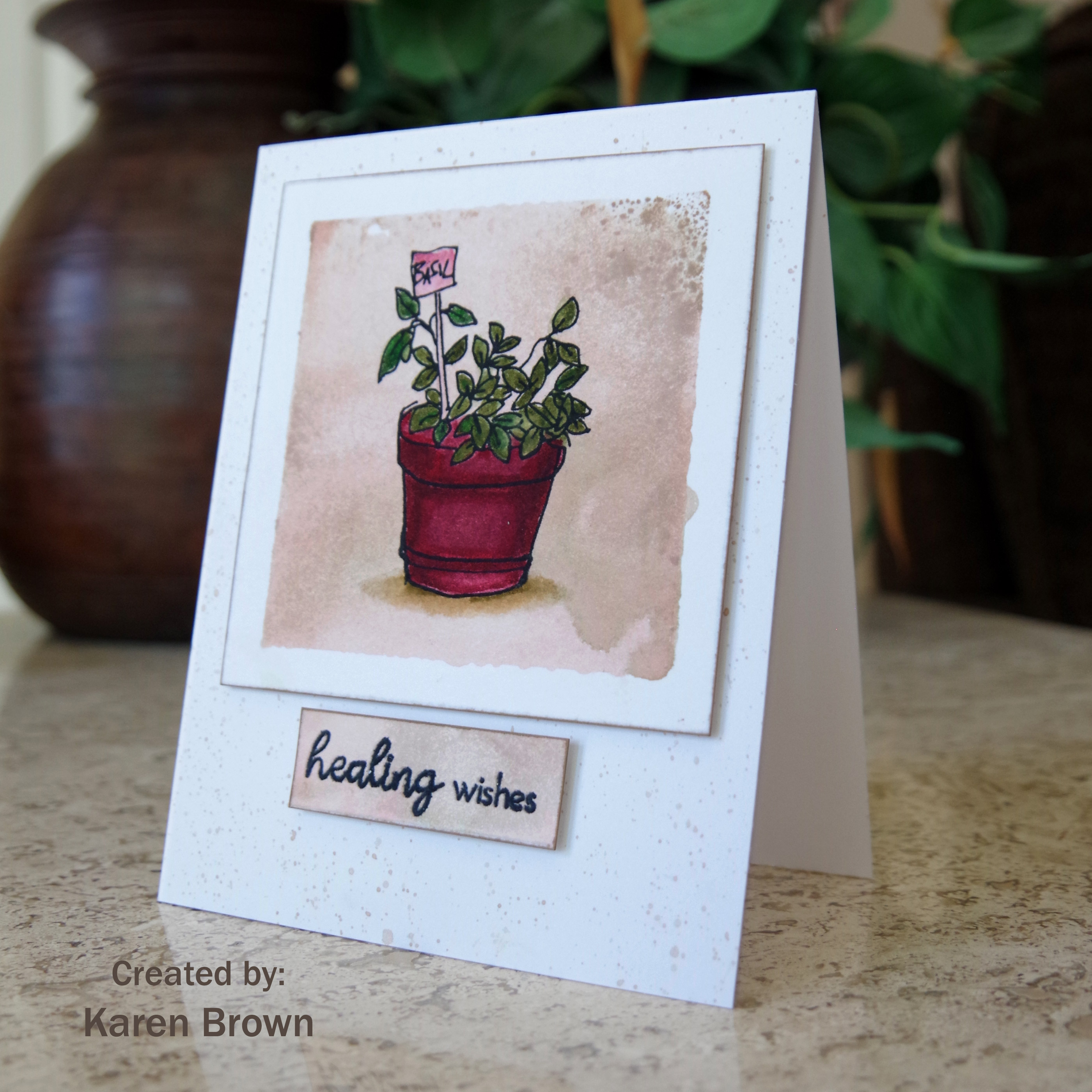
Hello and welcome.  Today we are making masculine cards at The Watercooler Wednesday Challenge and Marsha is our hostess.  I like the look of grunge/mixed media cards but I\’ve never made one myself.  I decided to give it a try with this dragonfly.
My Process:
  • I started by inking my glass media mat with various shades distress ink.  I sprayed with water and then laid a sheet of watercolor paper on the ink/water.  I dried with a heat tool and repeated this process a couple of times.
  • After the panel was dry I stenciled and stamped random elements on the panel
  • I then heat embossed the dragonfly and sentiment.
Supply List:
Visible Images \”Live In the Moment\” dragonfly stamp
Visible Images circle stamps
SSS Sketchy Lines background stamp
Tim Holtz Brick Layering Stencil
Ancient rubber stamp numbers
Stamps of Life sentiment
Nuvo Hot Chocolate Embossing Powder
Various colors of Distress Ink
Watercolor paper

I am playing along with:


This is a fun technique that I want to do again in the future.

I am so pleased that you stopped by!
Karen
Uncategorized

Altenew Academy: Easy Die Cutting

Hello and Welcome!  I just finished the Altenew Academy class titled Easy Die Cutting.  Yana Smakula was the instructor and she shared six wonderful lessons.   I chose to write this blog post about lesson #5:  Inlaid Die Cutting, which I found very inspirational.  I just purchased this large beautiful scripty thank you die (Altenew\’s Simply Thank You) and thought it would work great with the inlaid die cutting technique.  I learned to save all the pieces from both panels so you can can create two cards from the positive and negative die cutting.  Don\’t you just love two-for-one projects!  🙂

My Process:
I started by ink blending a bright colorful gradient on Bristol cardstock.  I didn\’t want it to smear so I let it dry overnight.  The next day I die cut the \”thank you\” from the inked panel.  I also die cut the same sentiment  from a white panel.  Then I just swapped the sentiments and glued the white die-cut into the opening on the inked panel and glued the inked sentiment onto the white panel.  I was careful to save all the die cut pieces so I could piece everything back together.  Voila…two cards!  Yana also loves embellishments so I felt encouraged to add buttercream jewels to the white background.  
These cheerful cards will come in so handy on my next thank you notes.
I am so pleased that you stopped by!
Karen
Uncategorized

WWC275 – Karen\’s Challenge: All About Occasions

Hello!  I am so pleased you stopped by.  Today we are showcasing \”Occasion\” cards at The Watercooler Wednesday Challenge and I am this week\’s hostess.

Offset Ink blended background:  squeezed lemonade, mustard seed, twisted citron, cracked pistachio, salty ocean and blueprint sketch
I recently won several stamps from Crackerbox and Suzy and this is my first card with my new haul.  I think the tree is just gorgeous.  I have been doing a lot of ink blending lately and knew this tree would be perfect for this technique.  I started by masking off a 1 1/2\” border on the left of the card and then started ink blending from the bottom right to the top left.  I was very heavy handed and put down a lot of ink.  I added a navy mat as I didn\’t want the clean white swath to fade into the card base.
Supplies Used:
Crackerbox and Suzy Tree Whimsey stamp
The Greetery Crimped Frame die
Distress Inks:  Squeezed Lemonade, Mustard Seed, Twisted Citron, Cracked Pistachio, Salty Ocean, Blueprint Sketch
Neenah cardstock
Navy Mat
Versafine Onyx Black Pigment Ink
Clear Embossing Powder
SSS Birthday Mix 1 sentiment stamp and die
Masking tape

NBUS Challenge – This is my first time to use Crackerbox and Suzy\’s beautiful Tree Whimsy stamp.

I am so pleased that you stopped by!
Karen 

Uncategorized

Altenew Academy – Irresistable Inking

Hello and welcome!  I\’ve been working my way through Altenew Academy\’s Irresistible Inking class and I wanted to share this card.  Sara Naumann is the instructor and she provided loads of inking details, tips and techniques to make cards more interesting.  I used three of these techniques on my card.  After watching all the videos, I was inspired to make a vintage look masculine card.

A vintage look masculine card featuring Altenew Garden Grow stamps.
My Process:
  1. I started by using the stamp block inking technique we learned in Class #3.  I took a square acrylic block, inked it with Altenew Sand Dunes ink, spritzed with water and then stamped on a Bristol cardstock panel.  Sand Dunes was a great ink to use because it looks vintage but it is light enough to color over.   I was going for a rustic, uneven masculine effect.  
  2. I popped out to have a latte and once the panel was dry, I stamped the planter on the inked square and then colored with Zig markers.
  3. I trimmed the panel down and then inked around the edges (lesson #4) of the square with the same Sand Dunes ink.  This is very subtle but the inking frames the vignette and gives a little more  definition to the card.  
  4. I also block stamped the Sand Dunes on a scrap of Bristol cardstock so the sentiment strip would coordinate with the square panel.  I  inked the edges of the sentiment strip and then heat embossed the sentiment.   
  5. I made a top folding A2 card out of Bristol cardstock and then used a small paint brush to make Sand Dunes splatters over the card base.
  6. I adhered the square panel and sentiment to the card base with foam tape.


Supplies:

Altenew Garden Grow stamp set
Altenew Sand Dunes ink (background, edges and paint splatters)
Square Acrylic Block
#2 paint brush
Small Spray Mister
Bristol cardstock
Zig Markers (Deep Red, Wine Red, Pale Rose, Oatmeal, Dark Oatmeal, Olive, Mid Green, May Green and blender)
Versamark Ink (planter and sentiment)
clear embossing powder.
Foam Tape

I am also playing along with:

With all the social distancing, I have been staying home a lot more than usual and these Altenew Academy classes have been the perfect activity for me to grow my card making skills.

Thanks for stopping by!
Karen
Uncategorized

Altenew Academy – Seasonal Scene Building

Hello and welcome.  I just finished Nichol Spohr\’s Altenew class on scene building and wanted to share this card.  I love \”scene cards\” so this class was very fun for me.  My card concept was \”coffee in the garden\”.  I was especially inspired by Nicole\’s lessons #1 and #4 on creating scenes and die-cut scenes.  
A scene card featuring Altenew Gardent Grow and Tea Time stamp and die bundles with Watercolor Stripes stencil and texture paste to create the background.
My Process:
Once I came up with my coffee in the garden theme, I started by working on my background.  I wanted to use a stencil technique that I learned in Laurel Beard\’s Stencil Techniques class.  I had never worked with embossing/texture paste and I found I really liked it.  I knew I wanted a subtle plank like background so I made three….a neutral tan, soft blue and light yellow.  I tinted the paste with dye ink and used a palette knife to work it through my stencil. I left the finish a bit rough and rustic and then put the panels aside to dry.  I really like the texture and look of the background.  

Next I stamped, Copic colored and die cut my images.  By this time my backgrounds were dry so I laid the die-cuts on each and decided I liked the neutral tan the best.  I adhered the images with foam tape and popped on a card base.
Supplies Used:
Altenew Garden Grow stamp and die bundle
Altenew Tea Time stamp and die bundle
Altenew Watercolor Stripes Background stencil
Altenew Sand Dunes Crisp die ink (to tint the paste)
Texture paste and pallet knife
Copic markers
Foam tape

I am also joining:
As You Like It Scene Challenge  I enjoy a latte in my garden every afternoon and depicted this scene on my card.  

Time Out Proust Quote Challenge   This is a wonderful quote that speaks to me.  I focused on the gardening aspect of the quote for my card.  

Update:
I was so pleased to learn that my card was selected as a top three at Time Out Challenges. 

I think this is a fun scene card that would work for a man or woman.  Thank your for stopping by!
Karen
Uncategorized

Altenew Academy: Celebration Stencil Techniques

Hello and welcome.  I just finished a wonderful Altenew Academy course and I am excited to share my card with you.   Laurel Beard taught us stencil techniques and I loved them all!  This is my favorite card from the class.  I also used my favorite Altenew stamp and die bundle called Weekend Doodles.
Bright card featuring Altenew Watercolor Stripes Stencil and Weekend Doodles stamp and die bundle.
My inspiration came from lesson 3:  Stamping with Stencils and  I chose to watercolor over my stencil.

My Process:
  1. I taped my stencil to a 6 x  6 piece of watercolor paper.  Next, I wet my watercolor paper well with a brush.  I then \”pounced\” three colors of distress ink onto the wet watercolor paper.  
  2. I haven\’t used my Zig markers in months but they were exactly what I wanted for this project because of their bright vibrant colors.  I heat embossed my floral image, colored with Zigs and then die cut.
  3. I die cut a white panel for the sentiment and to provide some contrast with the bold stripes and then heat embossed the sentiment.  I glued the white panel to the background and then used foam tape to adhere the flowers.
Supplies:
Altenew Watercolor Stripes Stencil
Distress Inks:  Salty Ocean, Mermaid Lagoon and Twisted Citron
Zig Markers:  Emerald, Green Shadow, Pale Yellow, Lemon Yellow, Yellow and Bright Yellow.
Watercolor Paper
Neenah Cardstock
Versafine Onyx Black ink and Clear Embossing Powder
Liquid Glue
Foam Tape

I am also playing along with:


I was so pleased to see this card chosen as a Top 3 at Tuesday Thowdown!


I am so pleased you stopped by and I would love to hear what you think about this card.

Karen


Uncategorized

WWC274 – Dawn\’s Challenge: Anything Goes with a Feminine Twist

Hello and welcome!  We are making \”feminine\” cards this week at The Watercooler Wednesday Challenge Website and Dawn is our hostess.

I\’ve been admiring \”grid\” cards  online and decided I wanted to make a watercolor botanical version. 
My Process:
I decided to make an oversized A6 card since there is so much going on with the layout.  I started by sketching six 1 1/4\” by 1 1/2\” rectangles on a watercolor panel. I added clean water into the first rectangle and then dropped in sap green and turquoise and let them blend for this wet on wet technique.  I repeated this process for each rectangle, varying the color combinations as I went.  The images were heat embossed for a vibrant silhouette.  I backed the panel with craft foam and popped on an A6 card base made from watercolor cardstock.


I really like the framed silhouette look.  

Supplies:
Altenew Garden Grow stamp set
\”Hi\” sentiment from Altenew Pinstripes background die
Watercolor Paper
Watercolors:  sap green, turquoise, blue, olive, yellow and orange
Versafine Ink
Embossing Powder
Heat Gun
Brushes

I am also playing along with:
The Inspired Challenge: All the Details  I was inspired by the grid layout and floral/botanical paper flowers.

Addicted to Stamps: Make Your Mark Challenge  I made my mark with Watercolors.

Time Out \”Free\” Challenge  I took \”time out\” to create this garden card.  My husband and I have afternoon lattes in the garden every afternoon and that is where we enjoy spending our \”free\” time.

Hand Stamped Sentiments: #340 Challenge  I was inspired by the squares.  

I am so pleased that you stopped by!
Karen


Uncategorized

Altenew Academy – Let It Shine

I finished Altenew Academy\’s Let It Shine Class and wanted to share this card on my blog.  As the name suggests, our teacher Clarissa Wiley, taught us to embellish our cards with a bit of shine. I am happy with the way this card turned out….but boy did I put in a lot of work.  I had a different layout created in my mind, but when I laid out the design there was  too much metallic gold.  I kept diecutting flags, banners and sentiments strips. Originally there was a lot more metallic gold cardstock but I decided for me, less is more…a little gold goes a long way!    I will save the other elements I created for future cards and it will be nice to have them all ready to go.

Altenew Academy Let It Shine card featuring gold embossing and gold metallic card stock accent.
My inspiration was to use metallic cardstock (lesson #5), gold embossing (lesson #2) and faux watercoloring over ink blending that I learned in Altenew Academy\’s Easy Ink Blending Class.  Another example of this fun technique is here.
My Process:
I started by heat embossing this beautiful daisy in gold and then I lightly inkblended a pale yellow over the bloom.  Next I gently sprayed the flower with water and then used a #8 brush and distress inks to paint on some darker yellow highlights using  wet on wet watercoloring.  I dried with a heat gun and then added random orange highlights using wet on dry watercoloring.  I repeated the same technique with the leaves.  I assembled the card using liquid glue and foam adhessive to raise up the flower bloom.
Supplies:
Altenew Smile More stamps and dies
Distress Inks
Watercolor Paper
Picket Fence Studios Life Changing Blending Brush
#8 Paint Brush
Gold Embossing Powder and Versafine Ink
Metallic Gold Cardstock
Scrap of green cardstock for sentiment
Liquid Glue
Foam Adhesive Tape
A2 cream colored card 

As I said above, I tried a lot of  layouts and decided in this instance, CAS was best for me.

I am also playing along at:  

The Sisterhood of Crafters Favorite Technique Challenge.  I recently learned how to faux watercolor and I am having so much fun with this new to me technique!

Global Design Project – Floral Challenge I am happy to add my flower to the GDP challenge.  

I am so pleased that you stopped by!
Karen
Uncategorized

Altenew Academy – Cards For the Guys

Hello and welcome.  Today, my blog post is about making masculine cards and I\’ve chosen to do a color blocking background.  Fun, bright and eye-catching.  
Altenew Academy Cards for the Guys using Color Blocking with Altenew Mega Alphabet T die and Large Thanks Sentiment die.
I started by cutting four 2×2 squares from brightly colored card stock.  My inspiration came from Jennifer Rzasa and her class on Pop Art Color Blocking.  Once the squares were cut, I taped them together, trimmed the edges for a nice even line and then backed with craft foam for dimension.  

Next, I die cut the \”T\” from bright blue card stock and the \”thanks\” from lavender cardstock.  I die-cut each three times and then carefully glued them together for nice dimension.   I initially was going to back them with foam but didn\’t like the white shadow which I thought distracted from all the bright bold colors.  

I made a 4 1/4\” x 4 1/4\” card base and then attached the color blocked panel.  I weighted it for a few minutes with an acrylic block
Supplies Used:
Altenew Mega Alphabet T die
Altenew Large Thanks sentiment die
6 shades of brightly colored card stock
tape
liquid glue
craft foam
white cardstock for base.

I am also playing along with: Try It On Tuesday \”Cut It Out!\” Challenge  This card is all about cutting as every element was either cut with a paper trimmer or die cut.  

I really like how the card turned out and think I will do some more color blocking in the near future.

I am so pleased that you stopped by!
Karen
Uncategorized

WWC273 – Marsha\’s Challenge: All About Occasions

  Hello and welcome!  Today we are making Occasion cards at The Watercooler Wednesday Challenge and Marsha is our hostess.
I wanted to create a 3D village scene by incorporating a fussy cut \”peek-a-boo\”window on my card.  I started by stamping two card panels:

  • In the center, a bit toward the top of one panel I stamped the longer street scene (inside the window pane).
  • On a second panel I stamped the \”Open\” shop on the far left and the cafe on the far right.
  • Next, I Copic colored the scene.  Then I die cut a small circle on the second panel and then used that opening to fussy cut the peek-a-boo window so panel #1 could \”peek\” through panel #2.
  • I assembled the card using foam tape so the scene would have dimension.
This card is for my sister. Linda loves to travel to Europe so I used their charming villages for my color inspiration.  

Supplies:
Art Impressions:  Shoppes stamp
Neenah cardstock
Copic Markers
The Greetery Crimped Frame Die
foam Tape
Heat Embossed Birthday sentiment

I am also playing along at:

Art Impressions \”All Layered Up\” Challenge. I used layers to simulate a 3D village scene.

 Inspired By\”Sitting Pretty Challenge\” I was inspired by those gorgeous colors that remind me of the beautiful European villages.

I am so pleased that you stopped by!
Karen