The case is cracked, the sleuth is on the scene, and this crafty caper is officially adorable! I’m thrilled to be part of the Hero Arts Instagram Hop – Link to Instagram Hop – celebrating the launch of the Case Closed Collection. My card today features the delightful Curious Crafter Bundle and its star: Miss Detective.
Key Products:
- Curious Crafter Bundle
- Miss Detective Stamp and Die Set
- Miss Detective Stamp Set
- It’s No Mystery Sentiment Stamp and Die Set
- Houndstooth Layering Stencils
- Magnifying Glass Die Set
- Collage Backgrounds Hero Transfer Set
Card Tutorial: The Curious Case of the Custom Cape
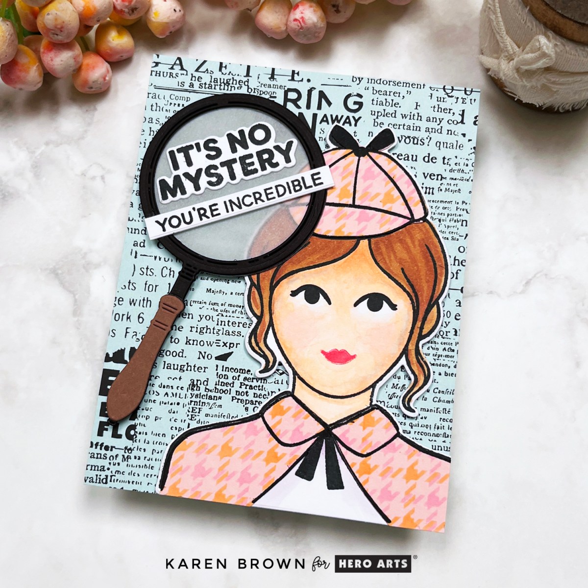
Say hello to my favorite cardmaking detective—a stylish sleuth (inspired by my own daughter!) ready to crack any case with flair. She’s decked out in a stenciled houndstooth plaid cape and Sherlock Holmes-inspired hat, thanks to the Curious Crafter Bundle. The finished look? Think Nancy Drew meets crafty couture!
Here’s how the case unfolded:
- Clothing Construction: I stenciled a custom houndstooth pattern over Peony cardstock, then stamped and fussy cut the pieces to dress Miss Detective.
- Copic Coloring: I brought her to life with Copic markers: E00, E21, E25, E55, R000, BV000, and BV02.
- Vintage Vibes: My background is one of my absolute favorites — the Collage Backgrounds Rub-On Transfers applied to Arctic cardstock. The vintage newspaper style is the perfect setting for some crafty sleuthing.
- Spotlight on Sentiment: A large die cut magnifying glass with vellum “glass” focuses attention on the stamped sentiment: “It’s No Mystery, You’re Incredible” — just one of the many clever sayings in this charming Sentiment Stamp Set.
- Finishing Touches: I used Precision Glue and craft foam to give the layers dimension and used a bone folder for flawless rub-on application.
Assembling Miss Detective (a step-by-step recap):
- Stencil the plaid onto Peony cardstock.
- Stamp and color Miss Detective.
- Stamp and fussy cut clothes from plaid panel.
- Die cut Miss Detective and adhere clothing.
- Die cut magnifying glass from cardstock and vellum.
- Stamp and die cut sentiment.
- Apply rub-on transfers to Arctic cardstock.
- Assemble card with dimension and precision.
Click HERE if you’d like to see my post on how to customize your Hounstooth stenciled background.
Pro Tip: These rub-ons are pure magic! They transfer easily with a bone folder and give a rich, detailed finish — no ink needed!
The Verdict?
The Case Closed Collection is a creative knockout—quirky, clever, and a total blast to work with. Whether you’re channeling your inner sleuth, crafting a personalized card, or just in it for the vintage vibes, this collection offers so many possibilities.
Thanks for hopping along with us on Instagram today! Be sure to follow the trail (aka the hashtag) for more clever creations and inspiration from this fun Hero Arts release.
Click Link to Instagram Hop – My IG handle is @karens_mini